|
| Group |
Round |
C/R |
Comment |
Date |
Image |
| 26 |
Feb 25 |
Comment |
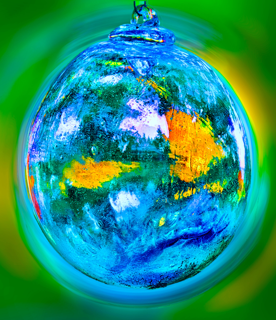
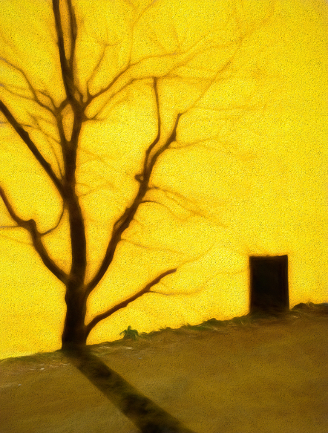
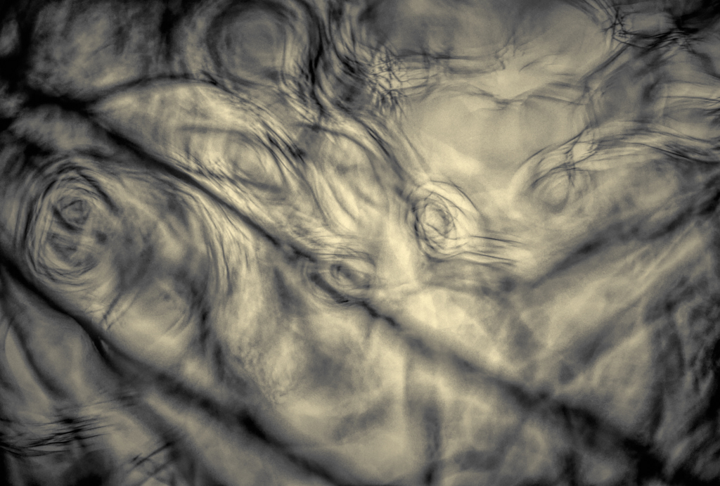
Thank you so much, Mervyn! My first idea was that it would serve as a background for a composite, but then I started to think that it actually might stand on its own. |
Feb 10th |
| 26 |
Feb 25 |
Reply |
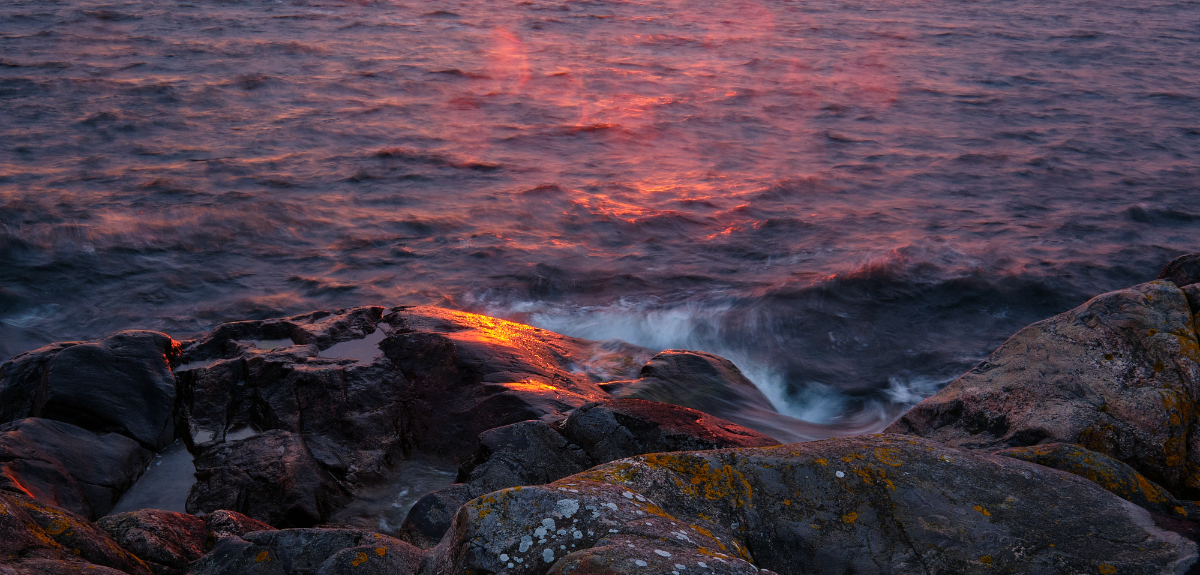
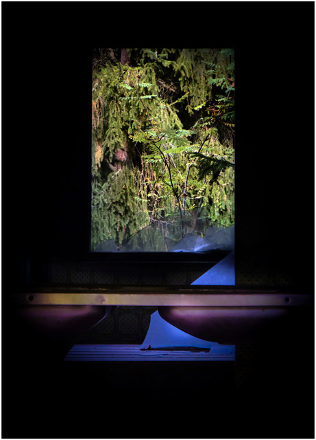
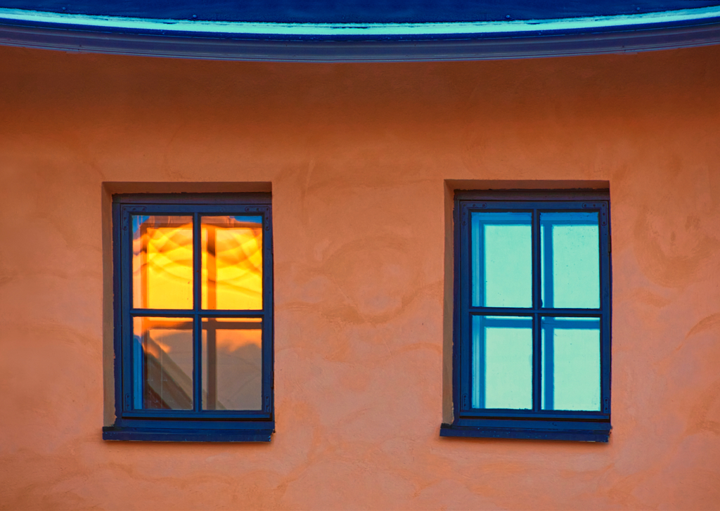
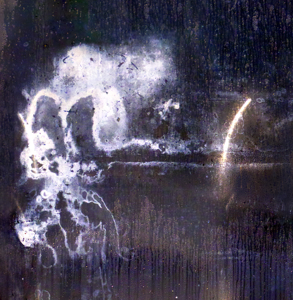
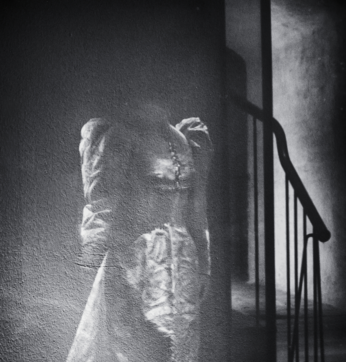
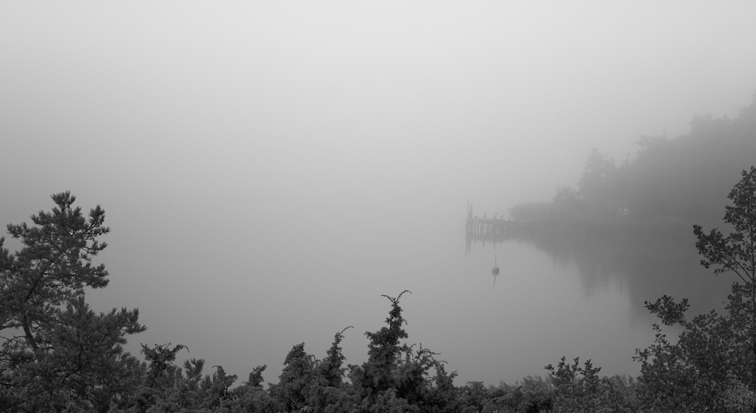
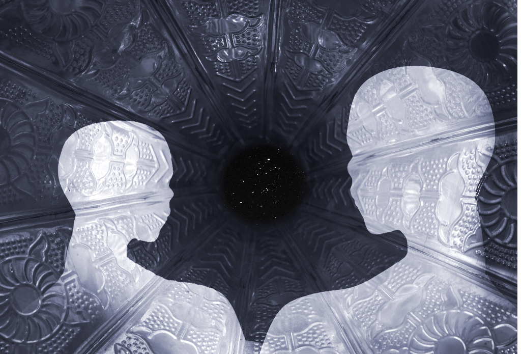
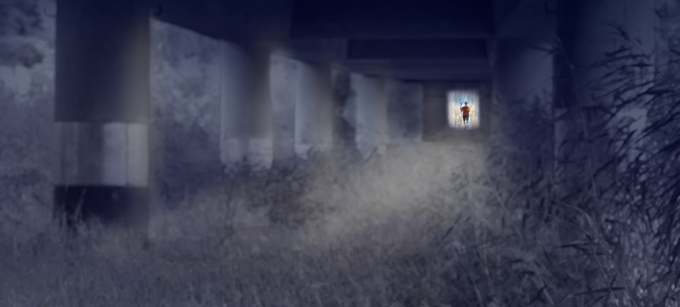
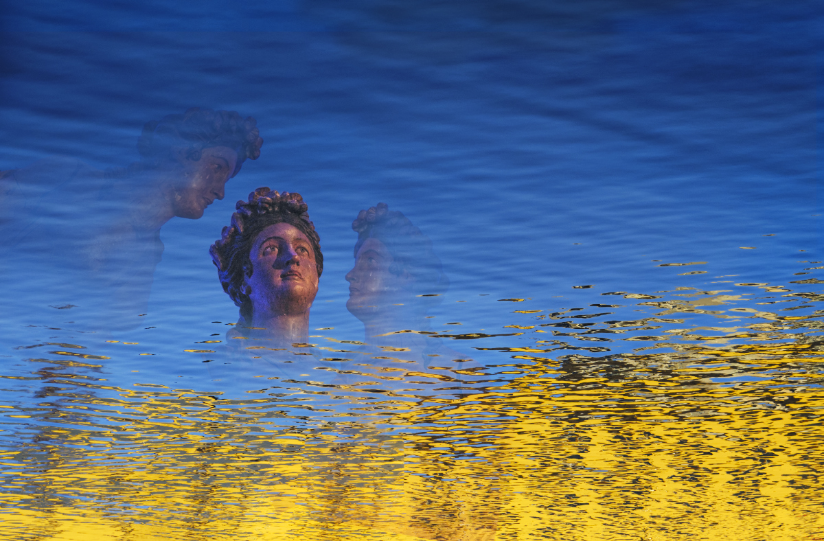
Thank you, Jose! You are right: the "sky" is the bottom part of the wall. I could not figure out if the source of the intense fluorescent light was somehow embedded in the wall, or underground, or a reflection, but the effect was fascinating. |
Feb 9th |
| 26 |
Feb 25 |
Comment |
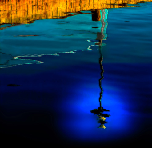
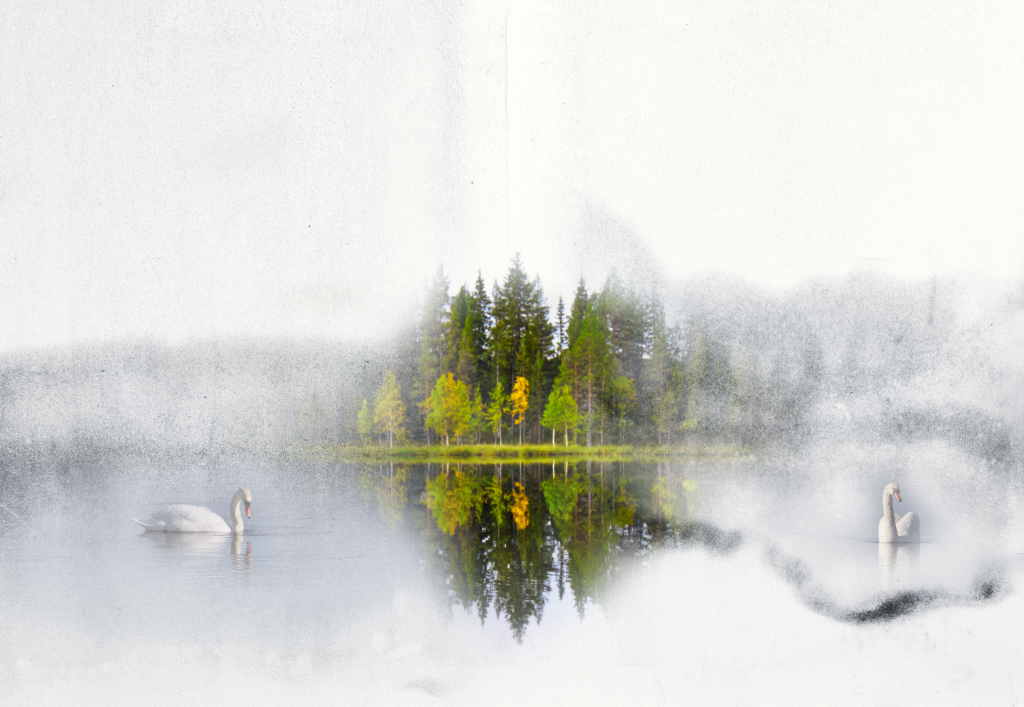
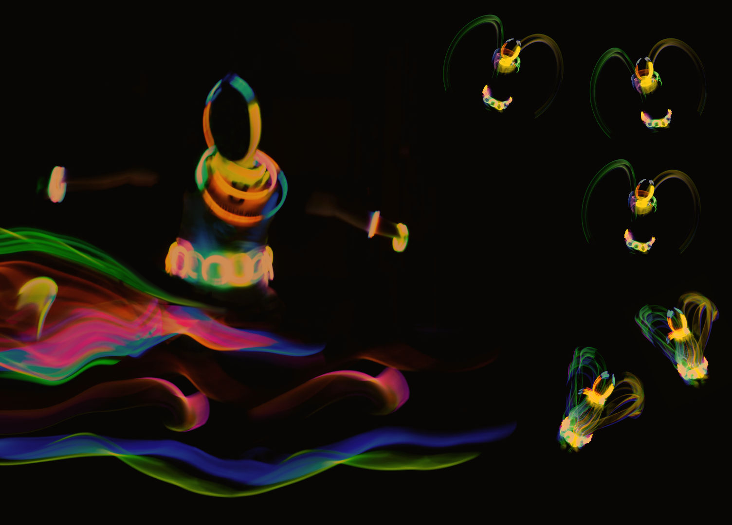
Hi Jose, I see the image as an abstract, with the lovely hues of orange and aqua, and the intriguing curved forms. I think that the flamingos and their reflections also become, as you say, dot-like visual elements.- I wonder if cropping off the light streak and the top row of flamingos might calm it down and emphasize the forms in the water? |
Feb 8th |
 |
| 26 |
Feb 25 |
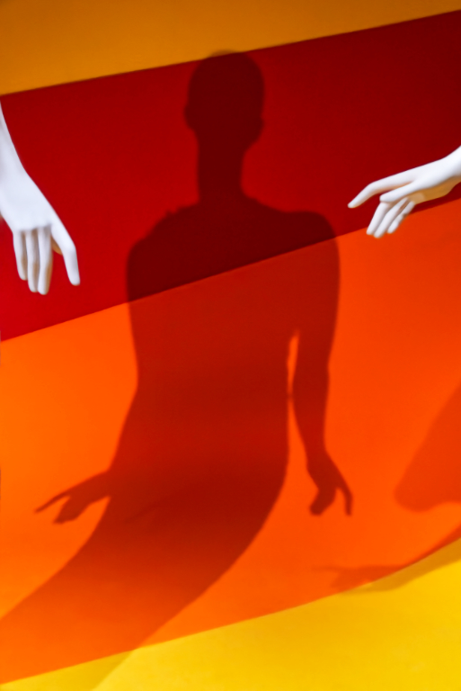
Comment |
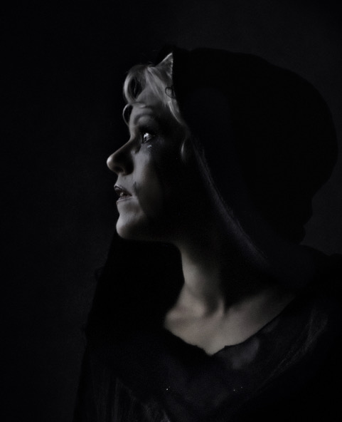
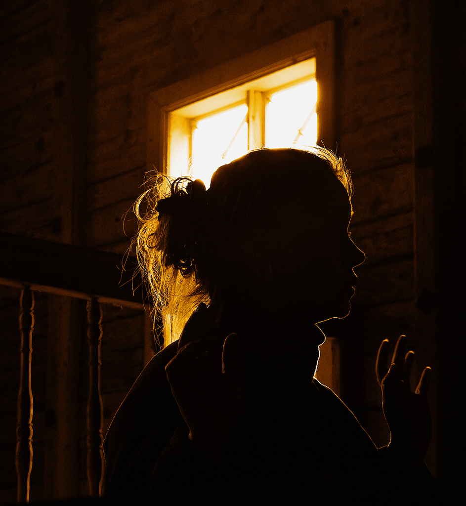
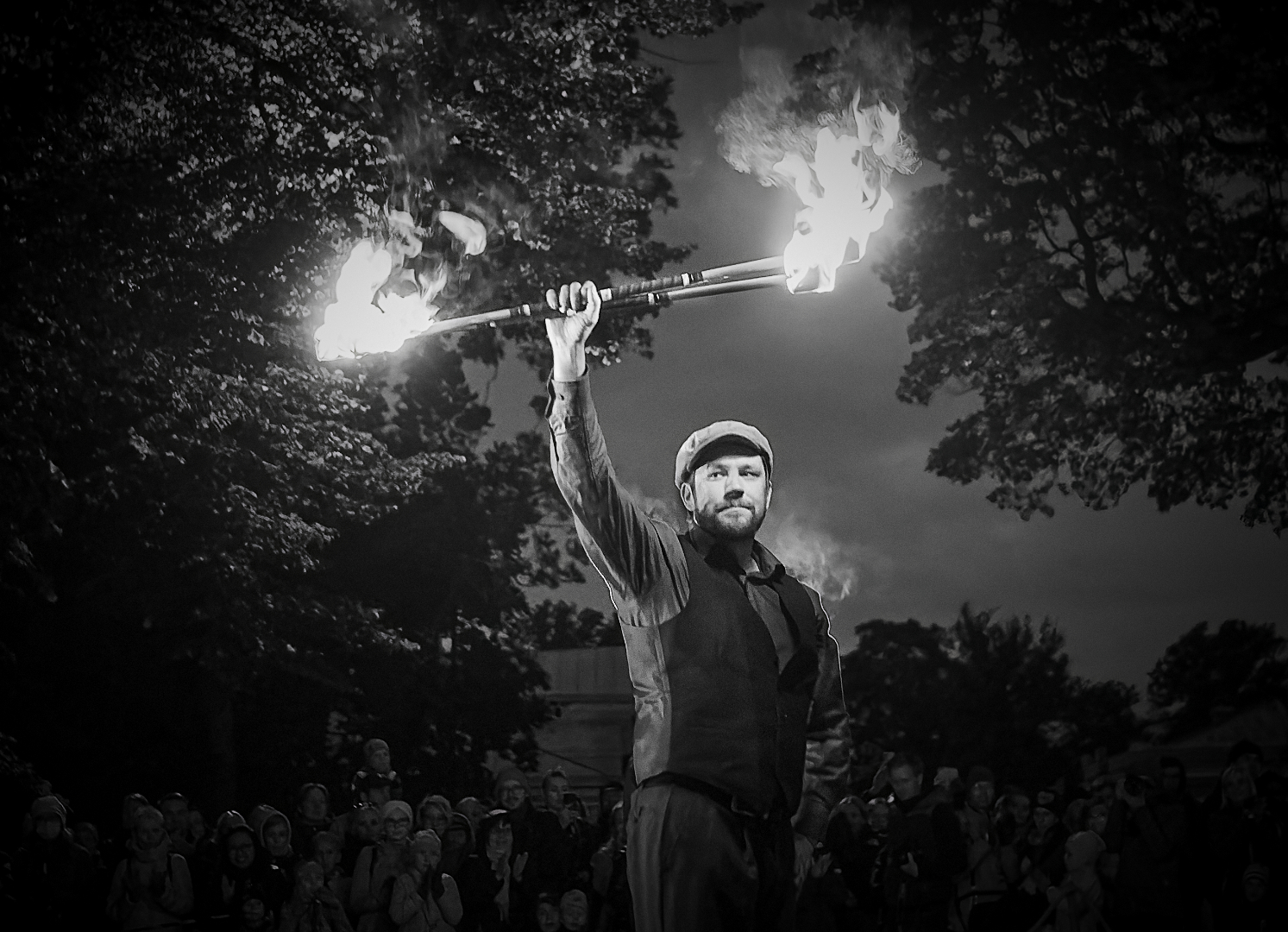
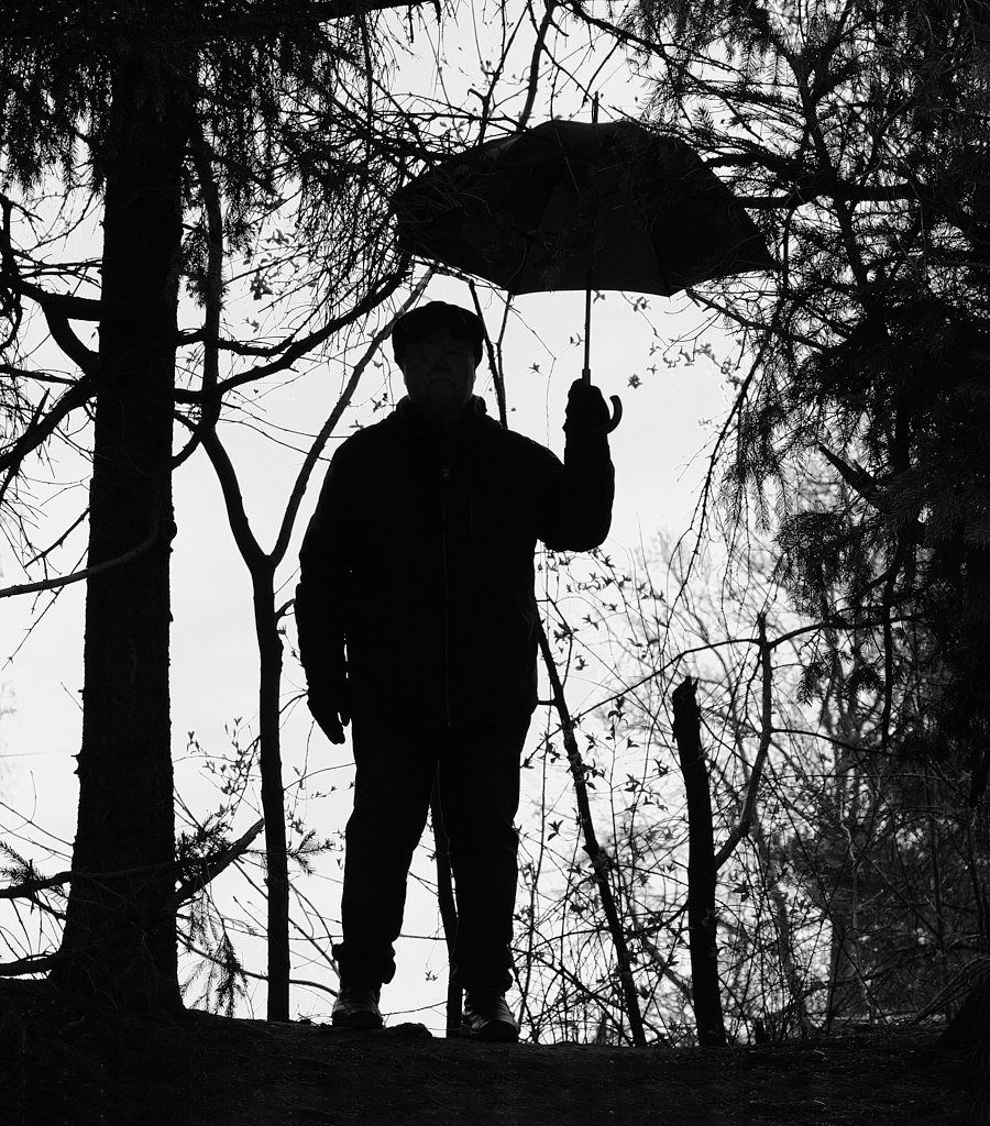
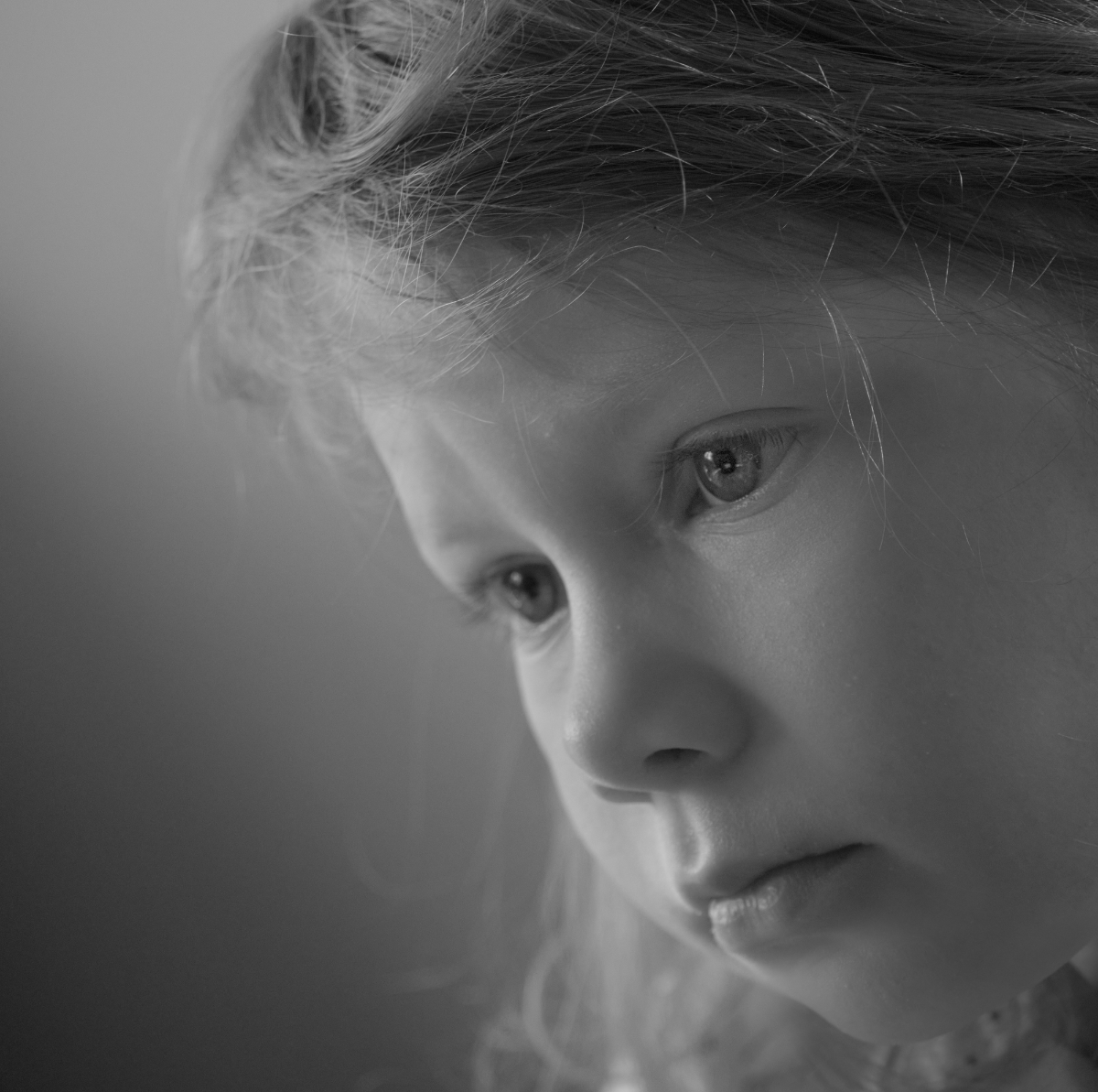
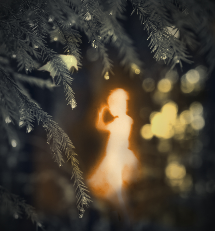
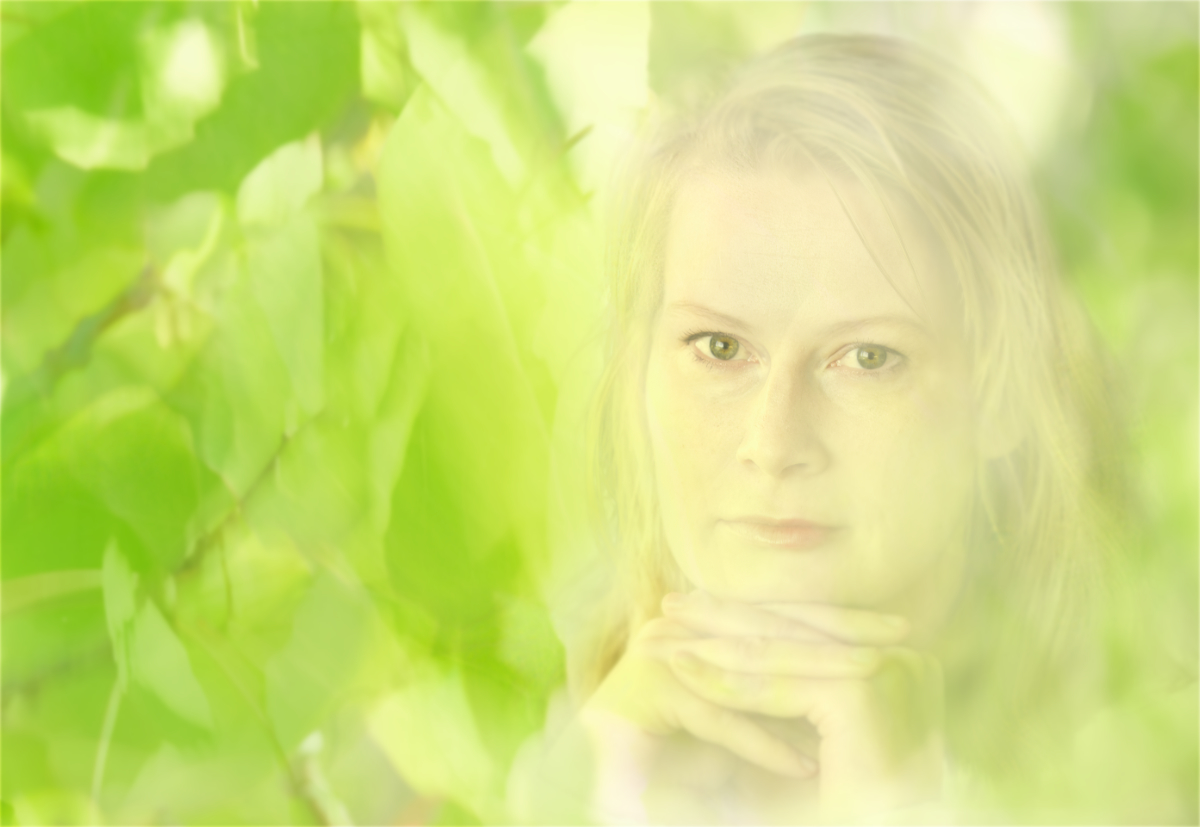
Hi Mervyn, the colors are just gorgeous! I love way the trees frame the person in the center. The difference in saturation between the pale background and the frame of the trunks, foliage and fallen leaves gives the image a lot of depth, and the attention is directed to the man in the red shirt. I wonder if it would be possible to get his face a bit better separated from the background.maybe by darkening it slightly? |
Feb 8th |
| 26 |
Feb 25 |
Comment |
Hi Tony, what a lovely action shot! It looks like the eye of the feeding bird is gleaming of intensity. The diagonal branch makes a nice composition. Every tiny feather is tack sharp, and the background blurs beautifully. - I wonder if it might be possible to darken or blur the bright flower above his head a bit? |
Feb 8th |
| 26 |
Feb 25 |
Comment |
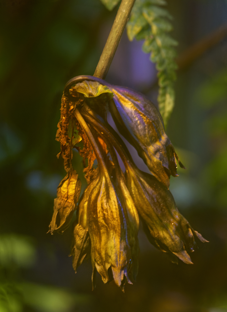
Hi Bob, I truly appreciate the effort as well as the results! Your exquisite butterfly now glows against the background, with every sharp detail visible. - I feel that the bright green areas a the top edge may be a little distracting? I think that I would try to use the same hue through the background myself, to reduce the contrasts as much as possible. |
Feb 8th |
5 comments - 1 reply for Group 26
|
| 47 |
Feb 25 |
Comment |
Hi Barbara, what a fine horse portrait! I love the graceful arch of the neck that the light brings out so beautifully, and the ripple of muscles under his skin. I think that crop supports the composition, and the depth of field is just perfect. - I wonder if the dark area of his belly might be a little lighter? |
Feb 14th |
| 47 |
Feb 25 |
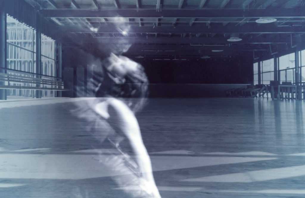
Reply |
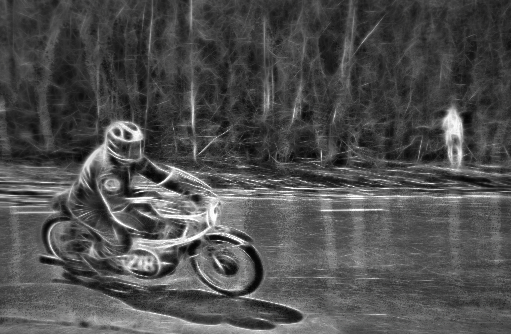
Thank you, Rob! I am so glad that the motion effect worked - it actually felt almost scary to crouch on the ground in front of those big wheels! The light background is a good idea! |
Feb 10th |
| 47 |
Feb 25 |
Comment |
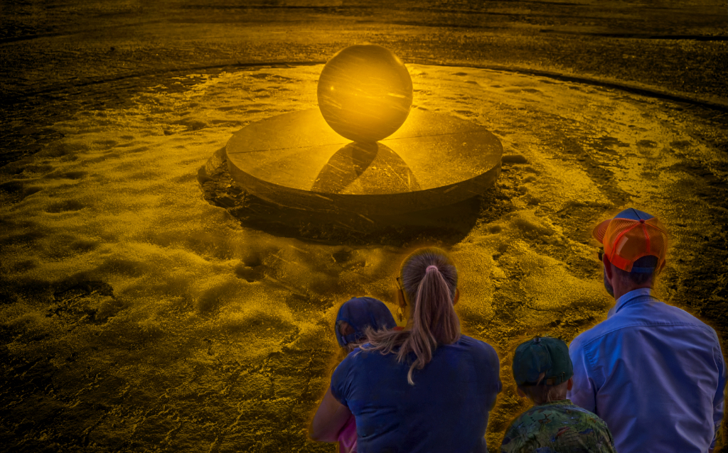
Thank you, Jeff! I know - it was the bright reflection from some corner that produced the unexpected octagon that I then decided to try to use in the story. - I think I'll continue with the experiment to learn how the lights behave in the process. |
Feb 8th |
| 47 |
Feb 25 |
Reply |
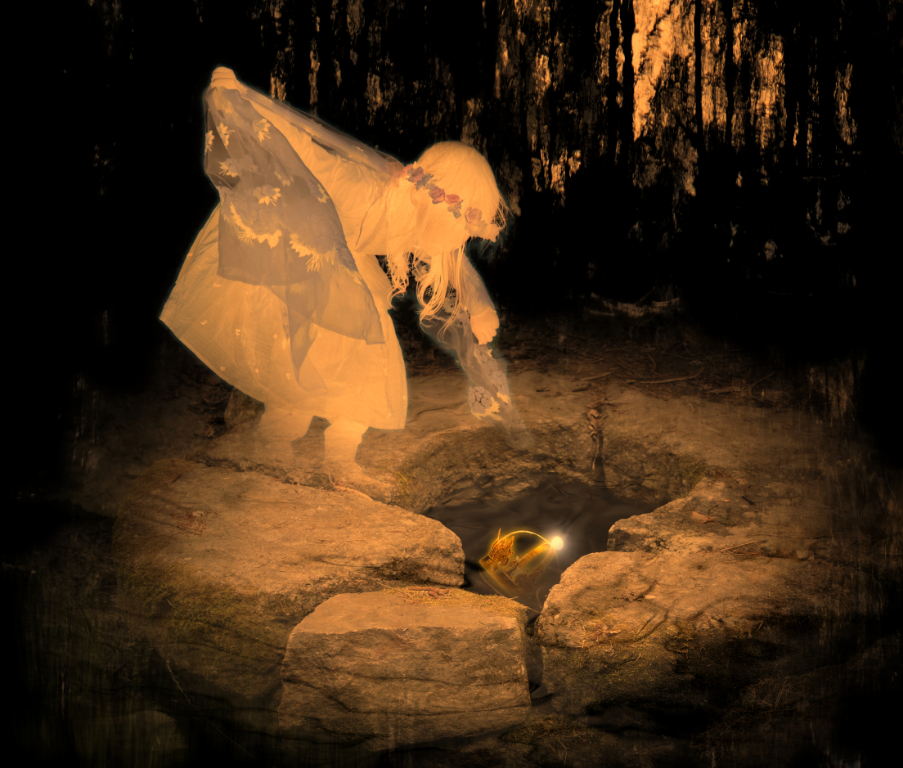
Thank you, Ed! I have been looking at the different versions side by side now, and I think, too, that the halo may actually add to the ghostly mood, after all. - I have not played with the zoom effect before, and find these unexpected results so fascinating. |
Feb 8th |
| 47 |
Feb 25 |
Comment |
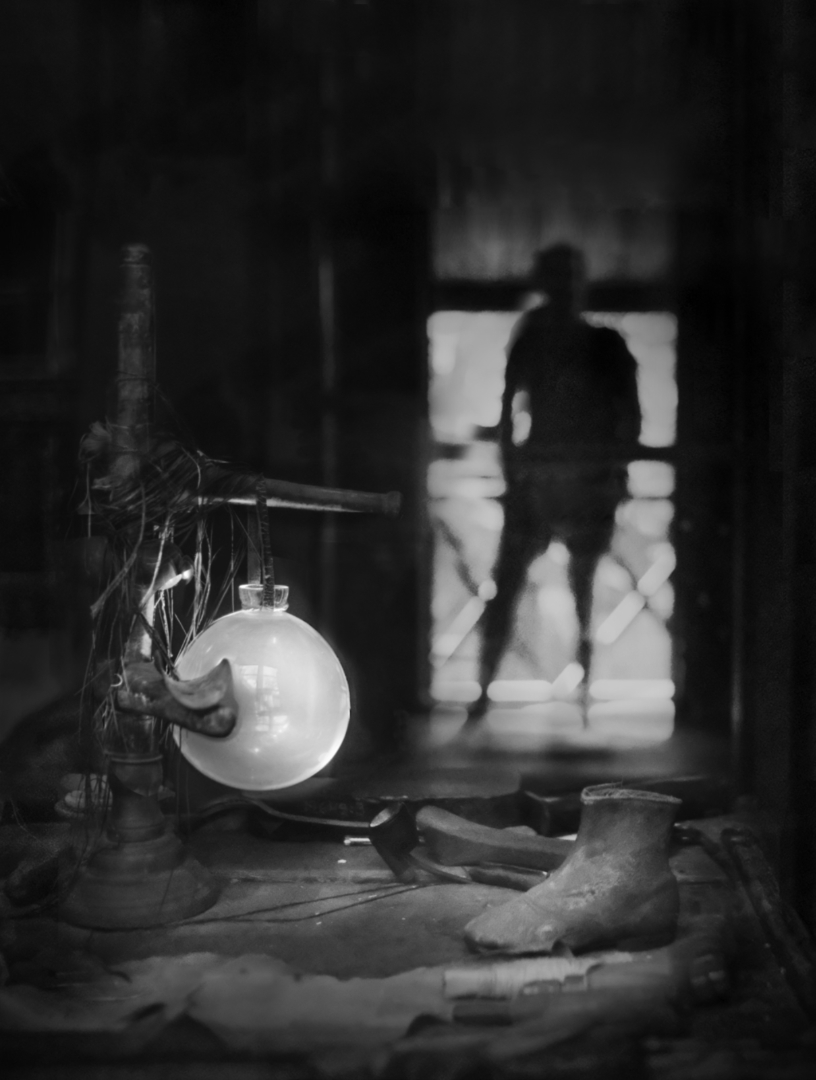
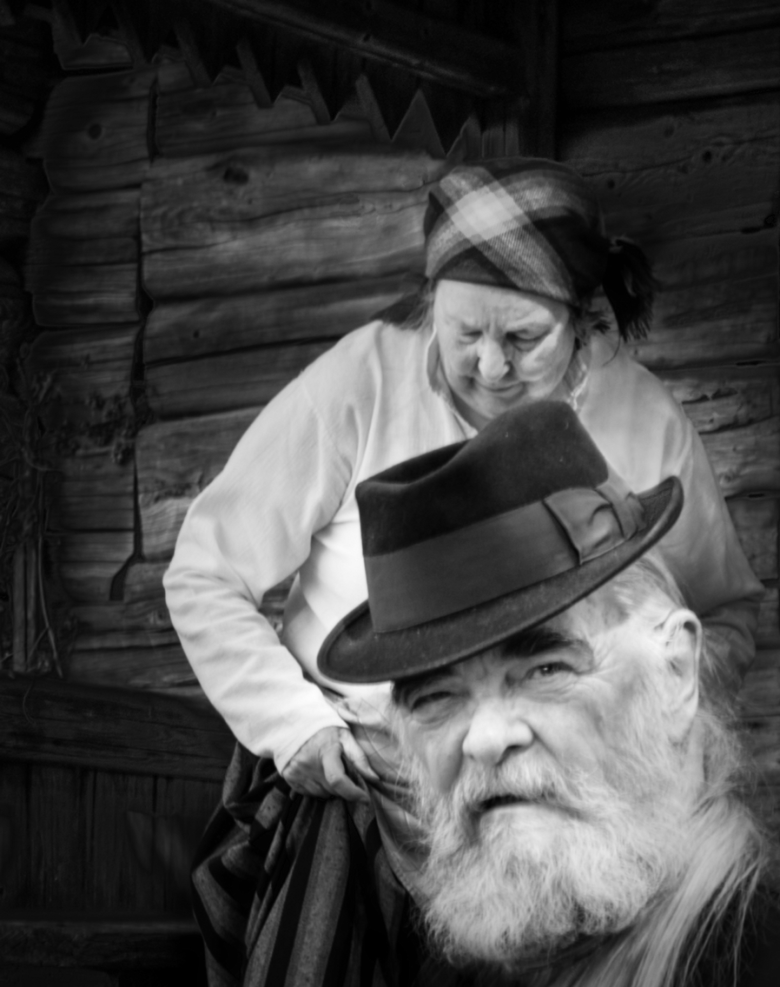
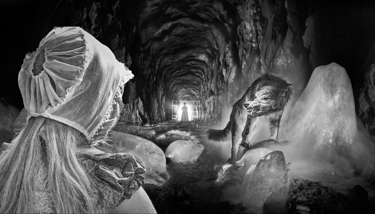
Hi Ed, what a rare treat it has been to witness the event! - I feel, too, that it is a bit difficult to understand what is happening, and really got the idea only when I read your explanation to Al. I think that it is partly that there are unfamiliar elements, and partly that the image is so sharp all through that the overlapping parts may get confusing. - I wonder if cropping off the bottom of the image would give more room for the action part, although it may dilute the delicious contrast between the gentleman in the statue and the samurai in their respective postures. Also, it might help the viewer if the primary target were more effectively separated from the background? To demonstrate, I made a duplicate layer with lens blur, and erased it off the man, his sword and the tatami. What do you think? |
Feb 8th |
 |
| 47 |
Feb 25 |
Reply |
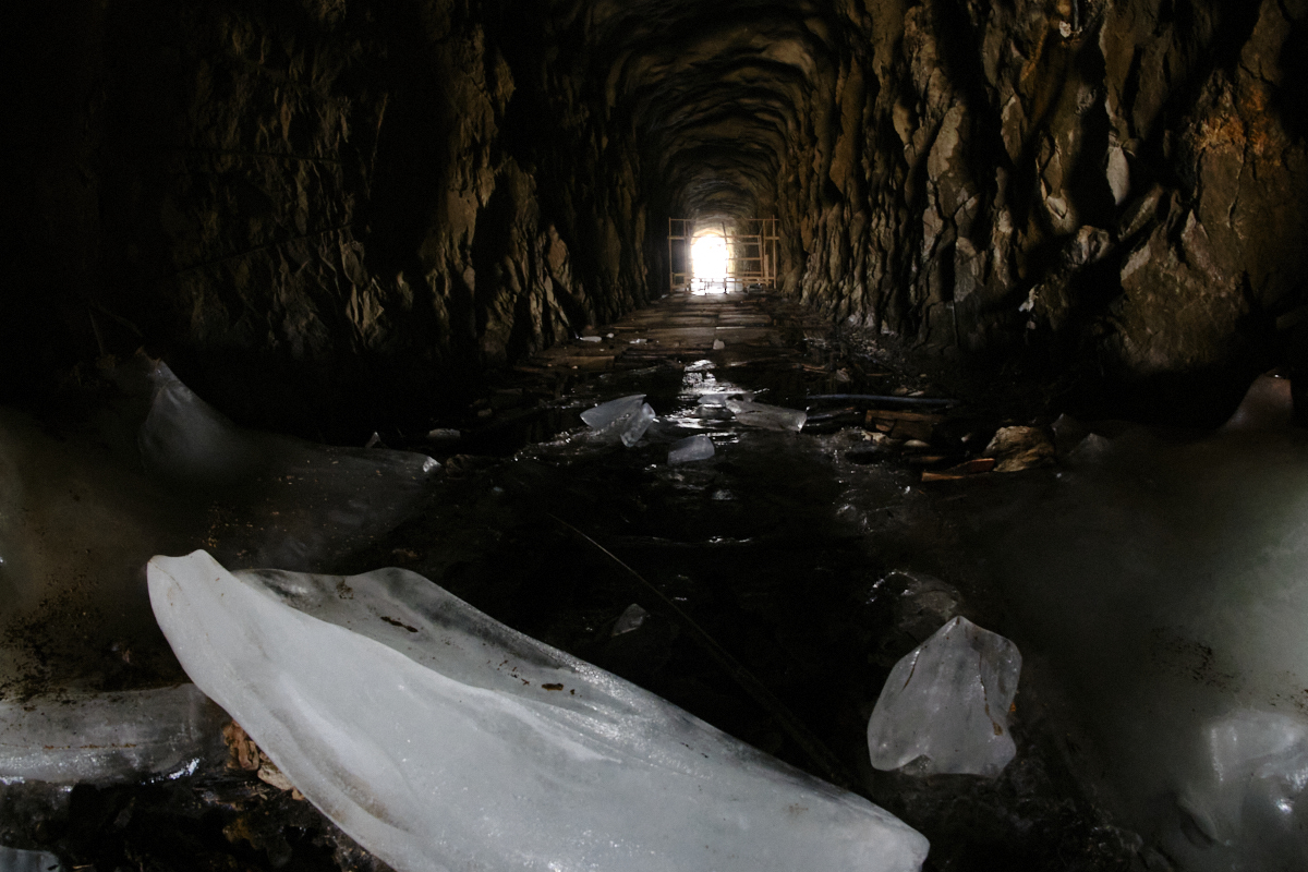
Al, I am so sorry: I somehow mixed up yours and Robs images. Please ignore my previous comment!
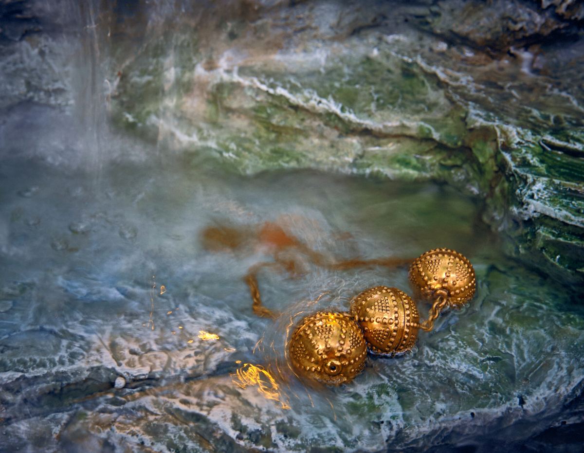
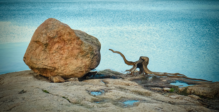
About this one: what a beautiful arrangement of tones and textures! I love the way you have used the light to show the various forms of ice, from the smooth glistening cover on the rock to the brittle almost transparent spiky layers. I think that the diagonals that divide the image into dark and light halves, with that little curved sliver of ice sitting in the center, make an interesting and balanced composition. I think that one can enjoy this either as a Nature image, or as an abstract as well. |
Feb 8th |
| 47 |
Feb 25 |
Comment |
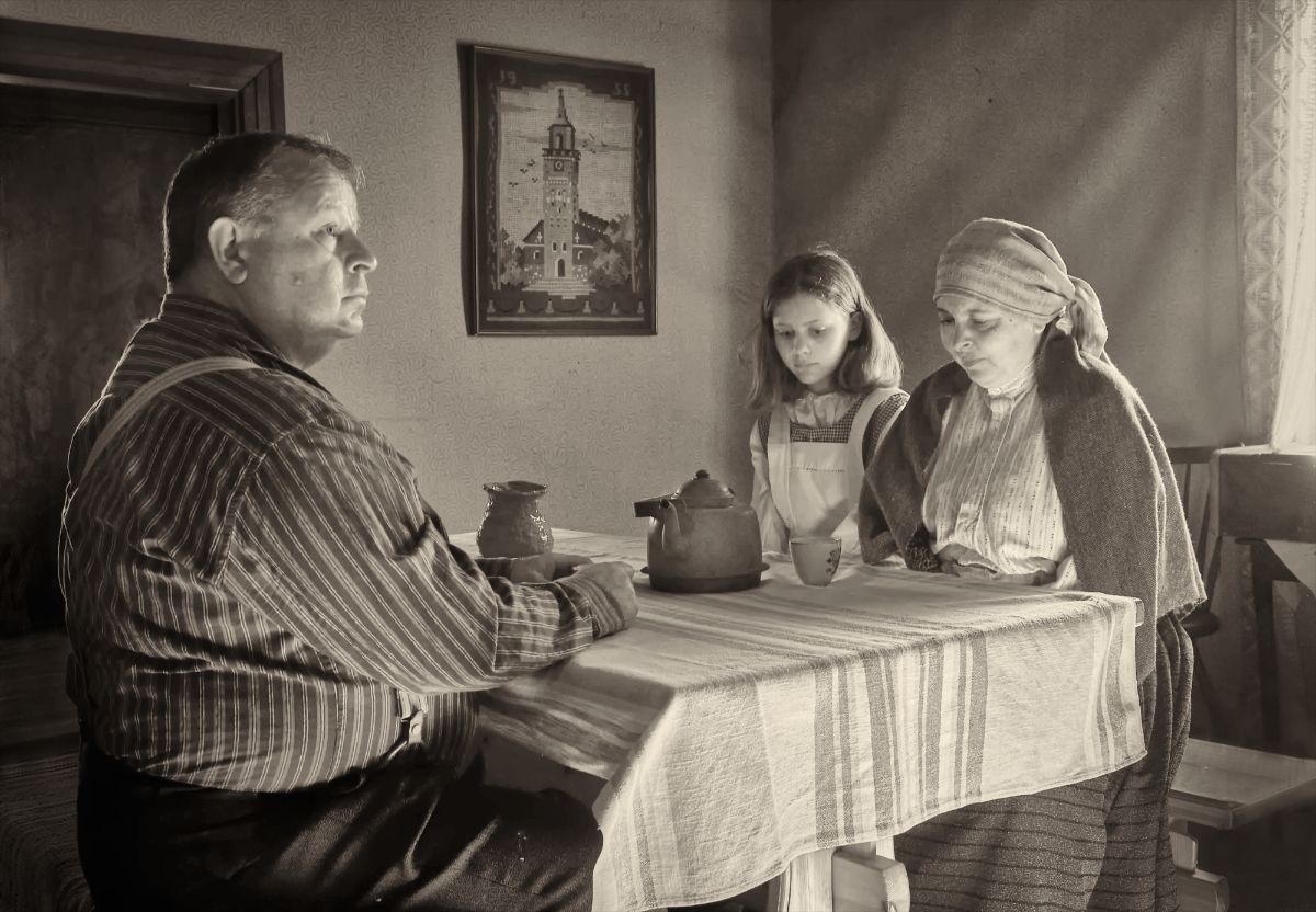
Hi Robert, I would vote for leaving it as it is, for exactly the same reasons you stated. The background anchors the image in time and place, and gives a wider dimension for the story it tells, of a culture and a way of life. Also, I think that compositionwise, the horse and bug are in a perfect place, following the dark diagonal of the road in the white scenery. Cropping a little at the bottom edge, as Al suggested, might be a good idea, too. |
Feb 8th |
| 47 |
Feb 25 |
Reply |
Thank you very much, Al -I think that this made a lot of difference!
|
Feb 8th |
 |
| 47 |
Feb 25 |
Comment |
Hi Al, I would vote for leaving it as it is, for exactly the same reasons. The background anchors the image in time and place, and gives a wider dimension for the story it tells, of a culture and a way of life. Also, I think that compositionwise, the horse and bug are in a perfect place, following the dark diagonal of the road in the white scenery. |
Feb 7th |
| 47 |
Feb 25 |
Comment |
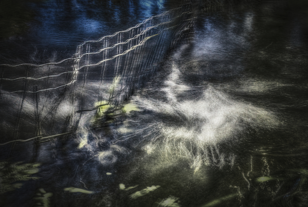
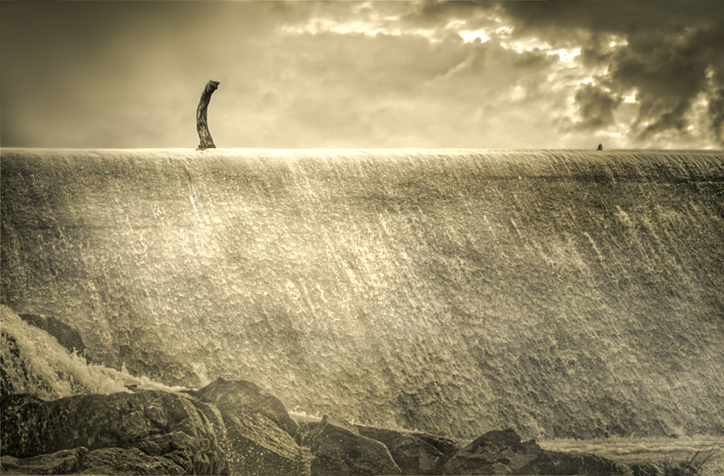
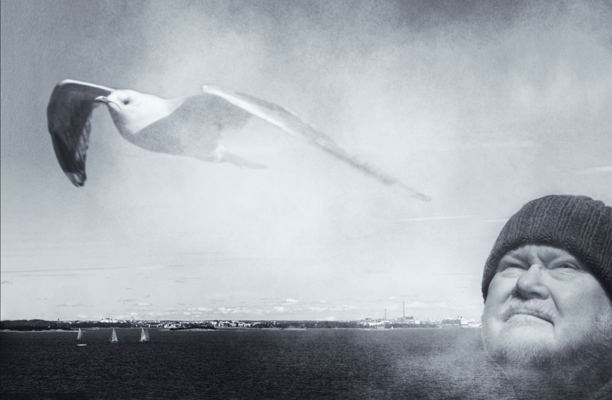
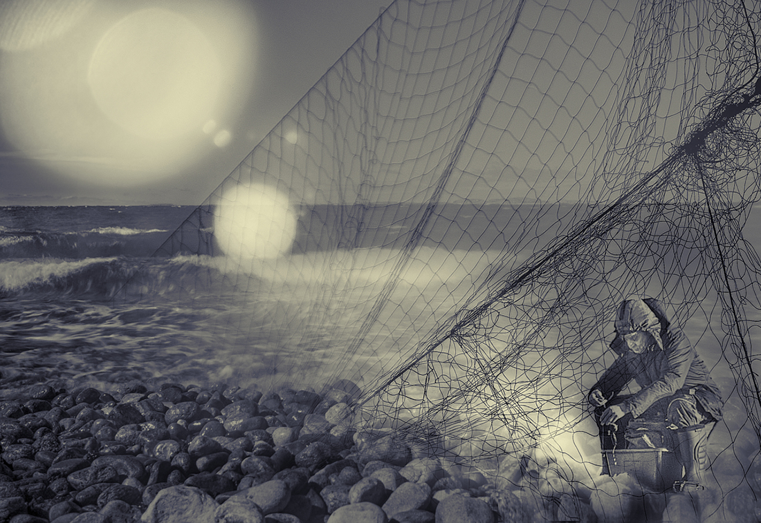
Hi Jeff! I think that there is an almost biblical power in the waves that roll towards the viewer under the heavenly rays. The effect is fortified by the centered composition, and the dark mass of the rock on the left and large area of the light sky balance each other beautifully. - A minor thing: my eye tends to wander to the bright sliver of water at the bottom left corner: I wonder about cropping it off or cloning a bit of the dark logs to meld it in the rest of the foreground? I like the sharp dark silhouette of the lonely lighthouse in the original - I wonder if it might be slightly darker in the BW image, too? |
Feb 7th |
| 47 |
Feb 25 |
Comment |
Thank you, Barbara, very good ideas! I'll try all of them out. - I quite like the darkness in the left side myself, as something mysterious for the truck to move in. Also, I got so fond of those narrow oblique stripes that come from the fence in the darkness that I just could not let them go, and then there is the tiny star above the forest in the left upper corner, too… |
Feb 5th |
7 comments - 4 replies for Group 47
|
| 54 |
Feb 25 |
Comment |
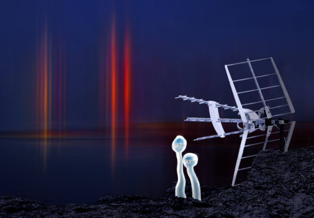
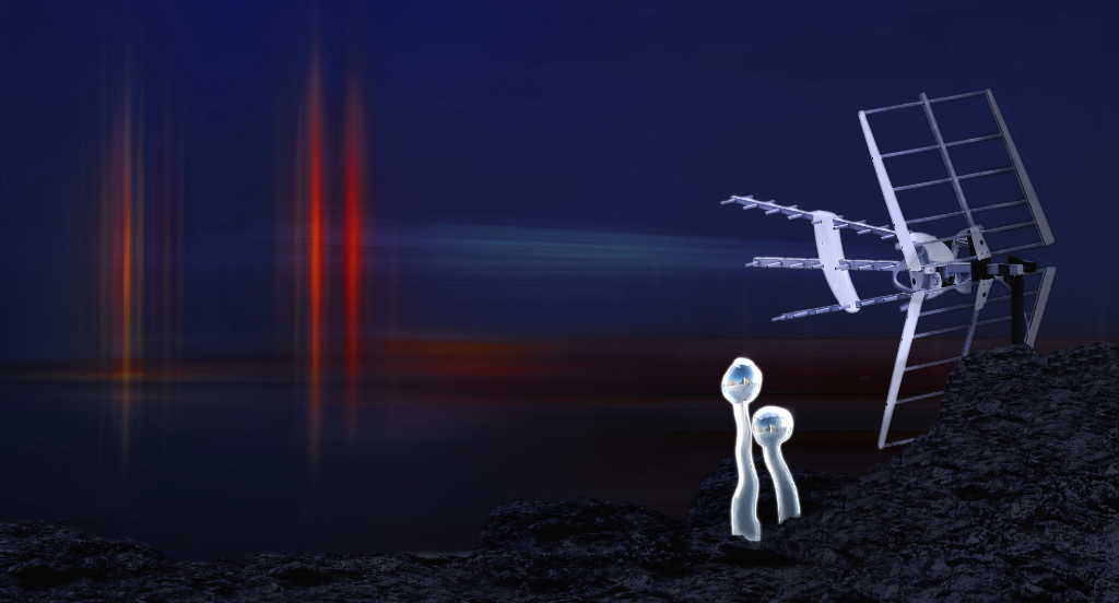
Thank you, Maria! I am so glad that you like the story! love the way the beam ties everything together, too.
|
Feb 21st |
| 54 |
Feb 25 |
Reply |
Hi Bruce, here is my next attempt. I am so grateful for the beam! I expanded the image to panorama-like format to give it more room - don't know if it was a good idea or not. The lovely signal interruptions seemed to make it a bit cluttered, so I left them off. I think that the Glamour Glow filter softened also the ugly shoreline a bit, and left it, and the horizon, visible for now, although the darkness looked very good, too. What do you think? |
Feb 21st |
 |
| 54 |
Feb 25 |
Reply |
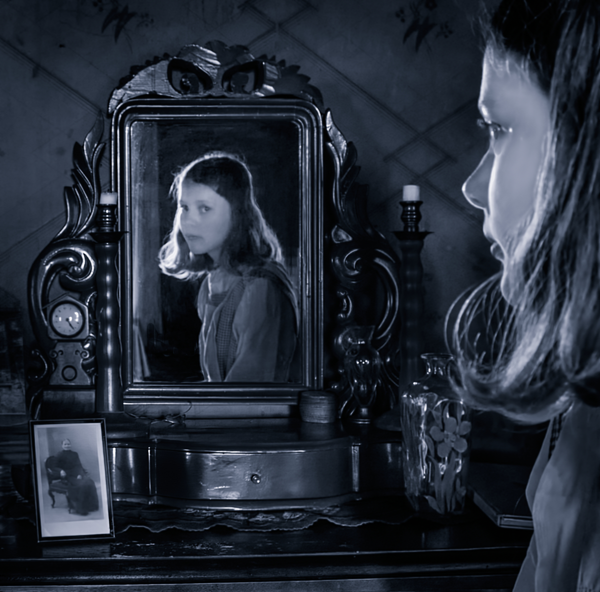
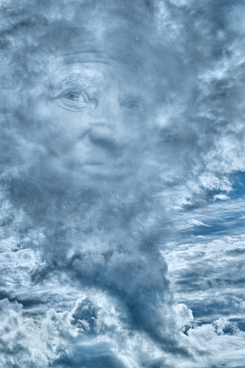
Thank you very much - I absolutely agree. I think it may be the shattered sense of security and the shock of betrayal to see a stranger looking out from the eyes in a familiar face that makes them the most scary. That would be a real challenge for an image! |
Feb 18th |
| 54 |
Feb 25 |
Comment |
Thank you, Brad, I see what you mean. I am experimenting with a little more panorama-like format now, expanding the image at the right edge, to give more room for the Bruce's lovely modulated signal effect. I think that this might help the against the crowded sense, too. |
Feb 14th |
| 54 |
Feb 25 |
Reply |
Thank you, Peggy, I am glad! |
Feb 14th |
| 54 |
Feb 25 |
Reply |
Hi, I like very much the extra dimension the frame gives the image, both in physical and metaphorical sense. I think that Peggy�s edit makes it more visible in a beautiful way. |
Feb 12th |
| 54 |
Feb 25 |
Comment |
Thank you so much again, Bruce! I knew that you would rescue the Aliens! I think that I tried every effect but the Glamour Glow, and the dark background gives everything a new power. The beam is a lovely idea, I cannot wait to see how I can recreate it myself - I can see it as a little wider and in a paler shade. |
Feb 11th |
| 54 |
Feb 25 |
Comment |
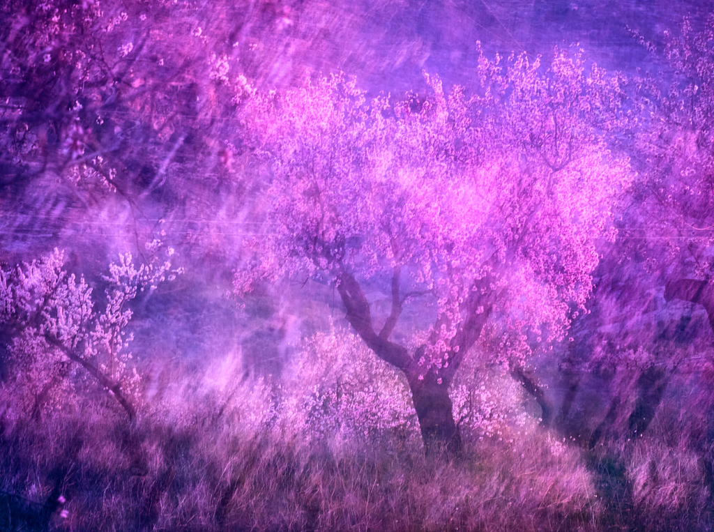
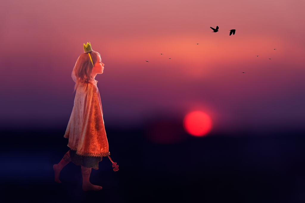
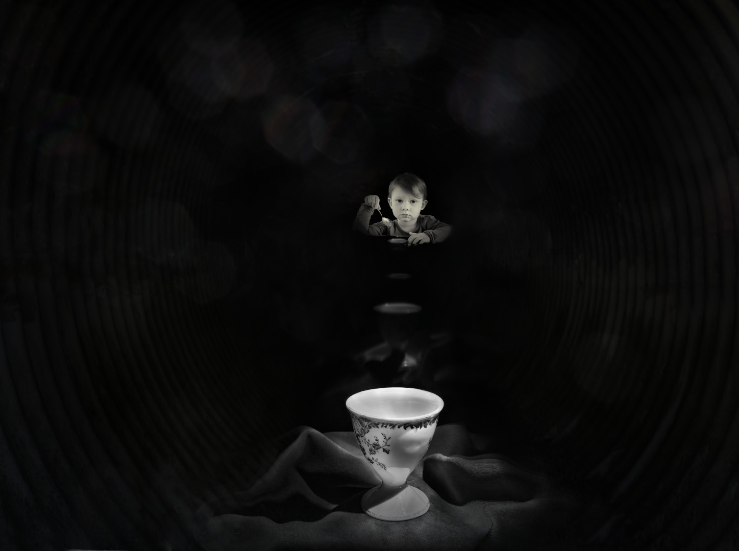
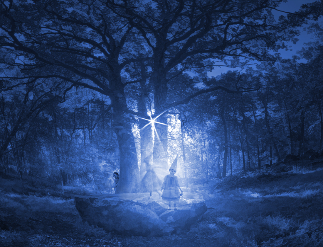
Hi Maria! The image makes me think about fairytales where toys or figurines come alive and get into all kinds of adventures. The brilliantly white egret has all the characteristis of a magical bird. The background landscape with the silvery trees, reflections and lovely colors is a fine image itself. - I think that the head and beak of the egret may get a little lost in the background - would slight darkening of the trees help to bring them out ? Is it a toppled chair the boy is balancing on? I think that some dodging might make its show better? |
Feb 10th |
| 54 |
Feb 25 |
Comment |
Hi Matt, you have created an enchanted corner where the name of the cafe gets a deeper meaning, with those magical glowing golden lights. I love the deep colors and the way the warm light falls on the pavement, and the red ribbon on the man's hat is a perfect final touch. - My only question is if you need the white menu stand on the right - it does balance for the man's white coat, but I feel that it may dilute the strength of the triangle composition formed by the man, the billboard and the window? |
Feb 10th |
| 54 |
Feb 25 |
Comment |
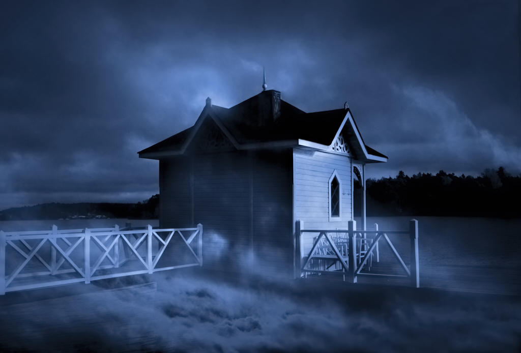
Hi Bruce, I love the foreboding mood you created by the color scheme - it feels like a storm is approaching, or, anyway, something is going to happen soon. I think that the caravan also gives a scale to the vast desert. |
Feb 10th |
| 54 |
Feb 25 |
Comment |
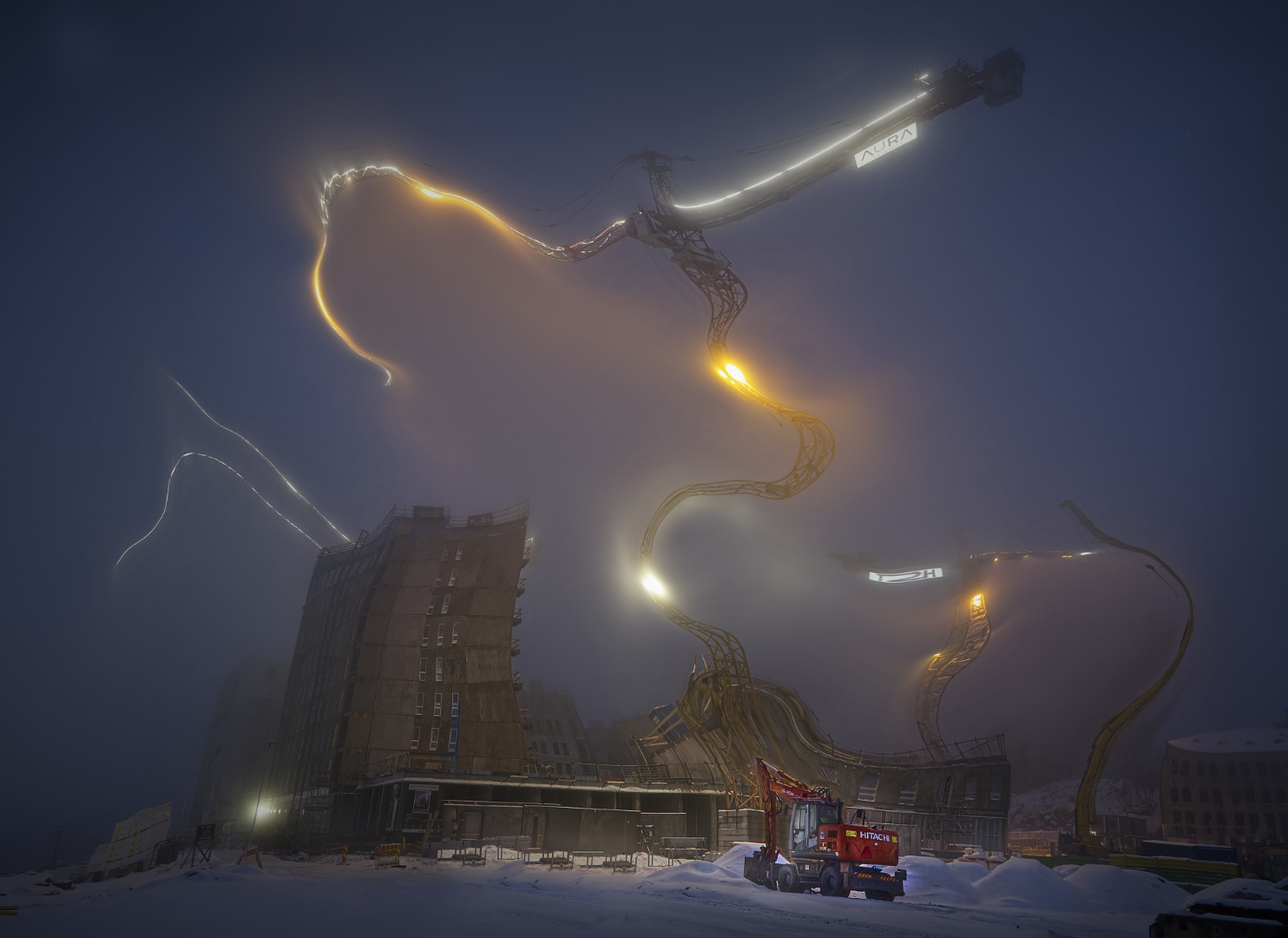
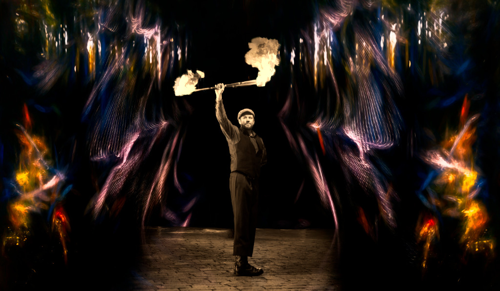
Alan, I think that this is brilliant, powerful and deeply disturbing, just as I guess you intended. It reminds me of the surreal visions of Hieronymus Bosch that one does not want to see but cannot help looking at. - I think that you play with light and darkness most effectively: your gleeful Lucifer is almost hidden in the dark and sends the luminous dies tumbling diagonally into the blackness, towards the viewer. The perspective and the varying turns of the cubes give a huge sense of movement, depth, and dimension, and the Radial Gradient adds to the three-dimensional effect. - I kept wondering if Lucifer really needs the pedestal, but it probably anchors the whole setup in space, and adds one surreal element by reminding that he is only a statue. |
Feb 8th |
| 54 |
Feb 25 |
Comment |
Brad, I think that you named the image very appropriately. It feels like memories of beloved sceneries blend seamlessly together and form something that is both new and oddly familiar, for you to step in. What I admire most is the way you combined the three parts of the river to flow towards the bend and further to the falls so naturally, with perfect lighting and reflections.
|
Feb 8th |
| 54 |
Feb 25 |
Comment |
Hi Peggy, I couldn't agree more with Alan: last year we had an Impressionist exhibition in Helsinki with the title "Color and Light", and your image would have fit right in. I love the slightly distorted perspective that adds to the dream-like atmosphere. -If something, I wonder if there could be some more subtle texture in the pale area of the road in the foreground? |
Feb 8th |
| 54 |
Feb 25 |
Reply |
Thank you very much, Matt! I'll try these tips out. The shading will certainly help. - I think that the greatest problem is to fit them in without losing their otherworldly quality. |
Feb 8th |
9 comments - 5 replies for Group 54
|
21 comments - 10 replies Total
|