|
| Group |
Round |
C/R |
Comment |
Date |
Image |
| 26 |
Jun 24 |
Reply |
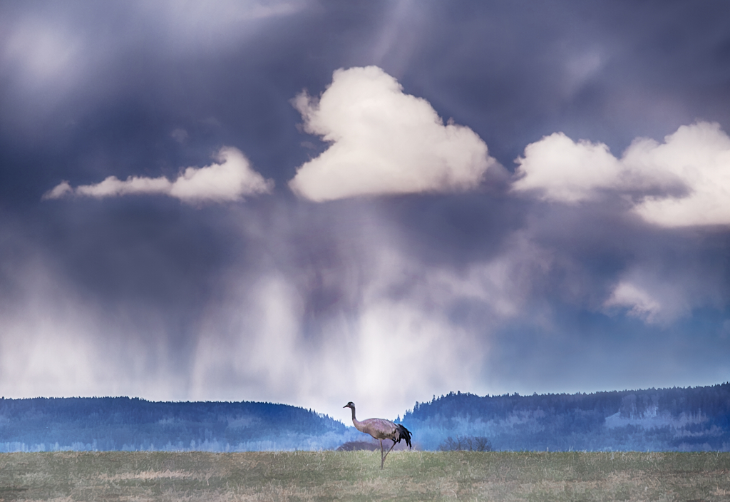
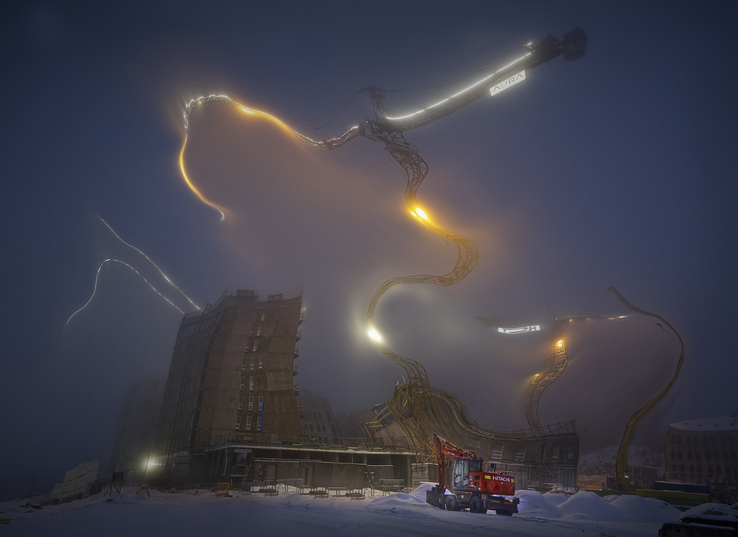
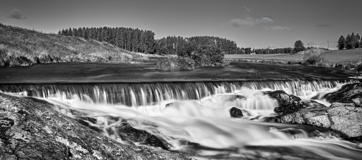
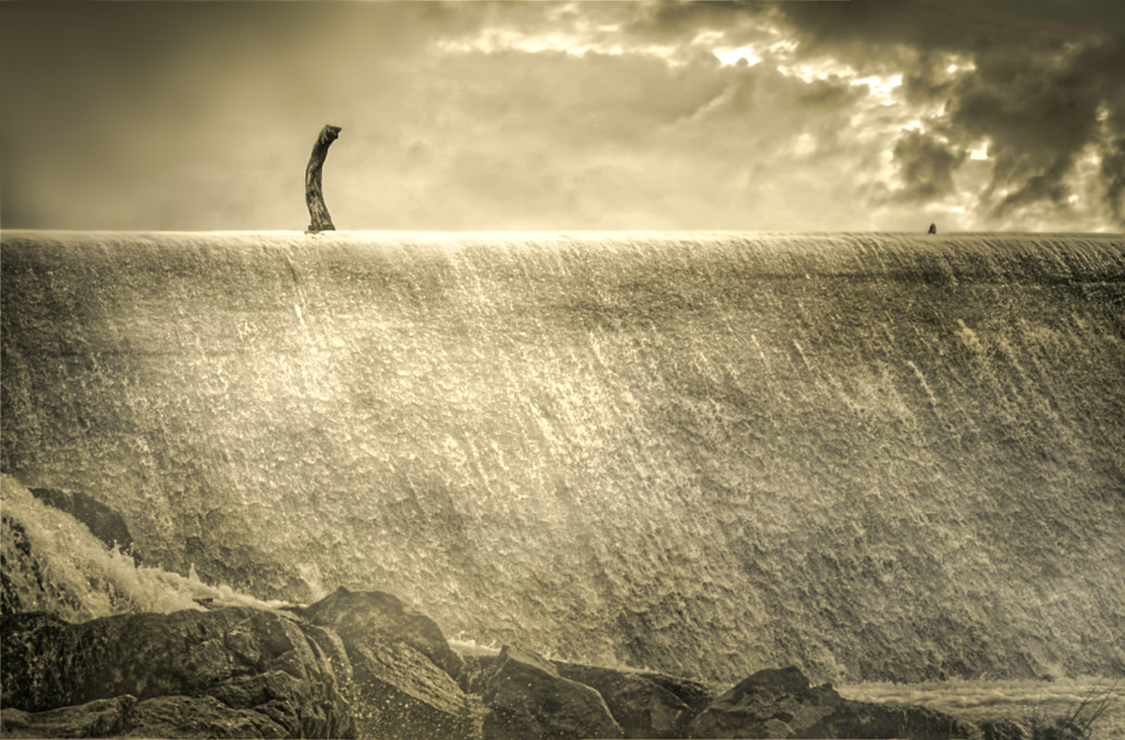
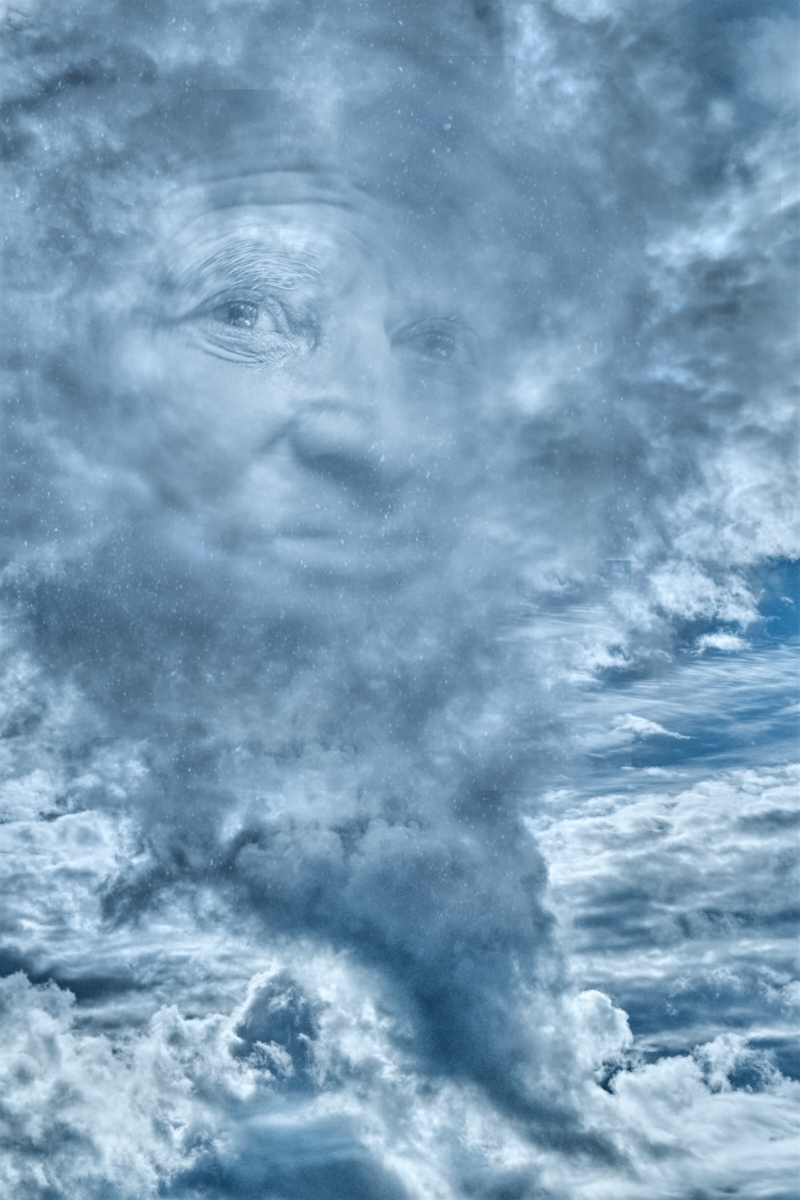
Thank you, Agnes! I'll go back and tune down the clouds. I am so glad if something of the magic of the moment comes through! |
Jun 19th |
| 26 |
Jun 24 |
Comment |
Thank you, Ian, I am so glad! |
Jun 17th |
| 26 |
Jun 24 |
Reply |
Thank you, Tony! I am so glad that you think that it works! I will go back and work on the cloud some more. |
Jun 13th |
| 26 |
Jun 24 |
Reply |
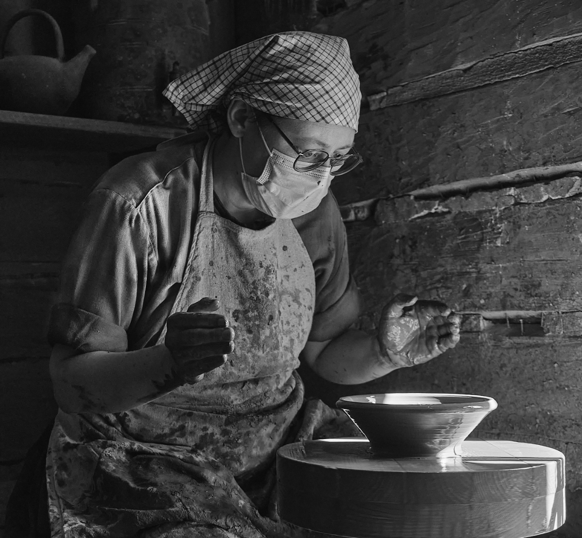
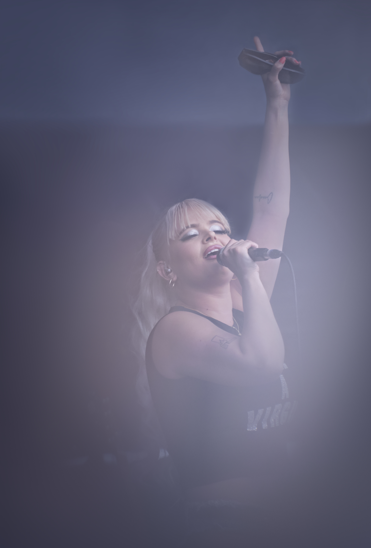
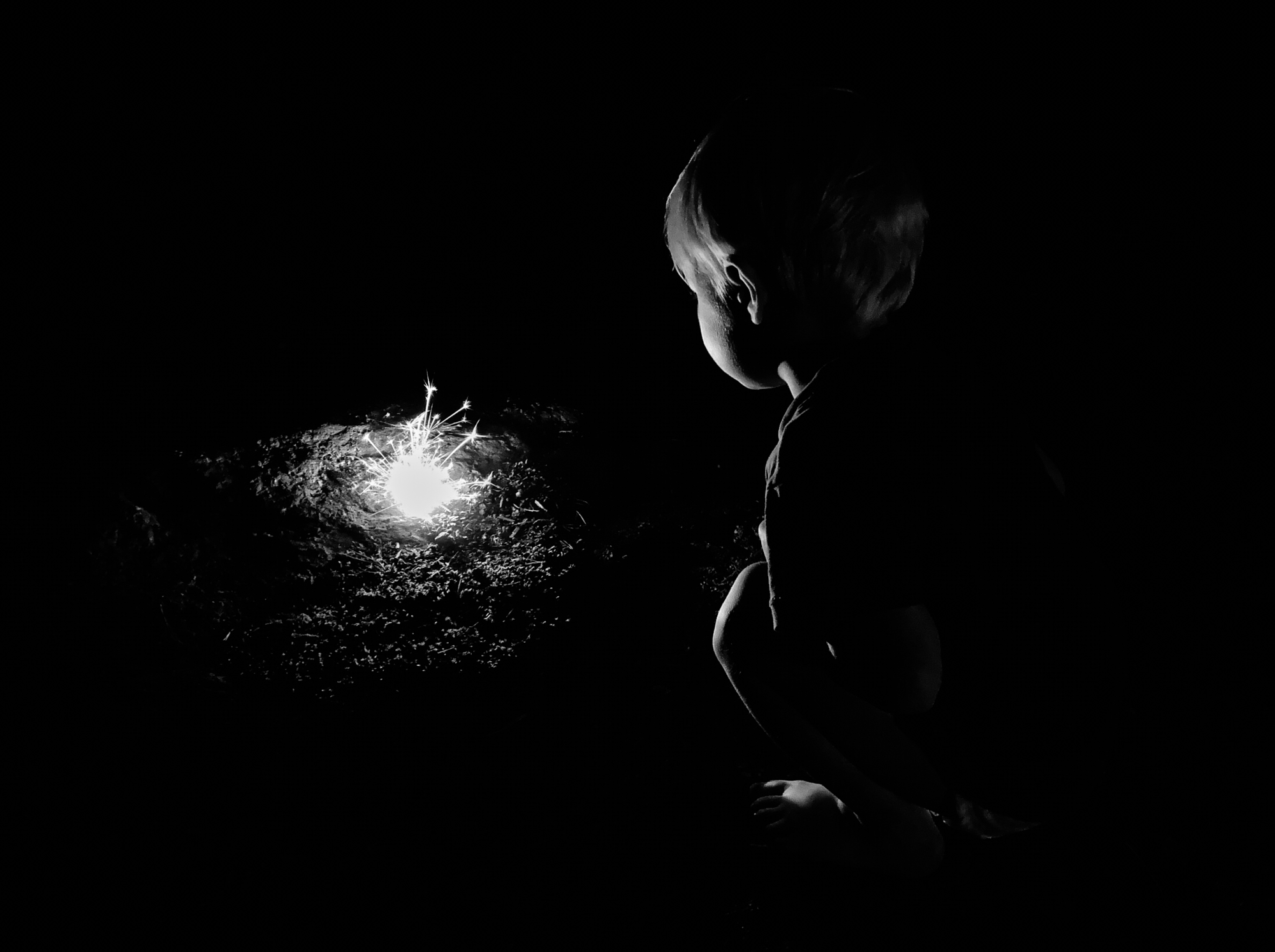
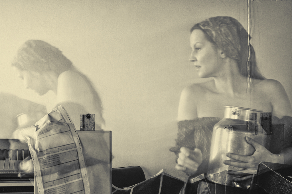
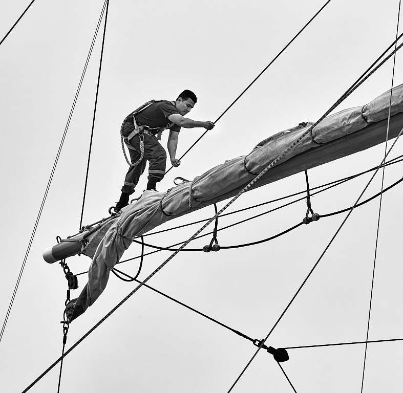
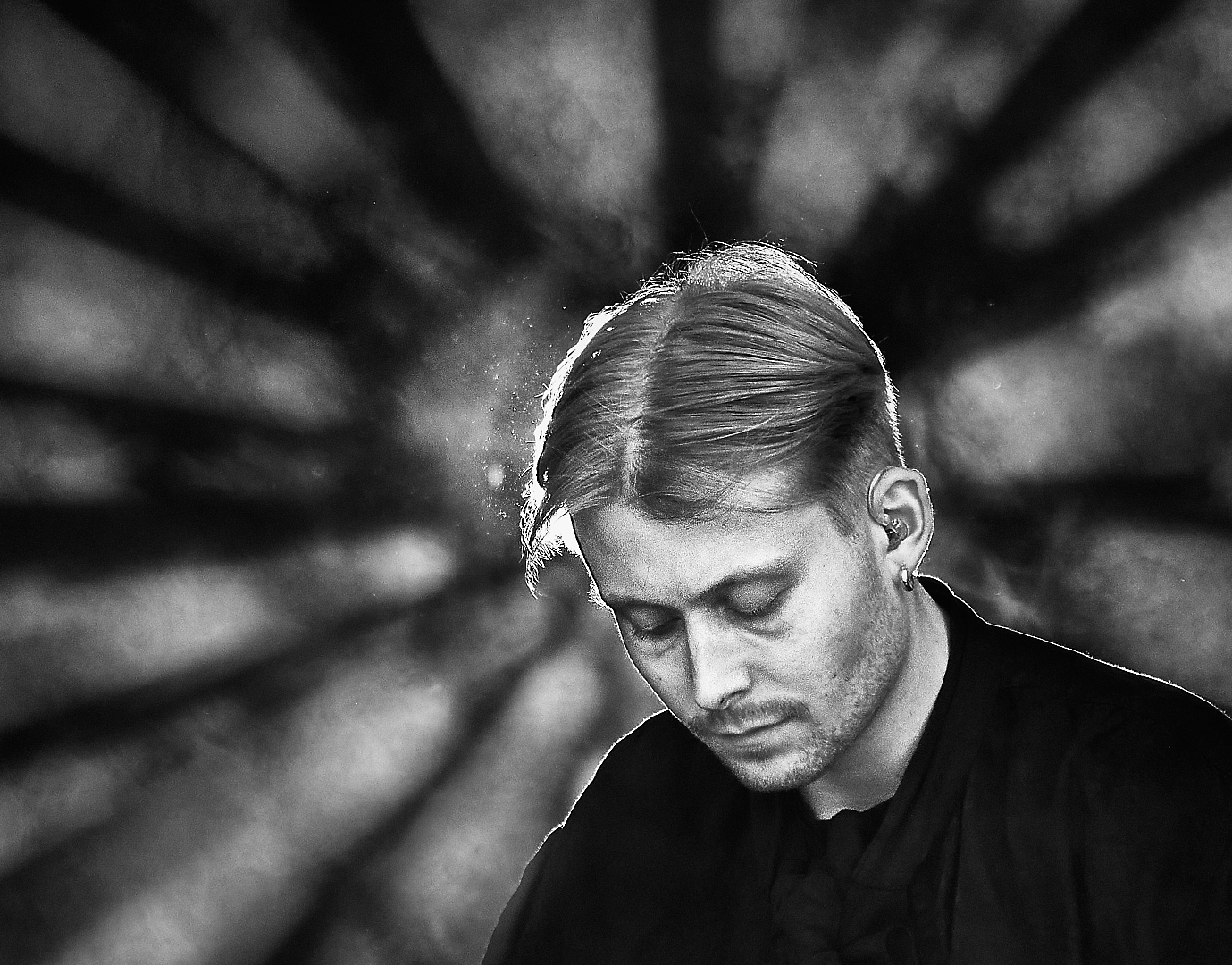
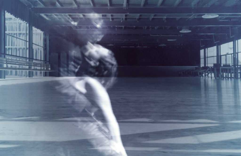
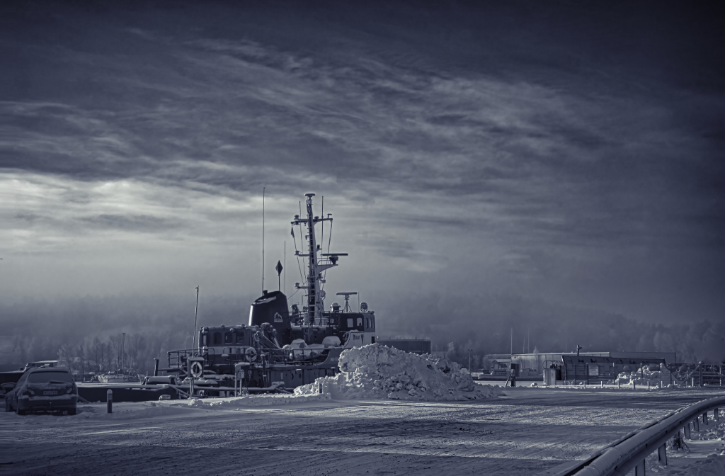
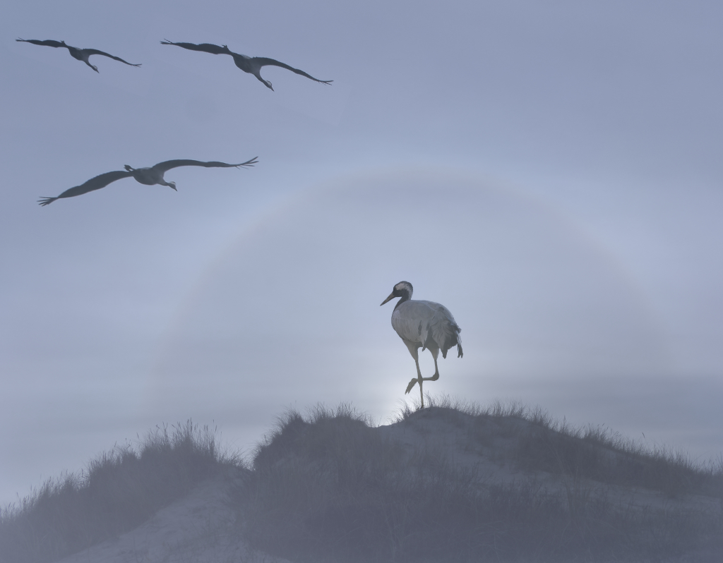
Thank you, Mervyn! I forgot to mention that I did use the selective sharpening options in Affinity Photo for the crane but it could have worked better. - I have the 4.1.0 version of Topaz Sharpen AI but I seem to get a lot of artifacts. Will have to wait for the next Black Friday sales to update - the newer versions are highly praised at least in the advertisements? |
Jun 11th |
| 26 |
Jun 24 |
Reply |
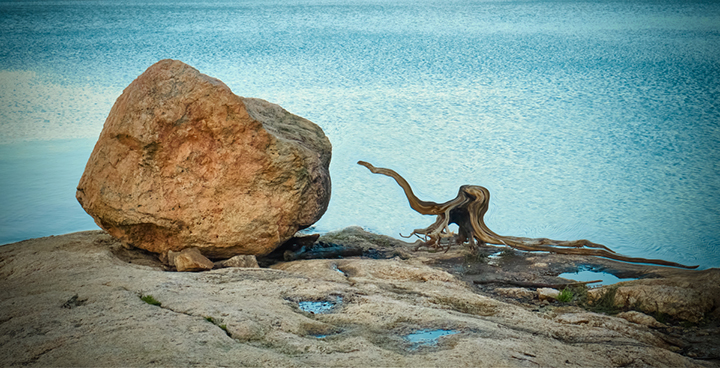
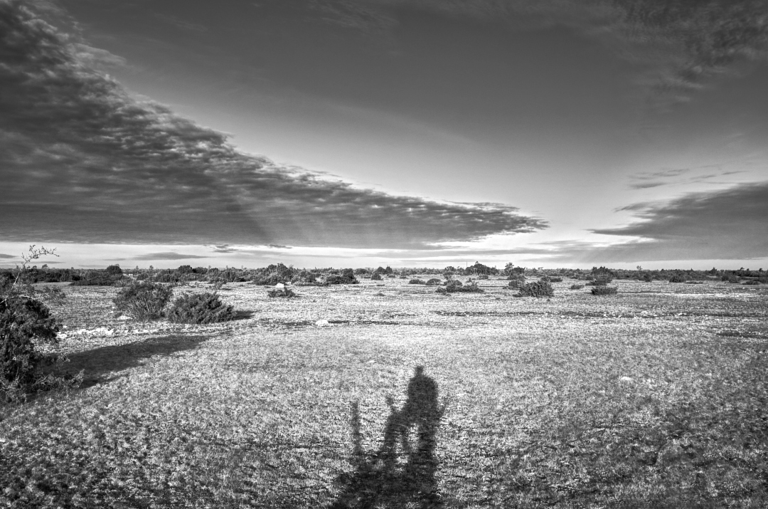
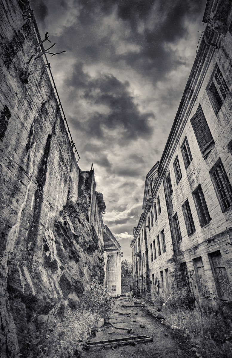
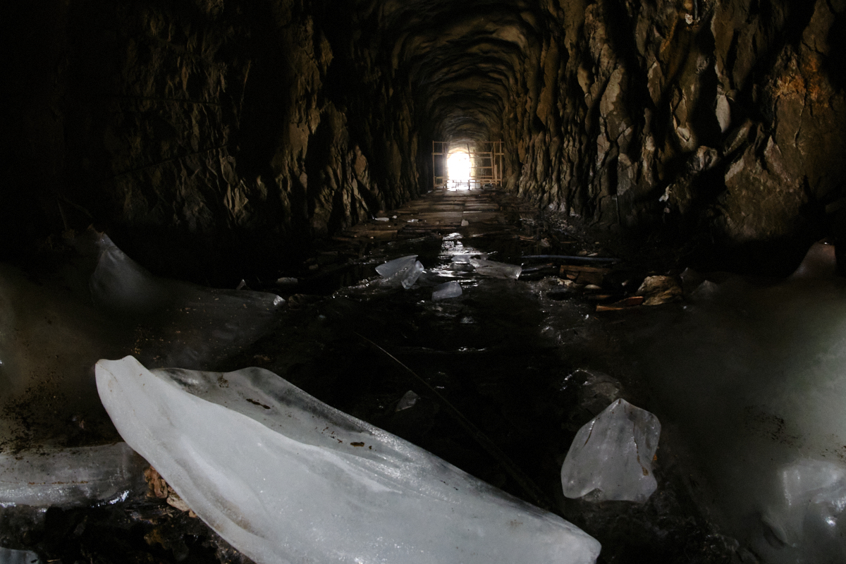
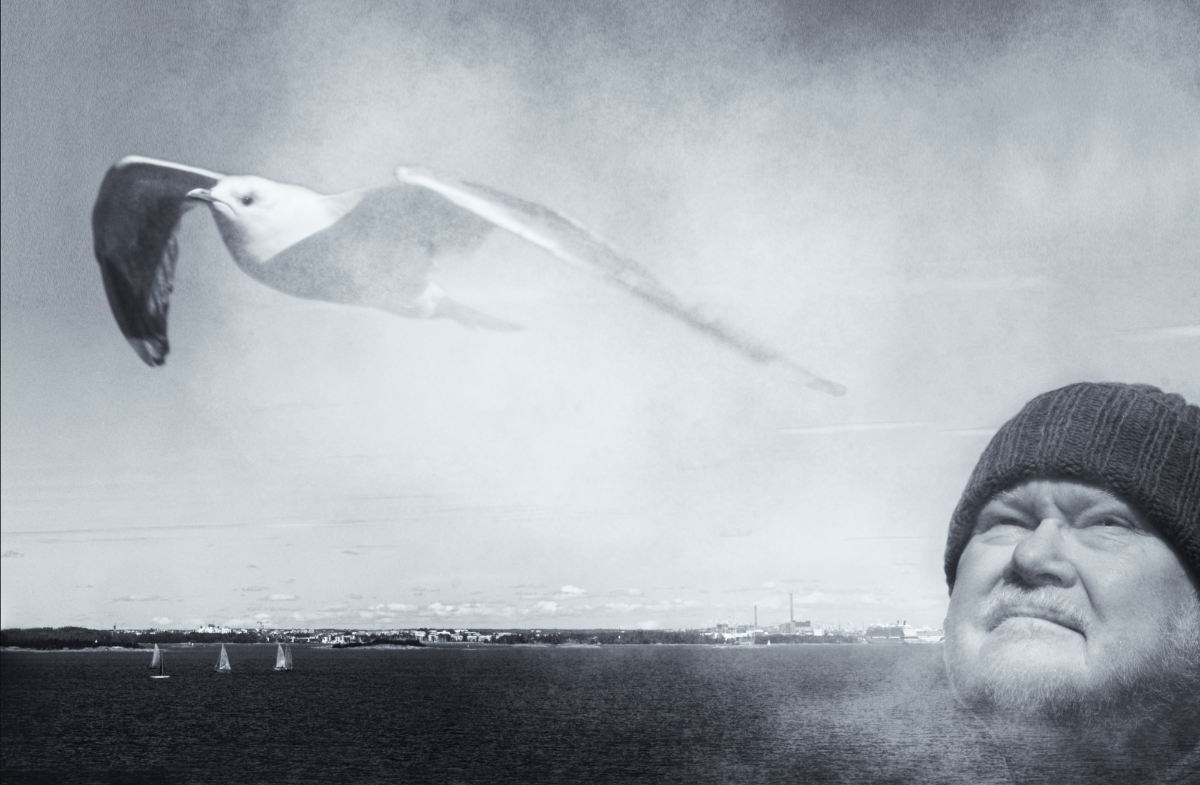
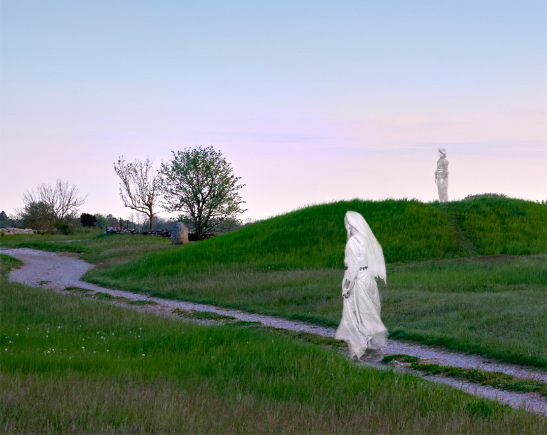
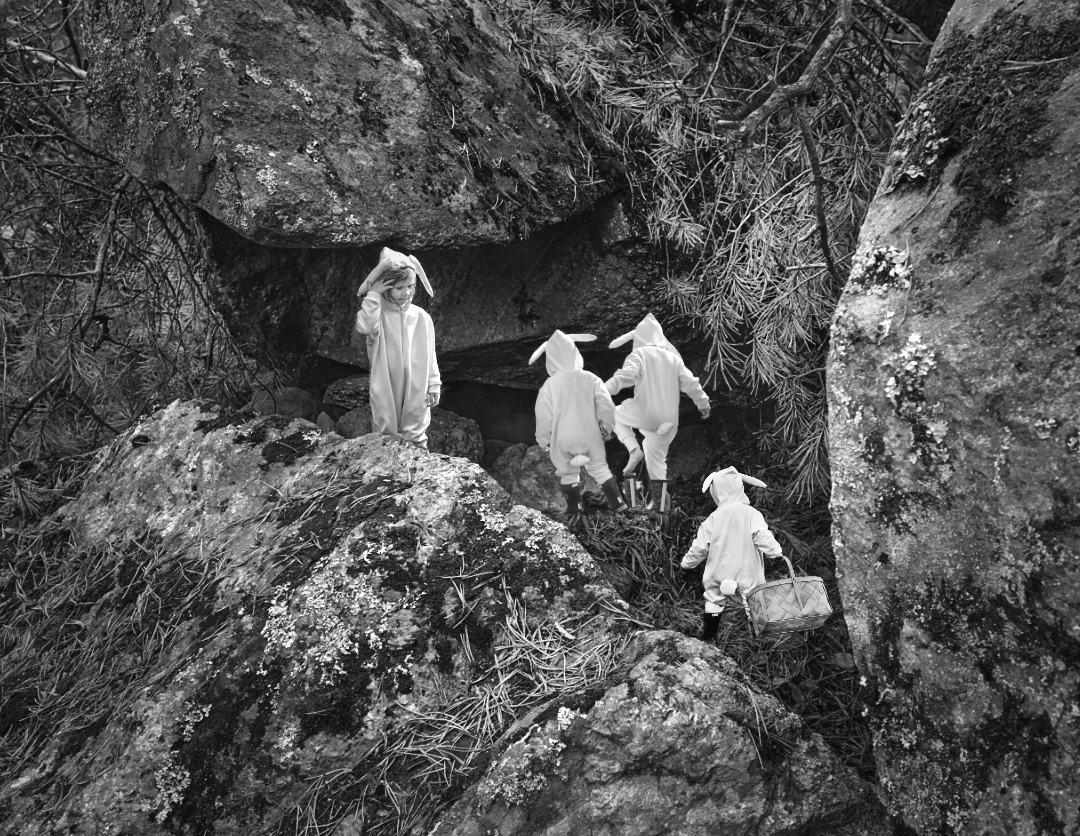
Thank you, Jose! I The connection between the crane and the clouds was just what fascinated me at the site. - I will go back to the original and see what I can do! |
Jun 11th |
| 26 |
Jun 24 |
Reply |
Thank you, Bob! I will try that approach next! |
Jun 7th |
| 26 |
Jun 24 |
Comment |
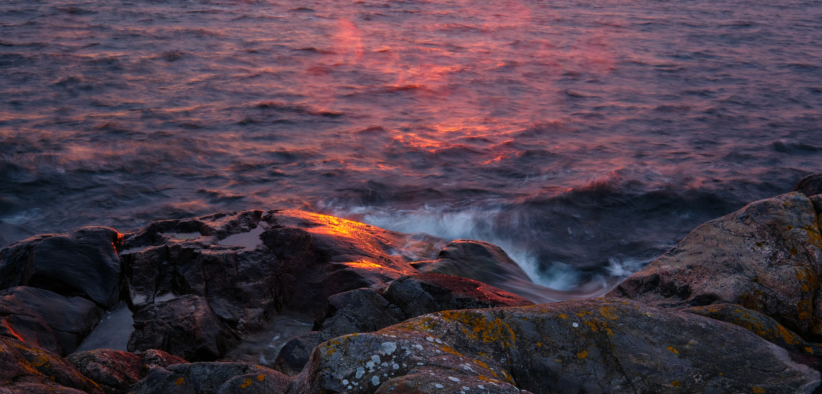
Bob, the bird�s-eye view gives such interesting camera angle. The perspective shows the three-dimensional structure of the abbey ruins very well, and there is such depth in the emerald fields that continue to the blue mountains in the hazy horizon. I think that it is a very balanced composition, with the cows in the foreground and the river winding diagonally through the image. It makes me wish to book a trip to the site right away! |
Jun 6th |
| 26 |
Jun 24 |
Comment |
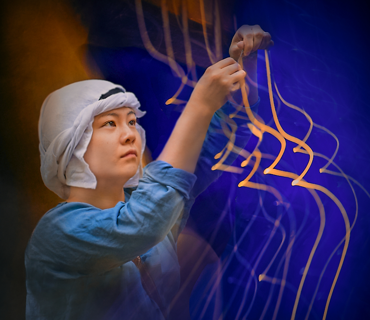
Tony, what a joyous festive street photo with the bright colors of the balloons and the happy vendor. It was certainly worth waiting for the perfect moment: the bills in her hand and the customers in the background add a lot to the story. I just love the composition with the attachment of the bunch of balloons as a center point from which the strings radiate upwards. |
Jun 6th |
| 26 |
Jun 24 |
Comment |
Hi Mervyn, I think that you have captured the action and the skill of the artisan in a beautiful way. I think that your crop shows the essential: the movement of the potter�s wheel and the wet glistening vase, and the hands stained with clay. The Topaz software did a wonderful job! - I wonder if it would be worth while to retouch the three dark spots close to the upper edge, and if a slight vignette might help to highlight the center? |
Jun 6th |
 |
| 26 |
Jun 24 |
Comment |
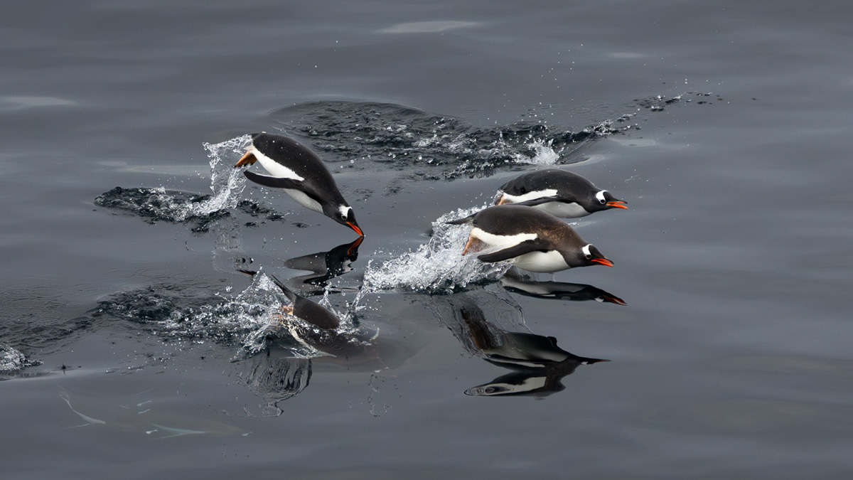
Agnes, you have used the trip so well for these amazing and unique images. I admire the way you got the birds so sharp in frozen movement, both in the air, as reflections on the surface of the water, and below. - I think that the small bright spatter at the right edge may draw the eye a bit from the penguins. Is it possible to reduce its brightness slightly in a Nature photo? - Have you thought about flipping the image horizontally? |
Jun 6th |
 |
| 26 |
Jun 24 |
Comment |
Hi Jose, you do demonstrate the power of negative space! I think that the minimalistic approach makes one truly appreciate the vastness of the barren salt flat, and the red truck in the hard midday light brings in an element of interest, and a story. It is balanced beautifully by the dark mounds in the horizon. - I wonder if it is possible to bring out the details in the ground slightly more clearly without losing the impression of dazzling brightness? Would adding some contrast work? |
Jun 6th |
6 comments - 5 replies for Group 26
|
| 47 |
Jun 24 |
Comment |
Thank you, Robert! |
Jun 28th |
| 47 |
Jun 24 |
Reply |
Thank you, Trung! I am glad you like it! |
Jun 19th |
| 47 |
Jun 24 |
Comment |
Hi Trung, I join the others - an exciting Nature story perfectly presented. I think that black-and-white is absolutely the right format for the image, with the lovely contrasts. |
Jun 13th |
| 47 |
Jun 24 |
Comment |
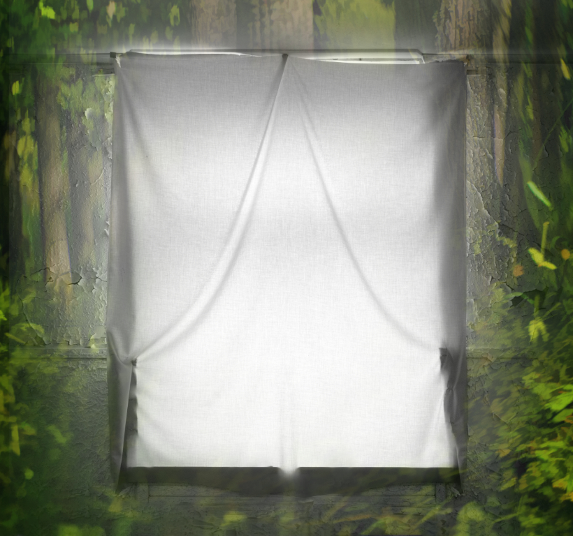
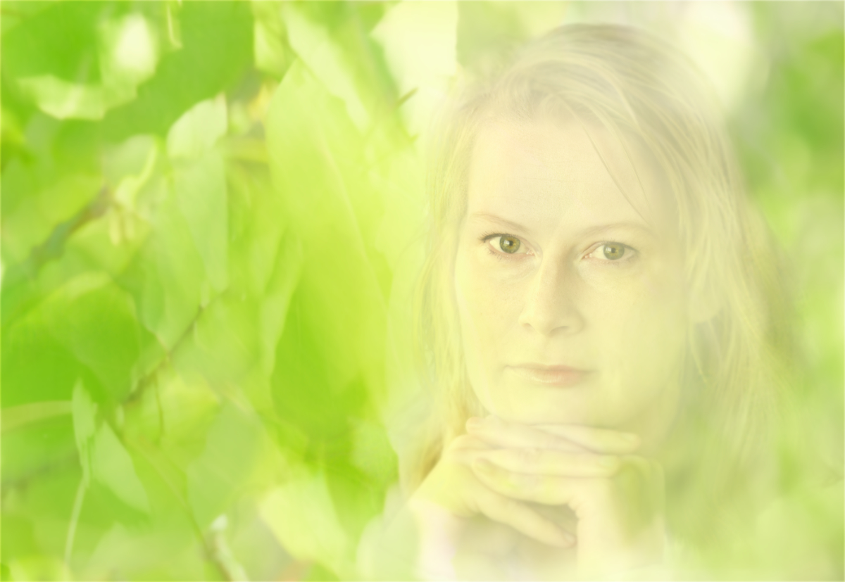
Hi Jeff, I would hang it on my wall any minute, too, and never get tired to watch it. I think that you have captured the essence of the luminous birch forest. The delicate network of the branches gives it extra life, and the background hints to darker depths of the forest. I find myself watching through the curtain of the trees and waiting what comes into view. |
Jun 13th |
| 47 |
Jun 24 |
Comment |
Hi Al, I almost feel the breeze on my face and squint in the glare. I think that you have used the backlight so well, with the boats and crews in silhouette, and the sails of the yacht illuminated by the sun. The position of the boats and the action of the crew make it very dynamic. The dazzling light on the waves makes a great background for the boats, and I think that the top clouds are framing the scene very nicely. |
Jun 13th |
| 47 |
Jun 24 |
Comment |
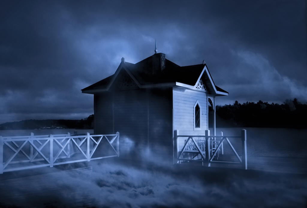
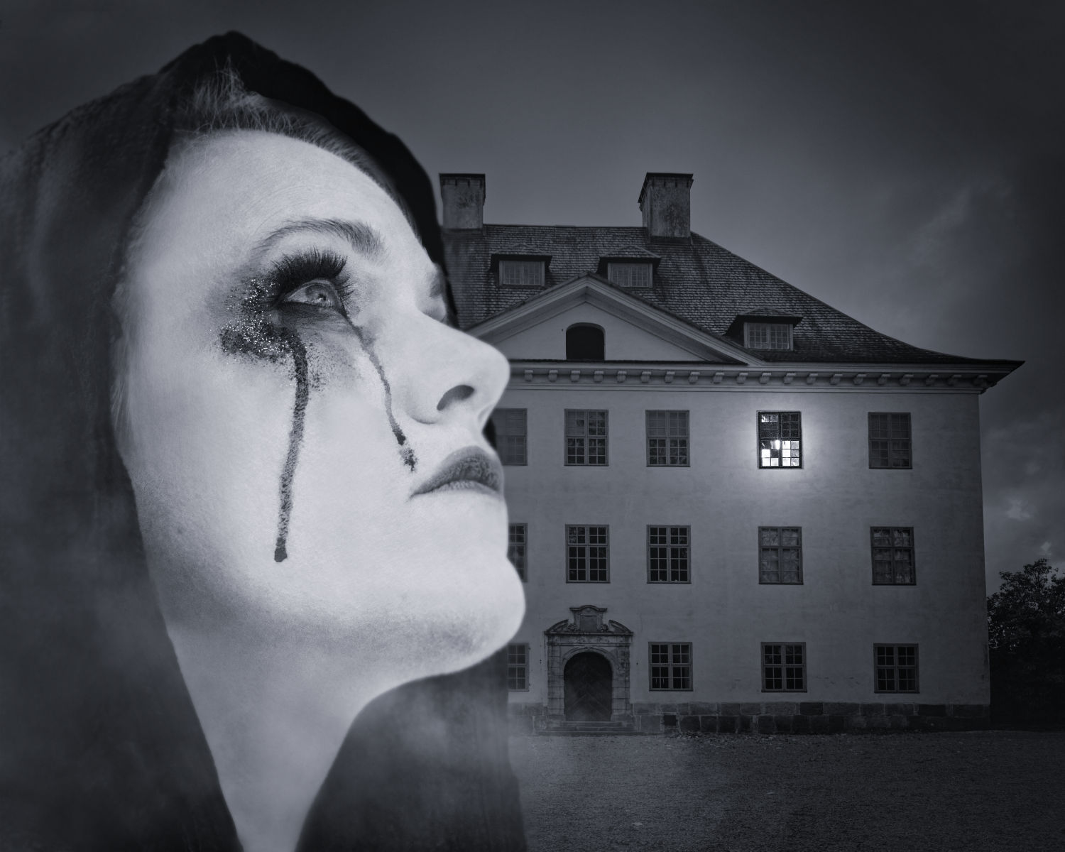
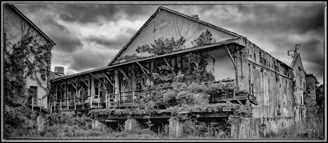
Hi Ed, I think that the image carries its message beautifully. This is very much a portrait of a house and its history that fills the frame. - I like the vignette idea very much, but as this is a tight crop in itself, it may hide parts of the building. I wonder if darkening the left and right edges and just slightly the top edge might be enough for the effect. This is the NIK Silver Efex "Burnt Edges" filter applied to the sides (in larger size for the left edge), and just a narrow strip for the top, with smooth transition. What do you think? |
Jun 12th |
 |
| 47 |
Jun 24 |
Reply |
Thank you, Ed, for the lovely comment! You made my day! |
Jun 12th |
| 47 |
Jun 24 |
Reply |
Thank you, Al! I like the color version myself, too, and will work on it a bit more and see where it goes. It was such a special soft light that made the pastel colors. - I'll check the conversion process - I think that I just reduced the saturation, and that was left incomplete. I got mixed up with the many versions, so it may also be that there is a slight toning. |
Jun 12th |
| 47 |
Jun 24 |
Reply |
Thank you, Jeff! I am so glad that it works! |
Jun 12th |
5 comments - 4 replies for Group 47
|
| 54 |
Jun 24 |
Reply |
Thank you, Brad, I will keep on playing with it! |
Jun 19th |
| 54 |
Jun 24 |
Reply |
Thank you, Maria, that is what I feel, too! |
Jun 17th |
| 54 |
Jun 24 |
Reply |
Bruce, thank you very much for sharing these lovely tips - I have to translate everything into Affinity Photo first, but "Average Blur" really seems to work wonders. I have started to go through old images and see how they are transformed.
And congratulations for the Awards - I especially loved the "Steampunk Pirate". |
Jun 11th |
| 54 |
Jun 24 |
Reply |
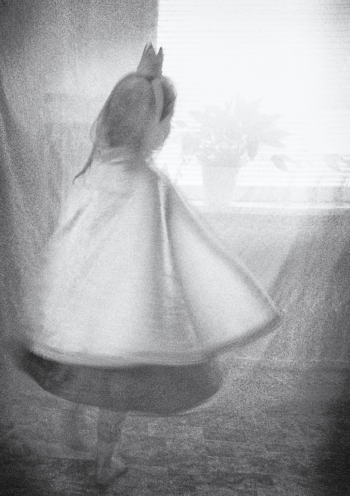
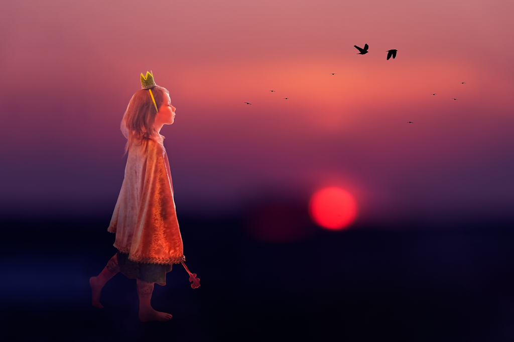
Thank you so much, Bruce! I love what the treatment of the Princess did to the image! She is now much better integrated in the image, and there is a new three-dimensional character. Even the poor scepter seems to be more or less part of the image now with the new shadows. I will try the Glamour Glow next - I am so glad for all the improvements! |
Jun 11th |
| 54 |
Jun 24 |
Reply |
Thank you, Alan, I truly appreciate the analysis of the image and the lovely comment! You are right about the birds, and the scepter. I will try to see if there is a way to handle it better, as I think that it may have a role in my version of the story. |
Jun 11th |
| 54 |
Jun 24 |
Reply |
Peggy - it is beautiful! I like the warm colors - actually, in my geographical location there are real-life spring days with just that kind of light when a late shower of snow passes quickly by, with this lovely contrast between the warmer tones, and the pure cold white. |
Jun 11th |
| 54 |
Jun 24 |
Comment |
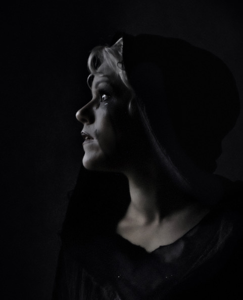
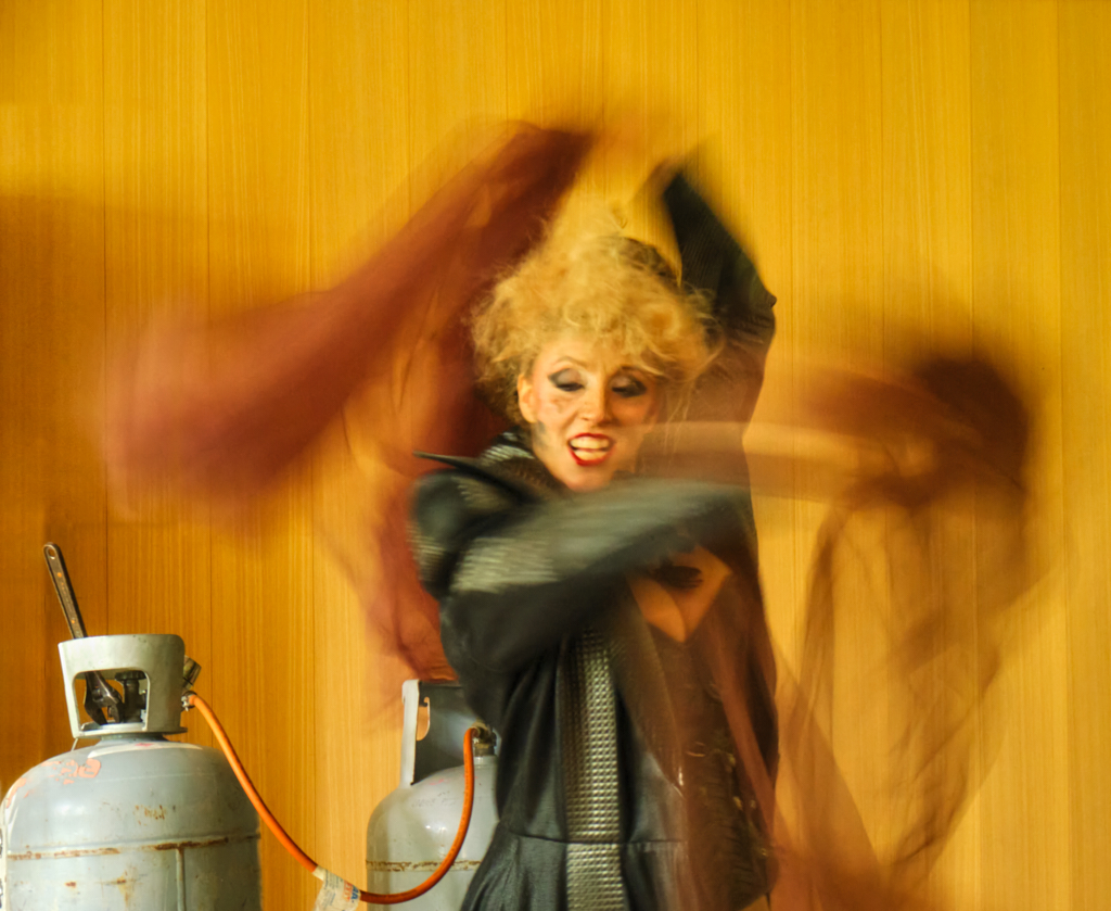
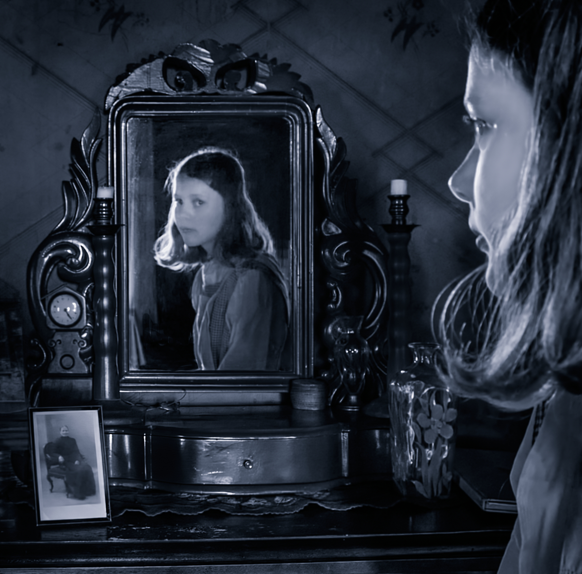
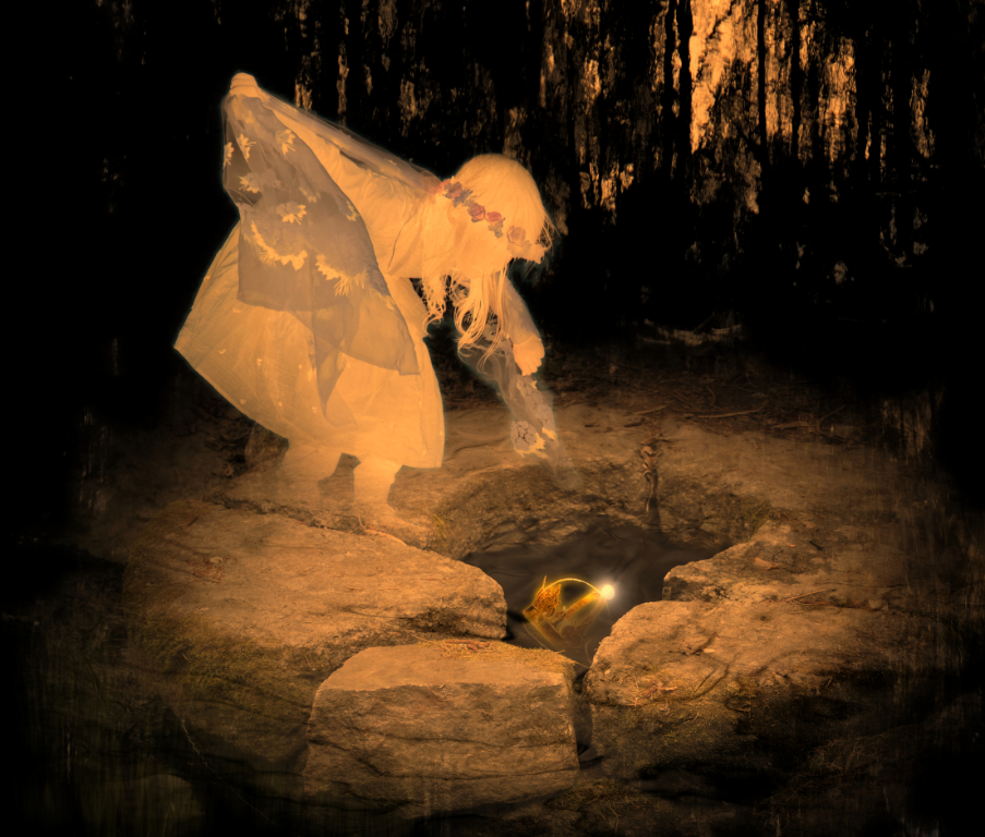
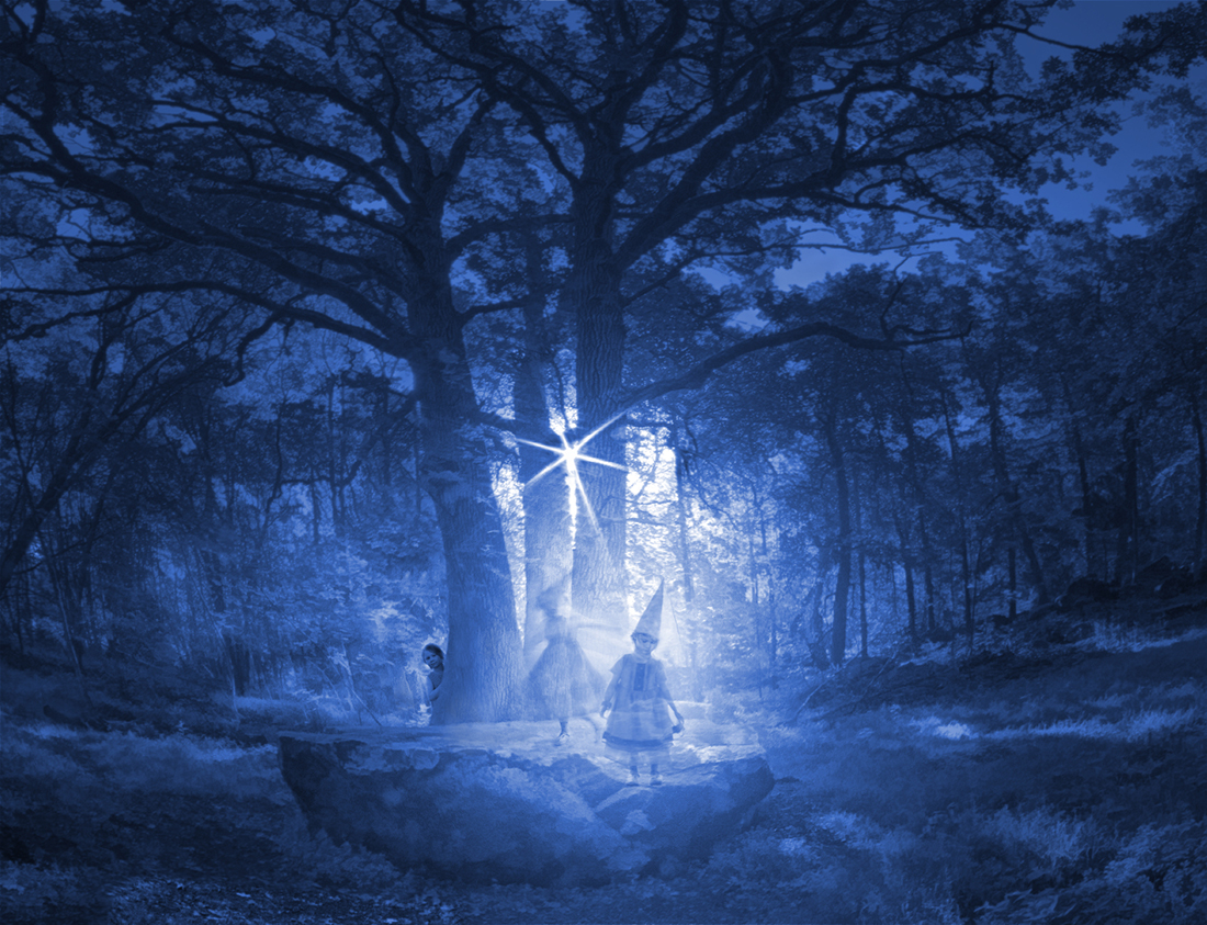
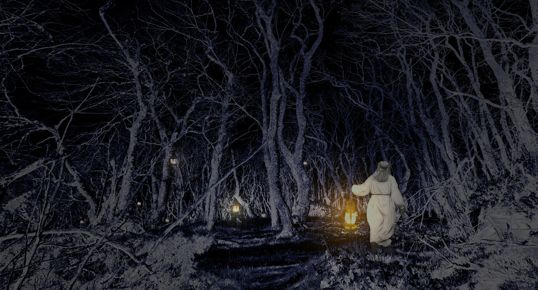
Hi Bruce! There is such a strong dark and fateful Gothic Romance mood hanging on the image. It is not only the spectacular gloomy background but the woman in dark red as well, in just the right position. I think that she is visiting the site of some tragic accident. I agree with Brad that there could perhaps be some more contrast in the sky, or would it distract from the intensive connection between the lady in red and the waterfall she is watching? -Thank you for describing the process in detail! |
Jun 6th |
| 54 |
Jun 24 |
Comment |
Alan, I love the playful touch and the title! I started immediately to imagine the party at the end of the rainbow just off the left edge where your maid is bringing the refreshments. It is clear that she has done the trip many times before and knows where to put her foot. I think that the direction of her moment is very well chosen, both in the right to left, and in the blue to red aspects. - It came to my mind that there might be another story with one of the umbrellas tilted a little bit, or at slightly different level from the others, but that would probably lose the minimalistic beauty of the image. |
Jun 6th |
| 54 |
Jun 24 |
Comment |
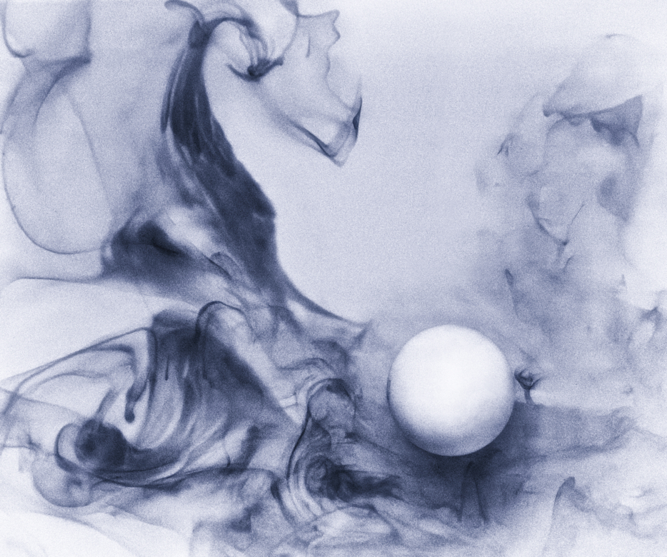
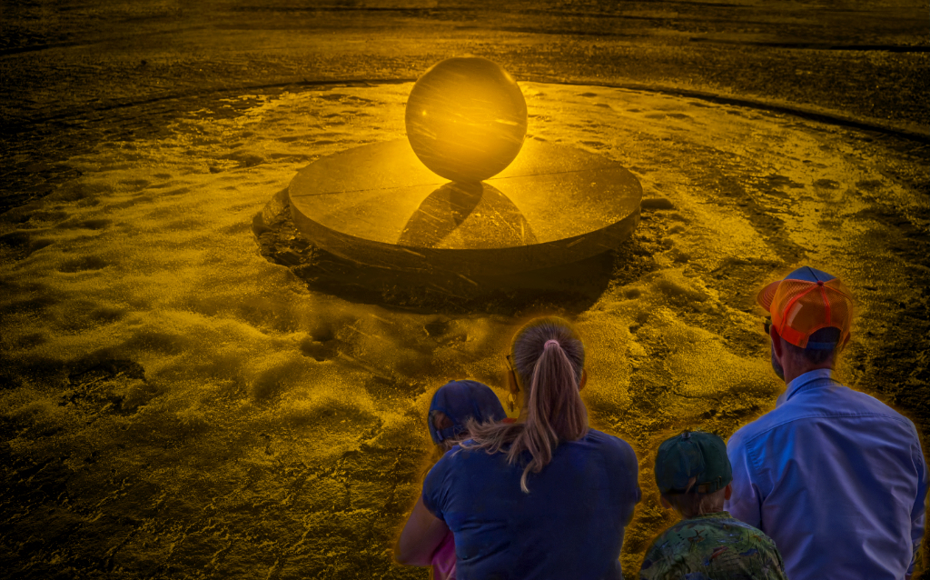
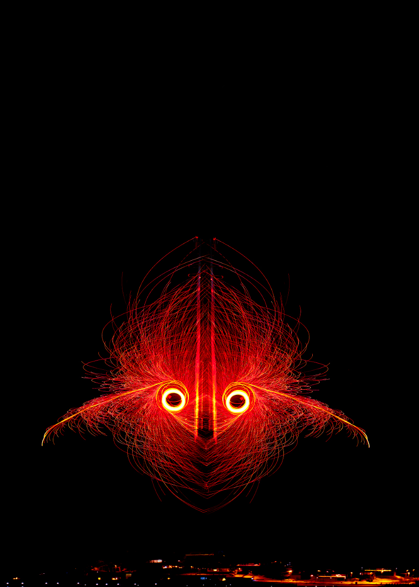
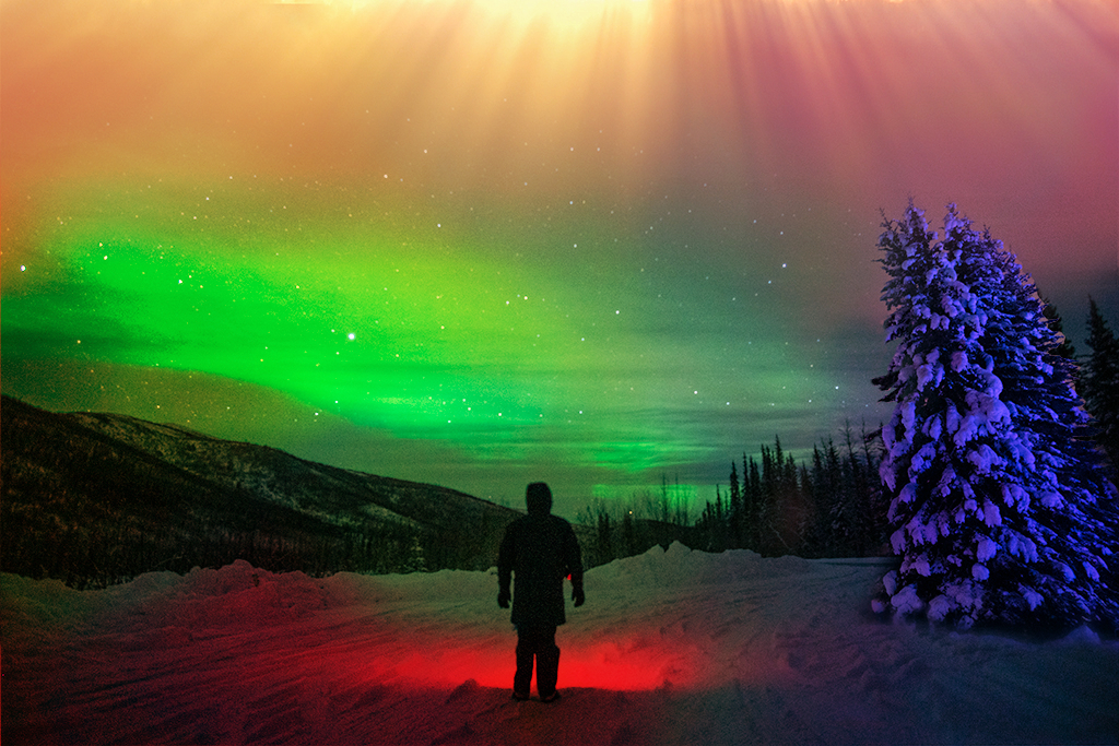
Hi Brad, what an intriguing idea! I think that the background image is a perfect scene to study the lights, with the lonely person in the center of the wilderness under the wide starry sky. The apple-green sky sets the basic color scheme and is effectively complemented by the red sphere in which the subject is standing, and the electric blue/magenta fir trees and the golden light falling from the sky complete your color wheel. - Here is one wild idea: I thought that it might be fun to emphasize the various colors of the light and their blending into each other. I made radial gradient fill layers with colors picked from the sky and the fir trees, from the top and right edge, respectively, and a radial gradient fill layer for the red, and erased parts of them from the center. What about "Tuned" for a title ? I think that it might describe the subject absorbed in the lovely wavelengths. |
Jun 5th |
 |
| 54 |
Jun 24 |
Comment |
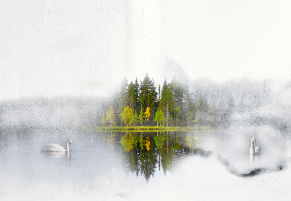
Peggy, you have created a wonderful atmosphere with the high-key pastel hues and the textures in so many shades of white. This is such a calm scene - I think that this is just a little cold spell and Mother Swan is telling the cygnets not to worry, the snow will melt soon, she will protect them, and it will be all right. I think that Brad�s idea about making the lovely birds more clear is very good. |
Jun 5th |
| 54 |
Jun 24 |
Reply |
Thank you, Peggy, I am so glad you like the colors - I felt so very good about them myself, like the image had started to sing. I love the subtle glow effect - thank you for Gaussian blur in overlay -tip! |
Jun 5th |
| 54 |
Jun 24 |
Reply |
Thank you so much, Brad! - In my first version, the princess actually was closer to the left edge, like stepping into the scene, and I kept changing my mind between the two compositions. I think that you are right! - I made some quick changes in the princess in this version. What do you think? |
Jun 5th |
 |
4 comments - 8 replies for Group 54
|
15 comments - 17 replies Total
|