|
| Group |
Round |
C/R |
Comment |
Date |
Image |
| 26 |
May 24 |
Reply |
Thank you, Agnes! I came to think that it might be even better if the empty slot were at the top right corner. I tried to flip the image but realized that that the text would then be mirror image. i am very happy with the present version. |
May 20th |
| 26 |
May 24 |
Reply |
Thank you, Tony! I am so fond of the new crop that adds a whole lot of tension and meaning to the image! |
May 20th |
| 26 |
May 24 |
Comment |
Thank you, Mervyn! It is such a delightful thrill when something like this catches one's eye. |
May 20th |
| 26 |
May 24 |
Comment |
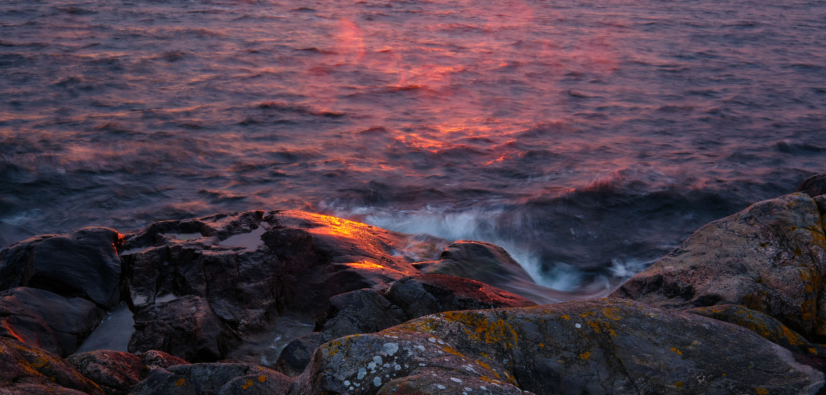
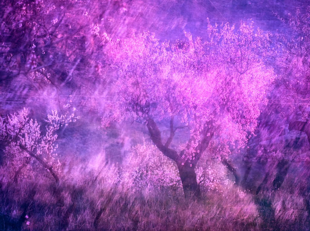
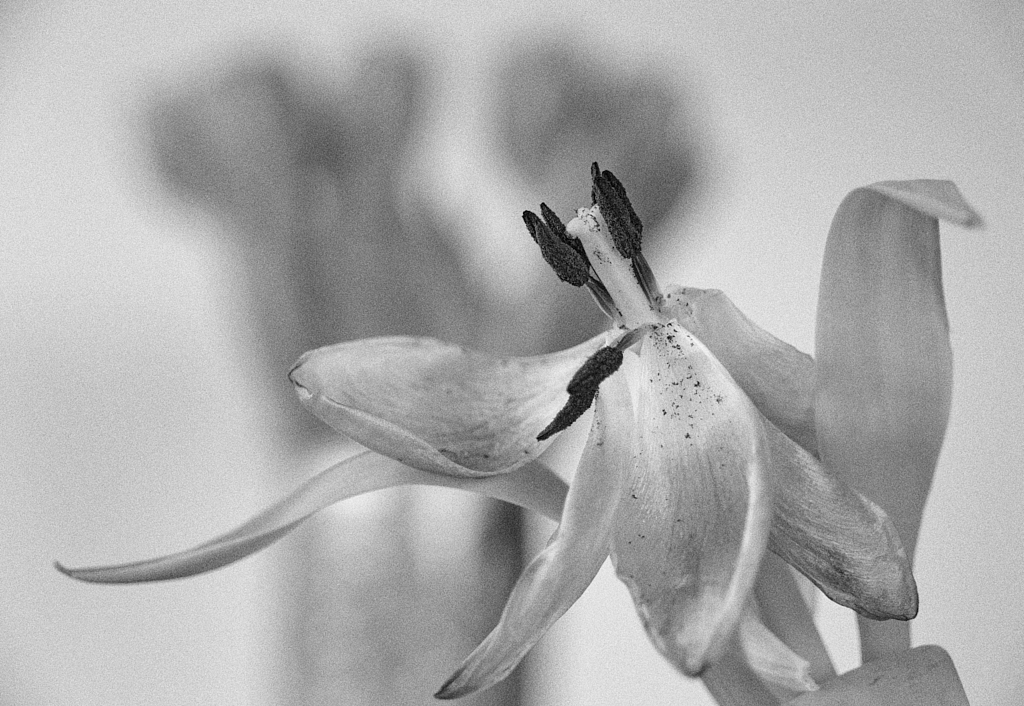
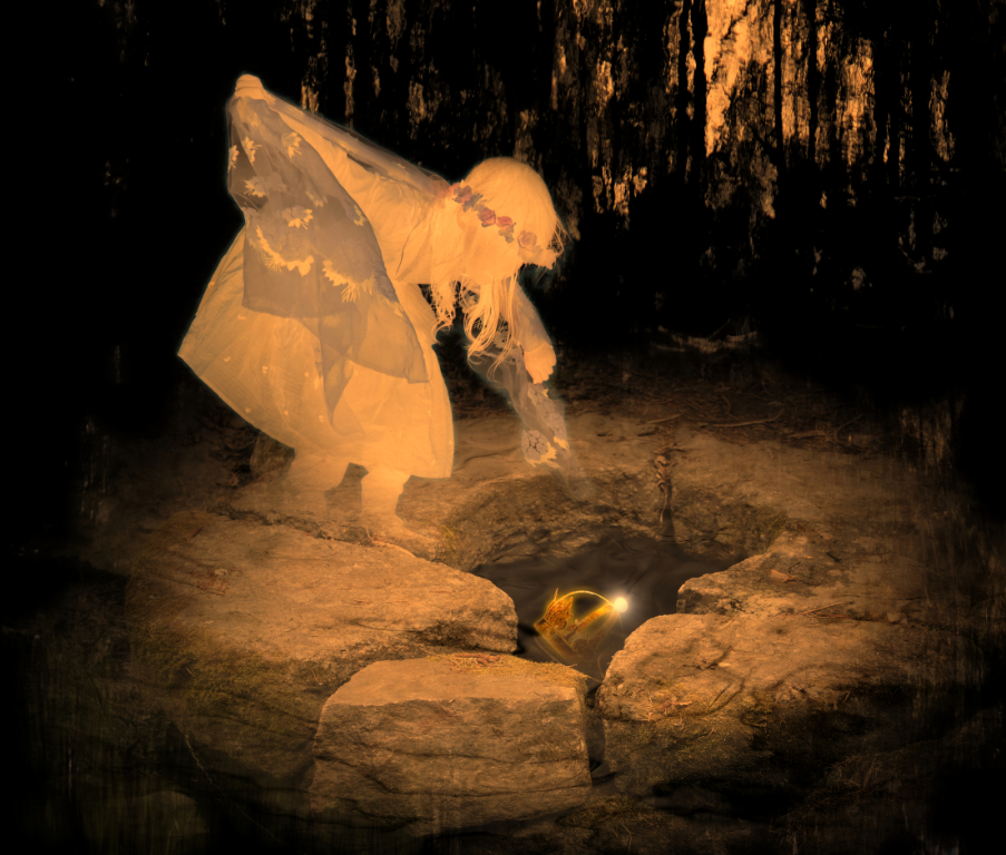
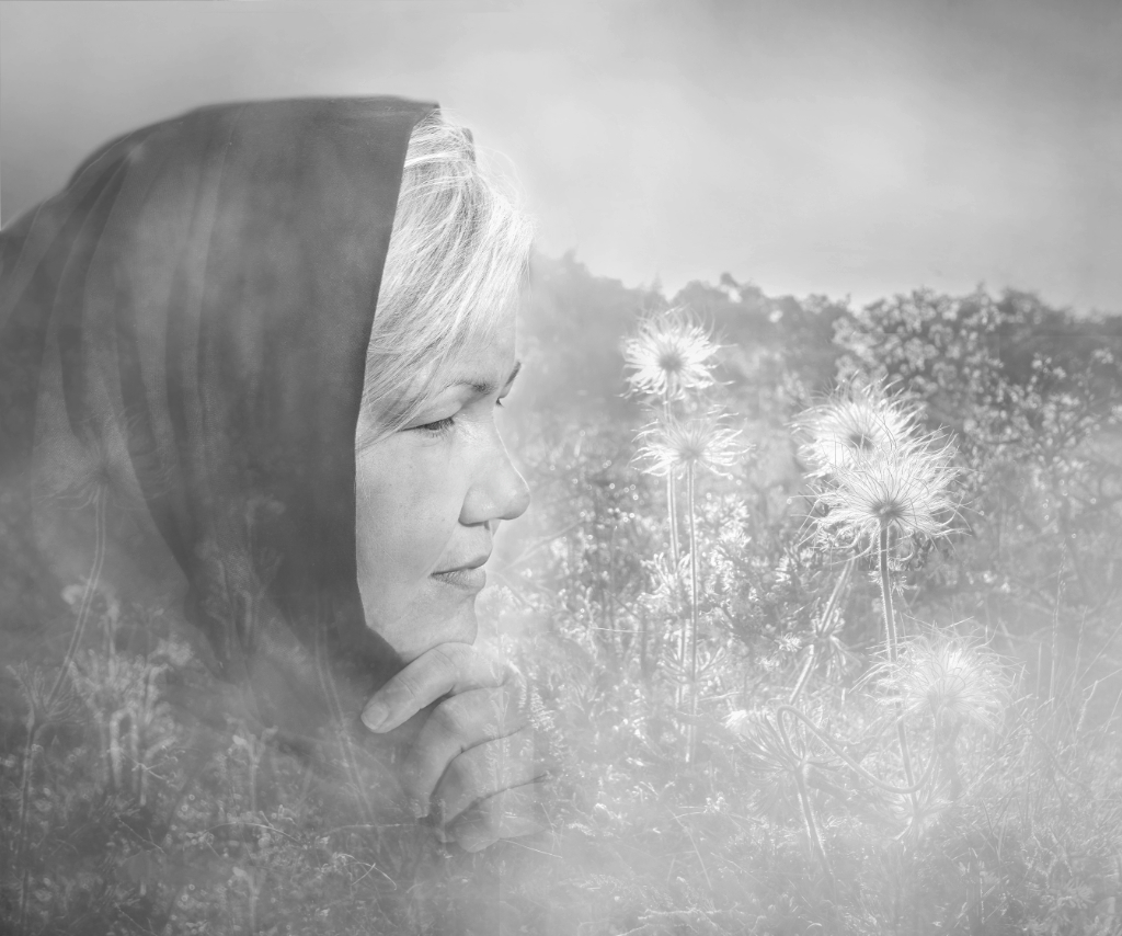
Hi Agnes, I think that the image mediates the awesome experience. The position of the majestic icebergs floating by in that very special light, and the coastline disappearing into the haze in the horizon make a fine sense of depth. The tiny penguins make a contrast point that first attracts the eye in the luminous scenery. They add an element of a story to the image and also give a scale of the size of the iceberg. It will be interesting to see the bw version - it would emphasize the forms and textures beautifully, but I think I would miss the lovely subtle pastel hues. |
May 13th |
| 26 |
May 24 |
Reply |
Thank you, Jose! Like this? - Brilliant, this totally changes the game! |
May 13th |
 |
| 26 |
May 24 |
Comment |
Hi Jose, the scene could be from another planet. I think that your camera angle captures the vastness of the scene and the rhythm of the strange cones in a very appealing way. I think that Bob�s edits make an excellent touch. |
May 9th |
| 26 |
May 24 |
Comment |
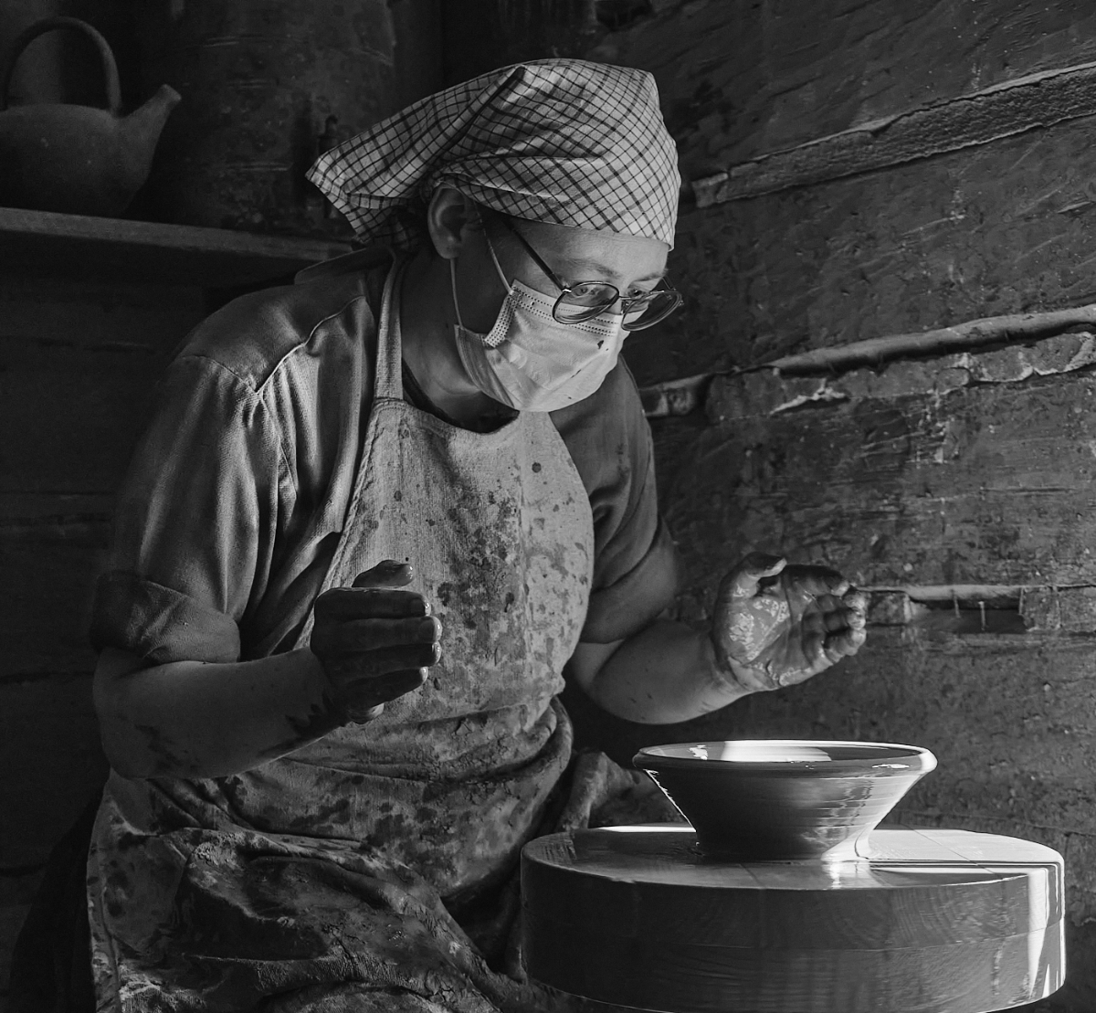
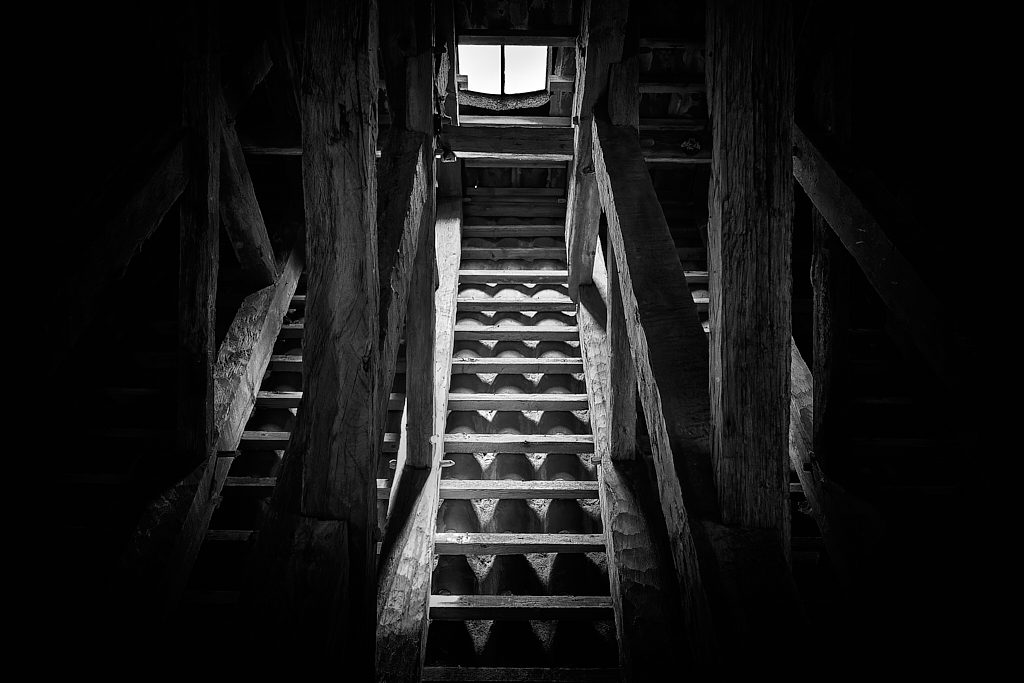
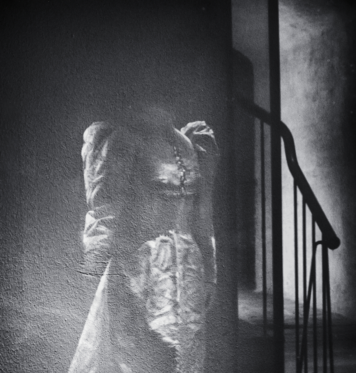
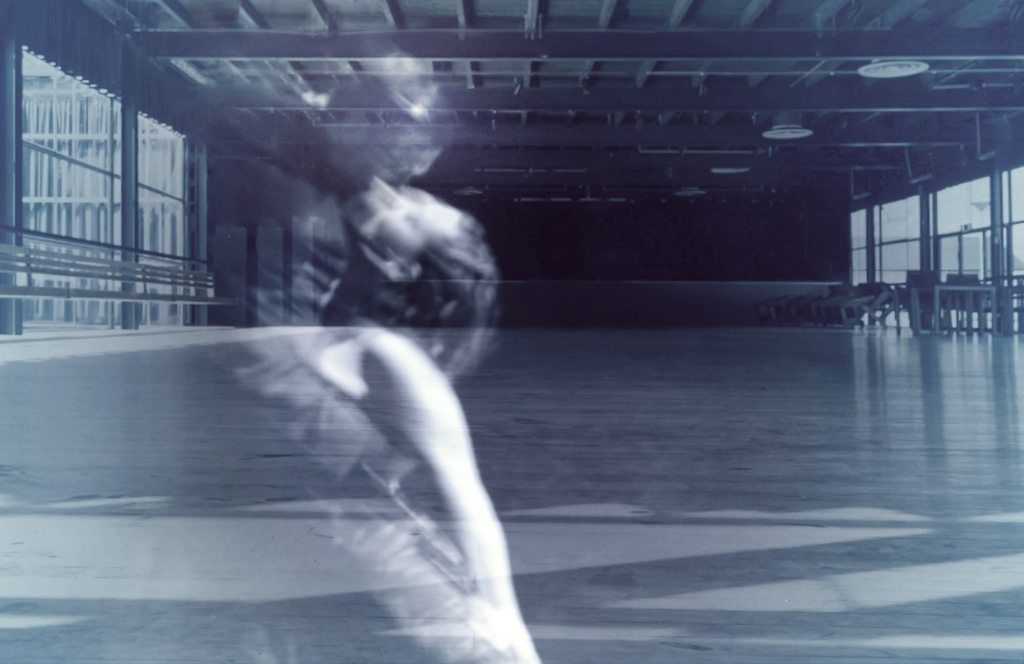
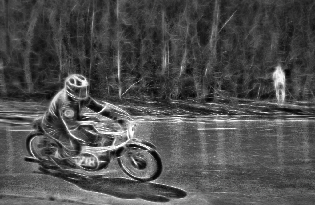
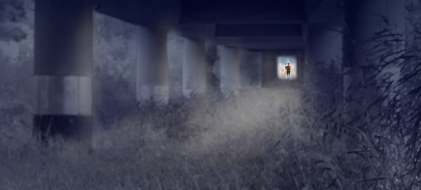
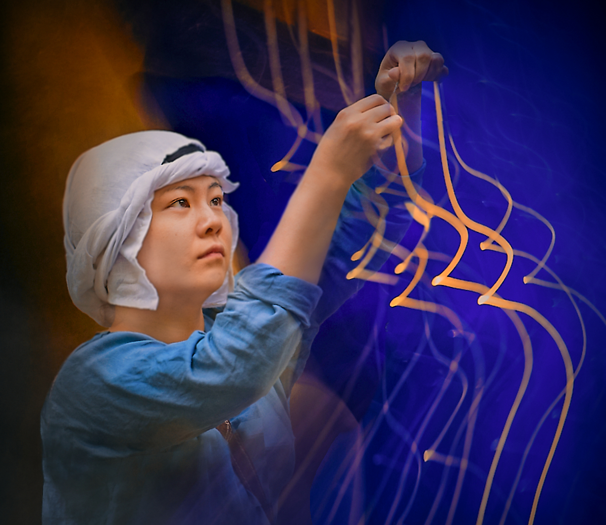
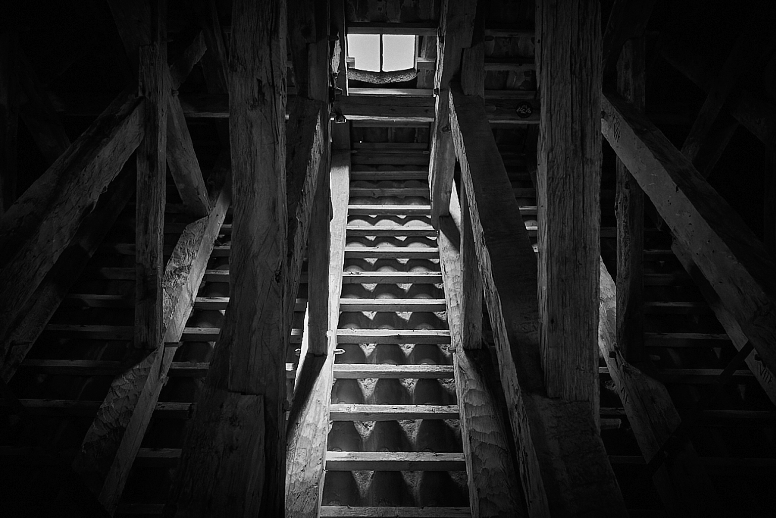
Hi, Terry! I think that the curved forms defined by that beautiful light make an exciting pathway for the man debating man. The image is also full of rhythm with the tiles on the walls and on the floor, and on the rail. I love the way the round forms in the shadow repeat the curves. I like the edited version very much but would maybe leave a bit more of the foreground in the image, to give room for the entrance. |
May 9th |
| 26 |
May 24 |
Comment |
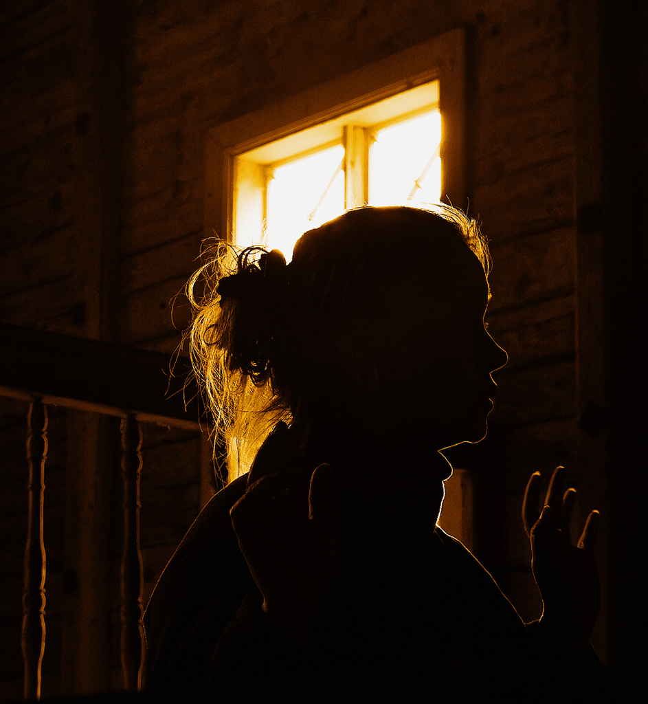
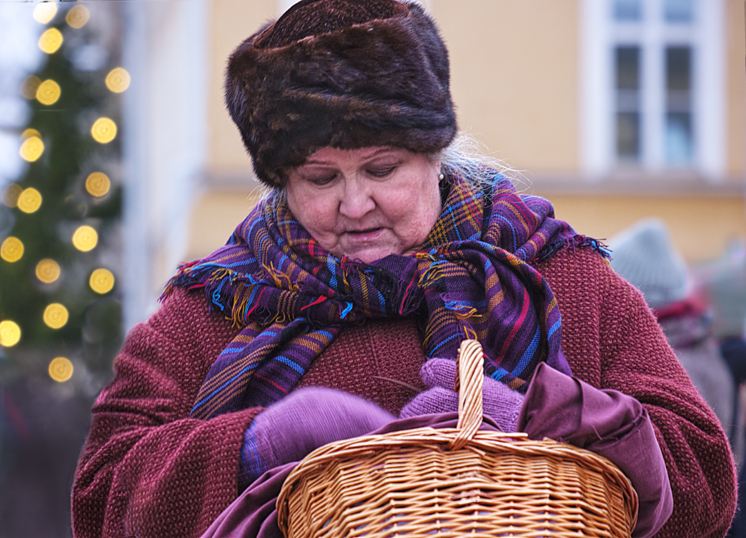
Hi Tony, I think that you have captured the very spirit of the Christmas market in the warm light glowing in the booth and the reds and gold, framed by the darkness. The moment of the friendly transaction is a great catch, and the way both the vendor and the customer look at the frying sausage makes a lovely connection between them in the composition. - I agree with the others about the upper left corner. |
May 9th |
| 26 |
May 24 |
Comment |
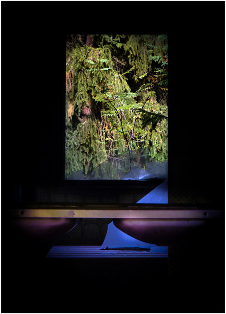
Hi Mervyn, I love the way the light filters through the hanging moss, and the dark arches of the branches and tree trunks that frame the white mansion. The shadows on the pavement form part of that frame. I agree with Bob about the shadows, and my suggestion for an alternative crop was almost exactly the same. |
May 6th |
| 26 |
May 24 |
Comment |
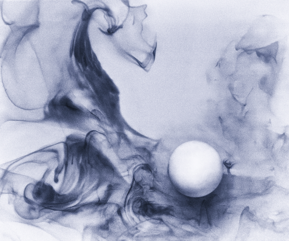
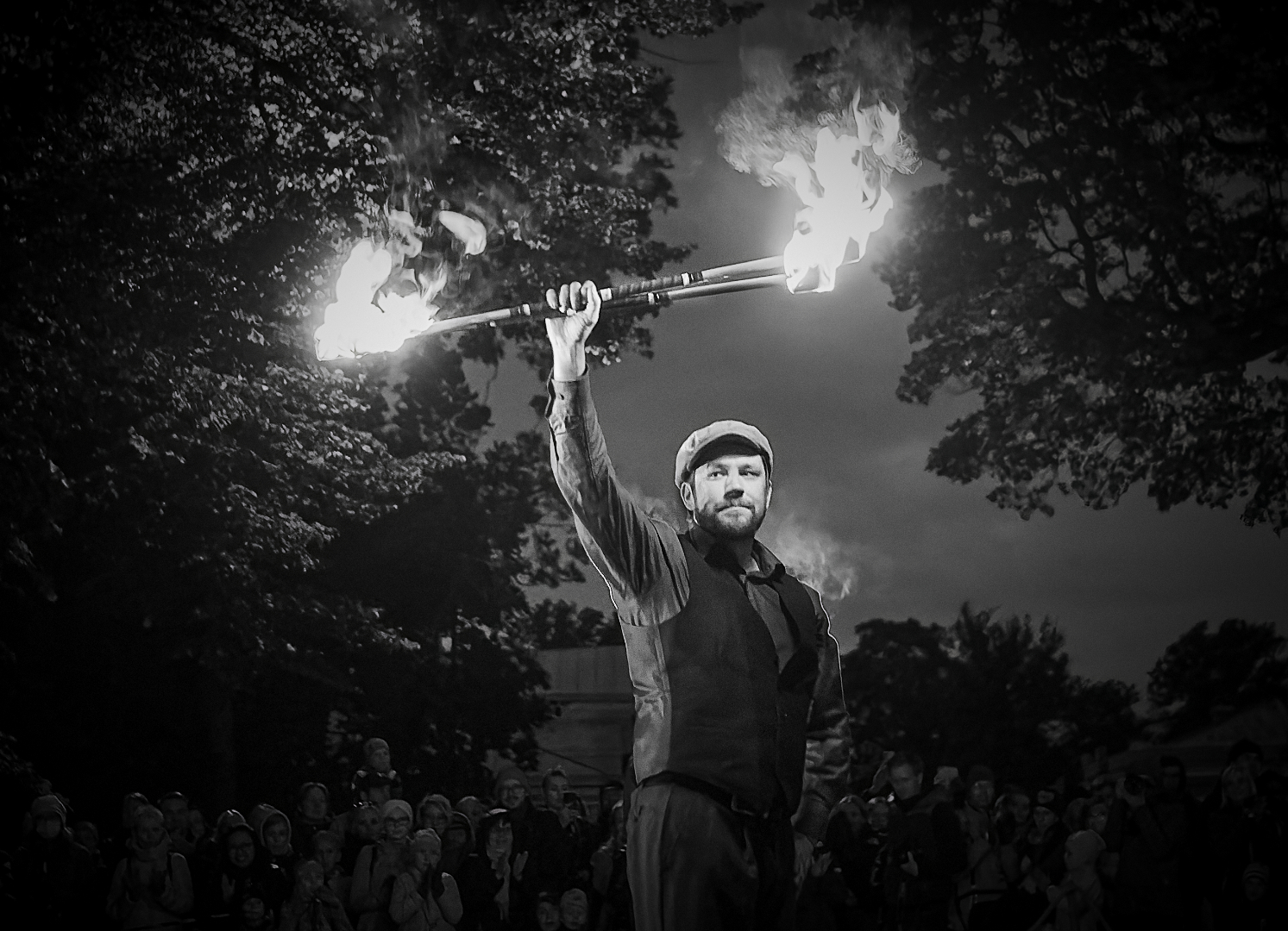
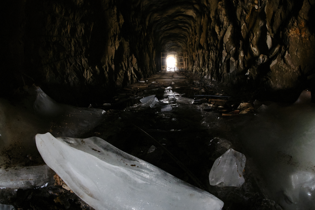
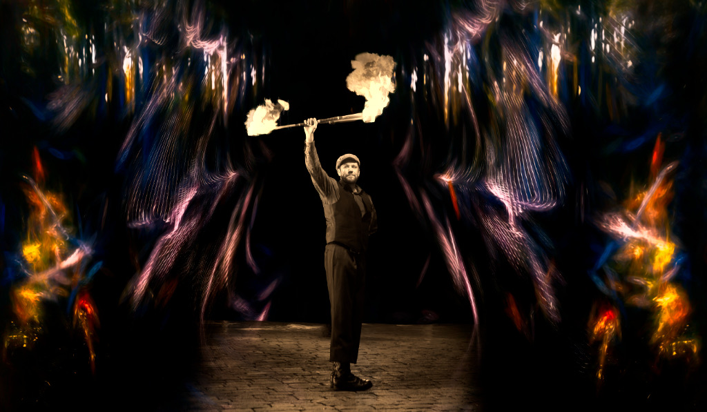
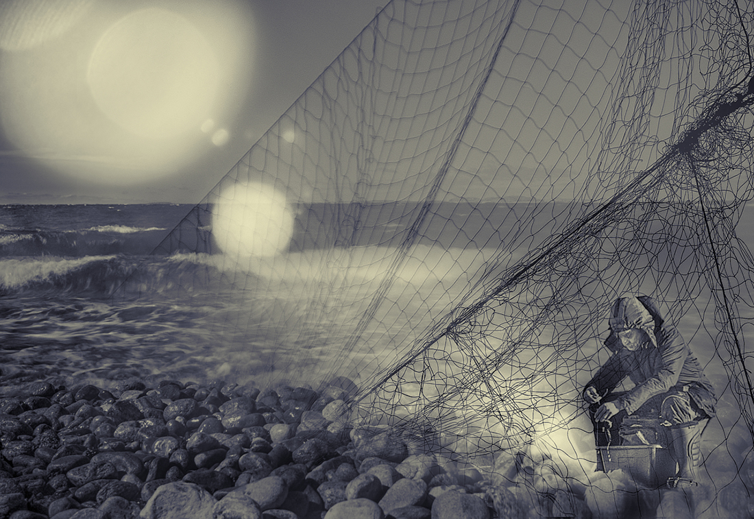
Hi Bob, that must have been an exciting experience! The backlit scene was a great idea. The shards of light that filter through the trees make the man look like he were working under the spotlight. I think that you have made the most of the smoke with the skilled adjustments. - I was thinking if cropping off a bit from the right edge and from the bottom would make the scene more intense, but realized that it feels just right as it is, with the branches and the grass in the foreground forming a frame for the action and a sense of depth. |
May 6th |
| 26 |
May 24 |
Reply |
Thank you, Terry! You and Bob were right - it is amazing how much difference the small adjustments made! |
May 3rd |
 |
| 26 |
May 24 |
Comment |
Thank you, Bob! I can see the difference that makes. |
May 2nd |
8 comments - 4 replies for Group 26
|
| 47 |
May 24 |
Reply |
Robert, I am so glad! |
May 22nd |
| 47 |
May 24 |
Reply |
Thank you, Thung! |
May 20th |
| 47 |
May 24 |
Reply |
Thank you, Robert! It really is a special place to visit. - I have been hovering over how the light should be, toning it down and brightening it up to overexposure, and even adding glow. Thinking about the heavenly aspect, I finally ended up with the brighter option. |
May 14th |
| 47 |
May 24 |
Comment |
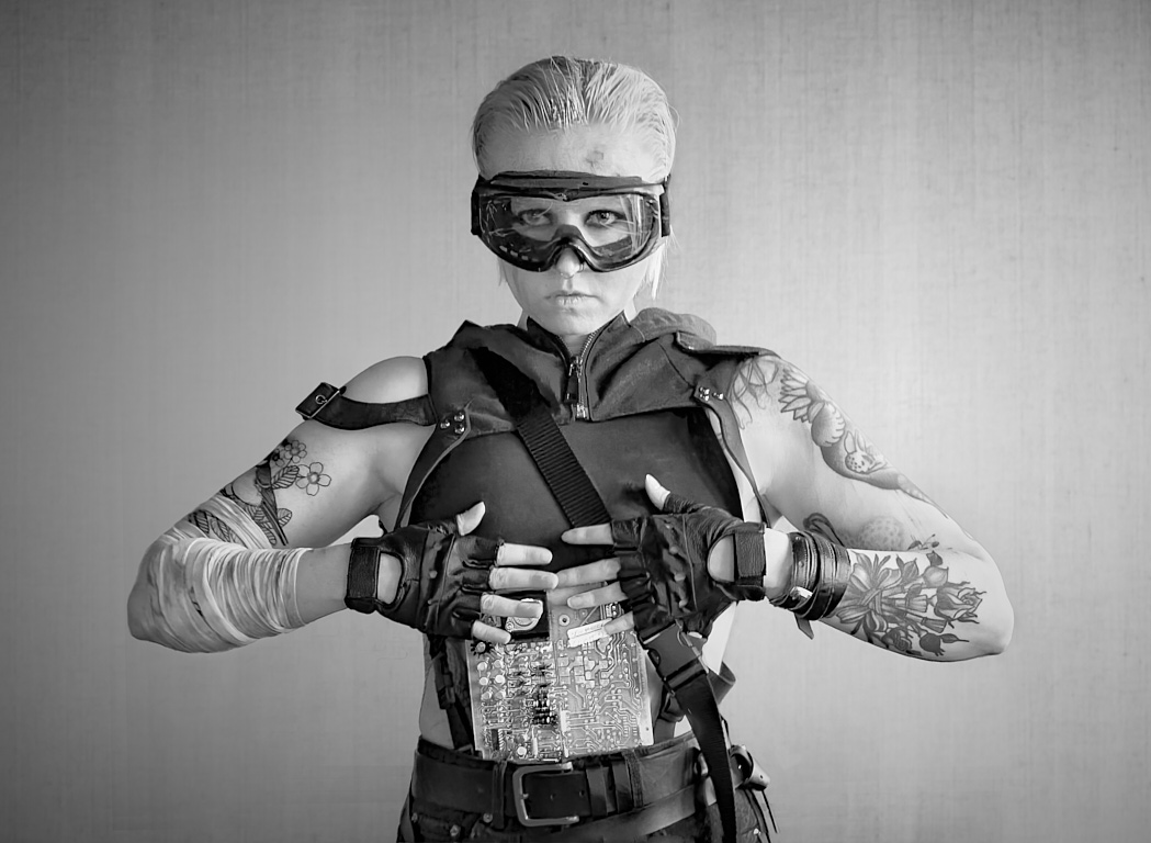
Wau, Trung! The image takes me exactly to the same scene as it took Ed: the warrior has arrived too late to the smoking ruins of her home. I think you caught her just at the moment the first reaction of helpless sorrow is turning into avenging rage. Just look at her expression and the hands that are clutching the axe with white knuckles! - I wonder if it might be possible to play with contrast or tones to separate the outlines blade from her dark cloak slightly more clearly? |
May 10th |
| 47 |
May 24 |
Reply |
Thank you, Ed! I love your interpretation of the dead end alternate paths. - I like the color version myself, too: I t think that the colors are subtle enough that they do not distract from the forms. |
May 10th |
| 47 |
May 24 |
Reply |
Thank you, Jeff - I started with a slightly lighter version but I felt that it made more an architectural image than the sort of symbolic message I was after, and kept darkening the edges for the effect. Maybe the final version will be something in between! |
May 10th |
 |
| 47 |
May 24 |
Comment |
Hi Al, thank you for sharing another magnificent landscape! I think that you have captured the play of light on the mountains beautifully. I especially love the tones of the shadows of the clouds on the snow. I like the composition, too, with the contrast of the rugged dark mountainside and the lighter smooth snow-covered areas. - Just some minor cosmetic points: are there three tiny dust spots in the sky in the upper left corner? I might also darken or maybe crop off the tiny lighter triangle in the right bottom corner. |
May 10th |
| 47 |
May 24 |
Comment |
Hi Jeff! a lovely minimalistic image that captures the atmosphere beautifully. The low contrast and the subtle tones that fade into the horizon make one feel the wind blowing snow in the air. I think that the lone tree is in a perfect position, showing the depth and leading the viewer deep into the scene, towards the darker patch that is momentarily visible in the horizon. I think that the empty space in the foreground is essential for the very balanced composition. - Is part of the fog in the air steam from those hot springs, or is it all swirling snow? |
May 10th |
| 47 |
May 24 |
Comment |
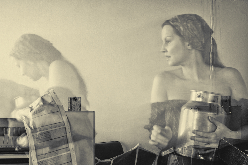
Hi Ed, I join the others: an image that touches the heart and makes a strong statement in a subtle manner. You show the beggar framed by various forms of indifference, people not looking at, or not seeing a fellow human being. What affects me most is the body language of the man in the black shirt who seems to look directly at the woman - I feel that their interaction - or lack of it - makes the core of the image. Like Jeff, I would be tempted to try darkening the surroundings a bit, but I can see the point of showing all the elements in equal light, too. Flipping the original gives it more impact, and making it monochrome eliminates distractions. - As a lover of blue toning myself, I have noticed the same attitudes in my camera club. I think the tint suits here well, but this image would also look great in plain B&W. |
May 9th |
| 47 |
May 24 |
Comment |
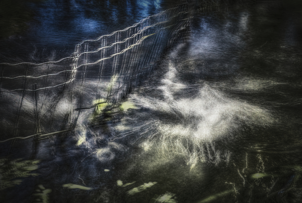
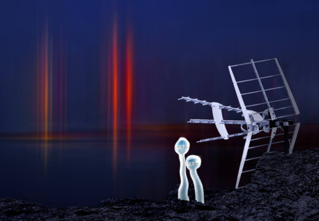
Hi Robert, I think that the optical illusion makes a most interesting image, with the almost abstract banner-like vertical structure that catches the eye immediately. Just when you start to wonder what it might be, your eye is led to the horizontal component, and you realize "Oh, this is a fence". I think that this is a very effective composition, with the strong contrasts, curved diagonals and repetitive patterns. The hard light must have come from just a certain angle to produce the effect. I tried Jeff�s idea of darkening the grass that would show the slots in the fence more clearly - it might be easier to do the selection in the color version? |
May 9th |
5 comments - 5 replies for Group 47
|
| 54 |
May 24 |
Reply |
Thank you, Brad! I will test all these things! |
May 14th |
| 54 |
May 24 |
Reply |
Thank you, Maria! That really makes a difference! |
May 13th |
| 54 |
May 24 |
Comment |
Maria, this is another of your scenes I feel that I can walk into and feel the damp grass under my feet. I love the pale sun coming through the luminous fog, and the blending of the colors. I think that Peggy�s suggestion for the dark area is good. |
May 9th |
| 54 |
May 24 |
Comment |
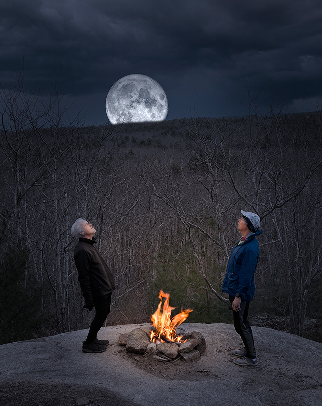
Hi Brad, I can imagine the shooting session! You have turned day into moonlit night in a beautiful way, and the campfire completes the story. I love the blend of the warm and cool light. I wonder if a slight vignette might emphasize the sphere of warm light without spoiling the moonlit effect? |
May 5th |
 |
| 54 |
May 24 |
Comment |
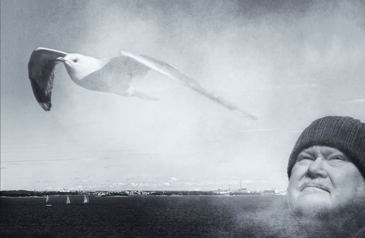
Hi Peggy, I think that the interesting background with the darker colors and the rich textures at the bottom part make a fine contrast to the pastel sky the seagull is gliding through. It makes one wish to see the bird's eye view of what is cut outside the frame. I think that both Alan's crop and the original work well but each makes a different mood, and that Bruce's treatment of the shadow looks very natural, especially within the original crop. |
May 5th |
| 54 |
May 24 |
Comment |
Hi Alan, the effect of the image is just what I think you have intended, and I will carry the bleak hopeless scene with me long after I close the monitor. The apathetic people seem to carry on by force of habit alone, beyond caring, in a scene where the pale light shows mercilessly every detail. The stairs lead to emptiness, and nobody has the strength or emotion left to pay any attention to the dead baby. I think that it is the tone scale that makes the mood - your "Witch's Brew" has worked its wonders again. - The dark sky is a great contrast to the rest of the image, but I wonder how it would look like if it were slightly lighter? |
May 5th |
| 54 |
May 24 |
Reply |
Thank you, Bruce - I think the full halo may need the extra space for balance. |
May 5th |
| 54 |
May 24 |
Comment |
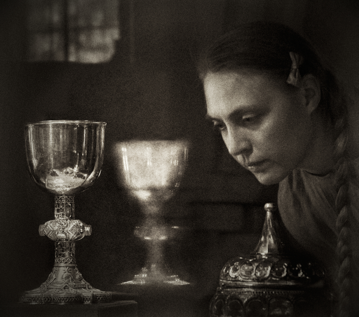
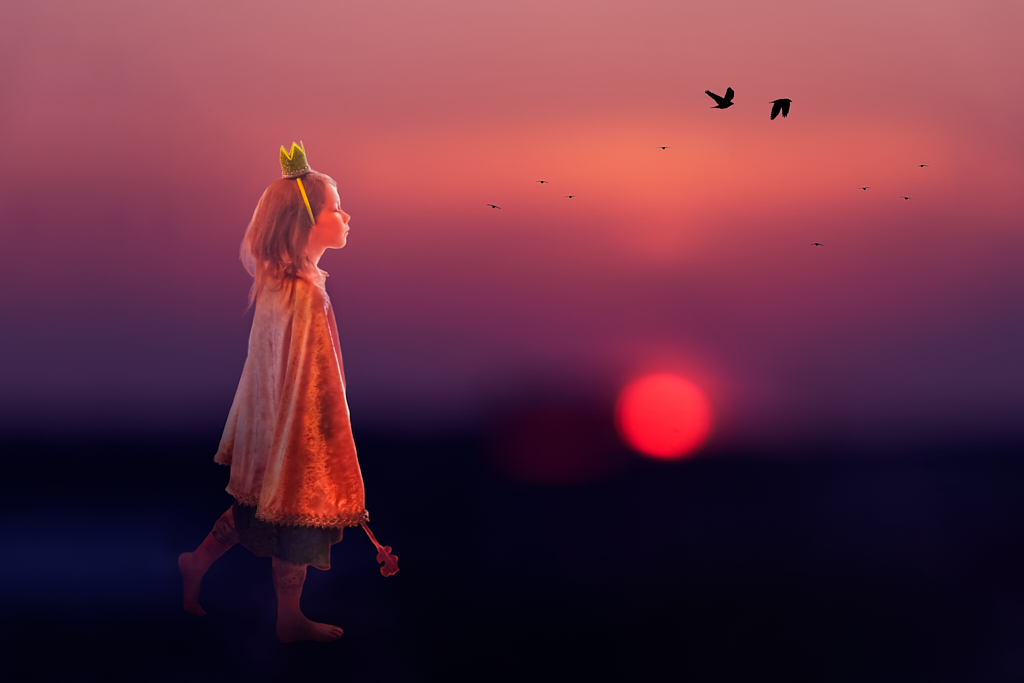
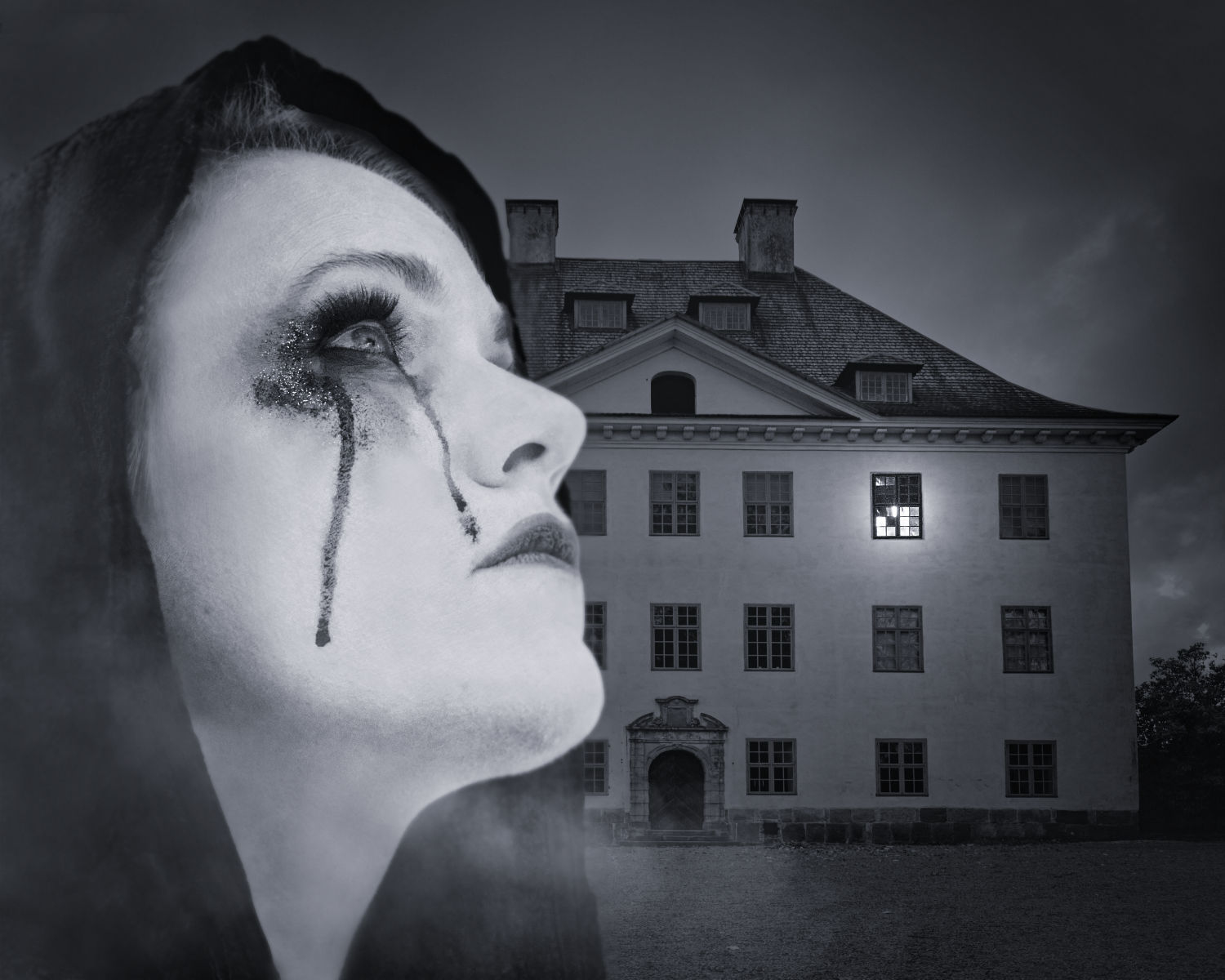
Hi Bruce, and welcome to the group - it is lovely to have another wizard to learn from! The gloomy courtyard, with the one dimly lit window, is a perfect setting for horrible things that happen in the darkness very close to home and normalcy. The coy pose of the poor unsuspecting Lady of the Night and the pure evil in Jack's grin are priceless, and the red scarf in the Lady's hands is a nice hint to future events. I admire the way you have positioned the elements to create a living three-dimensional drama. |
May 5th |
| 54 |
May 24 |
Reply |
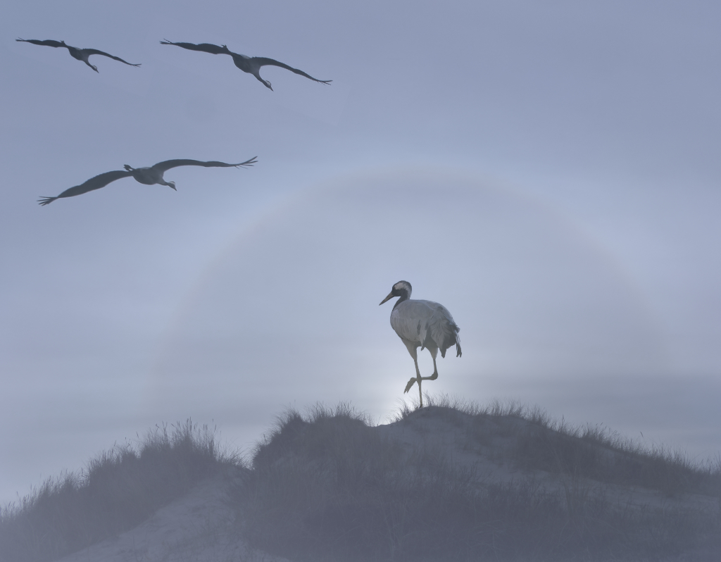
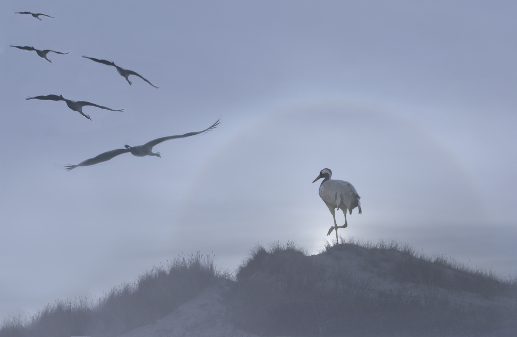
Thank you very much, Bruce, and welcome to the group! I like your version - I think that your magic touch of Levels did just what I have been struggling with. The new crop feels very balanced although I have been quite fixed with keeping the full halo. The question of reading direction is interesting - I thought the wedge of cranes coming in from the upper left corner followed just that principle but I can see now that this way, the story starts more clearly from the Queen. There is a bonus in that the flying birds look more natural when they come from their original direction. - I flipped my latest attempt (with the too many birds) horizontally, and I think that the principle works here, too? |
May 5th |
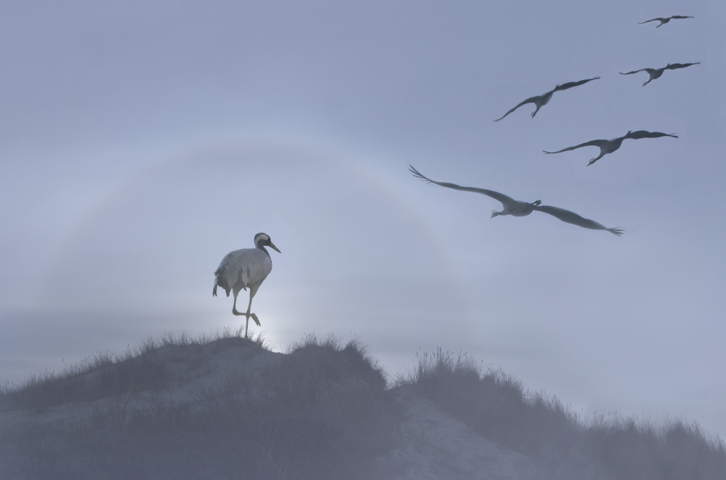 |
| 54 |
May 24 |
Reply |
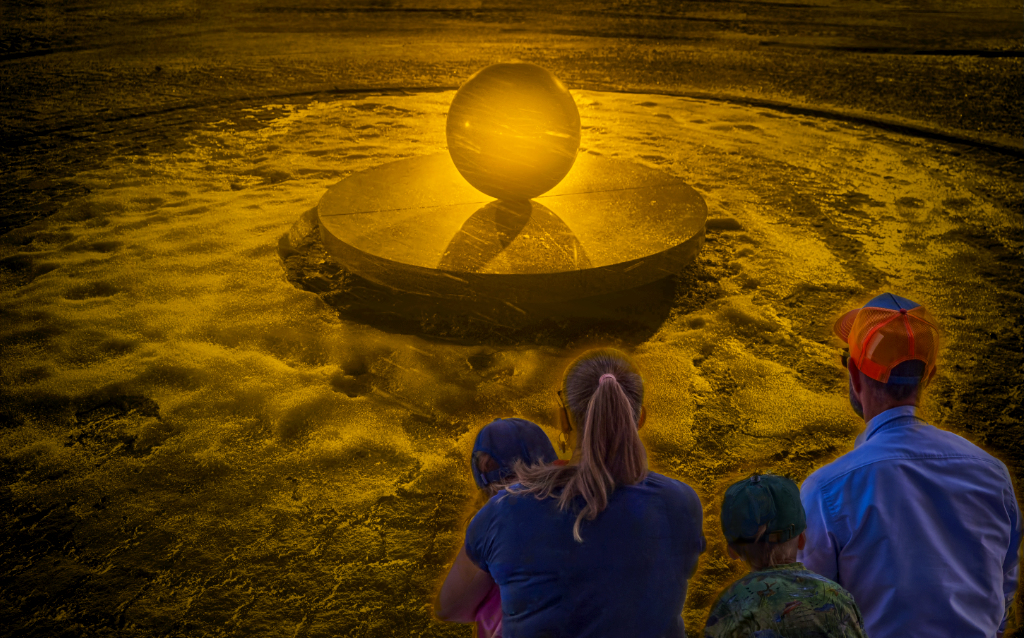
Thank you, Alan, I see the point. The "less is more" version was actually very much what I started with. - I don't know if I have the makings , but I am afraid that the present storyline has taken a life of its own for now: the Queen is serenely waiting inside her enchanted sphere, and her subjects return at dawn from the secret place they spend the night to consult her. Should I add another layer of haze on the flying birds to indicate that they are approaching from a distance? - I am so glad that the feeling of early morning comes through. The story of the flying bird who beckons the standing one to follow works beautifully but I feel that my lovely halo would then lose its mystery and become just a part of the background lighting. I will keep working on both lines, and think over about the title, too. |
May 5th |
| 54 |
May 24 |
Comment |
Thank you very much, Peggy! The connection is an excellent point. I rather liked the asymmetric position of the birds, though, and started from another angle. What if the cranes were coming from a specific place to answer the call, flying in formation? I enlarged the canvas towards landscape format and made them approach from the upper left corner. I also bent the wings slightly with the mesh warp tool for a more natural effect, too. I think that there may be more of a connection, and a story, now. What do you think? Does it look too crowded now - should I have enlarged the canvas more to give them enough room? |
May 3rd |
 |
6 comments - 5 replies for Group 54
|
19 comments - 14 replies Total
|