|
| Group |
Round |
C/R |
Comment |
Date |
Image |
| 26 |
Feb 24 |
Reply |
Thank you, Tony, for the lovely comment - I am so glad that you all bear with my weird ideas! |
Feb 20th |
| 26 |
Feb 24 |
Comment |
Jose, I think, too, that the tree that fills the frame makes a powerful composition. The sharp sunlit details in the foreground, and the greenery that fades in the haze in the horizon give the image such depth that one feels like standing there and watching over the canopy. |
Feb 11th |
| 26 |
Feb 24 |
Comment |
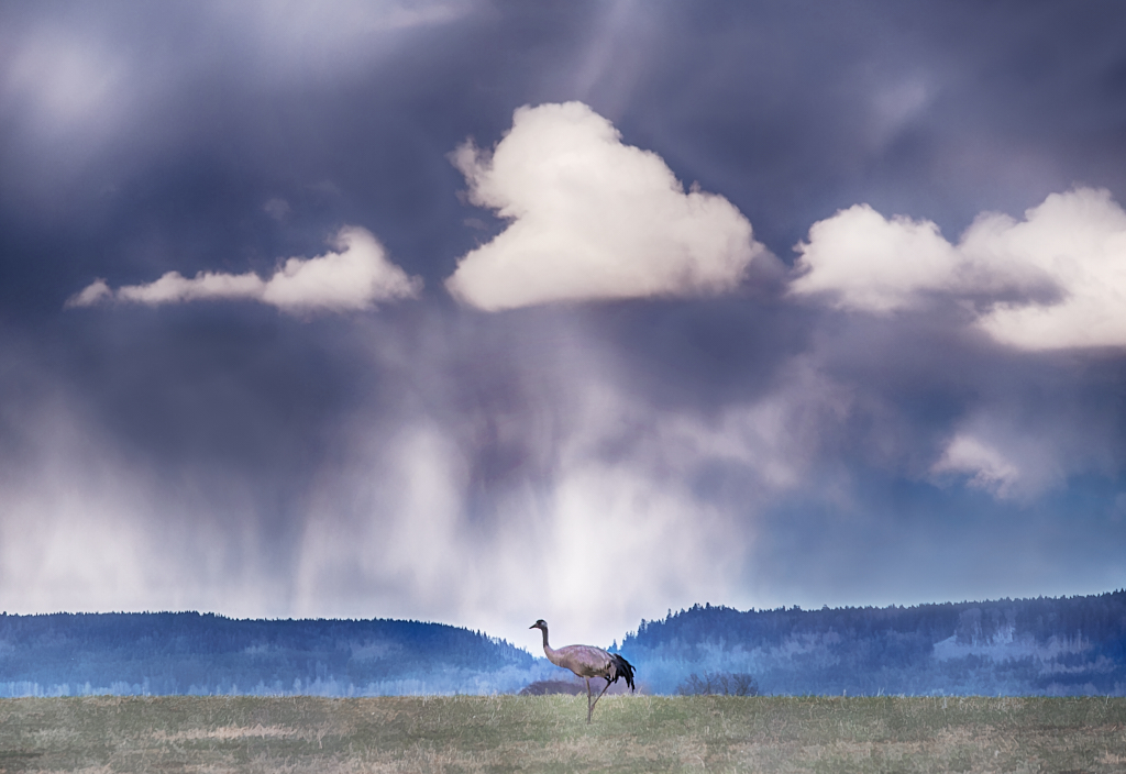
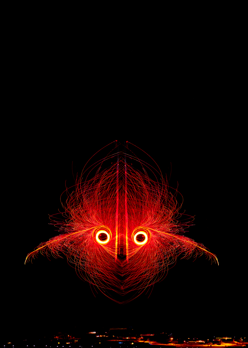
Hi Terry, I think that you brought out the essence of the sunrise into the image with the ICM. The lovely colors blend into each other beautifully, and the textures in the different parts are in perfect balance. - I like the bigger bird in her present position very much, but I think that the image is also fine as such, maybe more abstract? |
Feb 10th |
| 26 |
Feb 24 |
Comment |
Hi Mervyn, I like the image very much, too! I think that the perspective is very well chosen, making the building interesting and taking the attention to the bells and their beautiful shadows. I can almost hear the bells tolling. The blue of the cupola is rather close to the color of the sky - I wonder if it is possible to adjust tone/brightness/contrast slightly to make the cupola stand out a bit more? |
Feb 10th |
| 26 |
Feb 24 |
Comment |
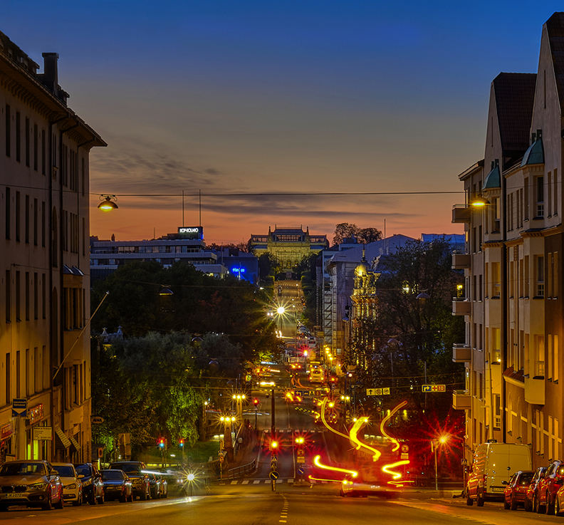
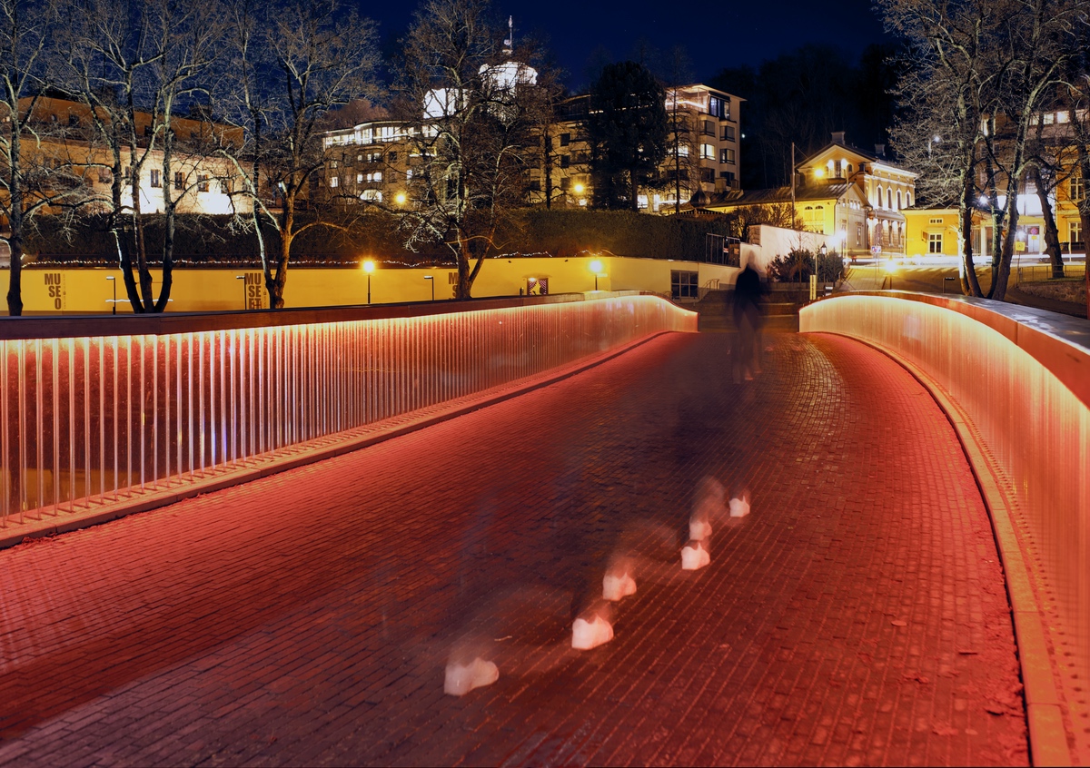
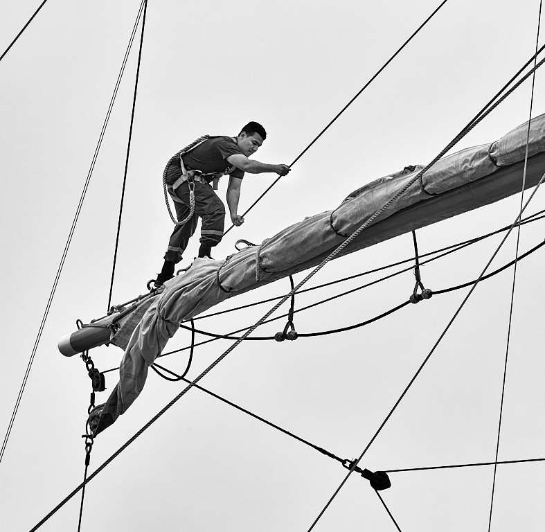
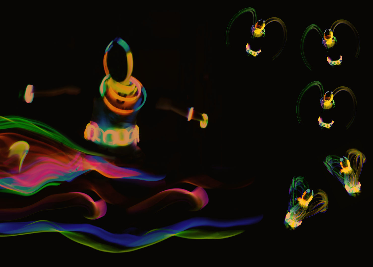
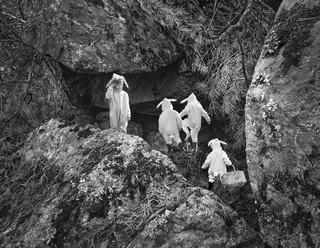
Hi Tony, I agree with the others in all respects. Another of your images the viewer can walk right into. The colors work so well together, and make a happy festive mood. - You have frozen the movement of the walkers perfectly - what was your shutter time? |
Feb 10th |
| 26 |
Feb 24 |
Comment |
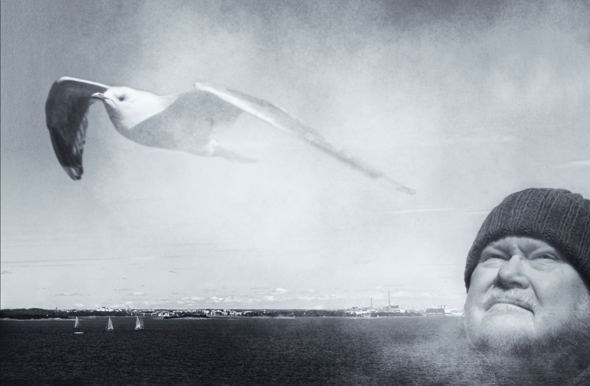
Bob, a lovely Nature story! I, too, like the composition very much, with the movement from the left frame towards the right, with enough room for the family to go. I wonder if adjusting the tones or brightness of the background a bit would make the birds stand out more? Is that allowed in Nature images if you do not touch the elements? |
Feb 10th |
| 26 |
Feb 24 |
Reply |
Thank you, Bob! I am happy with the colors myself, too! I will try the tripod,and see where it goes. |
Feb 10th |
| 26 |
Feb 24 |
Reply |
Thank you, Terry, for the lovely critique - the goose bumps really make me feel that I am close to the goal! |
Feb 10th |
| 26 |
Feb 24 |
Reply |
Mervyn, thank you for the kind words! They make my day! |
Feb 10th |
| 26 |
Feb 24 |
Reply |
Thank you, Jose! I think that the original may actually be a different frame than the one I processed - I took something like ten consecutive images that looked very much the same, and just picked up a JPEG to post as the original. I am travelling now but I'll check the file numbers when I get home to the computer. |
Feb 10th |
| 26 |
Feb 24 |
Reply |
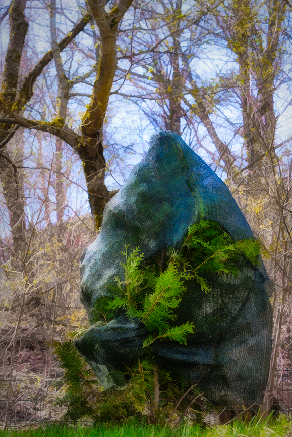
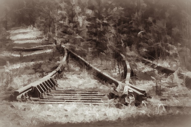
Thank you, Lance! I think you are right about the blur. The greatest benefit of the tripod might actually be to eliminate the effects of my shaky hands and keep the net and the plants sharp. I am so glad that you like the image! |
Feb 6th |
5 comments - 6 replies for Group 26
|
| 47 |
Feb 24 |
Reply |
Hi Ed, about Iceland - I have only been once myself but consulted some friends. Two enthusiasts just came back with lovely images of half-frozen waterfalls, stormy skies and huge waves; they say any time is good. Summer with the very long days is the most popular. In December and January the short daylight time sets limits to exploring. October to March are the rainiest months, but also best season for the Aurora. Some smaller roads are closed during the winter season. If you wish to avoid the masses of tourists, spring or fall would be the best options, and also somewhat less expensive. - I am sure that you will enjoy the landscapes tremendously and I am already looking forward to the images! |
Feb 20th |
| 47 |
Feb 24 |
Comment |
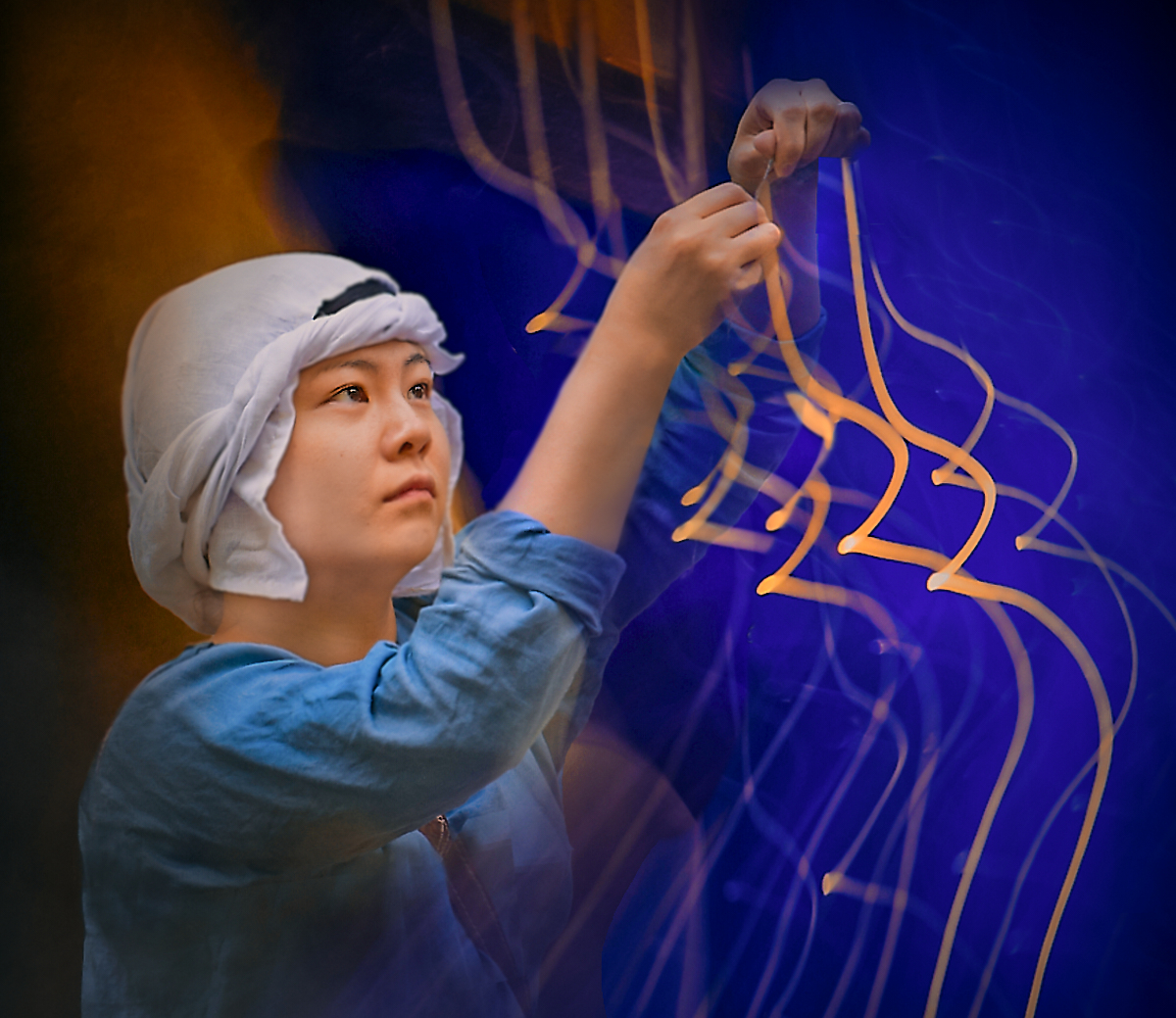
Hi Trung - I join the others looking forward to more of your portraits. There is definitely a story in the image. I love the way the light defines her face and the various textures in her clothing and accessories. I think that the folds in the backdrop show beautifully and add an element to to story. -I wonder if you could perhaps post the image in a little bigger size as a comment? |
Feb 20th |
| 47 |
Feb 24 |
Comment |
A fine moment perfectly captured that I think calls for the black-and-white approach. There is something regal in the way the bird seems to calmly observe his stormy world, and I think that it is especially this contrast that makes the image special. The dark area that Jeff mentions tends to draw my eye a bit, too.
|
Feb 20th |
| 47 |
Feb 24 |
Reply |
Thank you, Trung! At least it leaves room for imagination. |
Feb 15th |
| 47 |
Feb 24 |
Reply |
Thank you, Jeff - a great idea that did not come to my mind at all. I saw only a centered composition from the beginning. Here is another version - I like it a lot. |
Feb 15th |
 |
| 47 |
Feb 24 |
Reply |
Jeff - the minimalistic version looks very good! However, when I look at the two side by side, I think that the original extra wire makes the image and composition more interesting. |
Feb 15th |
| 47 |
Feb 24 |
Comment |
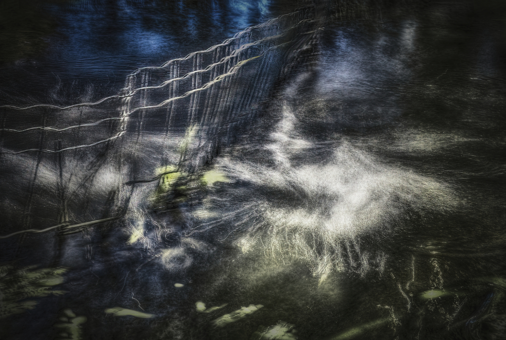
Hi Jeff, I love the mood of the image. The low-coming light creates such interesting shadows on the little mounds of snow, and the stark barbed wire fence in the middle of nowhere starts an intriguing story. I like the triangular frame created by the arched wire myself, but as Robert says, I can see the more minimalistic image without it working very well, too. I agree with Ed about the bright spots on the left.- I wonder if brightening the shadows in the foreground a little bit might bring out the sparkle of the snow even more without affecting the mood? - I wonder if such effect might be achieved in the BW conversion? |
Feb 11th |
| 47 |
Feb 24 |
Comment |
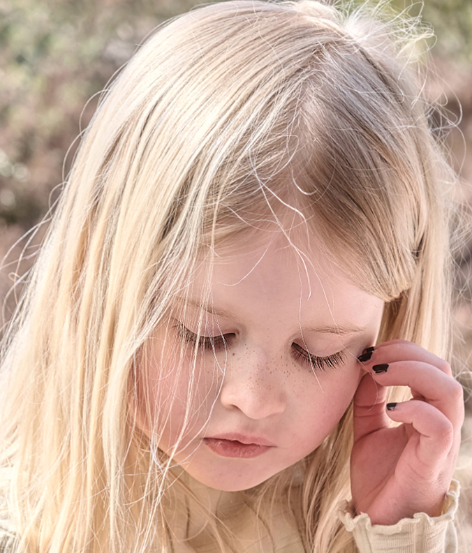
Hi Ed, the intense concentration really shows in the image that makes a fine portrait, too. I think that the black-and-white conversion is superb. The light now gives form to his face, and the tones are so rich. To tease the text out of the book is a great achievement! |
Feb 11th |
| 47 |
Feb 24 |
Comment |
Hi Robert! I would be on the same lines with Ed. I wonder if you could play with the contrast even more and aim towards a graphic design without any middle tones? It might bring the graceful network of the branches out in an interesting way, like in a drawing? |
Feb 11th |
| 47 |
Feb 24 |
Reply |
Thank you, Ed -I will! |
Feb 11th |
| 47 |
Feb 24 |
Reply |
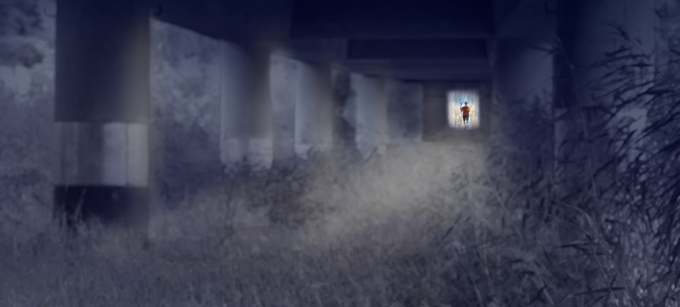
Thank you, Robert! It really was such an enigmatic sign in the whiteness. I am glad that I happened to find it untouched before it melted away. |
Feb 11th |
5 comments - 6 replies for Group 47
|
| 54 |
Feb 24 |
Comment |
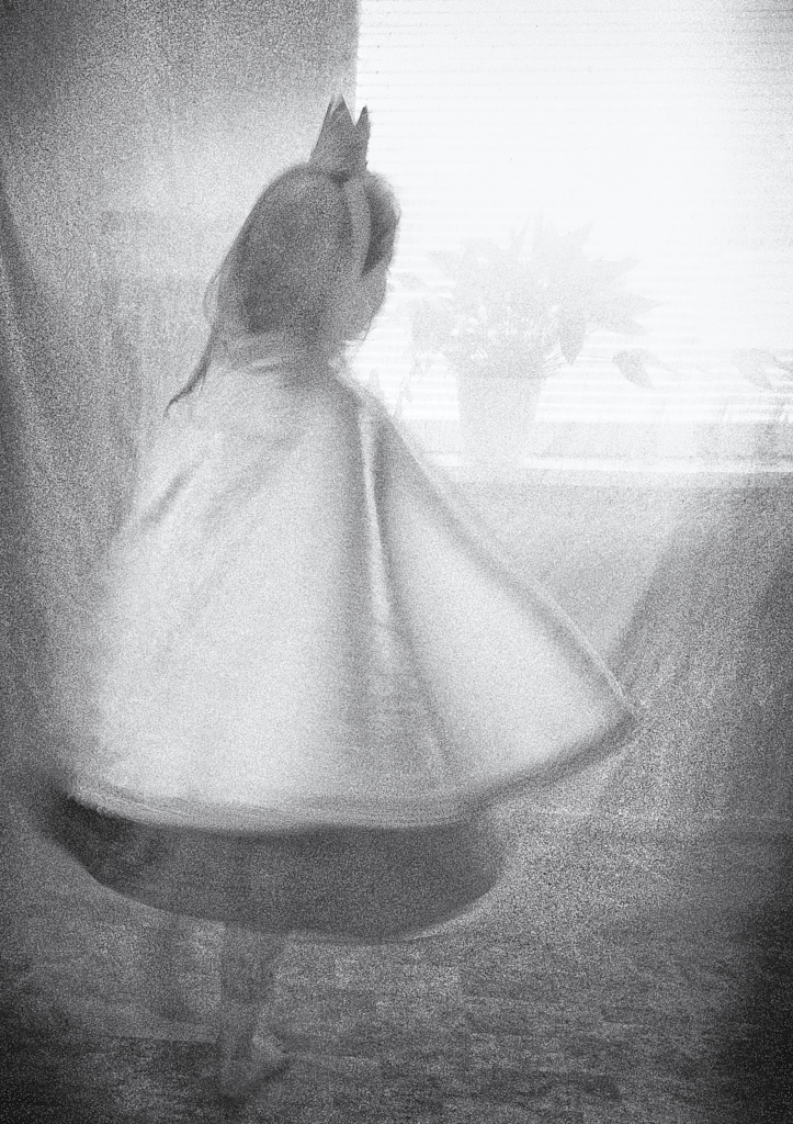
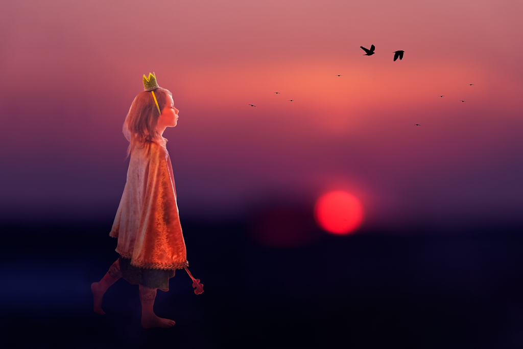
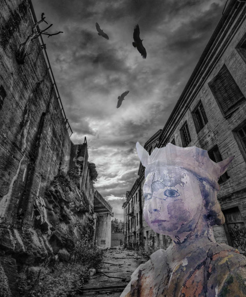
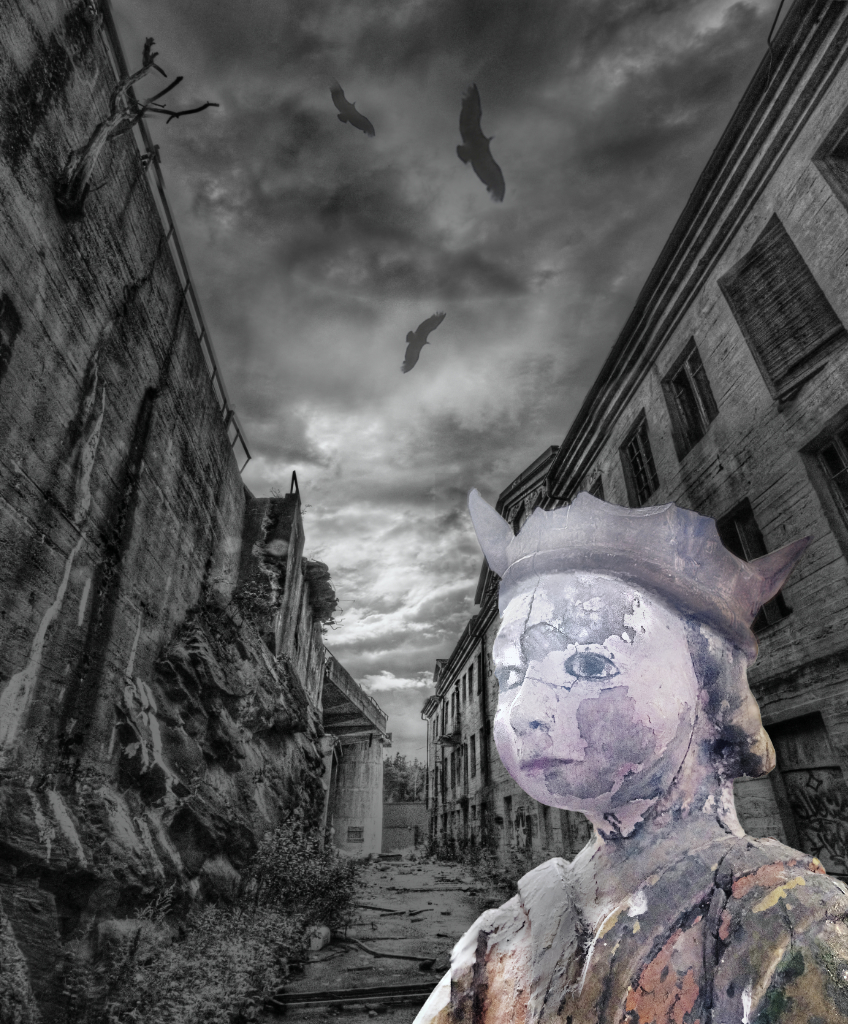
Hi Maria, thank you - I can see the problem! The longer I look at the images, the more fond I am with Peggy�s version. If only I could find a way to give the more colorful princess just a little bit more ethereal feeling! |
Feb 28th |
| 54 |
Feb 24 |
Reply |
Here she is in 90% opacity. The combination of the two approaches looks lovely, too. I will spend the rest of the evening playing with all the options. A thousand thanks for the tips! |
Feb 15th |
 |
| 54 |
Feb 24 |
Reply |
Thank you so very much, Peggy! I have the NIK bundle but have not used Viveza at all so far. This makes all the difference! Viveza will be my new favorite toy. |
Feb 15th |
| 54 |
Feb 24 |
Reply |
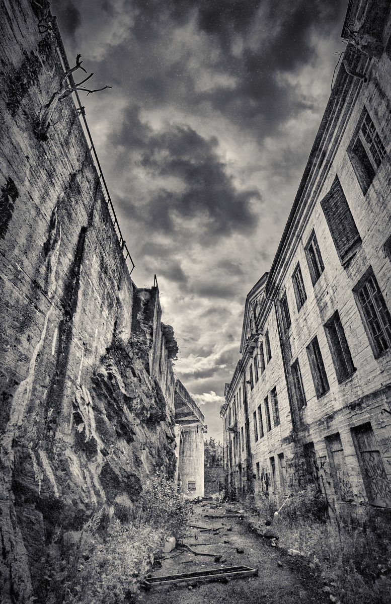
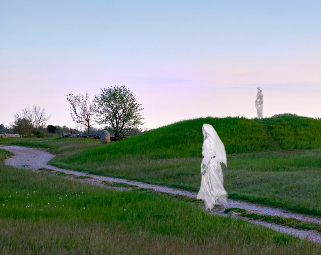
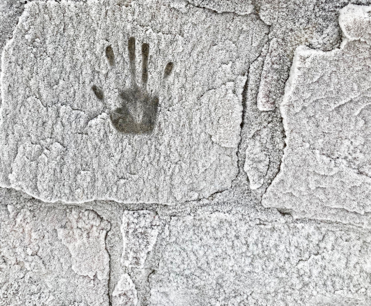
But the powerful magic probably preserves the building rather intact. |
Feb 15th |
| 54 |
Feb 24 |
Reply |
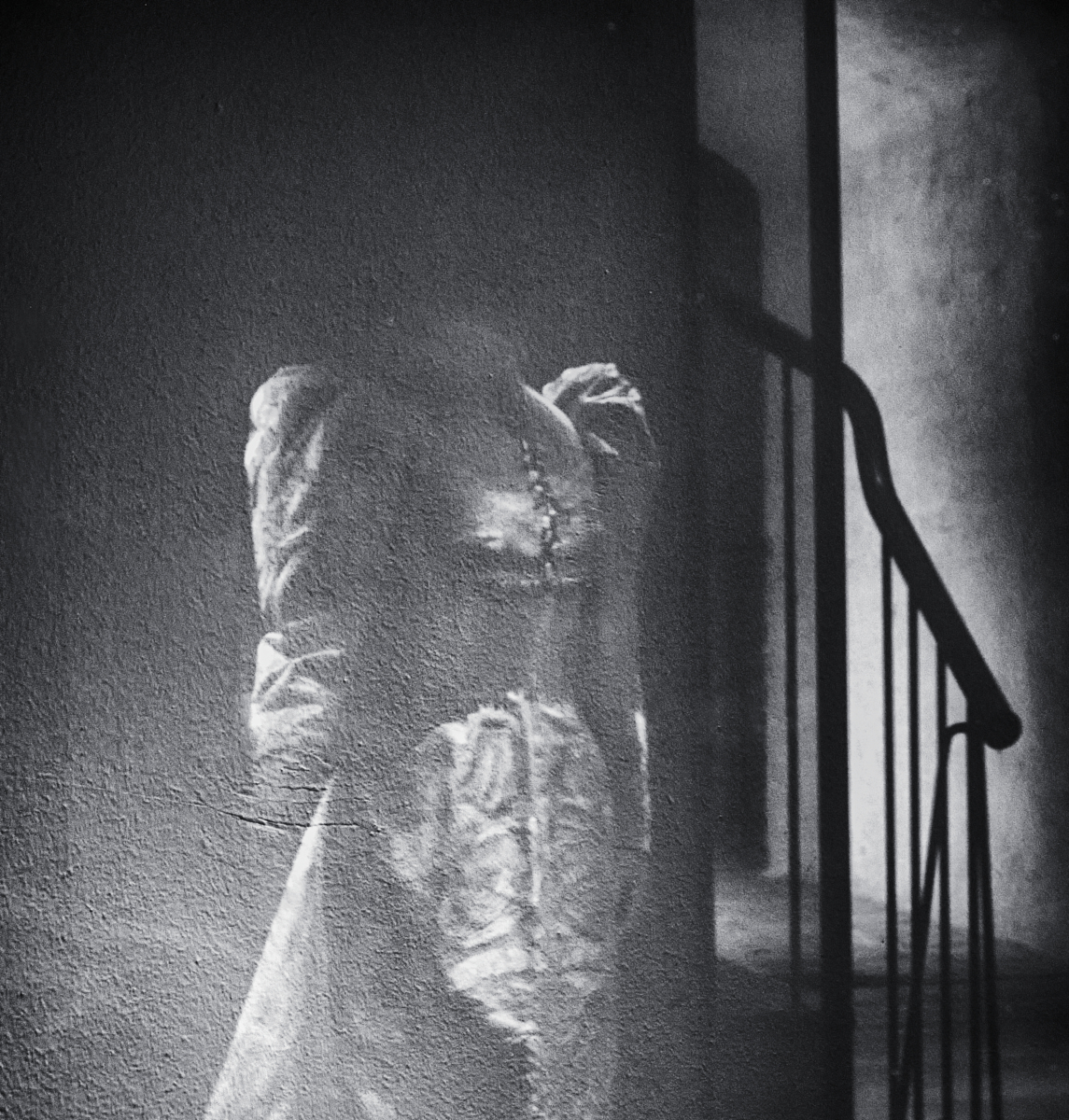
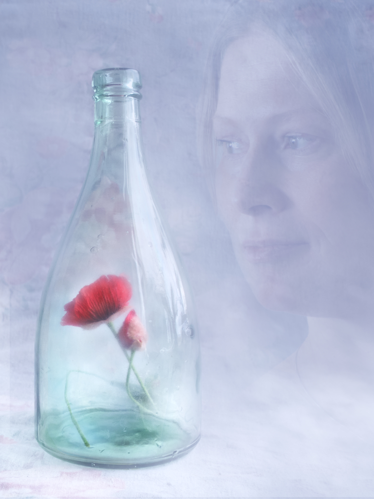
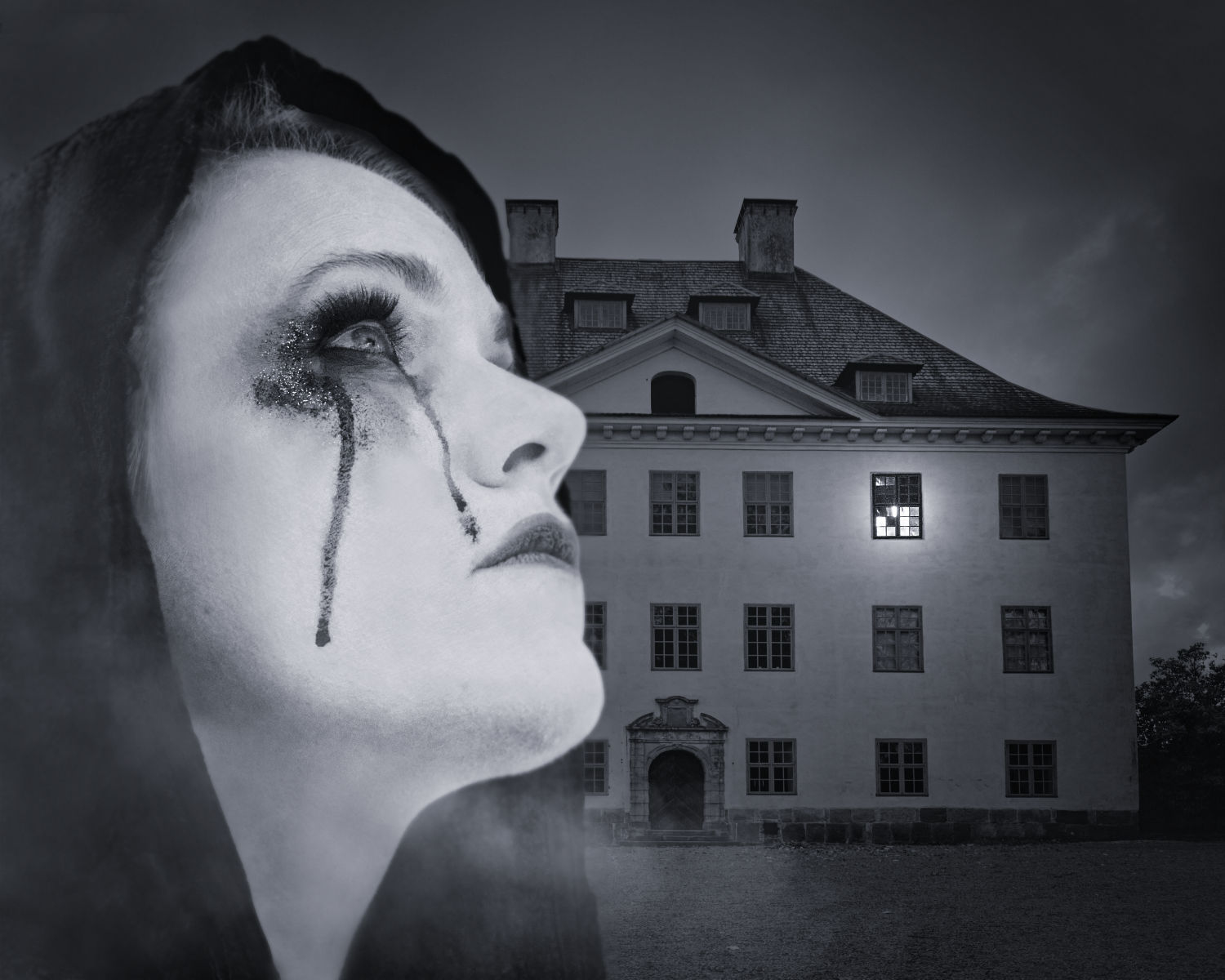
Thank you, Peggy! I tried to work on the darker version but I felt that she may disappear into the background. What do you think about the paler more ghost-like version that I posted in my reply to Aavo? I think that the more intense contrast somehow fits with the background better although she is so much lighter in tone? I added a slight vignette on the final image that I think may bind her in the scene. |
Feb 15th |
| 54 |
Feb 24 |
Reply |
Thank you, Alan! What do you think about the paler version of the Princess that I posted in comment to Aavo? |
Feb 15th |
| 54 |
Feb 24 |
Reply |
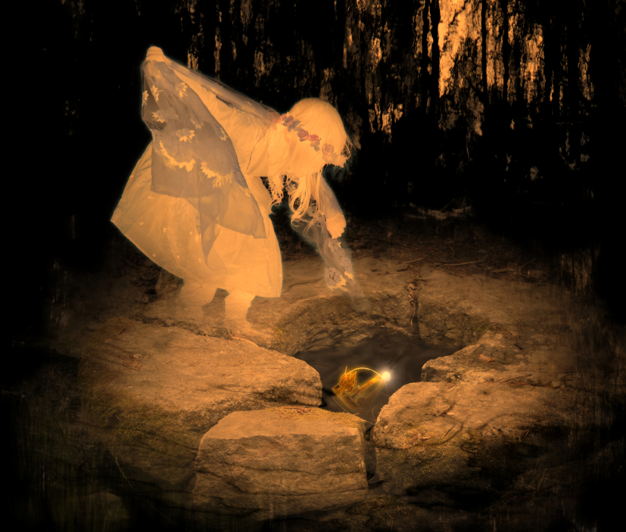
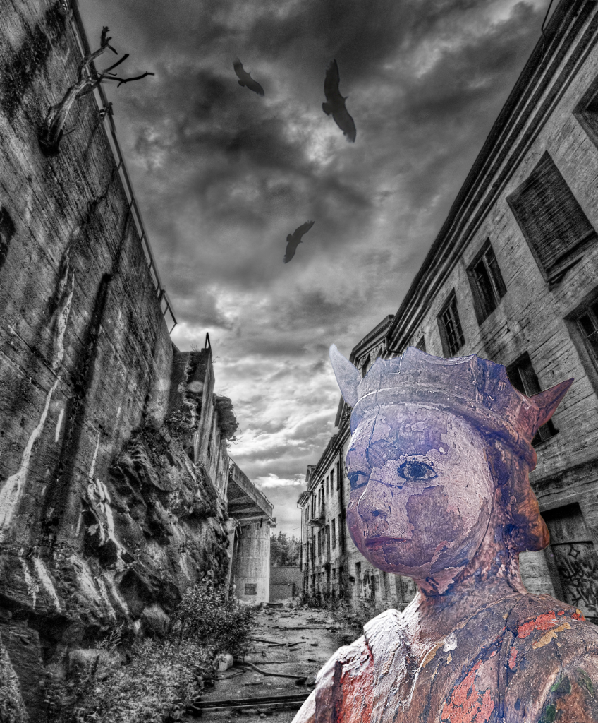
Thank you, Brad, you are so right. - I tried to follow Aavo�s suggestion, and I think that the image might work better with the ghostly element? The Princess has somehow become so important for me - I feel that I see her solemn brave face almost every day in the news from refugee camps and catastrophe areas - and I would love to be able to tell her story. - Thank you for the ideas about the alley! |
Feb 15th |
| 54 |
Feb 24 |
Reply |
Thank you, Aavo - I think that you are very much correct. Because of the background, making the Princess transparent did not work, but I made a paler, brighter and more high contrast version of her. I think that there is something of the feeling now. What do you think? |
Feb 15th |
 |
| 54 |
Feb 24 |
Comment |
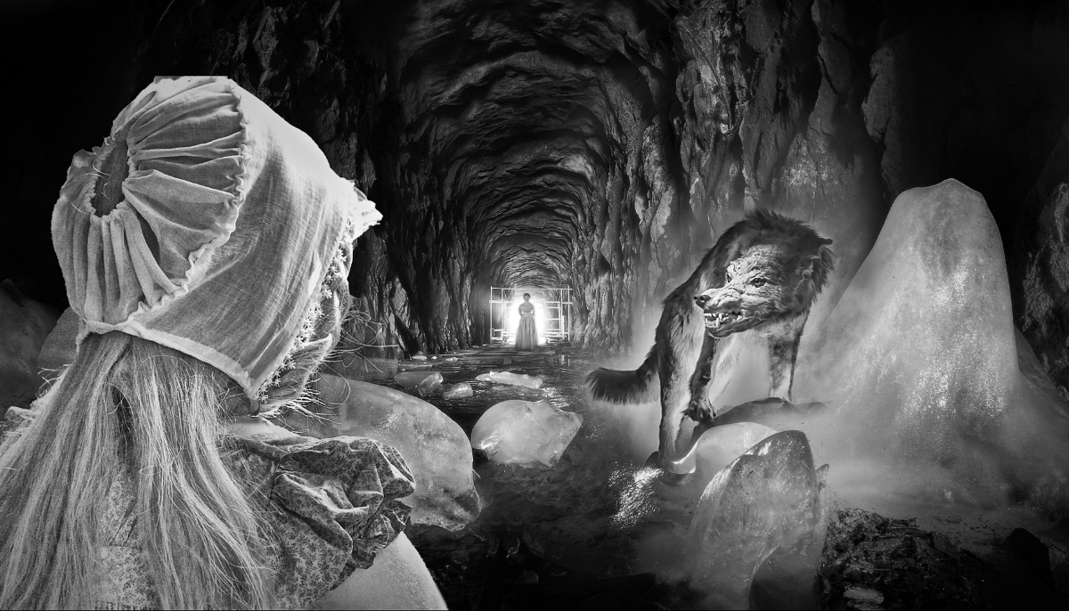
Brad, I think that you have created exactly the image you were after. The Gothic temple of knowledge grows seamlessly from the rock to the heights, and the desaturated background with the dramatic sky creates the mood. The bright colors and the modern attire of the eager seeker of knowledge make a fine contrast, and add an extra twist to the image. |
Feb 6th |
| 54 |
Feb 24 |
Comment |
Thank you, Peggy! - I have a version of the princess that has more contrast, saturation and vibrance, but I felt that the paleness might suggest that she comes from another time to face yet another catastroph as bravely as she handled the original one 2000 years ago. I will post the other version next week when I am back at the computer. |
Feb 6th |
| 54 |
Feb 24 |
Comment |
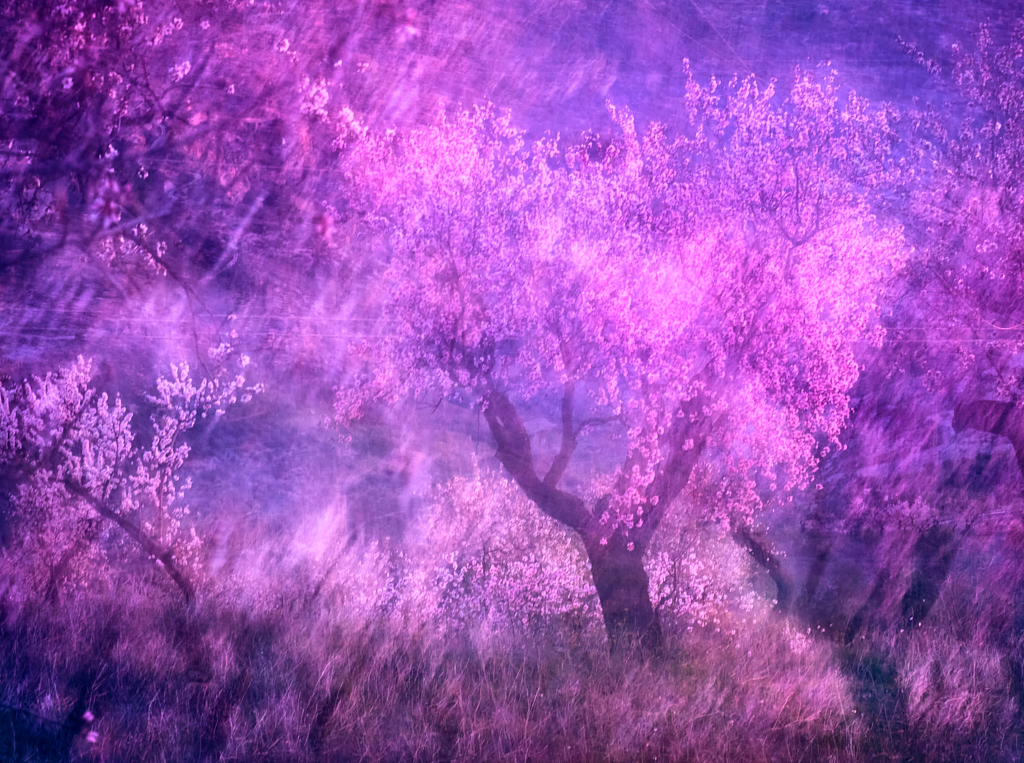
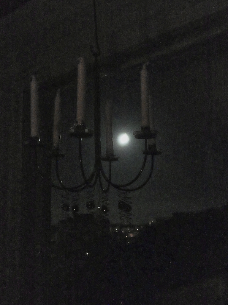
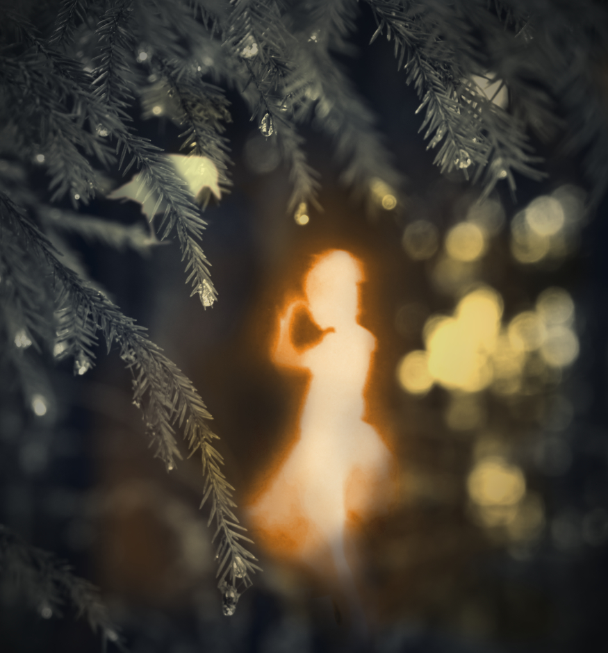
Alan, thank you for a wonderful vision! This could be a housing complex of the wizards on the Roke island in the Earthsea. I love the way the solemn figures materialize with the fading light on their balconies. The stark geometric forms of the building make a perfect background. I will start practising that lovely moonlight gradient that I think makes the story here. Thank you for sharing all the steps! |
Feb 4th |
| 54 |
Feb 24 |
Comment |
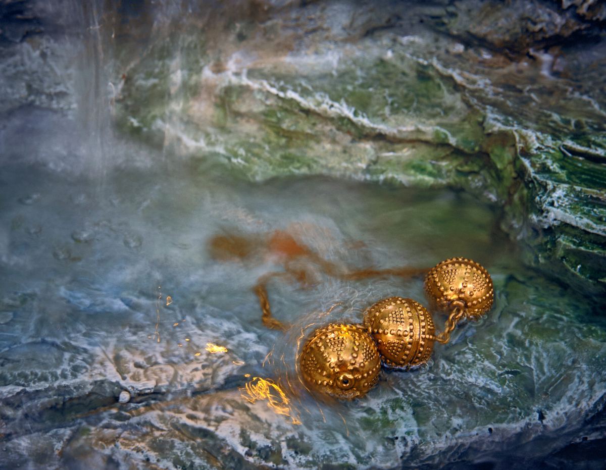
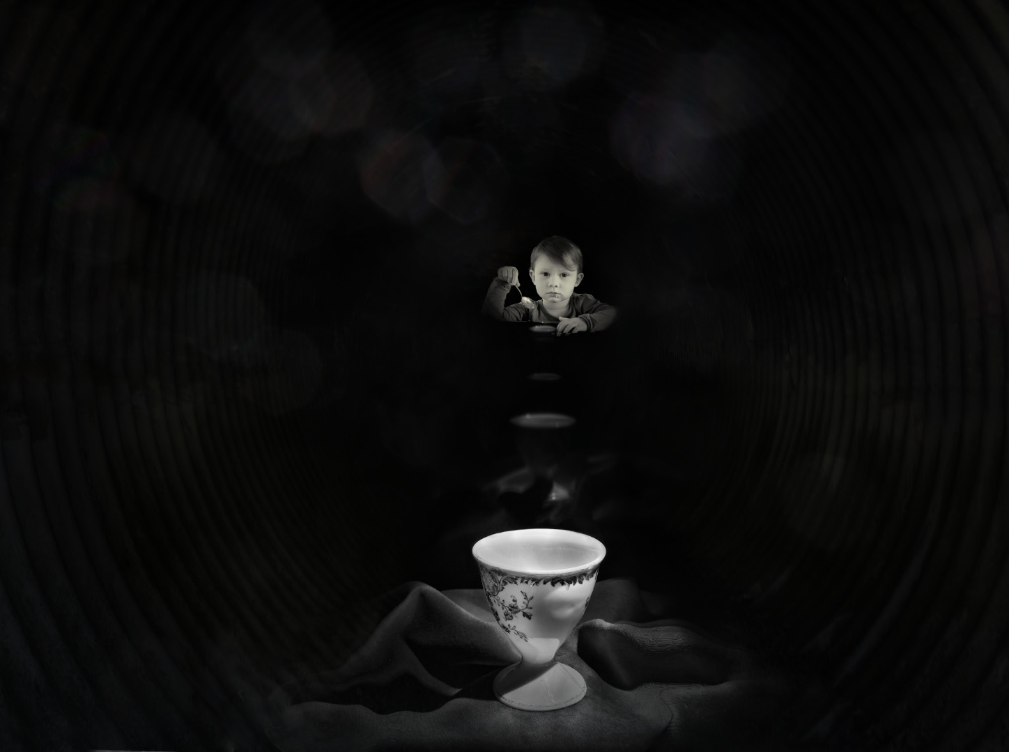
Hi Aavo,what a thriller! I can see the threads of the net stretch as the spider moves silently towards his prey who is resting totally relaxed without any idea of the danger. I think that it was a brilliant idea to color the net: the bokeh becomes amazing, and the color contributes to the atmosphere. The color of the head of the spider may be a bit close to the background color - I wonder if darkening it slightly or adjusting the hue might bring the creature out more? I think that the composition is very effective, with the triangle of the spider, the prey and the bright spot at the center of the net, and the potential escape route on the upper right corner. |
Feb 4th |
| 54 |
Feb 24 |
Comment |
Hi Peggy, I love your graceful long-legged bird who admires her mirror image. You have placed them so cleverly using the intersections of the bokeh balls. To me, it looks like they were floating inside their individual bright bubbles along the diagonal that gives the image a sense of movement.- I think that they would look great also with a more stationary backround, but that would make a different mood. |
Feb 4th |
6 comments - 7 replies for Group 54
|
16 comments - 19 replies Total
|