|
| Group |
Round |
C/R |
Comment |
Date |
Image |
| 26 |
Dec 23 |
Reply |
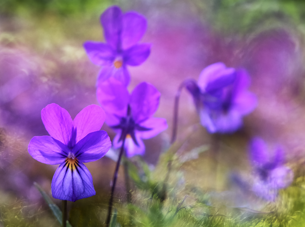
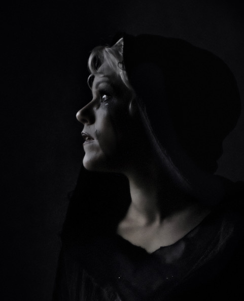
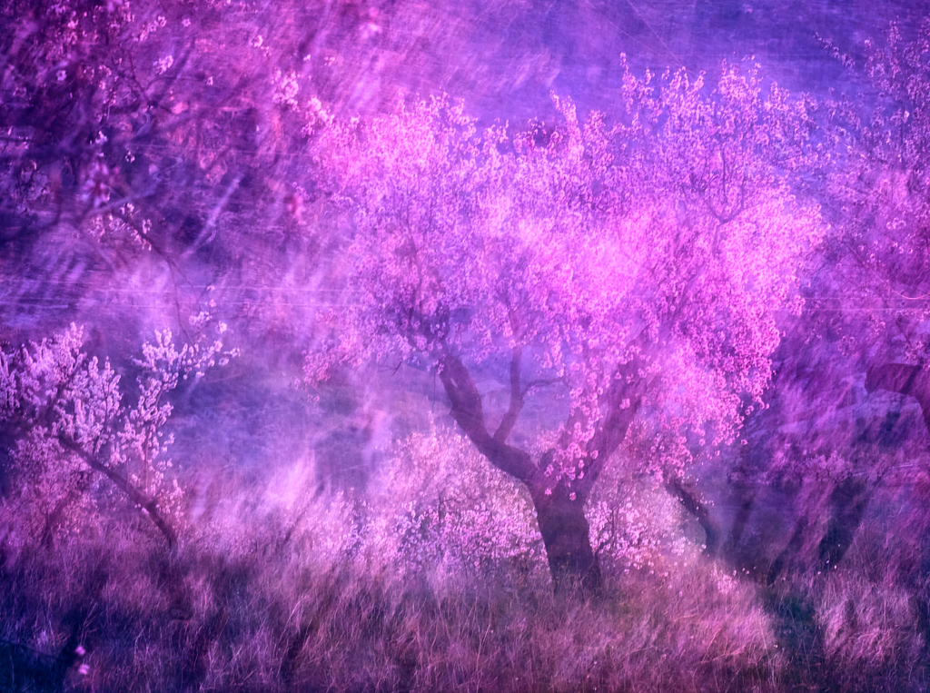
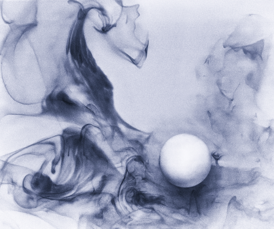
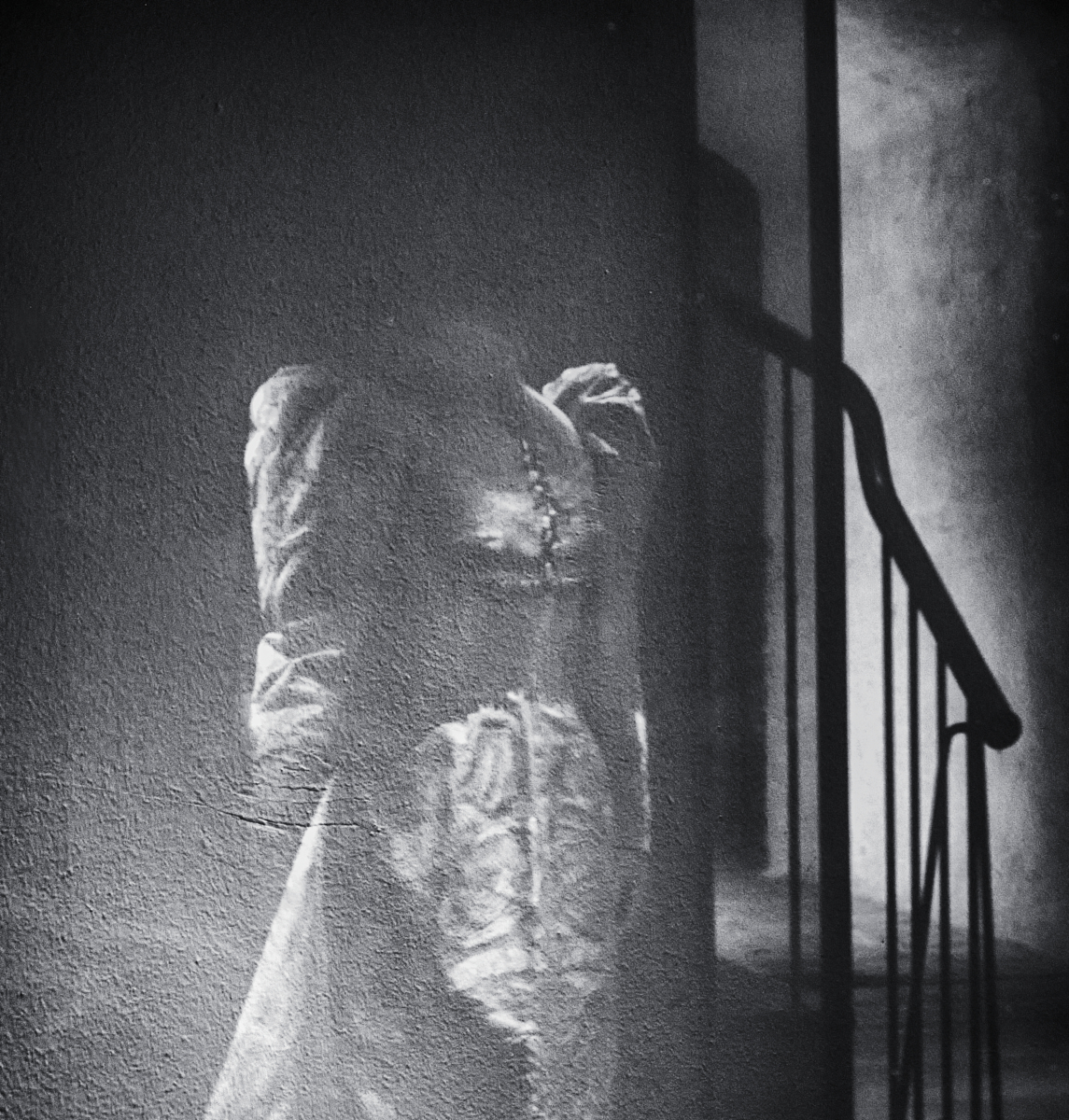
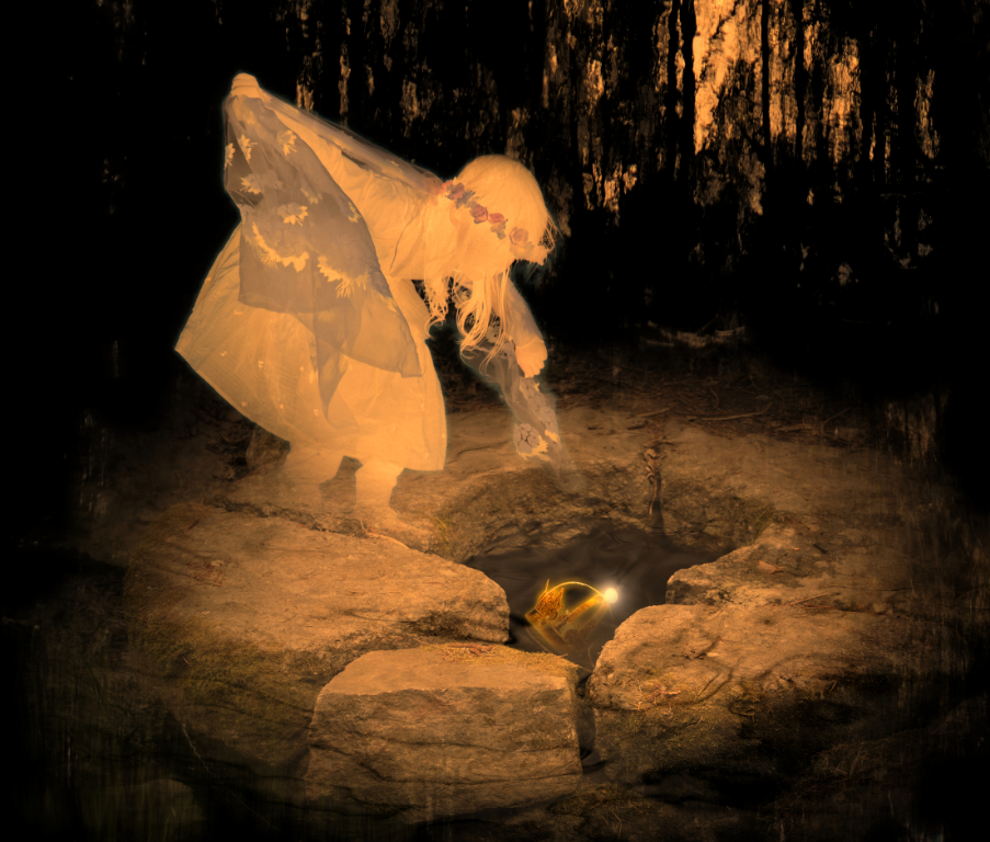
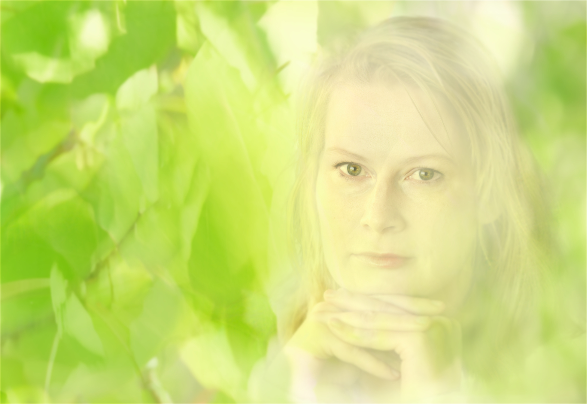
Thank you, Tony! Here I have reduced the saturation of the purple in the background, but left those purple and blue touches on the "veil" and the "body" intact. What do you think? |
Dec 18th |
 |
| 26 |
Dec 23 |
Reply |
Thank you, Agnes! You and Bob are right! I will tone the purple down. |
Dec 16th |
| 26 |
Dec 23 |
Reply |
Thank you, Bob! I do agree! I used the sponge brush tool in Affinity for a final touch for saturation and vibrance, and there is one stroke too much. |
Dec 16th |
| 26 |
Dec 23 |
Reply |
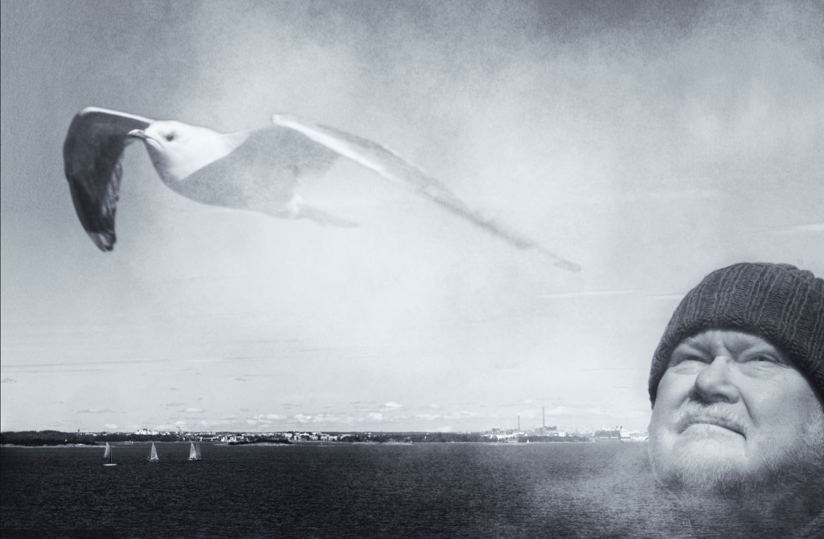
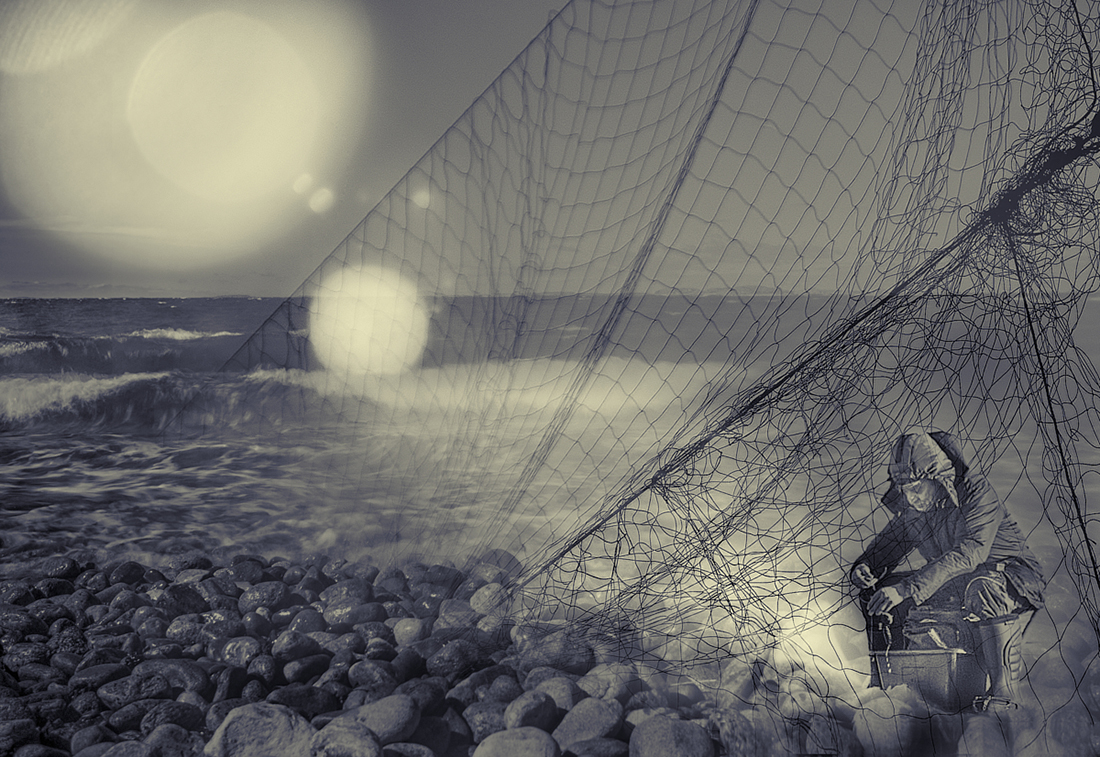
Thanks, Bob! He really fits in the background beautifully, and you probably have the same kind of soft diffuse lighting in both the originals that makes them blend so well. |
Dec 13th |
| 26 |
Dec 23 |
Comment |
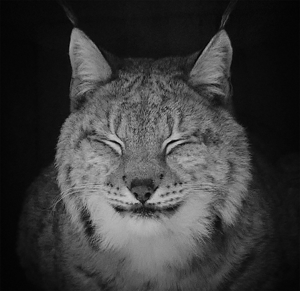
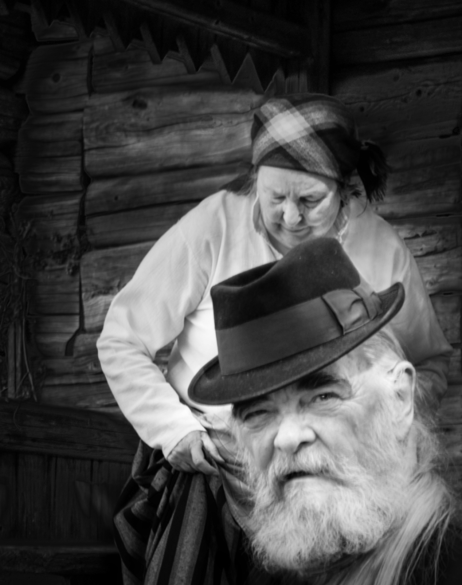
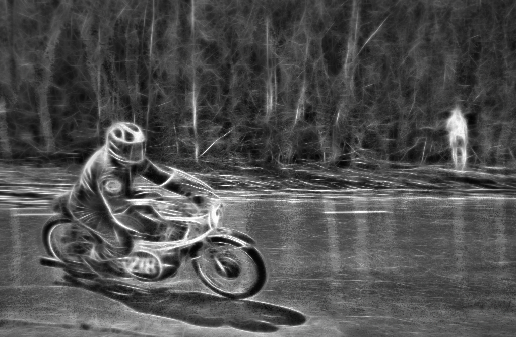
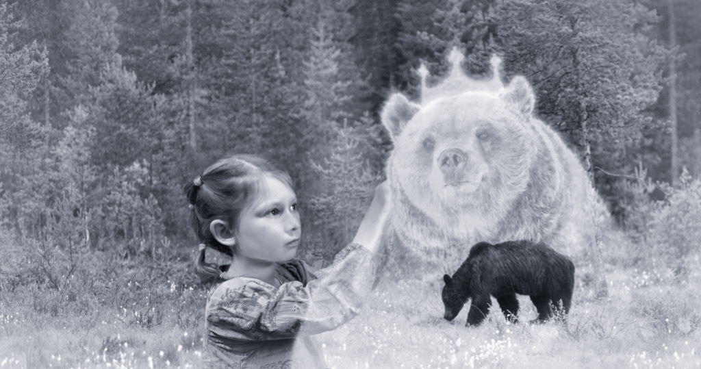
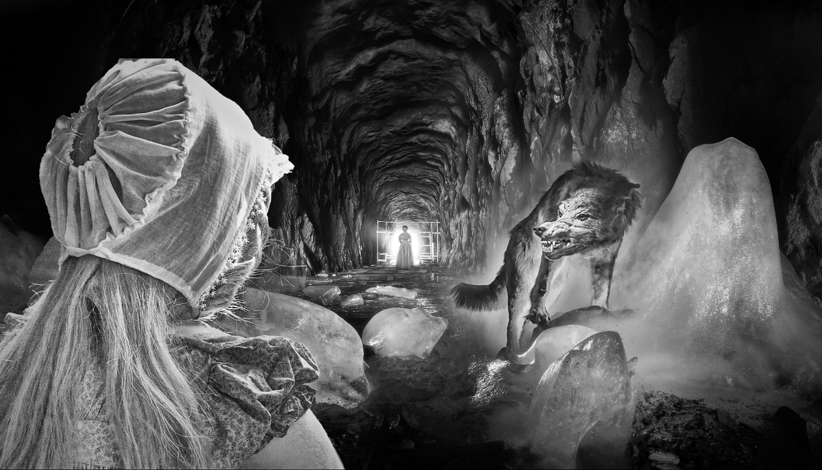
I join the others in admiration. If you had not shown the original, it would be very hard to guess that he is not in his natural habitat. He is very impressive, with the direct demanding stare. - In my composite group, they are big in creating and replicating shadows to make the components blend more naturally on the background. I was wondering if it might be worth while to add a subtle shadow on the ground under his body and paws, like on the original floor? |
Dec 13th |
 |
| 26 |
Dec 23 |
Comment |
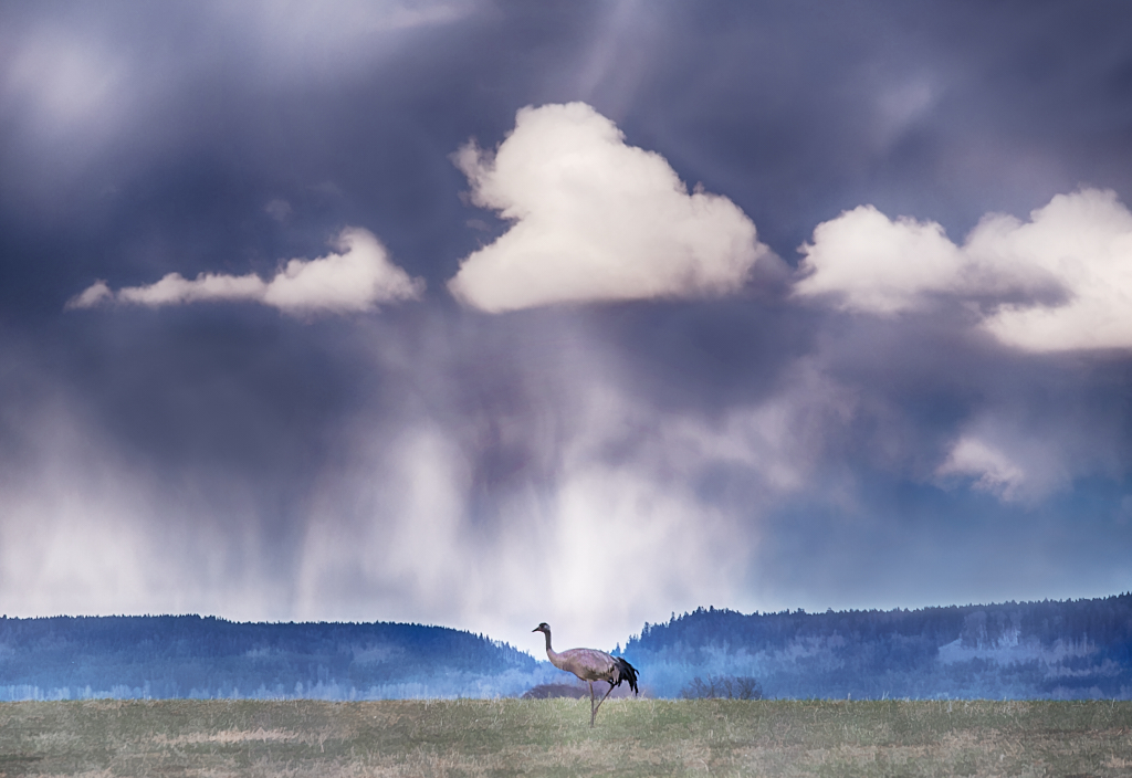
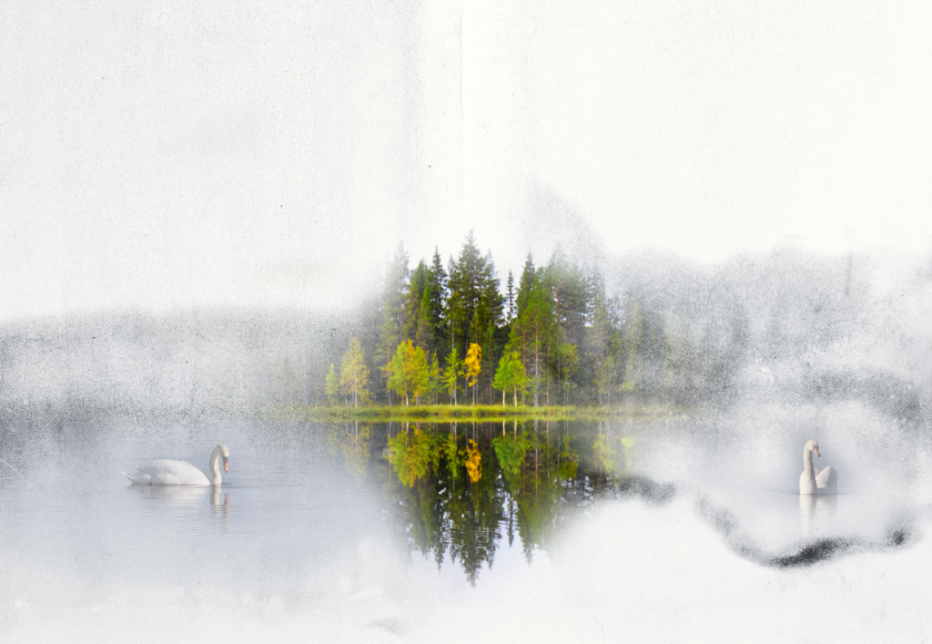
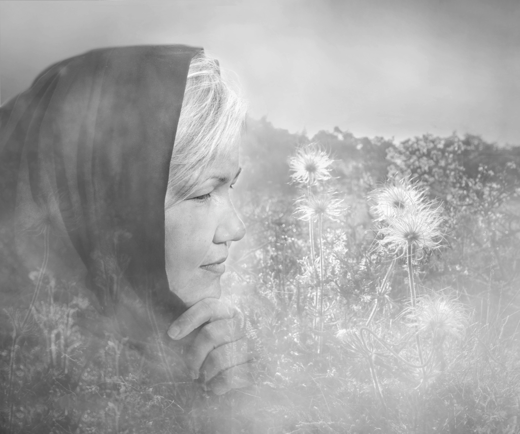
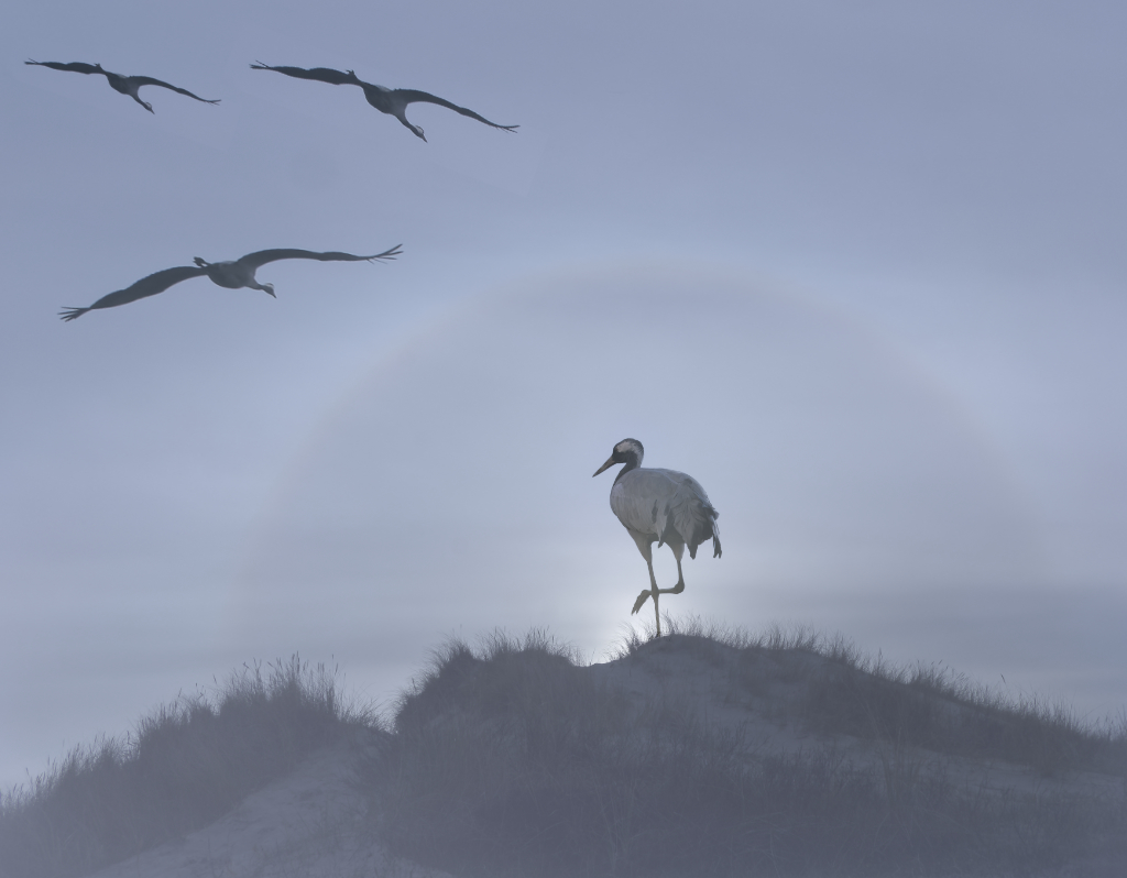
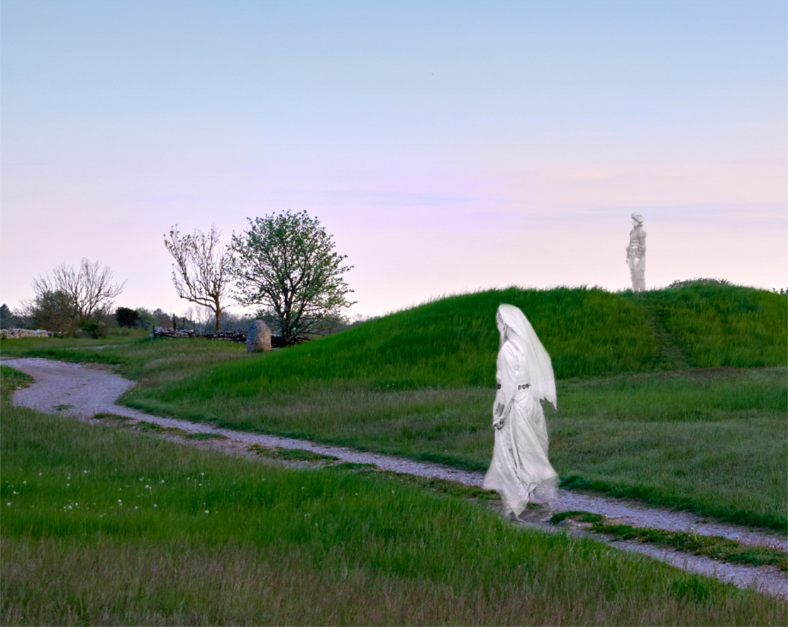
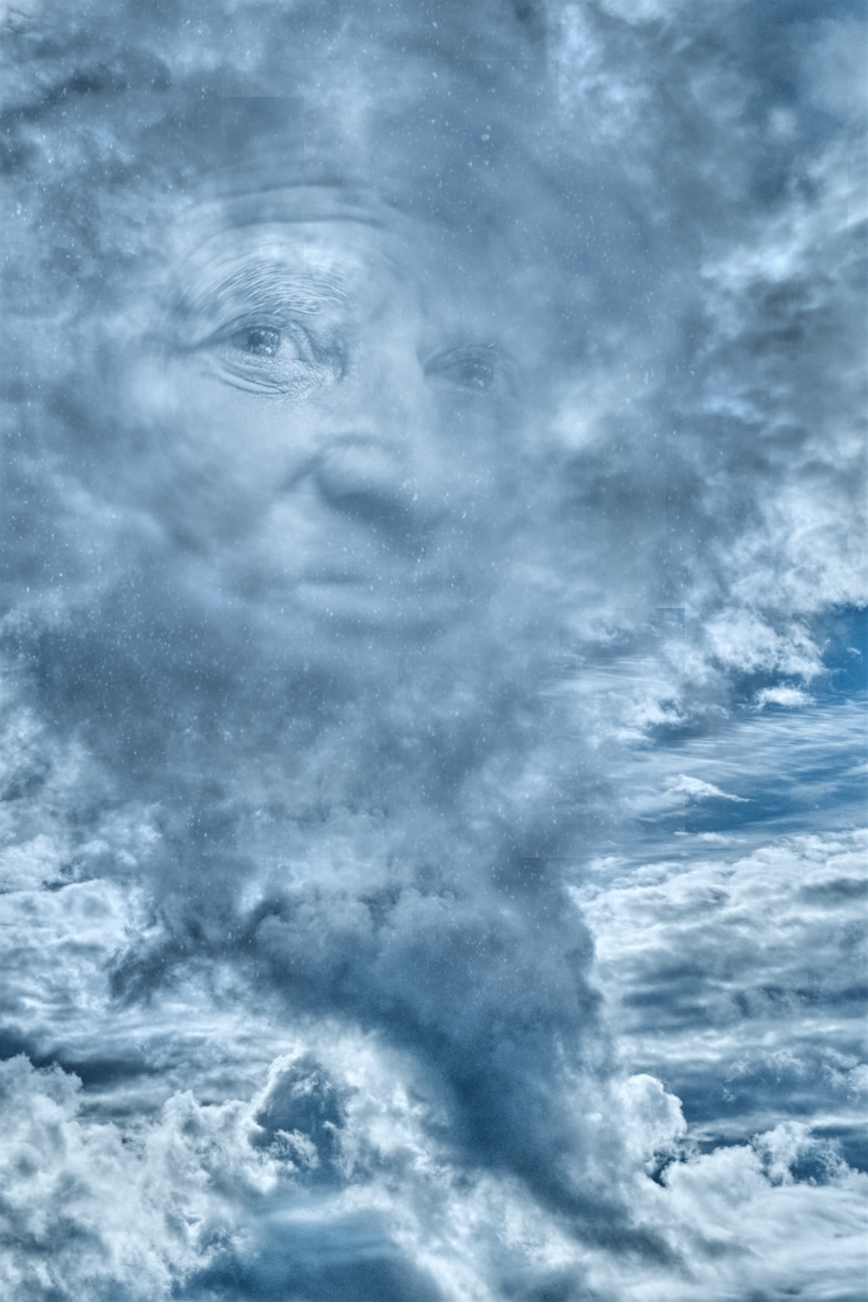
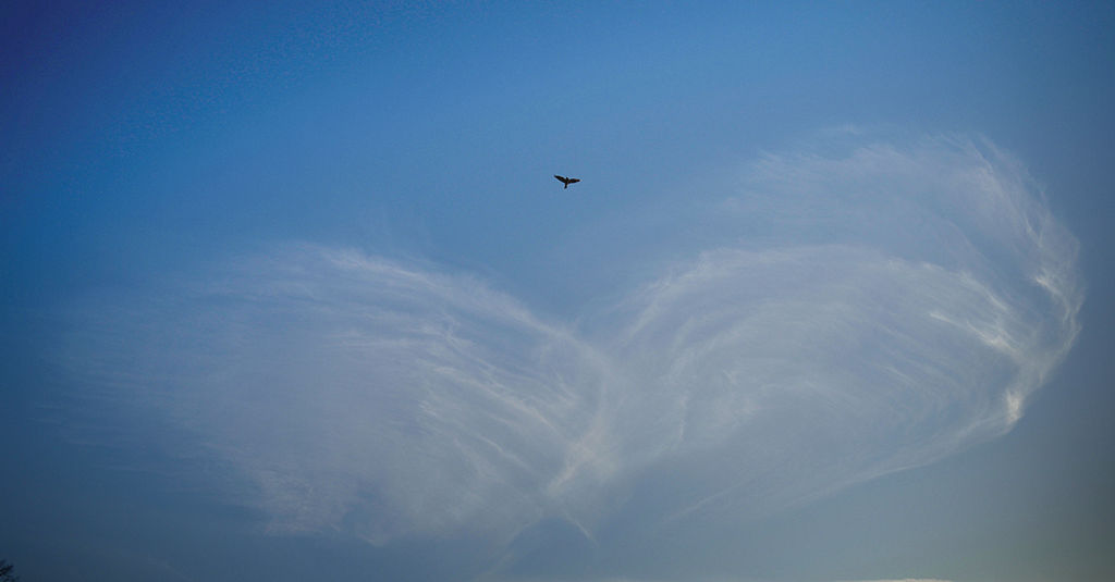
Hi Tony, a lovely image that one can look at a perfect Nature moment, or start finding symbolic interpretations - the ethereal clouds of the spiritual world mirroring the the bird of flesh and blood. - I was thinking of a way to show both her and the clouds a bit more clearly. I experimented with the ND gradient filter in NIK Color Efex, making the lower part slightly darker to give more contrast to the clouds, and the upper part slightly lighter to bring out the bird. What do you think - do the clouds lose some of their airy quality? |
Dec 13th |
 |
| 26 |
Dec 23 |
Reply |
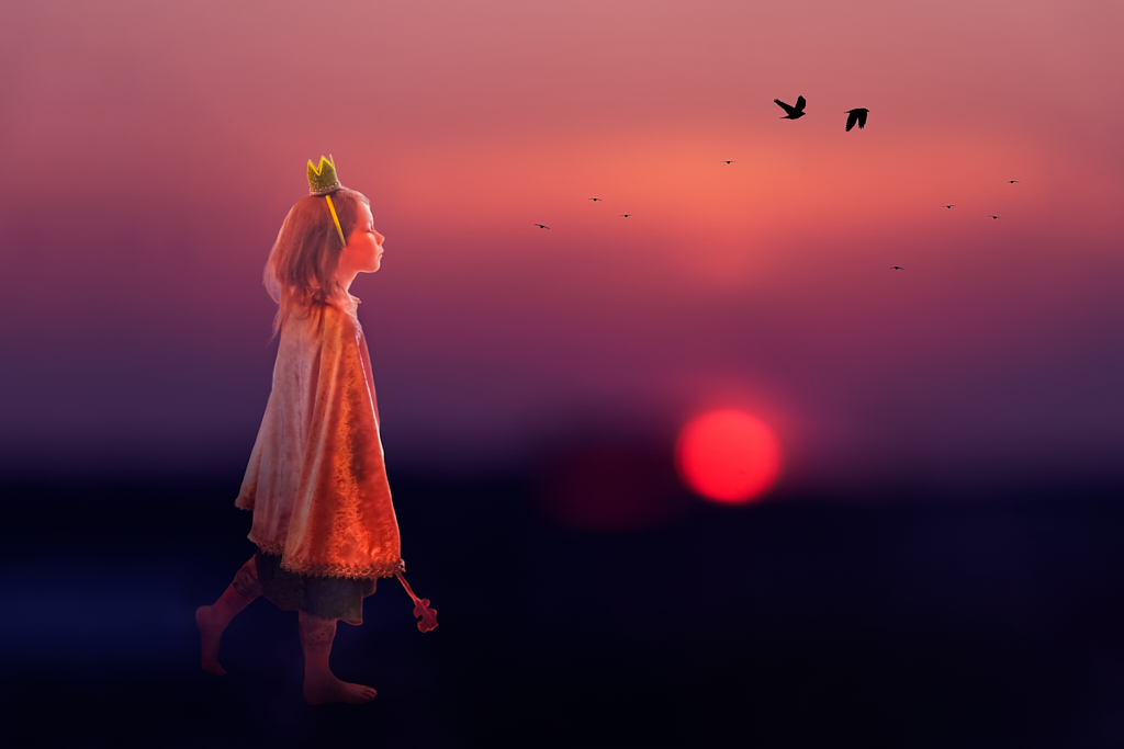
Thank you, Mervyn! She is now posing as December image in our next year's calendar. |
Dec 13th |
| 26 |
Dec 23 |
Comment |
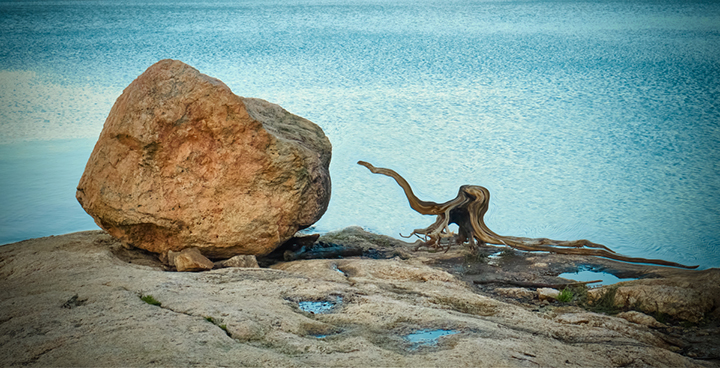
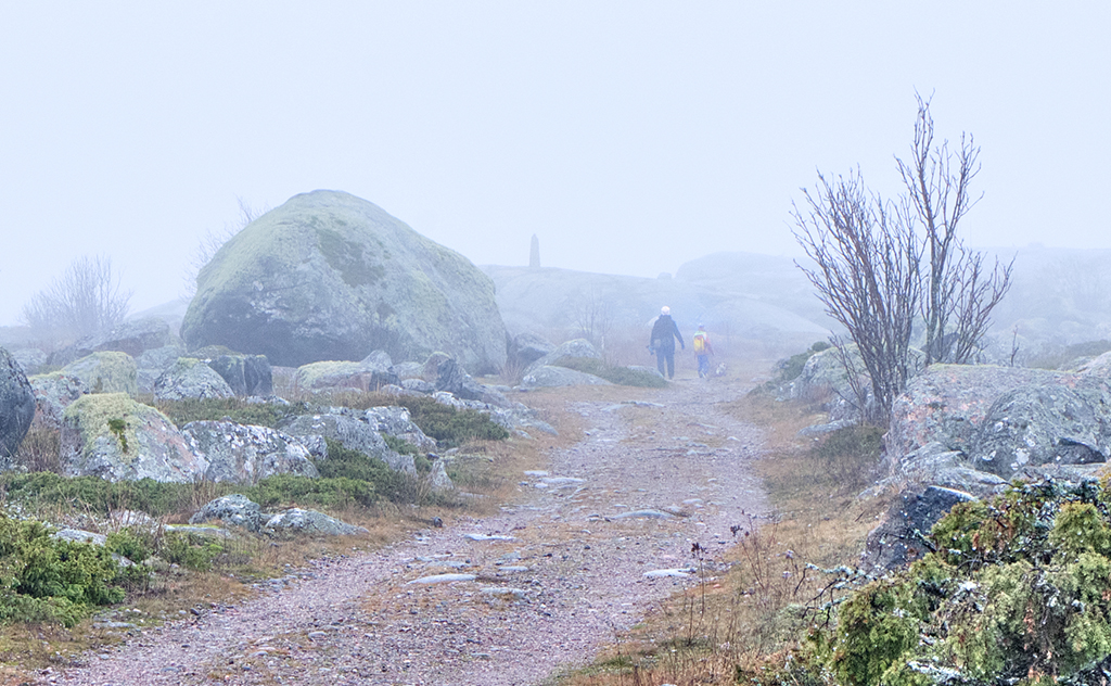
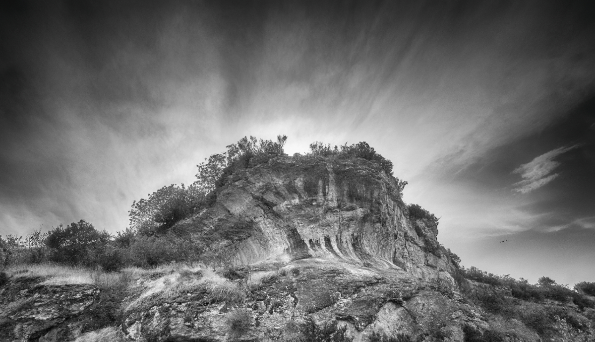
Hi Mervyn, it is such a treat to make virtual visits to spectacular places through images that make you feel like standing in the scene. The foreground-middle ground -background concept works perfectly, and the haze in the background adds to the depth and distance. I think that the tighter crop Jose suggested might add to the intensity without taking away the sense of space. |
Dec 10th |
| 26 |
Dec 23 |
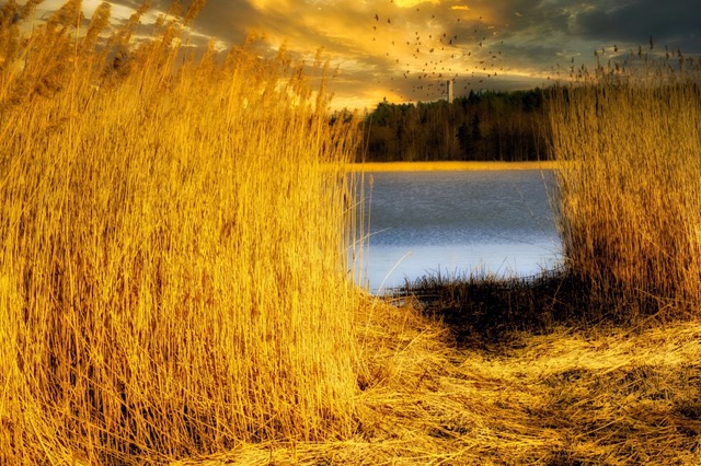
Comment |
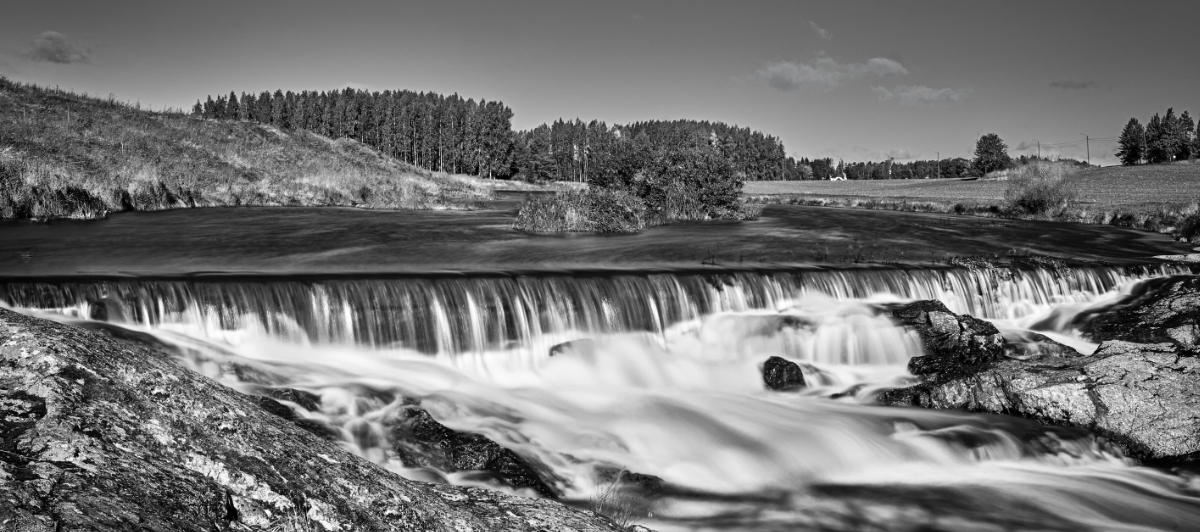
Hi Terry! I love the rich hues of green that come to life with the light that falls on the scene from the bright patch on sky, and the river that reflects it all. Like Jose says, it is a fine composition: a lovely image of a lovely landscape. |
Dec 10th |
| 26 |
Dec 23 |
Comment |
Jose, that must have been such a great experience!- I like the centered composition that makes him face the viewer so directly. I think that the narrow depth of field fits with it very well as it shows the textures of his wizened face against the blurred wrinkled skin. |
Dec 10th |
| 26 |
Dec 23 |
Comment |
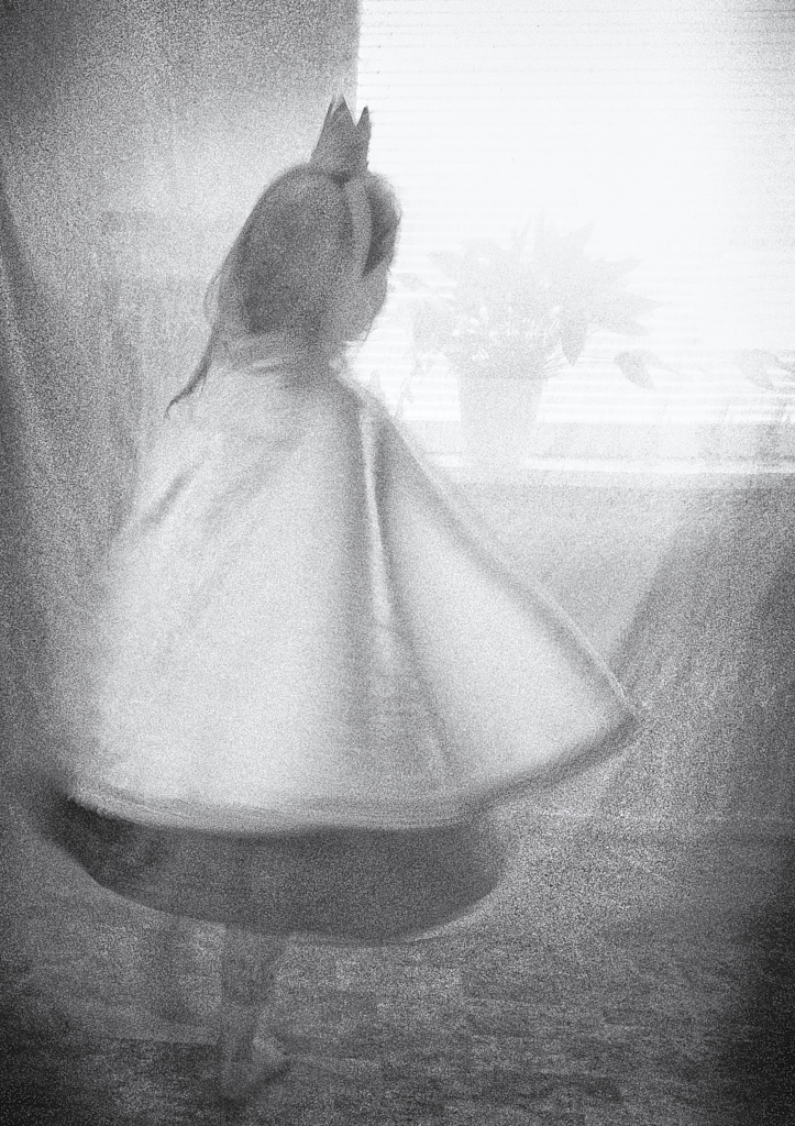
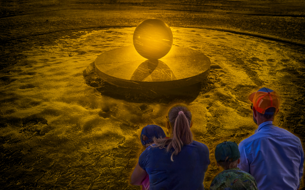
Hi Agnes! To me, the image gives the feel of a classic movie scene that is laden with anticipation: who is the first person to walk into the spotlight, and what happens next? The sleeping houses and the dark alleys with the sphere of light on the empty square make the perfect atmosphere, and I just love the way you make light fade into the shadows. |
Dec 9th |
| 26 |
Dec 23 |
Reply |
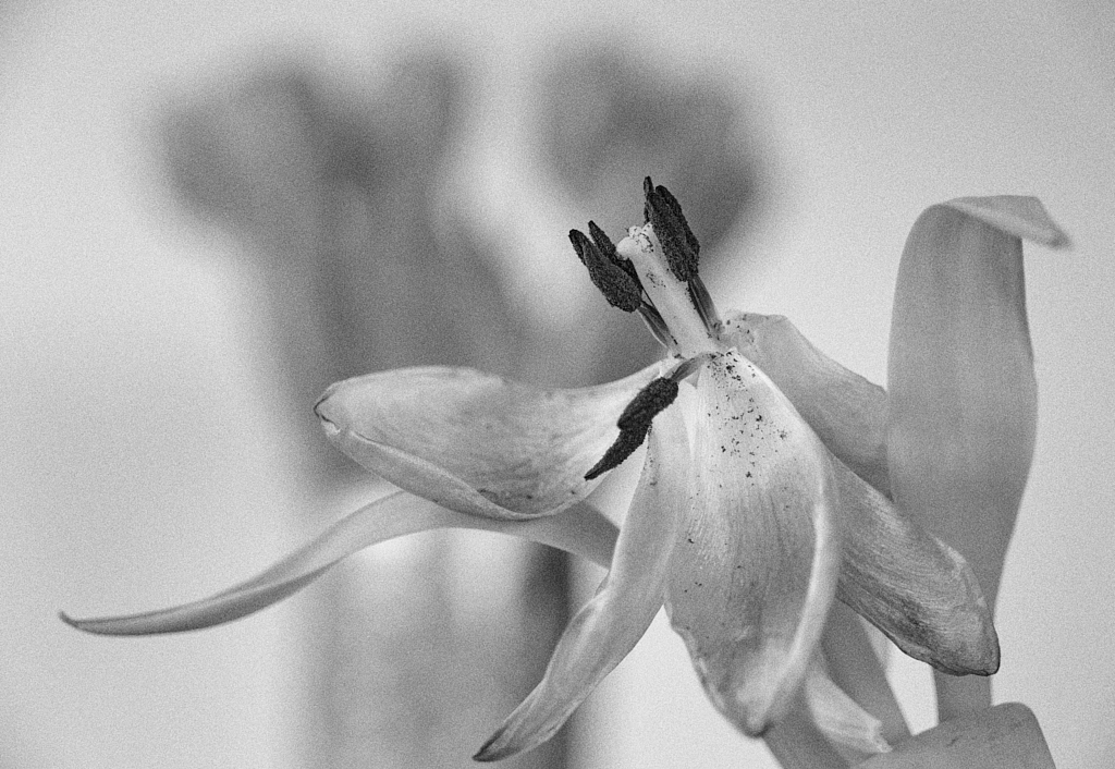
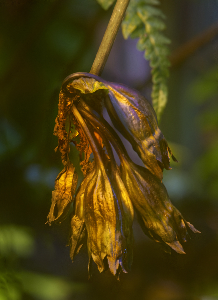
Thank you, Jose! The detail caught my eye, too! I made a version where it is cloned off, another where it was darkened (as well as the stem), and one with a wider crop including more of the leaf. I ended up with the present one, thinking that it might balance the bright greens in the background, and maybe add some depth. I think that you are probably right about removing it! |
Dec 9th |
6 comments - 6 replies for Group 26
|
| 47 |
Dec 23 |
Reply |
Thank you, Ed! I just love the adjustments - there is much more drama and mood now, and his face has come alive. I think that I will work on a print for the next club meeting on these lines. |
Dec 22nd |
| 47 |
Dec 23 |
Reply |
Hi Ed, I think that the present sky looks good, but I would still choose the lovely color version. |
Dec 22nd |
| 47 |
Dec 23 |
Reply |
Hi Ed, I think that the present sky looks good, but I would still choose the lovely color version. |
Dec 22nd |
| 47 |
Dec 23 |
Reply |
Thank you, Albert! I'll start working on that! |
Dec 18th |
| 47 |
Dec 23 |
Comment |
Hi Al! One of those decisive moments! The couple is totally absorbed in the conversation. They both seem to be looking at the expressive fingers of the young man, forming a triangle for the basis of the composition. The wobbly glasses painted on the background wall add to the drama. - I think that Jeff�s suggestion of a slight vignette would work very well. |
Dec 14th |
| 47 |
Dec 23 |
Comment |
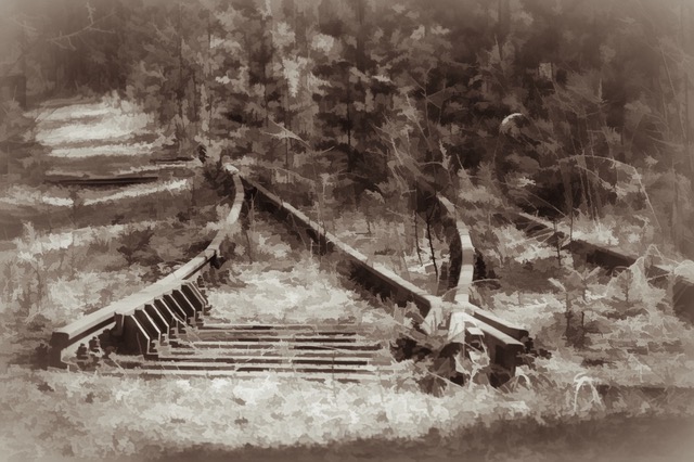
Hi Jeff, I think that you have revealed the essence of the scene with the forms and rhythm and contrasts. The zigzag diagonal and the placing of the black stones make an exciting composition, with the foremost stone off the groove, breaking the pattern. I love the way you have made it three-dimensional with the subtle greyscale tones. There also is a strange sense of movement: I can feel the stones sliding down. |
Dec 14th |
| 47 |
Dec 23 |
Comment |
Hi Ed, a powerful image where the three elements (if one counts the wall as one) carry a lot of symbolic meanings. Thank you for the background story! - I agree with the others about the sky. The black-and-white image is very good, but I cannot get my eyes off the warm glow of the golden dome and the rich hues of the stone. |
Dec 14th |
| 47 |
Dec 23 |
Comment |
Hi Robert, a documentary image that tells more than a chapter of words, about a culture and changing society. The child who plays in the middle of the desert in the tiny patch of shade gives the image the impact. I think that she could have looked very much the same in the old nomad days. - The depth of field works very well, keeping the camp in focus and showing the barren background and mountains slightly blurred in the distance. This is one of the places I have always wanted to visit. |
Dec 14th |
| 47 |
Dec 23 |
Reply |
Thank you, Robert! It was of those very rare moments when everything seemed to click. You a right about the big spot. It is removed in the version I added for Jeff, and I feel that it is certainly an improvement! |
Dec 13th |
| 47 |
Dec 23 |
Reply |
Thank you, Jeff! You are so right about the white patch! I tried originally to clone it off but the result looked so tacky that I decided to let it be. Now I tried another approach: I copied a patch from the background just on his left side, and pasted it on the bright spot. I used a small sharp eraser brush to remove the unnecessary parts of the mask to retain the rim light. I think that it worked ok for the most disturbing area? - I also removed the largest spot as Robert suggested. I feel that the image improved a lot. Thanks to you both! |
Dec 13th |
 |
4 comments - 6 replies for Group 47
|
| 54 |
Dec 23 |
Reply |
Thank you, Peggy! I think that there may be some budding stories in the images from the session! I am plsying with some ideas! |
Dec 28th |
| 54 |
Dec 23 |
Reply |
Thank you, Aavo, I can see that area and will work on it - I will post are revision with various borders (I have just figured out how to produce them in Affinity) when I get by the computer! |
Dec 16th |
| 54 |
Dec 23 |
Comment |
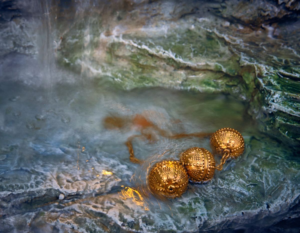
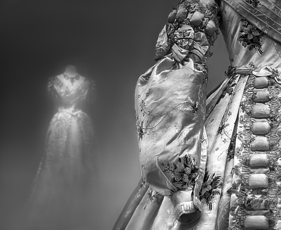
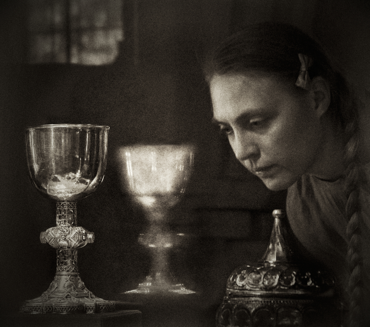
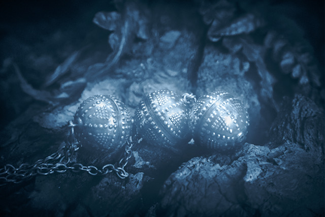
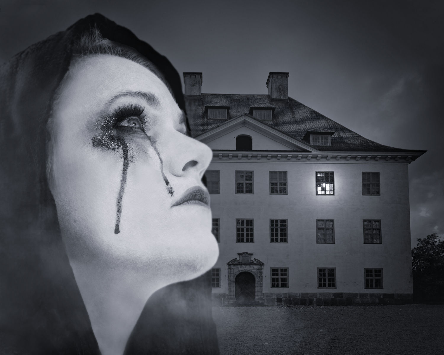
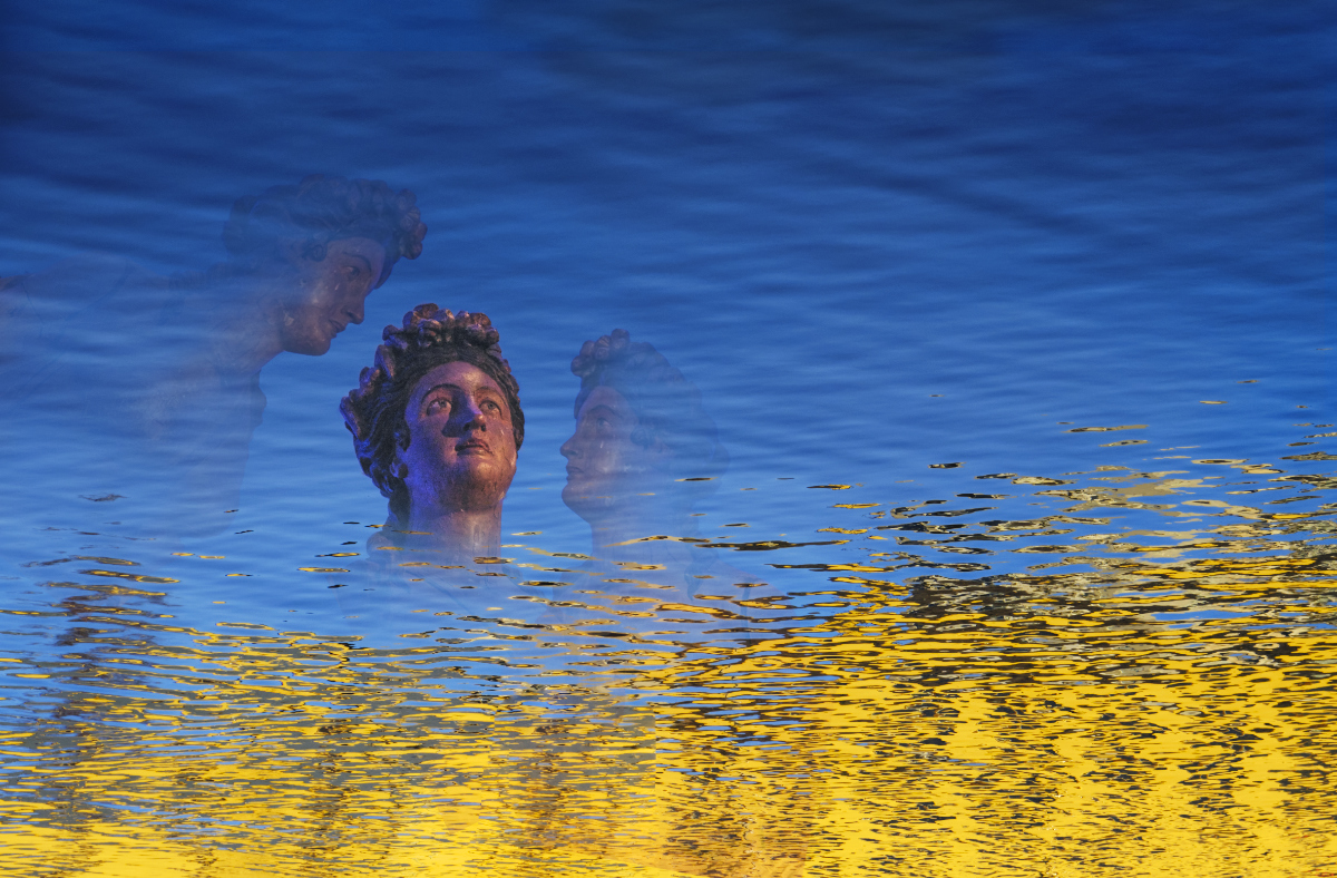
Hi Peggy, I totally agree with the others. This is a swan from a myth, absolutely beautiful, rising from a pool of jewels. The shapes in the background give her the look a heraldic figure any king would be proud of. -Thank you again for explaining your moves so clearly. |
Dec 14th |
| 54 |
Dec 23 |
Comment |
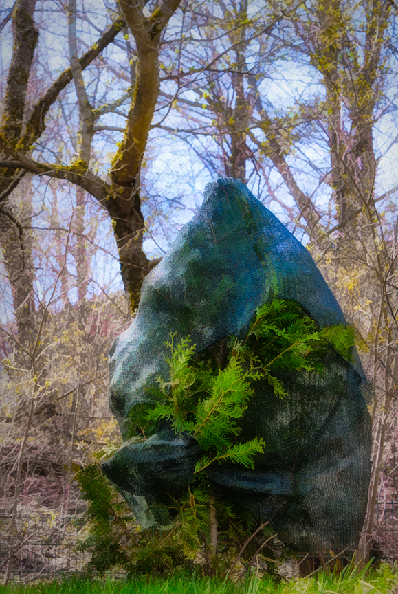
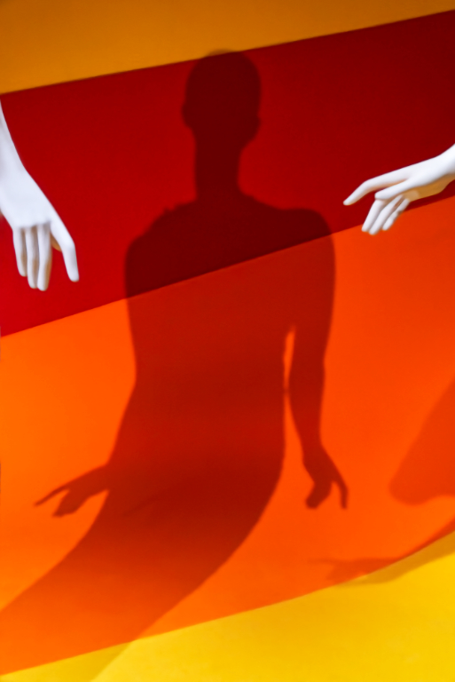
Hi Aavo, what an interesting surreal image with a visually very attractive composition. The oval frame is perfect for the image. - I can find a feministic message in showing the nudes as petals of an exotic flower, with the hands reaching to grab them. - I agree with Maria about the color of the stem and the leaves. What about giving the stem more of a green hue, or making it same color as the leaves? |
Dec 14th |
| 54 |
Dec 23 |
Comment |
Hi Maria, I join the others admiration! There is something in the muted soft colors that give a feeling of a dream: the "unrealistic" car would fit in beautifully. The way you have the car turn on the road makes one feel that it is slowly moving. I like Alan�s suggestion for the crop - I think it somehow gives more space for the approaching car. |
Dec 14th |
| 54 |
Dec 23 |
Comment |
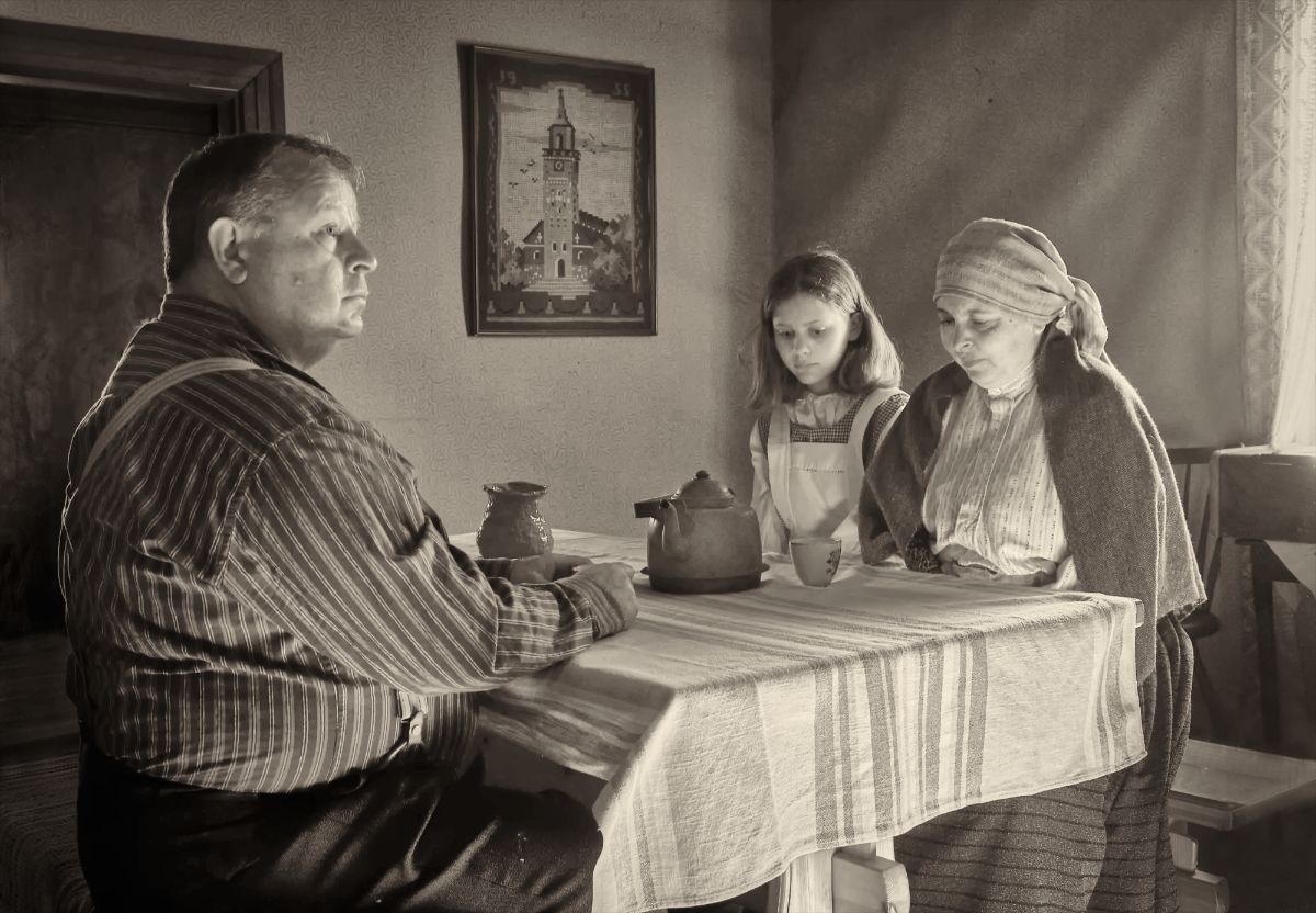
Hi Alan, a suggestion of one more variation: what about removing the house on the left that has a lot of sharpness, contrast and details that may draw attention, and leaving only the more subtle house on the right to give context to the story. The body language of the characters is very revealing. The defiant attitude of the son clashes with the anger of the mother who clearly has not forgiven him yet. The bleak colors give just the right mood to the encounter. |
Dec 14th |
| 54 |
Dec 23 |
Comment |
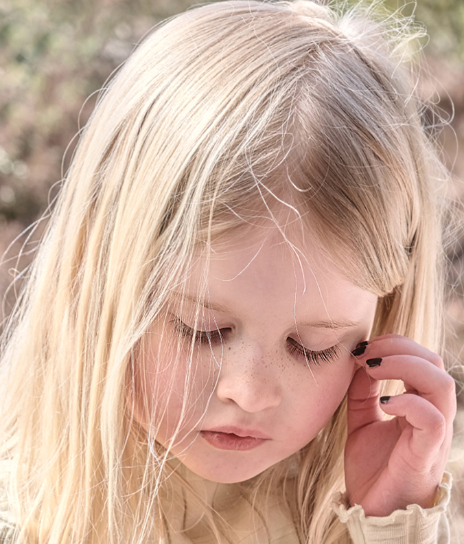
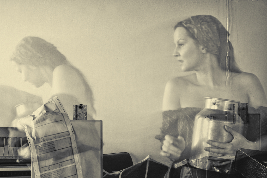
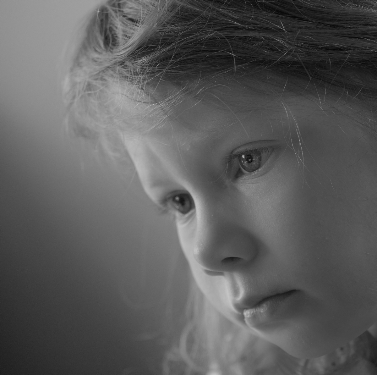
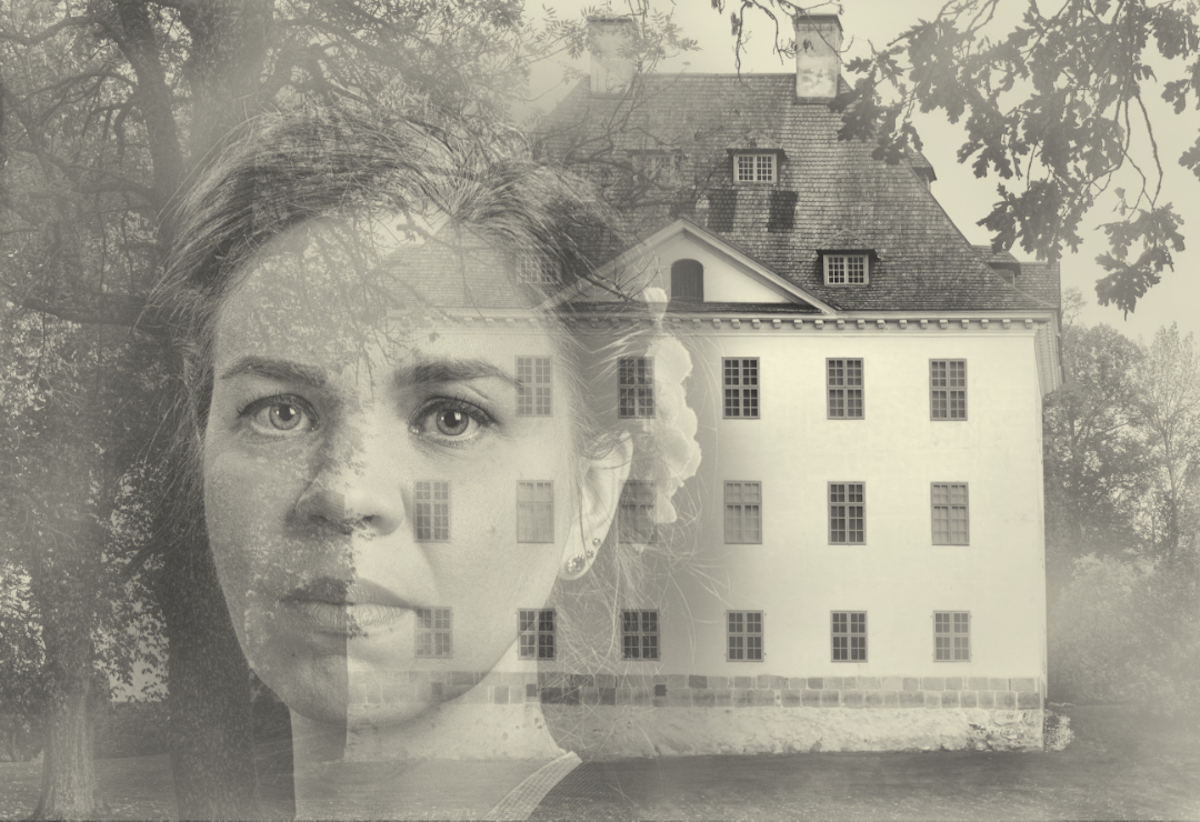
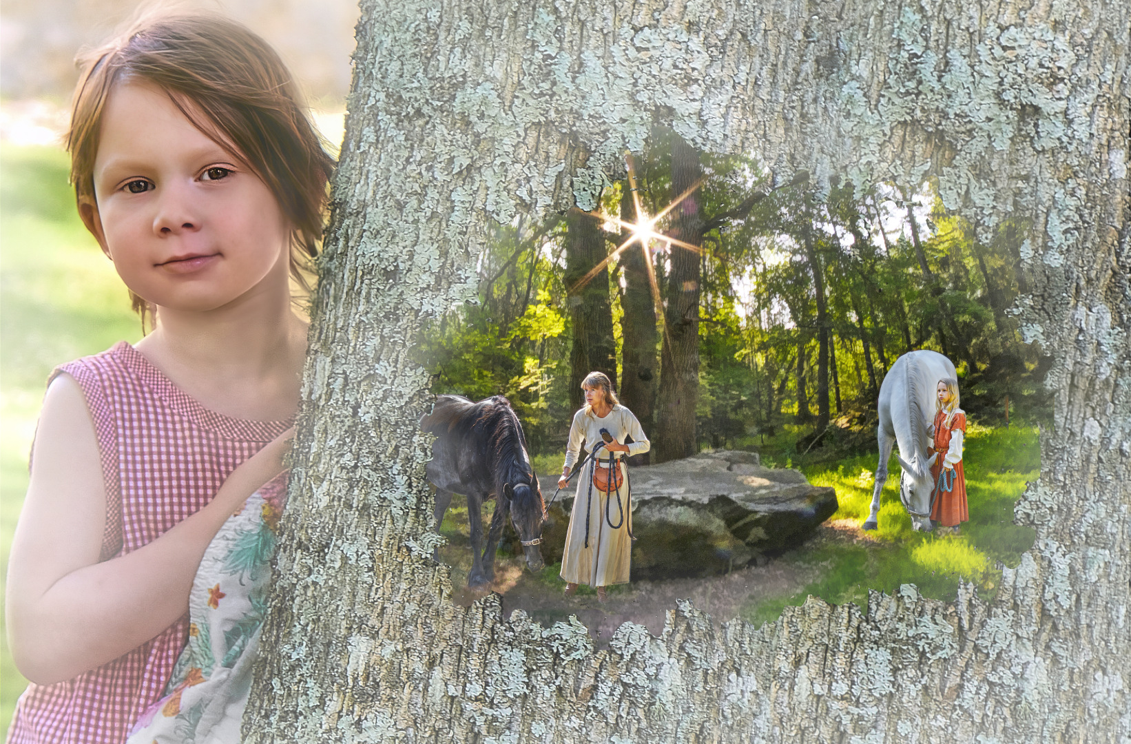
Hi Brad, your daughter is so lovely! I think that there is also a likeness in the bone structure and the shape of the face of the two ladies whom you have blended in one in such masterful way. It is as if the painting came into life: the lady turns up her gaze towards the viewer and smiles that wonderful enigmatic smile. I am certain that your daughter will love the portrait. - I think that the fingernails are a perfect touch. |
Dec 14th |
| 54 |
Dec 23 |
Reply |
Thank you so much, Alan! - I am afraid that the border is not quite that simple to create in Affinity, but now I know five different ways to do that. It will sure come handy!
P.S. Thank you for the Witches Brew recipe! |
Dec 14th |
| 54 |
Dec 23 |
Reply |
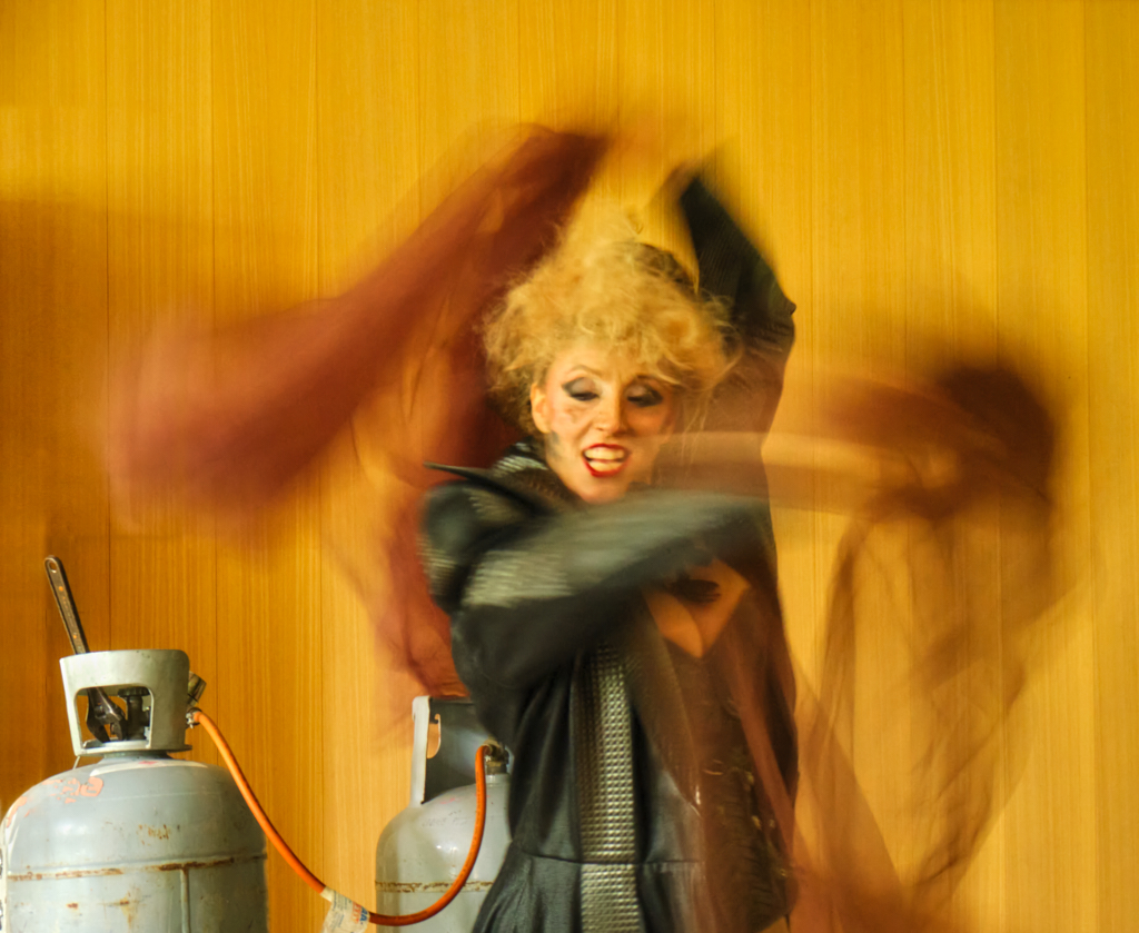
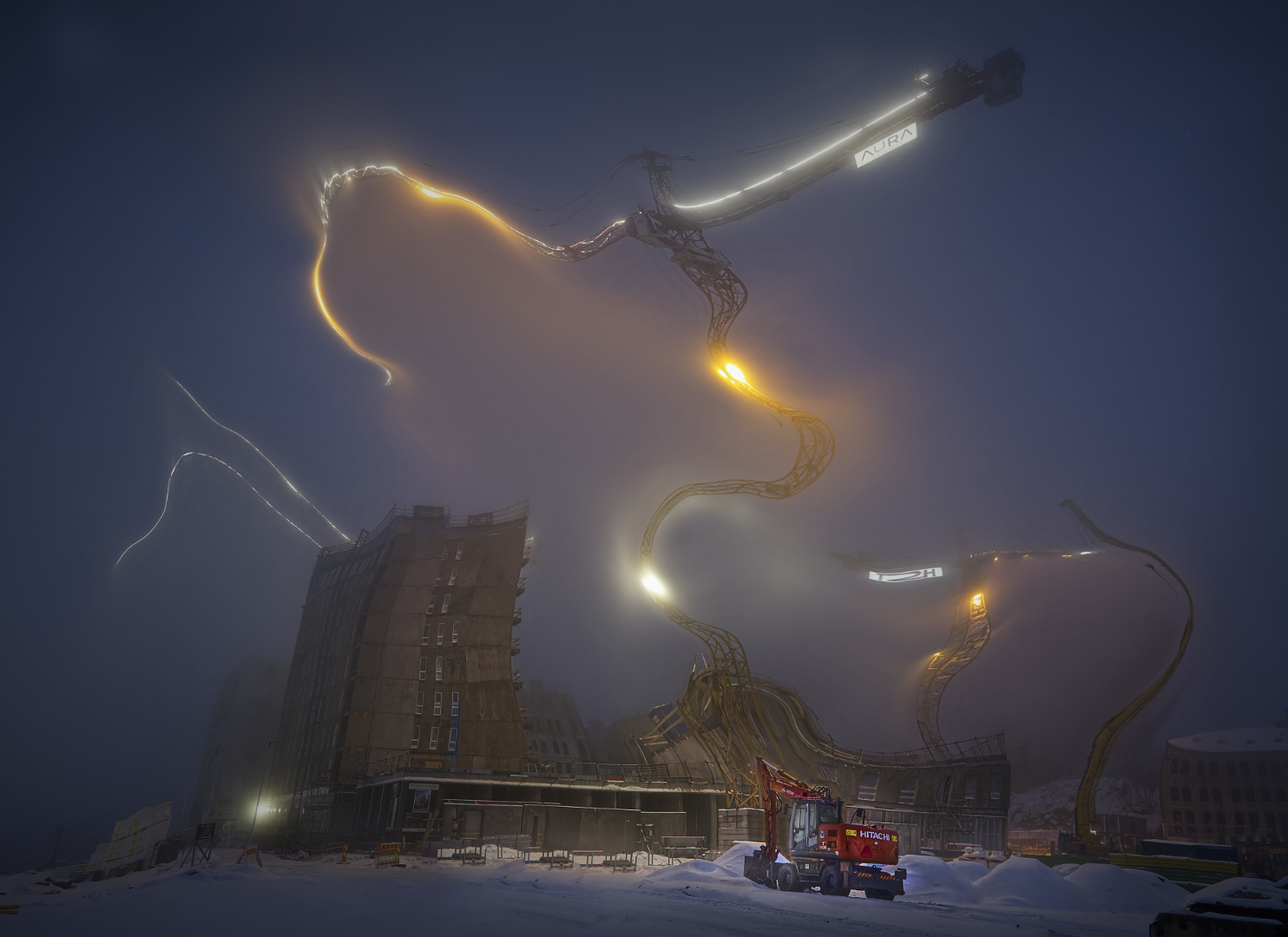
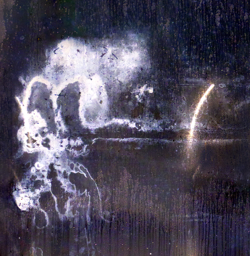
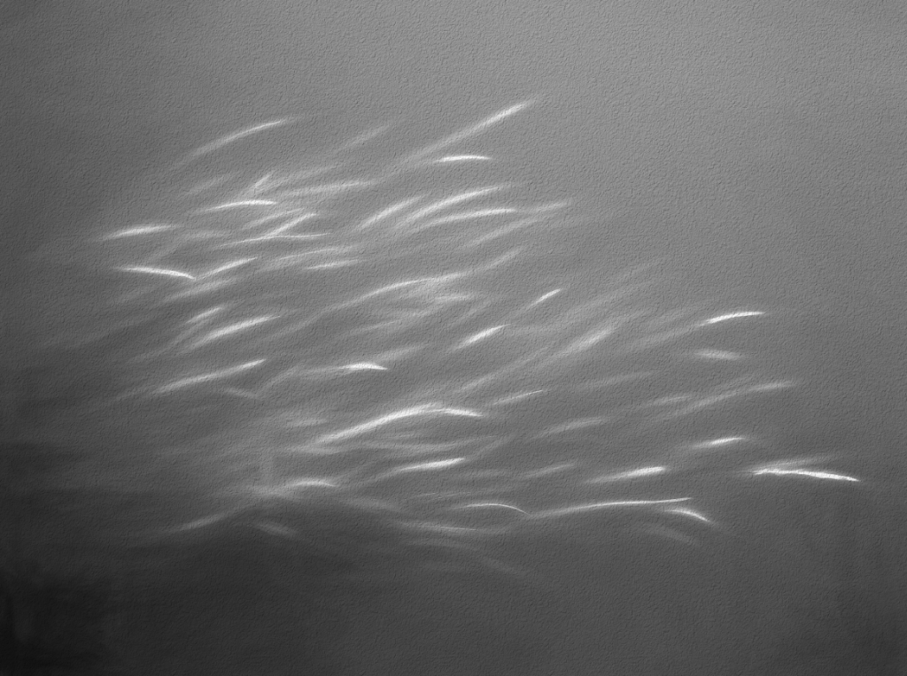
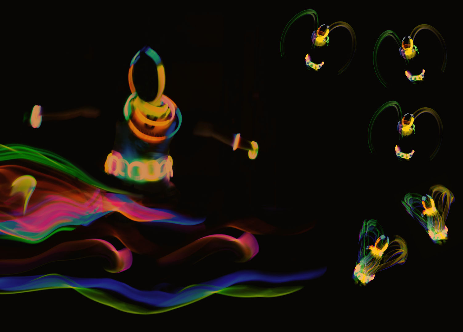
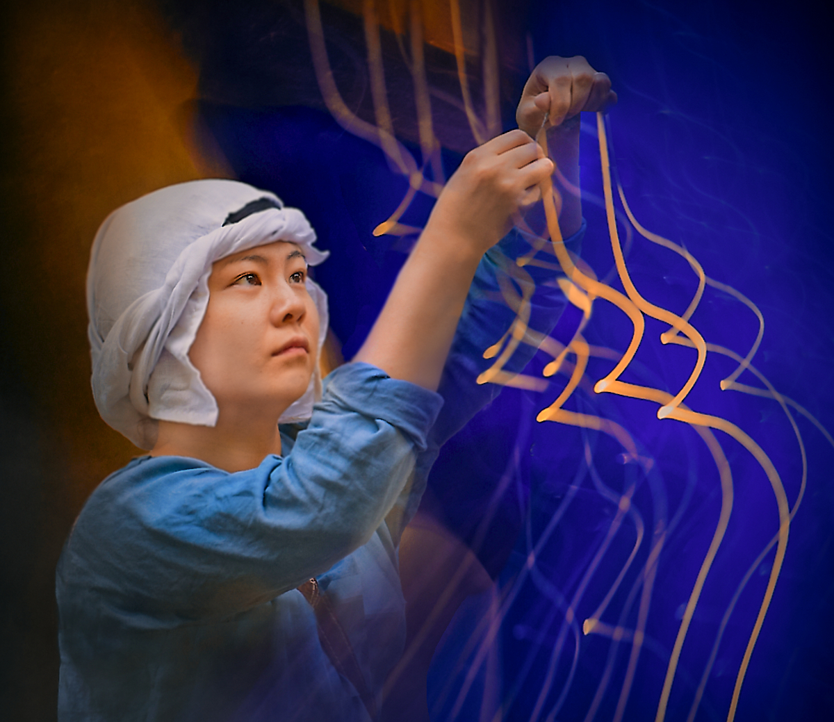
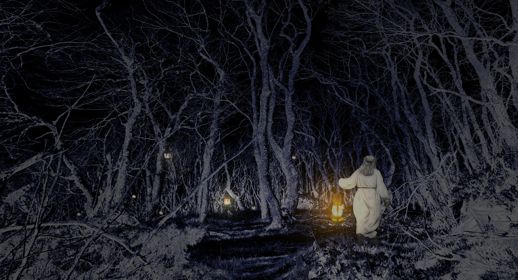
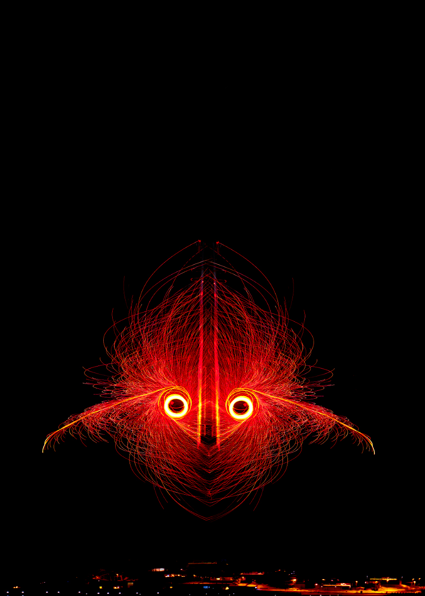
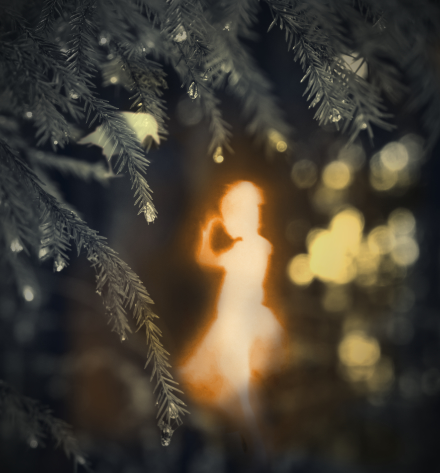
Thank you, Brad! I love the element of chance in the light painting images - and combining them together multiplies the opportunities. - I have a story in mind maybe for next month from images of the same session. |
Dec 14th |
| 54 |
Dec 23 |
Reply |
Thank you, Maria! You are right - I will try to see if I can improve it. There is a problem with sharpness overall, as I forgot to bring my tripod to the session. Luckily my models are always ready for glow stick games, so I think that it will be easy to reproduce the exercise. |
Dec 14th |
5 comments - 5 replies for Group 54
|
15 comments - 17 replies Total
|