|
| Group |
Round |
C/R |
Comment |
Date |
Image |
| 26 |
May 23 |
Reply |
Thanks, Terry! This has been a very useful exercise! |
May 13th |
| 26 |
May 23 |
Reply |
Thank you, Tony, I'll try that! |
May 13th |
| 26 |
May 23 |
Reply |
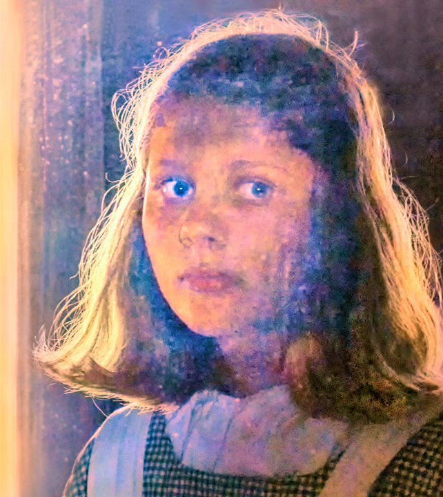
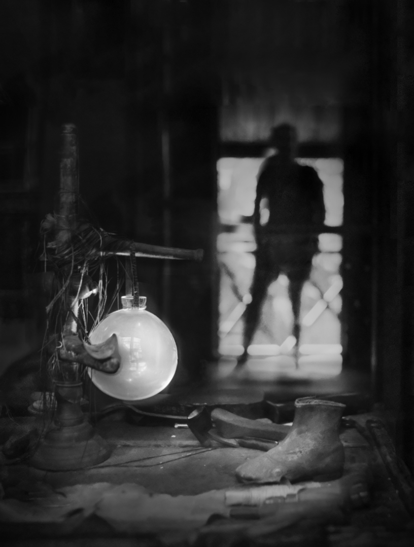
Hi Agnes, here is a color version from the frame that had the sharpest foreground ( + all I could do on sharpening). I did not try to switch the figure in the doorway as the original one did not look as good in color as in BW. What do you think? - I think that my favourite is Remake 2. |
May 13th |
 |
| 26 |
May 23 |
Reply |
Thank you, Jose! I added two remake versions on my reply to Terry. I like the second one myself - I think that the balance between mystery and miracle and the more-in-focus details is better. What do you think? |
May 13th |
| 26 |
May 23 |
Reply |
Thank you so much, Bob! I made two different version to correct the focus issue, and posted them into my reply to Terry. What do you think? |
May 13th |
| 26 |
May 23 |
Reply |
Hi Mervyn, I like the BW version, too, myself. I added two versions of the remake in the reply to Terry's comment - do you think that they corrected the issue, and which one do you like better? |
May 13th |
| 26 |
May 23 |
Reply |
|
May 13th |
 |
| 26 |
May 23 |
Reply |
|
May 13th |
| 26 |
May 23 |
Reply |
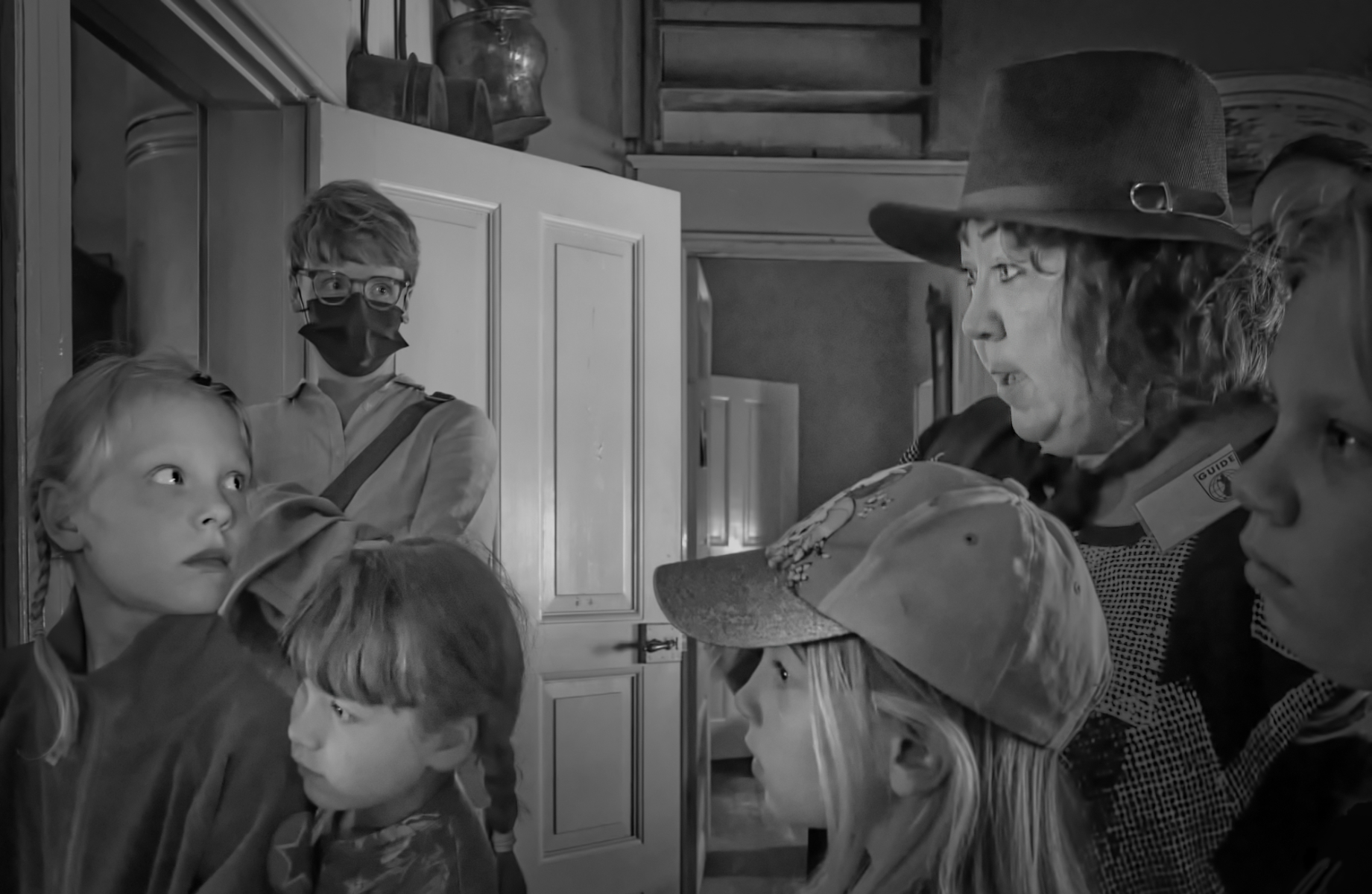
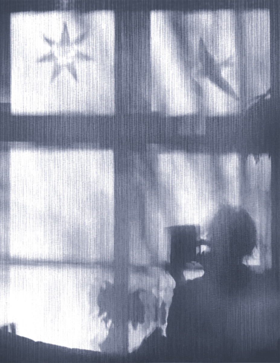
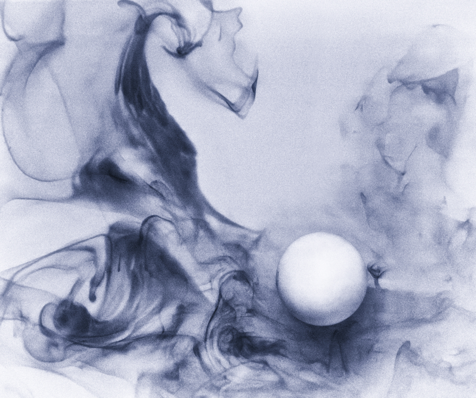
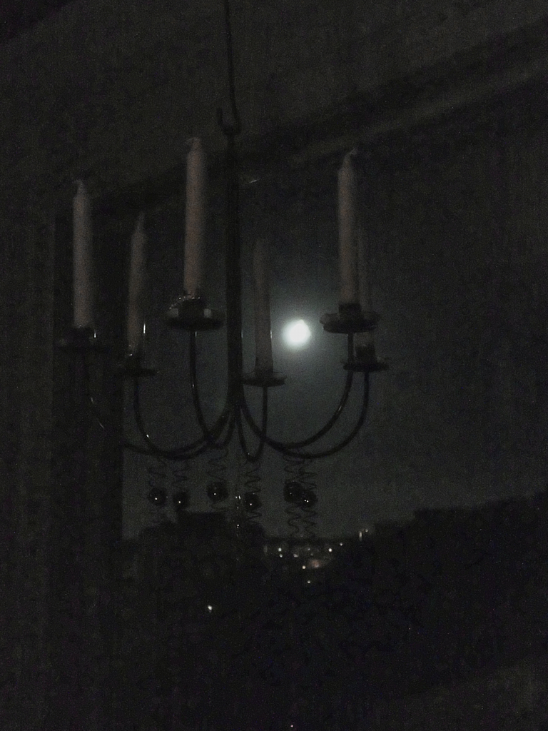
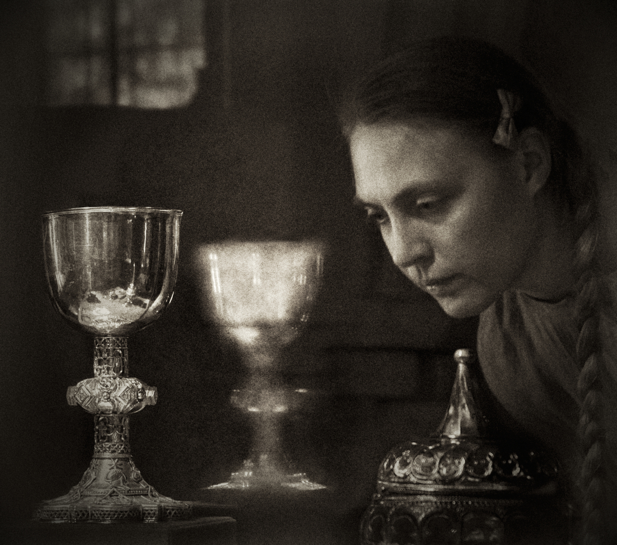
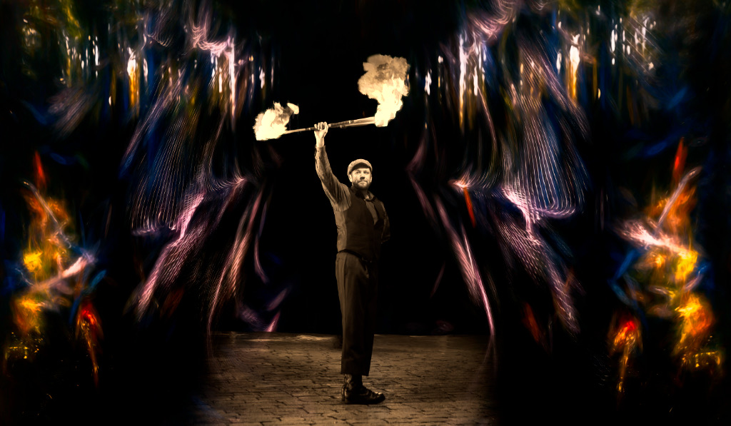
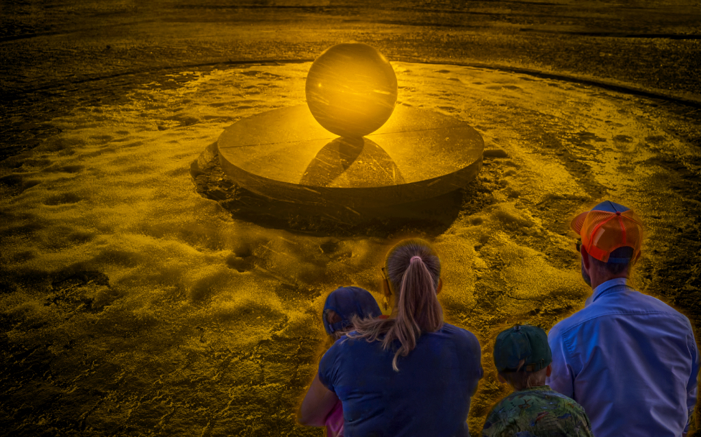
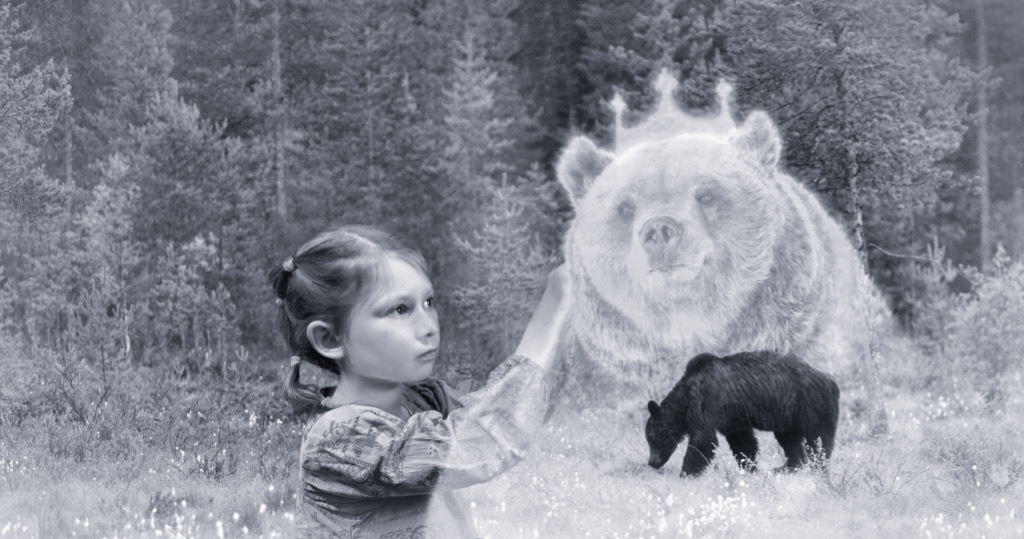
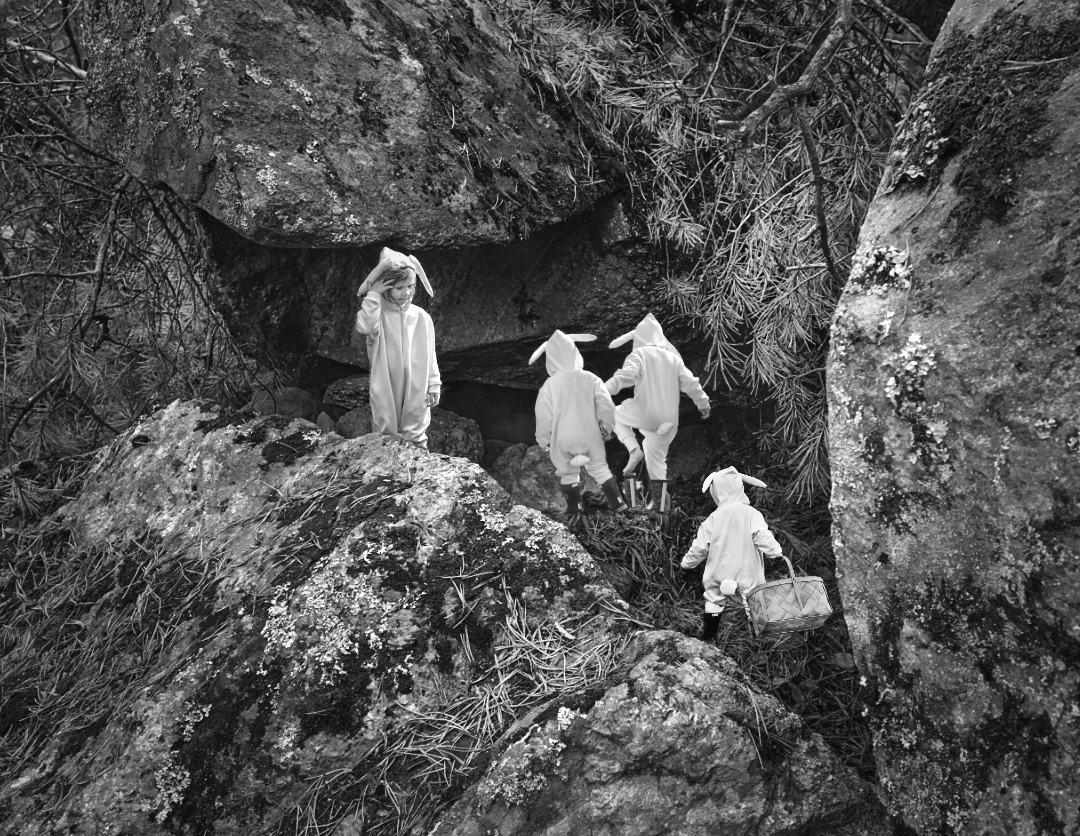
Hi Terry, thank you! I love the artificial leg idea! - All of you commented on the lack of an area in sharper focus, and I could see the problem clearly myself right away. I took yet another frame where the foreground was in better focus and added that part as a layer on the original - it was from a slightly different angle, but I think that it melded in quite well.
There are two versions: Remake 1 with the new foreground, and Remake 2 where I kept the original shoe and work table with extra local clarity and unsharpening mask. There is also some diffuse glow in the glass sphere. I like Remake 2 better myself - what do you think? |
May 13th |
 |
| 26 |
May 23 |
Comment |
Thank you all, I totally agree about the sharpness issue - I'll start working on the next version! |
May 10th |
| 26 |
May 23 |
Comment |
Thank you all, I totally agree about the sharpness issue - I'll start working on the next version! |
May 10th |
| 26 |
May 23 |
Comment |
Thank you all, I totally agree about the sharpness issue - I'll start working on the next version! |
May 10th |
| 26 |
May 23 |
Comment |
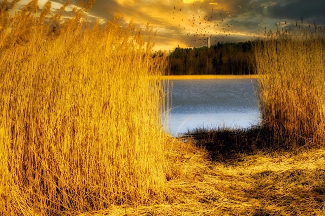
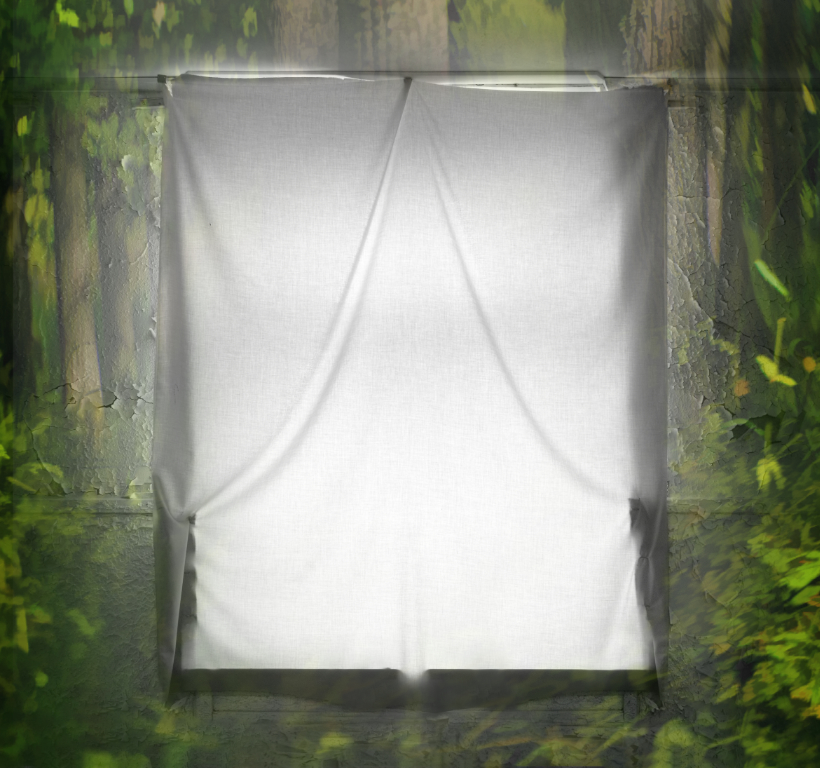
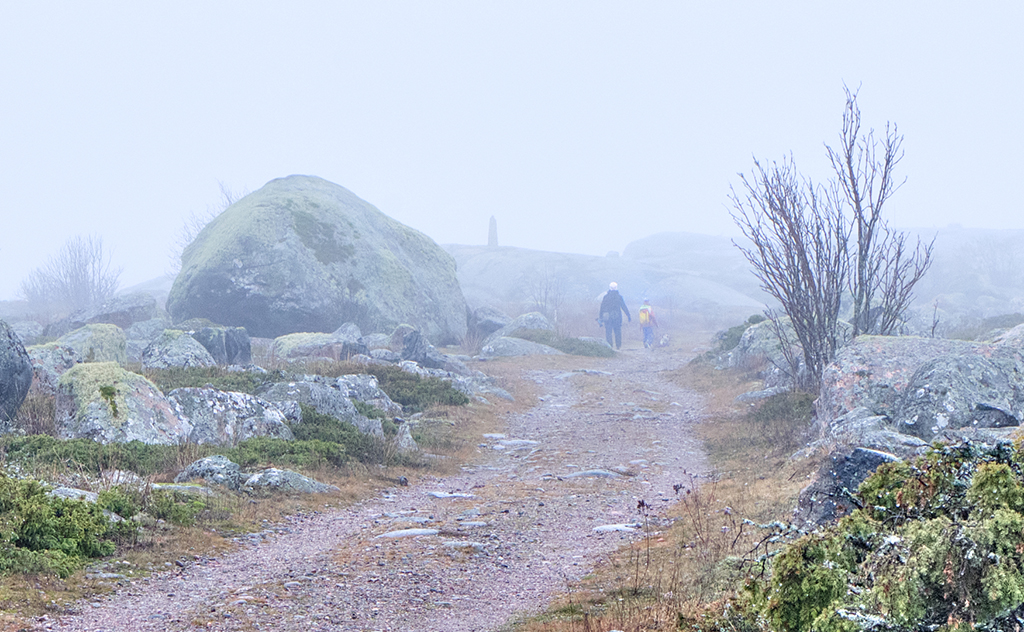
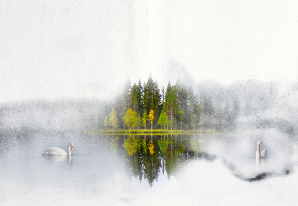
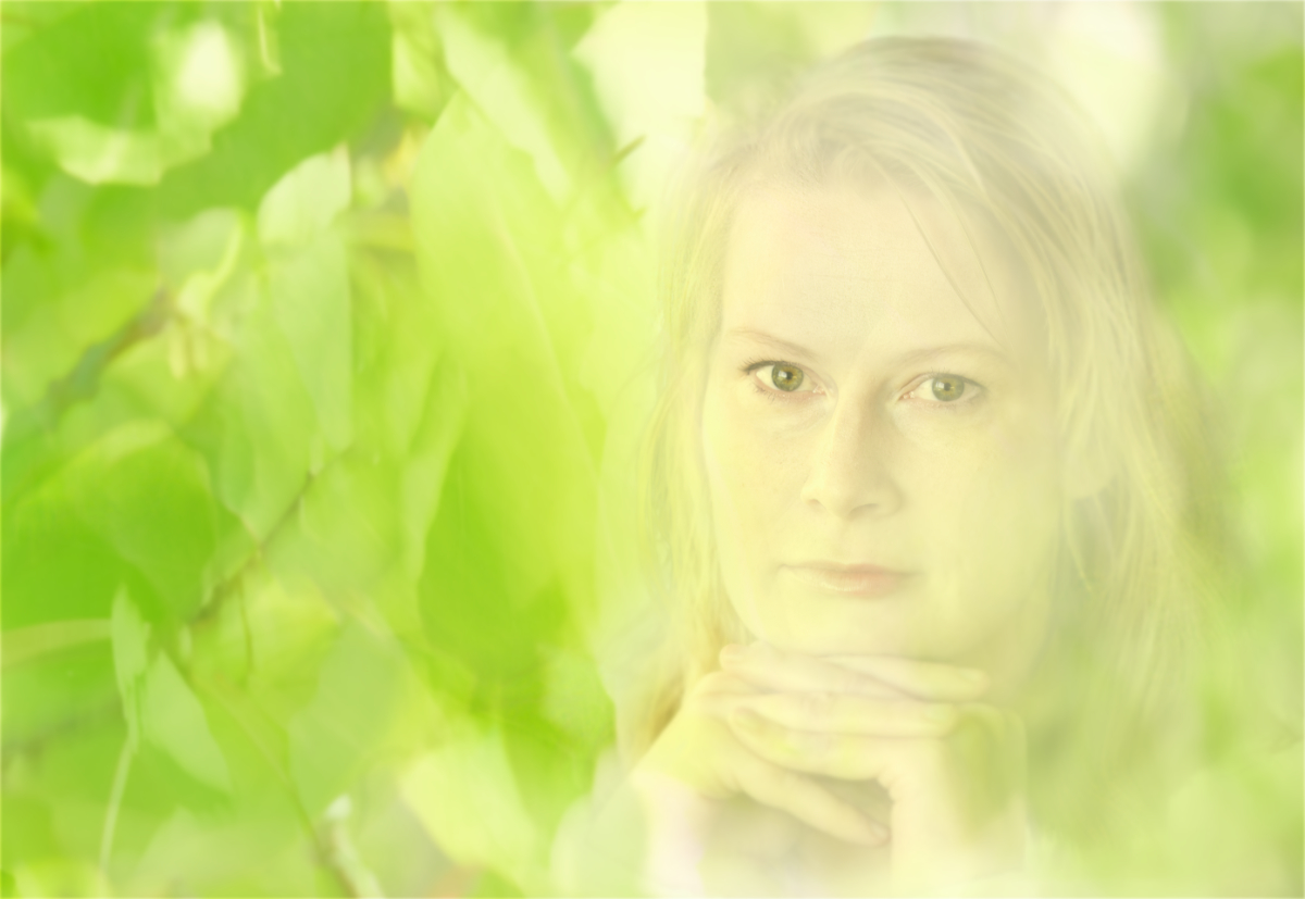
Hi Agnes, this is like walking into a misty fairytale forest, with the soft colors and the absolutely beautiful light. I love the tree trunks in the foreground: they make one feel like walking from the shadows of the trees into a clearing full of light. |
May 9th |
| 26 |
May 23 |
Comment |
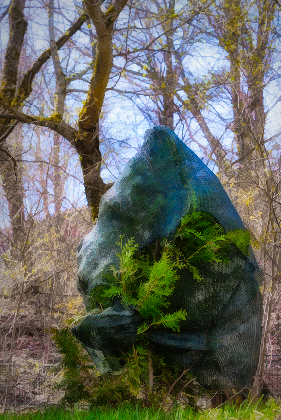
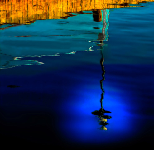
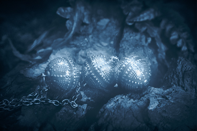
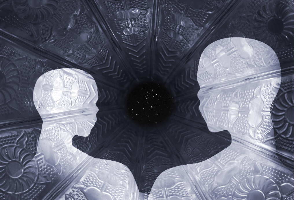
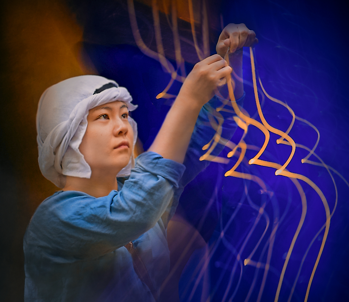
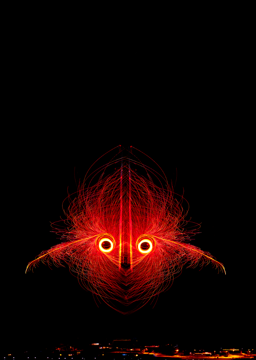
Hi Jose, an impressive image - my first intake was the head of an alien robot in a sci-fi story. I love the way you have made the blue and golden light glow on the surface, and the centered symmetric composition works well. |
May 9th |
| 26 |
May 23 |
Comment |
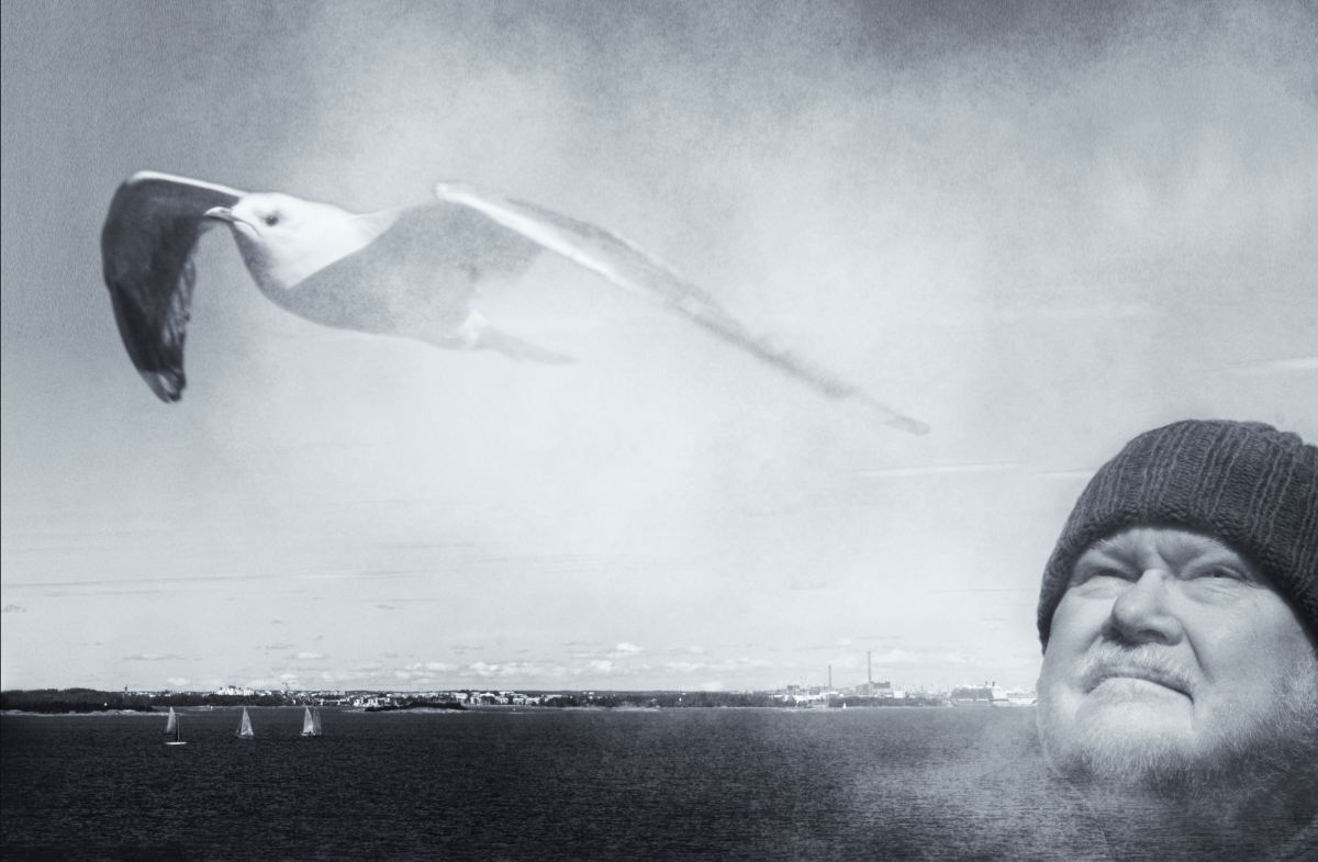
Hi Terry, a great shot! You caught him just at the critical moment, and those piercing eyes seem to stare right through you! The tilt of the wings gives him an extra sense of motion. His beautiful coloring makes an effective camouflage that matches so well with the background that it is hard to get him separated. Thank you for sharing in detail the post production scheme! - I wonder if a slightly stronger blur and vignette effect would look unnatural? |
May 9th |
| 26 |
May 23 |
Comment |
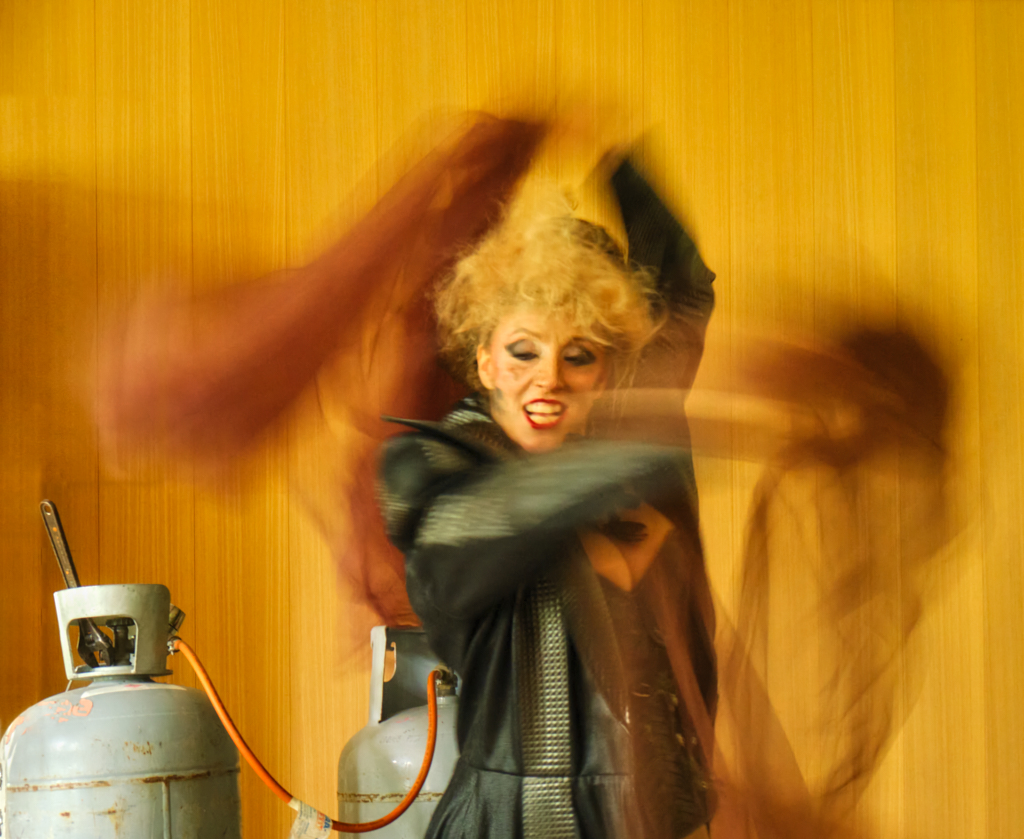
Hi Bob, what an adventure! The image mediates effectively the harsh conditions where the tiny church stands there against the huge forbidding mountain. The snow and the clouds add to the story, and I think that your post-processing has worked very well. I think that it might look great also in BW? |
May 9th |
| 26 |
May 23 |
Comment |
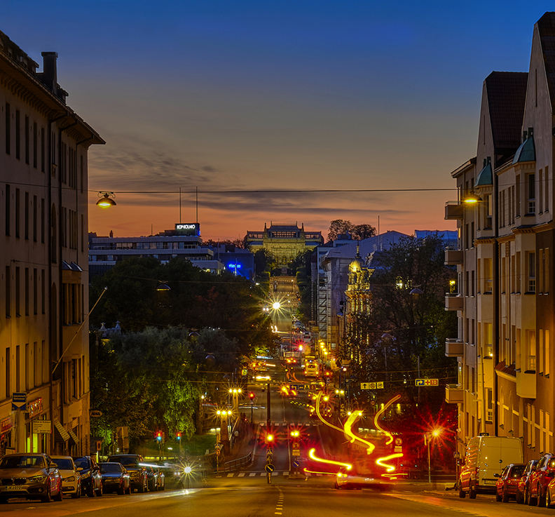
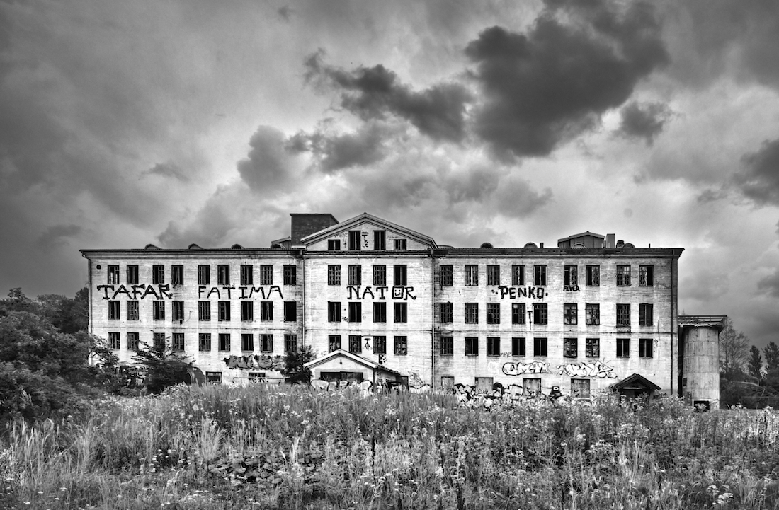
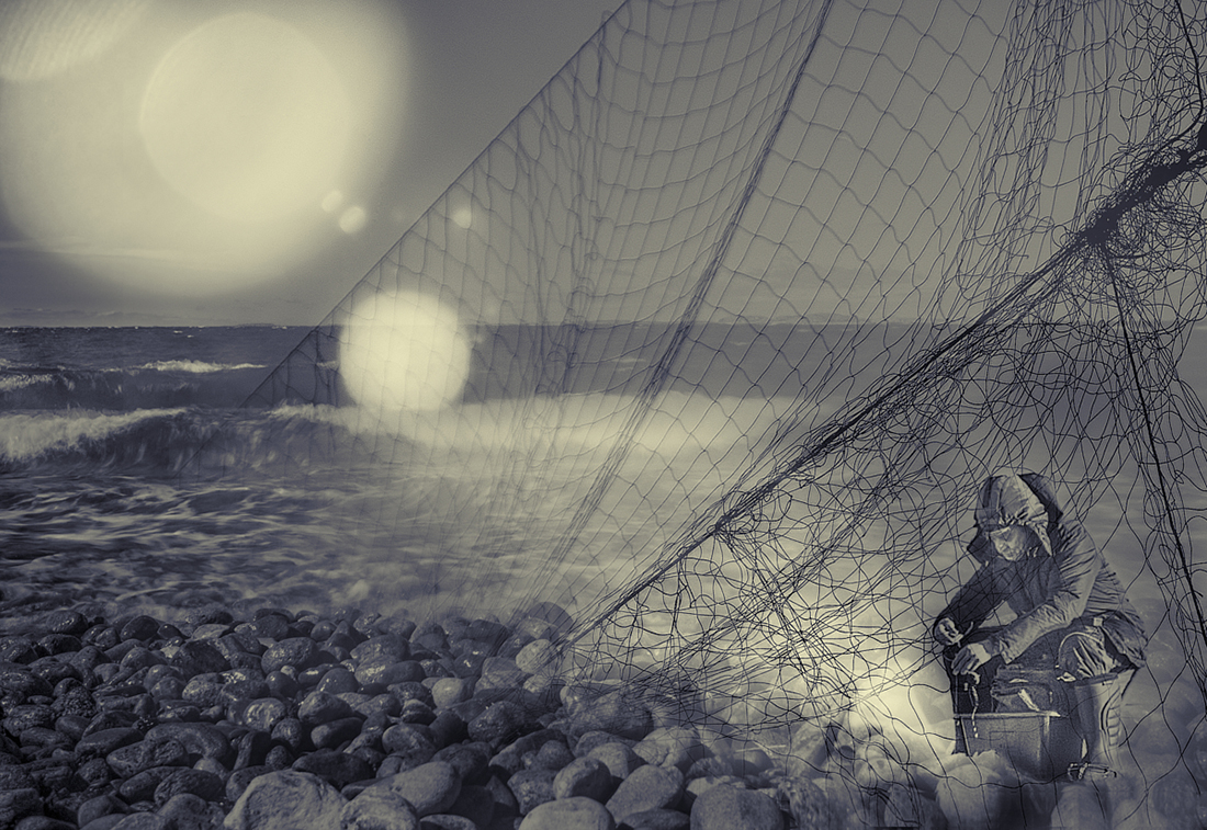
Hi Tony! I think that you have here a fine street photo full of atmosphere. The shoppers that bring life to the scene are a great catch, especially the one of who bends to inspect the products. The passage from the shadows to the inviting warm light is lovely. I feel that the richness of details creates much of the atmosphere. - Bob's crop concentrates on the essentials of the scene and brings them out very well, but I think that some of the sense of depth of the original may be lost? I wonder if a slight vignette would work in directing attention more to the center part if that is needed? |
May 9th |
 |
| 26 |
May 23 |
Comment |
Hi Mervyn, after struggling with another lighthouse image myself, I really can appreciate how you have caught the beam just perfectly. - Is it a passing ship that is lit by the beam in the bottom right corner? I think it gives a special meaning to the image, and also makes a nice balancing element. I love the way the palm trees are lit from below and show against the dark sky. |
May 9th |
9 comments - 9 replies for Group 26
|
| 47 |
May 23 |
Reply |
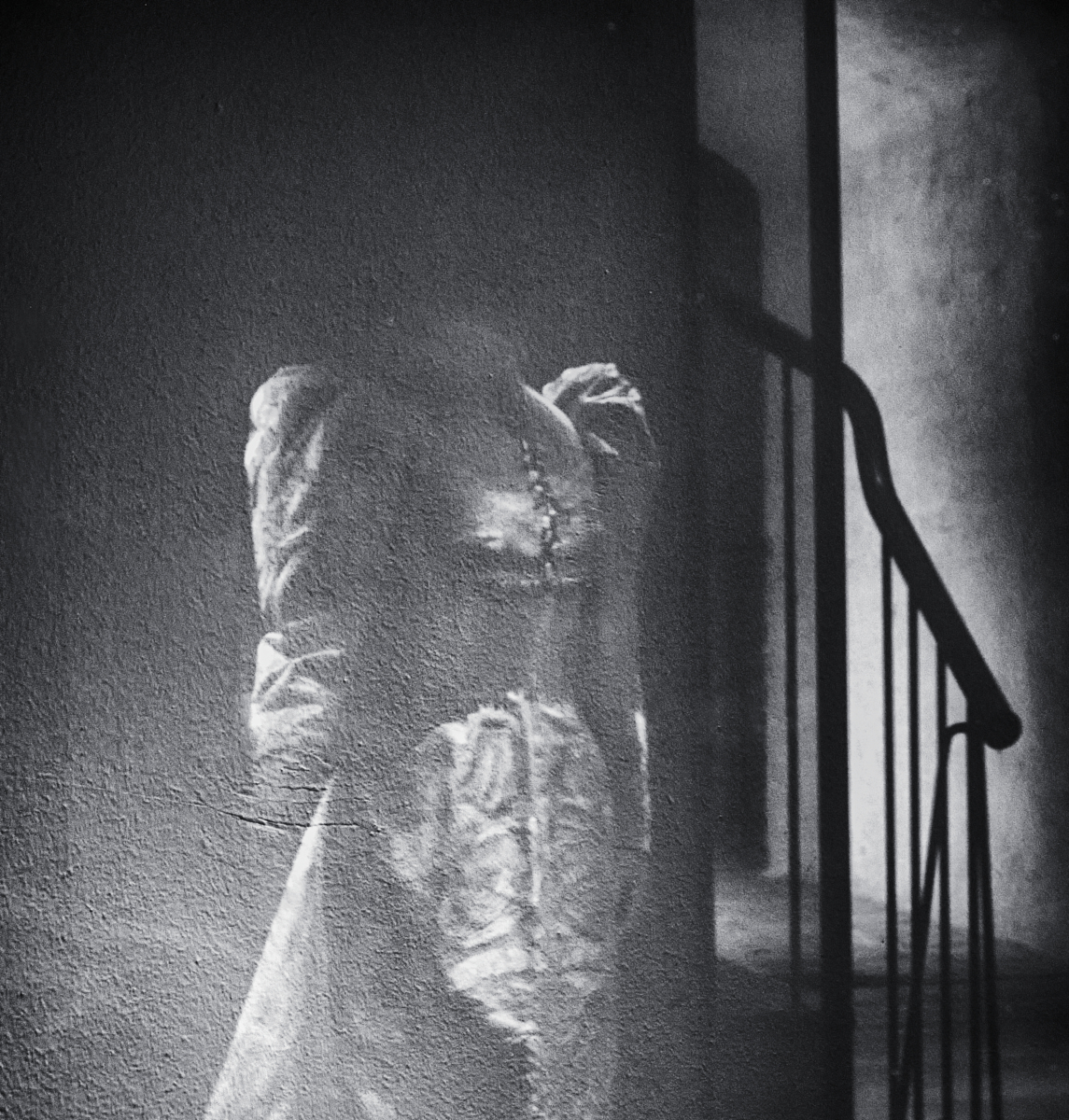
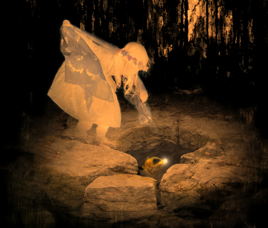
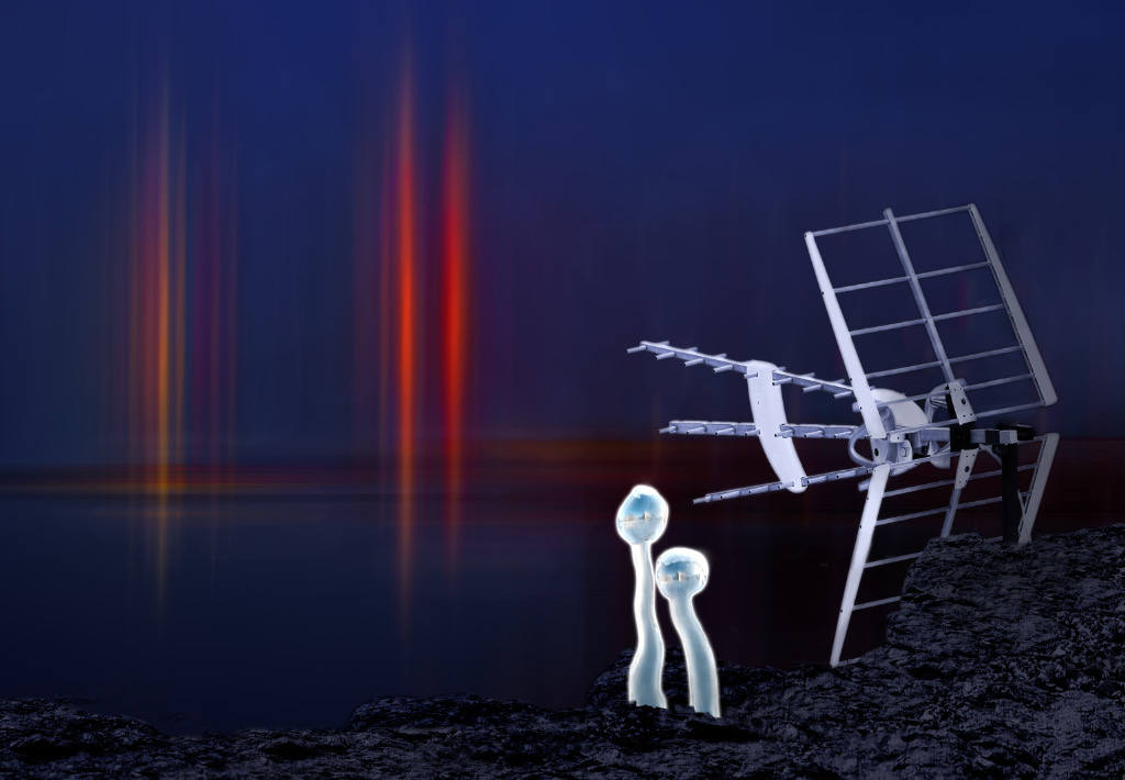
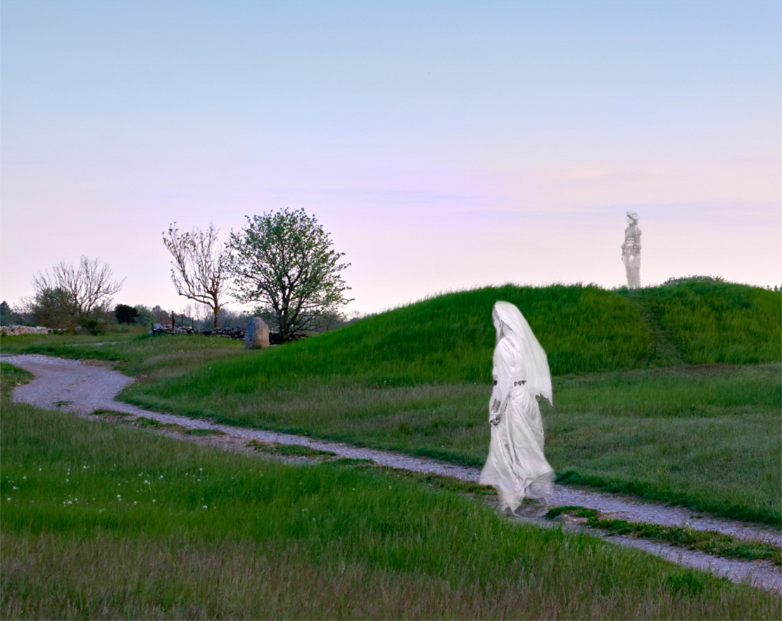
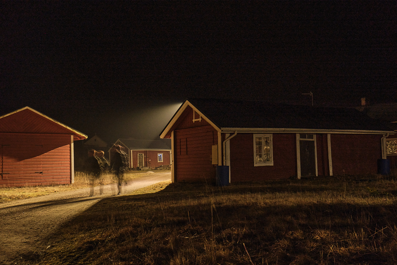
Thank you very much, Jeff! I think that these are both great ideas - the ghosts come out much clearer now, and the scene is a lot calmer. - I'll try if I could find a way to keep the church on the hill though. I think that it may add to the story (which may be just that for me it anchors the scene to time and place and the memory of the experience.) |
May 14th |
| 47 |
May 23 |
Comment |
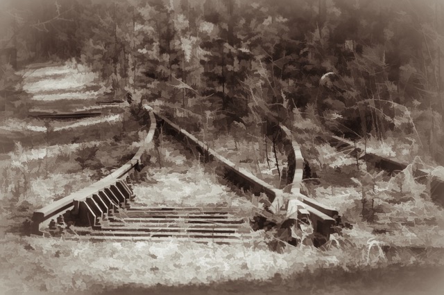
Hi, I like the lamp, too! It is part of the frame of the main object and I think that it balances nicely the trees on the left, and the stairs. |
May 14th |
| 47 |
May 23 |
Reply |
Thank you, Robert! It doesn't happen too often! |
May 13th |
| 47 |
May 23 |
Comment |
Hi Al, what a magnificent landscape image again! - I actually like the original crop best: I feel that the foreground gives the image a sense of depth and distance. I like about what Ed did to the mountains. I wonder if it would be ok to lighten the dark cloud in the upper left corner a bit so that it would not dominate the glorious sky? I also added haze removal in Affinity Photo - what do you think? |
May 13th |
 |
| 47 |
May 23 |
Comment |
Hi Jeff, this is one of the images I could just sit watching for hours. I love the symmetry, the fluid lines, the light on the dune, and the dramatic sky. I would vote with Dom for removing the sharp contrasty reflection of the little trees. |
May 13th |
| 47 |
May 23 |
Comment |
Hi Ed, I love the mood of the image. The stairs that lead into the image just invite one to sit and dream on the bench. I think that the soft sepia tones suit very well in the atmosphere. - I am a fan of the "old time" look, too: I wonder if you have used the NIK "Antique plate 2" filter with the lovely soft negative vignette in this one? I tried to change the vignette into a little more rectangular shape to show the fine lamp slightly bette . What do you think: does it now compete with the bench too much? |
May 13th |
 |
| 47 |
May 23 |
Comment |
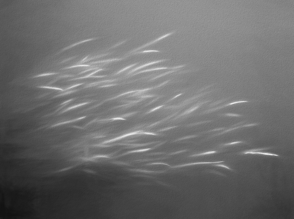
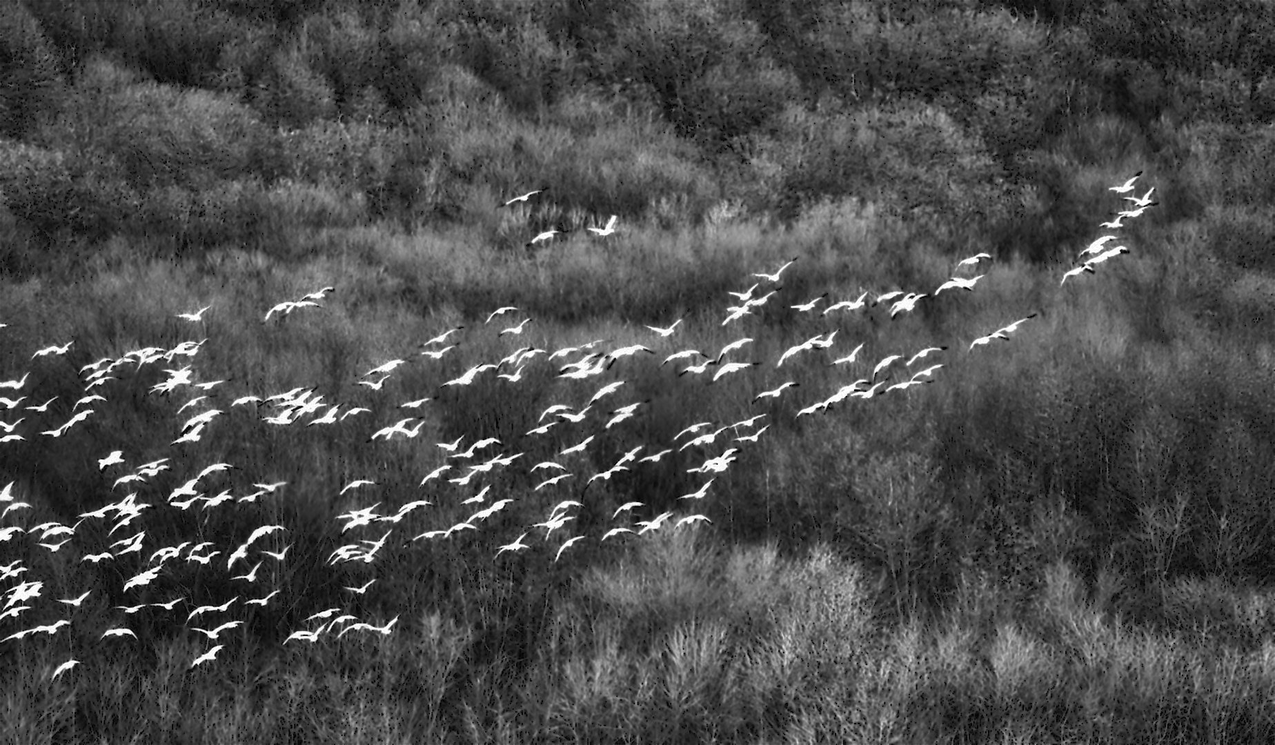
Hi Robert, I think that Ed gathers the flock together beautifully into a balanced nature photo, but I feel that the original crop is more exciting, almost abstract with the diagonal configuration. I could not resist trying the luminosity mask that Dom suggested: selected the background in Capture One and turned down brightness, contrast, clarity and structure to show them off better and to enhance the graphic quality. What do you think? |
May 13th |
 |
| 47 |
May 23 |
Comment |
Hi Dom, I join the others - a most impressive image! The focus bracketing works fantastically, with the sharpness throughout, and the dramatic sky adds to the atmosphere. I think the scene was made for black-and-white. |
May 13th |
| 47 |
May 23 |
Reply |
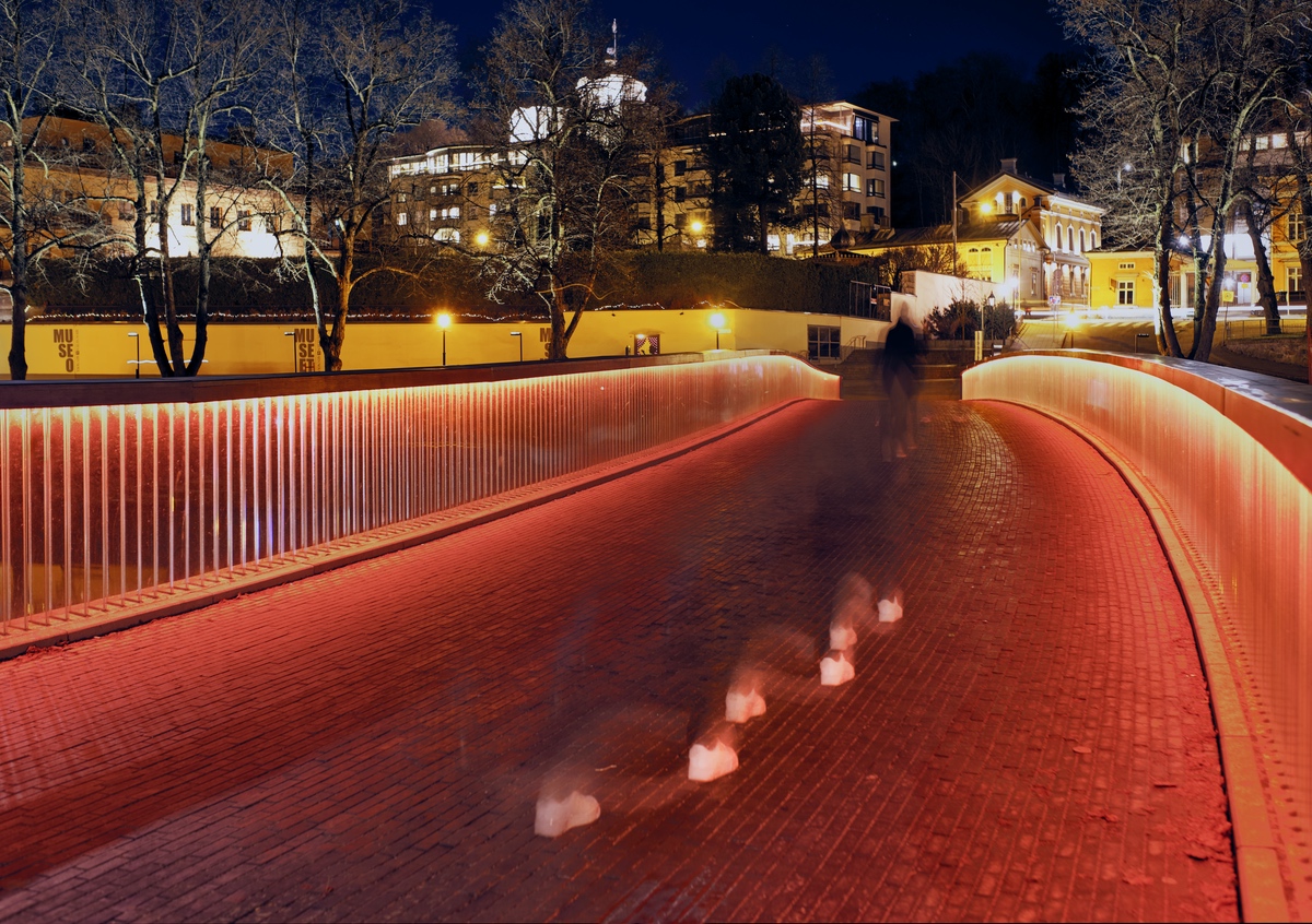
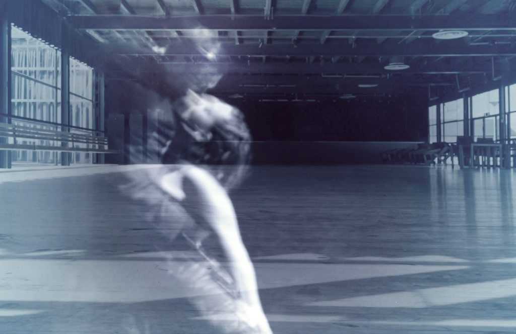
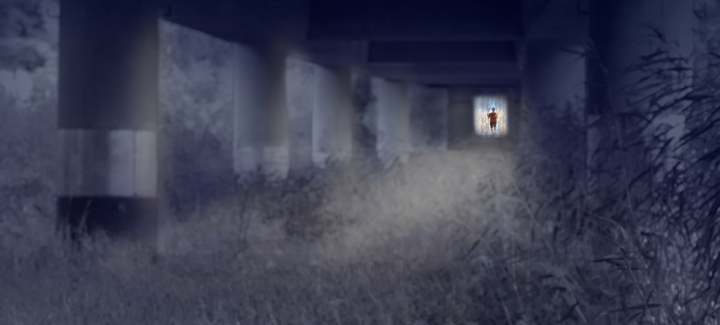
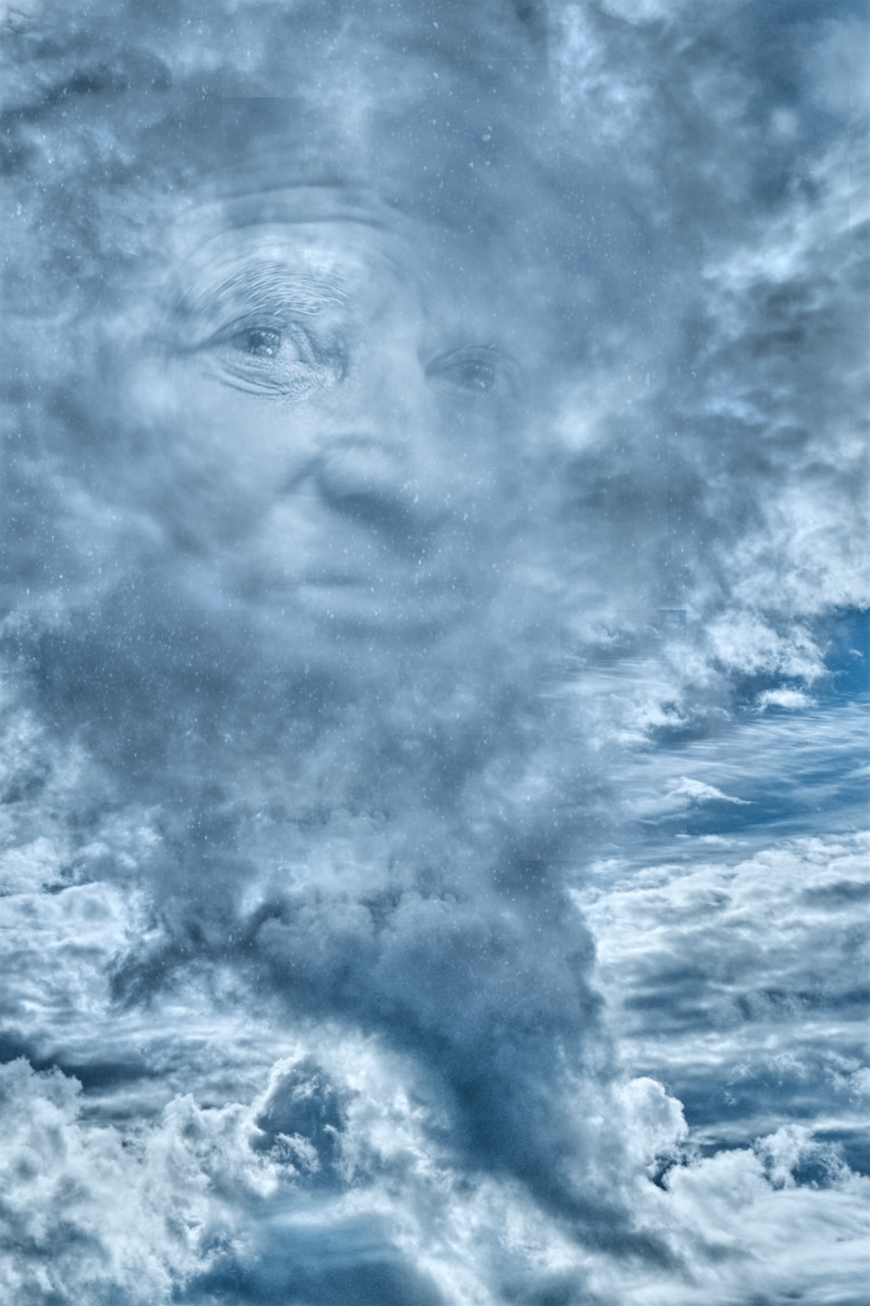
Thank you, Ed, I am so glad that you caught the atmosphere I was after! - I just realized that the title and the story behind the image had dropped off at some point, and posted them in a comment to Dom. - So this was just a long-exposure shot, turned into BW and flipped horizontally, with some of the outlines of the moving persons removed to make the ghosts a bit clearer. - I'll attach the original here, so it is easy to see the edits. |
May 13th |
 |
| 47 |
May 23 |
Reply |
Hi Dom, again! I just realized that the title and the story about the image had dropped off at some point. Here they are - they may help to understand the idea, although of course the image should speak for itself.
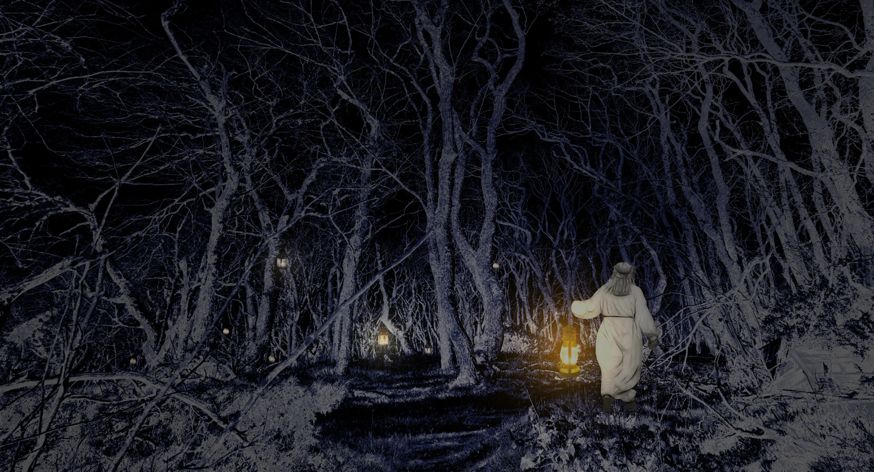
"Here is "Where We Used to Walk". This is another image from the trip to the archipelago in February. There was this one main road, with the few houses scattered along it, and the little church looming over the village from a hilltop. A single street light illuminated the passage, and some villagers, or tourists like us, walked by. A long-exposure shot turned them into ghosts of the islanders of bygone days, meeting each other at their usual place. Fuji X-T4 on tripod, 28.9 mm, manual exposure. f/5, 1.5 s, ISO 200. I flipped the image horizontally, cropped off the unnecessary, and erased some of the outlines of the ghosts for a clearer effect." |
May 13th |
| 47 |
May 23 |
Reply |
Hi Dom, thank you for the comment! I often fail to convey in my images the vision that is so clear in my mind, which of course makes the rare times this happens even more precious. - There may, however, perhaps be something that speaks to the Finnish soul as the image actually won this month's local club competition. I wonder if you can think about something that I could do with the image to tell the story better? |
May 13th |
6 comments - 5 replies for Group 47
|
| 54 |
May 23 |
Comment |
Thank you, Peggy, I think that the vignette is a perfect finishing touch: It makes the image so deep and mysterious! |
May 14th |
| 54 |
May 23 |
Reply |
Thank you, Peggy! All of the versions are so beautiful, but I love the quiet reflective mood of the more muted colors best. |
May 14th |
| 54 |
May 23 |
Reply |
Thank you, Aavo! This is a most lovely compliment! - The cropping was hard but I am convinced that it is the right thing to do. |
May 14th |
| 54 |
May 23 |
Reply |
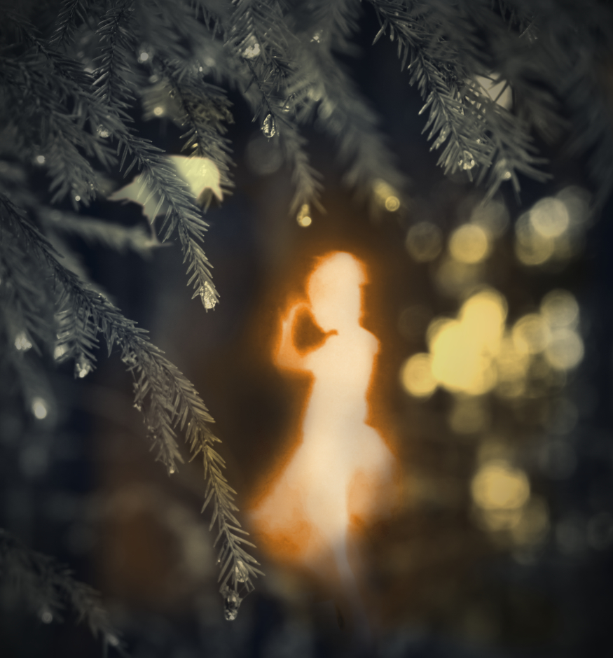
Thank you, Brad! I love your ideas about the foreground spirit - I'll work on it! - The girl behind the tree is on her own layer, so it was quite easy to do individual adjustments. |
May 13th |
| 54 |
May 23 |
Reply |
Thank you, Maria! I think that there was something quite special in the process with this image: it kind of started to talk back to me and tell how it wanted to be. |
May 13th |
| 54 |
May 23 |
Comment |
Hi Brad, had you not shown the originals it would be hard to imagine that this perfect moment consists of different components. I love the way you have combined the frozen motion in the sharp wave tops and the smooth fluid long-exposure flow of the water together, combining the most compelling elements of both approaches. The golden sunset light binds it all together. A magical image!
|
May 8th |
| 54 |
May 23 |
Comment |
Hi Maria, another lovely harmonious country life scene with that extraordinary tree! I love the muted colors and the pale light, and the triangle of the girl and the animals works so well. I think that I agree with Alan about the rain: it would be nice to see a version without the raindrop layer, or maybe reducing its opacity slightly? - I looked up Andrew Wyeth, and you certainly have a kindred spirit there. |
May 8th |
| 54 |
May 23 |
Comment |
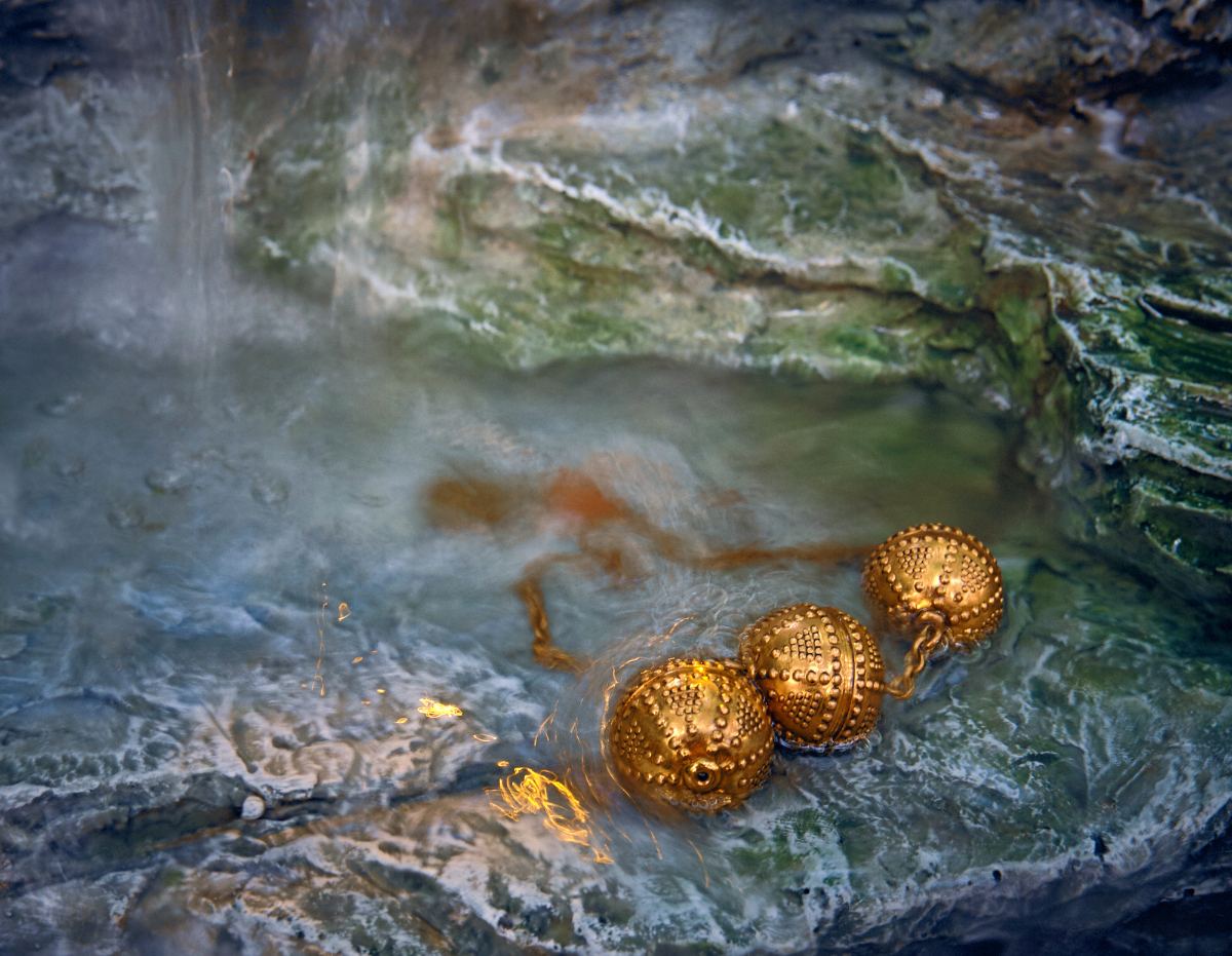
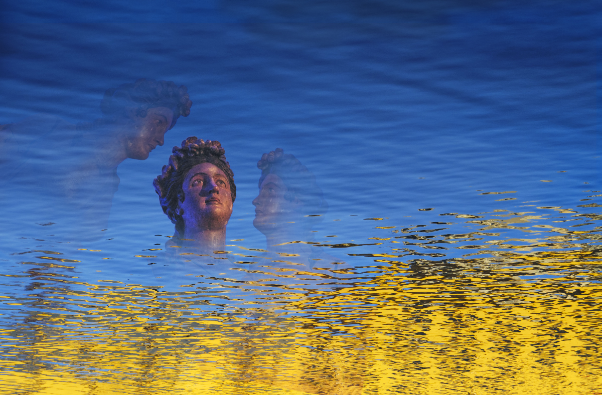
Hi Aavo - Mono lake will never be the same! I think, too, that this is a delightful idea that you have skillfully made to an exciting surreal image. I think that you have selected the components perfectly: the city and the cathedral could be made of same pale yellow stone as the rock formations of the lake, the forms of the rocks mimic the city skyline, and the lighting looks identical. - I wonder if it is possible to blend the lighter blue area round the cathedral dome slightly more smoothly in the lake surface tones? |
May 8th |
| 54 |
May 23 |
Comment |
Hi Peggy, your play with the textures is fantastic! The goose swimming in the rainbow looks like she were totally absorbed in admiring her reflection. I think - in same lines as Alan - that she might look lovely also in more muted maybe pastel tones, but the mood would then be different. |
May 8th |
| 54 |
May 23 |
Comment |
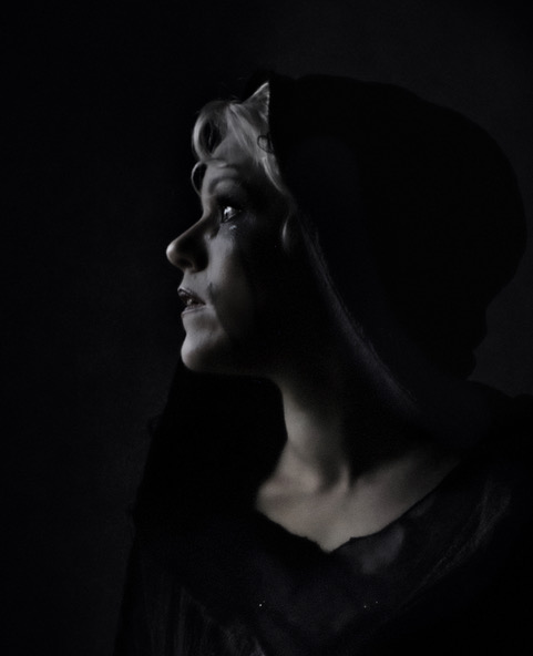
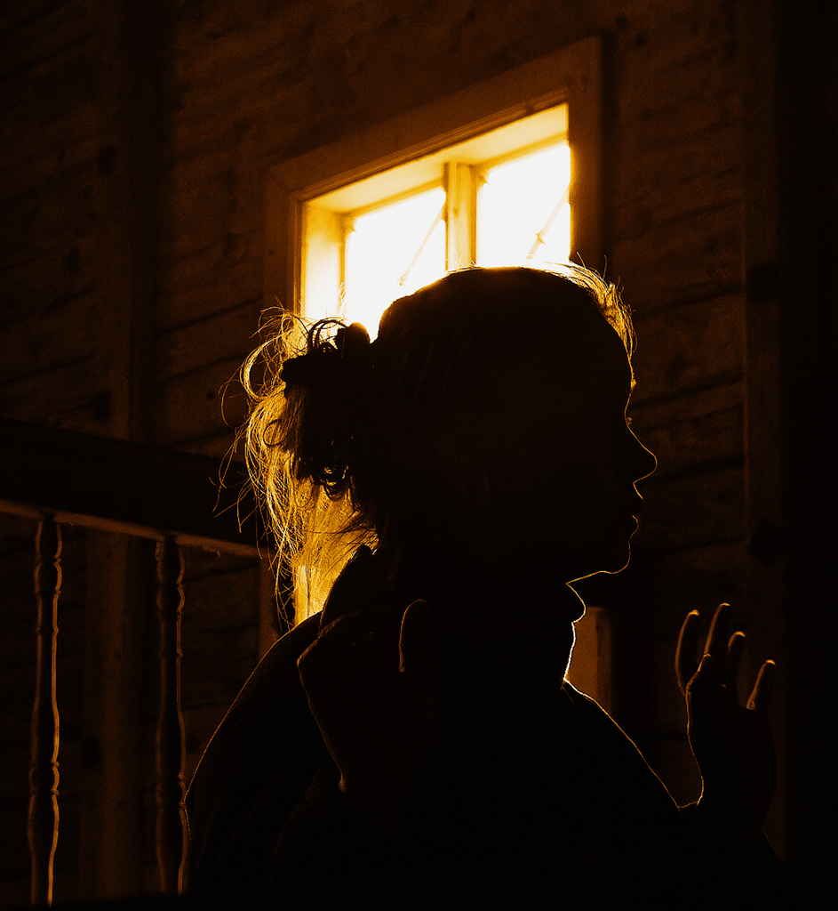
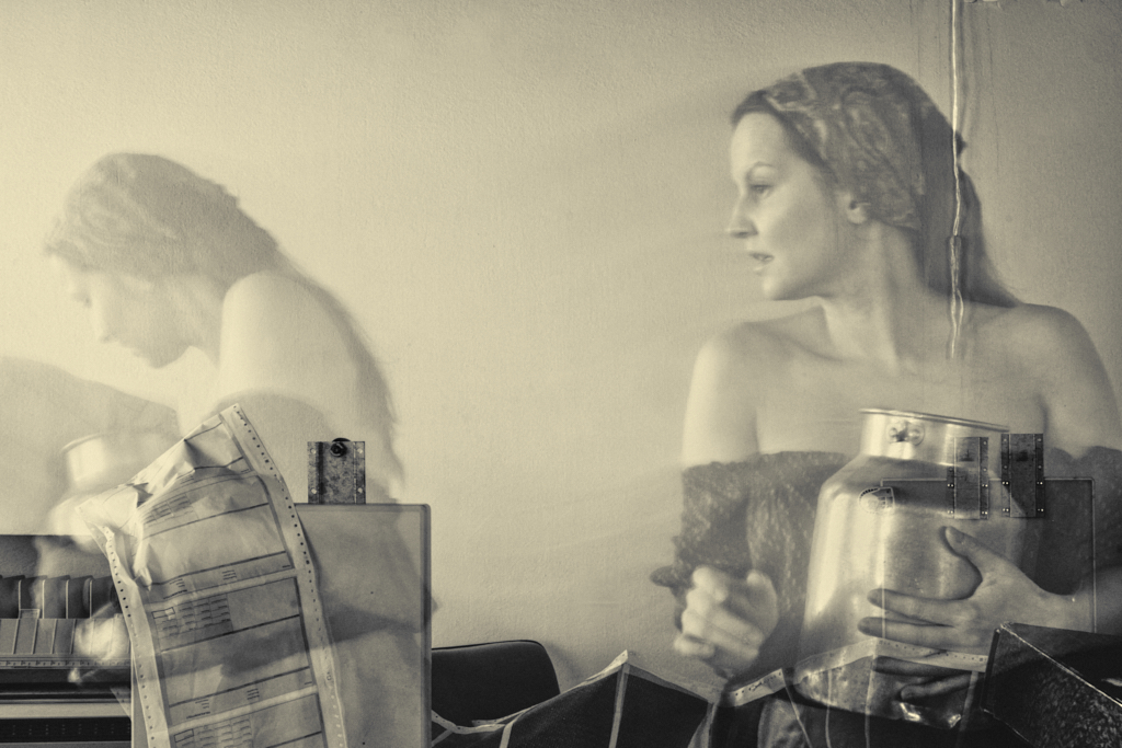
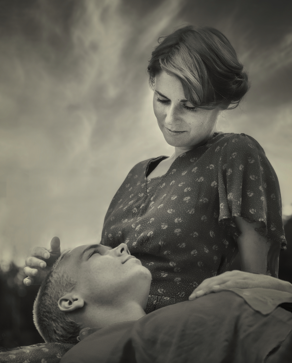
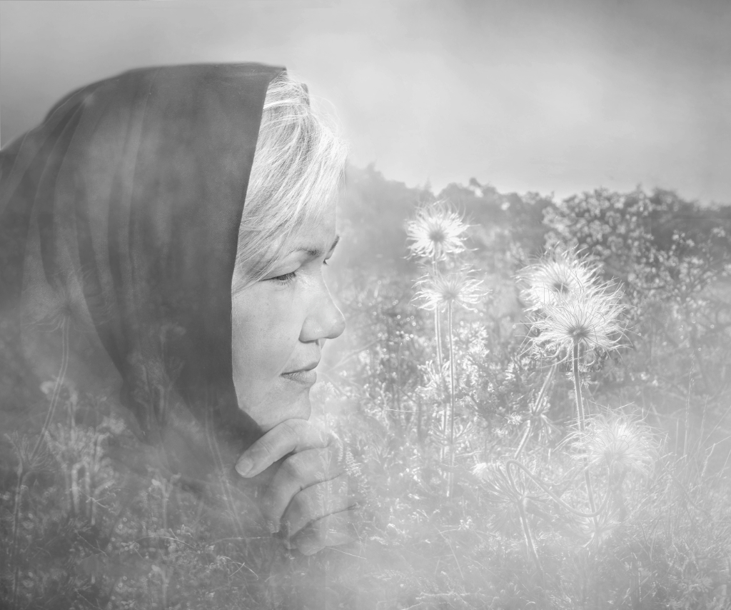
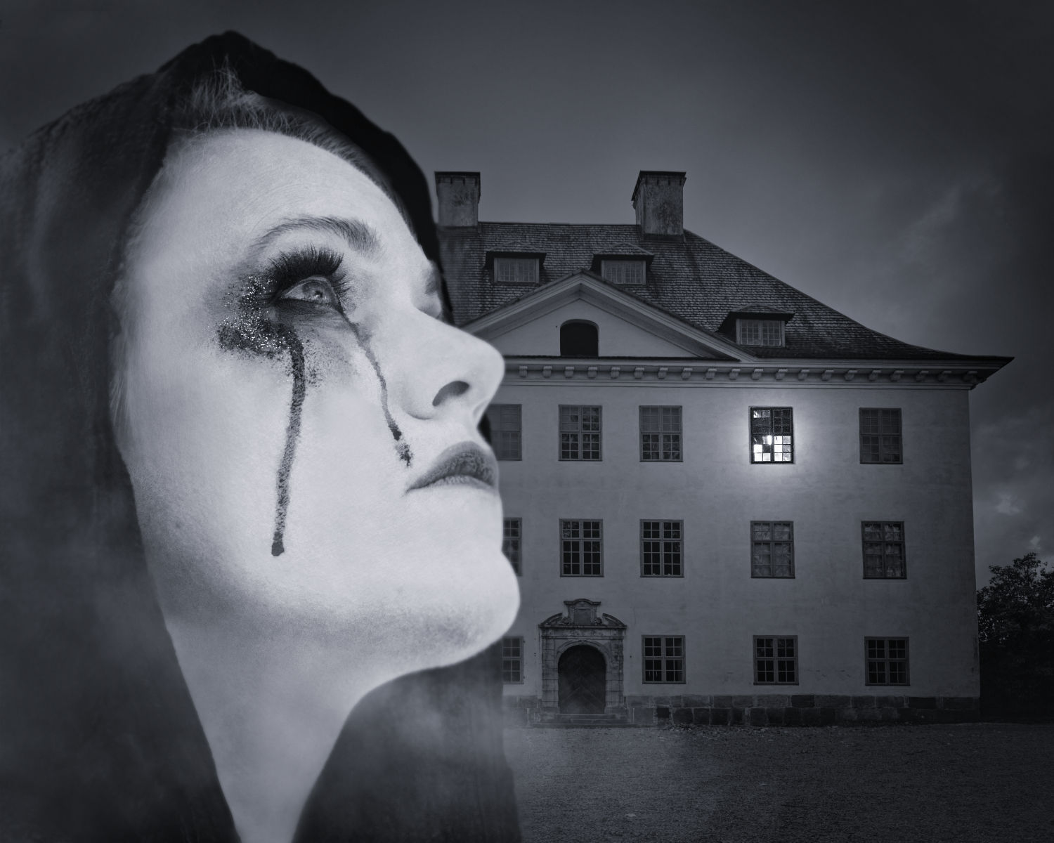
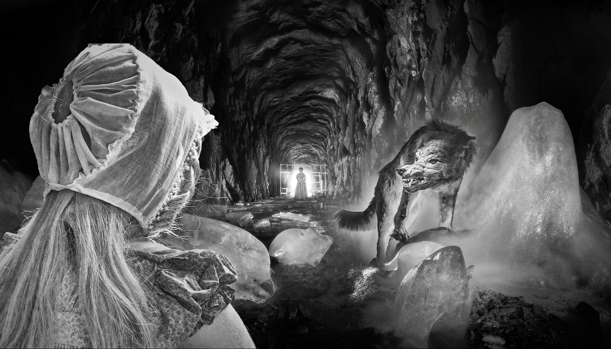
Hi Alan, the image took me right to the bleak December day of the poem - I think that it is the muted desaturated tones and pale light as much as the somber lady framed in her doorway, and the Raven himself. This is another image of yours that will stay long in my mind.
Thank you for describing in detail how you dealt with the doorway- I think that it is a piece of art - and the "accident" ties everything together. - I wonder if the head of the Raven might be just a little bit lighter? I was trying to figure out how the light and shadow would fall on him. |
May 8th |
| 54 |
May 23 |
Comment |
Thank you, Alan! You are perfectly right with the crop. - I fell so much in love with the background that I did not have the heart to cut anything off, but the image is so much more intense now! |
May 6th |
7 comments - 4 replies for Group 54
|
22 comments - 18 replies Total
|