|
| Group |
Round |
C/R |
Comment |
Date |
Image |
| 26 |
Jan 23 |
Comment |
Thank you, Ann! |
Jan 12th |
| 26 |
Jan 23 |
Comment |
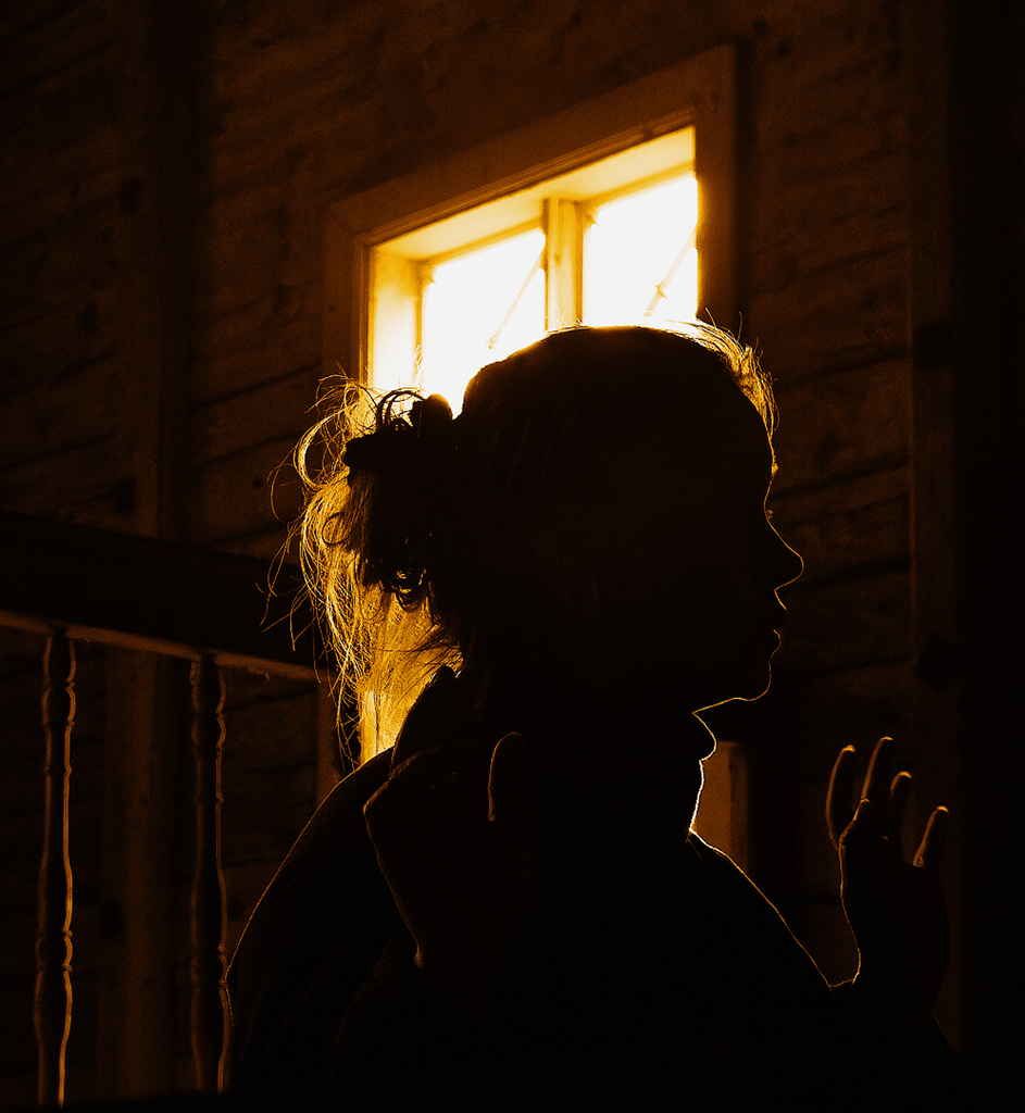
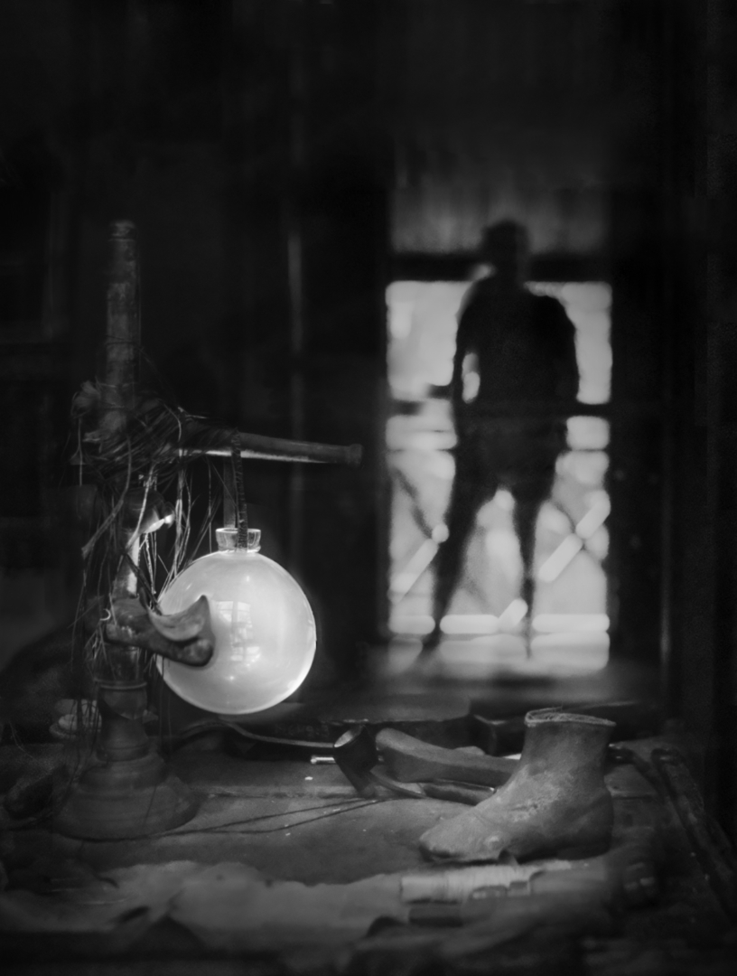
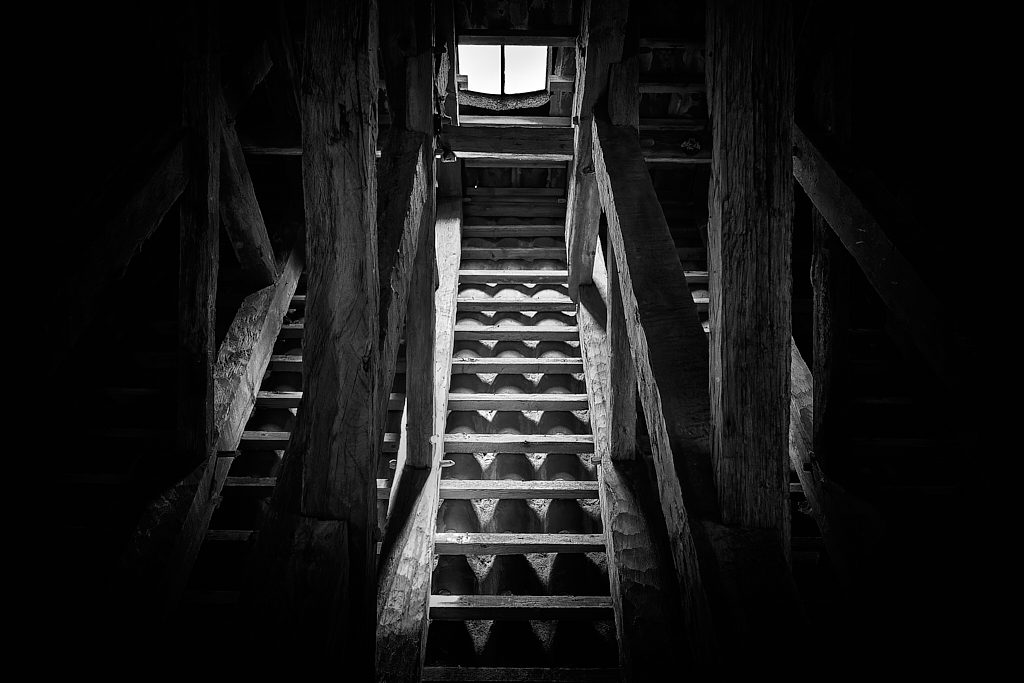
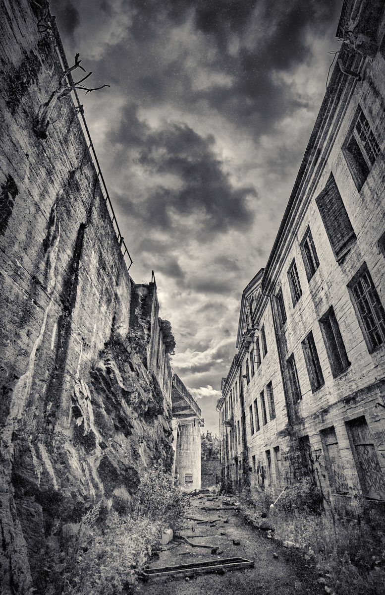
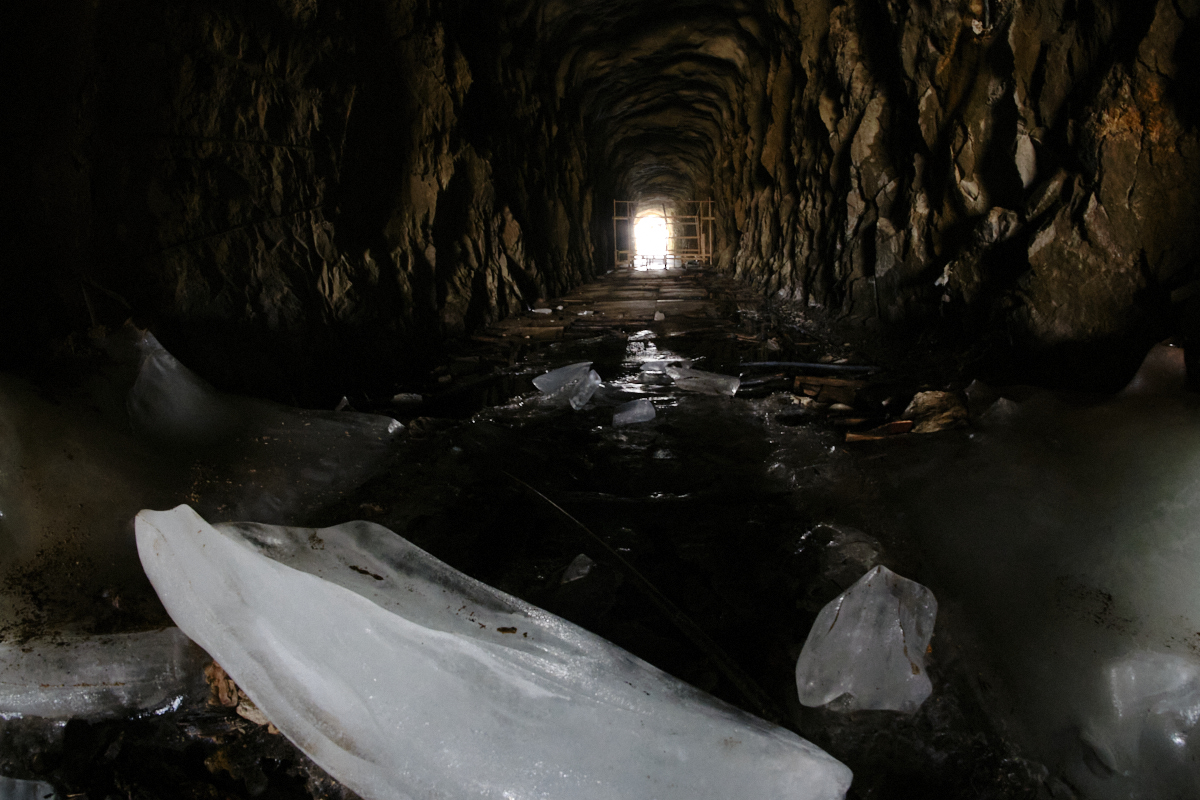
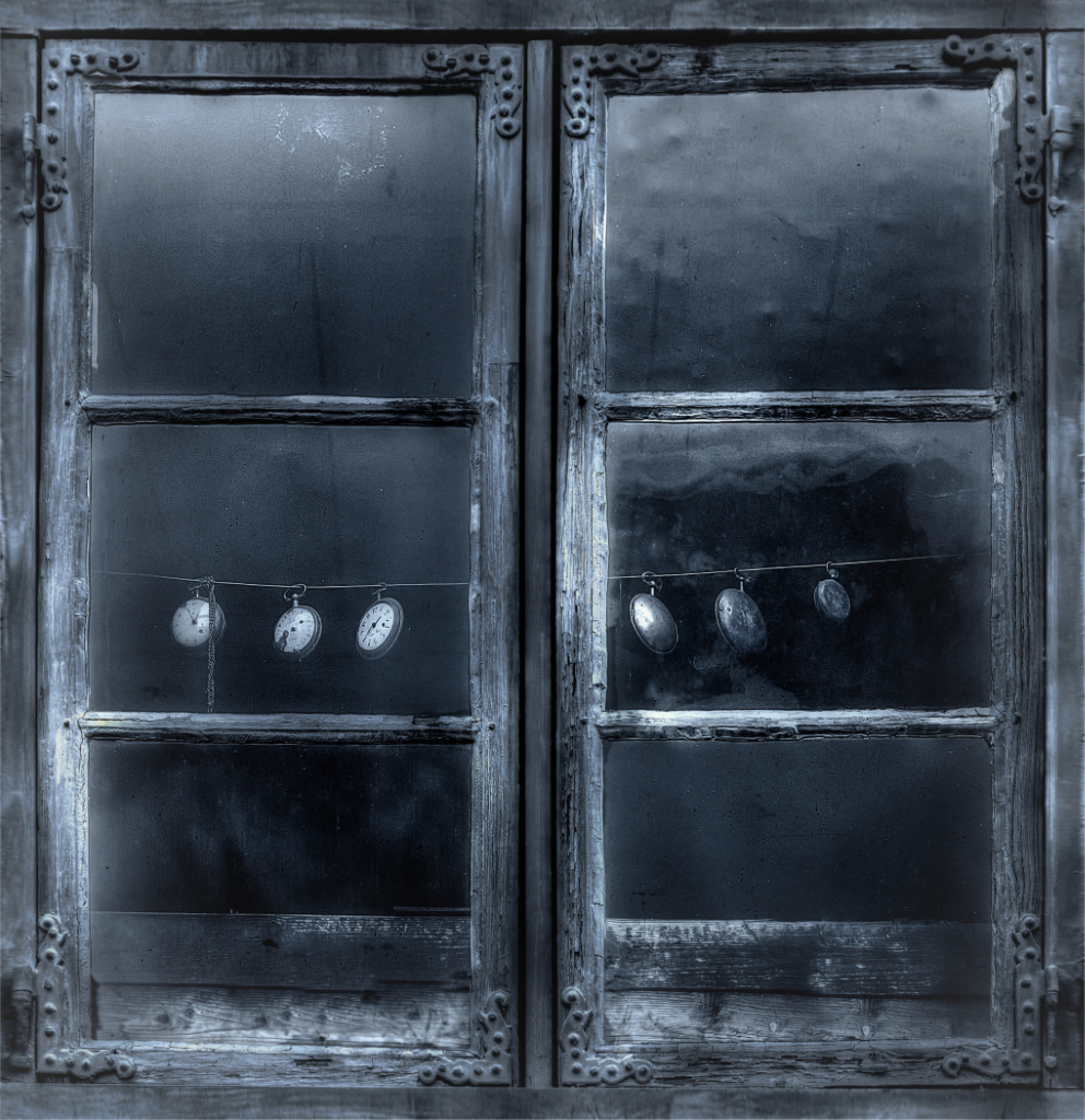
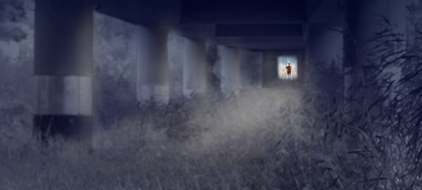
Hi Bob, I agree with the others: an interesting milieu, beautiful tones and textures. The light is beautiful, and the dark beams that cross the image make a nice contrast with the arches. |
Jan 10th |
| 26 |
Jan 23 |
Reply |
Thank you, Tony! |
Jan 10th |
| 26 |
Jan 23 |
Comment |
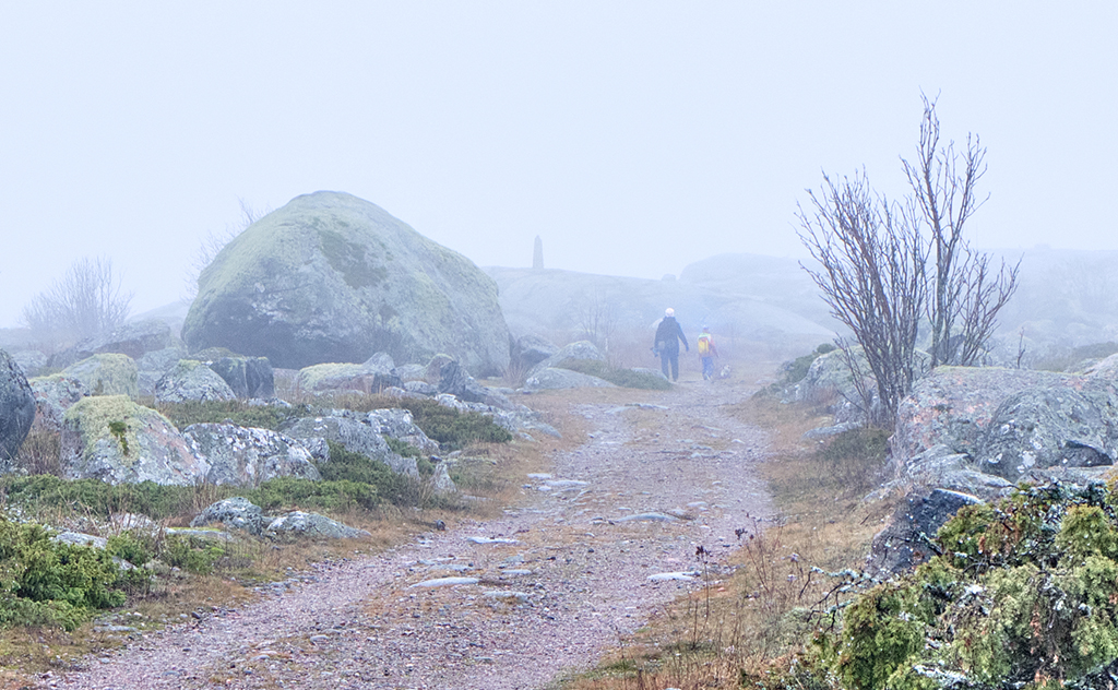
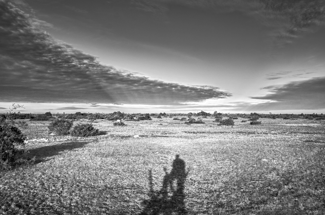
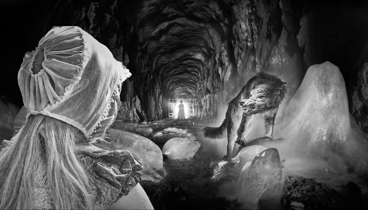
Hi Agnes, I join the others: a perfectly lovely image. The sense of depth and dimension is huge with the sharp foreground and the mountains in the horizon disappearing in the mist, and the color palette is absolutely beautiful. - I would also vote for eliminating the poor hiker. |
Jan 9th |
| 26 |
Jan 23 |
Reply |
Thank you, Agnes! I am glad you like it, and I think that you are right with the old fashioned, look, too! |
Jan 8th |
| 26 |
Jan 23 |
Comment |
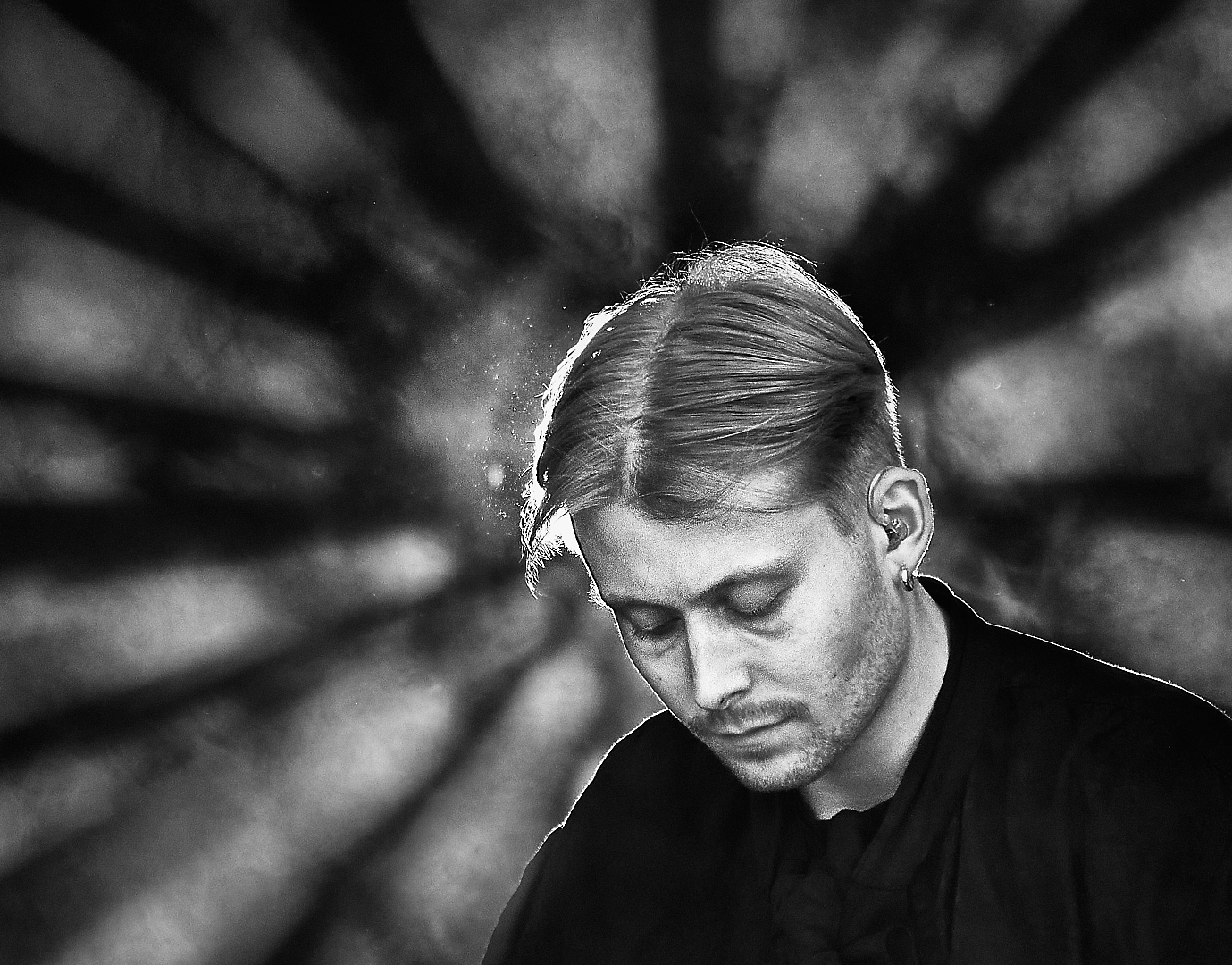
Hi Tony, I agree with the others: a lovely light defining the pillars and arches, the rich tones and a huge sense of perspective make a very beautiful image, and the posture and position of the couple is perfect. I love the way the light finds their faces that are turned to admire the building. They also provide a measuring stick that help to grasp the huge dimensions of the structure. - It would be nice to know what lens and camera angle you used. |
Jan 7th |
| 26 |
Jan 23 |
Comment |
Hi Jose, you have again captured a moment full of atmosphere and life. The vivid colors of the rickshaw make a lovely contrast with the rainy day background, and the slight blur carries such a sense of movement. I think that Mervyn is right about the rider in sharp focus at the left edge. I wonder if his outlines could be blurred a bit - that would make him less distracting while maintaining the panorama format that suits the image so well? |
Jan 7th |
| 26 |
Jan 23 |
Comment |
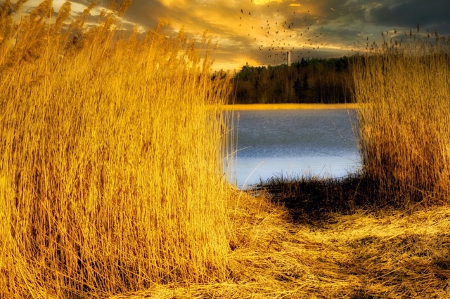
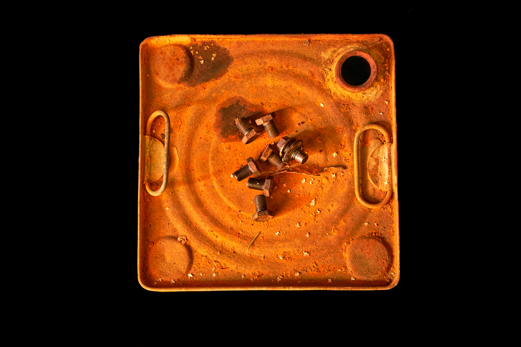
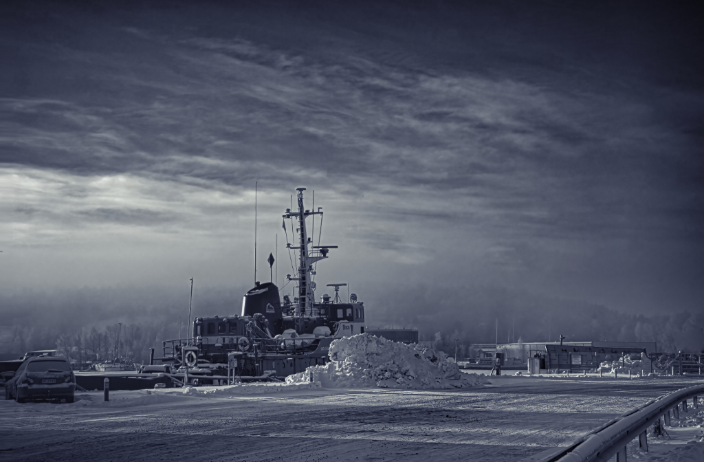
Mervyn, a beautiful calm rural landscape, with the weathered barn in the middle of so many hues of green. I think that the original more muted colors suit well with the mood. I think, too, that it is such a good composition with the layers that give it depth, and the triangular formation of the red flowers in the front complementing the shape of the orange rusty roof. |
Jan 7th |
| 26 |
Jan 23 |
Reply |
Thank you,Mervyn! That sure was one of those rare lucky moments! |
Jan 7th |
| 26 |
Jan 23 |
Reply |
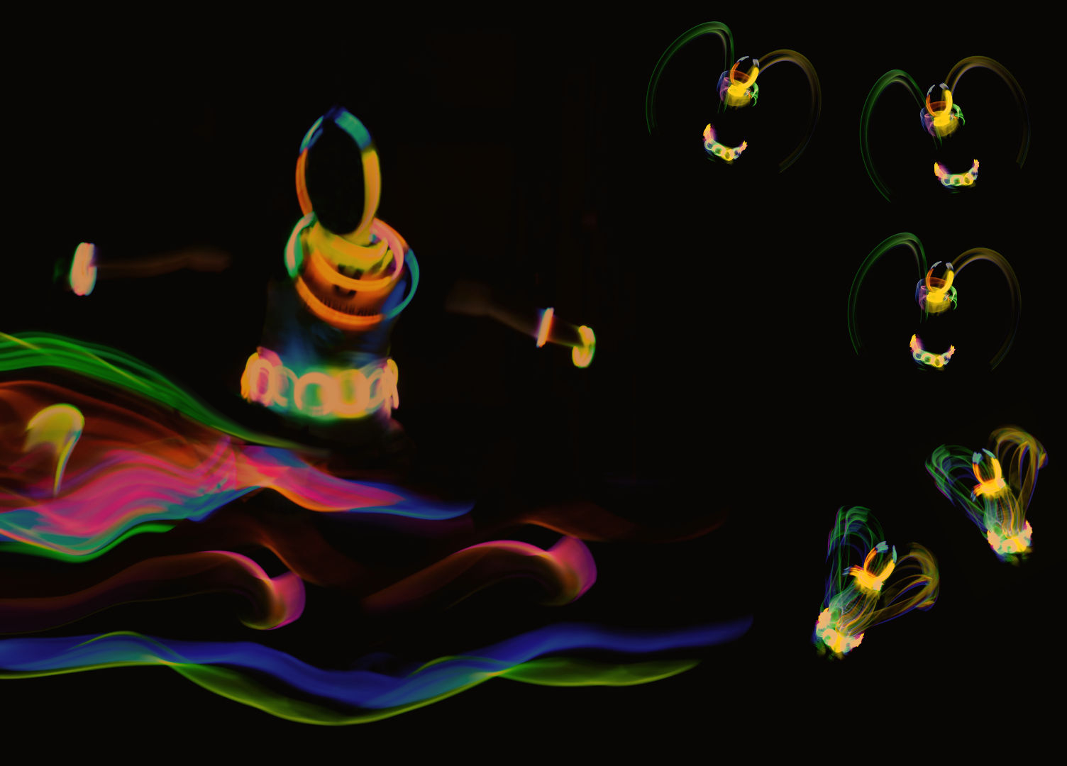
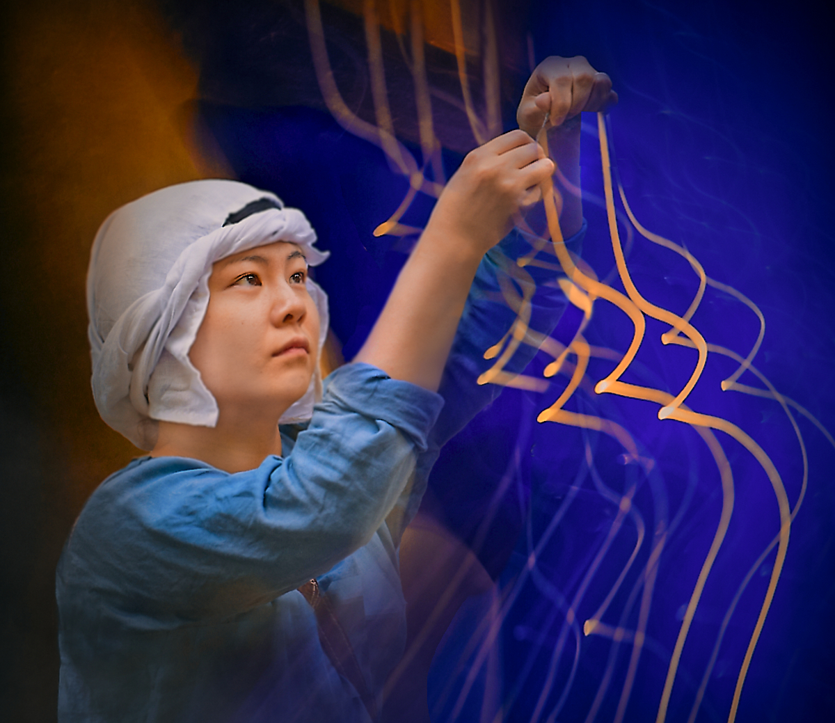
Hi Jose, thank you so much for the insightful comment - I really started to think about the image and found it more revealing than I had realized. The quick snapshot of pleasing patterns in changing light does tell about someone who chases the shadows and has an urge to make invisible things seen - with more or less success! |
Jan 7th |
6 comments - 4 replies for Group 26
|
| 47 |
Jan 23 |
Comment |
Thank you, Robert! Will keep on working! |
Jan 16th |
| 47 |
Jan 23 |
Comment |
Hi Trung, I like the image very much, too! It is like a day in the life of the landmark that stands on the cliff with the tourists coming and going. The tones are so lovely, I especially admire the way you have made the white walls of the building glow. I like the original crop that shows also the couple leaving the scene, but I feel that both Ed's and Jeff's suggestions have a good point. |
Jan 13th |
| 47 |
Jan 23 |
Comment |
Hi Al, what a powerful image that immediately carries out the message. I think, too, that it is a perfect capture. The camera angle makes most of the power of the tree that looks very much a living thing that could stretch out a root at any moment. The person, tiny in comparison, not only adds to perspective but I think his posture and body language also show his awe for the giant. The effect the infra-red gives the sky and the foliage adds to the impact. |
Jan 13th |
| 47 |
Jan 23 |
Comment |
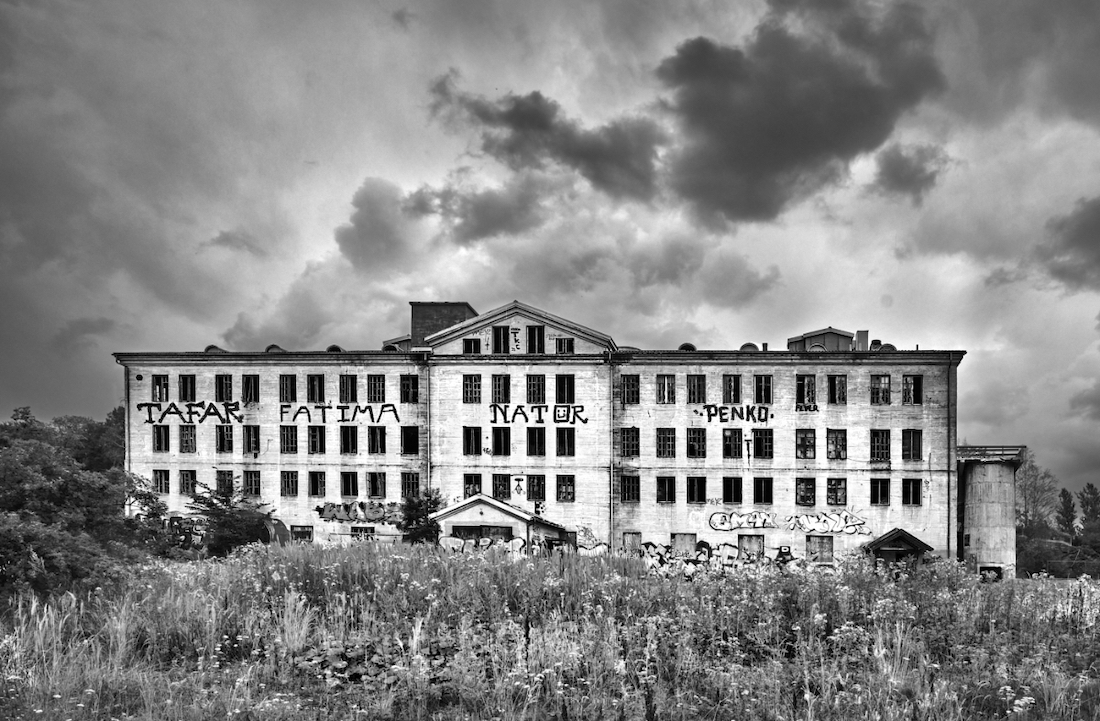
Hi Robert, I totally agree with the others - a great architectural image that one can also look as an abstract combination of forms and tones. I think that the small bright pools of light (windows/reflections?) give almost a sense of movement. - My husband just walked by my screen and commented that the image could be straight from "Aperture" magazine. |
Jan 13th |
| 47 |
Jan 23 |
Comment |
Hi Jeff, this is so full of impact and power! I think that this is a most effective composition, I can feel the machine roll on relentlessly over the field towards the horizon. The drama of the high-contrast version appeals to me very much, it has even surreal sci-fi like tones. Ed's great re-edit brings the details and structures out very beautifully, and reflects the calmer mood of the original, like a plough resting after a completed work. - I think that if it were my image, I might try to lighten the furrows a bit and retain the contrast? |
Jan 13th |
| 47 |
Jan 23 |
Comment |
Hi Ed, I join in Jeff�s words. The tree looks like it proudly guards the entry into an ancient fortress; I love the way the stairs climb up the wall from its shadow. Your camera angle is just perfect, and the tones and textures blend with the soft sepia toning blend into a beautiful image. |
Jan 13th |
| 47 |
Jan 23 |
Reply |
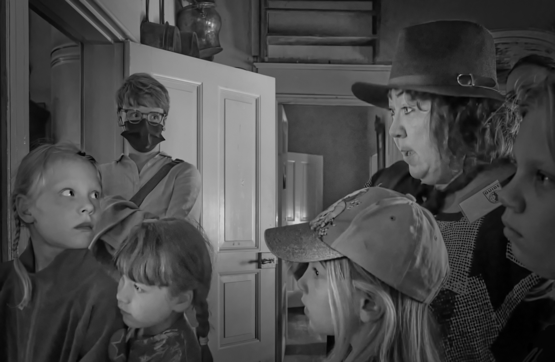
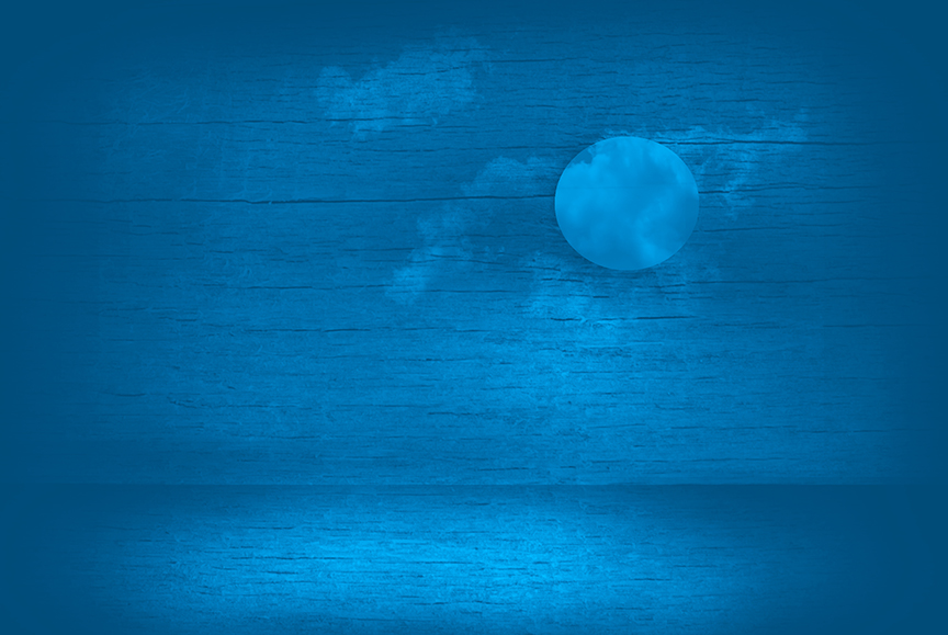
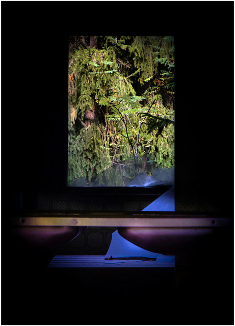
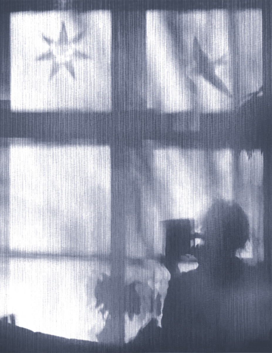
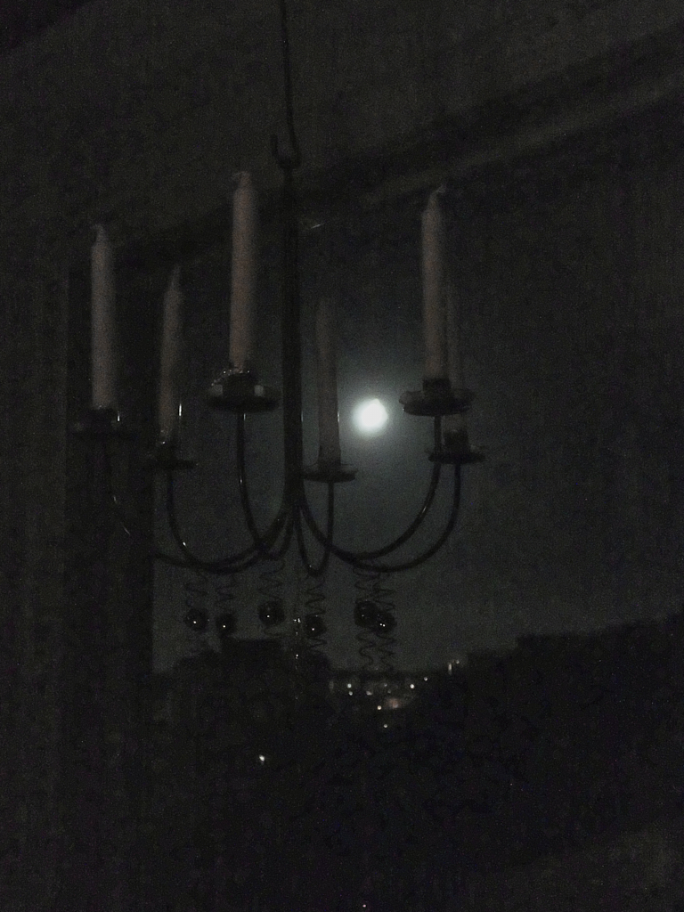
Thank you, Jeff, for the comments. The project will obviously need a lot of more work. - I think that the image might open a little better as part of the little series that at the moment starts with a wide view of the dark living room. I will try to retake this one at next full moon with better image quality, and I will follow your advice with including more of the interior. I think that this will be a great improvement! |
Jan 13th |
| 47 |
Jan 23 |
Comment |
Thank you, Ed! You did wonders with the image! Your noise reduction software really works beautifully; I have the Topaz Denoise that tends to produce a lot of artifacts and plastic-like structures at least in my hands. Your version is very beautiful and brings the tones and forms out better, but I think I still like more of the atmosphere of the fuzzy original. |
Jan 10th |
7 comments - 1 reply for Group 47
|
| 54 |
Jan 23 |
Reply |
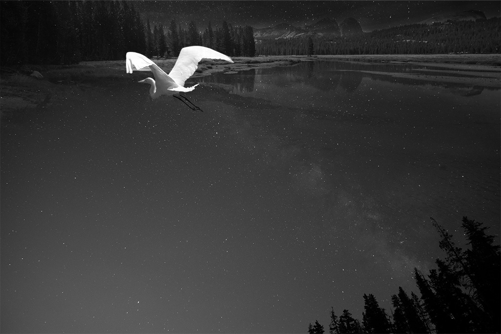
Thank you, Maria! I absolutely love Peggy's version of the bird, too. The original idea was that he and Sunray come from, as Christian expressed so beautifully, the same universe of light. I think that the dark bird with the glow will make a different story. I 'll continue to develop them both! |
Jan 24th |
| 54 |
Jan 23 |
Reply |
Thank you so much, Christian! You gave words to what I was after! I will keep working on the bird and the branch. |
Jan 24th |
| 54 |
Jan 23 |
Reply |
Thank you, Alan - I see what you mean. I think that I�ll have to try to find her another venue to test the effect, as the original background has so many out-of-focus areas. i 'll work on it! |
Jan 11th |
| 54 |
Jan 23 |
Reply |
Thank you, Peggy! The bird has from the beginning been my least favourite part of the image. Your dark version of him with the glow looks very good! I will start from there! |
Jan 10th |
| 54 |
Jan 23 |
Reply |
Thank you, Peggy! The bird has from the beginning been my least favourite part of the image. Your dark version of him with the glow looks very good! I will start from there! |
Jan 9th |
| 54 |
Jan 23 |
Reply |
Oh, that is a lovely idea! |
Jan 9th |
| 54 |
Jan 23 |
Reply |
Thank, I`ll attack that next! |
Jan 8th |
| 54 |
Jan 23 |
Reply |
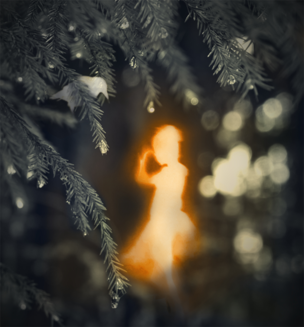
Hi, here is the next attempt. I really saw what you meant when I started working on the image. I think that the basic problem is that the original background has a little too narrow depth of field so that some of the branches in the front are not in focus. I tried to do the best I could with sharpening and blurring and some creative cutting and pasting, and I think it is a little better now? |
Jan 8th |
 |
| 54 |
Jan 23 |
Reply |
Thank you, Aavo, a good point! I �ll work on that! |
Jan 8th |
| 54 |
Jan 23 |
Reply |
Thank you, Brad! I tried all the options you suggested with the bird. If I left it black it disappeared in the background, and a different hue seemed to make it look too conspicuous, so I just made it a little whiter and added contrast slightly. I think that he may be slightly better visible without stealing the show now? |
Jan 6th |
 |
| 54 |
Jan 23 |
Comment |
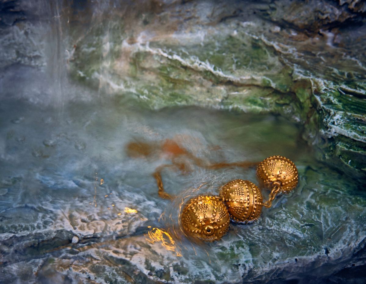
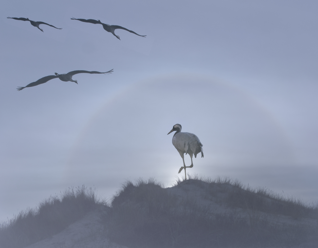
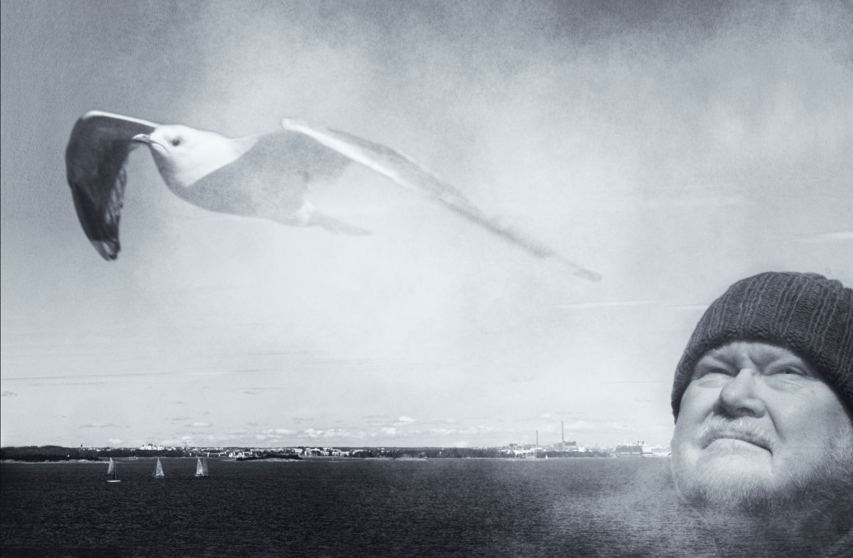
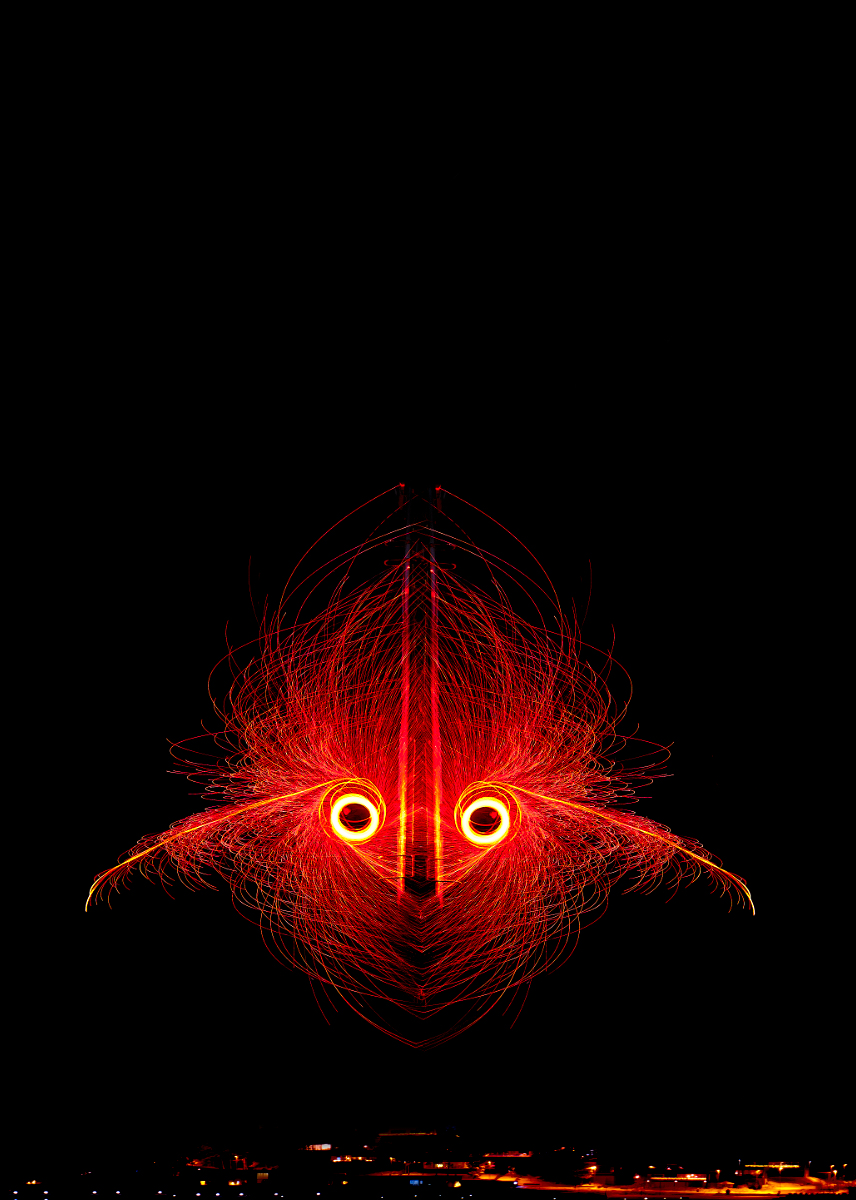
Brad, I think that you could not have found a more beautiful way to convey the message. The way the mountains, the forest, the lake and the milky way melt together is exquisite, and I feel that the position of the bird is just right. - I wonder if turning the bird (the yellow beak) into black-and-white would add to the mythical quality? - I think that you have grasped perfectly the "between the not-yet-now and the not-quite-then" (as Doctor Who puts it) feeling of retirement. |
Jan 5th |
 |
| 54 |
Jan 23 |
Comment |
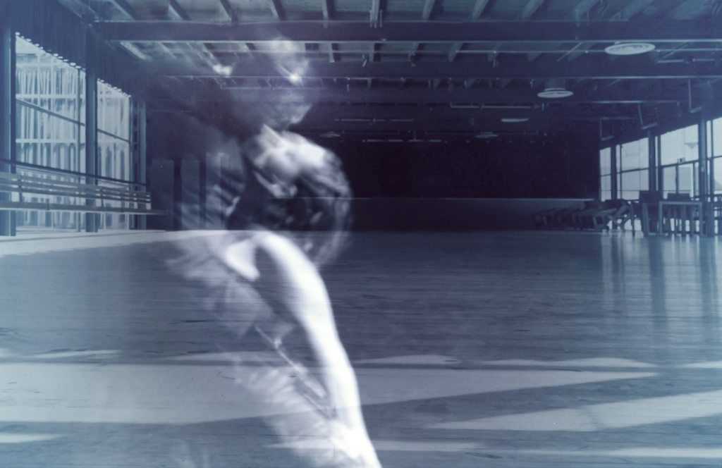
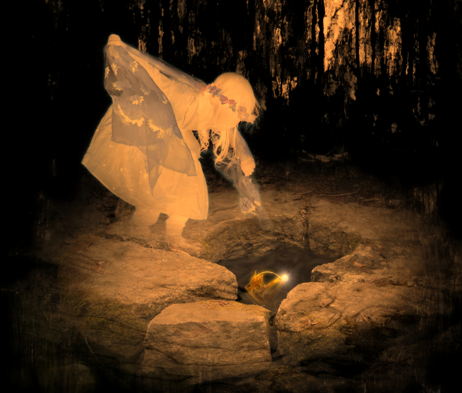
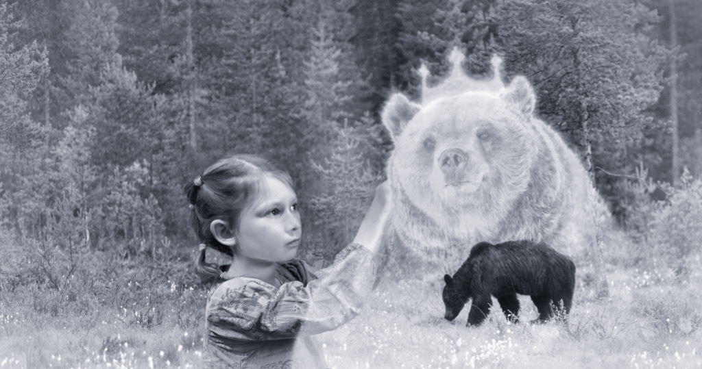
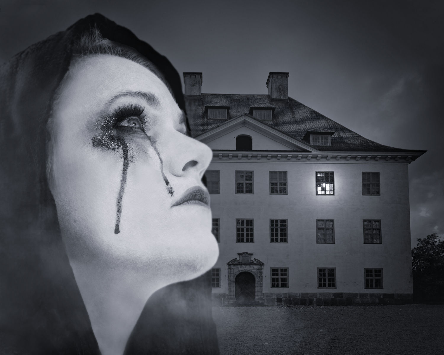
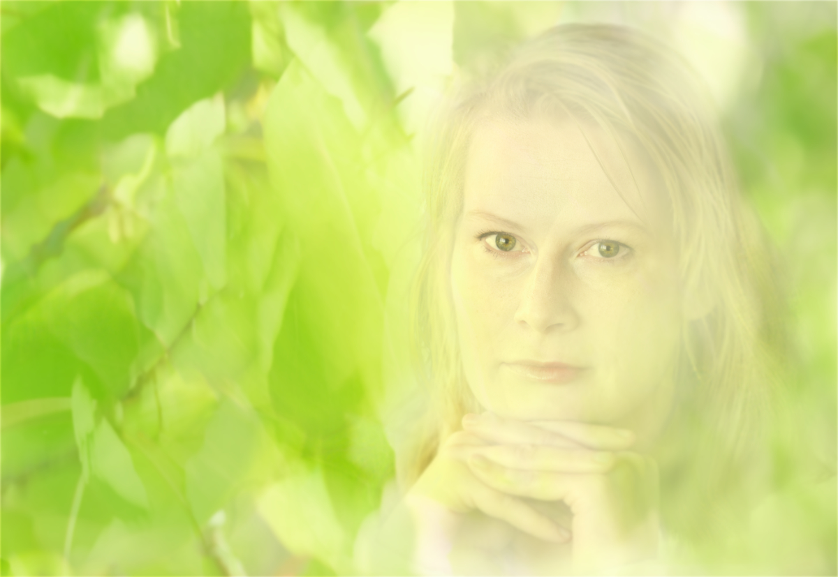
Alan, I keep coming back to contemplate the image. I see the model and the artist fading into grey shadows while the woman in the painting has drawn into herself all their life force and is now reaching out of the frame so vivid and so full of life. She has this small victorious smile on her face, as if she well knew what is happening. Or, this could be read simply as a tribute to the power of Art. The distorted gradient background is just perfect for the surreal atmosphere - thank you for sharing the details how to make it. - I am so glad that the world has not lost the lovely ballerina! |
Jan 5th |
| 54 |
Jan 23 |
Comment |
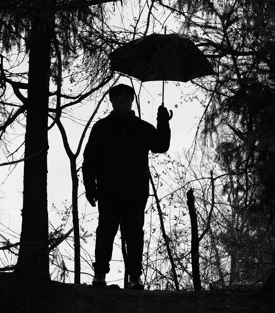
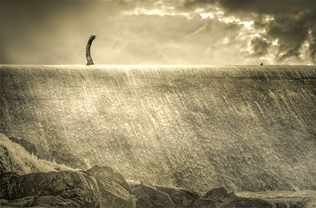
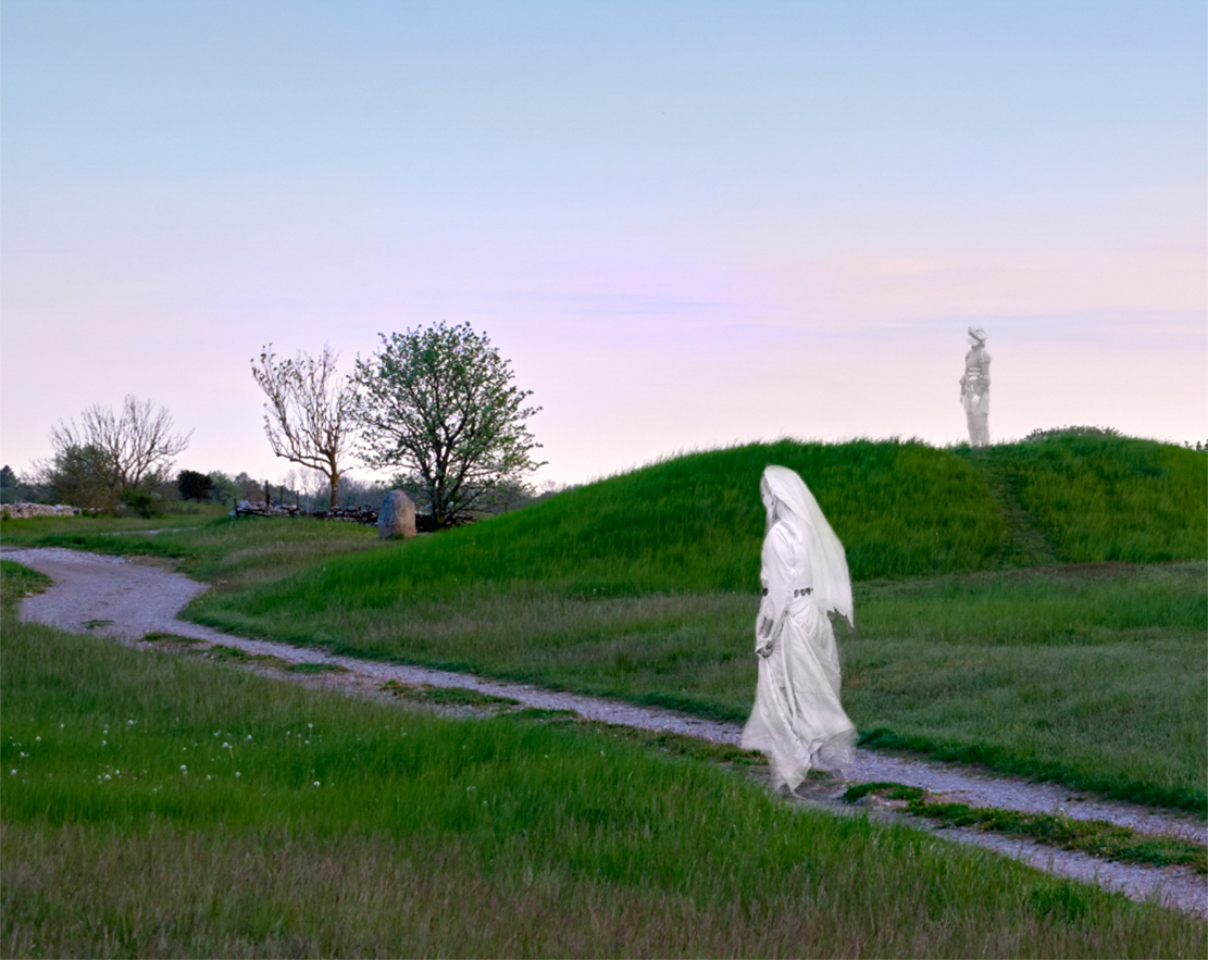
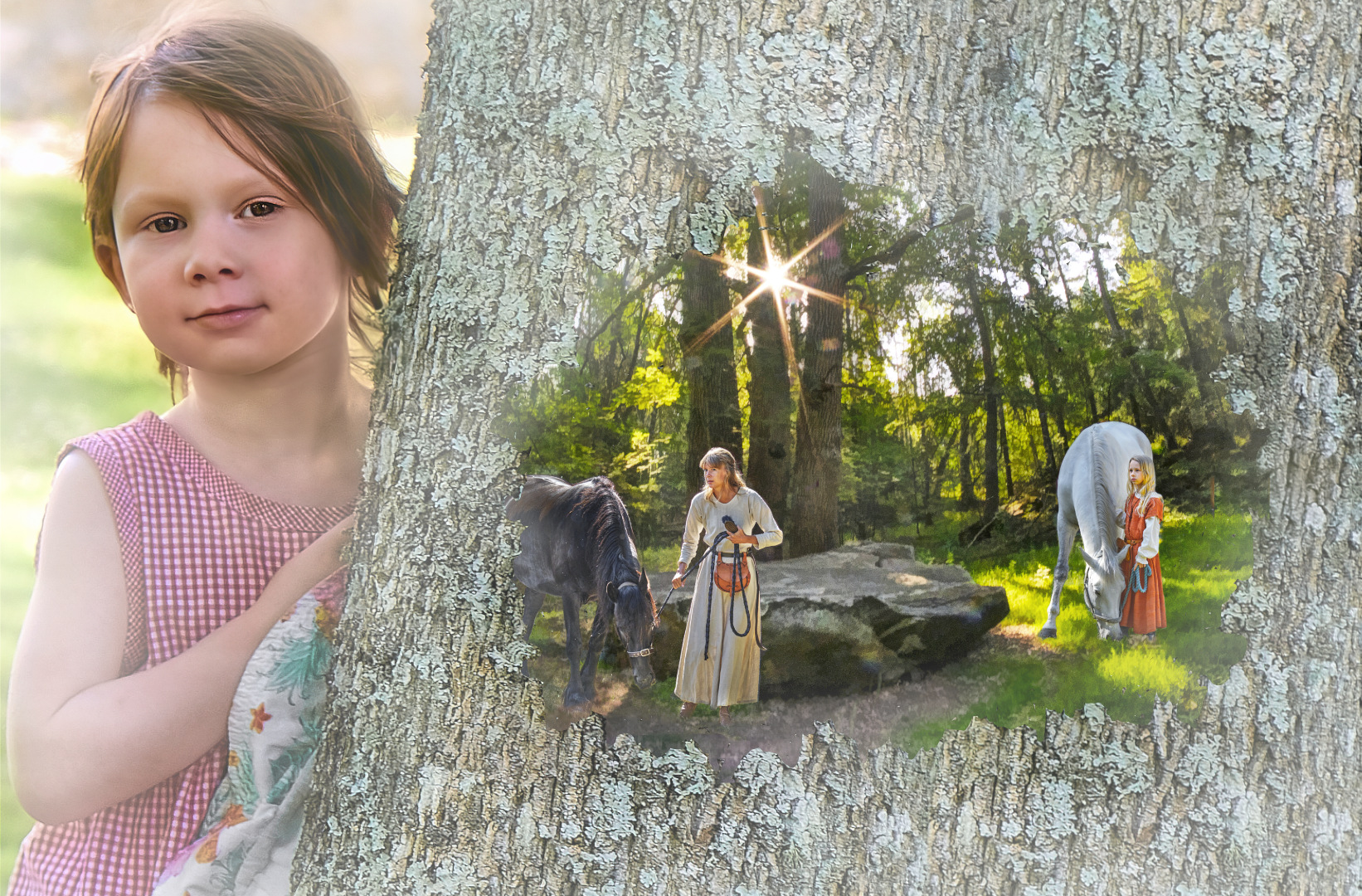
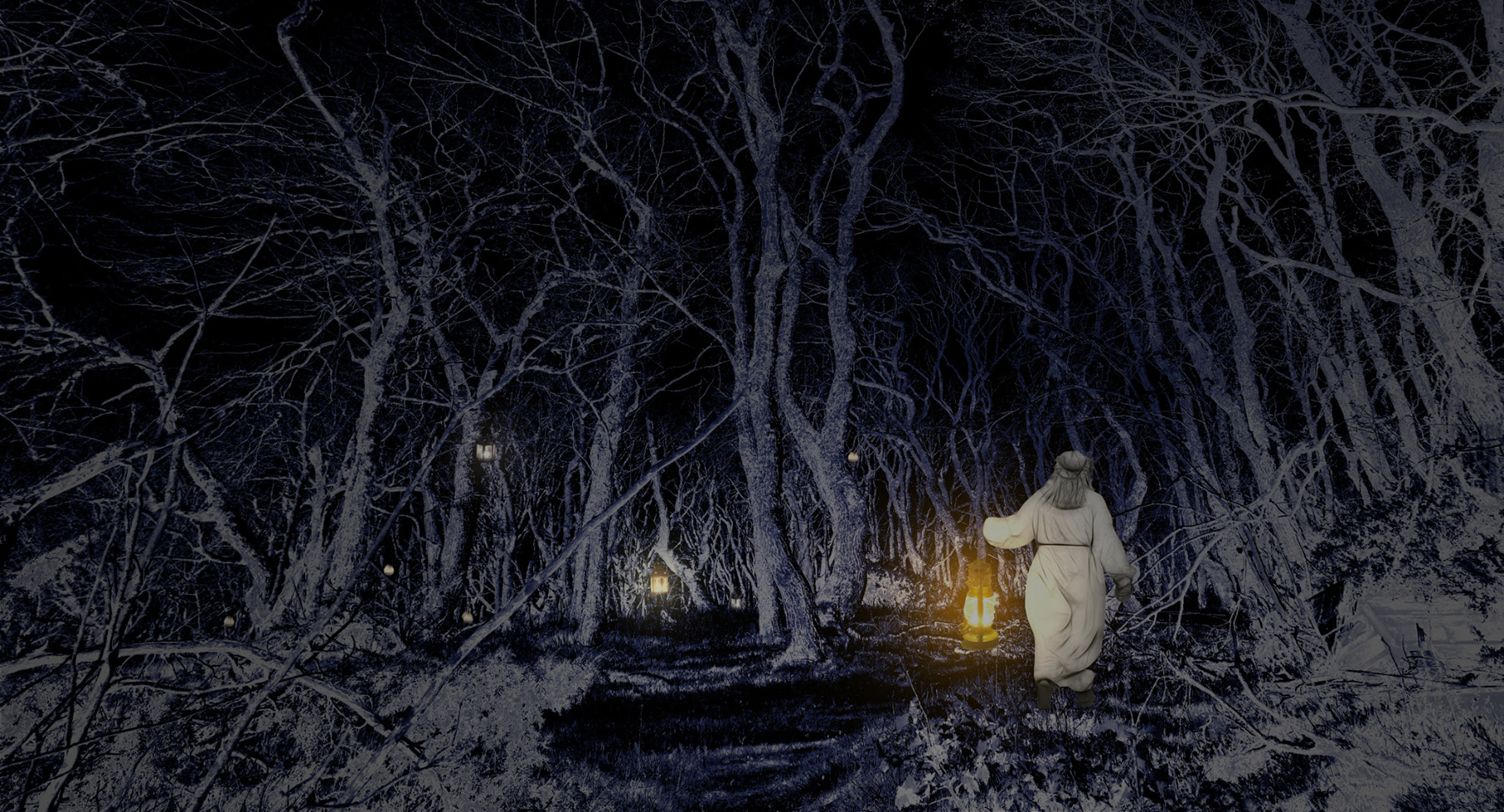
Hi Aavo, a wonderful start for the new year, with the brave adventurer leaving the idyll of the wilderness (maybe at the end of his holidays?) behind and facing the reality. I think that the pixelation gives it a cartoon-like appearance that suits well to the idea, but it would probably look good in smoother form, too.- I wonder if there could be more of the foamy structures blended with the feathered part at the bottom? |
Jan 5th |
| 54 |
Jan 23 |
Comment |
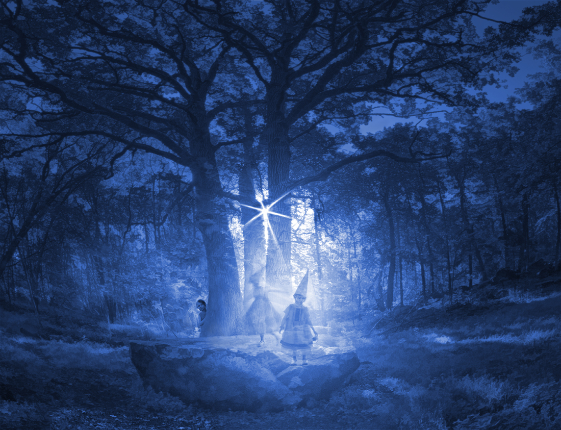
Hi Peggy, this is directly from Santa's workshop. You can sense the movement of the the train that revolves round the tree, and there is such intention in the position of the hand that hopes to grasp it! I just love the way you have created the dream with the soft blurs and the blend of the red and green hues, thank you for describing the steps so clearly! |
Jan 5th |
| 54 |
Jan 23 |
Comment |
Hi Maria, what a lovely light! The hazy pastels bind the the elements together so beautifully, with the girl with the red cart drawing the eye to her. I can feel the moist air and the sand under my toes. - I like both crops: I think that the beacon adds to the sense of being at the seaside, and in Alan's version there is a special sense of space round the girl and the cart on the lonely beach. I think that both of them look very balanced. I wonder if there could be just a little bit more contrast in the outlines of the girl�s arm and the surfing board against the sky? |
Jan 5th |
5 comments - 10 replies for Group 54
|
18 comments - 15 replies Total
|