|
| Group |
Round |
C/R |
Comment |
Date |
Image |
| 15 |
Jul 22 |
Reply |
Thank you all very much - I made all the adjustments you suggested, and they do look good! |
Jul 26th |
| 15 |
Jul 22 |
Comment |
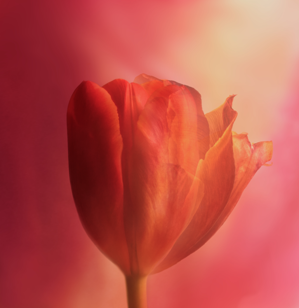
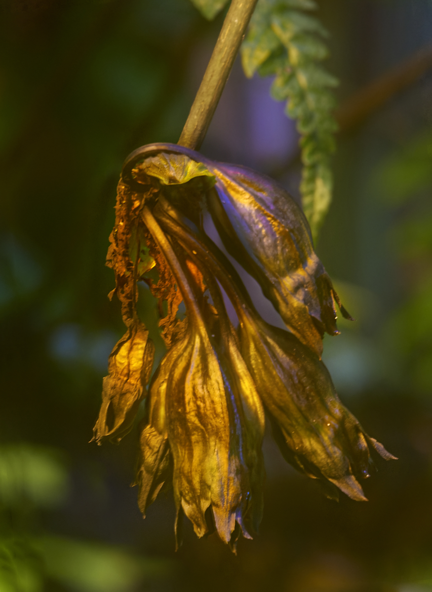
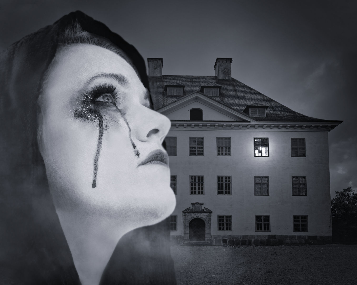
Hi Rick, this is truly no ordinary dahlia! The forms of the petals, the lights and shadows and the softly blending colors are exquisite. The frame that repeats the golden hues against the dark background is a great final touch. |
Jul 9th |
| 15 |
Jul 22 |
Comment |
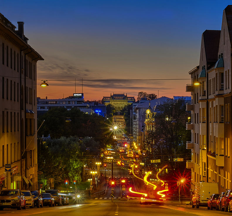
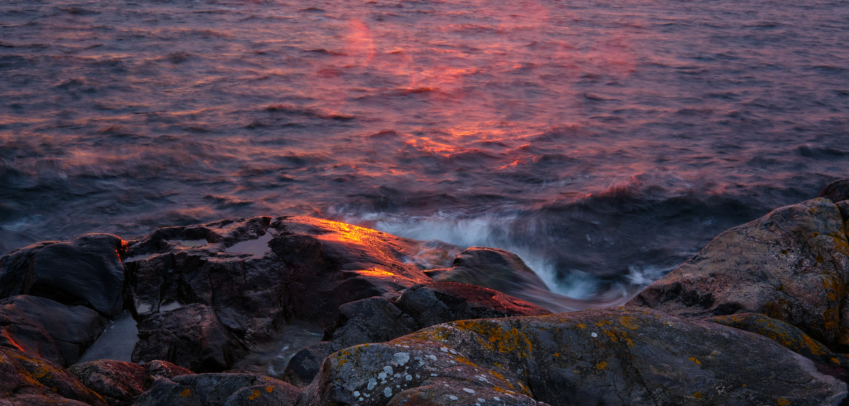
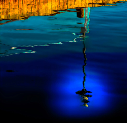
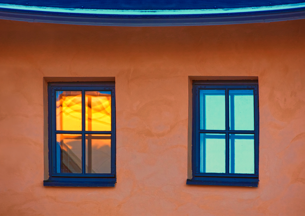
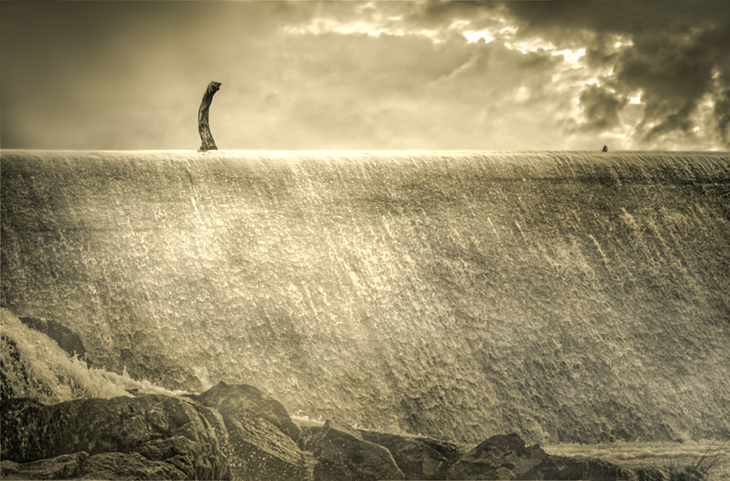
Hi Christine, a truly amazing sunset! I think that you found a great camera angle to capture such a fine composition, with the symmetric reflections and the leading lines. The subtle tones on the buildindgs look great against the blazing sky and its reflection. - I think that the two little bright spots close to the left edge may draw the eye from the center and would be easy to remove? I wonder if the saturation of the greens could be reduced just a little bit? A lovely image! |
Jul 9th |
| 15 |
Jul 22 |
Comment |
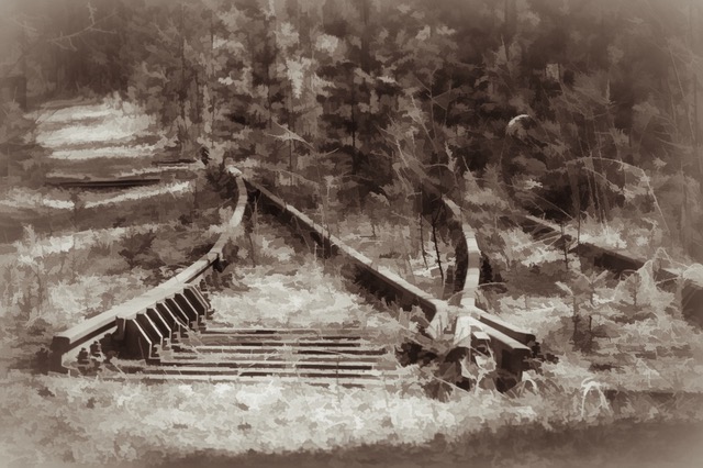
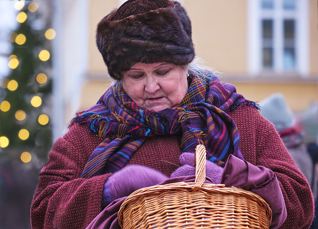
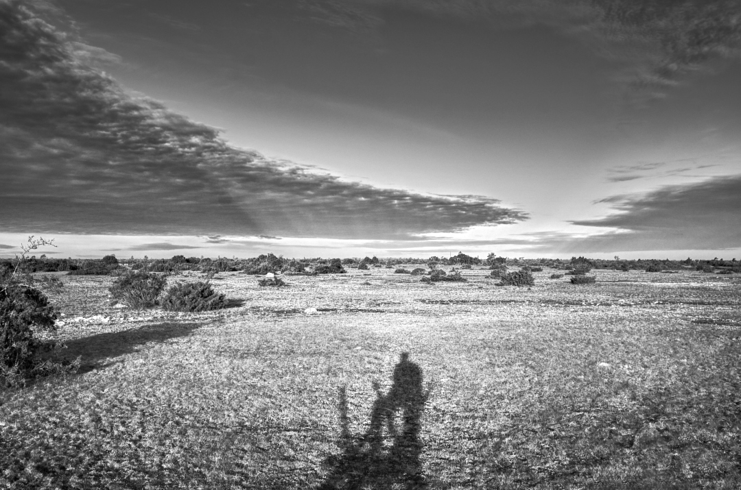
Hi Joan, what a lovely image - another one of yours that I would like to hang on my wall to keep watching it! I think that you certainly picked the best part of the scene. The vertical lines of the tall thin trees give it a fine rhythm, and the combination of the deep orange, dark green and pale grey is so satisfying. - I think that the crop works very well but wonder if you could include just a little bit more from the left edge in the image? |
Jul 9th |
3 comments - 1 reply for Group 15
|
| 47 |
Jul 22 |
Reply |
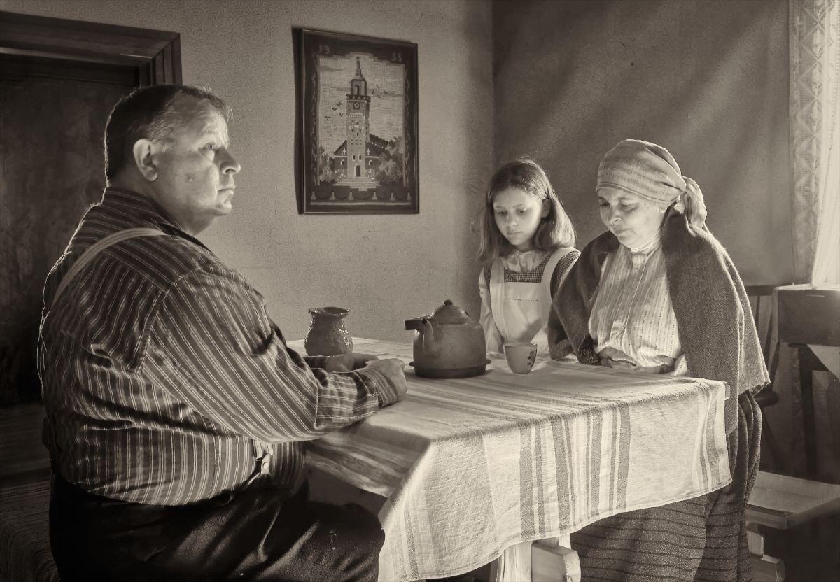
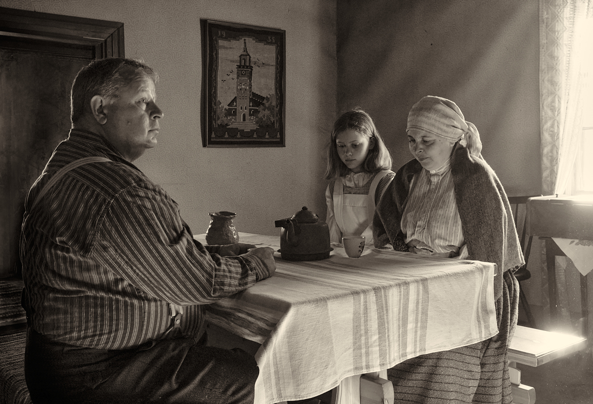
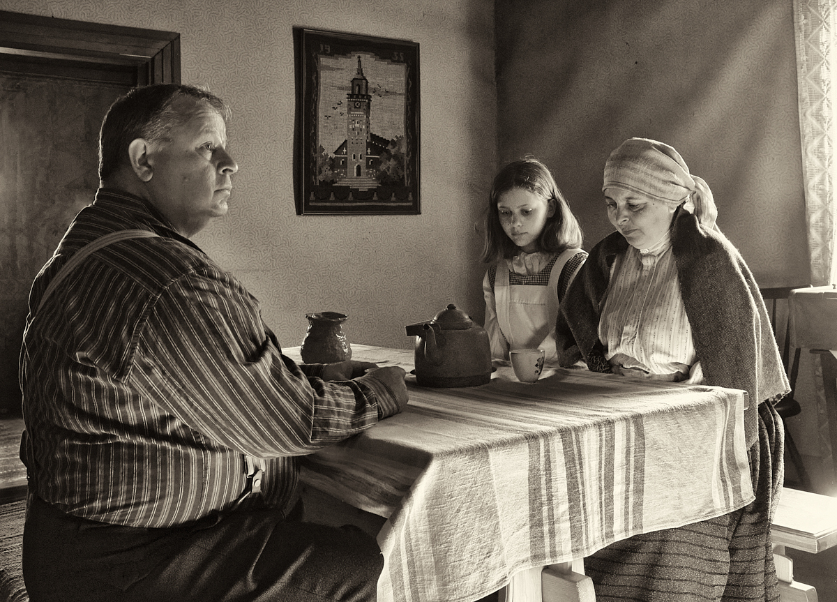
Thank you very much, Lance and all - this is turning into a most rewarding exercise! Here is my Version 3.0. + noise, + glare, + shadows on the faces. I started to think about the light coming from the left that makes a rim on the father - should there be a hint of its origin (as here), or is it a distraction? |
Jul 18th |
 |
| 47 |
Jul 22 |
Comment |
Hi, Al, thanks - I can see your point. I am afraid that the new one does not look quite as it was supposed to. I have probably interpreted the aims incorrectly, and done it all most clumsily. There light effect from the window comes from the folds of the uneven wallpaper, and the light on the mother is from the window, just as they were - they are probably affected by too much contrast? For the first version, I made a whole lot of local brushing to even the shadows and highlights out. I think that I will try to do still one version that is something in between - and I will definitely reduce the contrast in the tablecloth. Constantly learning! |
Jul 15th |
| 47 |
Jul 22 |
Reply |
Hi, sorry, the image sixe was over the limit, so it did not go forward. It is there now. |
Jul 14th |
| 47 |
Jul 22 |
Reply |
Hi Al, thank you! Here is a new version of the image. I started in this wonderful BW mentorship program with Lance Lewin in June, and redid the conversion process following his comments. The main differences are that I did not worry about the noise at all, did more masked layers for fine tuning, payed closer attention to the histogram, and used local brushes for dodging and boring very sparingly. I think the result has more contrast, and shows the people and other details more clearly and lively? I think that especially the father shows more character now. What do you think? |
Jul 14th |
 |
| 47 |
Jul 22 |
Comment |
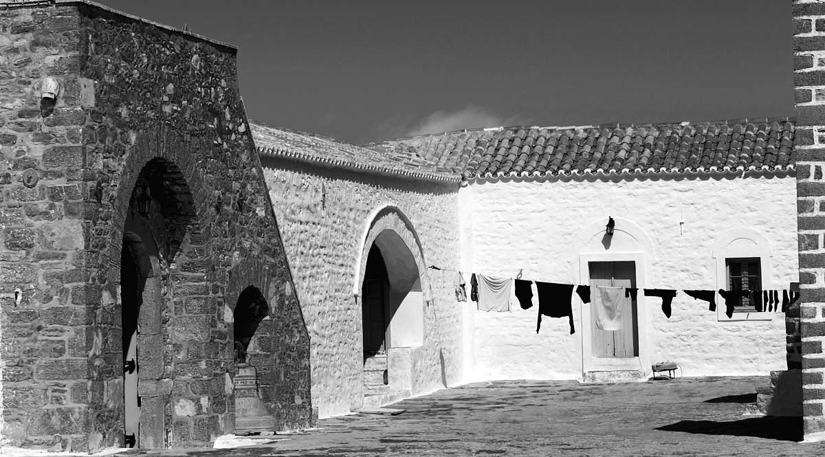
Hi Robert, what wonderful light! I can sense the midday heat reflecting from the brilliantly white wall and the feeling that nothing moves in the yard baking in the sun. The clothesline is a lovely sign of life. - I think that the little bit of brick wall on the right edge kind of forms a frame for the image, balances the structure on the left, and gives an origin point for the shadows, so I like the original crop. - What about applying a gradual ND filter for the sky? |
Jul 14th |
 |
| 47 |
Jul 22 |
Comment |
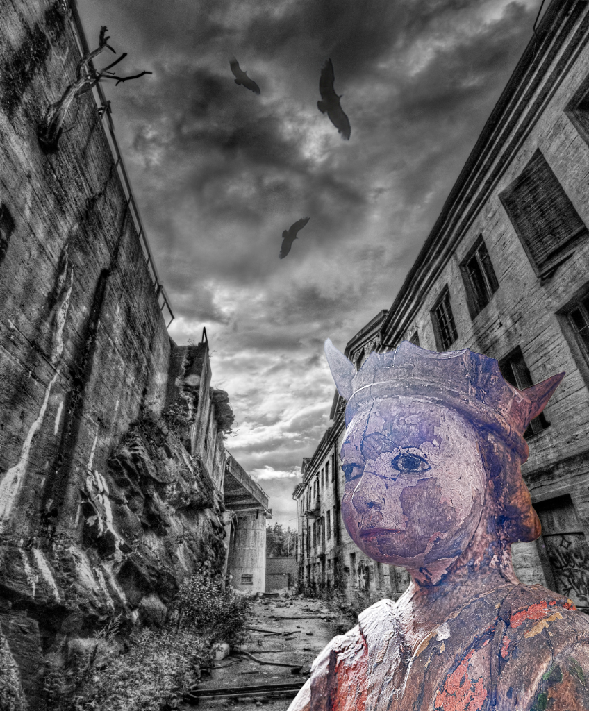
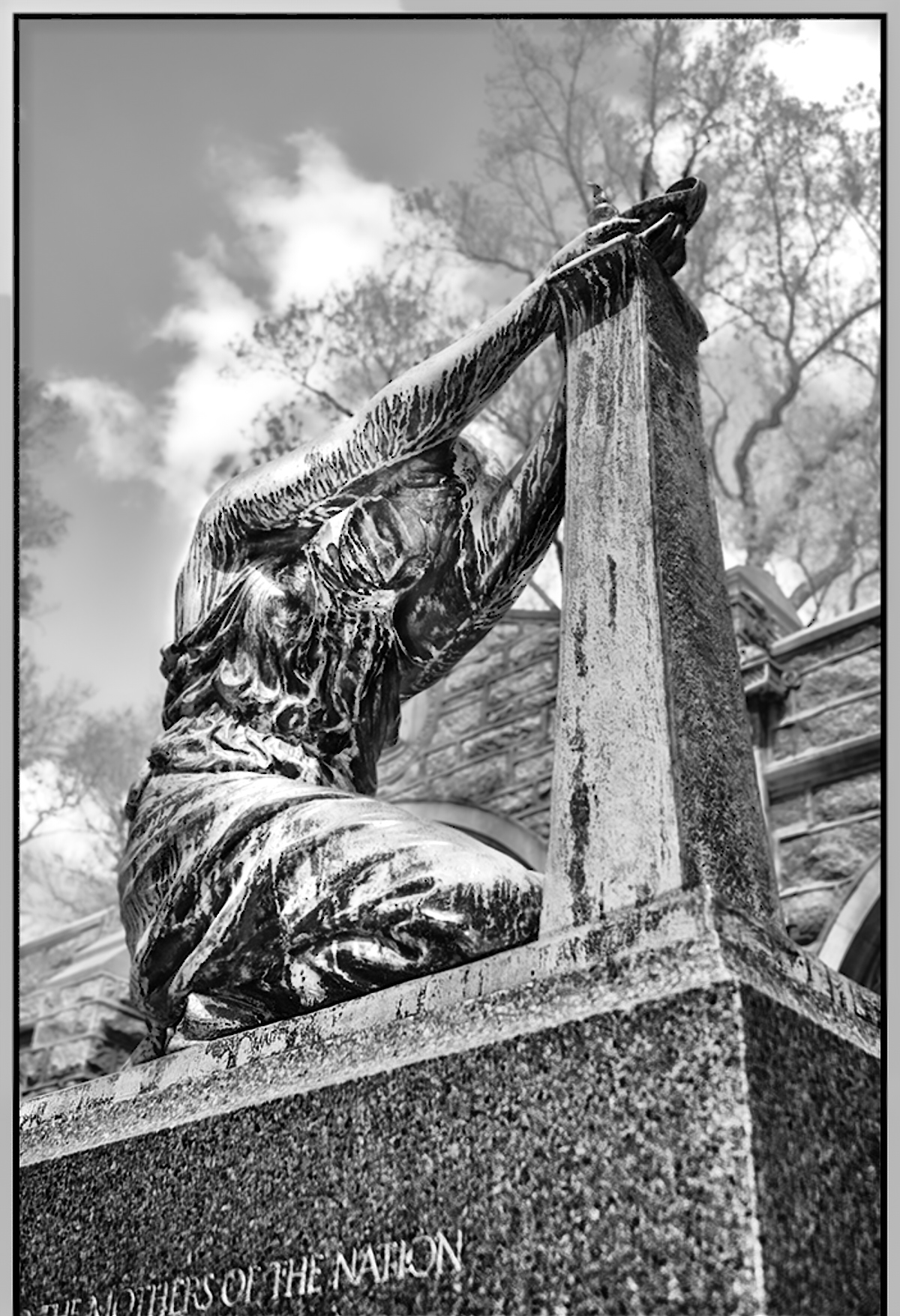
Hi Ed, the image is filled with emotional impact: I think that Al says it all so beautifully. - The original speaks to me more strongly, I think it is the camera angle. I think, like Al, that it would be enough to just subtly blur the background. I made a mask for the sky, trees and the wall in the background, and brought clarity, contrast and structure down, and increased brightness a bit, and made opposite changes for the statue. She shows now darker against the background, but I think that it might emphasize her tragic nature. What do you think? |
Jul 14th |
 |
| 47 |
Jul 22 |
Comment |
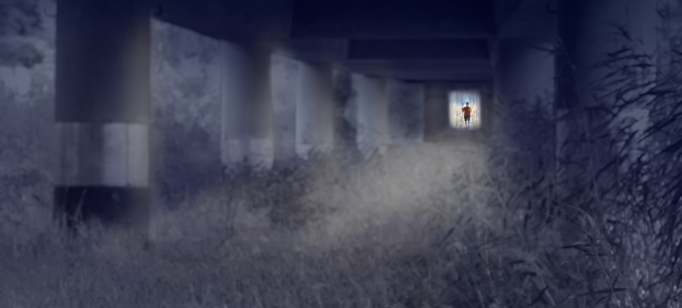
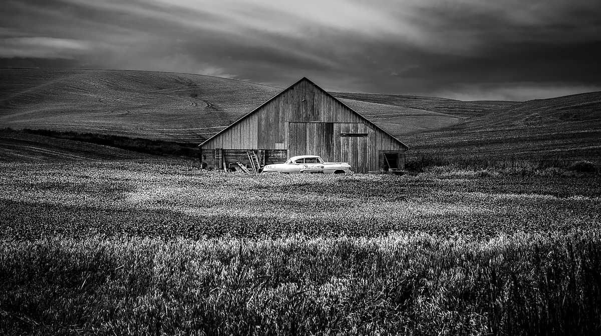
Hi Jeff, there is a lovely desolate atmosphere with the barn and the car in the middle of nowhere under the moody sky, and definitely a story. My favourite is a Bonnie-and-Clyde type hidden get-away car episode. - I think that there are many crops that would work: the original centered composition emphasizes the incongruous sight of a car in such a place, and Al's suggestion would make even more of the loneliness. I think that you could also try to crop off some of the sky (although it would be a pity) to make one feel like wading through the very wide field to reach the car? A wonderful image! |
Jul 14th |
 |
| 47 |
Jul 22 |
Comment |
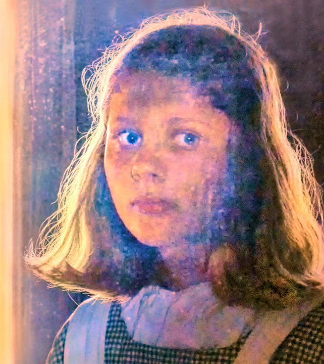
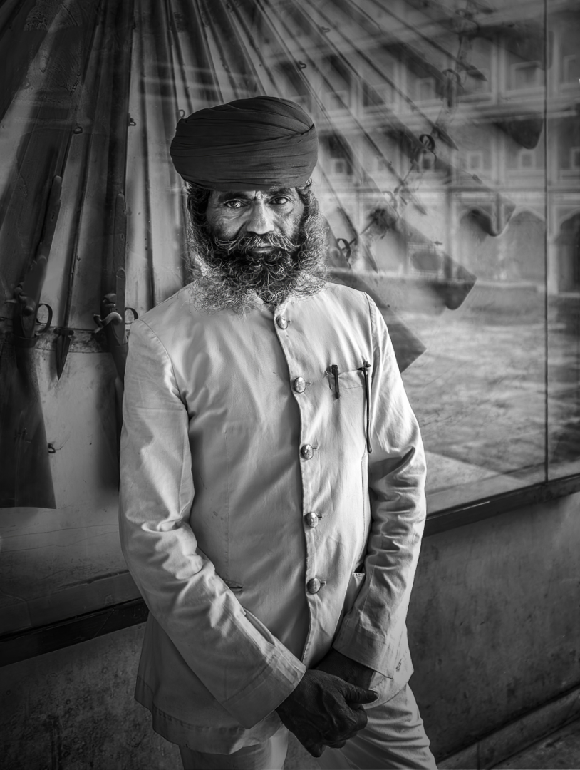
Hi, I love the image so much, too! You have really captured the calm purposeful dignity of the guard in a perfect way, and the background locks him in time and place, and in his task. I like Jeff's version very much, too.
- Here are some more ideas for the original crop: I corrected the perspective slightly to make the lines of the reflection of the building vertical so that it might be easier to see that there is a palace he is guarding. I tried to make the blotchy part of the reflection less conspicuous - used the frequency separation filter in Affinity Photo and painted the light areas with a darker tone. Cropped just a little bit off from the left edge. Darkened the light triangle in the lower right corner. Added a slight vignette, and a little bit of brightness and contrast. What do you think? |
Jul 14th |
 |
| 47 |
Jul 22 |
Reply |
Hi Robert, thank you! It has really been a privilege to get to work with the group! I like the sepia tone myself, too. Please check the newest conversion attempt - I would love to hear what you thinkK |
Jul 14th |
| 47 |
Jul 22 |
Reply |
Hi Jeff! I think that is a very good idea. Please check the newest conversion posted for Al: I think that it has got the same effect? |
Jul 14th |
| 47 |
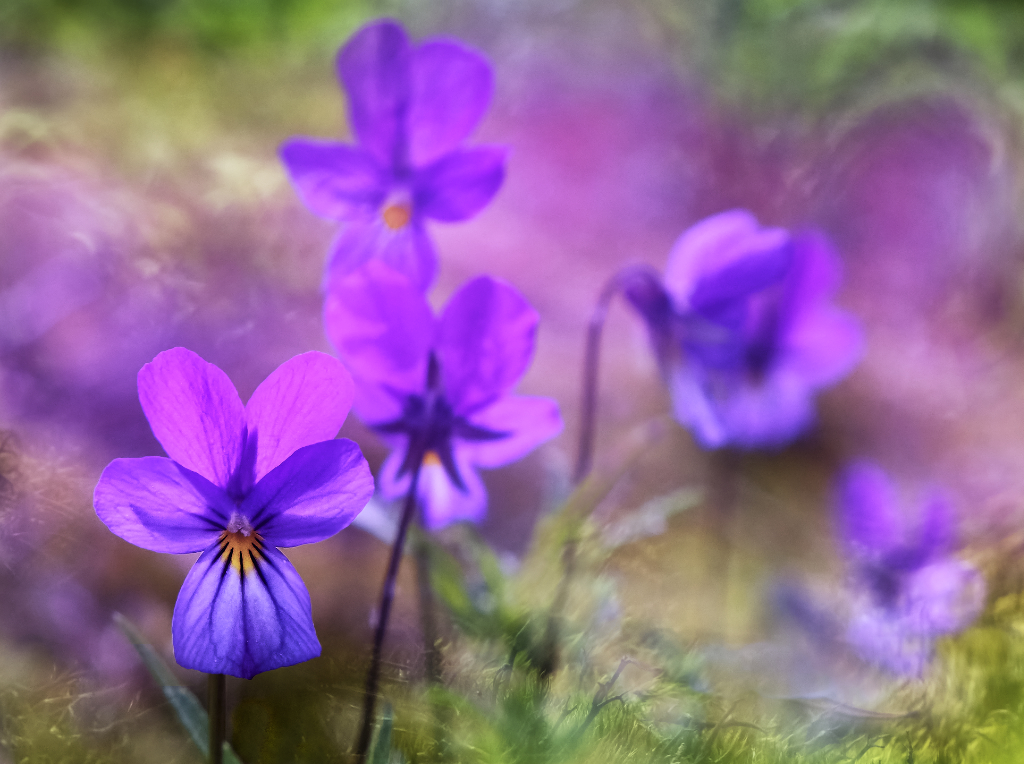
Jul 22 |
Comment |
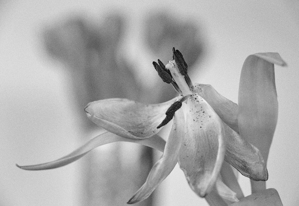
Hi, I totally agree with Ed. An exquisite image of the flower, with the beautiful tones on the petals. I think that the toning suits perfectly to the image. |
Jul 9th |
| 47 |
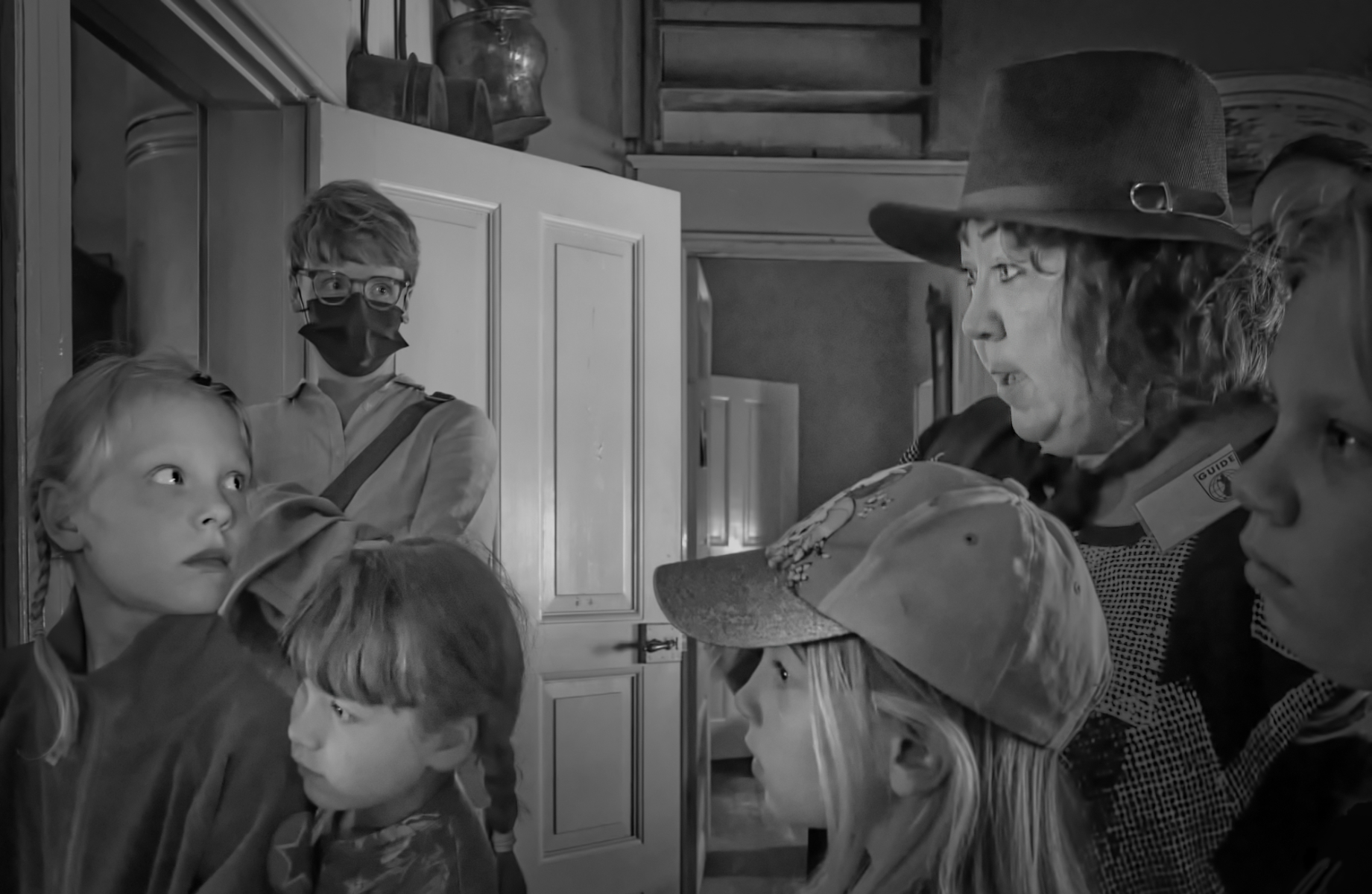
Jul 22 |
Reply |
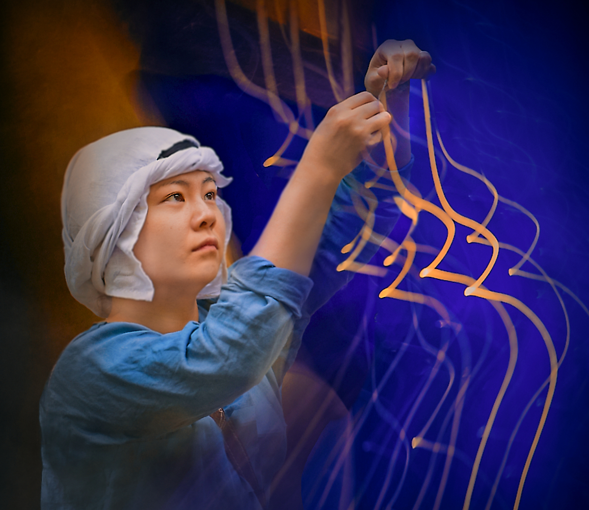
Thanks, Ed, I am so glad that you caught the intended atmosphere. The actors were just wonderful, changing gears within minutes from one scene to another, and brilliantly calm and patient. |
Jul 9th |
6 comments - 6 replies for Group 47
|
| 54 |
Jul 22 |
Reply |
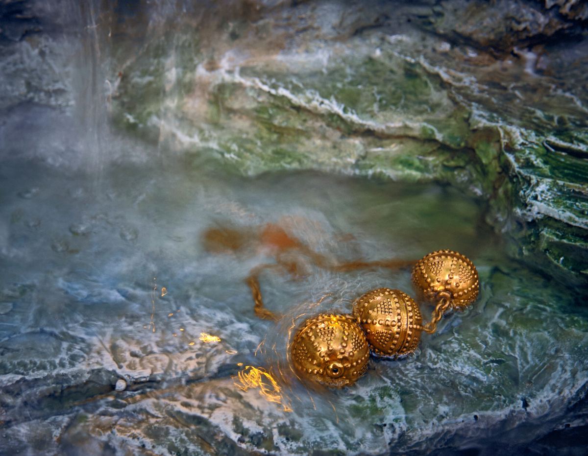
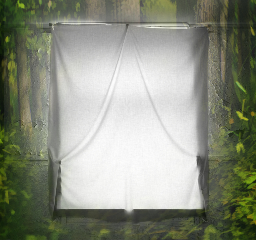
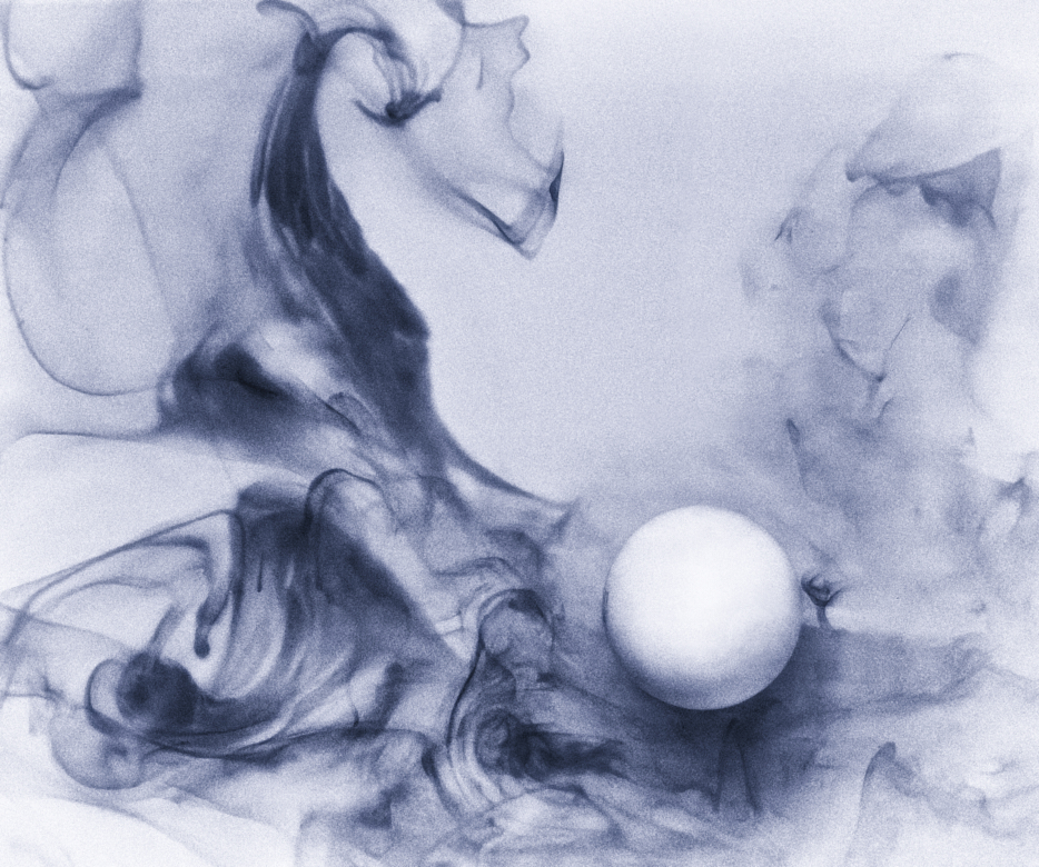
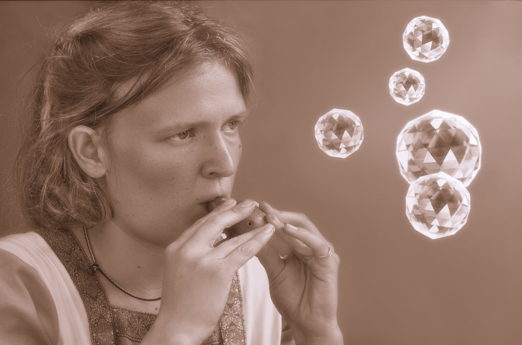
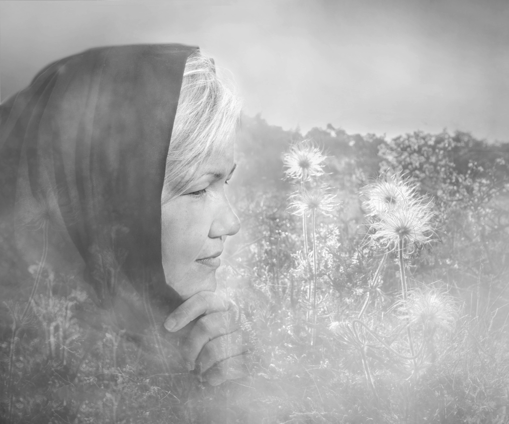
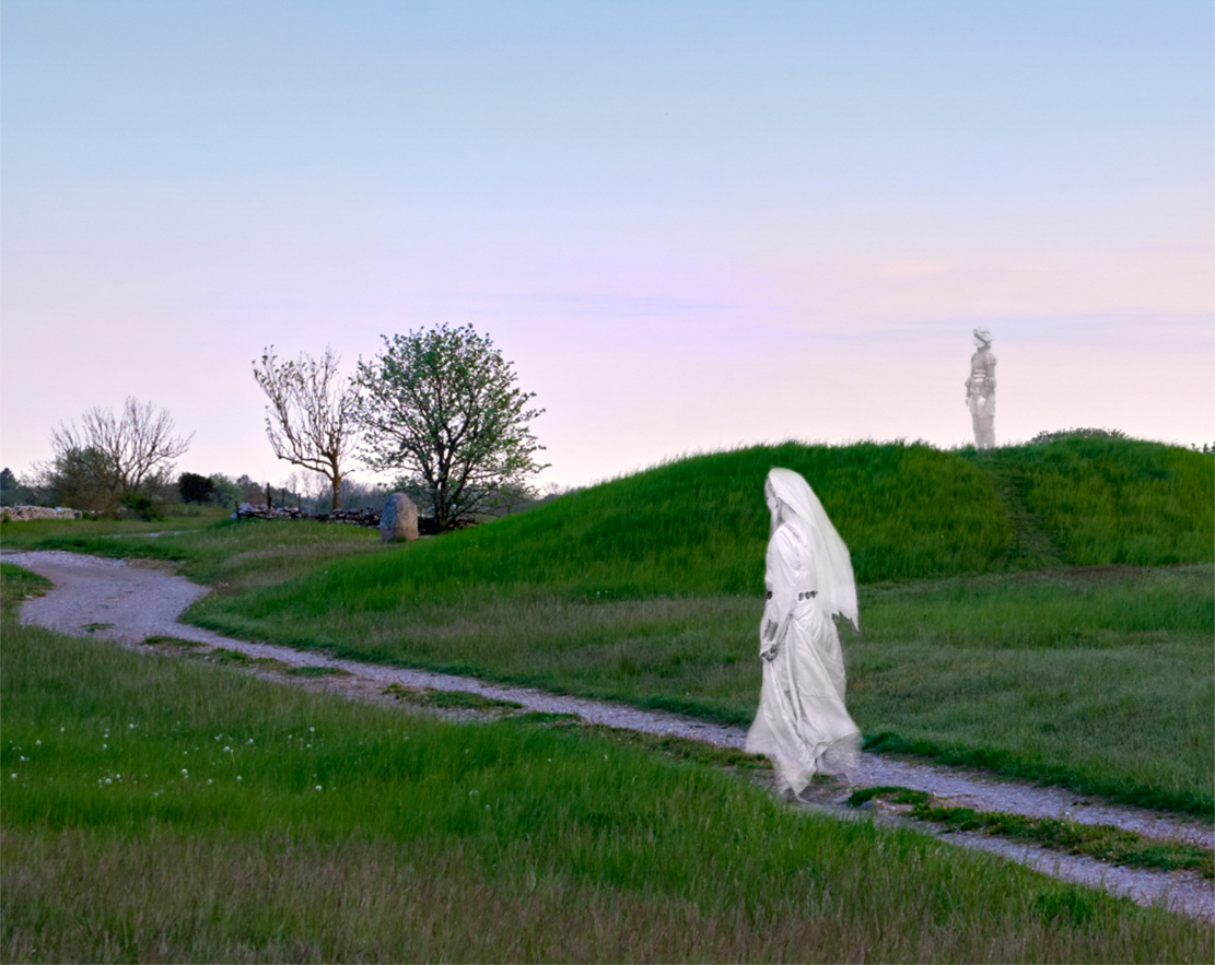
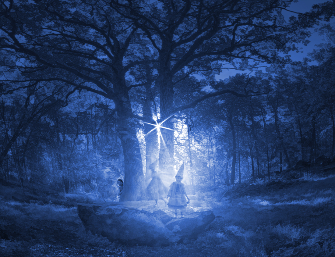
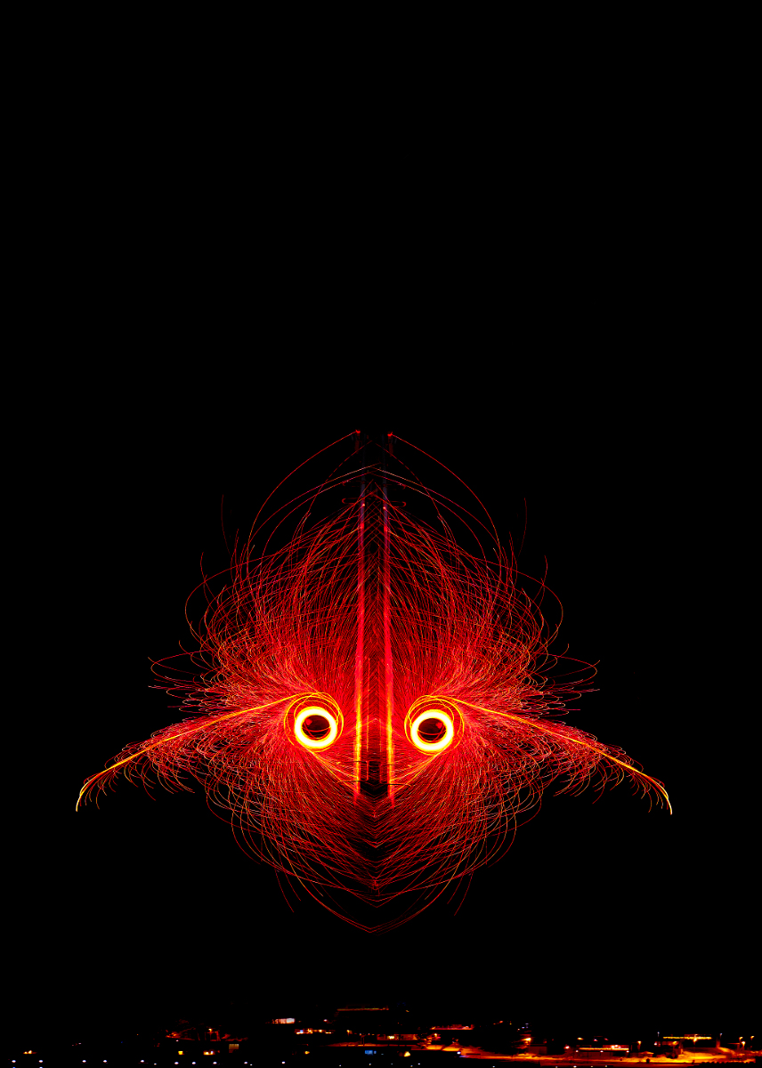
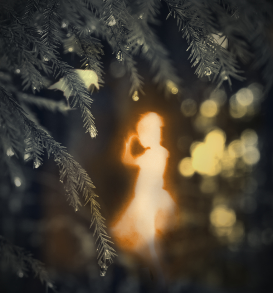
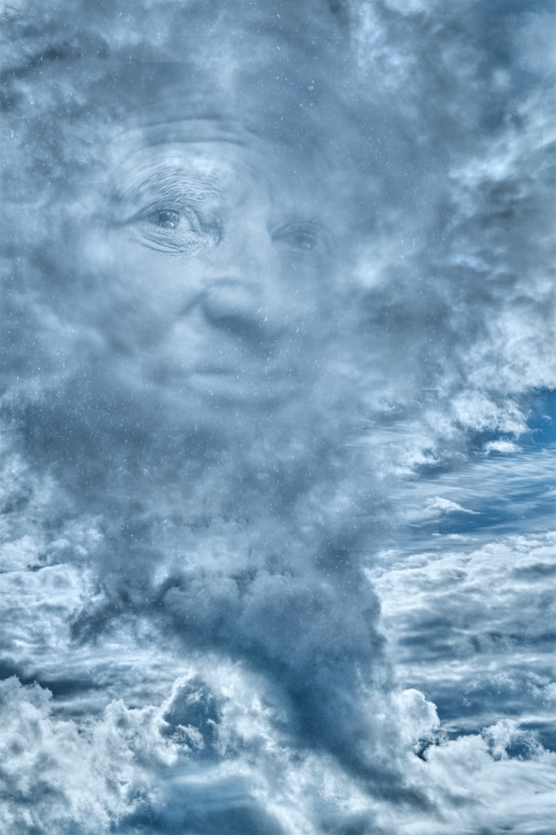
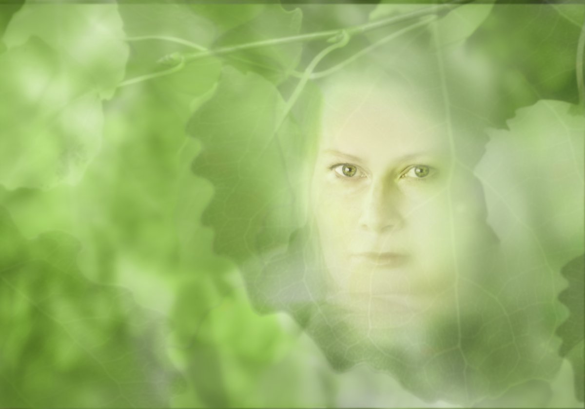
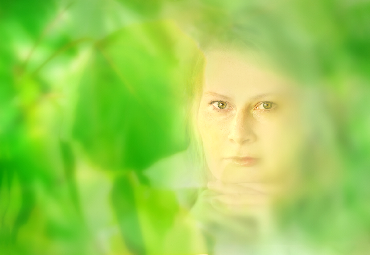
Hi, here she is behind a layer of more definite leaves + some diffuse glow. I tried to change the hue of the greens - it looks less vile now but is still not right. I think that I will keep working on her a while - just cannot let her go! |
Jul 26th |
 |
| 54 |
Jul 22 |
Reply |
Thanks, Aavo, you are right about the green. I was aiming for the kind of color you see early in the summer in bright sunlight when you lie under a tree and look up in the foliage, but the tone is definitely not right. - I went and took more photos of the leaves, and try to work on it. Will try the brown, |
Jul 14th |
| 54 |
Jul 22 |
Reply |
Thanks, Brad you are absolutely right about the color. Working on it. |
Jul 14th |
| 54 |
Jul 22 |
Reply |
Thank you so much! I will try that next! |
Jul 11th |
| 54 |
Jul 22 |
Reply |
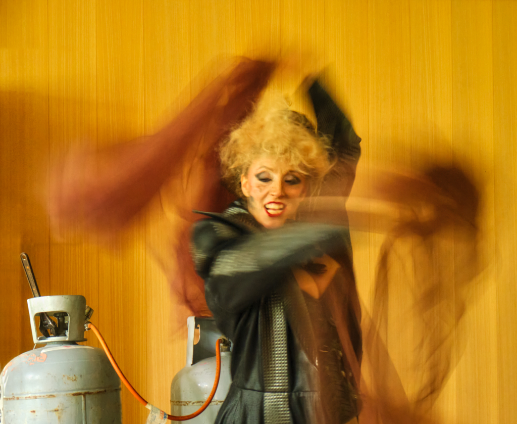
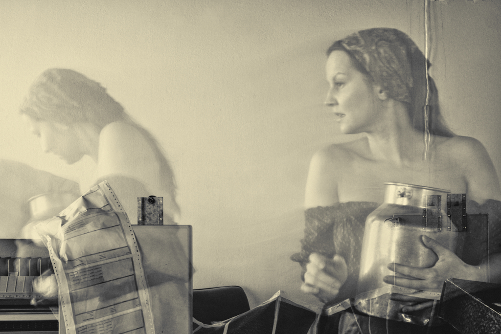
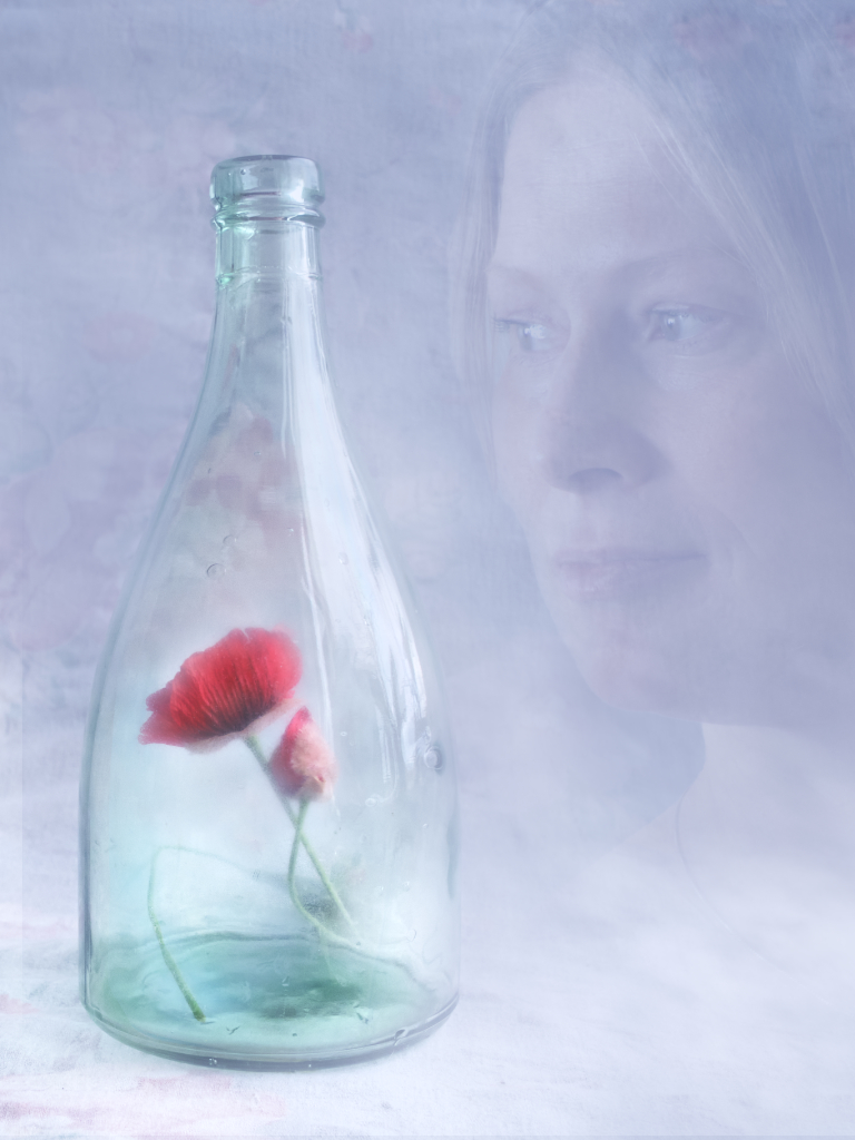
Hi, here is my next attempt. I reduced brightness and increased contrast to get rid of the flat overexposed look. To bring back the feeling of sunlight filtering through the leaves I added an external spot light source to both the upper corners, and some layers of leaves and Gaussian blur to soften the effect. - I think that this needs to be a soft, high-key image - she is a spirit, after all, and I would like to make her look like she could as well be just a trick of light and shadow. - Do you think that this is any improvement? |
Jul 9th |
 |
| 54 |
Jul 22 |
Comment |
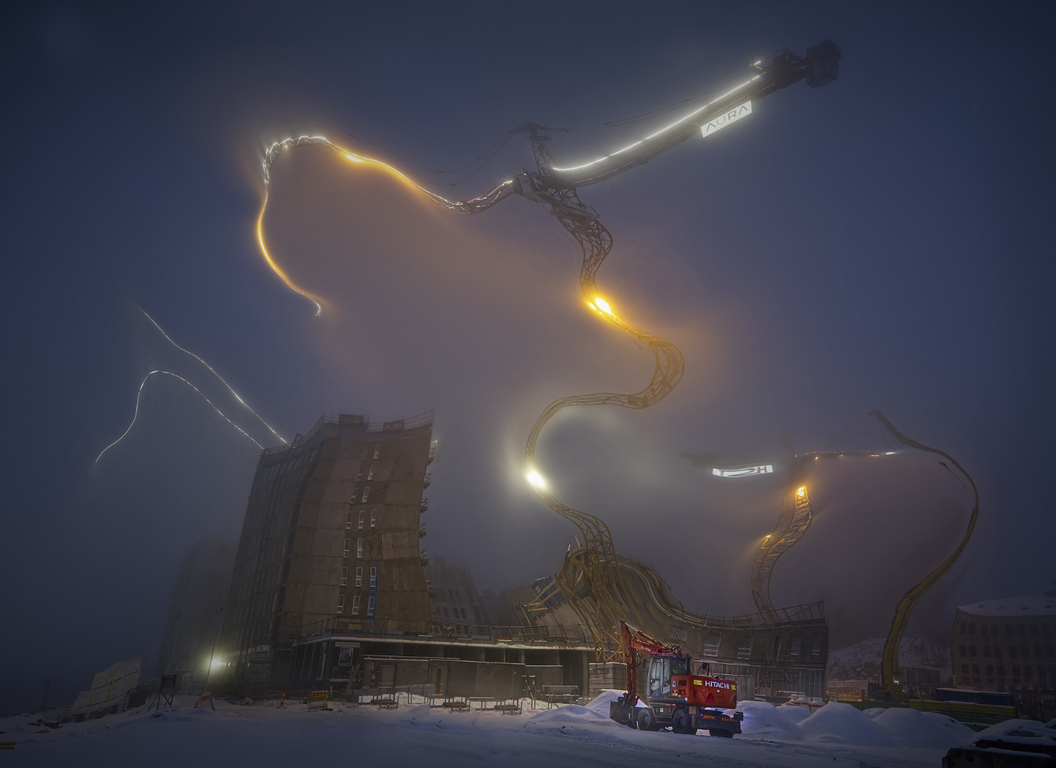
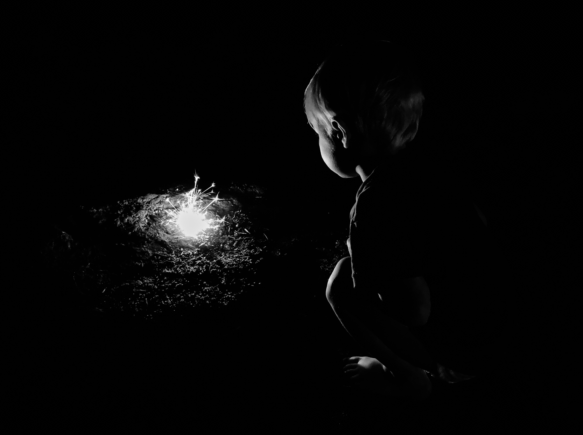
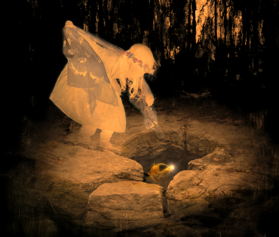
Hi Alan, a narrow escape indeed! The minimalistic approach with the blue color scheme, simple composition and black background works beautifully, and the posture of the man huddling in the box is perfect. I so admire the natural-looking way the light touches the man and the balloons. |
Jul 7th |
| 54 |
Jul 22 |
Comment |
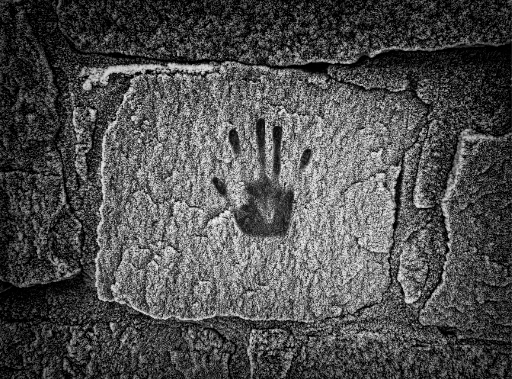
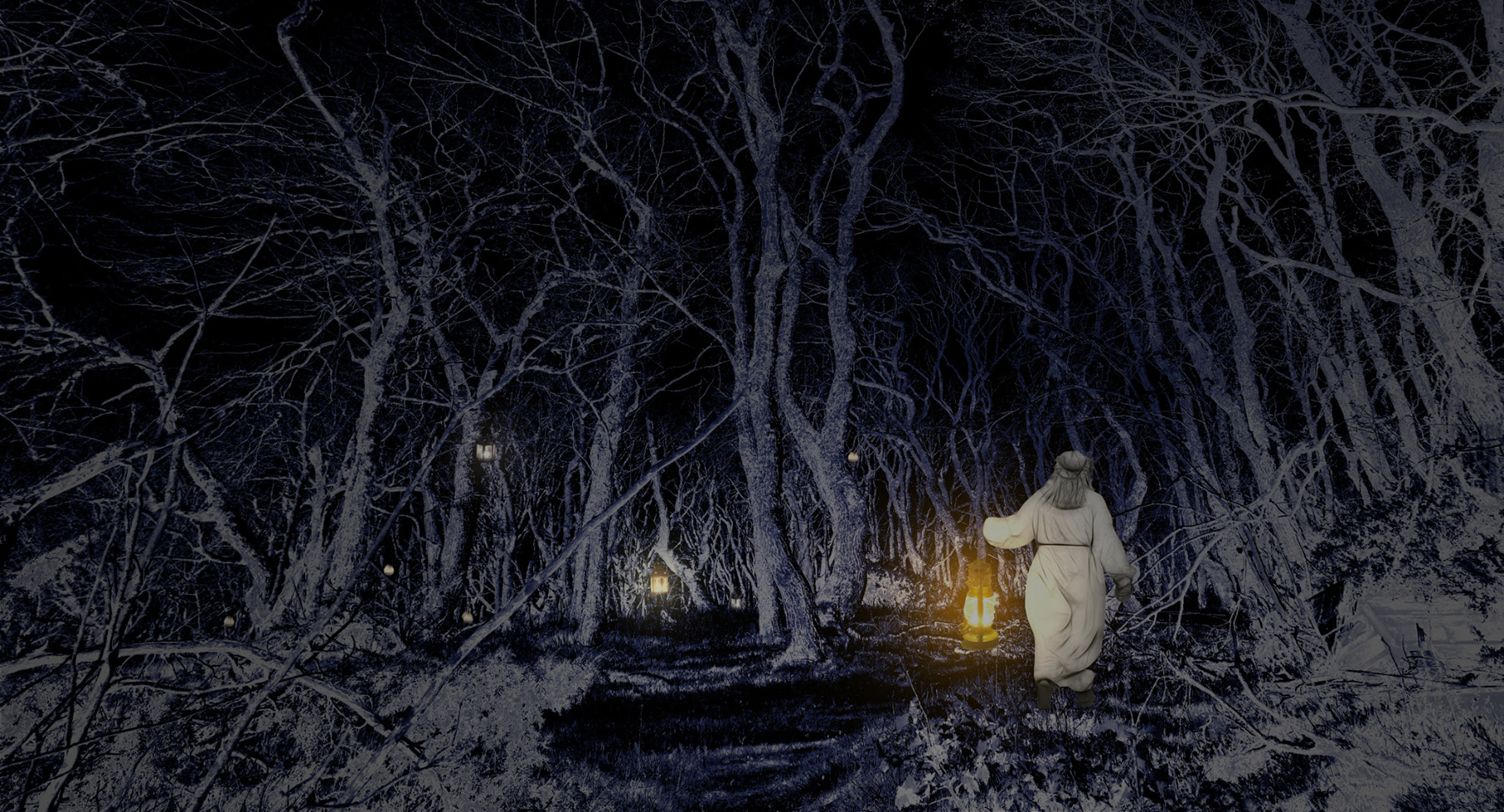
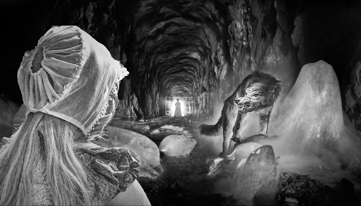
Hi Brad! The image made me think of the scene in Ursula Le Guin's Earthsea novels with the border between the dusty colorless land of the dead and the vivid world of the living. I think that the spray-can version speaks to me most strongly, with the infusion of color, light and life into the land of shadows. - in Version 3, I like the way the people make a choice of an untrodden path, and escape the Hand. There are so many alternate stories in these intriguing images! |
Jul 7th |
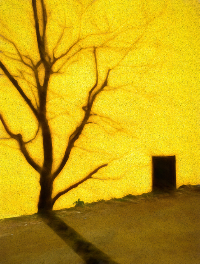
| 54 |
Jul 22 |
Comment |
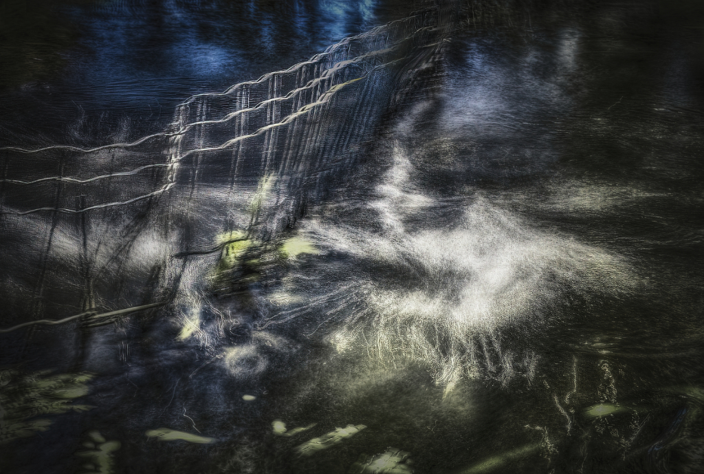
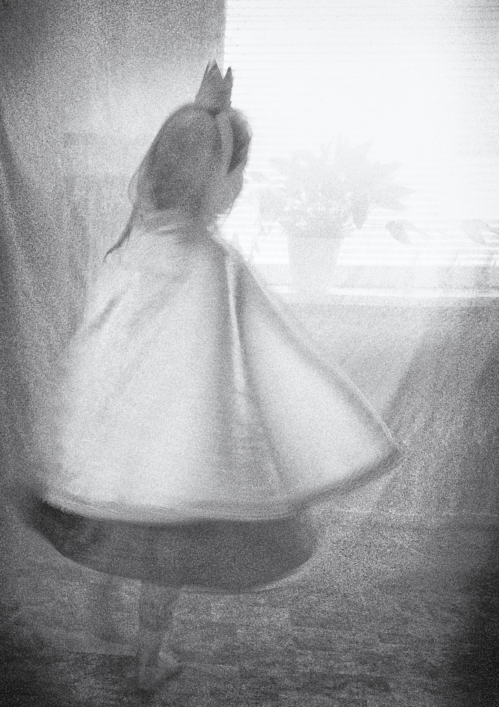
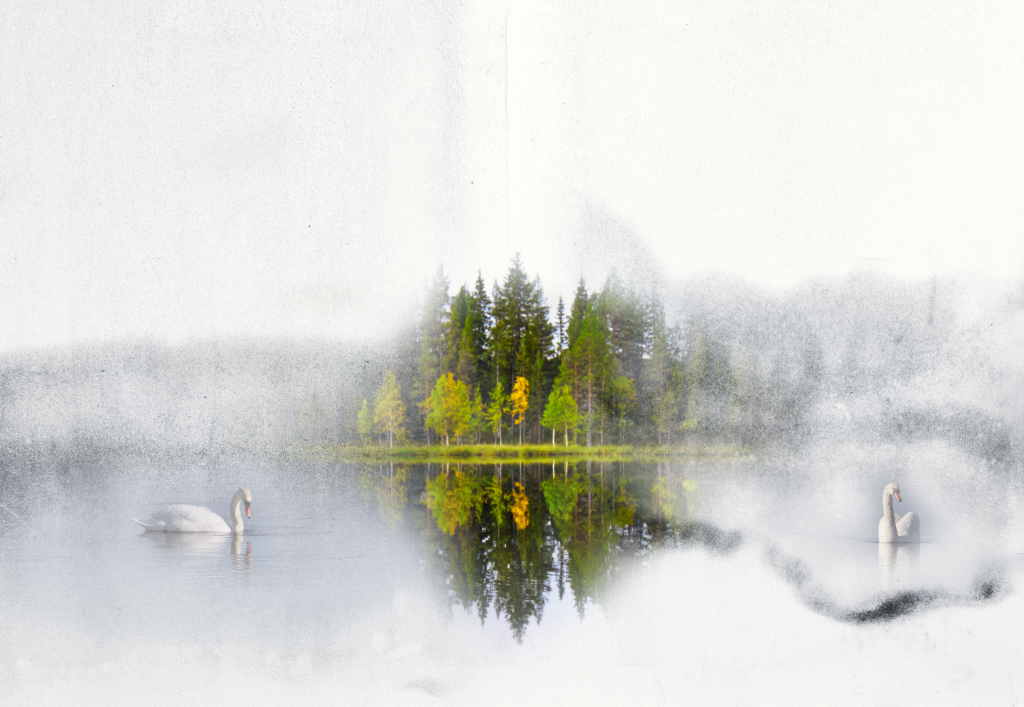
Hi Maria, there is such a strong feeling of sadness and loss and emptiness. The sky is just perfect for the mood. I think that Alan's suggestion of moving the girl to break the balance gives it more strength and tension, and also more sense of depth. It becomes more the girl's story, the wonderful barren trees framing the scene and the fence leading over the hill. |
Jul 6th |
| 54 |
Jul 22 |
Reply |
Thank you, Alan! I looked Steve's image up, and I can see what you mean. I will keep on working! |
Jul 6th |
3 comments - 6 replies for Group 54
|
12 comments - 13 replies Total
|