|
| Group |
Round |
C/R |
Comment |
Date |
Image |
| 15 |
Mar 22 |
Reply |
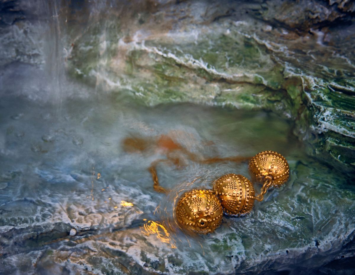
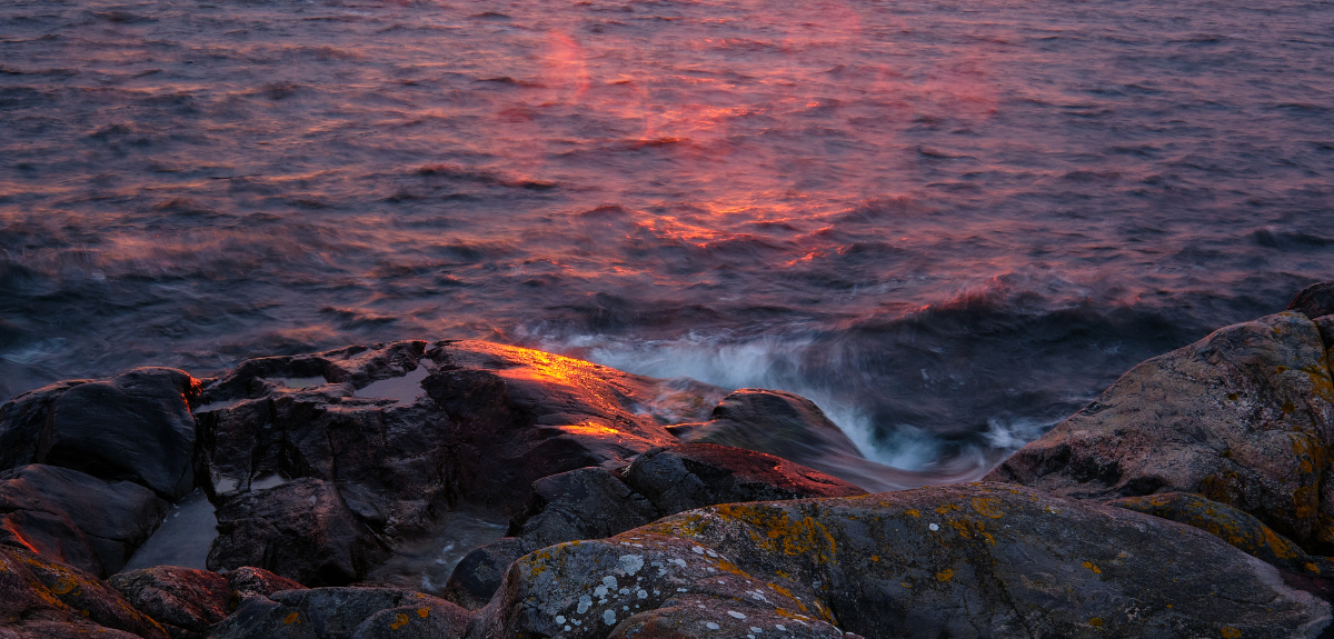
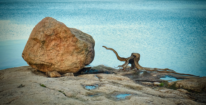
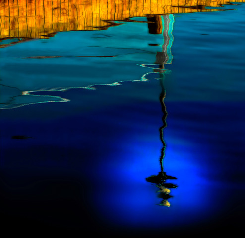
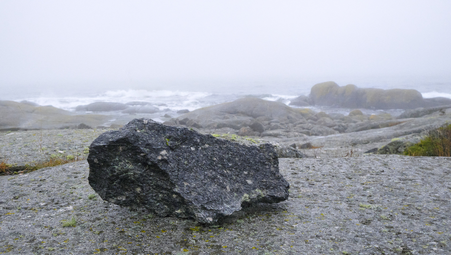
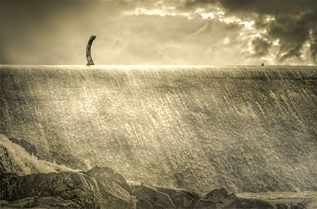
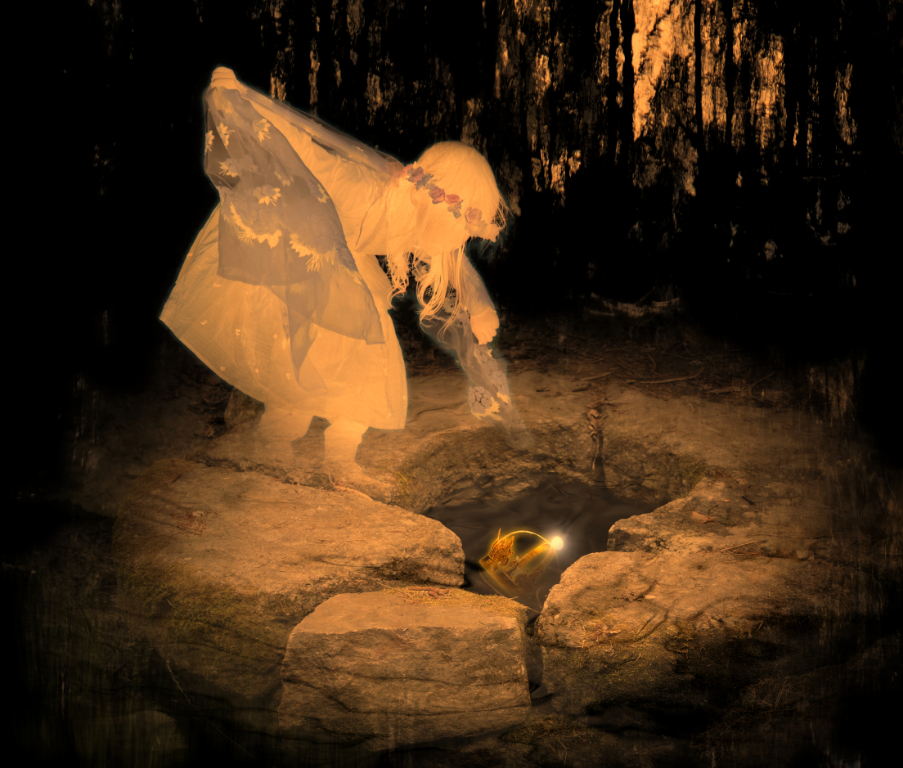
Thanks, Joan! The new crop definitely makes it so much stronger. I think that the glowing rock is now clearly the center, and the contrast between the foreground and the water is better. It is a wonder how much difference this makes! |
Mar 25th |
| 15 |
Mar 22 |
Comment |
Thanks, Billy! I love the light, too! |
Mar 22nd |
| 15 |
Mar 22 |
Comment |
Thanks, Linda! I think you are right about the crop. I will try it right away! |
Mar 18th |
| 15 |
Mar 22 |
Reply |
Thank you, Cristine - exactly my feelings! |
Mar 16th |
| 15 |
Mar 22 |
Comment |
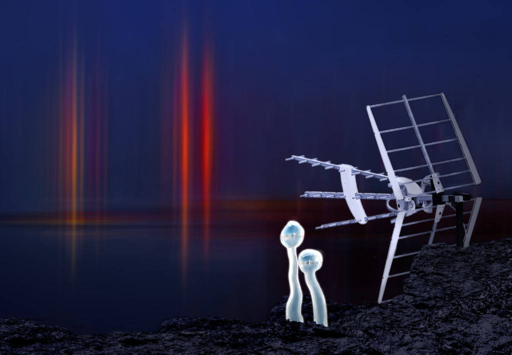
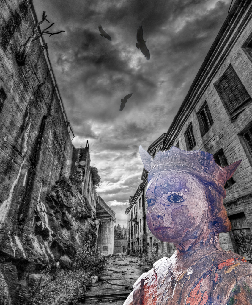
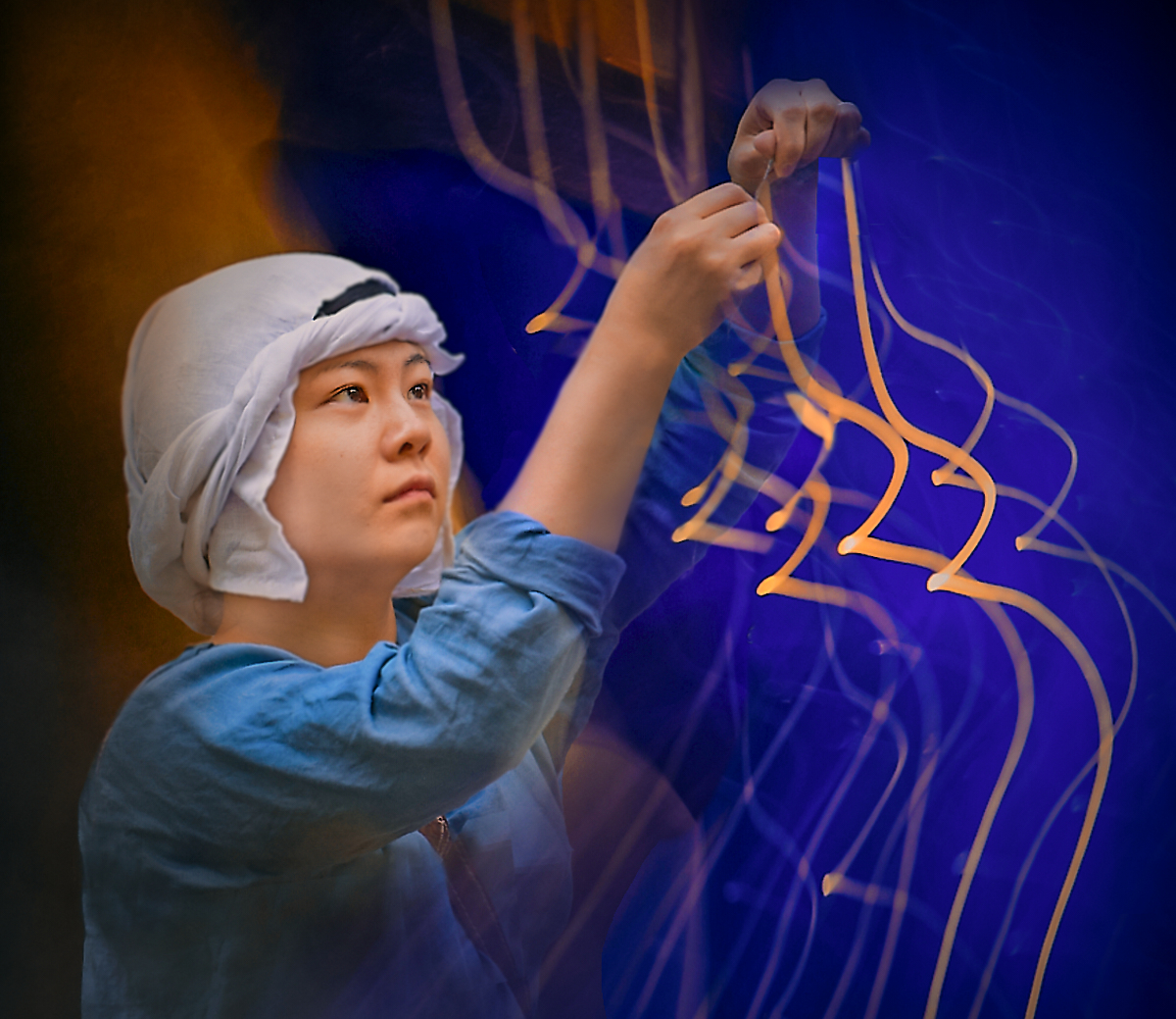
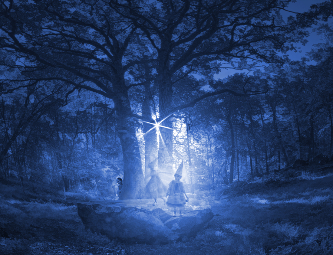
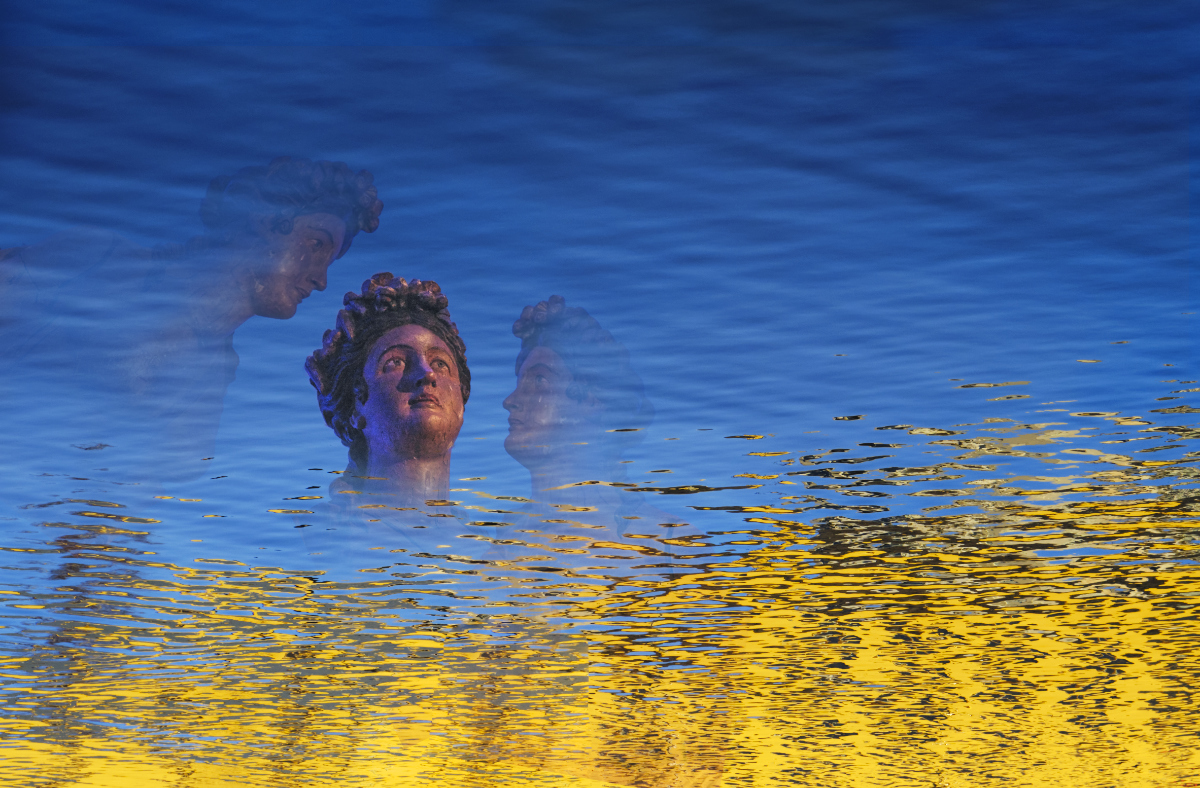
Hi Linda, this is cool! There is a surreal sci-fi feeling that high-key tones emphasize. The faded oranges and blues make a perfect contrast, and the rhythm of the angular shapes and the arches is very effective. An intriguing image! |
Mar 15th |
| 15 |
Mar 22 |
Comment |
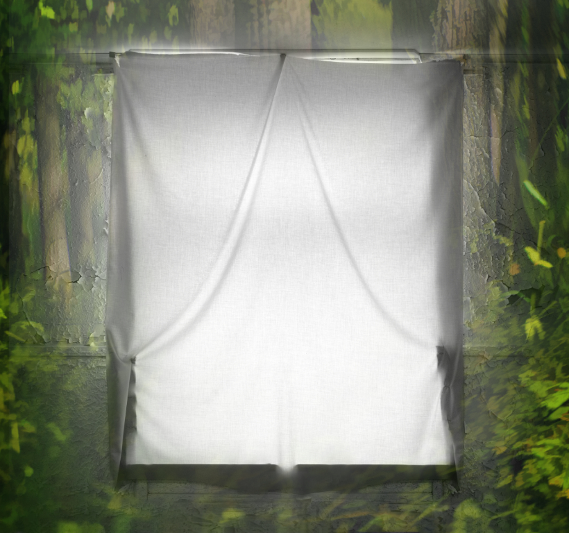
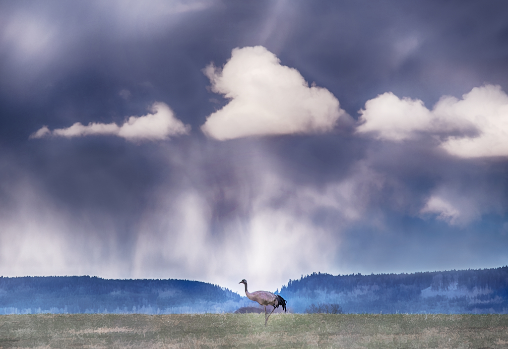
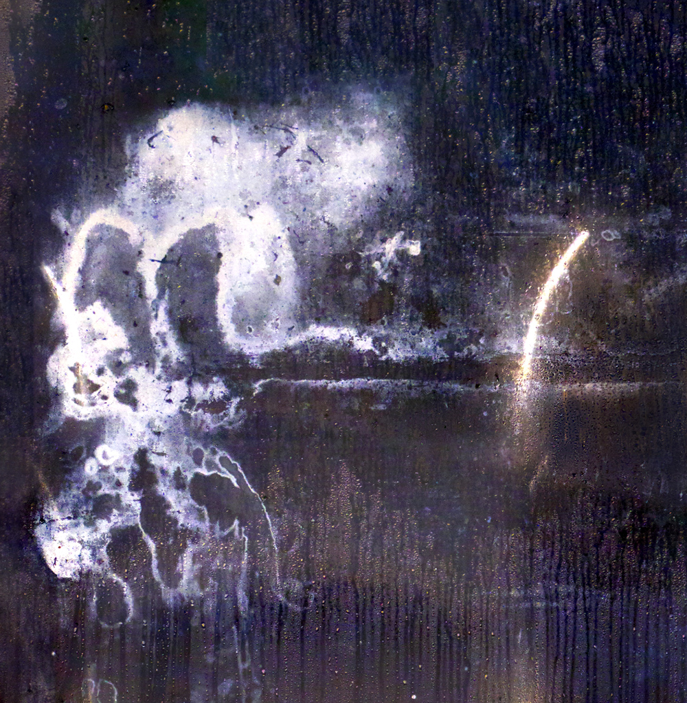
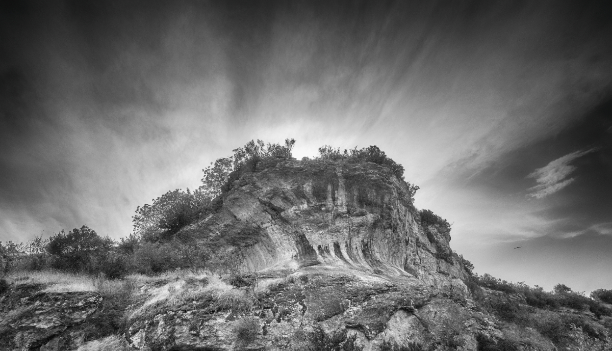
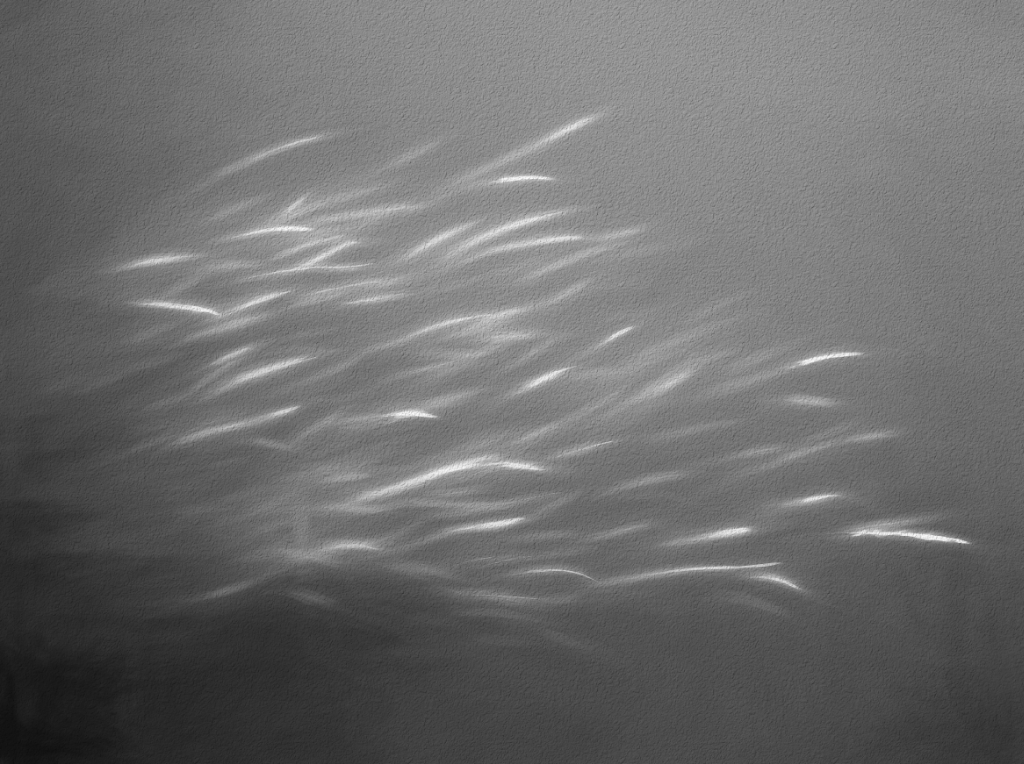
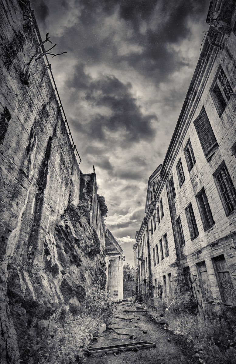
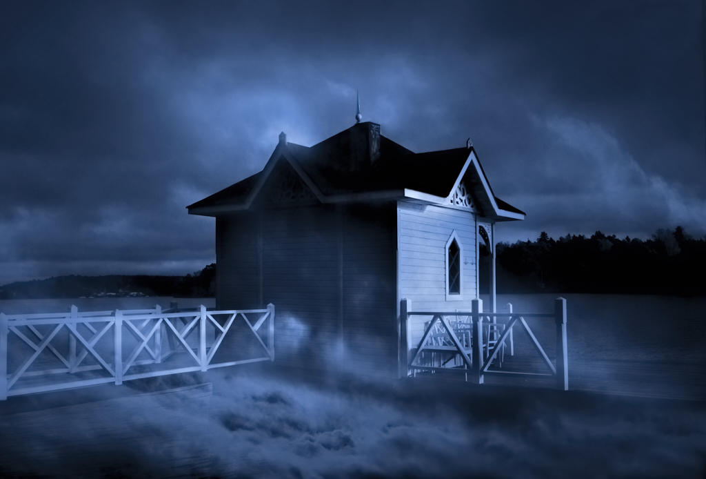
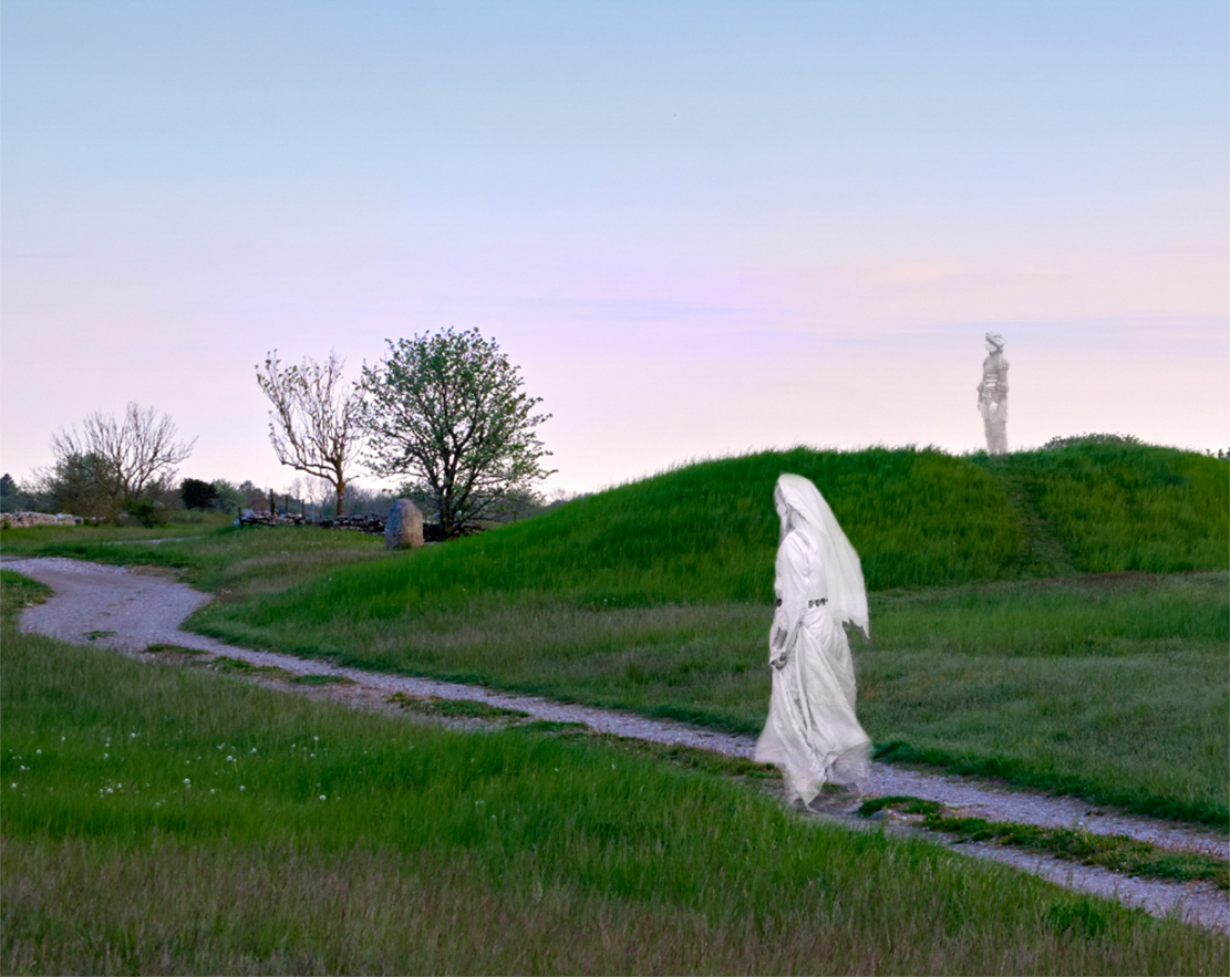
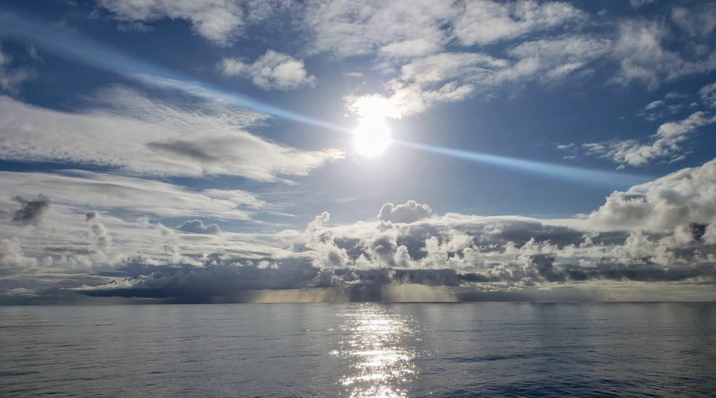
Hi Christine, a lovely image! I totally agree with Joan and Jeri: the clouds are impressive, and the diagonal blue ray really makes it special. I think that the centered composition is perfect. I would also vote for cropping the bottom part, what do you think? |
Mar 15th |
 |
| 15 |
Mar 22 |
Comment |
Thank you, Jeri, I am glad that the magic comes through! |
Mar 12th |
| 15 |
Mar 22 |
Comment |
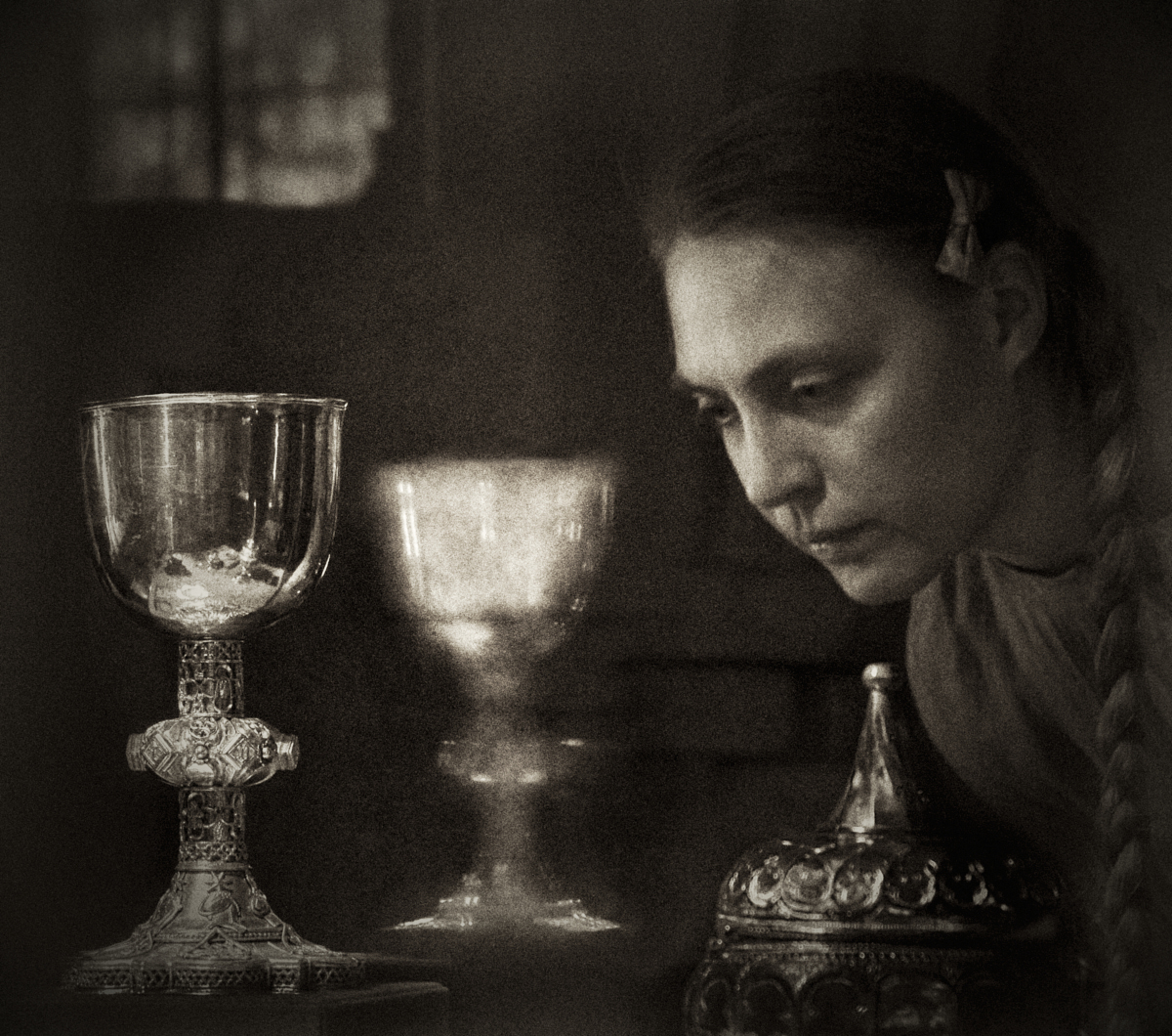
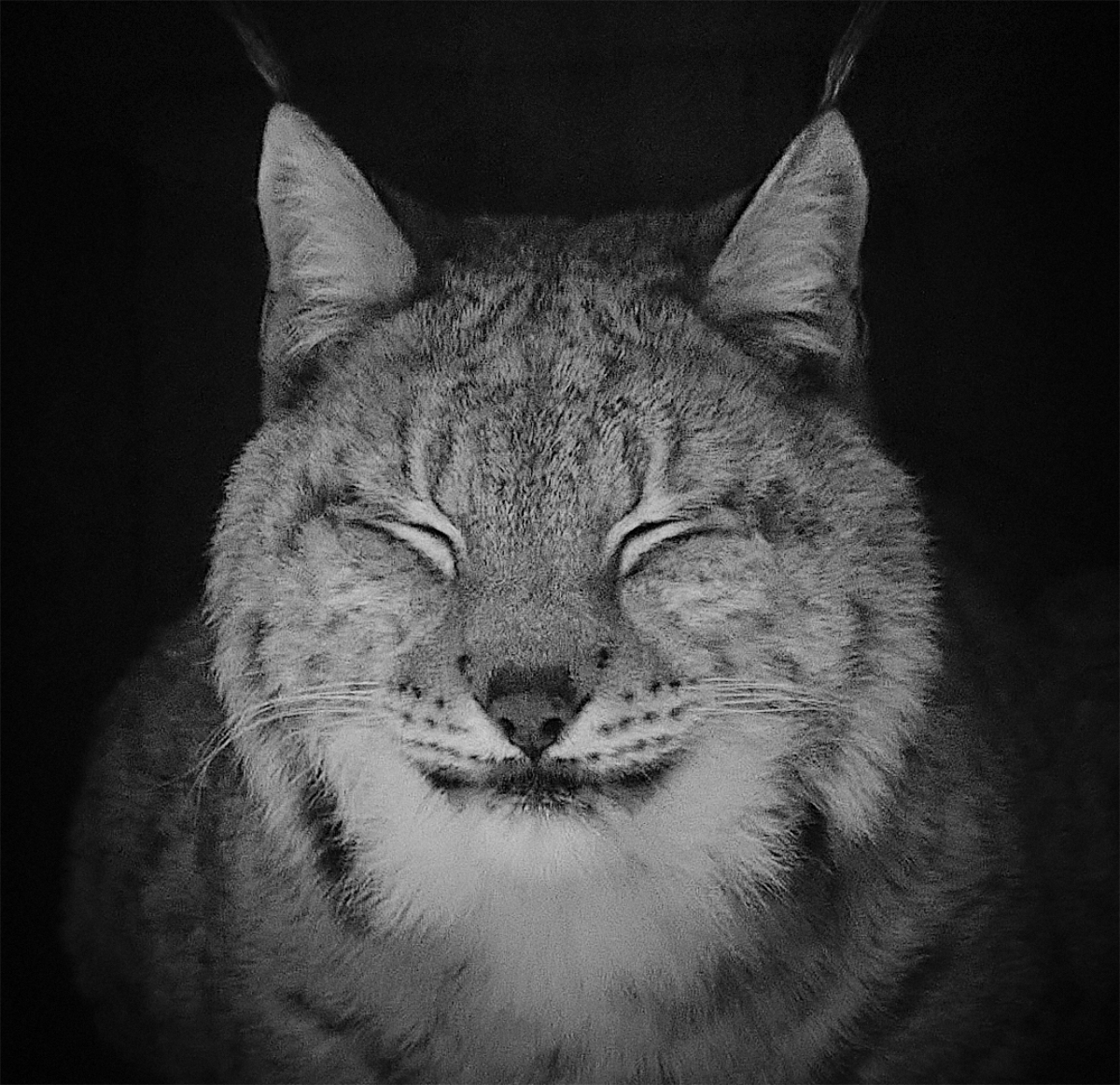
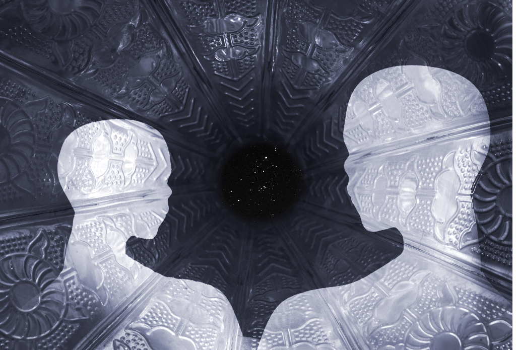
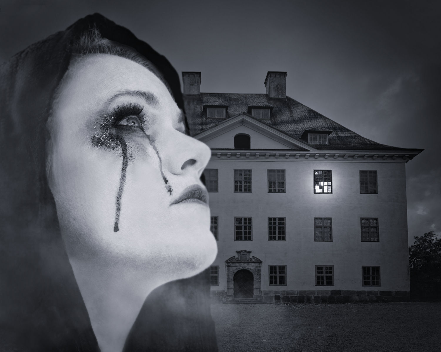
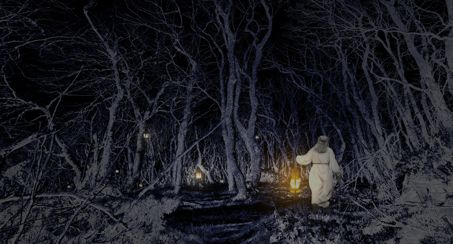
Hi Joan, I have been drawn back to the image again and again by its strength and symbolism. It is like looking into light and freedom from the dark side, and I think I will be watching it many times more this month. Thank you! |
Mar 8th |
| 15 |
Mar 22 |
Comment |
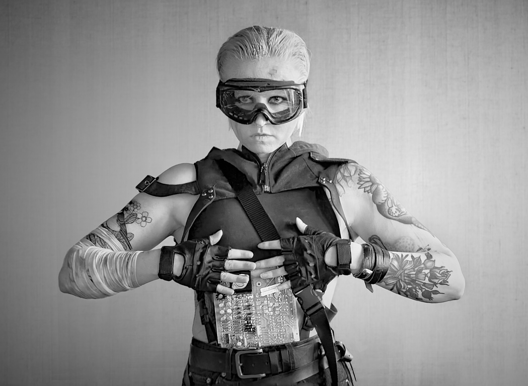
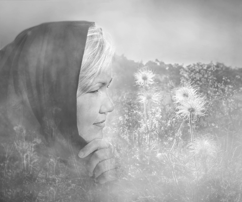
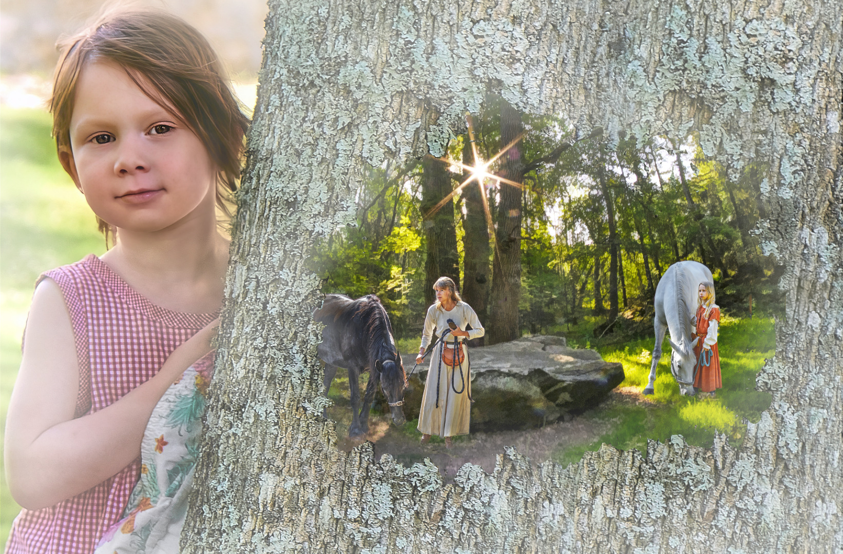
Hi Joan, I love the contrast between the dark grass in the shadow and the sunlit hillside, and the balanced and beautiful composition. The new sky fits in perfectly. What may be slightly bothering in the composite is that both the grass and the tree are now sharp but the midground between them is out of focus. - I think that Original 1 as such would actually work quite well, just making the grass the main subject, and letting the tree on the hill form a slightly blurred background? What do you think? |
Mar 6th |
| 15 |
Mar 22 |
Comment |
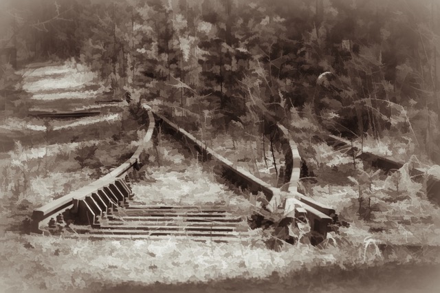
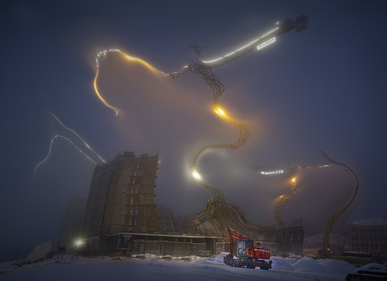
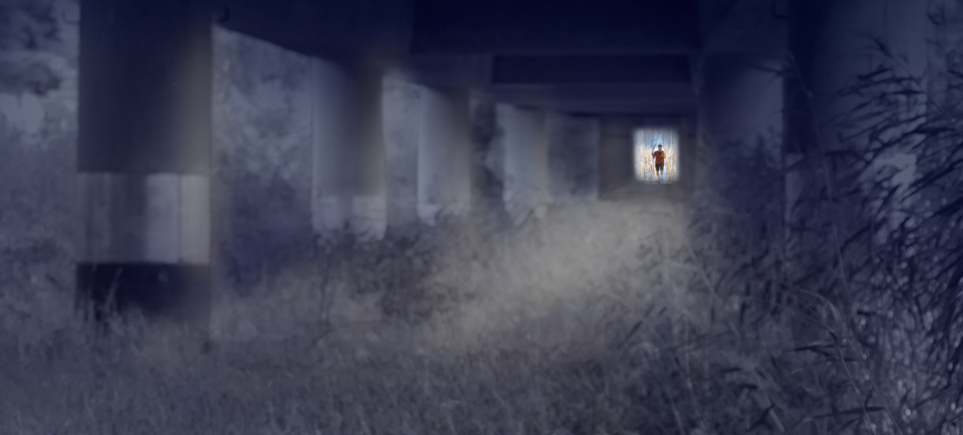
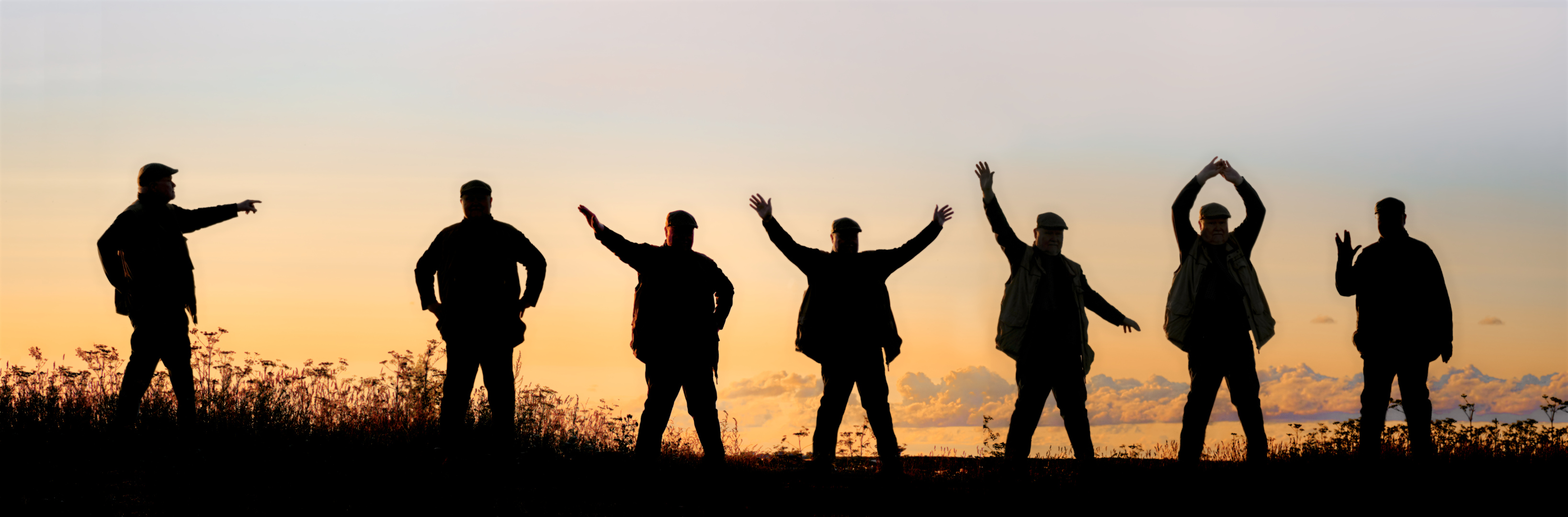
Hi Billy, I have done the course, too, and especially loved the night photography lesson. I think that you have done a fine job with the station. The lonely street lamp with the beautiful pool of light invites the viewer into the image. I think that the strong horizontal lines, the repetitive rhythm of the structures and the color contrasts keep it very well together - I think that you definitively need that blue sliver of the sky (?) at the top edge. I wonder if you could make even more of the lamp by brightening it a bit and darkening the light coming from both sides, and if a bit of vignette would add to the atmosphere. What do you think? |
Mar 6th |
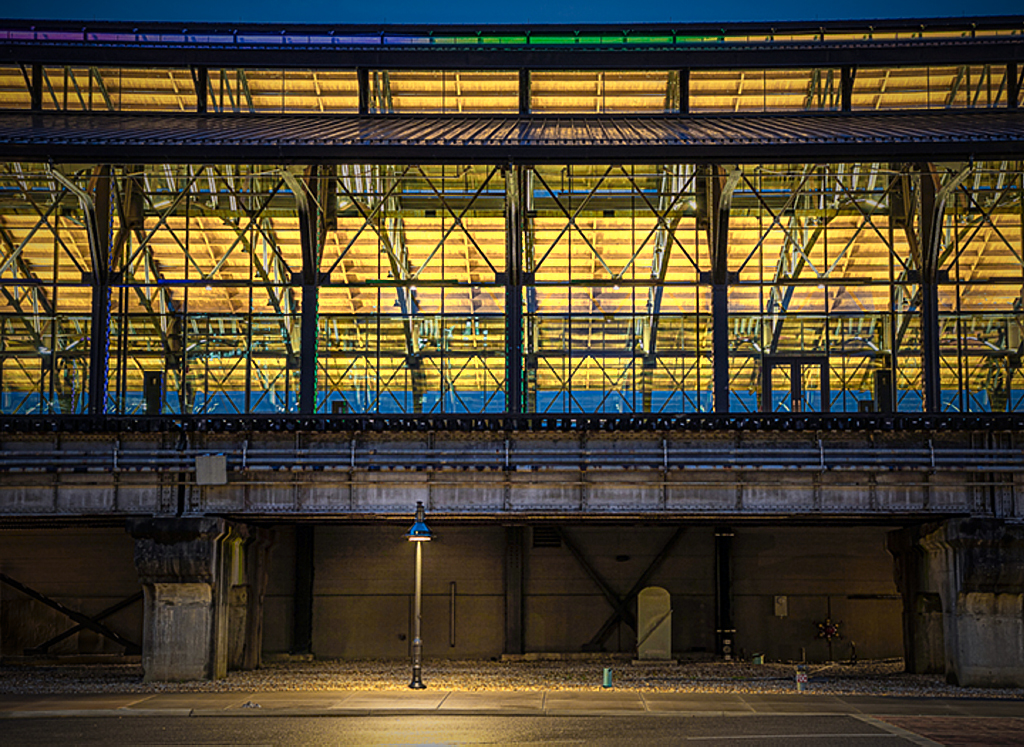 |
| 15 |
Mar 22 |
Comment |
Hi Rick, the portrait really does the job! The tree is magnificent and surreal against the blazing sunset sky and the full moon. I so admire the lighting on the grass and the trunk and branches of the tree, and love the mood that the painting-like effects give to the scene. |
Mar 6th |
| 15 |
Mar 22 |
Comment |
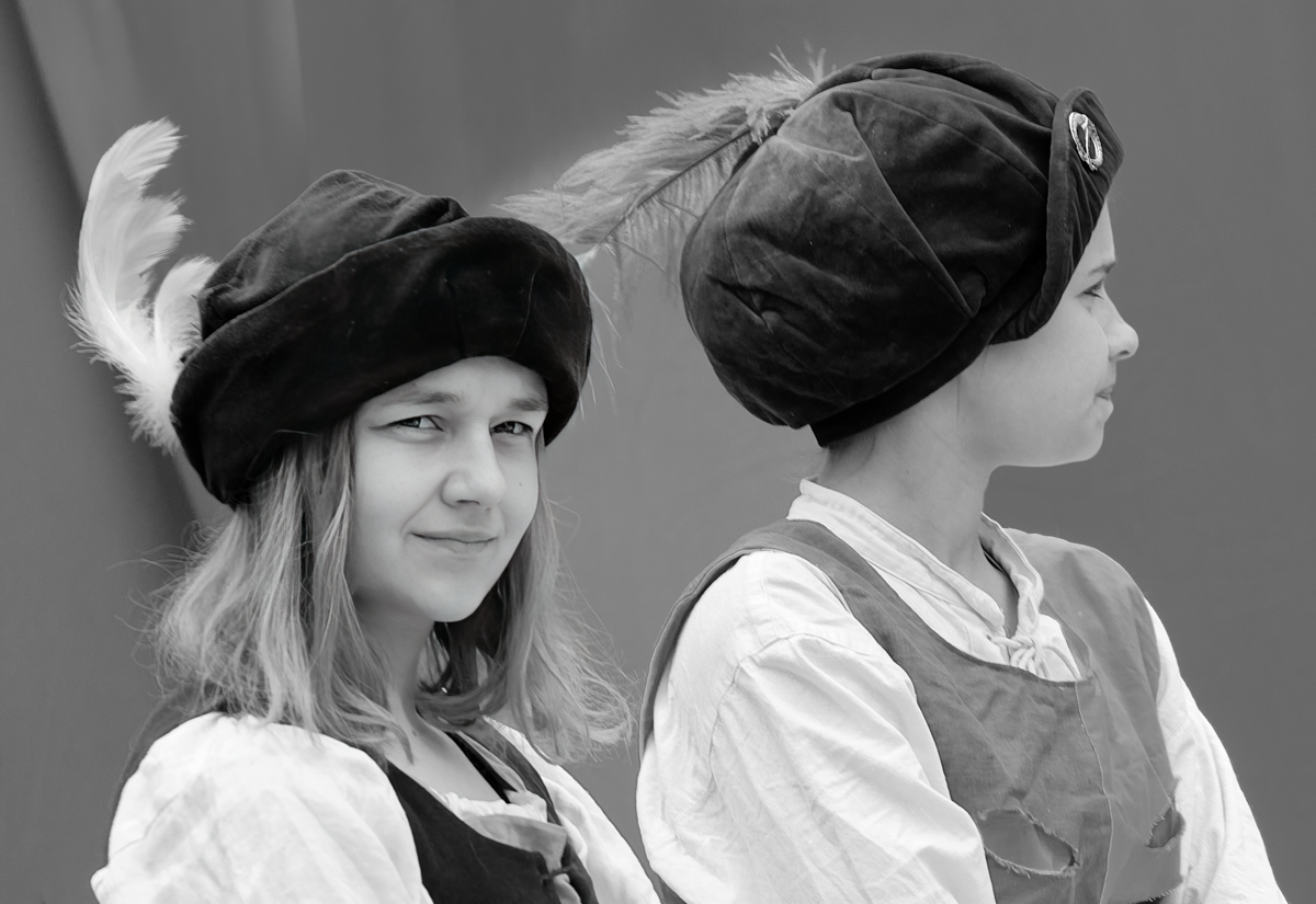
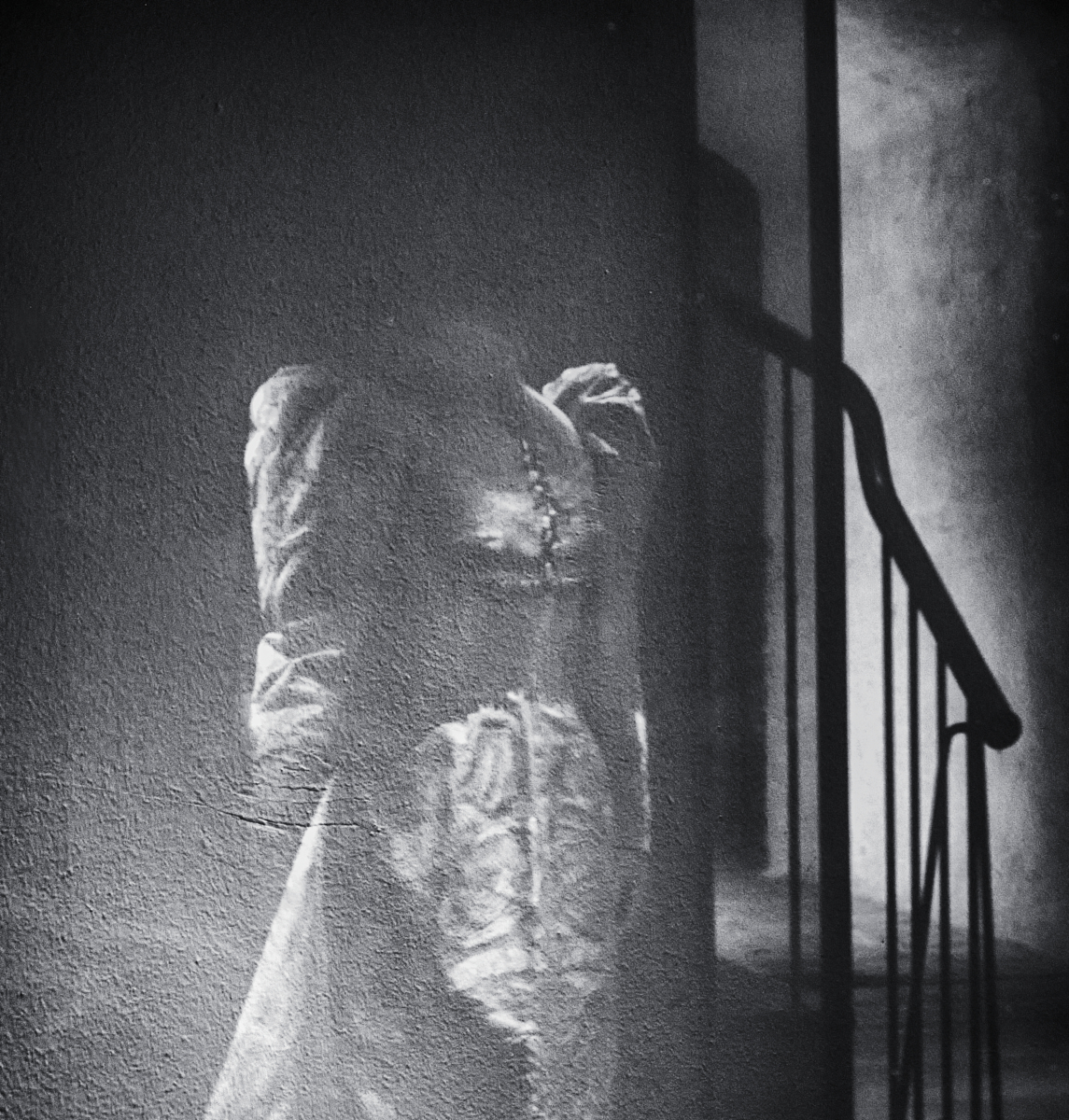
Hi Jeri, a wonderful combination of colors and textures! I really like the way the uniform white plaster frames the mosaic of the varied forms in complimentary terracottas and blues in the center. I think that you might try to crop just a little bit off the right edge to emphasize the frame effect? The various layers tell the history of the wall in a beautiful way. |
Mar 6th |
10 comments - 2 replies for Group 15
|
| 47 |
Mar 22 |
Reply |
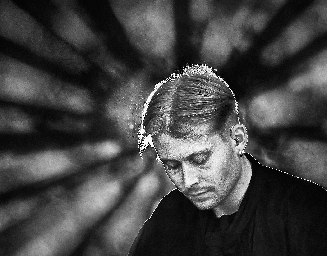
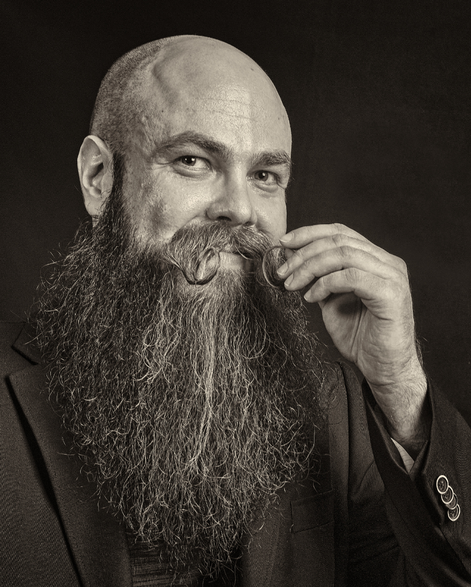
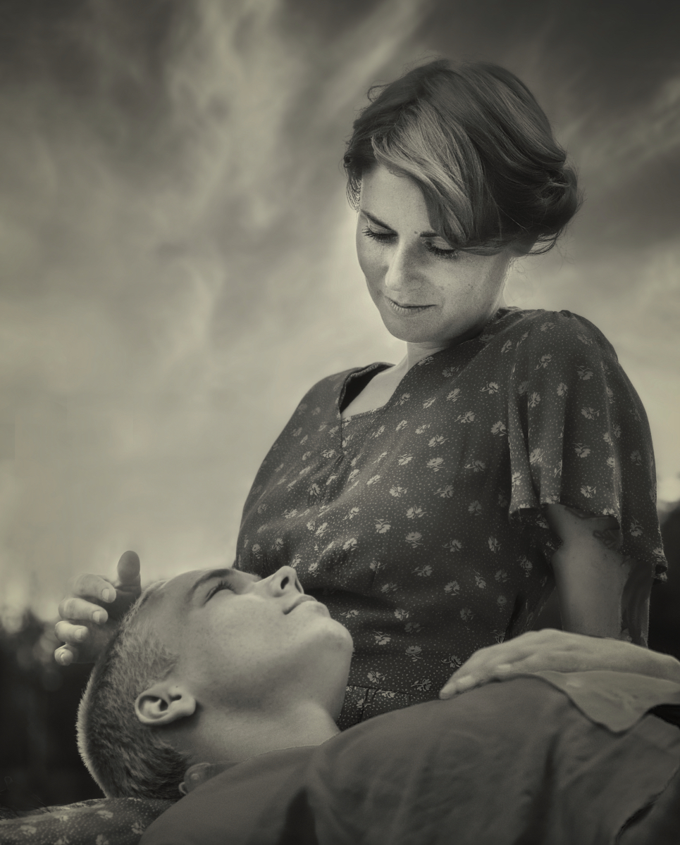
Hi, this is him with the corrections you all suggested. I put him in Affinity Photo and worked on the face with frequency separation, eliminated the buttons, and tightened the crop slightly. I think that he is much improved. Thank you! |
Mar 16th |
 |
| 47 |
Mar 22 |
Comment |
Hi, I totally agree with Jeff and Robert. There is a wonderful gloomy mood. - I think that the sharpening in the foreground and the snow in the midground may be a little on high side? |
Mar 15th |
| 47 |
Mar 22 |
Comment |
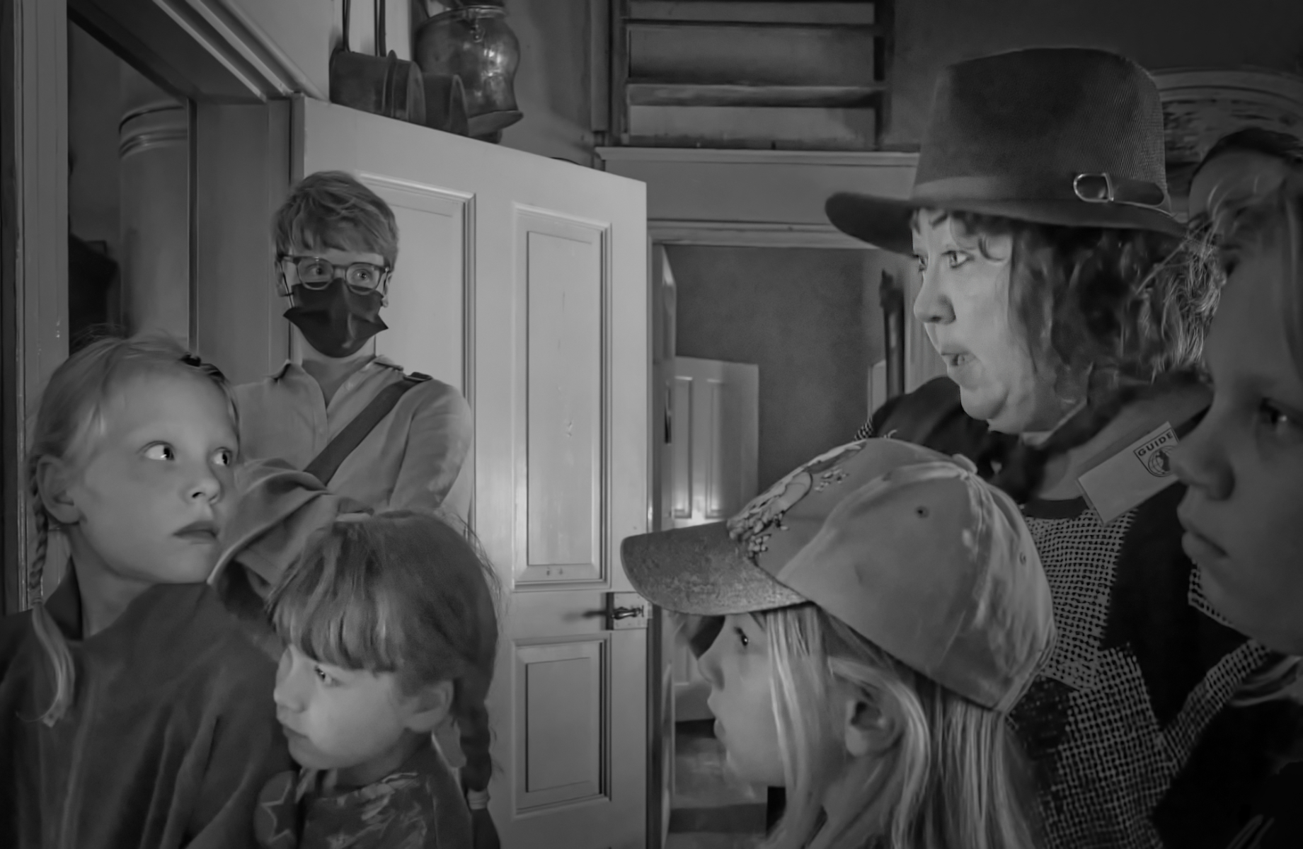
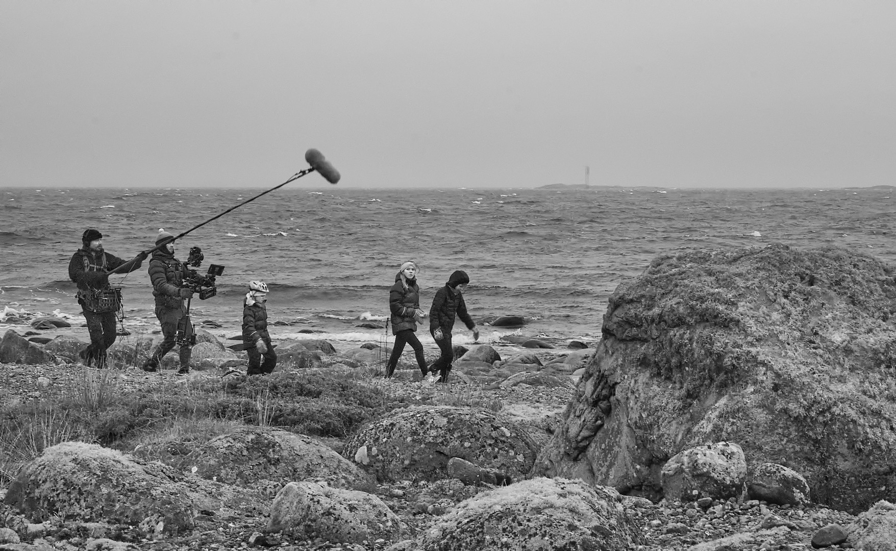
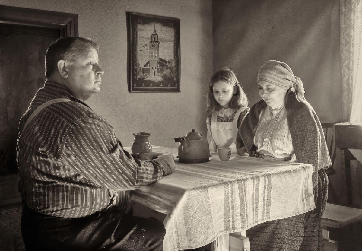
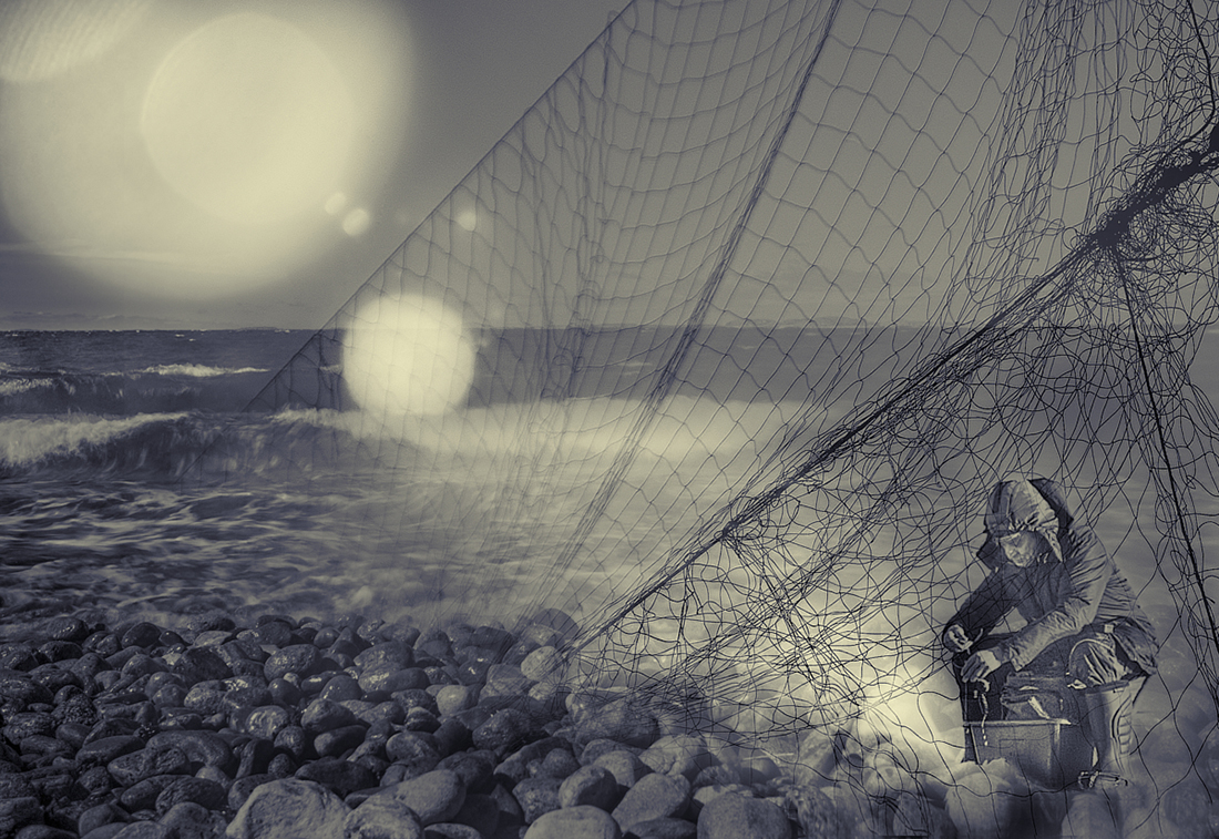
Hi Robert! I love the composition, too, and the whimsical play of the diagonals. The triangular bit of scenery and sky at the top is a bit distractive. On the other hand, I think that the horizontal lines at the top of the wall have a role in giving the image structure and helping to keep it together. What about just cropping off just a little bit, and blurring and darkening the rest of the triangle so that it is less conspicuous? I would also suggest just a slight keystone correction for the vertical lines to calm the view, and a slight vignette to concentrate attention in the middle part. I wonder if it is possible to get more tones in the clothing of the three people, to show the separate from each other. A lovely image! |
Mar 15th |
 |
| 47 |
Mar 22 |
Comment |
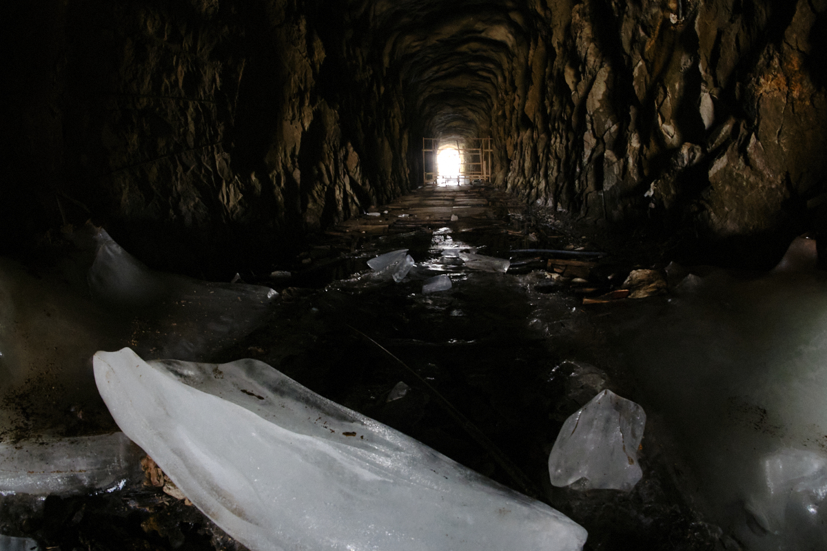
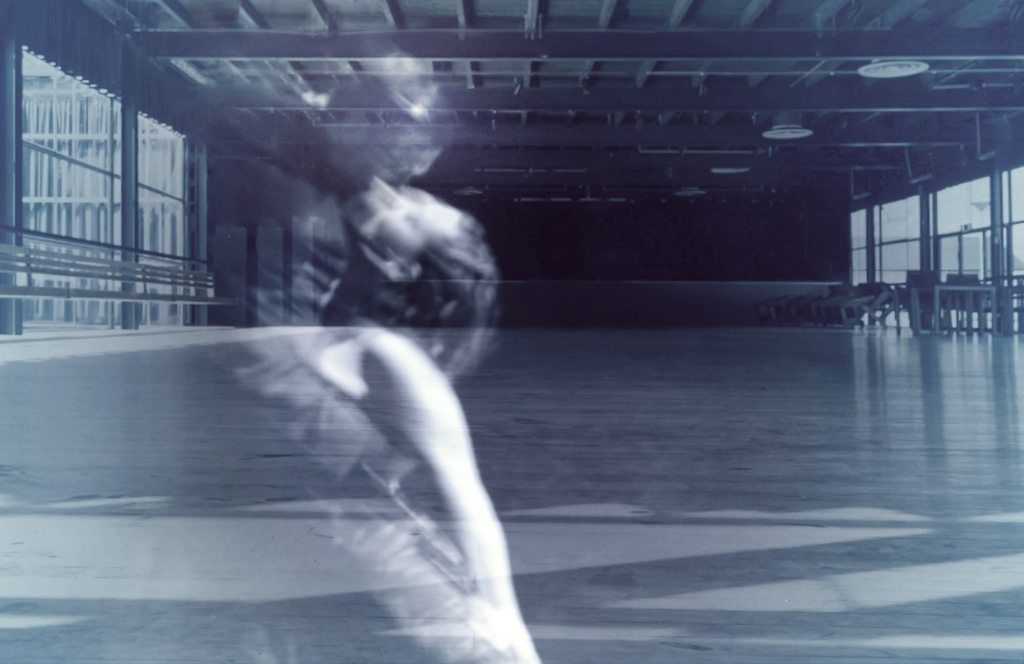
Hi Jeff, I like the image very much, too. My first thought was the machinery in Chaplin�s "Modern Times". The image is full of rhythm, and I think that the softer parts of the shadows give it a sense of motion. There is a tremendous three-dimensional quality, and I can make my eye do the convex-concave thing, too. And the tones are so beautiful. |
Mar 15th |
| 47 |
Mar 22 |
Reply |
Thank you, Robert, I will work on the shadow! It is quite clear now that you pointed it out! |
Mar 15th |
| 47 |
Mar 22 |
Reply |
Thank you, Jeff! The buttons bothered me, too. I tried to darken them but the result was quite unnatural. I removed them once but I started to think that they might kind of repeat the curved form of the mustache. I'll remove them, or use the tighter crop that takes care also of that problem. I put more work on the skin, too. |
Mar 15th |
| 47 |
Mar 22 |
Reply |
Thank you so much, Gerald! I will make the corrections and try my luck! |
Mar 15th |
| 47 |
Mar 22 |
Comment |
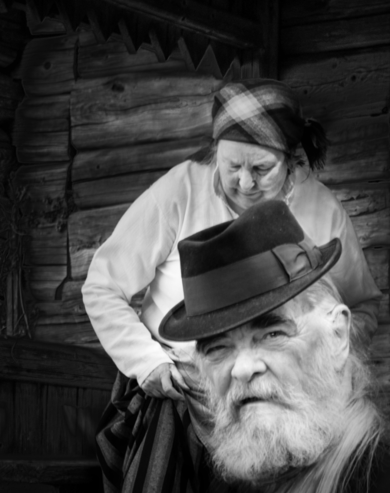
Thank you, Gerard! The tighter crop will be an improvement. - I actually have another version a bit like you suggested. I was thinking of submitting the image for the Individual Portrait Competition - do you think that it is good enough? |
Mar 14th |
4 comments - 4 replies for Group 47
|
14 comments - 6 replies Total
|