|
| Group |
Round |
C/R |
Comment |
Date |
Image |
| 15 |
Oct 21 |
Reply |
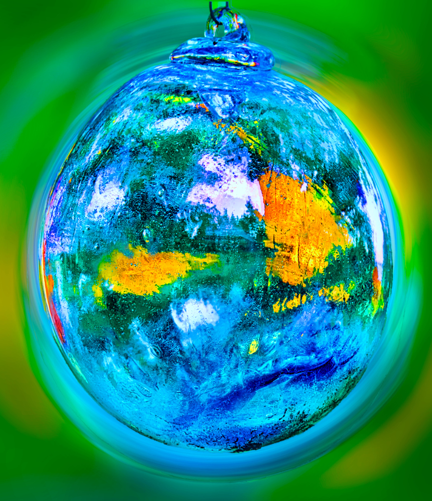
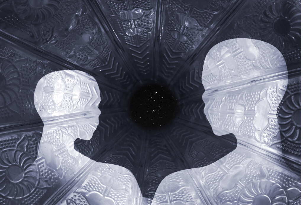
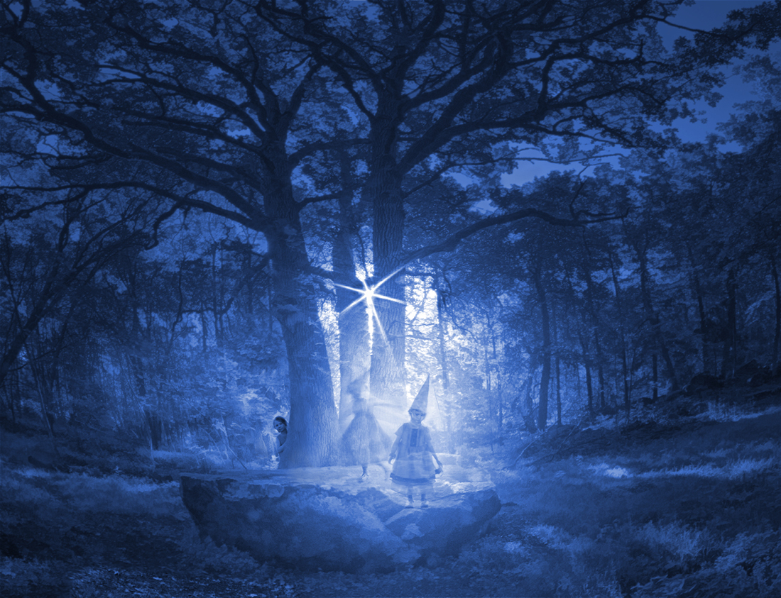
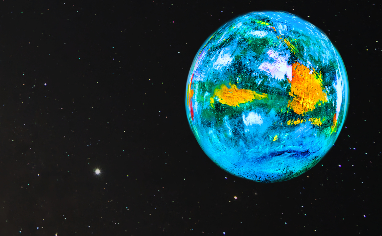
Rick and Joan, thank you very much! Your idea opens so many new ways to see the image. I started to experiment with a night sky asset in Affinity Photo, changed the colors of the globe slightly and tilted it a bit. I think it looks like something directly out of Star Trek now! I also tried to recolor the whole image with an ice blue tint, and that made a wonderful cool scene with a frozen planet. I am thinking of other options! |
Oct 29th |
 |
| 15 |
Oct 21 |
Comment |
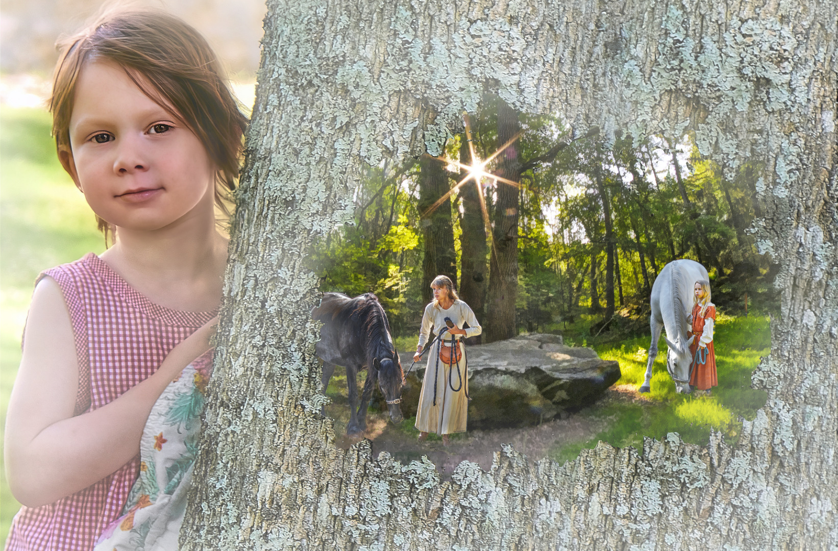
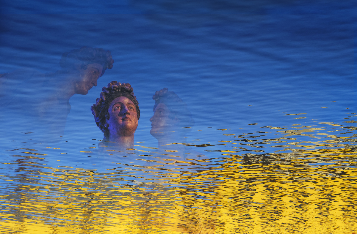
Thanks, Jeri! Very good points! - I actually thought "world" in a more narrow sense, like a beloved scenery. It was only after Joan and Rick pointed out that it could resemble the Earth that I began to see it that way, too. I attached a sketch of the new concept in my comment to Rick. How do you like it? |
Oct 29th |
| 15 |
Oct 21 |
Reply |
Thanks, Joan, that is wonderful - I did not see that before! I will try what removing the top will do. |
Oct 17th |
| 15 |
Oct 21 |
Comment |
Thanks, Billy. I am glad if this works! |
Oct 15th |
| 15 |
Oct 21 |
Comment |
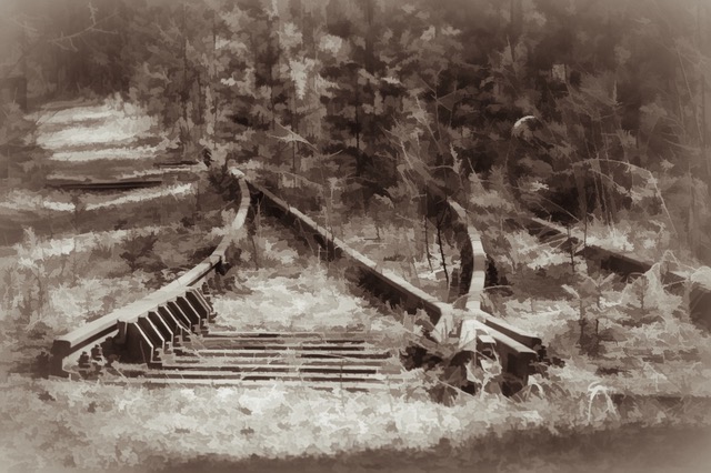
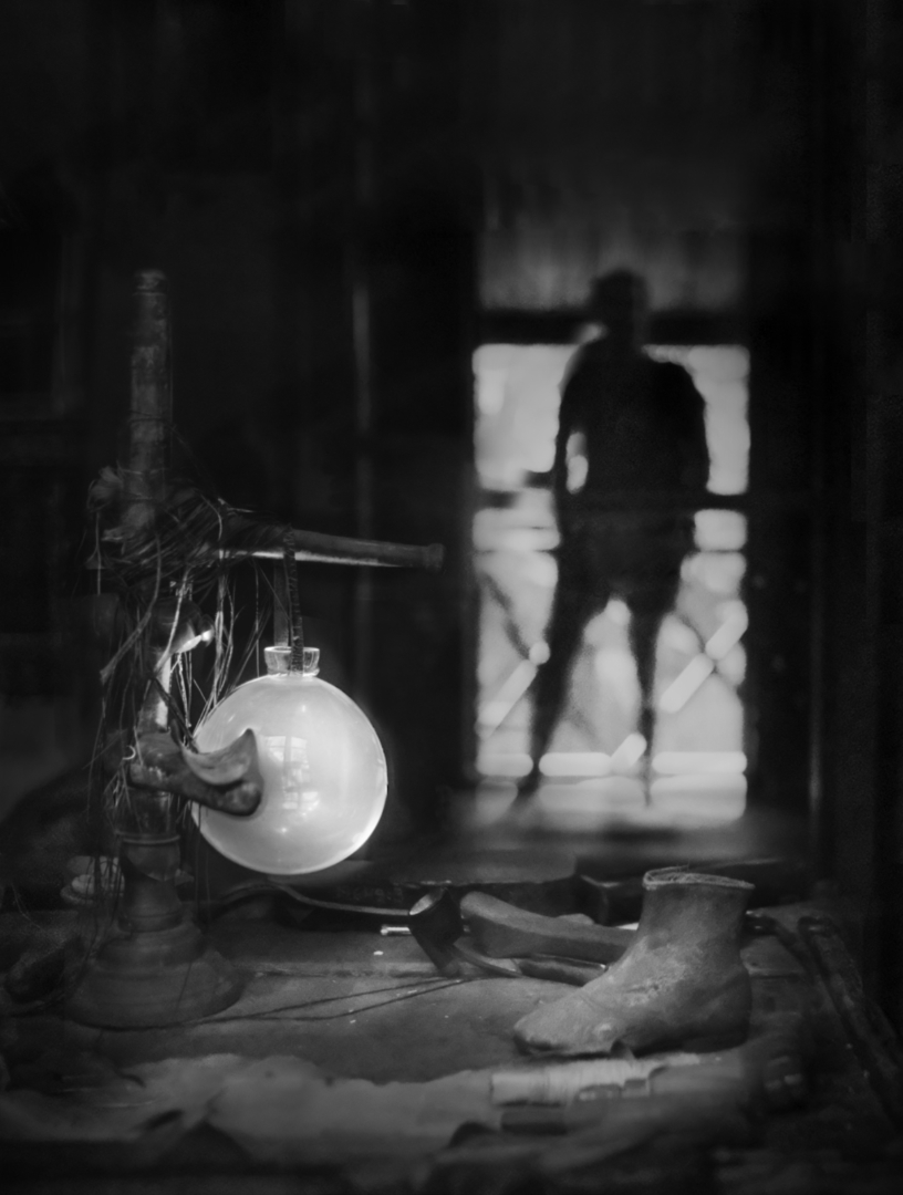
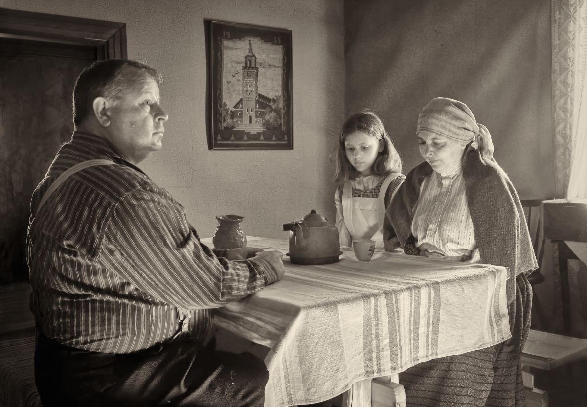
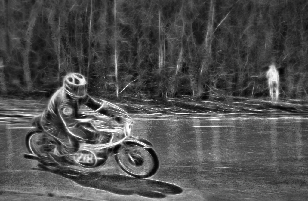
Hi Joan! I think that this is full of action, drama and impact. The camera angle makes the engine look very powerful and dynamic, and the activity around makes it very much alive, like it would rush out of the frame towards the viewer any minute. It is magnificent in black-and-white. I especially like the gleam on the engine, the steam, and the HDR effect on the clouds. I think that every minute of post-production has really been worth it. A great image! |
Oct 13th |
| 15 |
Oct 21 |
Comment |
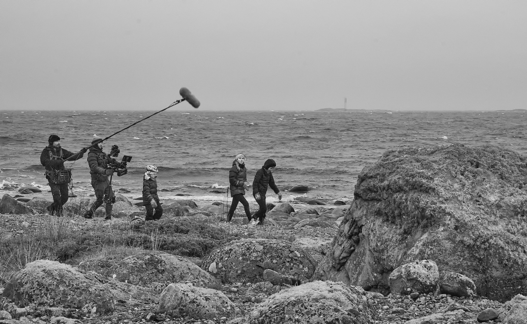
Hi Billy! I think that you have captured the feeling of challenge and adventure very well by freezing the motion of the kayak in the middle of the torrents. I think that the white water and the shades of green look great. I wonder if placing him a little more off-center and leaving a bit more room to move in might make the image even more dynamic? |
Oct 13th |
| 15 |
Oct 21 |
Comment |
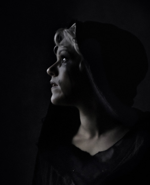
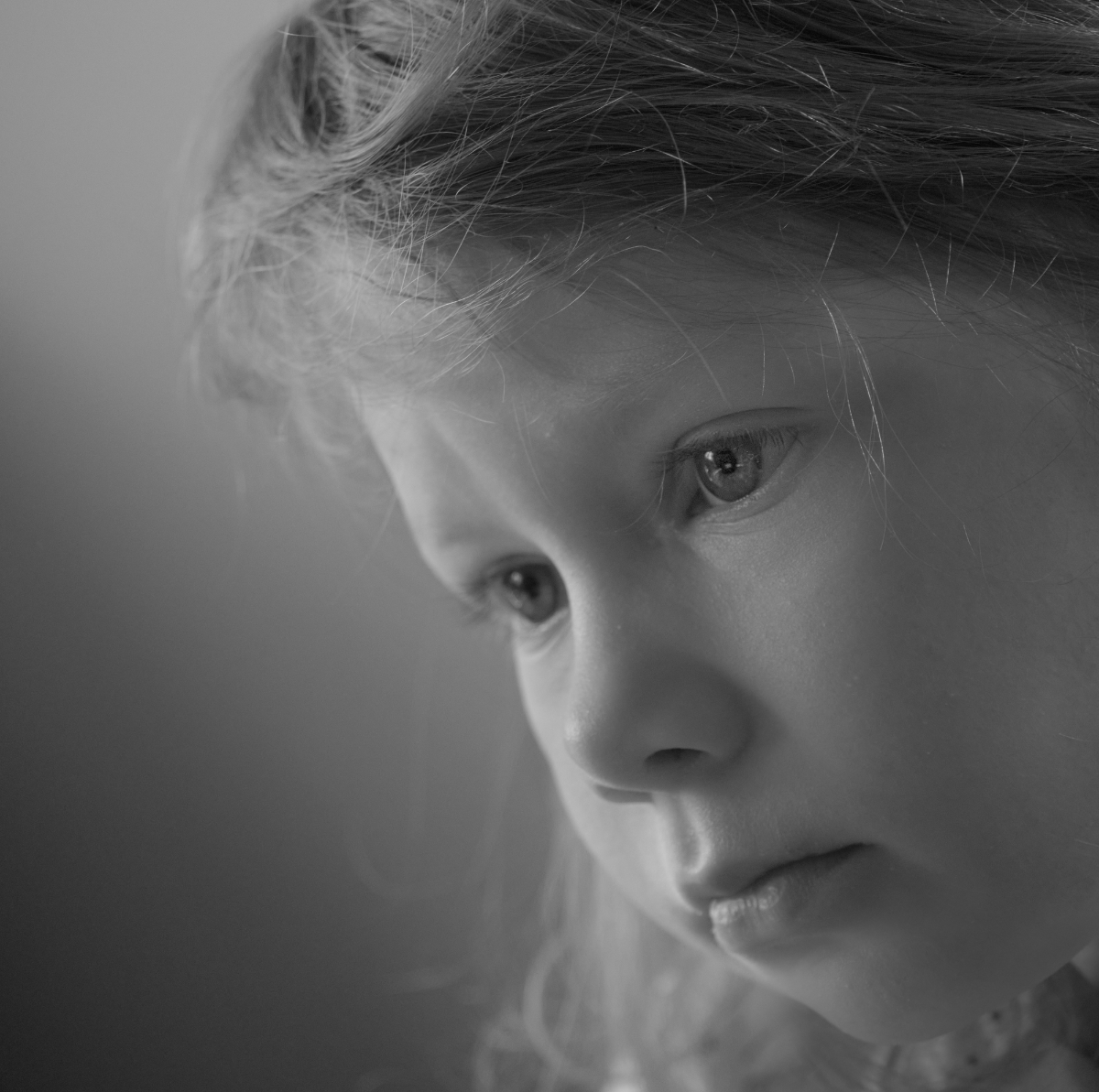
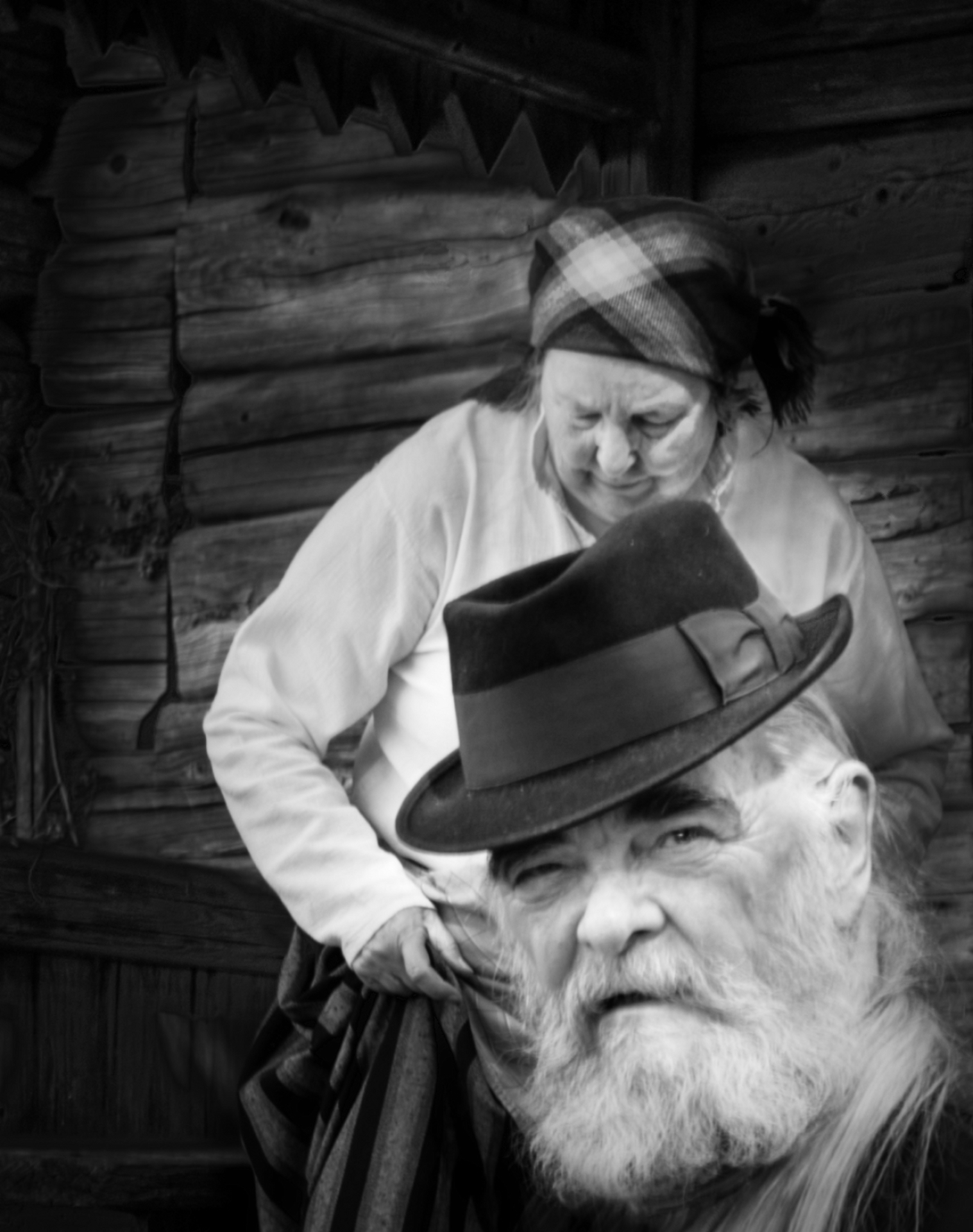
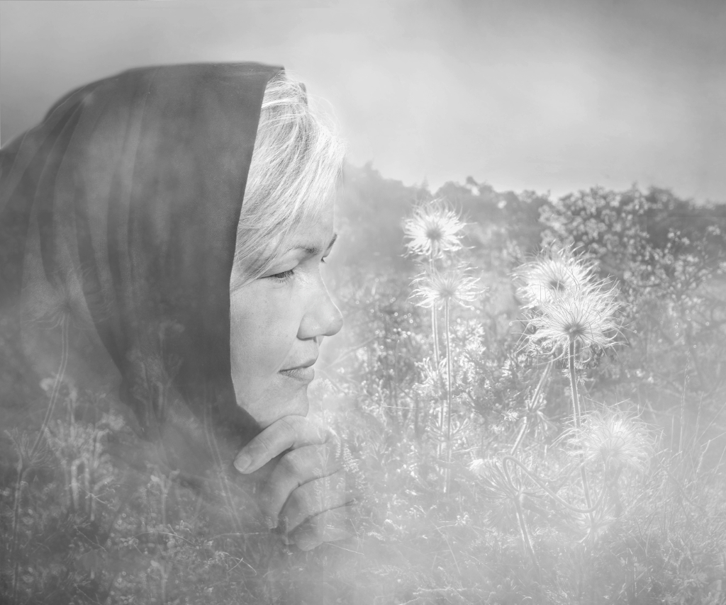
Hi Rick, I think that the intriguing swirling patterns of the leaves transform the young man with the solemn eyes to an Elf of the Woodland Realm. The small bright splashes of blue, green and purple contrast beautifully with the orange and beige, and make the image very much alive. I love him. - I think that the borders frame the portrait beautifully. |
Oct 13th |
| 15 |
Oct 21 |
Comment |
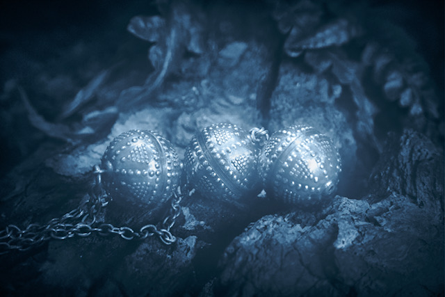
Hi Jeri, a wonderful image! I think that your crop is perfect - it does give the image a fine tension. I think that square format could easily reduce it just to a pretty mandala? I love the background, too, with the soft blend of colors, that makes the dew drop jewels stand out. |
Oct 13th |
6 comments - 2 replies for Group 15
|
| 47 |
Oct 21 |
Reply |
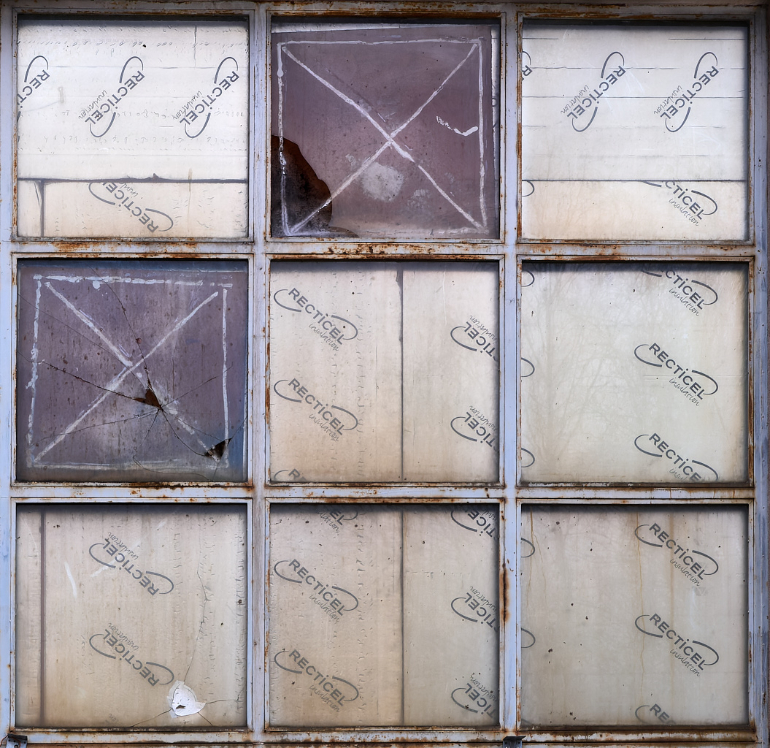
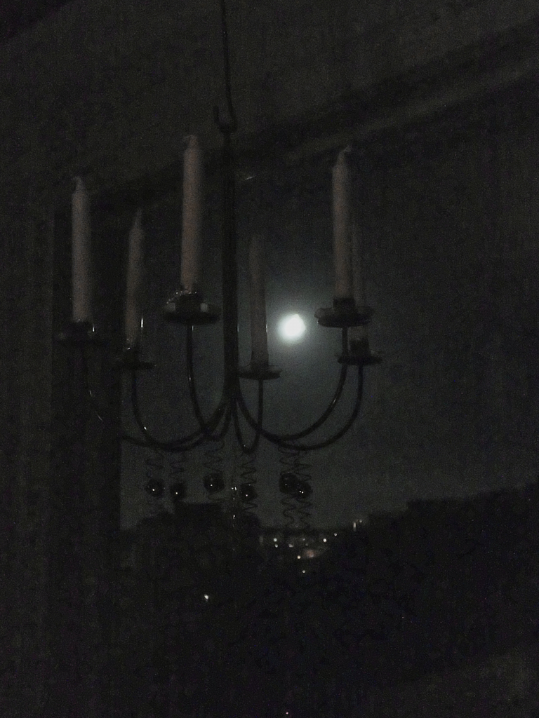
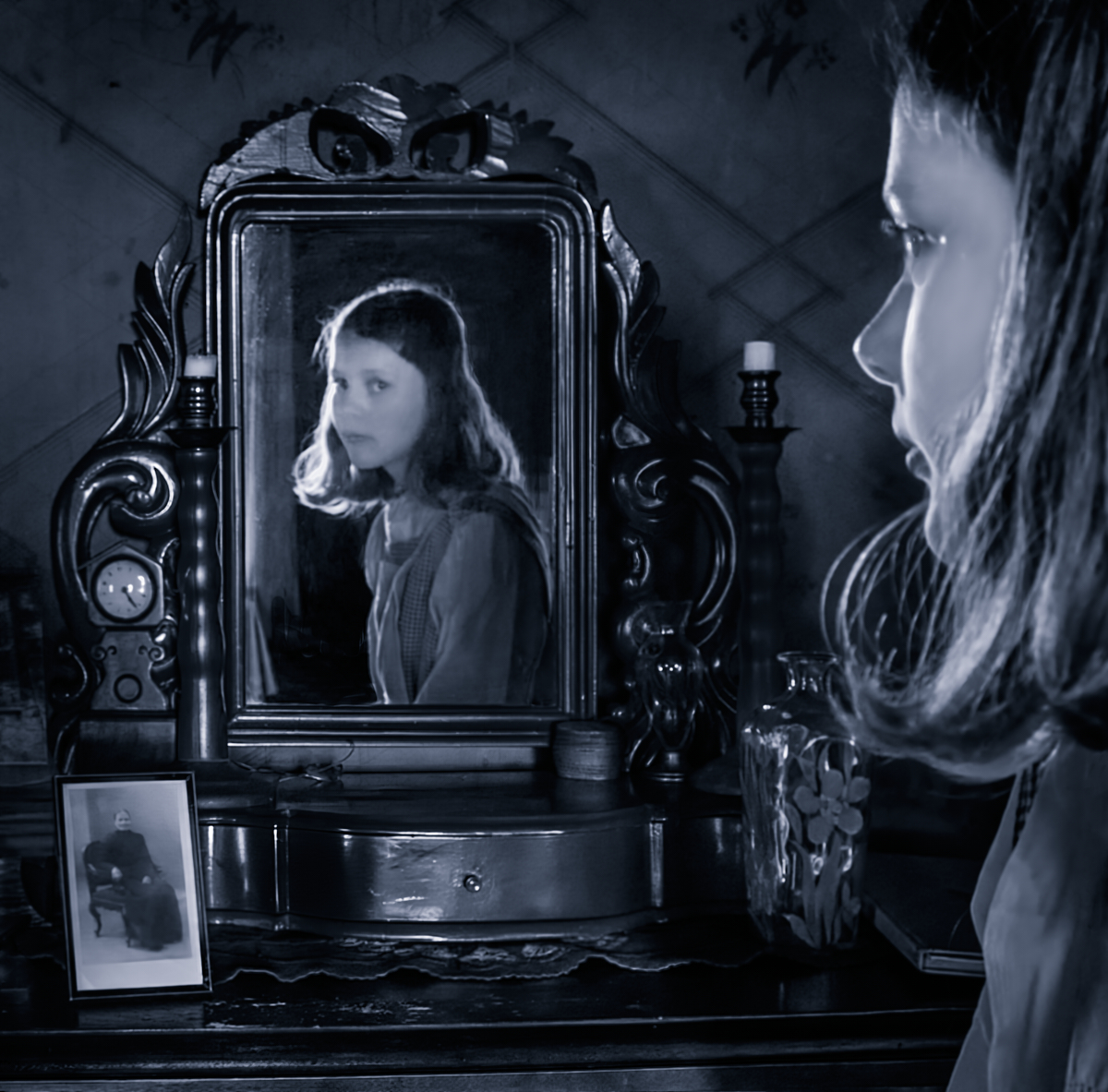
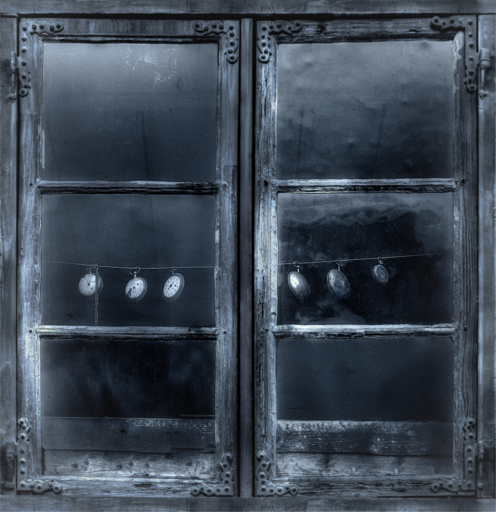
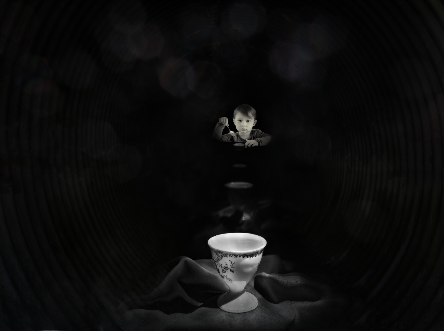
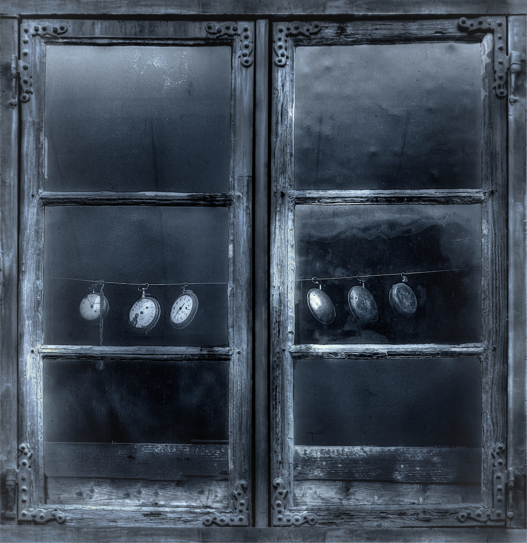
Thanks, Ed! I also feel that the empty upper panes have something to add to the story. - The title of this little exhibition project that we are planning would translate to "Joined in an image". I thought that my contribution would be about connections through time - about the feeling you sometimes get in museums and historical places that stories of the past come alive. I think that the clocks would make a perfect starting image. However, I do have to sell the idea to the others first... |
Oct 29th |
| 47 |
Oct 21 |
Comment |
Thank you, Adrian, for everything! It has been such a pleasure to converse with you! Will miss you in the group. All the best! |
Oct 25th |
| 47 |
Oct 21 |
Reply |
Thank you very much, Jen! I actually enlarged them a bit, but it is not quite enough. And when I tried to make them bigger, the panes started to look very crowded. I'll keep working on it. |
Oct 18th |
| 47 |
Oct 21 |
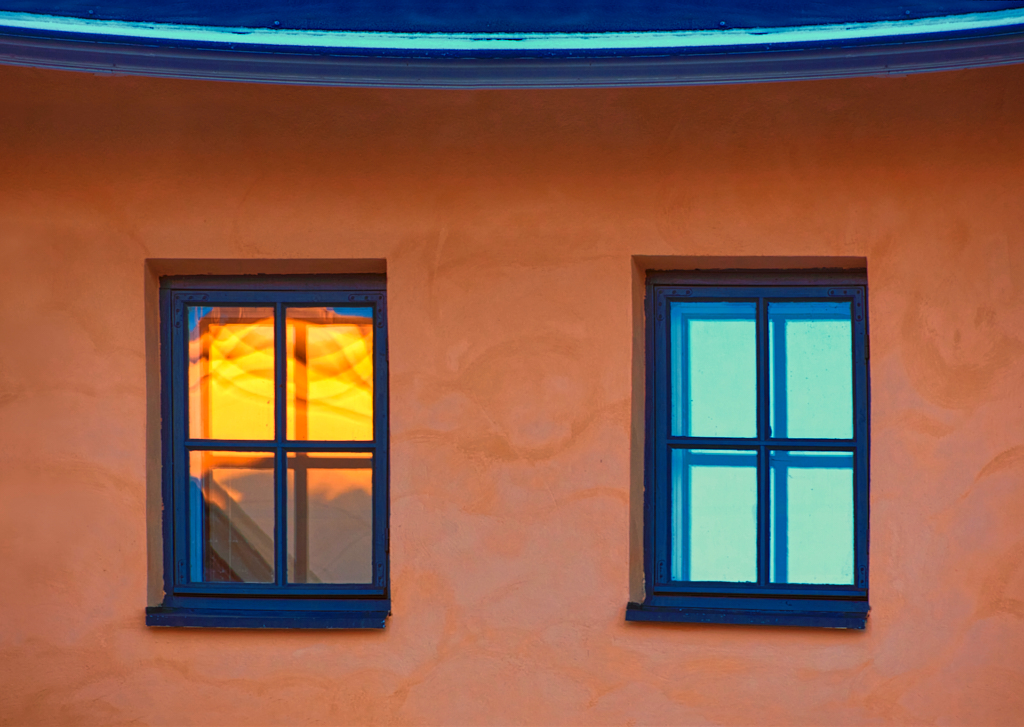
Comment |
Thanks, this will work - although I kind of like the upper panes with the strange gleam of light. I think that they may add to the ghostly atmosphere. I made also another square version where the watches are a even little bit larger, and cropped off the outer part of the frame, but that did not increase se size very much. |
Oct 15th |
 |
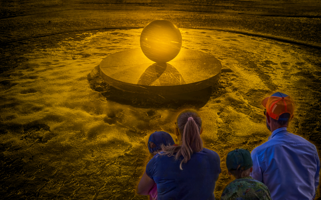
| 47 |
Oct 21 |
Comment |
Hi Jen! Big Boy really is a sight! You have made his surface gleam in a wonderful way. I wonder if cropping off both the poles from the right edge might make him look even more dynamic? |
Oct 14th |
| 47 |
Oct 21 |
Comment |
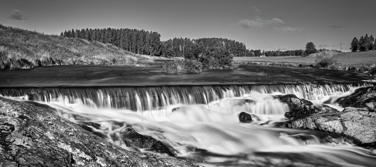
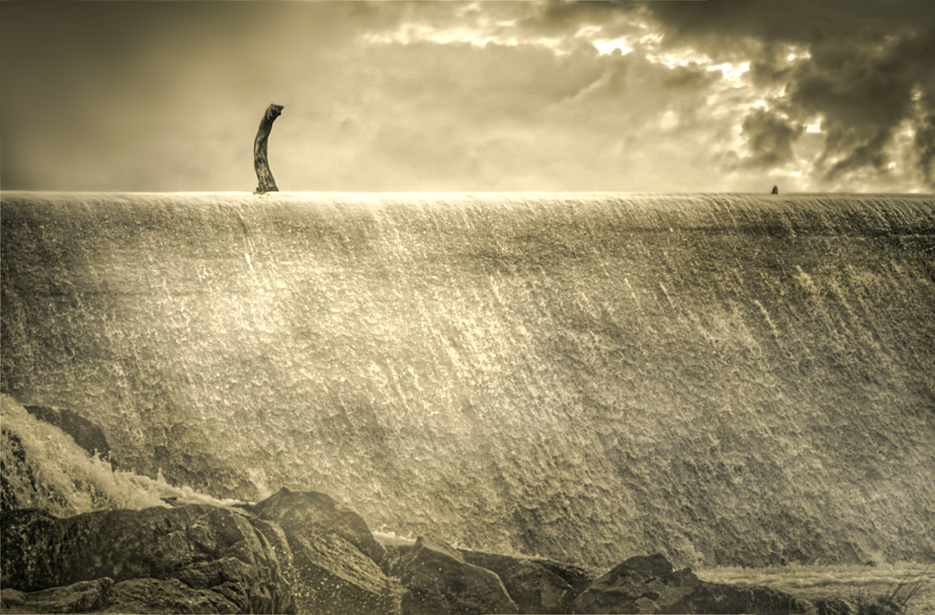
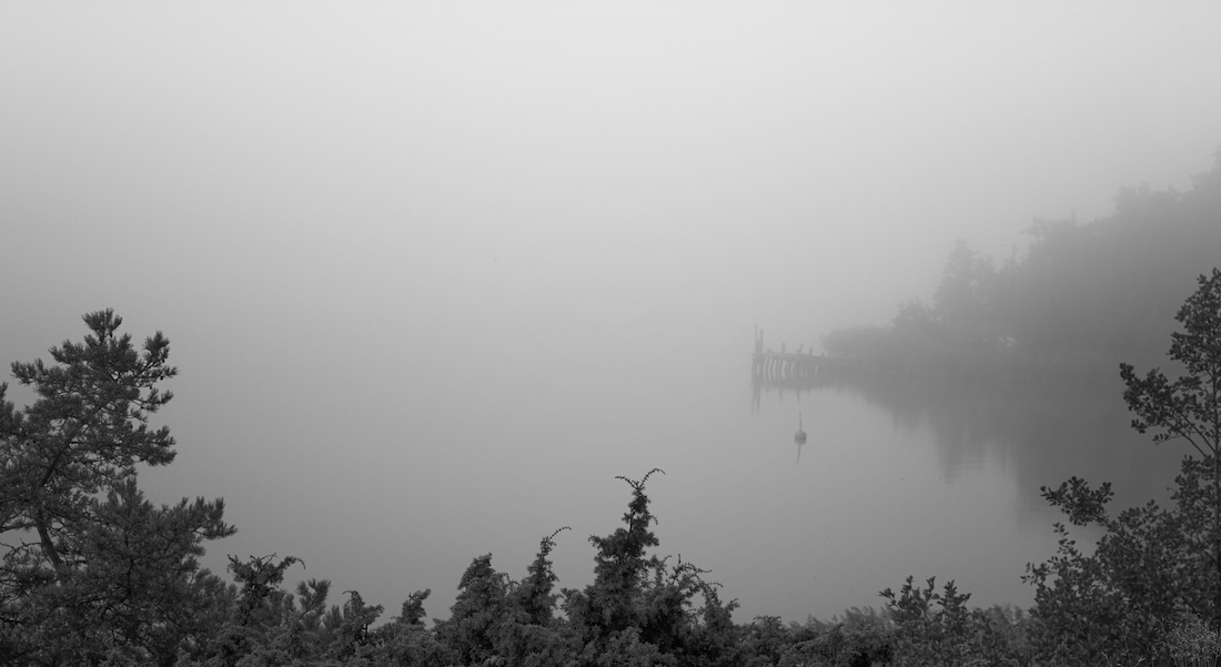
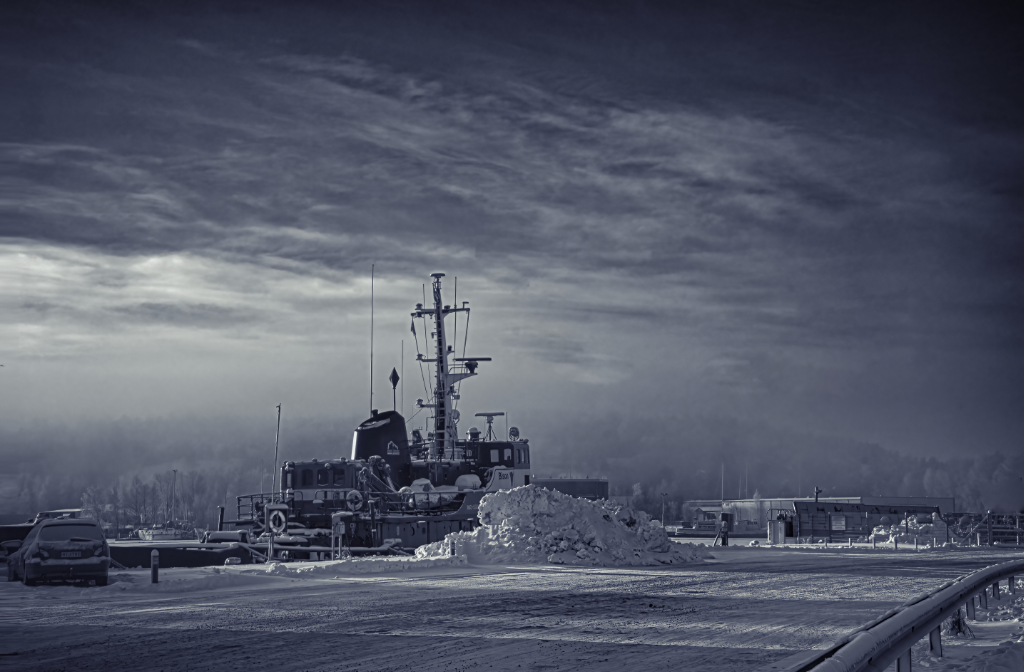
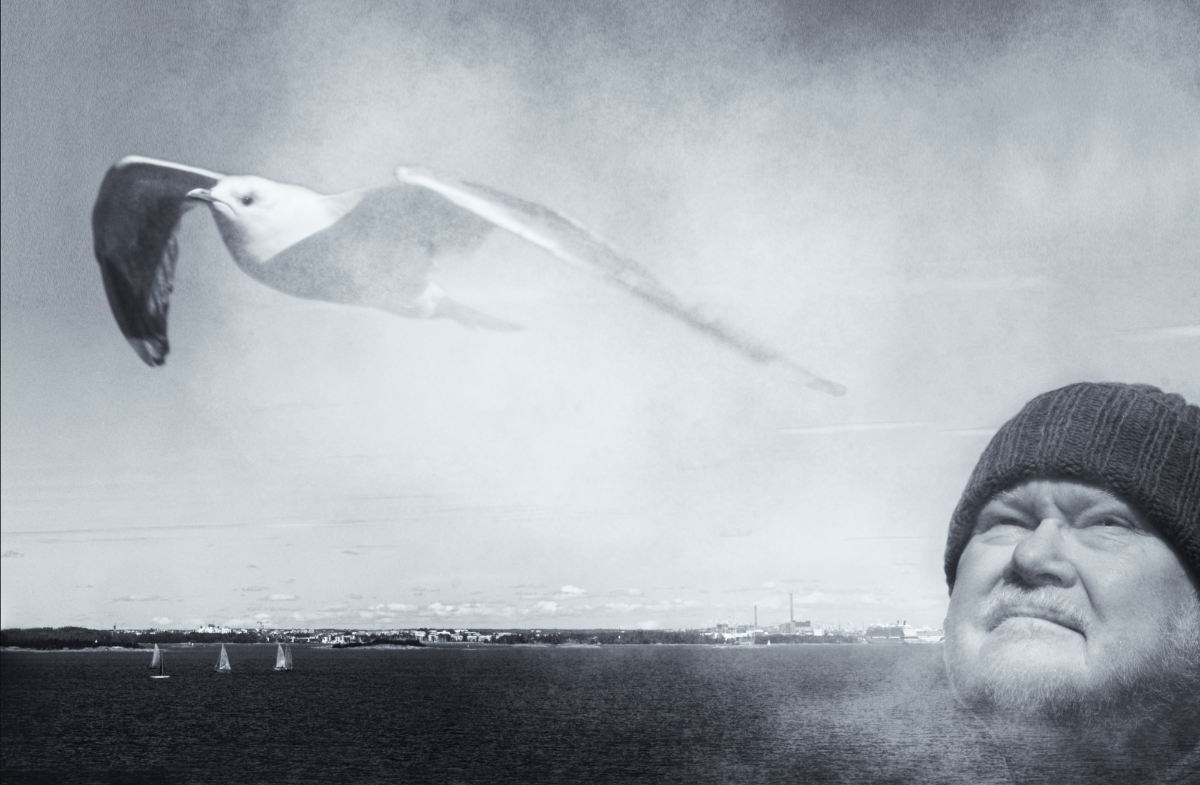
The color version is beautiful, but I like the black-and-white better, too. The sky was magnificent to begin with, and the touch of HDR makes it amazing. |
Oct 14th |
| 47 |
Oct 21 |
Comment |
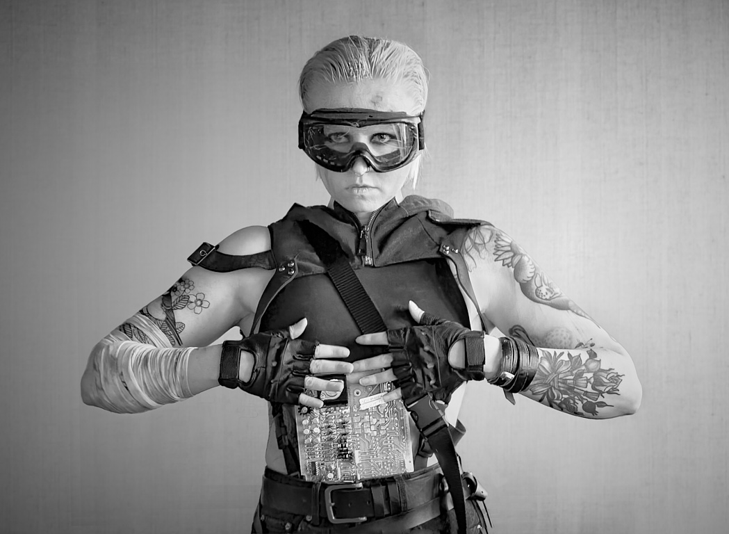
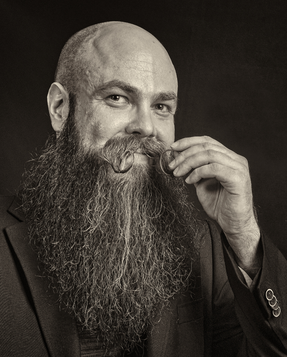
Hi Adrian! What an interesting face! I think that you have made the most of the hard lighting that makes him/her squint against the bright sunshine. I think the the harsh wrinkles work very well as a contrasting structure to the sharply defined knit of the cap and the velvet of the collar. |
Oct 14th |
| 47 |
Oct 21 |
Comment |
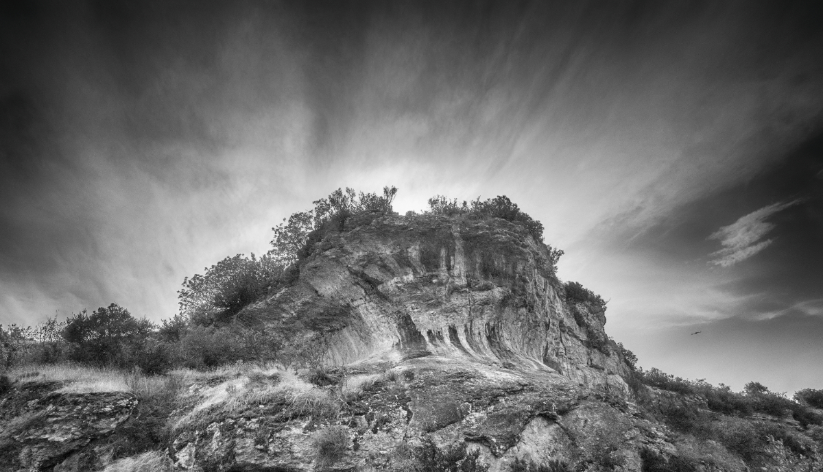
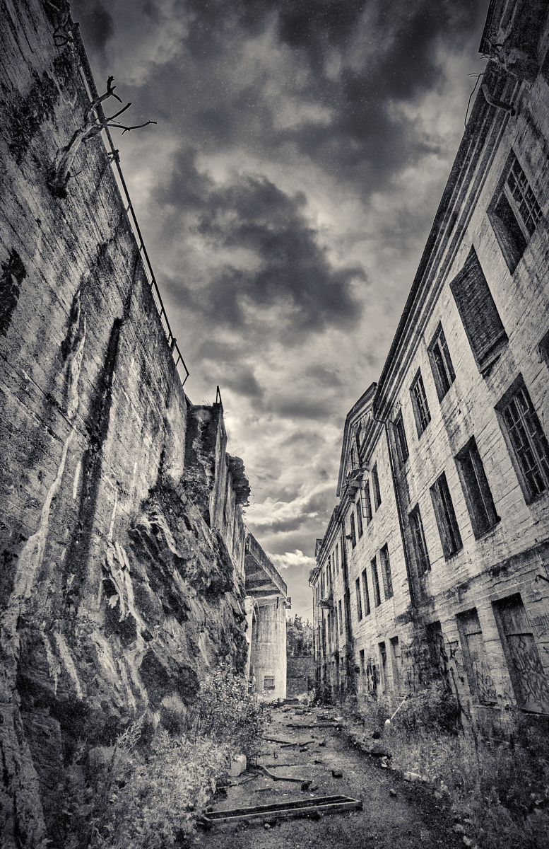
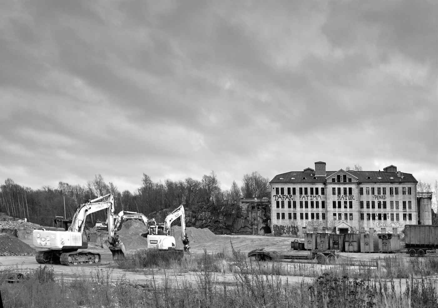
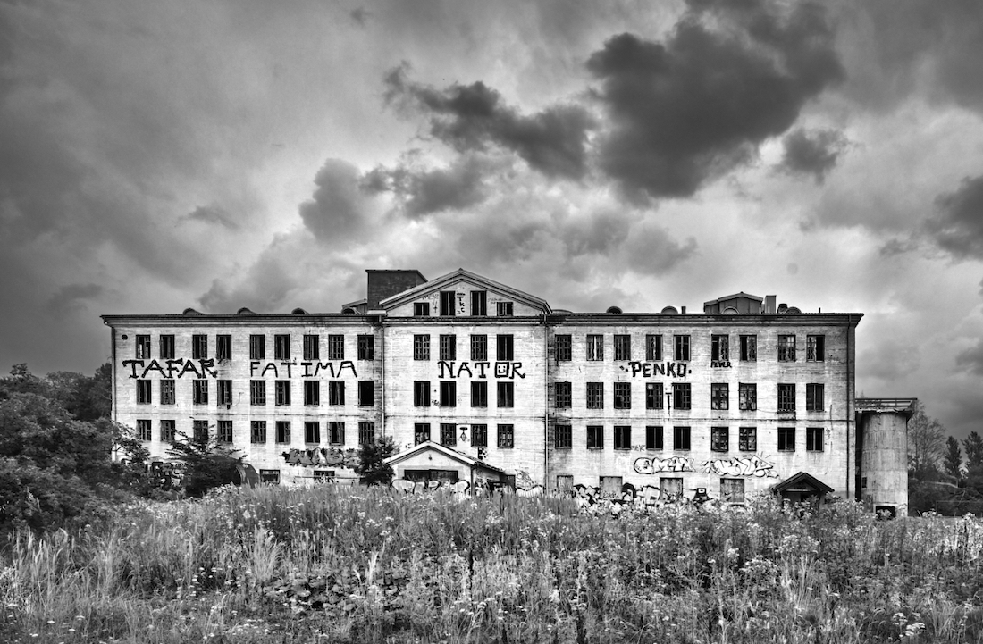
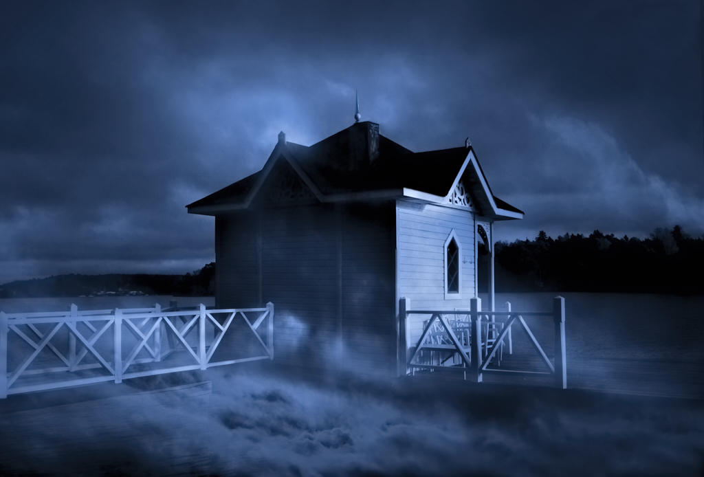
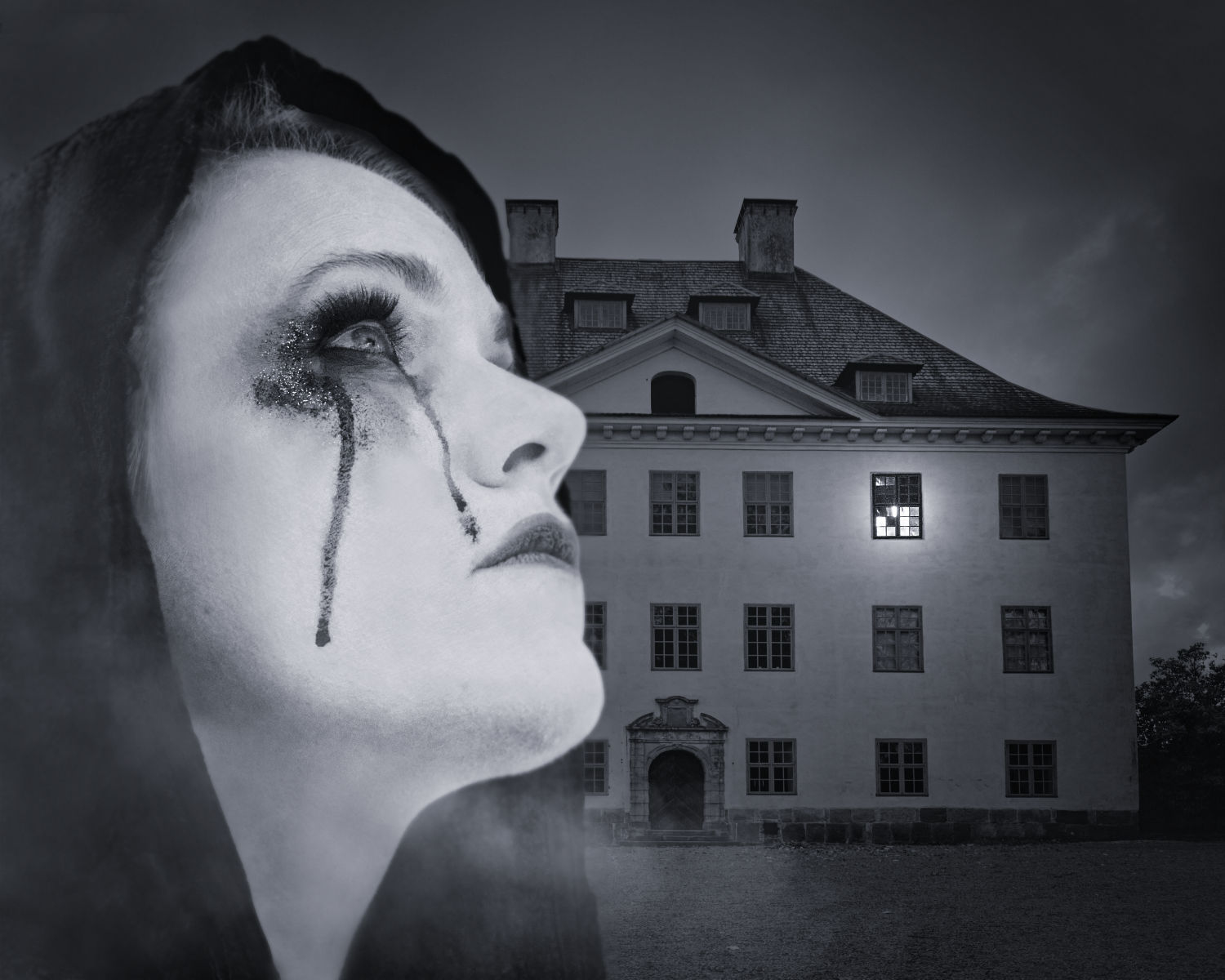
Hi Ed! I think that the image carries finely the threat of the impending storm - both current and past. I agree with Al about the perspective - I think that it would have worked to enhance the greatness of the mighly building if there had been more foreground, though. It would be really interesting to see the cropped version. |
Oct 14th |
| 47 |
Oct 21 |
Reply |
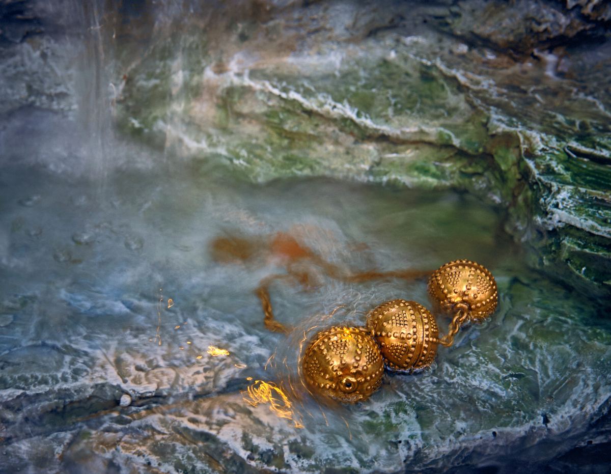
Thank you, Al - this is very evident now that you pointed it out. I think that even a little increase in the size of the watches makes a whole lot of difference. - This was very important for me as I am planning to use the image to try to sell some weird ideas to a group that is planning a little exhibition together. I will try to think of other options, too - maybe a composite? - and am very grateful for all suggestions. |
Oct 14th |
 |
6 comments - 3 replies for Group 47
|
12 comments - 5 replies Total
|