|
| Group |
Round |
C/R |
Comment |
Date |
Image |
| 15 |
Feb 21 |
Reply |
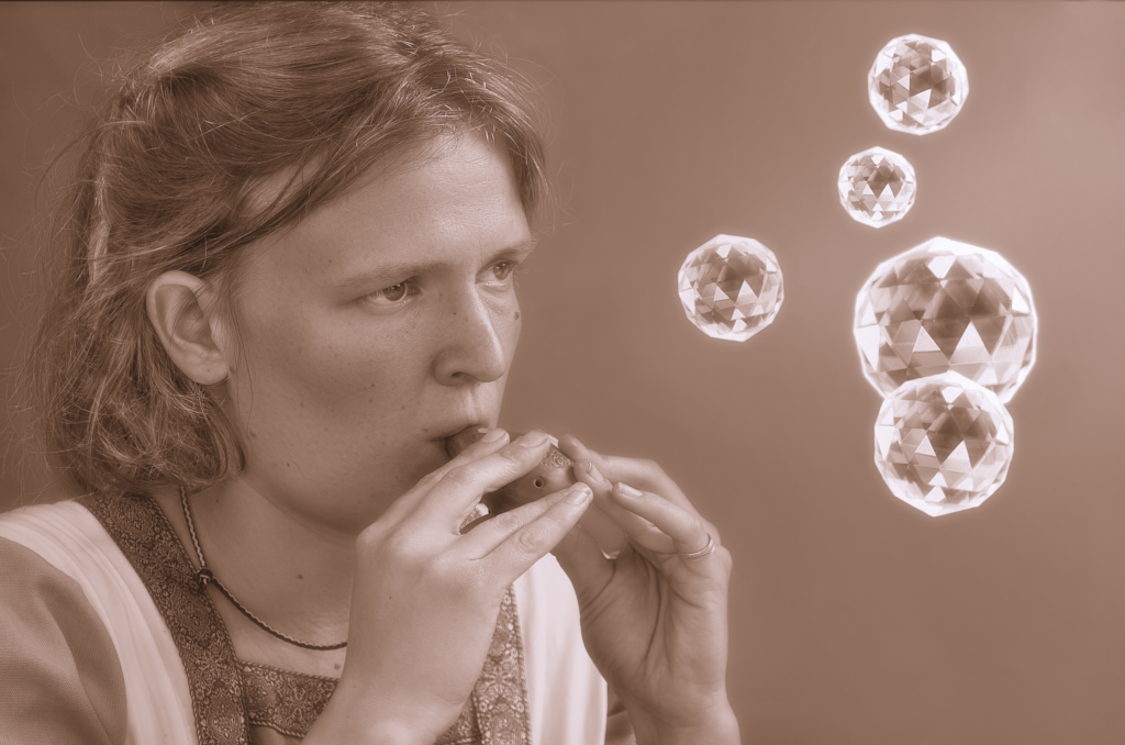
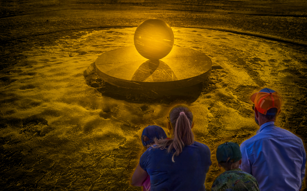
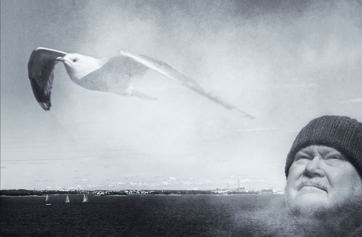
Thank you, Rick! Yes, we call it "snow moon". I am watching it right now - it feels specially bright! |
Feb 26th |
| 15 |
Feb 21 |
Comment |
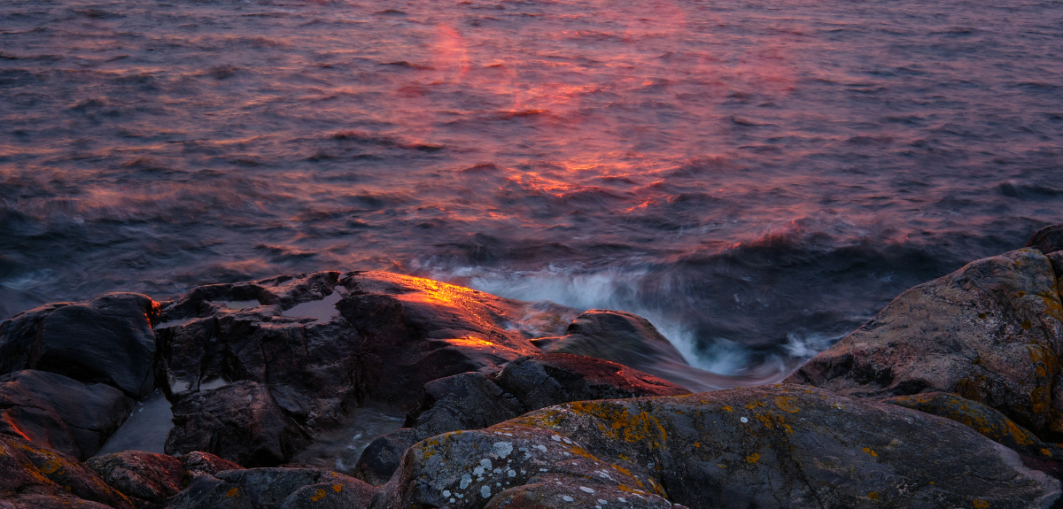
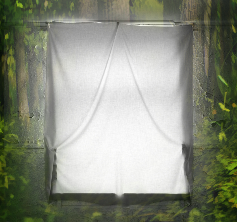
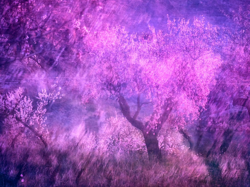
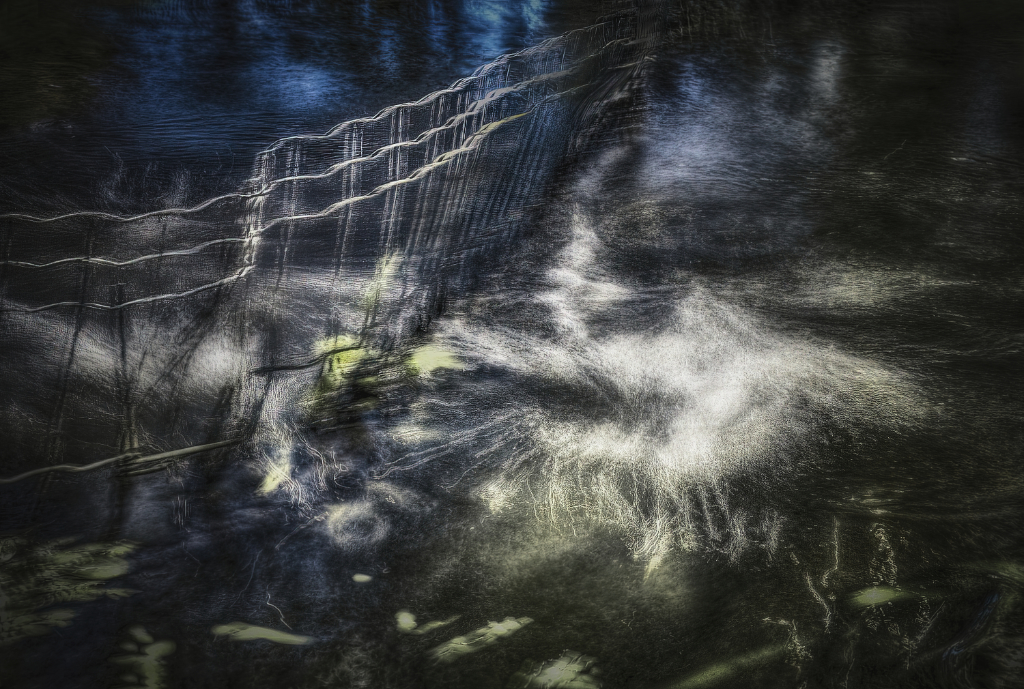
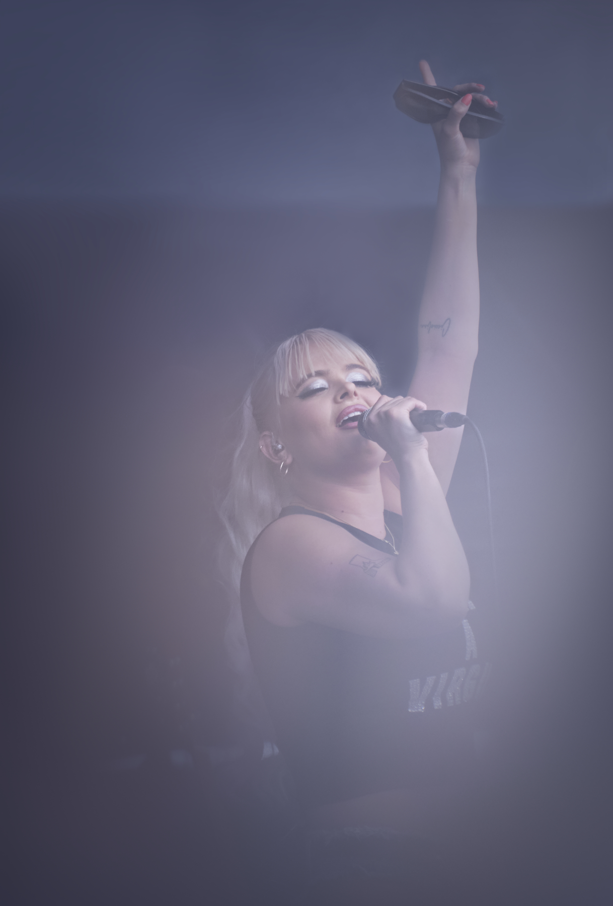
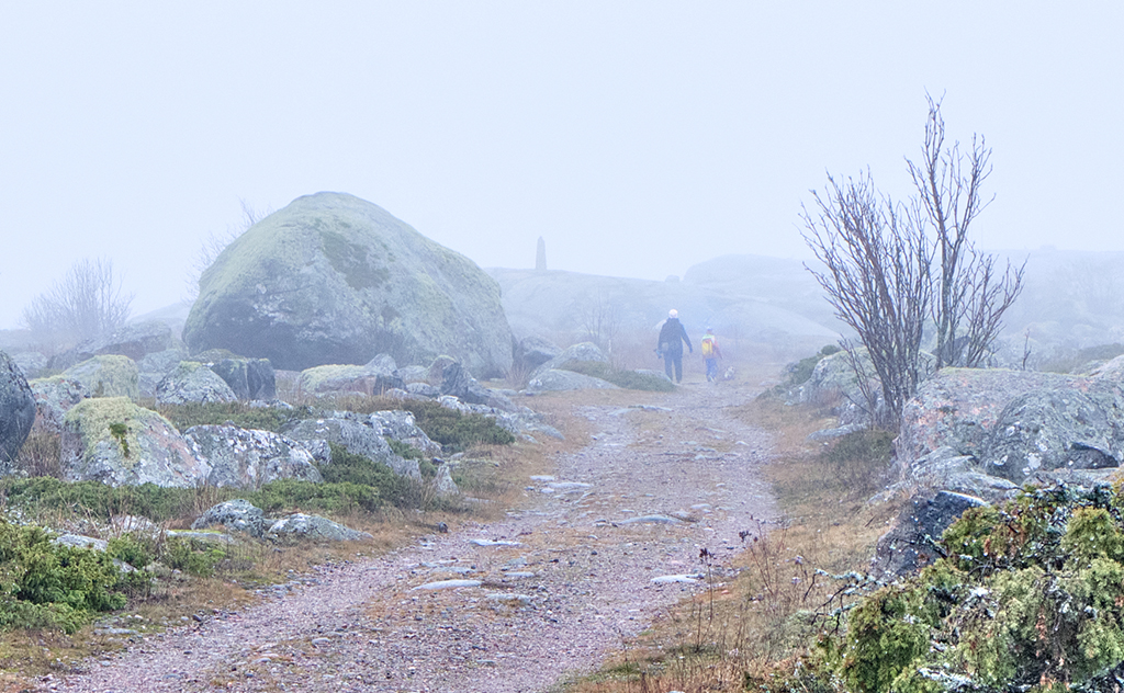
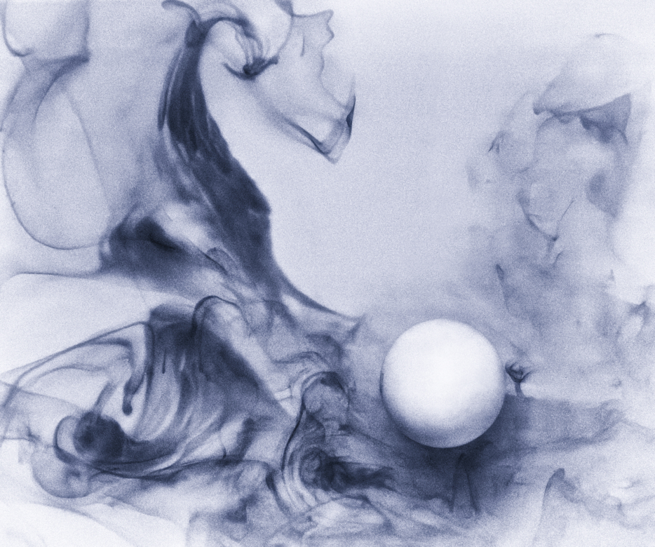
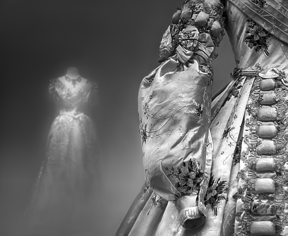
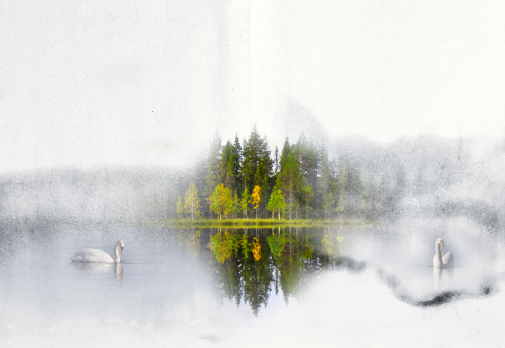
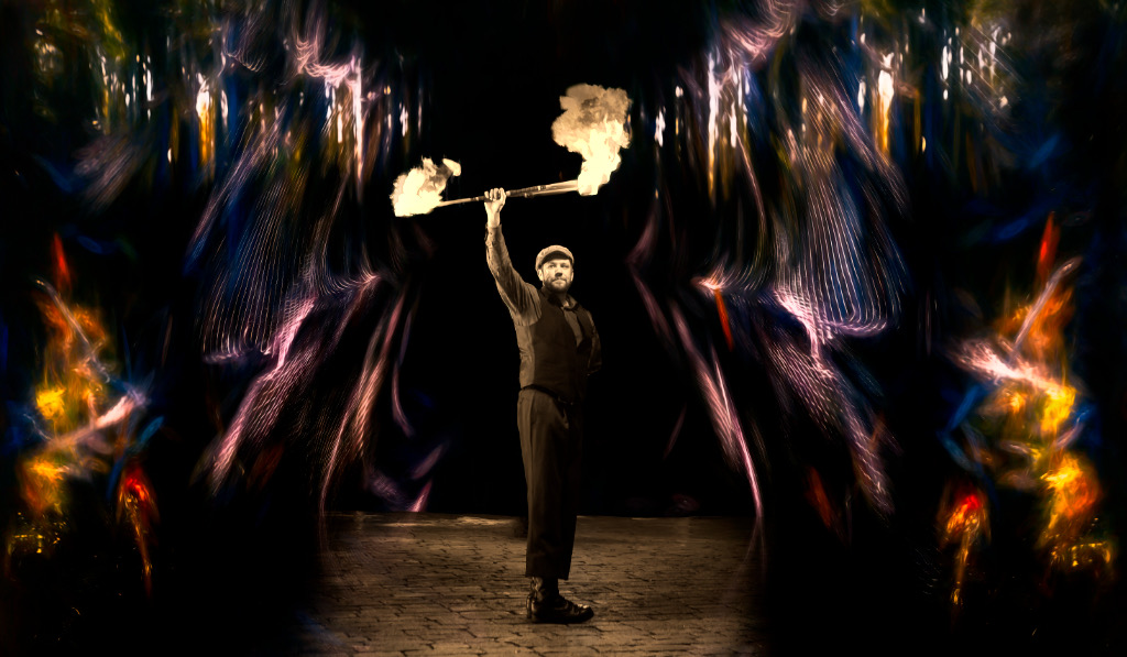
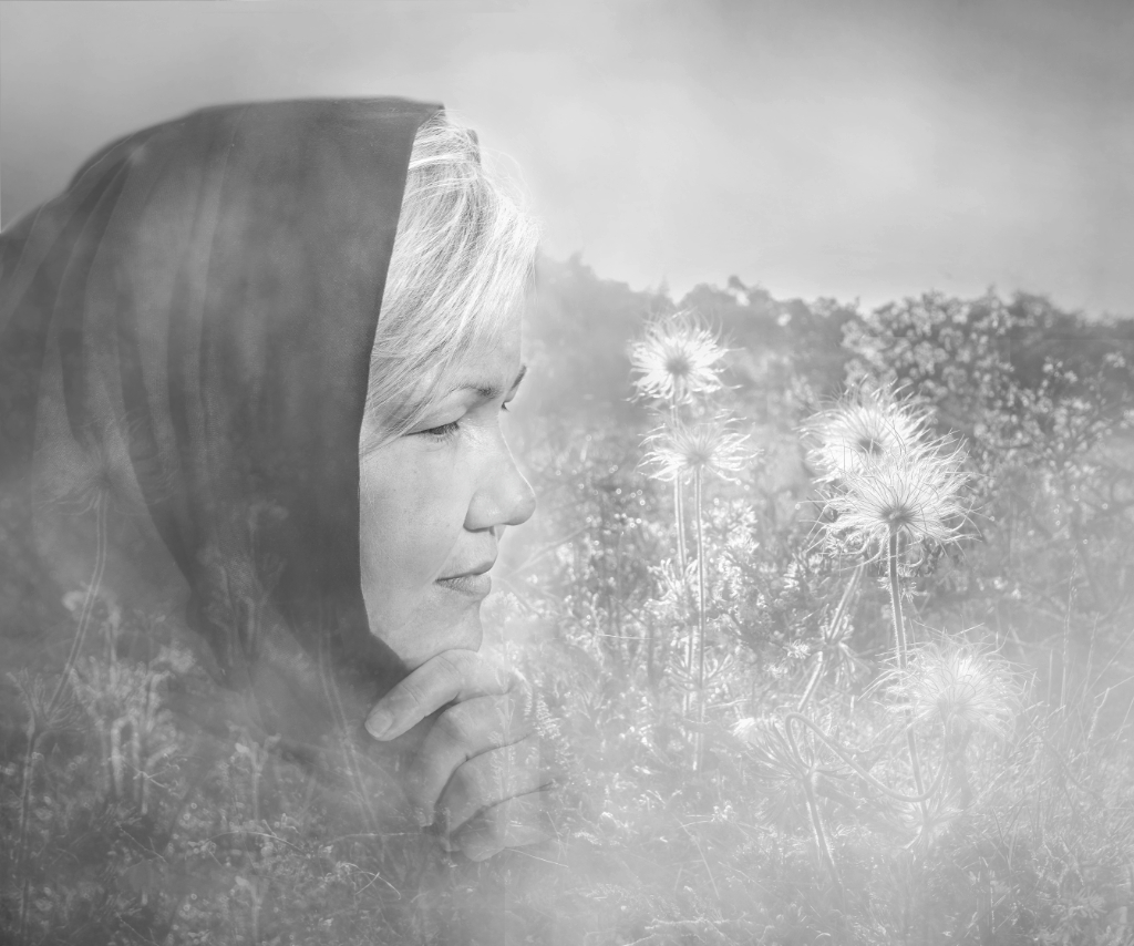
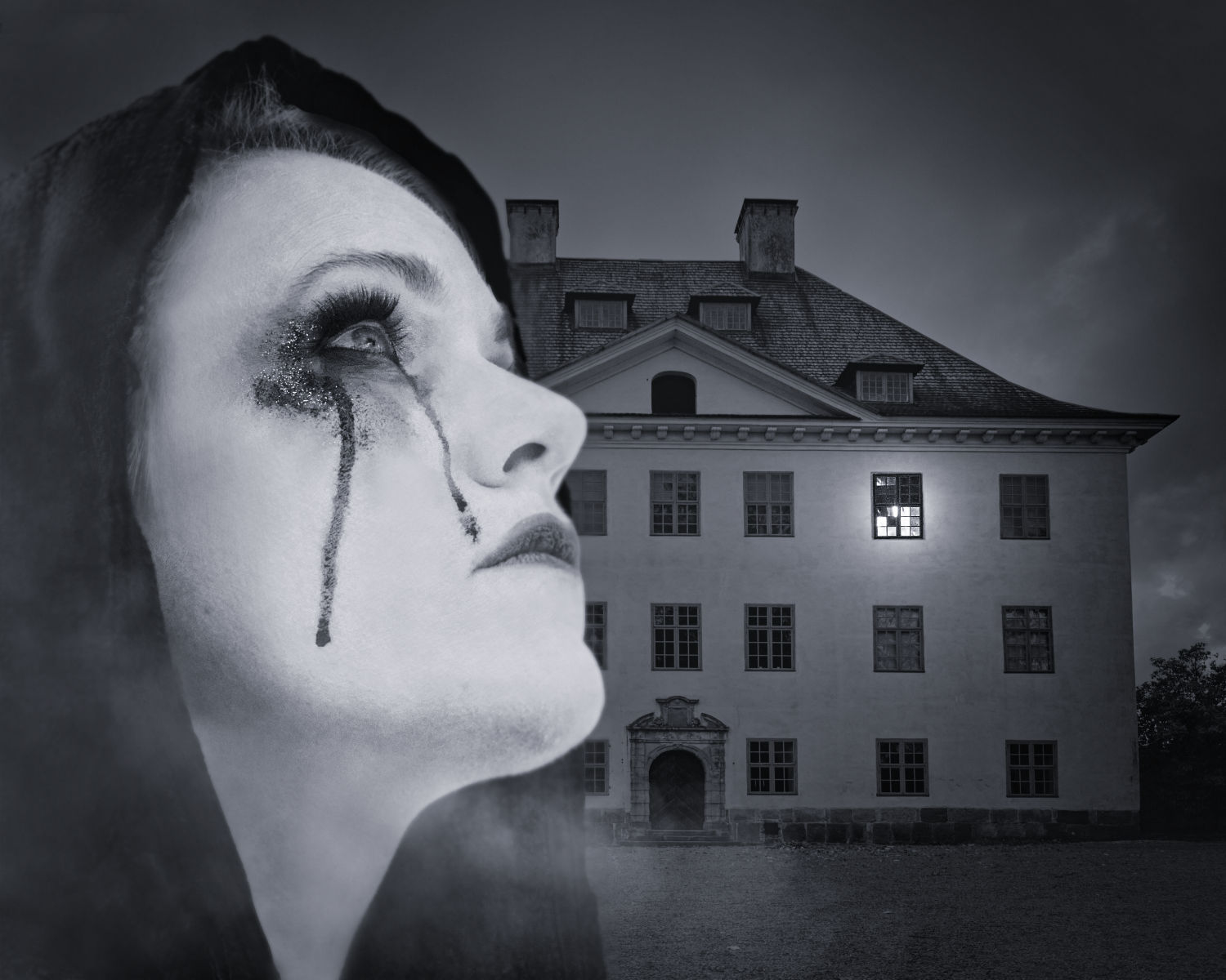
Hi, I loaded the image to Color Efex Pro and found out that they have 4 different filters for layered fog, and you can freely adjust how thick/deep/from which direction it comes. Here is option 3 + graduated ND filter. I think that it works beautifully. Thank you for the tip, Joan! |
Feb 20th |
 |
| 15 |
Feb 21 |
Comment |
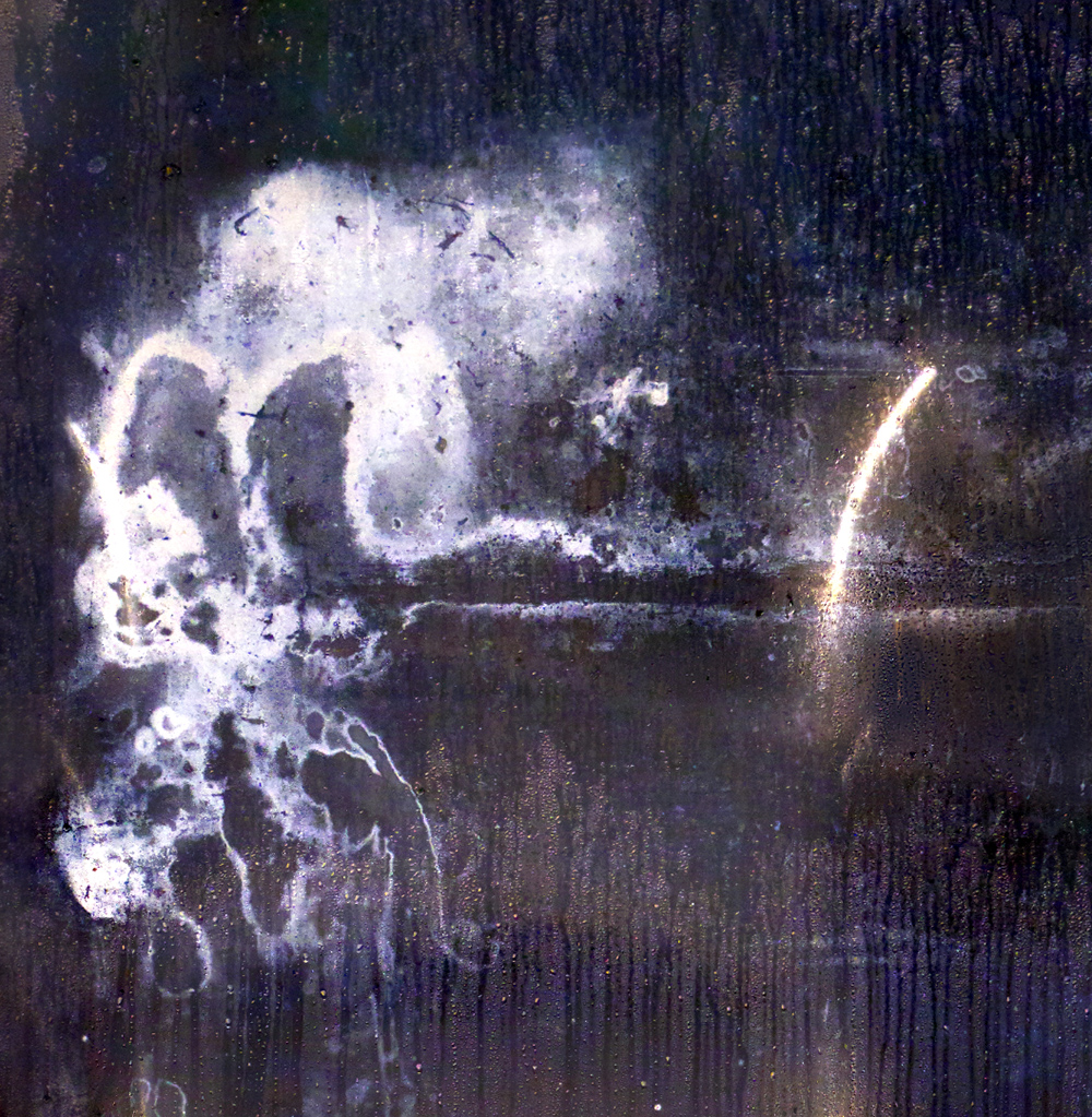
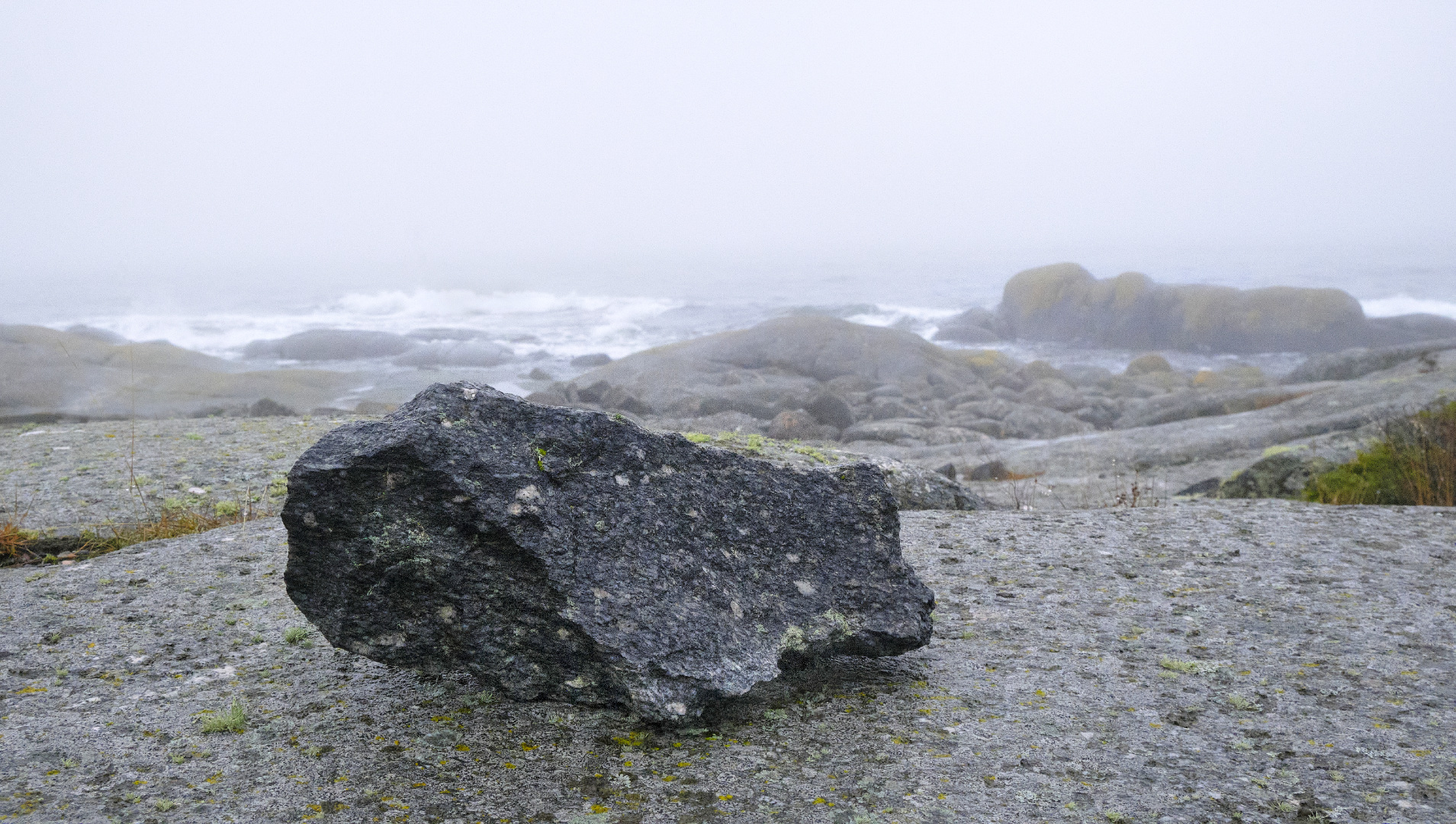
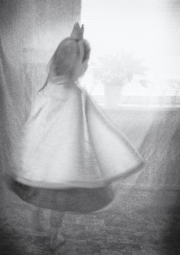
Here it is! |
Feb 20th |
 |
| 15 |
Feb 21 |
Reply |
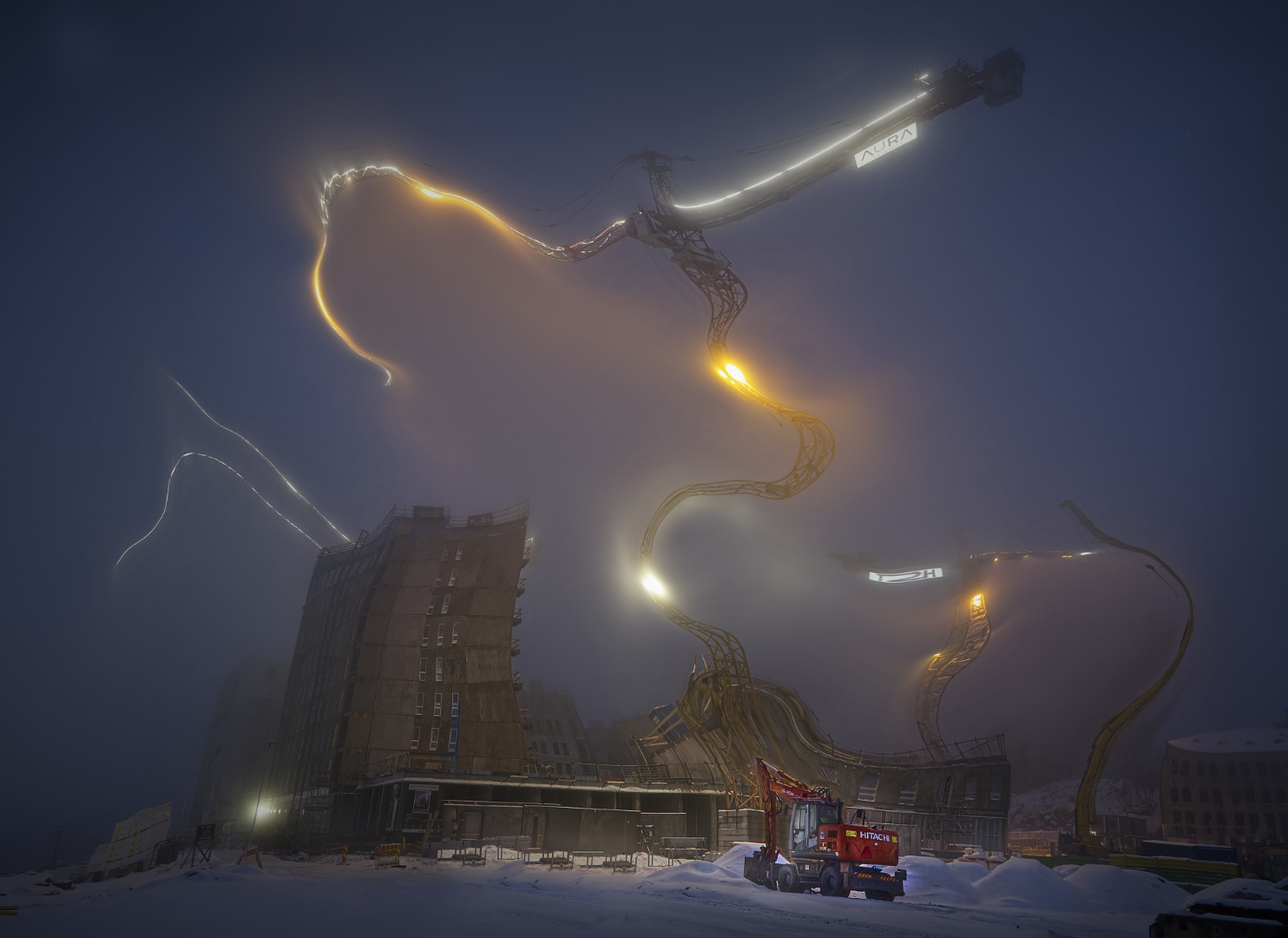
Thanks Joan! I think that the program is very much like Photoshop, with endless options (when you lear how to...). It works as an external editor with Capture One and, e.g. Apple Photo, and a bonus is that it has an eternal license with free updates. |
Feb 20th |
| 15 |
Feb 21 |
Reply |
Thanks, Bob! I'll certainly test the idea! |
Feb 10th |
| 15 |
Feb 21 |
Reply |
Thanks, Billy! It has been great fun to play with the tools and effects while trying to learn to use the new program! |
Feb 7th |
| 15 |
Feb 21 |
Comment |
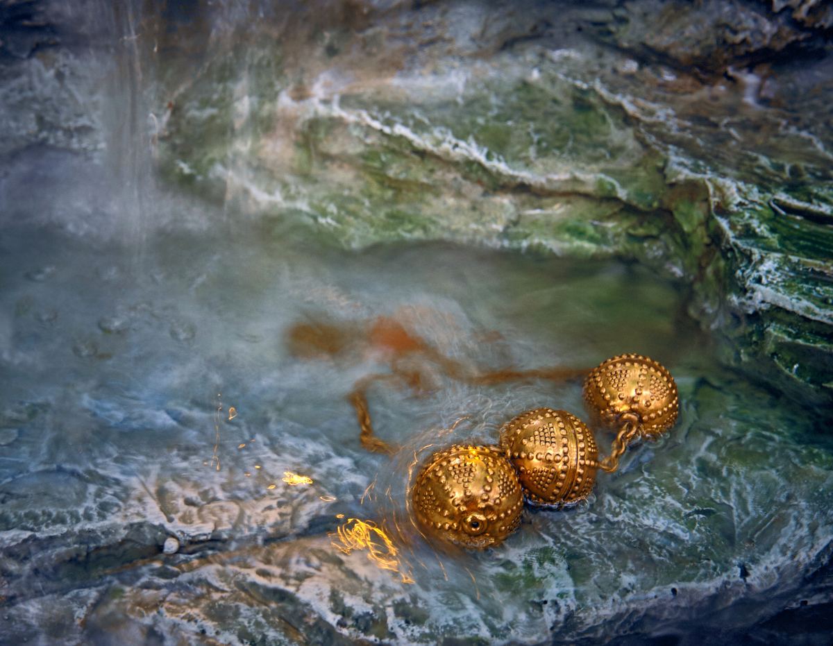
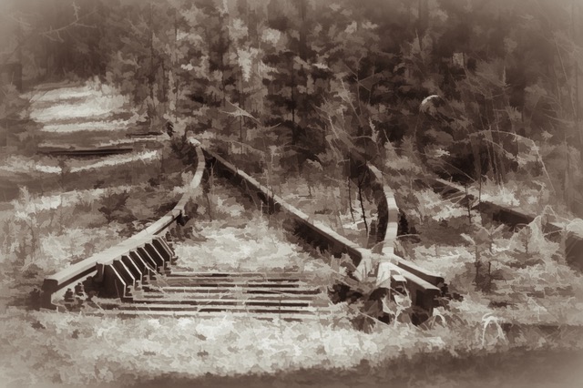
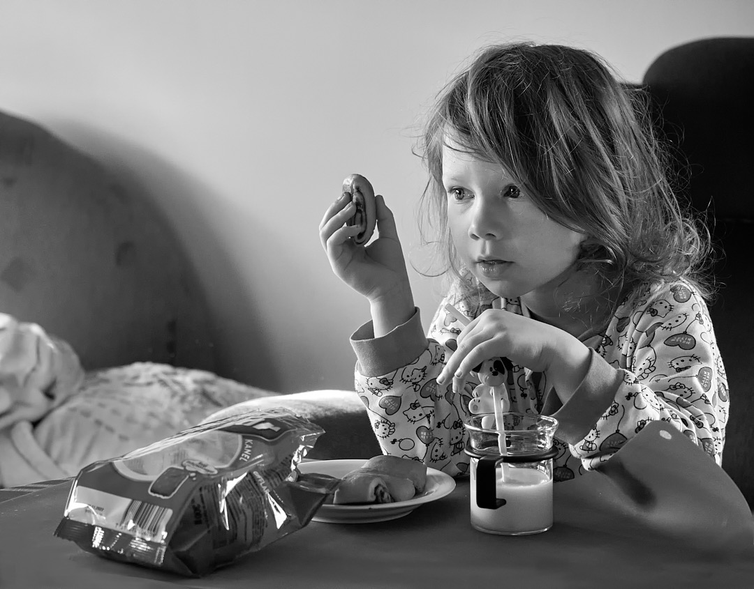
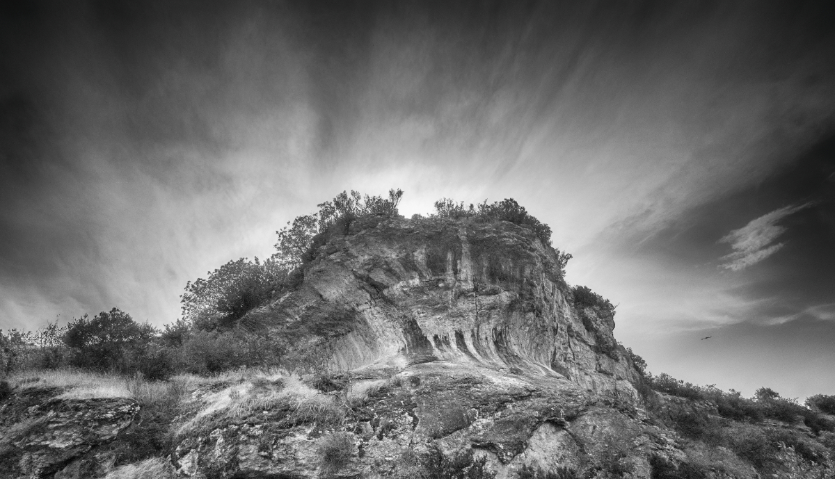
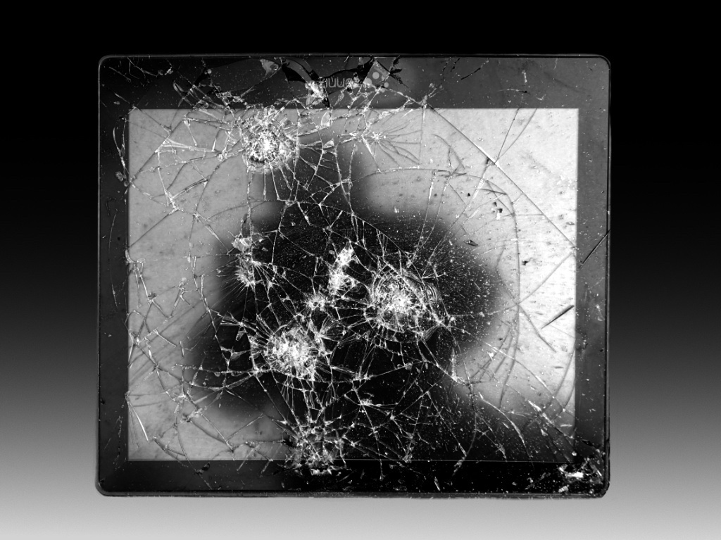
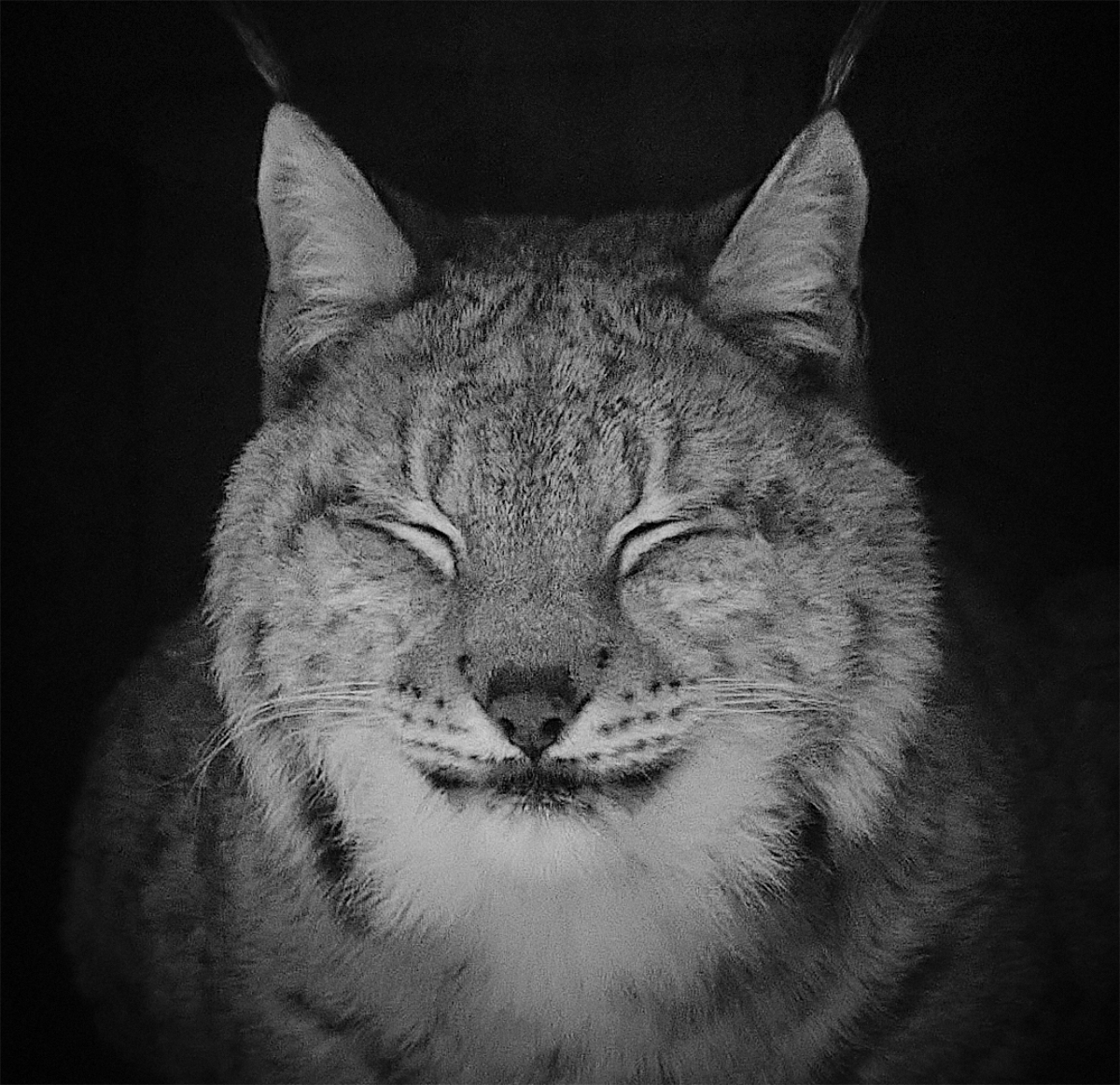
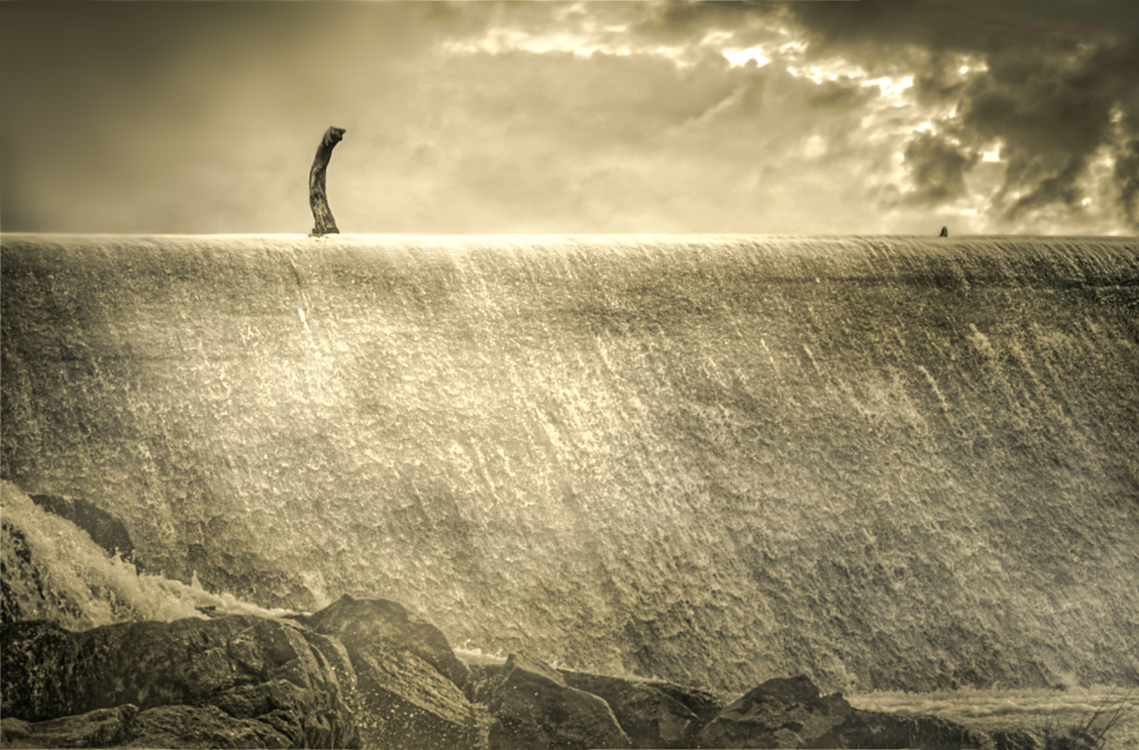
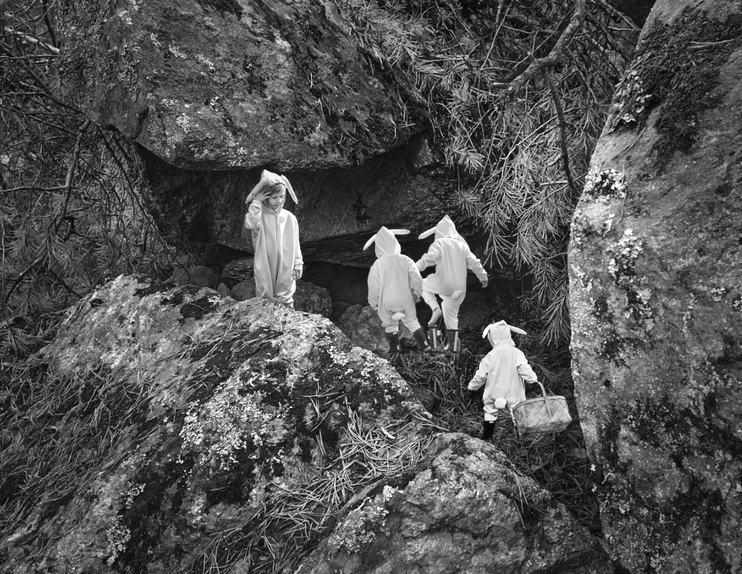
Hi Jeri, it looks like it could crawl out of the frame any minute! The light and shadows
bring the structure out beautifully. I agree with Billy about the highlights. It looks so three-dimensional, and I like the composition, with the mysterious dark cavity in the center. |
Feb 7th |
| 15 |
Feb 21 |
Comment |
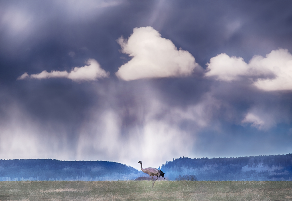
Hi Rick! This is breathtaking! The golden hilltops and buildings stand out contrasted by the different shades of purple and blue in the sky. I think it look like they were illuminated and protected by the arch of the rainbow. The shades on the hillsides (or mountains?) give a sense of depth and distance. It is so beautiful!
I acquired the new Luminar AI, too, but have not so far gotten quite comfortable with the presets. Do you use them a lot?
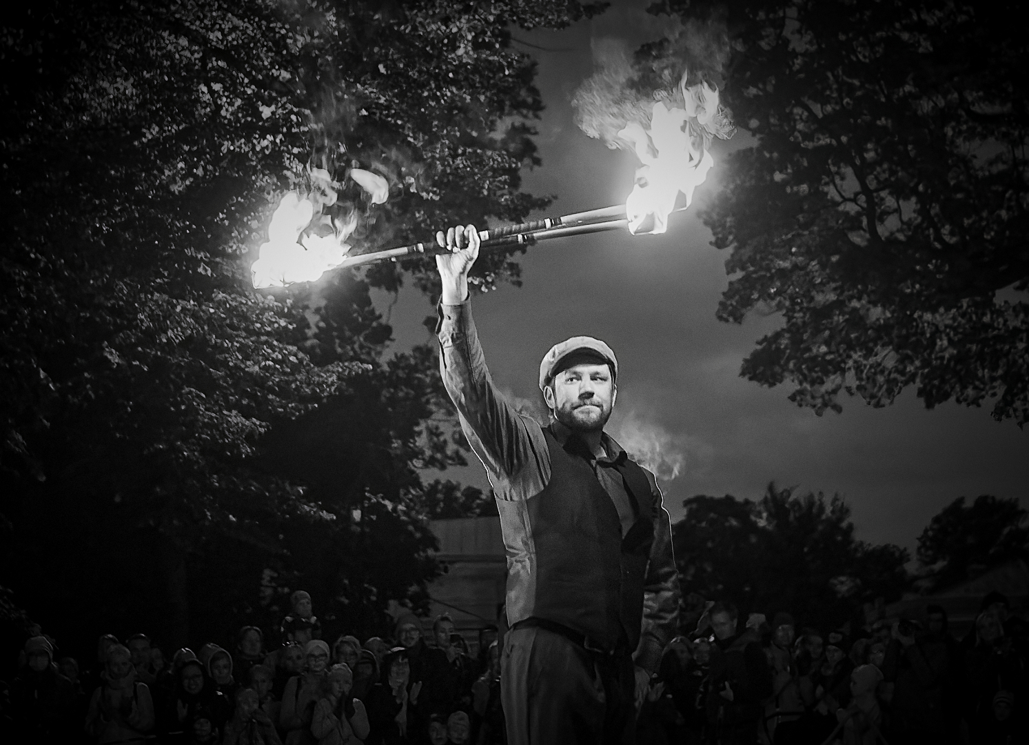
|
Feb 7th |
| 15 |
Feb 21 |
Comment |
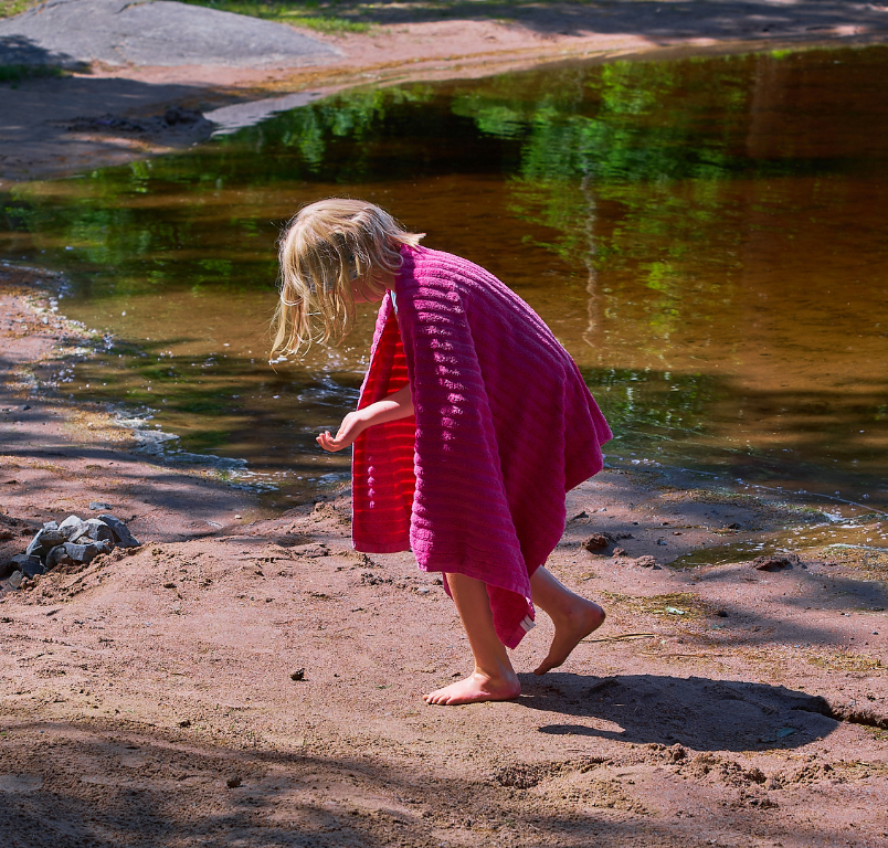
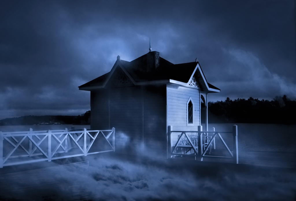
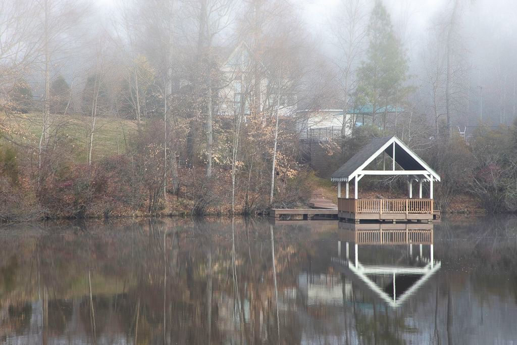
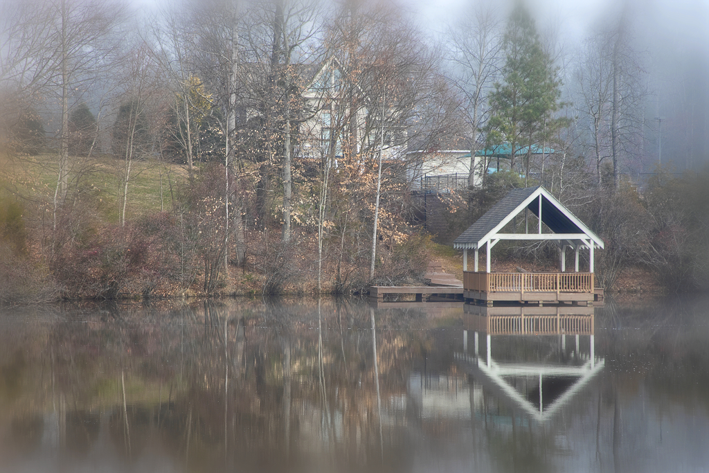
Hi Billy, I can sense the feeling of the misty morning in the image! I think that the crop is a little tight for the nice reflection. I would prefer the original and would not worry about the shoreline. The triangles repeated in the pavilion , its reflection and the attic of the house make a nice composition.
I thought about adding the intensity of the mist which would allow to increase saturation and contrast a bit and still maintain the atmosphere. I attempted to do this in Affinity Photo by adding a layer of Gaussian blur and then wiping some off, and doing adjustments in black point, contrast, brightness and saturation. What do you think? |
Feb 6th |
| 15 |
Feb 21 |
Comment |
Hi Linda! He sure is full of patriotic zeal! You caught a precious moment of the celebration. The bright colors and light emphasize the joyful atmosphere (our Independence Day in Finland is so different - December 6, cold and dark, very solemn and serious).
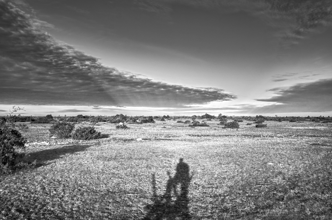
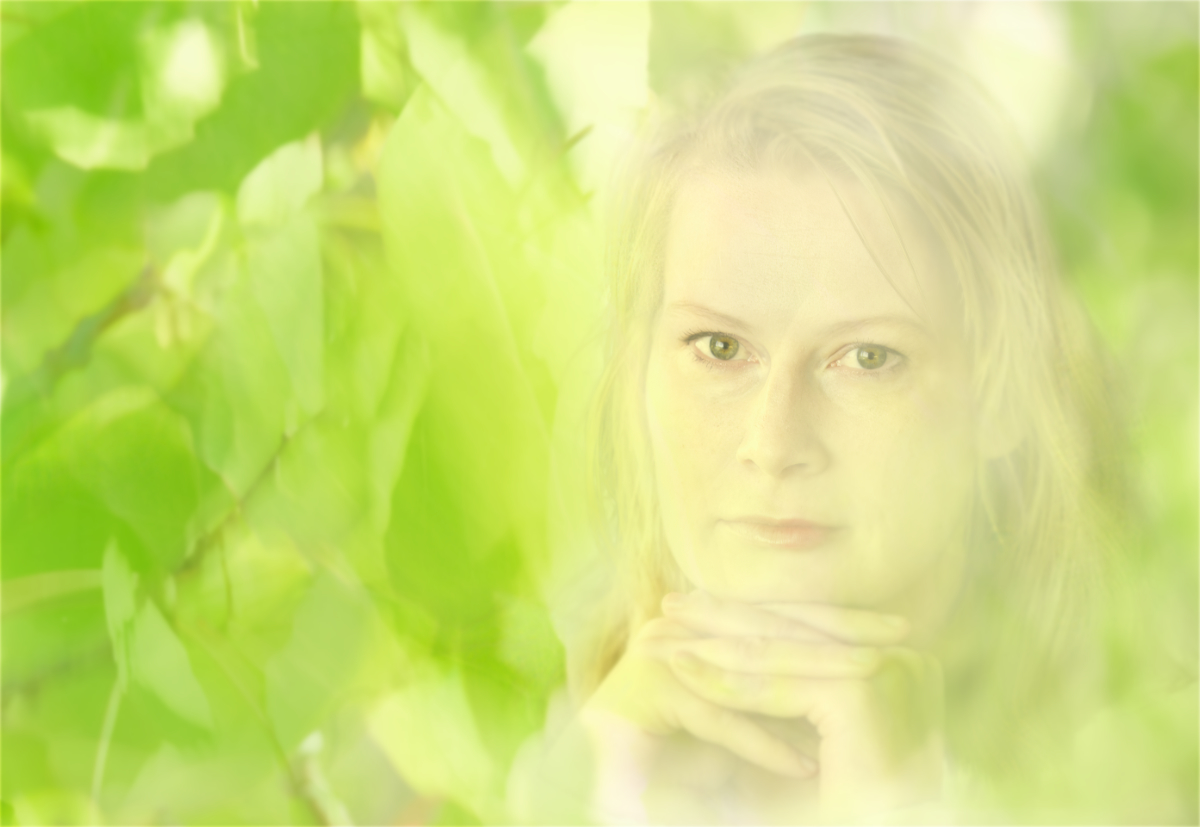
I was wondering if a square crop would work as well? I tried to see if some local contrast and black level increase would show his eyes even better? What do you think? |
Feb 6th |
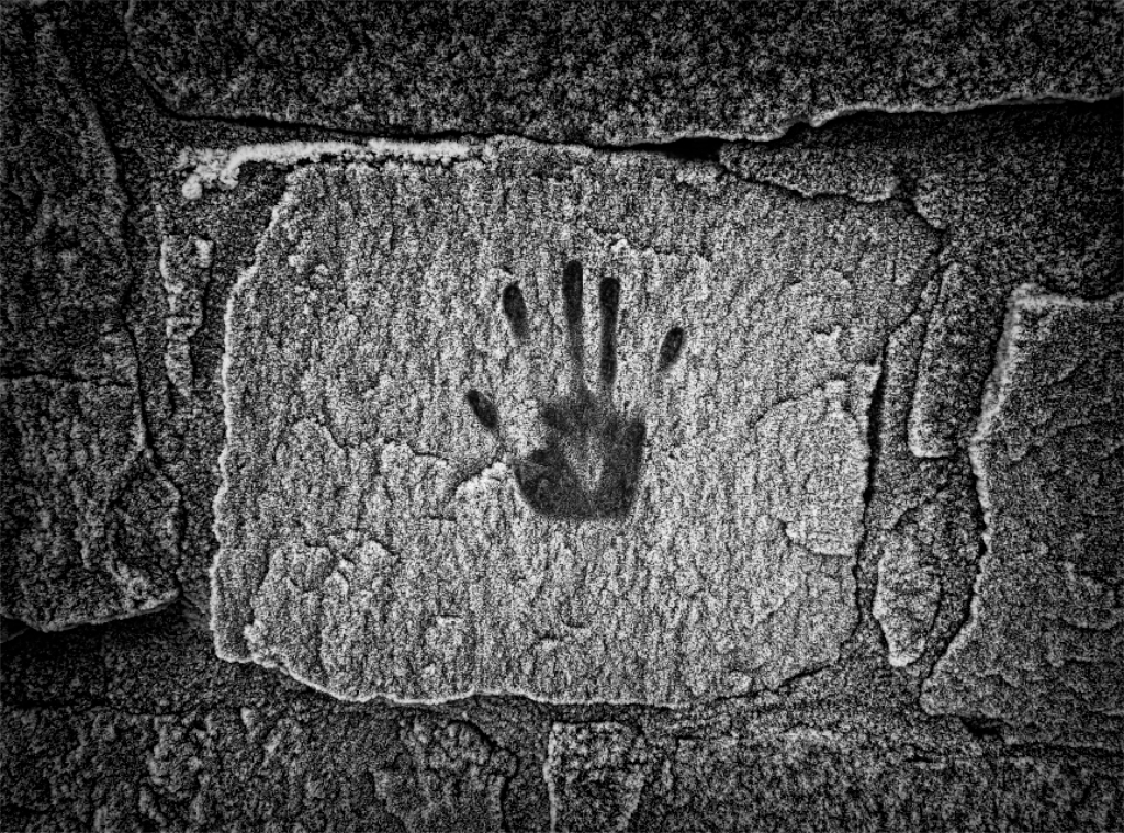
 |
| 15 |
Feb 21 |
Comment |
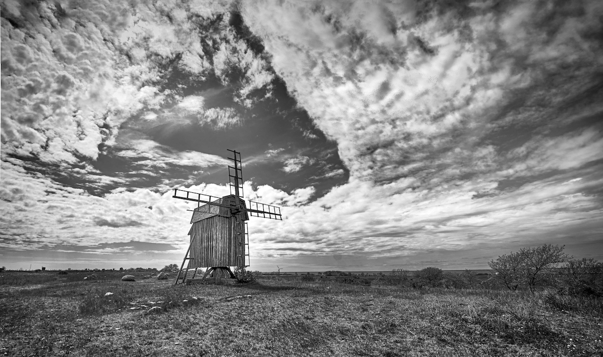
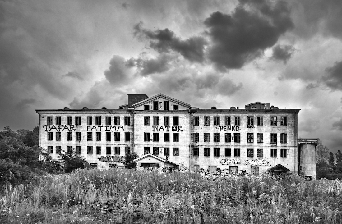
Hi Joan, this is an impressive scene. It feels like the last rays of sun before a storm hit the windmills. The new sky fits in beautifully. Have you done any relighting of the scenery? The play of the highlights and shadows and the tones of green and blue are so beautiful. I think that it would be a tough choice between the crops: Larry's suggestion would make a bold and strong image, but I think that the fourth windmill in the distance adds a sense of depth to the image, and the light on the hill is absolutely beautiful. |
Feb 6th |
7 comments - 4 replies for Group 15
|
| 29 |
Feb 21 |
Comment |
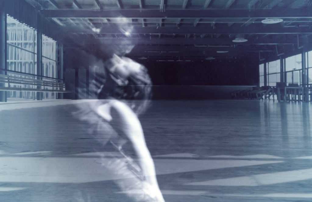
Hi Bob, It is beautiful! The special effects bring up the essence of a butterfly! |
Feb 15th |
1 comment - 0 replies for Group 29
|
| 47 |
Feb 21 |
Reply |
Hi Adrian, thank you so much! I am so happy that the image could convey also my original idea. I now have a whole set of different versions of the image, and begin to see the merits and problems of each one! |
Feb 28th |
| 47 |
Feb 21 |
Comment |
Hi Ed, thank you! |
Feb 23rd |
| 47 |
Feb 21 |
Reply |
Thanks, I'll do that! |
Feb 21st |
| 47 |
Feb 21 |
Reply |
Thanks, Albert! I would never have come to think of it this way. Here is a quick new crop. It looks good! |
Feb 20th |
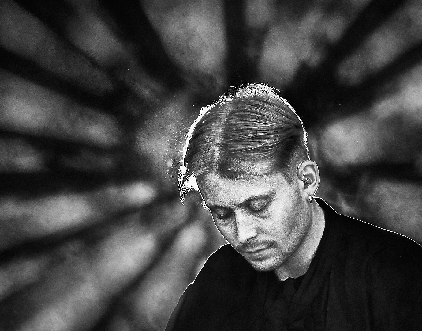
 |
| 47 |
Feb 21 |
Comment |
Thanks, Bob! I just submitted lesson 2 assignments of the Image Evaluation Course, and am enjoying Larry's comments tremendously. He is a great tutor! |
Feb 16th |
| 47 |
Feb 21 |
Comment |
Thanks,Colin! Great ideas! In the pano version, the trail is actally cloned off. I'll experiment with the lightening and darkening right away. |
Feb 8th |
| 47 |
Feb 21 |
Comment |
Hi Albert, a very beautiful composition! I think that the fine toning adds to the lovely relief-like three dimensional feeling. |
Feb 7th |
| 47 |
Feb 21 |
Comment |
Hi Adrian, a majestic portrait! I was also wondering what a slightly wider crop - like head and shoulders, so to say - would look like, showing the front paws and a bit of the background? |
Feb 7th |
| 47 |
Feb 21 |
Comment |
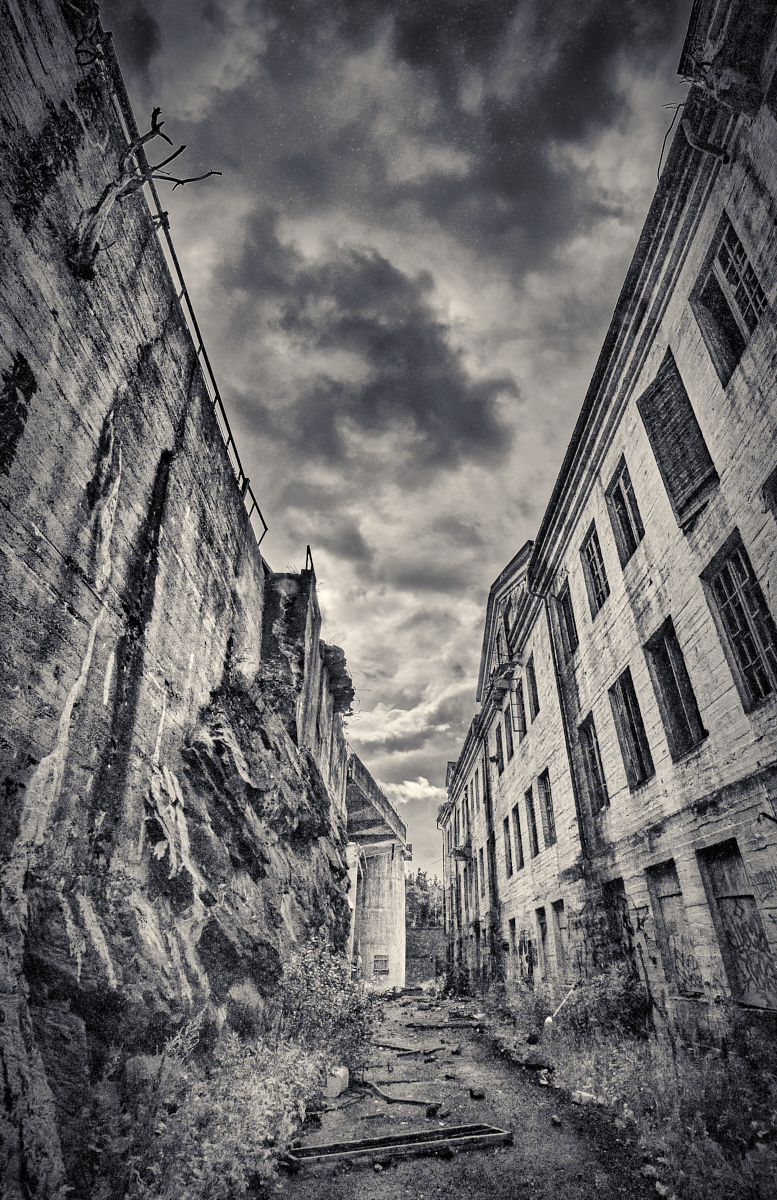
Hi Ed, this is an exiting image that makes me think of Barcelona in an alternative reality. I wonder if it would be worth while to darken the bright spots on the right wall (original shadows).I think they may draw the eye a bit from the people and the street.Then there would be only the bright horizontal leading lines on the walls.What do you think? |
Feb 7th |
| 47 |
Feb 21 |
Comment |
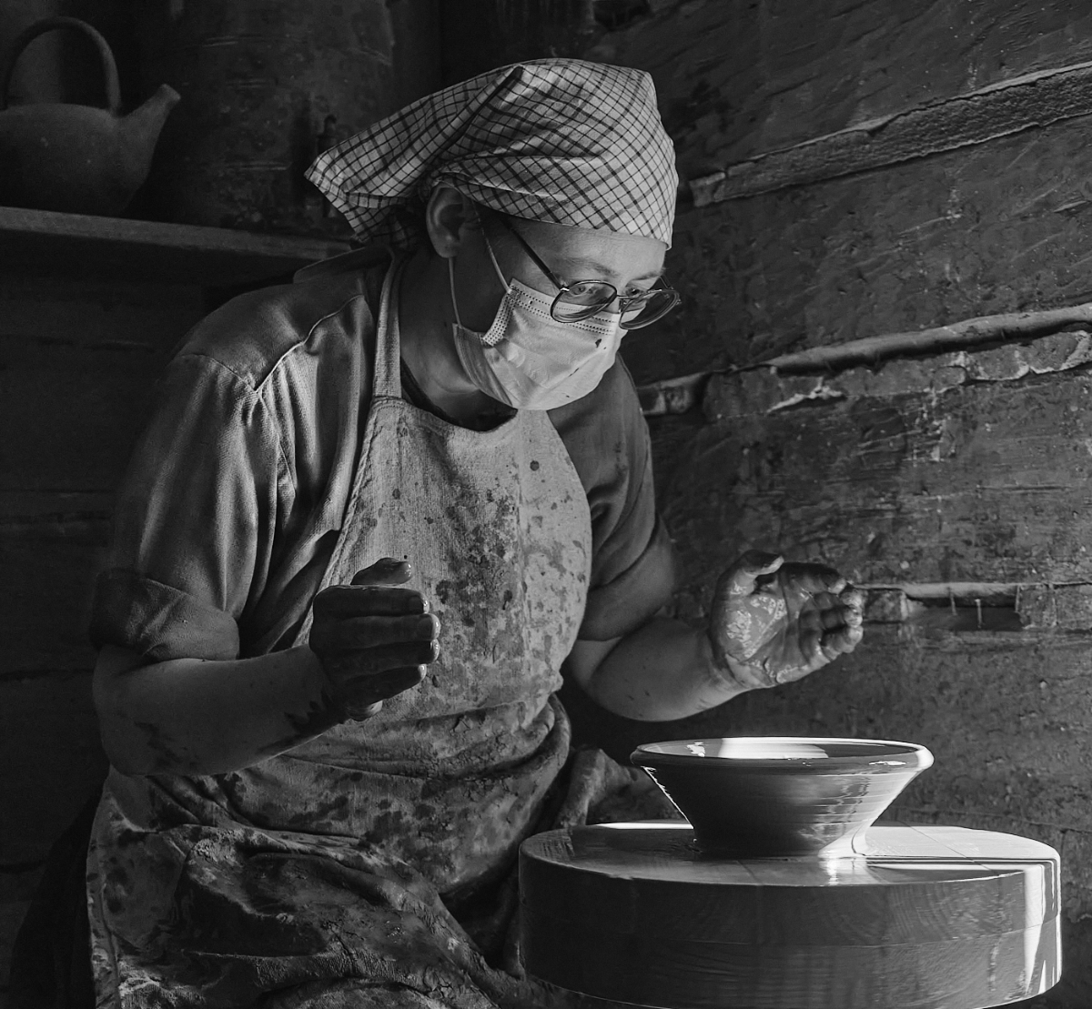
Hi Colin, an impressive portrait! I feel like he were standing in a dark alley in the light of a street lamp, ready to defend himself against a gang. The black background brings him out beautifully, and the light does define his muscles. There is an extremely strong presence and contact. |
Feb 7th |
| 47 |
Feb 21 |
Comment |
Hi Jack! The lights and shadows are beautiful! I think that the softer approach suits this very well; I wonder if just a little more midtone contrast would bring the fine wave formations out a bit more clearly? A tighter crop omitting the uppermost bright sliver of sand would be more restful, leaving only three triangles, but I think that it would also take off most of the tension from the image. What do you think?
- This would work well also in color with the bluish shadows and the warm yellow tones. |
Feb 7th |
| 47 |
Feb 21 |
Reply |
Thanks, Jack! I tried a lighter tint and it looked good. I am doing the Image Evaluation course with Larry and submitted this one, too, as an exercise, so the discussion will continue! |
Feb 7th |
| 47 |
Feb 21 |
Reply |
Hi Larry, thanks, I would love to! I have already prepared two other cases that I was almost ready to mail to you. I wonder if it is possible to add the harbor as a third? |
Feb 6th |
| 47 |
Feb 21 |
Comment |
Hi Jen, here is definitely a story! How did the boat end up in the middle of the meadow and what will happen now? The daisies in the foreground make an effective contrast with the wrecked boat and emphasize the fact that it is absurdly out of place. They lead the eye to the boat in the center. The tones are beautiful, and I think that the sepia suits to the atmosphere very well. |
Feb 6th |
| 47 |
Feb 21 |
Reply |
Thanks Jen! I am so delighted that they could convey the ideas! Had to look up "Dead Wind" in Google, the original Finnish name is "Karppi" which is the last name of the detective. I liked it a lot, too. |
Feb 6th |
| 47 |
Feb 21 |
Reply |
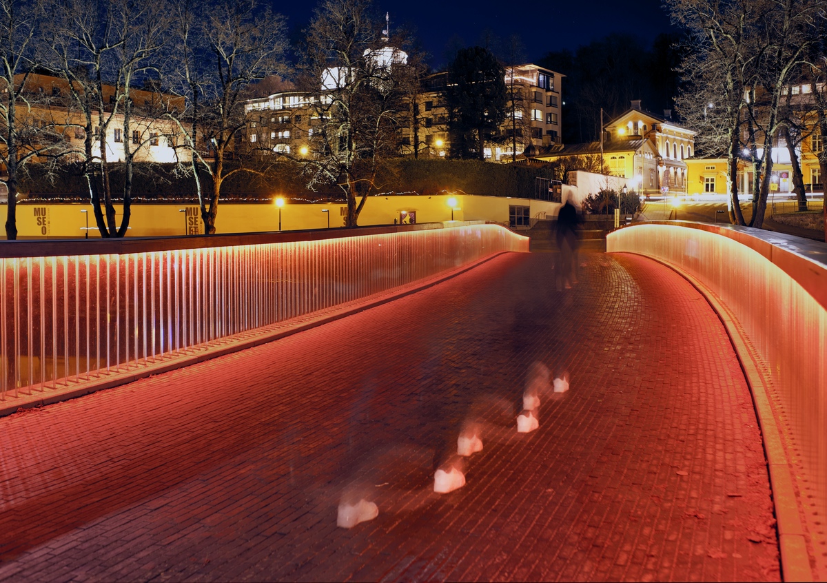
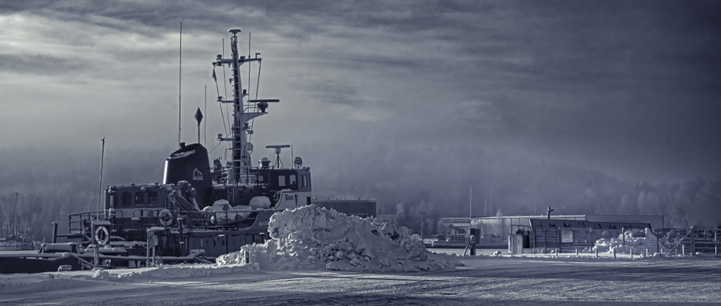
Hi Larry, I did more work on the image, turning it every which way and realizing that nobody else but myself will ever be able to see the pier as the key point. I sacrificed the front and part of the sky, making it more panorama-like, and followed your tips otherwise. Now, the lightest spot comes on the pier, drawing the eye; there is still left enough of the horizon (which I think is the best part of the picture), and the rail and the car have been exterminated. I also put it through Topaz Sharpen AI with a mask + Denoise AI, and the boat really looks much better. I think this begins to look like what I wanted to say. Thank you so very much for your help! |
Feb 6th |
 |
| 47 |
Feb 21 |
Comment |
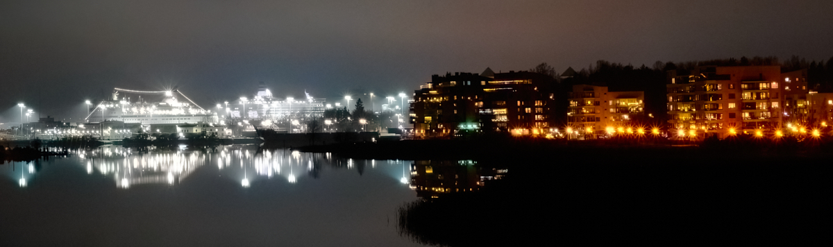
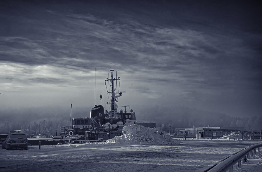
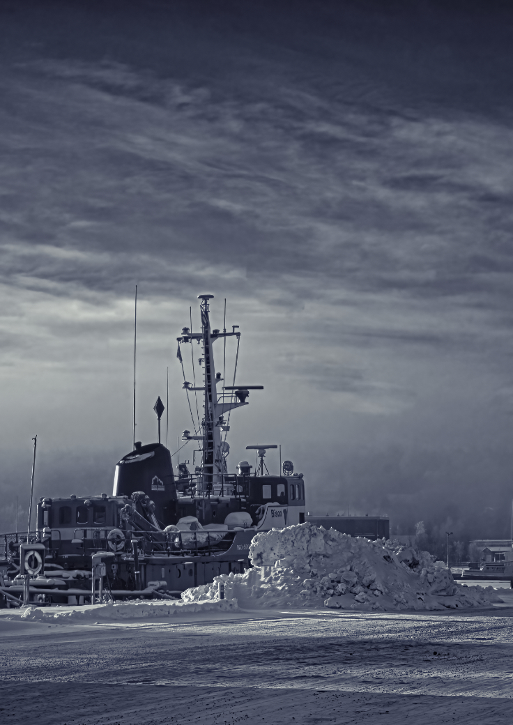
Thanks, Larry! I do agree with all your points! One of the crops I tried was exactly the one you suggested, and is probably the most sound solution composition-wise. However, I felt that it ripped off the atmosphere of a harbor silenced by the cold, leaving only a-not-so-good picture of an unremarkable boat and an untidy pile of snow. I began to see the empty pier as the key element instead of the boat, leading to unknown destination but frozen to stillness for the moment. The boat and the car (the means of transportation) also stand still. I think that the patterns of light and shadow and the rail form kind of leading lines towards a vanishing point on the right edge. Does this make any sense?
I also have versions with the car/the rail/both cloned off in the original crop, but the result was not very tidy, and I actually started to think they have a role in the image.
|
Feb 4th |
10 comments - 7 replies for Group 47
|
18 comments - 11 replies Total
|