|
| Group |
Round |
C/R |
Comment |
Date |
Image |
| 96 |
Feb 23 |
Reply |
Thanks Gloria. Yes and I have seen some of the beautiful skies you have to go with that sky line. I look forward to seeing your shots! |
Feb 18th |
| 96 |
Feb 23 |
Reply |
Thank you so much Kate. Yes light trials might me a nice touch. I will have to go out when the town still felt alive sometime. |
Feb 18th |
| 96 |
Feb 23 |
Reply |
Thanks Bob. I usually don't have too much trouble cloning trees out but for some reason the subtle changes in the light on that particular tree made it difficult so I decided to leave it thinking it was dark enough most wouldn't be drawn to it. You have a keen eye. The bottom was pretty much full of branches that I just blackened out. I may give that right hand branch another go sometime and see if I can get rid of it. |
Feb 18th |
| 96 |
Feb 23 |
Reply |
Hi Dan
I do tend to put too much sky in most of my images I think. I have always loved gorgeous skies. As I am learning and I compare my more current images with my older ones I am seeing that as a general rule (although rules are meant to be broken sometimes) you should have 2/3 foreground (an interesting foreground) and 1/3 sky. When I look at most of my favorite landscape images (from top landscape photographers) this rule is usually in place. Unfortunately with this particular image I can't crop down much more and the foreground was tree branches so this was the best I could do at this location. I may try again with different angles to see what I can get for foreground that might be more interesting. Thank you Dan I always find your comments thoughtful and helpful. |
Feb 18th |
| 96 |
Feb 23 |
Comment |
This is my crack at a black and white version with more depth while still having some of the finer detail. |
Feb 18th |
 |
| 96 |
Feb 23 |
Comment |
Hi Bob
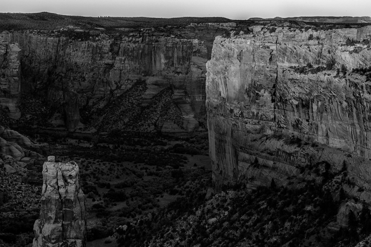
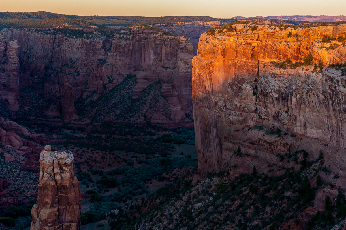
I really like the viewpoint in this image. I really hope to go to an area like this some day. I like your first black and white version better than the second one. The second one seems to have too much contrast and has lost the subtle shades of grey. I think the layers of color in the color version is what draws my eye to the color image. I do however think that the image requires the rocky areas lit by the light to be brighter than the rocks in the valley and behind. This would give the image more depth. I used to truely hate black and white but I have come around to loving the detail that it can bring out in an image like this. I have tried a couple version but I am not sure if they are much improved. The first is my attempt to bring out the bright rocks in the color version and darken the valley and background in an attempt to create more depth |
Feb 18th |
 |
| 96 |
Feb 23 |
Comment |
Hi Gloria
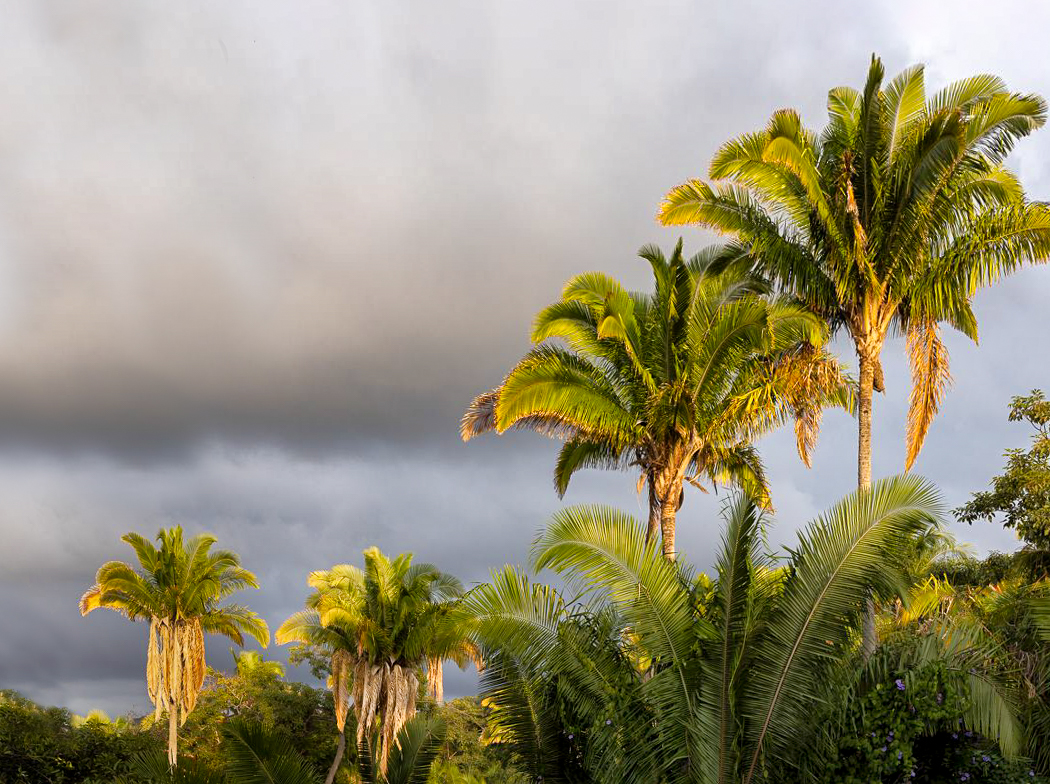
I really like the lighting of this image. You definitely picked the right time of day. I am not a fan of the branches in the top left. As well the image was taken with an upward angle causing the trees to appear to be leaning. This is an easy fix in lightroom by clicking on the vertical option in the transform settings. It is not too difficult to clone out those upper branches and lower branches on the left to simplify the image and bring all the focus to the main palm trees. The clouds add a bit of moodiness to the image and make me wonder if a storm is coming but there are still rays of happy sunshine on the trees. It provides a nice contrast in the image. Great choice in camera. I have heard very good things about that camera. I personally like a crop with all 4 trees. I know some say that groups of 3's work better but in this case I like all 4 trees. |
Feb 18th |
 |
| 96 |
Feb 23 |
Comment |
Hi Dan
I really like your image this month. I keep coming back to it to decide how to express my reaction to it. It is one of amused curiosity I think. The tree looks almost like a creature riding a robot to me. I love the symmetry. I can't decide whether I want more symmetry of colors on left and right of the car or if its best as it is. I think it should be left because I imagine you would have thought of that already. Sorry I can't think of anything to improve it. I think you have accomplished what you set out to do. |
Feb 18th |
| 96 |
Feb 23 |
Comment |
Hi Kate
I agree with both Dan and Bob. It is a great image which portrays a story. When I look at the image I do really wonder what all the fuss is about. My thoughts mirror Dan's re removing distracting debris. I find the image a bit soft and Topaz sharpen would surely take care of that.
|
Feb 7th |
5 comments - 4 replies for Group 96
|
5 comments - 4 replies Total
|


