|
| Group |
Round |
C/R |
Comment |
Date |
Image |
| 96 |
Nov 22 |
Reply |
Thanks Bob |
Nov 21st |
| 96 |
Nov 22 |
Reply |
Thank you Gloria. I agree shooting into the Sun is not easy and I don't usually do it. I don't remember why I gave it a try this time. Likely I was just shooting randomly and it worked LOL. |
Nov 21st |
| 96 |
Nov 22 |
Reply |
Thank you so much Bev! |
Nov 21st |
| 96 |
Nov 22 |
Reply |
Thank you Robert. The Walker and the dog were in this exact position and I didn't know them so I did not ask them to pose LOL. As I mentioned in my reply to Haru I may try to move the person and dog in Photoshop and see if I can improve their separation. |
Nov 21st |
| 96 |
Nov 22 |
Reply |
Thank Haru. I agree totally with you regards to the placement of the person and dog. It never came to mind when editing it for me though. I may try to move it if possible in Photoshop and see if I like it. |
Nov 21st |
| 96 |
Nov 22 |
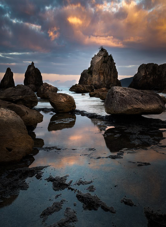
Comment |
Hi Haru
I love the colors, lighting and reflection in this image. The image may benefit from a more defined focal point. When I gave it a try to define the focal point by cropping it ended up very similar to your second version and Roberts edit. I like the composition of your portrait version better because the rock on the lower left is at a better angle and does not dominate the foreground allowing you to focus on the reflection and the main Rock structure. I do like the light better in your landscape version and I generally tend towards landscape orientation instead of portrait orientation but each image requires something different. In this case I think cropping vertical is required to provide a more defined focal point and a path to that focal point. I also thought it could benefit from more room in the foreground and sky so I extended both just a little. |
Nov 21st |
 |
| 96 |
Nov 22 |
Comment |
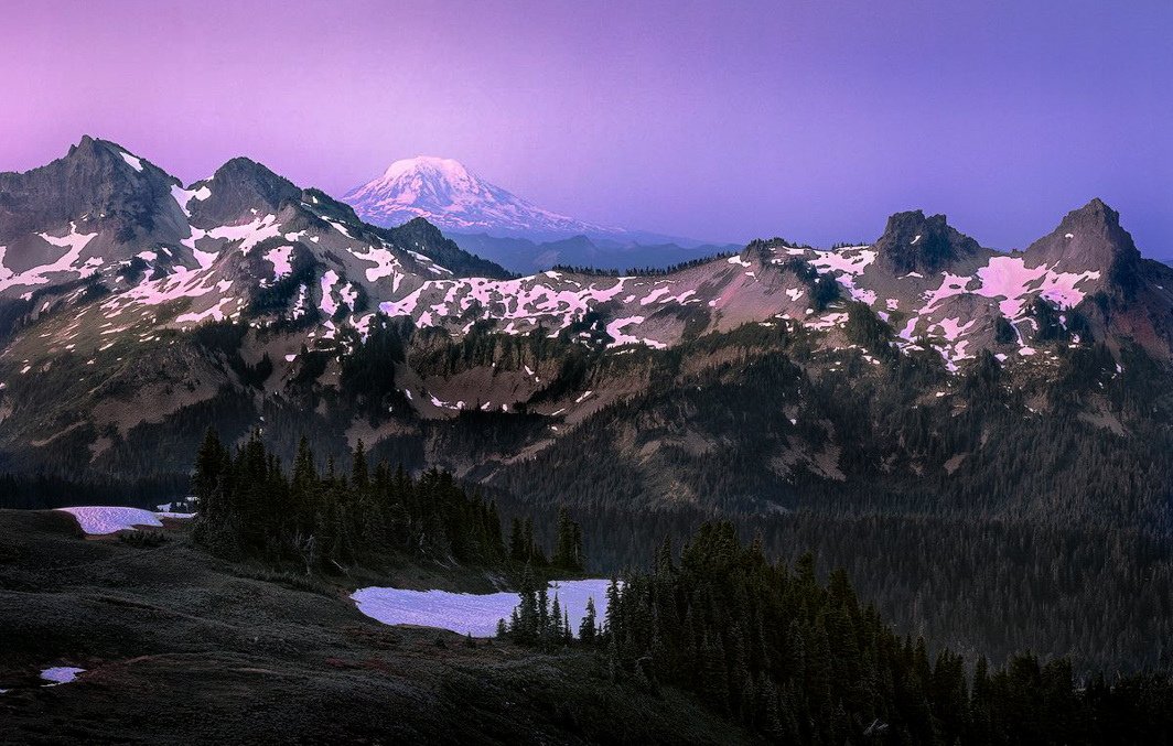
Hi Robert
I really love your images from the 4x5 and admire the dedication and skill you have to use it. I could not imagine not be able to take images as freely as I do on my digital camera. I love the color and light in this image and can see why you like the tonality of the film. It is very beautiful and I too can feel the start of the fresh new day and the excitement when that beautiful color comes into the sky. I have attached my attempt at cropping which puts the subject closer to the left line of the golden triangle which always looks better to me than on the rule of thirds. Re your question about darkening the foreground I believe it would benefit from darkening things a bit in the valleys that appear to me should be in shadow. I always tend towards a darker image as I'm sure you have noticed so it might be too much for your taste. I do love your images so keep sharing! |
Nov 21st |
 |
| 96 |
Nov 22 |
Reply |
Thanks Bob. I think you're right about warming it up a bit. There is not halo on my PSD copy so it might be the sharpening when I exported it. I will have to watch for that. Here is my re-edit with some warming and an attempt to make the Sun a little less blown out. |
Nov 9th |
 |
| 96 |
Nov 22 |
Reply |
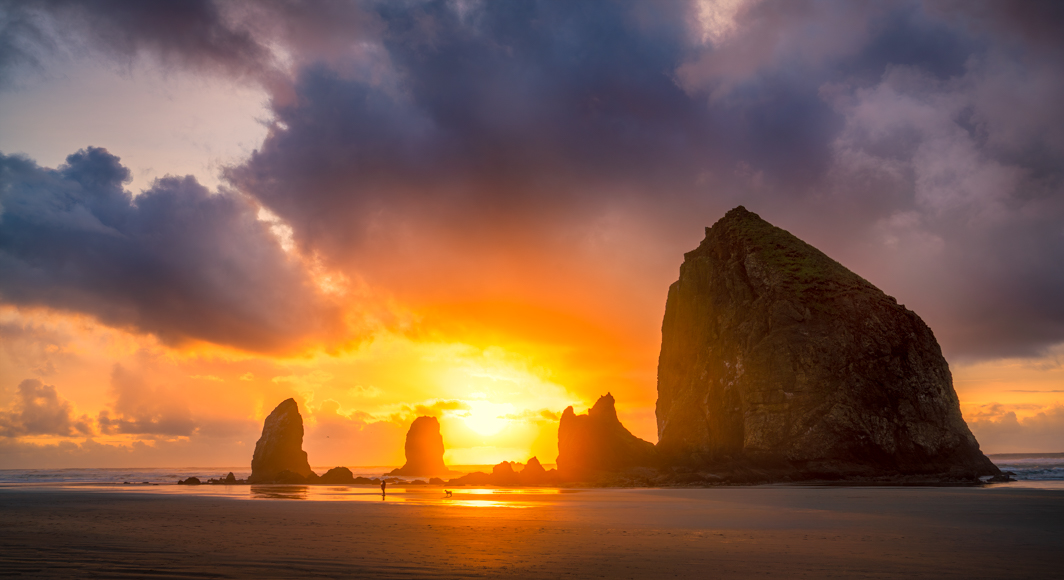
Hi Kate
Thank you for the kind words. This is in Oregon on Canon beach. I believe they call the large rock formation Haystack rock. |
Nov 5th |
| 96 |
Nov 22 |
Reply |
Thank you Dan. I took the Sun down in exposure/highlights as much as I could without it looking unnatural. Looking at it today I think it kind of gives a lonely feeling since there is just one person and a dog. |
Nov 5th |
| 96 |
Nov 22 |
Comment |
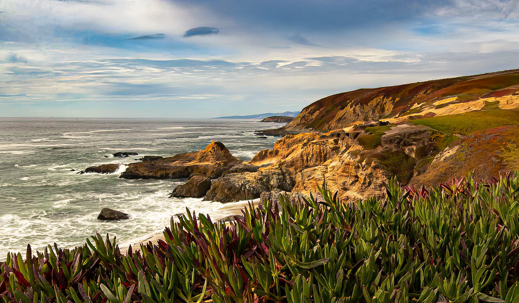
Hi Gloria
what a wonderful spot. I like the the foreground detail and the leading line of the rocks and cliffs through the image. I think the image would benefit from some contrast in the midtones and some dodging and burning of the shadows and highlights to add dimension. The sky is very bright as well and a linear gradient in lightroom to adjust the exposure, temp and dehaze sliders could bring out more color and detail. Cropping to put the cliffs closer to the rule of thirds and cropping out some of the foreground also helps to put the attention on the cliffs. As you mention a better time of day would improve the harsh look to the shadows and you could use a longer shutter speed to smooth out the ocean. All options you could play with to see what kind of look you want to acheive. I tried adding some contrast and darkening the sky to see what it would look like. |
Nov 5th |
 |
| 96 |
Nov 22 |
Comment |
Hi Dan
Another awesome image. I love all the leading lines and your choice of color for processing is spot on in my opinion. All of the lines and shadows are wonderful and interesting. My eye wanders around the image with interest. Several of these lines can lead the eye out of the image so I have only one very minor suggestion. I think the image would benefit from using the radial gradient to darken the sides and bottom just a tiny bit to help keep the eye in the center of the image. |
Nov 5th |
 |
| 96 |
Nov 22 |
Comment |
Hi Kate
This does look like a very calm and peaceful scene. With the majority of the image being split between the sky and the river it is difficult for the viewer to know which is your subject. If the river is the subject you may want to crop out some of the sky so the eye rests mostly on the river. As well I would think of other times of day to take an image like this. If you can return often a sunset or sunrise may add to the calmness of the river. I hope that the drying up of the Mississippi is only temporary. I guess only time will tell. |
Nov 5th |
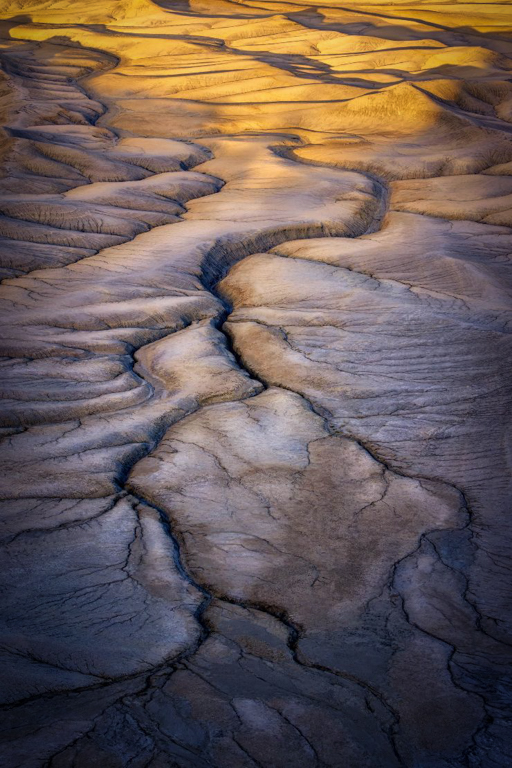
| 96 |
Nov 22 |
Comment |
Hi Bob
This image looks very otherworldly. If this was your intent you succeeded wonderfully. The color of the image make it look like it is another planet. My suggestion would be to darken the foreground a bit and maybe take down the highlights. I also see a bit of a halo around the rocks on the left. The composition is interesting with the left side and right side providing leading lines into the center of the image. This is a very interesting take on the badlands. |
Nov 5th |
6 comments - 8 replies for Group 96
|
6 comments - 8 replies Total
|


