|
| Group |
Round |
C/R |
Comment |
Date |
Image |
| 96 |
Sep 22 |
Reply |
Oh yes I forgot to use the perspective tilt in photoshop after changing the sky. I see what you mean. Thanks for the reminder. |
Sep 22nd |
| 96 |
Sep 22 |
Reply |
Thank you Arne! I really appreciate your feedback. |
Sep 22nd |
| 96 |
Sep 22 |
Reply |
So I have made a few changes to the image. Do you think this has improved the image? Any further suggestions? |
Sep 21st |
 |
| 96 |
Sep 22 |
Reply |
Thank you so much for coming by and giving me your suggestions. I will add some room to the left of the image. I am not sure why I cropped so close to that side. I will also try your suggestions and repost my edit for further critique. I actually had just downloaded Julia's book and am starting to read it. It is good to know that I have chosen well for learning this art. Thank you again! |
Sep 16th |
| 96 |
Sep 22 |
Comment |
Yes Haru I agree that while not pulling you out of the frame it is less balanced. I'm not sure of the best solution. I think you would need more on the left to balance the image than the small bit that is on the left in your original. I tried adding a bit more on the left but I am not sure that it is any better. |
Sep 15th |
 |
| 96 |
Sep 22 |
Comment |
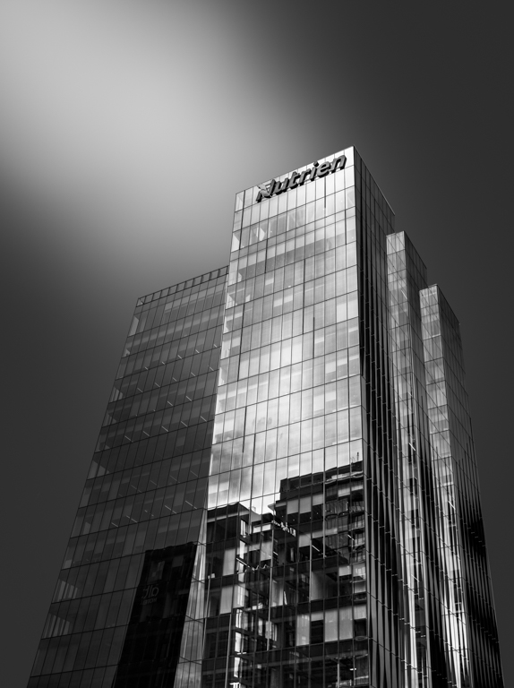
Hi Bob. I had no idea that a similar angle was used in Citizen Kane so I did a quick google search. I see what you mean. I looked at removing that line as well but chose not too because it was the edge of the building. I am now rethinking it because the rest of that side of the image is so dark it doesn't look right. Thanks for pointing it out. |
Sep 15th |
| 96 |
Sep 22 |
Reply |
Thanks you Dan! |
Sep 15th |
| 96 |
Sep 22 |
Comment |
Hi Bob
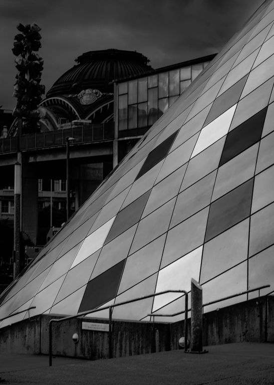
I really like the lines in the triangle and would focus on that. I think converting to black and white would allow you to Play with the squares to bring out that architecture. I gave it a quick conversion. I would probably play with which squares to choose a bit more and I would probably go with more than just the few intensities but I think you get the idea. This could become a really artistic looking image if that is a direction you would want to take it. |
Sep 15th |
 |
| 96 |
Sep 22 |
Comment |
Hi Gloria
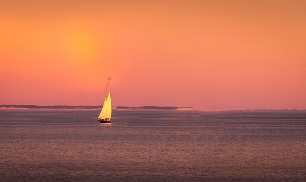
I agree with Dan that the rainbow probably can't be salvaged. I did give it a try but could not bring it out. As for composition, I think you did as well as can be expected from your deck. If you were on the ground I would suggest trying to get the lighted boat out of the center and minimize the other boats as they are distractions. This of course is in a perfect world. I think you did wonderfully given the situation. |
Sep 15th |
 |
| 96 |
Sep 22 |
Comment |
Hi Dan
I am going to suggest the middle ground between Bob's crop and Haru's crop. I also think it would benefit from more detail in the foreground of the walkway. It's an interesting concept that makes me wonder what is at the end because there is always something else around the corner. |
Sep 15th |
 |
| 96 |
Sep 22 |
Comment |
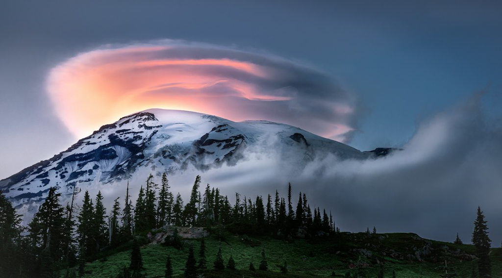
Hi Robert
This truly is a WOW shot. The cloud is just awesome. I too would crop in. I have attached where I would crop it but do what looks right to you. I also desaturated the greens a little. Was the lighter halo around the trees there in the original? I would also try to make the halo less obvious. All very minor details. Such a wonderful image Robert! |
Sep 15th |
 |
| 96 |
Sep 22 |
Comment |
Hi Haru
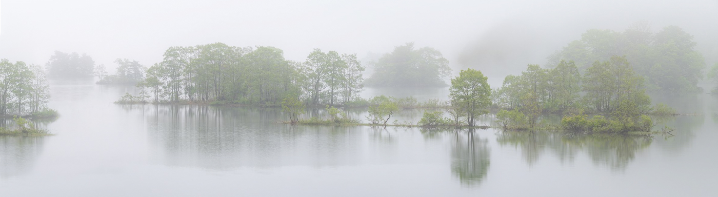
I too really enjoy this image. I love the fog and the softness of the image. I like the color version better. I agree with Robert re the softness and the cloning. I did a quick cloning to see what it would look like. I also decreased the dehaze slider to give it a more ethereal feel and then I boosted the yellow and green saturation just a touch so that the color was not lost with the decrease in the dehaze slider. I'm not sure if it is what you were envisioning just thought I would give it a try. Thanks for sharing this calming scene. It is very lovely. |
Sep 15th |
7 comments - 5 replies for Group 96
|
7 comments - 5 replies Total
|


