|
| Group |
Round |
C/R |
Comment |
Date |
Image |
| 96 |
Aug 22 |
Reply |
Thank you Robert, I think I understand and will attempt to decrease some of the distractions although I agree it may not be easy. |
Aug 28th |
| 96 |
Aug 22 |
Reply |
I see what you have done here and I did do this to some extent but maybe not strongly enough. I am going to go back and add a little more dodging and burning as you suggest. |
Aug 28th |
| 96 |
Aug 22 |
Reply |
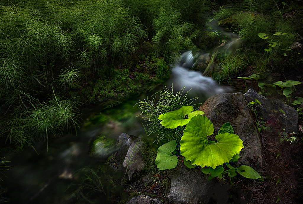
I checked the fern in my original and it is not blurred but yes it looks blurred in this copy. I'm not sure what happened there. I too like the wider version and did not want to get rid of the stone and I agree with your analysis of the most important parts of the scene. |
Aug 28th |
| 96 |
Aug 22 |
Reply |
I checked the fern in my original and it is not blurred but yes it looks blurred in this copy. I'm not sure what happened there. I too like the wider version and did not want to get rid of the stone and I agree with your analysis of the most important parts of the scene. |
Aug 28th |
| 96 |
Aug 22 |
Comment |
Hi Dan
I too love this image. You always get such great foregrounds with the technique you used hear. I wonder if you could answer a question for me. I think you are using F22 to ensure everything is in focus from the foreground to the background. Is there an advantage to this over focus stacking other than the obvious, ie you don't have to blend later, and do you ever find you get diffraction.
As for improvements on this one I would say the same as others in that the vignette is a little too dark
Thank you for sharing another great image! |
Aug 28th |
| 96 |
Aug 22 |
Comment |
Hi Bob
This image creates a lot of tension for me. I am really wanting to go around that bush and see the Pagoda from the front. Is this what you intended? If so its working on me. I like the color of the Pagoda but not the coloring in the bushes. I would remove he red there since I find it distracting. The black and white version definitely brings out the texture and removes the focus on the bushes which I like. I do find that I am having difficulty with knowing what the subject is. I believe the subject is the Pagoda but with this framing it is not a strong enough subject. Do you have any other images from different angles? |
Aug 21st |
| 96 |
Aug 22 |
Reply |
I like this much better with the foreground. I would even include more the next time. You can always crop it out if it doesn't look the way you like. |
Aug 21st |
| 96 |
Aug 22 |
Comment |
Here is my edit with a little dodge and burning and more foreground similar to what I did with the last one. It is a little over done but I think you'll understand what I am trying to show you. |
Aug 21st |
 |
| 96 |
Aug 22 |
Comment |
Hi Gloria
I agree with what the others have said. However I did not crop the right side off. Instead I used the clone stamp to try and clone in the bright area with the muted color below it. It is only a rough version so not done perfectly and is just to give you the idea. I have discovered that the beautiful skies always need a base or foreground to "ground" them. I added some contrast using Lightroom settings attached then I dodged and burned the sky to try and create more depth in the clouds.
I've got to tell you I am really envious of the gorgeous skies you have been capturing! They are just beautiful. I would definitely add this to my sky collection if I were you. |
Aug 21st |
 |
| 96 |
Aug 22 |
Comment |
Hi Haru
This is a really nice small zen garden!. I agree with all the suggestions above except I don't like the square crop. I like the wider version which to me provide more balance in the image. I really like Roberts edits and the only other suggestion I would make would be to remove some of the blemishes on the leaves in the foreground.
|
Aug 21st |
 |
| 96 |
Aug 22 |
Comment |
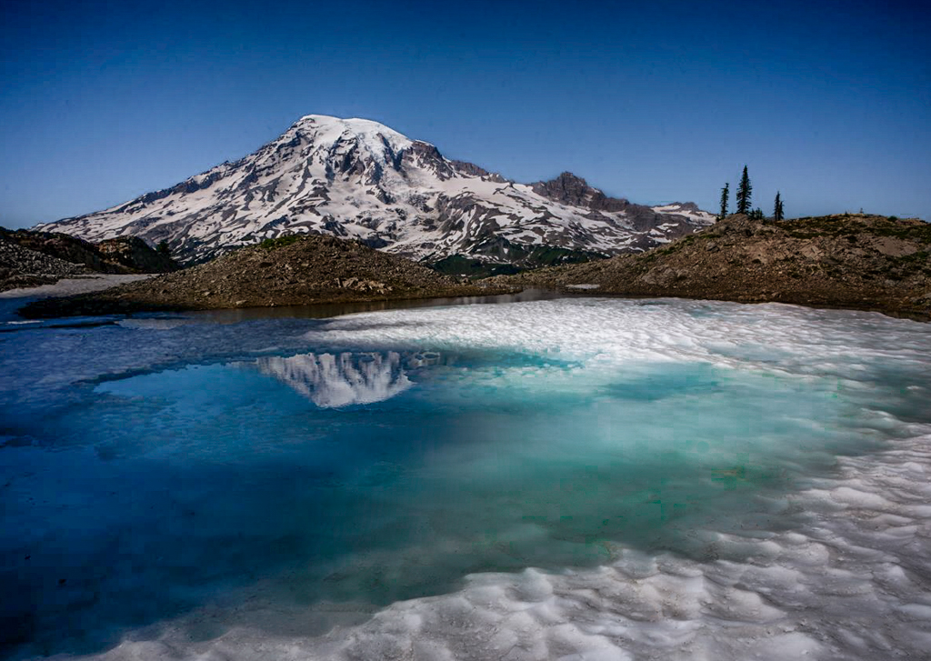
Hi Robert
This is a really nice image and a wonderful find. I totally understand why you would want the softer light of sunrise or sunset.
I think the edit is a little too contrasty as Dan had mentioned.
I agree with Haru regarding the yellowing of the snow. I think I understand why you did it, to provide the opposite color to blue on the color wheel but it does not work in this case. If you wanted to add some yellow to have the blue/yellow color palette I would add the yellow to the earth in the scene not the snow.
The trees don't bother me at all although I do know some sticklers in my camera club that would not like it. Honestly sometimes in nature they don't grow perfectly straight either.
To remove that flat feel to the lighting I think your only option would be to dodge and burn the image to enhance the shadows and darken the over bright areas.
I like the lighter area in the snow around the water as a leading line and would enhance it by darkening the edges of the image and the hills before the mountain but not so much that it makes the snow look dirty. |
Aug 21st |
 |
6 comments - 5 replies for Group 96
|
6 comments - 5 replies Total
|


