|
| Group |
Round |
C/R |
Comment |
Date |
Image |
| 96 |
Jun 22 |
Reply |
Thankyou Gloria, I agree with you 100%. I really do love the wide scene but it does not always work so I am trying to train myself to be able to do both wide and smaller more detailed shots. It's sometimes hard to expand your style. |
Jun 23rd |
| 96 |
Jun 22 |
Reply |
Thankyou Dan. Every time I go the reflection is not that great. I have seen images with wonderful reflections of this area and they do look fantastic. I just have not been lucky enough yet. Maybe next time. |
Jun 23rd |
| 96 |
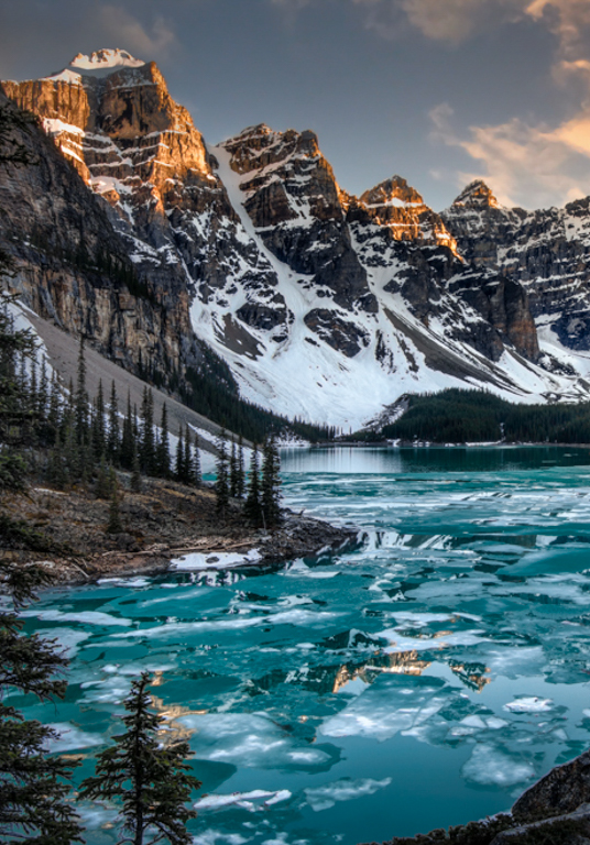
Jun 22 |
Reply |
Hi Haru
I think I will go even further with the crop. The story really is the Mountains and the reflection. Similar to this. Although I like the idea of just the reflection as a second image too.
Thank you for your ideas, they got me thinking. |
Jun 23rd |
 |
| 96 |
Jun 22 |
Comment |
Hi Gloria
Sorry to be so late to comment. It seems everyone has touched on what I was thinking. This image has wonderful colors and I really like the monument as the focal point. The suggestions made about too much happening in the water and smoothing the water are the two main points that struck me about this image. I really hope you get another wonderful sunset like this one on your next trip. |
Jun 23rd |
| 96 |
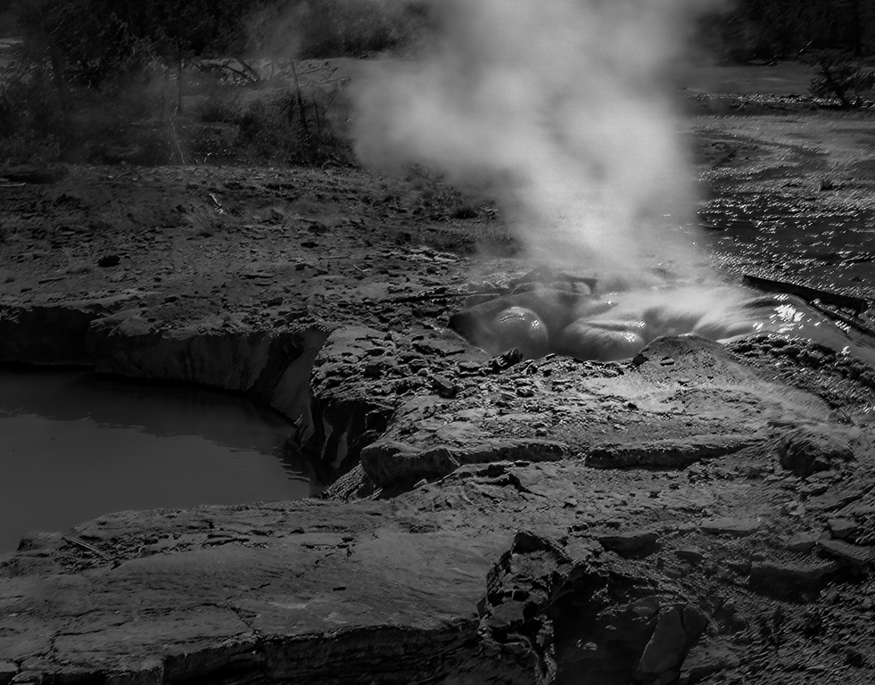
Jun 22 |
Comment |
Hi Bob
I like the leading lines provided by the rock on the bottom left leading to the rocks and steam. I too tried Topaz sharpen and I am always amazed at what it can do. To me the story is the steam coming off the rocks. I would darken most of the image a little then lighten the steam while trying to add some detail there as well for interest. I would also try to add a little more detail in the wet rocks themselves. I like Roberts idea of black and white and Haru's idea of lightening the leading lines (but not as drastically). As for the crop I would only take a little off the bottom. Here is my humble attempt. |
Jun 23rd |
 |
| 96 |
Jun 22 |
Reply |
Hi Don and welcome. Don't ever hesitate to come by and give me feedback. I love all kinds of feedback. When it comes to sky replacement, I don't do it often and I find that most times I don't like it because it was not the way I saw it. I tried to pick a sky with the sun illuminating the clouds from the right angle and with similar color to other clouds in the sky. There were some clouds of similar color behind the tree on the right but I know you can't see that from this image. I think you might be right that they are a bit too yellow so I'll try to adjust that too. I think that Haru hit the nail on the head by pointing out the sky color was not being reflected in the foreground and if this was corrected, it might look like it belonged. I have still have not decided whether to keep the replacement. Thank you for the feedback and please visit often. |
Jun 7th |
| 96 |
Jun 22 |
Reply |
I see what you mean about the reflection of the yellow sky in the foreground and I will fix that. It is really tricky replacing skies and I don't do it very often.
I also understand why the tree branches on the right bother you. I don't find them attractive and they do not add to the story. I think a better solution would have been to move down and forward of them to eliminate them.
Thank you for your suggestions, they are very helpful. |
Jun 7th |
| 96 |
Jun 22 |
Reply |
Thank you Rober, I love your suggestion to make an image out of the reflection alone. I will probably do that and have two images from the one. |
Jun 7th |
| 96 |
Jun 22 |
Comment |
Hi Dan
I'm with Robert on this one. The title made me laugh and I wonder where it came from. This is a great image. I have only been to Oregon once and I loved it. I really want to go back. The sky and reflection are wonderful.
This is another great image of the coastline with wonderful sky and reflections.
I do find the sky a bit too dark (only a little) and I find myself wanting to be able to see more detail in the rocks. Those are the only 2 minor suggestions I would have for you.
|
Jun 7th |
| 96 |
Jun 22 |
Comment |
Hi Robert
I think this is my favorite of all of them so far. You see a lot more of the red lava behind the steam. The rocks and water in the foreground give it context and ground the image. I think the flow of the water is just right. I can't think of anything I would change. |
Jun 7th |
| 96 |
Jun 22 |
Comment |
Hi Haru
This is a lovely image. I really like your editing on this one. It is soft and calming to me. I do not find the clouds to create a feeling of uneasiness but I do agree with you that they are a bit dark and should be lighter than the reflection. Lightening the shadows would be my personal preference but that is an artistic choice.
As for the composition I like it as is. Cropping to the right side eliminates the leading line of the island going left to right. The way it is now my eye is drawn from the left side of the island to the right then up to the clouds and back around. It keeps the eye exploring the photo.
I do agree with Robert that the reflections may be improved with a lift in the shadows to allow for more detail. I would try it but if you like it better as is, it still looks wonderful.
This image is a winner. I love it. |
Jun 7th |
5 comments - 6 replies for Group 96
|
5 comments - 6 replies Total
|


