|
| Group |
Round |
C/R |
Comment |
Date |
Image |
| 96 |
Feb 22 |
Reply |
Thanks Gloria
I will see what I can do with those branches to make them less dark and more frosty. |
Feb 27th |
| 96 |
Feb 22 |
Reply |
Hi Gloria
Robert is right that you should return to take multiple images. I have done this and you never get the same mood or exact perspective. You learn what you like. I also think it is good to go to those places that everyone takes a picture of(this is sometimes frowned upon as not being creative enough). You can learn how the masters like Ansel Adams saw the scene and composed their image. I also like to make these spots "my own" by creating my own image that is different than the "masters version". I think it is all a part of learning and experimenting then when you come across a great spot that is "unknown" you will be able to create your own masterpiece. I don't know if your open to learning photoshop but it is a great tool. Some of what is suggested like blending a shorter exposure with a longer one is not easy to do in Lightroom and a graduated ND filter will not allow you to blend two exposures (one long for the water and a shorter one for the sky). |
Feb 26th |
| 96 |
Feb 22 |
Reply |
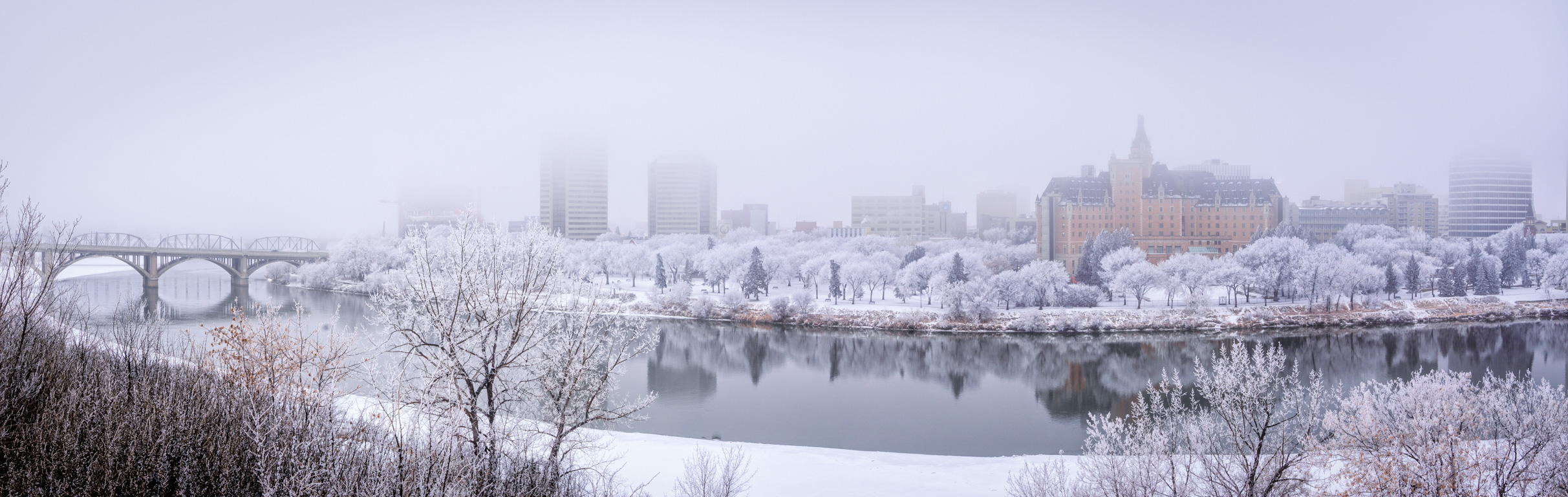
Hi Don
Yes it was early in the Winter season. I went back to look at the capture date and it was 30 Nov 2018. A while back I decided I wanted an image from this point of view in Summer, Winter and Fall. I have Fall and Winter ones I like but not yet a summer one unless you count the fireworks image from last round. I will have to try for a good summer version this year again. |
Feb 26th |
| 96 |
Feb 22 |
Reply |
I would go a bit further and tried my self. The low resolution files we get make it difficult to do much work without it looking poorly. I would try to make the spots almost disappear. |
Feb 26th |
 |
| 96 |
Feb 22 |
Reply |
Yes! I see what you mean and I like it very much.
Thank you |
Feb 14th |
| 96 |
Feb 22 |
Comment |
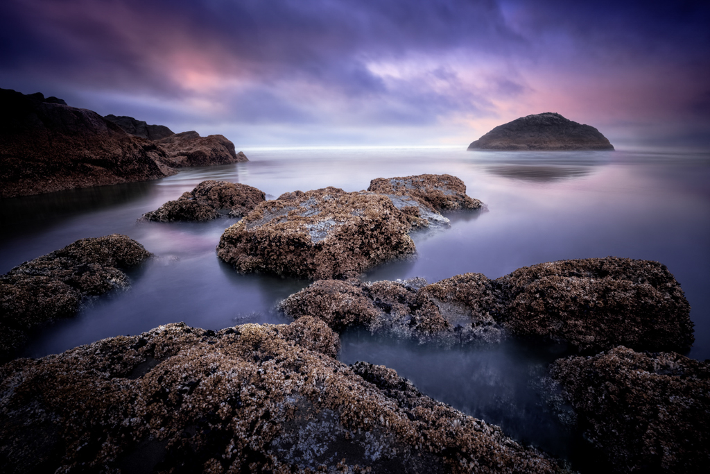
Hi Dan
My thoughts were almost exactly the same as Robert's. I like the leading line the rocks provide to pull you into the image. The softness of the water and clouds provide a dreamy effect. I like the softness of the island because it creates mood as well as depth in the image. I tried flipping it horizontal as Bob suggested to find that Robert was right. Because we tend to read left to right the rocks on the right stop your eye from leaving the image. Without them your eye tends to leave the image. I have attached the flipped version which I do not prefer. I too love the solitude of going out on my own. I create much better images with more thought and creativity when I am alone. It is almost a meditative experience where I can connect with nature. Thanks for submitting another beautiful image. I enjoy your work very much. |
Feb 14th |
 |
| 96 |
Feb 22 |
Reply |
Thanks Robert
I find my style changes over time. I still tend to edit with a higher contrast but I am beginning to see the beauty in more muted and subtle tones. I think your and Dan's editing style is more subtle and muted than mine and it is rubbing off a little in a good way! I agree that the right hand side is darker and I have adjusted a little. Let me know if you think this is the right amount. I also like your idea of adjusting towards a blue side. Let me know if you think I have hit the right amount of that too. Thank you for your suggestions, they always help me to improve my images. |
Feb 14th |
 |
| 96 |
Feb 22 |
Reply |
Thank you Bob. You are probably right. The foreground would not have been as sharp at a lower f stop unless I focus stacked it. As pretty as it is I have some cabin fever this year. It has just been too cold with temperatures dipping down to -27 C (-16 F). Sunrise also tends to be after I get to work at 9 am and Sunset around 5 pm when I get off work so seeing the Sun is not so easy some days either. I think when I retire I will want to move and just come back to visit occasionally. |
Feb 14th |
| 96 |
Feb 22 |
Reply |
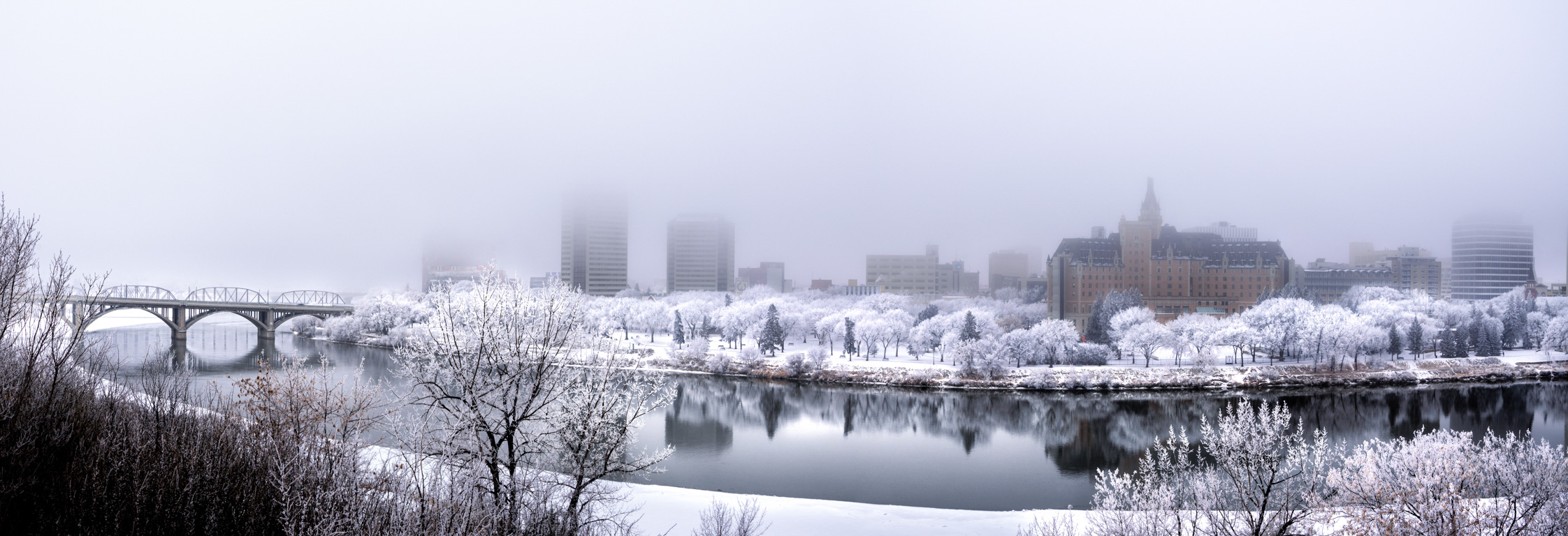
Thanks Haru
This re-edit is much more muted than my original edit. I tried to make it more natural. Judging by your comments I think I was successful. I have attached my original edit for comparison. |
Feb 14th |
 |
| 96 |
Feb 22 |
Comment |
Hi Bob
I like this version much better than the last. It is blended more smoothly and the lighting appears correct. When you tried this a while back I suggested an alien on top of the right hand rock. I like the wolf idea better. If you were to tweak the rock to look like a wolf and then put a wolf on top of the rock, howling at the moon it would give it more of a theme. |
Feb 8th |
| 96 |
Feb 22 |
Comment |
Hi Gloria
Yes this is a beautiful image and definitely worthy of hanging on your wall as Bob has said. My thoughts were the same as Dan's suggestions. I like how you smoothed out the water and the light on the center rock is wonderful. This is a great image. |
Feb 8th |
| 96 |
Feb 22 |
Comment |
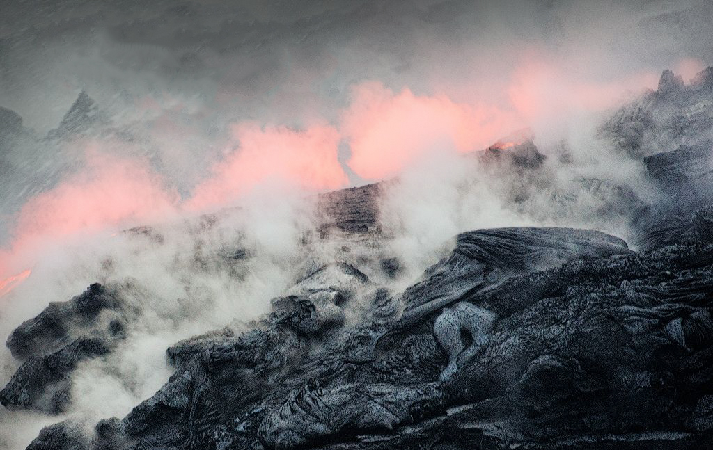
Wow Robert
That sounds like it was an awesome experience. I couldn't imagine getting anything without blur at that shutter speed with that lens. Good job! The rock formation looks nice and sharp to me with a lot of interesting texture and detail. I'm going to go back and look for the images Bob was talking about. I didn't see them the first time. When it comes to crop, I struggle to pick the right one all the time. Maybe a little off the bottom but not much. I think your choice to keep the image lighter rather darker is correct. The only suggestion I would have would be to remove some of the white spots above the lava glow. I find them somewhat distracting.
Interesting image Robert, my eye wanders through to take in all the detail in the rock formations. |
Feb 8th |
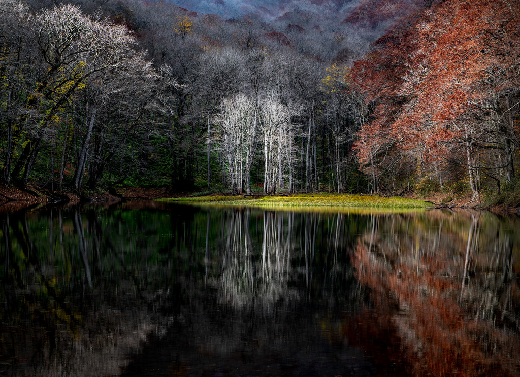
| 96 |
Feb 22 |
Comment |
Hi Haru
Another gorgeous image! I really like the colors and the symmetry. The image is very well balanced and all leading lines draw the viewer to the center trees. The image portrays a calm feeling of wonder and a feeling of being grounded with nature. There is not much to improve on here in my opinion, just minor adjustments to bring a stronger focus on the center trees by
- dodging the center trees
- Burning the highlights in the other trees so they don't draw your eye.
- Burning the green grass so it does not draw the eye.
- Remove that little patch of sky using the clone stamp.
- Healing brush to clean up in the debris in the water to remove distraction from the main subject.
I really enjoy your images Haru. You really have an ability to create images that have feeling. I don't find the black and white image portrays the same emotion to me so I would definitely go with the color version. |
Feb 8th |
 |
5 comments - 8 replies for Group 96
|
5 comments - 8 replies Total
|


