|
| Group |
Round |
C/R |
Comment |
Date |
Image |
| 96 |
Jan 22 |
Reply |
Hi Emily
I wondered if the shutter speed was to prevent movement. I would bet you could still get a sharp image with a shutter speed lower. Have you experimented with how low you can go without getting a blurry image? |
Jan 22nd |
| 96 |
Jan 22 |
Reply |
Hi Robert
I'm glad your back from your time away from the group. I hope you had a Merry Christmas and a great new year. As always I think you have hit the nail on the head. Sometimes I get so caught up in getting the perfect image that I eliminate what makes it feel real. I think thas is what happened in this case. I have added some of the smoke back in. I will go back to it in a while and see if this feels like the right amount. Thanks! |
Jan 22nd |
 |
| 96 |
Jan 22 |
Reply |
Thanks Don
I too went to the U of S and graduated as a pharmacist. I grew up in Brandon Manitoba so it looks like we both know the prairies quite well. Please visit any time I'd love to hear your thoughts on my images. |
Jan 22nd |
| 96 |
Jan 22 |
Comment |
Hi Robert
When I saw this image I thought WOW, then I remembered a time when I saw a rainbow and took the image only to be disappointed in the result. I know where you are coming from, the image never does the experience justice. I do love this image Robert, it gives me a feeling of hope and an appreciation of the beauty in the world around us. I agree that the top left is too bright and draws away from the mountain. I too thought cropping the left might help. As for improving the colors of the rainbow, I have never found a way to make this happen in my own images or in this one either. I do think you are judging this one too hard, it seems to speak to all of us in some way. |
Jan 15th |
 |
| 96 |
Jan 22 |
Comment |
Hi Haru
I really love the fall colors, I think it adds to the image. I would remove the person. I think the placement of the person is too centralized and they are too bright in the scene. Maybe if they were wearing darker clothing and not in the center of the image..... but I tend towards no human element. It's always good to experiment. when I was looking at the image there is a distinct line near the top of the image where the colors get brighter and crisper. It is almost as if you have added a haze below the line. I kind of like the coloring and look of the non hazy portion and wonder if the image would look better without the haze. I tried to remove it a little and I like it better but it is all a matter of taste. I really do love this image though, wonderful job. I agree with Dan you should print it and put it on a wall in your home. |
Jan 15th |
 |
| 96 |
Jan 22 |
Comment |
Hi Emily
This image is well exposed and the highlights don't appear blown out. I image may have been helped with a little different framing when you took the picture. I wonder how it would have looked with the camera at a lower angle and moved to the left to use the prints on the left side of the image as a leading line. I can not say if this would have worked having not been there at the time. With the foreground as is I find the prints in the snow too busy. Also could you give me some in site as to your choice of F stop. The aperture is almost wide open making some of the details soft rather than sharp and in focus. With a shutter speed of 1/4000 you may have been able to move the f stop to f8 or f11 and still have a fast enough shutter speed to shoot handheld ( I am assuming this is handheld). I also think a better time of day (sunrise or sunset) would have improved the sky and eliminated the harsh shadows although I have no idea if that would have been possible for you.
I have never seen an ice volcano so I really do appreciate being able to see them. Great job capturing something unique. |
Jan 15th |
| 96 |
Jan 22 |
Reply |
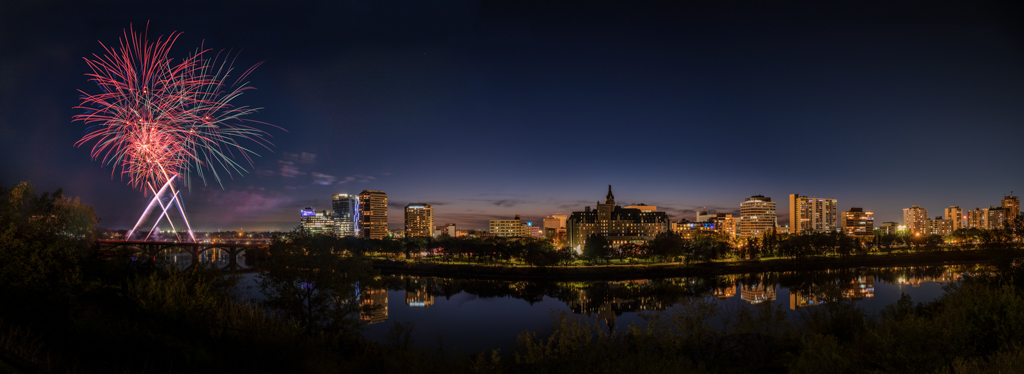
Thanks for trying so hard Bob. Sorry to hear about your computer problems. They can be so frustrating when they don't work, I've been there. I think I know where you were trying to go with it. I added some fireworks to the right side then the middle looked to bare so I added some there too... The problem then becomes the reflection. It is missing the fireworks.... It is difficult to add the reflection with the foreground plants. I could do it but it would be much more work and before I spend time on that I'd like your opinion if you think it is better with the extra fireworks. It may be too much or it may just seem that way to me because that did not happen when I was there. |
Jan 11th |
 |
| 96 |
Jan 22 |
Reply |
The right side looking so bare is part of what bothered me too. So I wondered about the crop. See my reply to Bob and let me know if any of the extra fire works adds to the image. |
Jan 11th |
| 96 |
Jan 22 |
Reply |
Thanks Dan. I was wondering about that crop too but I can't decide. Take a look and see if you think it is better. I value your opinion |
Jan 11th |
 |
| 96 |
Jan 22 |
Comment |
Hi Gloria
I see the rock in the water as the main subject of the image. I agree with Robert's comments. If this is a special place to you, you may want to return often to get a shot with a more interesting natural sky so you will have an image exactly as you experienced it. I often tend to like an image as I saw it, especially if it was a special location to me. Bob is right though, keeping some images of skies you have taken allow you to compensate for a bad sky day if you don't mind doing that. I will replace the sky in an image if it feels right to me. I think I would look to recompose with the rock by itself and not blending into the background as Robert suggested. In my example, I have not cropped in quite so much as Bob since I like the leading line of the rocks from the bottom left to your main subject and enjoy the soft water from your long exposure around the small rocks to balance the main subject. I added a sky your might recognize ;) |
Jan 11th |
 |
| 96 |
Jan 22 |
Comment |
Hi Dan
As I experience the image the subject matter is the birds and the sun. I love the color pallet with the soft pinks and blues. I thought it might benefit from darkening the sky and foreground to bring attention to the middle birds and sun. I also thought that a little more saturation of the pinks would draw the attention to the subjects as I saw them . I agree that cropping some of the forground brings the image into better balance but I would not crop the right hand side. I like that the fence leads from the bottom right corner to the left. When I view the image my eye is drawn from the bottom right to the left where the birds take over then the sun takes my eye and I then explore the trees then around back to the birds. I really do enjoy this image. It is a beautiful winter scene. |
Jan 11th |
 |
| 96 |
Jan 22 |
Comment |
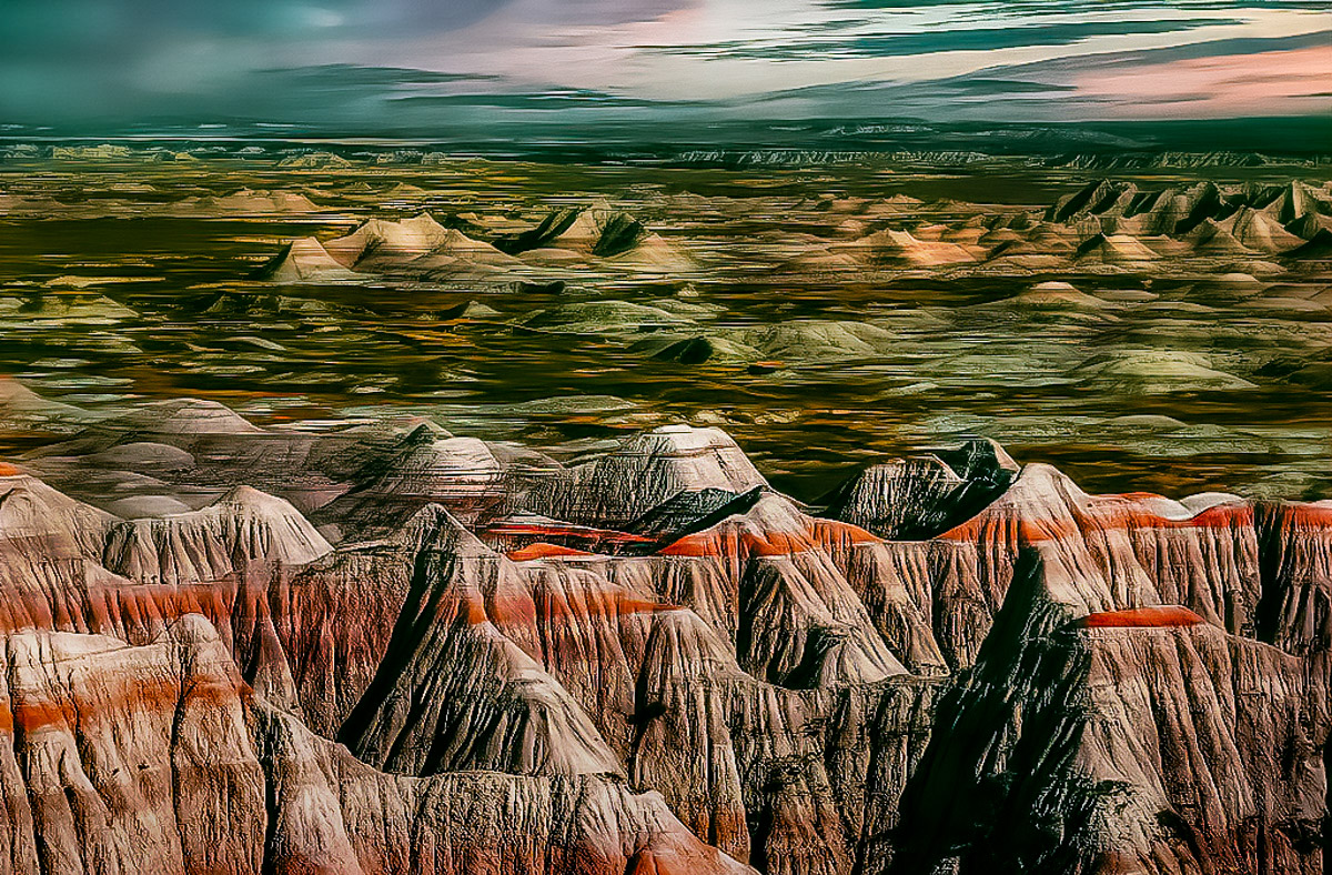
Hi Bob
I too thought of a moonscape and that it looked like a painting. It definitely is very interesting and the eye wanders through the image a lot (which is good). I bit of cropping off the bottom helps to pull the eye into the image. What I found troubling when looking at the image is that the bottom was way too bright in comparison to the light that would be coming from the sky. I would brighten the sky and darken the foreground to balance it. I also would use dodge and burn to try to make the peaks and valleys look more separated and 3 dimensional. Your purple version looks too purple to me and too sharpened. I like the original better. |
Jan 11th |
 |
6 comments - 6 replies for Group 96
|
6 comments - 6 replies Total
|


