|
| Group |
Round |
C/R |
Comment |
Date |
Image |
| 96 |
Dec 21 |
Reply |
Hi Bob
I do like this version better except for losing some of the warmth which is probably why it has lost some of the feeling for you. |
Dec 26th |
| 96 |
Dec 21 |
Reply |
Hi Emily
It is much closer. My crop is very similar to Gloria's. I darkened the gras by -0.72 in lightroom using a gradient. I also made some adjustments in lightroom. I decreased the highlights by -50 and adjusted the blacks by -44. to make the trees look mor saturated and the highlights of the windmills look less severe. These are just my tastes and yours may be different. |
Dec 23rd |
 |
| 96 |
Dec 21 |
Reply |
Thanks Gloria. I'm far from an expert. This is just my learning process. If it helps anyone else that is great. I'm looking forward to your photos and your feedback. I'm glad you have joined the group! |
Dec 23rd |
| 96 |
Dec 21 |
Reply |
Thanks Emily. I love editing so it doesn't seem like "hard work to me". Every rendition gives me more experience and I always learn something. |
Dec 23rd |
| 96 |
Dec 21 |
Reply |
Hi Gloria. I'm glad you like it. I took the image into photoshop and cloned out the top of the tallest building on the left hand side. Then I duplicated the layer, inverted the image, pressed control T to activate transform so I could drag the inverted image down and line it up where I wanted it. I then masked out the area I did not want and merged the two layers. After it was merged I used the rectangular marquis tool to select just the reflection area and used the motion blur filter at -90 degrees and adjusted the blur to 20 pixels or there abouts to blur the refection. Do you use photoshop at all? If so and you want to look at my layers I can put it in dropbox for you to download. Just let me know and I will attach a link. |
Dec 23rd |
| 96 |
Dec 21 |
Comment |
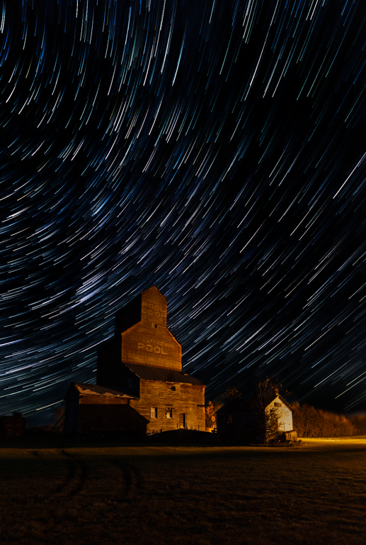
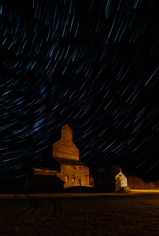
If anyone is interested here is a link to the photopills guide.
https://www.photopills.com/articles/star-trails-photography-guide |
Dec 14th |
| 96 |
Dec 21 |
Reply |
OK One last kick at the cat (sorry cat lovers). I think this is the best balance I can do with this image. On to my next try. |
Dec 14th |
 |
| 96 |
Dec 21 |
Reply |
Thanks for the kind words Dan |
Dec 14th |
| 96 |
Dec 21 |
Reply |
Thanks Haru
Yes I think the balance is the key. It appears that I have gone too far the other way which I can easily adjust. All part of the learning curve.
|
Dec 14th |
| 96 |
Dec 21 |
Comment |
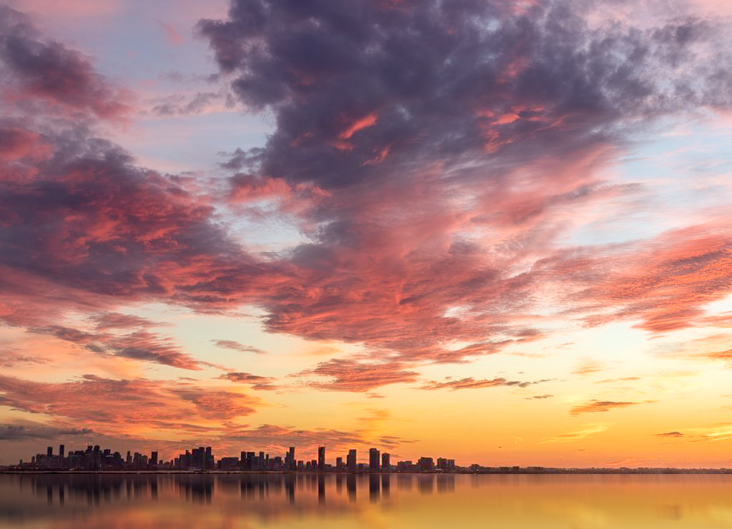
Hi Gloria
This sky is absolutely gorgeous! I am very envious of the view from your new home. Congratulations! I would not go too contrasty in the sky. I think the clouds should look soft and natural. The clouds don't require much editing IMHO. If anything maybe a little more contrast using Lightroom by decreasing highlights to -100 increasing shadows +100 increasing whites +48 and decreasing blacks -48. This adds contrast making the pinks just a bit more luminous.
I think the image would benefit from a bit more foreground to anchor the image even though the sky is really the subject. I did not like the idea of cropping off the left side to eliminate the buildings in the bottom right corner. The clouds on the right lead the eye into the center. Cloning the buildings out wasn't easy so I tried another approach. I created a reflection to get rid of the bottom right hand corner buildings and add a little more foreground. I know it is not as you saw it in real life and I don't know how much you agree with alterations like this but it does give you an idea of what it would look like with a bit more foreground and no distracting buildings on the right side.
This is the kind of sky I dream of seeing when I am out taking images. Great shot! |
Dec 12th |
 |
| 96 |
Dec 21 |
Comment |
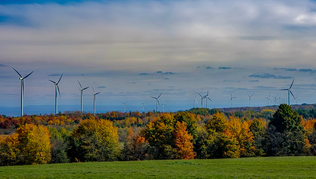
Hi Emily
You did a great job with your Samsung.
I love the fall colors in the image and the leading lines created by the wind turbines that draw the eye into the center of the image. I think the image would benefit from cropping out some of the top sky which appears too saturated to me and adjusting the foreground so that the green is not so bright. |
Dec 12th |
| 96 |
Dec 21 |
Reply |
I re-edited the image using all the suggestions. I think it is better. Next time I will expose for fewer stars I think. The re edit is attached to my reply to Haru. |
Dec 12th |
| 96 |
Dec 21 |
Reply |
I re-edited the image using a color palette closer to yours Bob. Let me know what you think. I attached it to my reply to Haru |
Dec 12th |
| 96 |
Dec 21 |
Reply |
Hi Haru
I exposed as many shots as I could for the time that I was there. As you take 30 sec images the earth turns and creates the trail. The more shots you get the longer the star trail. I blended the stars from each image to create the trail. I adjusted the opacity to create a fading tail effect so they look more like shooting stars. If I were to reduce the number of exposures it would just shorten the star trail not eliminate the number of trails. It's not a silly question and it is something I am learning as well. I would need to decrease the exposure by decreasing ISO or shutter speed to decrease the number of stars in the image. I think the softening of the foreground is a problem of blending all the light from all the elevator images. I have done a re-edit. I did not blend the light of the grain elevator, I changed the white balance of all the images before blending to decrease the yellow muddy look, I decreased the exposure of the sky by -2.23 in lightroom, increased the highlights, Whites and clarity to 100 to bring back only the brightest stars to decrease how busy it looks. This has taught me a that if I'm going to take an image of star trails I may not want to see soooo many that it makes the image busy and to adjust my exposure accordingly. Let me know what you think of this edit. |
Dec 12th |
 |
| 96 |
Dec 21 |
Reply |
Me too!! |
Dec 6th |
| 96 |
Dec 21 |
Reply |
Hi Bob
I like the color you have in the trails better too. I am going to take a look at fixing that. I'm also going to look up Blake Rudis. I think this is an area I would like to learn more about. I appreciate you sharing that because I am always looking for new ways to improve my images. |
Dec 6th |
| 96 |
Dec 21 |
Reply |
Thanks Dan
The color bothers me as well. It is from a street lamp that makes everything yellow. I work on that some more as well as try to decrease the amount of trails as well and clone out the arrant lines you mention.
I thought I had focus on the grain elevator for the first shot. Maybe I chose the wrong image to be in the front. I will have to check that out.
It took me about an hour to get all the images. My Sony a7RIII has a built in intervalometer. I set it up to keep taking picture every 30 seconds until I decided I wanted to head home and stopped it. Funny thing was it was around Halloween and I was out there by myself at night. I got kinda creeped out by the wind blowing through the trees LOL so I packed it up. Usually I relish being out by myself but that night I had to head home.
|
Dec 6th |
| 96 |
Dec 21 |
Comment |
Hi Haru
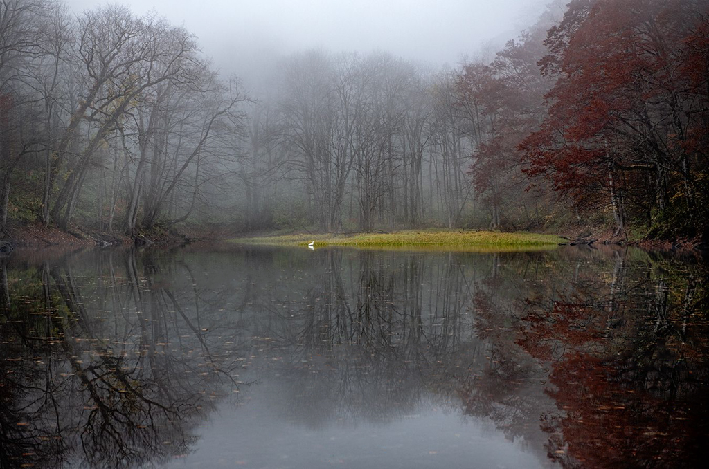
I too like the the color version better. It portrays more mood. I always think of Black and White as needing more contrast (brighter whites and darker blacks). This is a calming image and I love the muted colors. The green doesn't look too florescent on my screen. I too think the image would benefit from cleaning up a lot of the distracting leaves in the water because they make the image look busy which is in contrast to the serene mood the fog and muted colors create. One last thing that I think would benefit the image is to move the bird to the left. I moved it a little and it may need to go a little farther. Everything has nice symmetry but for the bird I think it needs to be off center. Just my opinion though. |
Dec 6th |
 |
| 96 |
Dec 21 |
Comment |
Beautiful image Dan. I love the Sun and the fog and of course the texture in the foreground. If I had to find something to improve I would try removing the surfers to see what it looked like. I can't decide if I like the surfers in the image or not. I am not passionate about surfing so they probably add to the image for you but I'm not sure I would leave them in. It might also benefit from a little more shadow lifting in the rocks on the left. It really is a beautiful image and these are minor things that could be considered nit picking. I always enjoy your images Dan. |
Dec 6th |
| 96 |
Dec 21 |
Comment |
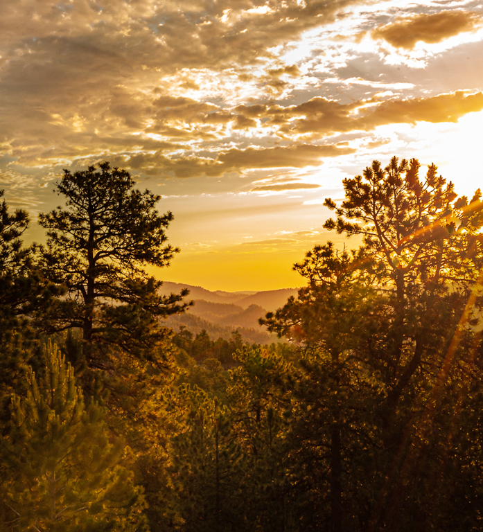
Hi Bob
It is really hard for anyone to know exactly how it felt to you. I will do by best to guess. I think if I was standing there I would looking to the beautiful golden sun on the on the mountains, so I take this to be the subject. I might be totally wrong but that is what I see. I think the image would benefit from some cropping and darkening of the foreground, leaving a bit of a lighter area as a leading line from the bottom right into the center to the Mountains. This makes the mountains the subject and the viewers eye is drawn there. I also find the sun is too blown out. While I don't like to actually see a line around the sun because that is unnatural I still think it is a bit too hot. Because it's a jpg I was unable to adjust it at all without making it look grey. |
Dec 6th |
 |
6 comments - 14 replies for Group 96
|
6 comments - 14 replies Total
|


