|
| Group |
Round |
C/R |
Comment |
Date |
Image |
| 96 |
Nov 21 |
Comment |
Hi Emily
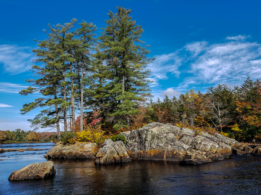
My thoughts were very similar to Roberts. I rarely take an image in daylight. I almost always take a sunrise or sunset image. The softer light adds much better color and shadows are not as harsh. I like your composition and the clouds in the sky. I wonder if the trees were really at that angle or if it is distortion from the wide angle lens in the phone. In my version I darked the top of the sky and the rocks which looked a little over exposed to me and I straightened the trees a bit. |
Nov 12th |
 |
| 96 |
Nov 21 |
Reply |
Hi Haru
Yes I did increase the blue to reduce the orange. I agree that this made the Grain Elevator too blue so I will go back and remove the effect from the Grain Elevator. I will also play with the number of stars to see if there is a better balance.
Thanks for your ideas. I think they will help to improve the image. |
Nov 12th |
| 96 |
Nov 21 |
Comment |
Hi Bob
This is a great find. I really love the glass reflecting in the pond. I do like that you toned this one down. As has already been mentioned, the highlights seem a little too bright. I would love to see more detail in the lighted areas of the glass. I made an attempt to add some space at the bottom and remove some of the red as suggested by Robert. It looks like it would work but of course my edit is just quick to see if it is possible. |
Nov 6th |
 |
| 96 |
Nov 21 |
Comment |
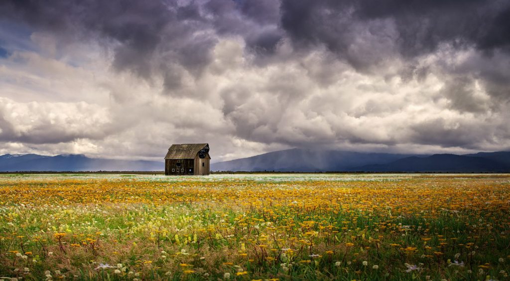
Hi Dan
I think you did the right thing when you composed for the barn. Where you placed it allow it to stand out from the background. It doesn't look like much editing is required here. I may have cropped a little differently and darkened the very front of the foreground a little. The only other suggestion would be to bring out a little more texture in the barn itself. |
Nov 6th |
 |
| 96 |
Nov 21 |
Comment |
Hi Robert
Another really interesting image from the canyon. This is a very interesting image. I love the layers and the shapes. I am not sure there is much to improve on here. My personal taste has more contrast that yours. I have seen this in the images you submit. You have a softer more natural editing style that I would like to emulate a little in my own work. My edit of this would have a little more contrast but that is just my style and would be the only thing I would have done differently. |
Nov 6th |
 |
| 96 |
Nov 21 |
Comment |
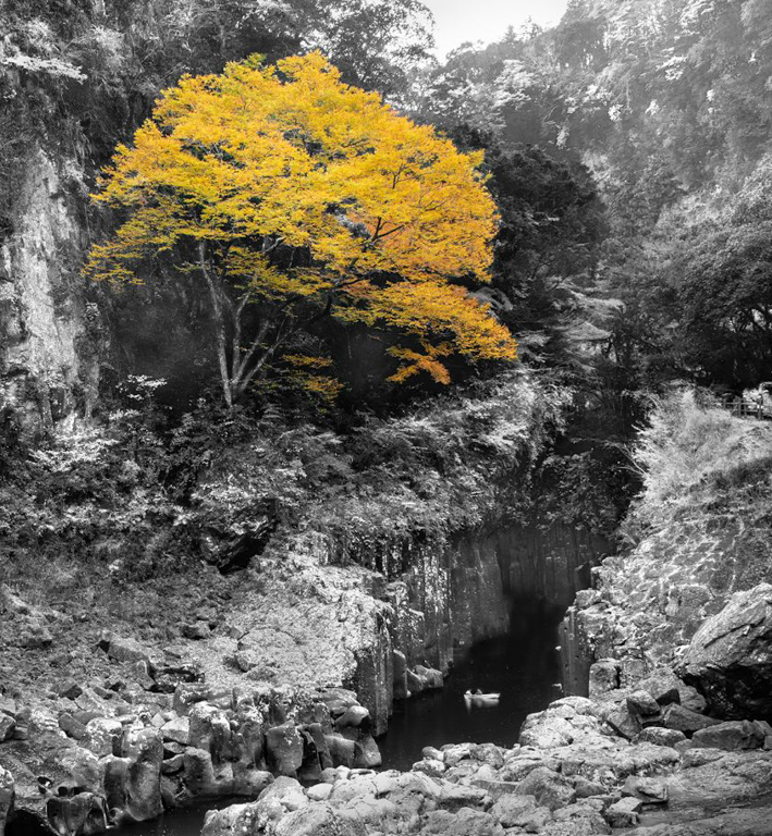
Hi Haru
This looks like a wonderful spot. You seem to know just where to go for interesting landscapes. The yellow tree is stunning! I too did not see the boat until I read your description. I like your composition but wonder if removing all color was a good choice if you wanted attention on the boat as well for scale. With the boat having no color it seems to get missed. Maybe a more muted color palette then enhancing the areas you want to bring attention to with stronger color or make them brighter than the rest of the image. Maybe cropping in tighter might help to bring more attention to it but I think it needs more than that. |
Nov 6th |
 |
| 96 |
Nov 21 |
Reply |
Thanks Robert
I actually started again from scratch after watching a Kelbyone tutorial. I used their techniques trying not to over do anything and it worked out more natural looking.
Anytime you think I might have a tidbit that might help don't hesitate to ask, however, I am far from any kind of expert so my take my advice at your own risk! I am more of an experimentalist to see what works. |
Nov 6th |
| 96 |
Nov 21 |
Reply |
Thanks Dan
I wish I knew what they meant by "blobby". Since we were not allowed to question the judges and just hear comments I did not get a chance to ask. It was the last photo that was judged and they did not take much time to explain. My interpretation was that the stars looked to much like bright white dots (blobs) with no definition and that made it look unreal. I will try NIK Define next time and see if that gives a better result. Thanks for pointing out the green. I didn't notice it but now that all I can see so I will go back and fix it. Funny how that works. Thank you for your feedback it really helps. |
Nov 6th |
| 96 |
Nov 21 |
Comment |
Hi Robert
I thought I nailed the focus but it was a while ago now so who knows LOL. Topaz Denoise may have removed some of the fainter stars but I really think it was too much clarity that brought out such bright stars that look glaring to the eye. My second edit is actually origonal 2 which I think has the wrong colors. After doing a little more research (Yes I found lonely speck) with Kelby one I tried yet another edit which I think is the best of them so far. I added a glow around some of the bright stars to make them look more natural and I changed the color and then sharpened the image which really helped. Let me know your thoughts and thanks for the feedback. |
Nov 6th |
 |
6 comments - 3 replies for Group 96
|
6 comments - 3 replies Total
|


