|
| Group |
Round |
C/R |
Comment |
Date |
Image |
| 96 |
Jun 21 |
Reply |
Thanks Bob. I have tried the calibration tool but as of yet have not gotten the hang of it. I will keep trying and see if I can use it effectively after a little research re how it should be used. If anyone has any comments on exactly how to calibrate an image I would appreciate the input. |
Jun 21st |
| 96 |
Jun 21 |
Reply |
Great job compositing Dan. I always love your images, this one included. Thanks for the update letting us know how it was done. My curiosity has been quenched. I really did want to know the how it was done. |
Jun 21st |
| 96 |
Jun 21 |
Reply |
Hi Robert
Yes I used Luminar 4 but I don't remember the settings. I kind of just play around till I get something I like. I tried to recreate it but was unable to get it exactly. I have attached my efforts from today. Note that I placed the sun above the image itself and moved it around until I got some rays where I thought they should hit if they were actually from the sun. Looking at the two now I think I like this version better. |
Jun 13th |
 |
| 96 |
Jun 21 |
Reply |
Hi Robert
I see what you mean about the color palette. I have been reading a lot about color grading in images and you might be right. Too many colors complicate an image and often times simplifying the color palette improves the image. I will play around with that. it might be easier to decrease the magenta/pink instead. I'll see what works best. I also agree with the rim lighting and the tiny cloud. I will fix those as well. I really appreciate your suggestions, I think it will really help to improve this image. |
Jun 12th |
| 96 |
Jun 21 |
Reply |
Thanks Dan. I'm embarrassed to see that I did not level the horizon. That is something I usually do right away. Not sure why I missed it this time. Rest assured I will do that right away. I agree with you that as photographers we should try to find unique places and images but I also like to take images of iconic places and capture the uniqueness of the moment when I was there and try to make it my own as well.
I must confess, much time was put into removing people in this image. The original was certainly not people free. |
Jun 12th |
| 96 |
Jun 21 |
Comment |
Hi Bob. Welcome to our group!
When I view this image the sand and the foreground in the image are the focal point to my eye. Would a longer exposure smooth out the sky and background water which seems to draw my eye due to having such high frequency detail? Also cropping more of the sky out may bring the eye to the foreground subject. |
Jun 12th |
| 96 |
Jun 21 |
Comment |
I'm intrigued! Can't wait to find out your process because I love this image. The colors and reflections are wonderful.
The crop didn't seem quite right to me either but for me it was the trees on the right and left needed to be removed to make the middle tree fall on one of the rule of third lines. I have attached my cropping suggestion. With this crop the tree trunks on the outer edges lean in drawing your eye into the image. |
Jun 12th |
 |
| 96 |
Jun 21 |
Comment |
Hi Robert
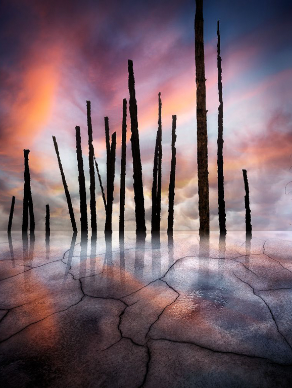
You have such a great eye to see this composition. I love the color palette and the tiny tree in the patch of light coming through. I too like the vertical composition better. I would crop a bit but not so much as to lose the leading lines to the tree. I see what you are trying to do with the lens flare but to my eyes it makes it look a little too washed out. I tried to add some sun rays but I am not sure they were successful. I will let you decide. I would also enhance the highlights and shadows of the foreground rock a bit to add interest. I too would love to see your finished images. This is another great image. |
Jun 12th |
 |
| 96 |
Jun 21 |
Comment |
Hi Emily
As I look at this image I am drawn to the geometric patterns of the bridge structure. I like the design in the structure and the fact that the sky does not distract from this pattern. To my eyes the cars on the bridge don't add to the image.
My thoughts would be to enhance this aspect of the image by adding more contrast and removing the cars. I played around with it a little and found that converting to black and white and inverting the image really enhanced the pattern. I also thought a portrait crop would bring attention to the pattern of the main bridge structure. |
Jun 12th |
 |
| 96 |
Jun 21 |
Comment |
Hi Tim
I always take a look at the image before reading others comments and in this case I think Robert's comments are spot on. I think that darkening the background sunset would also give some depth to the image. |
Jun 12th |
5 comments - 5 replies for Group 96
|
5 comments - 5 replies Total
|


