|
| Group |
Round |
C/R |
Comment |
Date |
Image |
| 96 |
Apr 21 |
Reply |
Yes that makes a lot of sense. Thanks for the insight to your thought process. |
Apr 27th |
| 96 |
Apr 21 |
Reply |
Thanks Emily! |
Apr 27th |
| 96 |
Apr 21 |
Reply |
Thanks Dale. I did increase the brightness in the trees as you suggested and it looks better.
|
Apr 27th |
| 96 |
Apr 21 |
Comment |
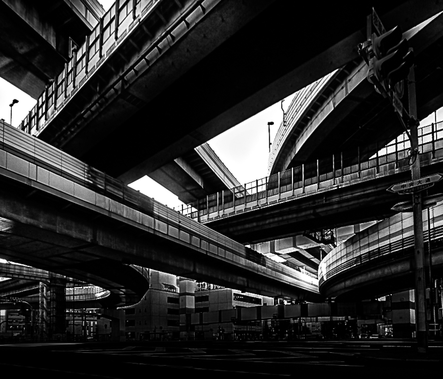
I like it better without the straightening. I think I might of went too dark but you get the idea. I wanted to remove the distracting street level element and focus just on the bridges. |
Apr 17th |
 |
| 96 |
Apr 21 |
Comment |
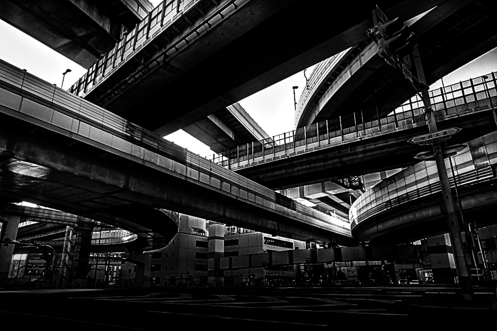
Hi Emily
I love the intersecting lines of the bridges. Really interesting image and I enjoy looking at all the elements of the image.
I find the blue and red color under the bridge draws my eye to the distracting street level background. For this reason I like the idea of black and white. I would darken the street level and highlight the bridges. Dan had a great idea about cloning out the street light. I too tried straightening the tilt due to the wide angle lens but liked it better without. |
Apr 17th |
 |
| 96 |
Apr 21 |
Comment |
This is a beautiful image Robert.
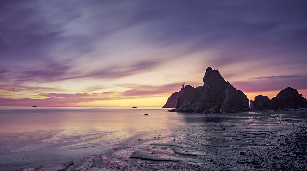
I love the colors and the foreground detail. Cropping is always such a personal preference. If you include the right half of the image the main stack is on the rule of thirds line however it may include some distracting elements in the bottom right hand corner. You as the artist will have to decide if it is too distracting. My main constructive criticism would be that by lightening the image you may have washed it out too much. I think the sky has become too grey. I have attached a version that shows more color in the sky and enhanced the yellow sunset. As well I show a crop that puts the main stack in the rule of thirds without it being panoramic. This is probably where I would go and then try to minimize the distracting elements especially in the bottom right corner.
This is an awesome image with beautiful colors.
|
Apr 17th |
 |
| 96 |
Apr 21 |
Comment |
Hi Dan
I really love this image. The sky has such beautiful color and detail and the foreground has very interesting shapes. I am curious as to why you used F22. Was it because it was so bright?
Beautiful image. |
Apr 17th |
| 96 |
Apr 21 |
Reply |
Thanks Dan. I agree with everything you have said. Appreciate your feedback and I will try cropping in a bit to see what it turns out like. |
Apr 17th |
| 96 |
Apr 21 |
Reply |
Yes I see your point. I also think this is very close to the crop that Ansel Adams used for his tunnel view and who could argue with that!
Thanks Robert. |
Apr 17th |
| 96 |
Apr 21 |
Reply |
Very cool idea! Thanks Gerard! |
Apr 17th |
| 96 |
Apr 21 |
Comment |
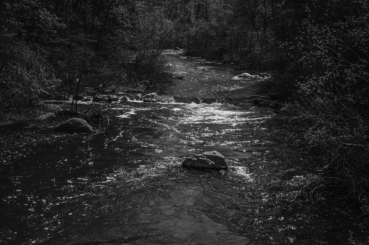
Hi Dale
I love the leading line of the water drawing you into the image.
It does seem to warm to me so I agree with Robert. Might I also suggest trying black and white and decreasing the highlights around the image leaving the river to be the brightest so your eye is not distracted by the bright leaves on the trees.
|
Apr 17th |
 |
| 96 |
Apr 21 |
Reply |
Thanks Bev. I like the Black and White better myself although there is no way I could possibly compare my work to Ansel's. His shoes are way to big to try and fill. |
Apr 6th |
5 comments - 7 replies for Group 96
|
5 comments - 7 replies Total
|


