|
| Group |
Round |
C/R |
Comment |
Date |
Image |
| 96 |
Mar 21 |
Reply |
Yes I do like what you have done with the foreground. I remember darkening the foreground because when I converted it to black and white it was too bright and was too distracting. You have shown me that I have definitely gone too far. I will correct this too. I am really thankful that everyone is so honest with their feedback. It helps a lot. Thanks Emily |
Mar 21st |
| 96 |
Mar 21 |
Reply |
Yes, yes Gerard I think you are absolutely right! It does balance the light and the contrast in line with the rest of the image. Thanks for showing me what you mean. I think I will adjust that too. |
Mar 21st |
| 96 |
Mar 21 |
Reply |
Hi Emily
It is the background sky scrapers that look a little tilted towards the outside left and right to me. |
Mar 21st |
| 96 |
Mar 21 |
Reply |
Thanks Dale. I just might include this in a competition. I was wondering about the crop. You think it is correct the way I submitted it? My original crop is in the reply to Dan. I didn't want to lose the detail in the upper sky. |
Mar 13th |
| 96 |
Mar 21 |
Reply |
Thanks Robert. Yes the trees were tilting but I don't think by as much as in the final image. I agree they don't look quite right now that you mention it. I will fix that a bit. I also agree that the mountain on the left is to bright so I will darken that as well. See the image submitted in my reply to Dan. Your thoughts on the crop would also be appreciated. Thanks so much for your help. I think it will help me make this image even better. |
Mar 13th |
| 96 |
Mar 21 |
Reply |
Thanks Dan. I agree the blacks could use some darkening on the left and I will adjust them. I struggled with the crop on this one. My original crop is attached. At first I did not want to loose the top of the sky and needed the bottom to balance that out so I left it in. In the end I thought there was too much negative space at the bottom right so I cropped it. Did I do the right thing with the crop in the final image I submitted? |
Mar 13th |
 |
| 96 |
Mar 21 |
Reply |
Thanks Paul, I don't know what to say.... I appreciate the kind words. |
Mar 13th |
| 96 |
Mar 21 |
Comment |
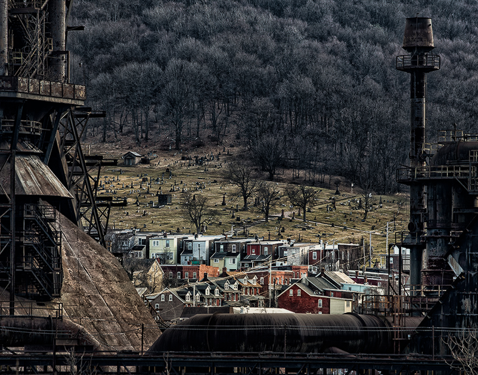
Hi Gerard. Your title really help to focus in on the point of this image. I can really see what you were intending to show the viewer. Your treatment of the image is very well done. My only suggestion and it is a minor, one would be to darken the foreground and background to bring out the color in the middle and enhance the "lived" part of the image for increased contrast to the "worked" and "died" part of the image. |
Mar 13th |
 |
| 96 |
Mar 21 |
Comment |
Hi Dale. I wondered about the human element as well so I tried it without just to see. I like the mood the people add to the image. It makes it more upbeat and less deserted/lonely looking. See attached and you decide which you like better. I think it depends on the story you want to portray as Dan has said.
I would try to enhance the blue in the sky a bit. It is not blown out but does look a little washed out. Other than that I love the color of the blooms and the lines the tree limbs provide. This is a really nice image |
Mar 13th |
| 96 |
Mar 21 |
Comment |
Hi Dan. This is yet another awesome image. I never tire of looking at your work. I love it all! The fog, the river creating an S curve, and the smooth snow that looks magical. There is a lot of wonderful detail in the trees, branches and the detail of the snow drifts. As for overcooking (something I tend to do sometimes) I looked really close and no I don't think it is overcooked.
It's a Wonderful Winter Wonderland |
Mar 12th |
| 96 |
Mar 21 |
Comment |
Emily I really like this image. I like the contrast of the shorter buildings in the front with the tall buildings in the distance. The color is very good and I like the way the coral building leads you into the image. It gives me the feeling of a fresh beautiful morning. The only minor detail I would fix ( and its something I missed in my own image this month) would be to correct the tilting of the buildings so that they look more upright.
Great Image! |
Mar 12th |
| 96 |
Mar 21 |
Comment |
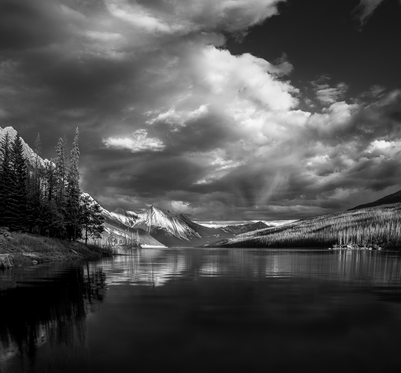
I too really love this image Robert! I love the s-line and the ripples. The both draw you right into the image. I do find it a bit dark but it may be because you darkened it. I have a calibrated monitor and my guess is that it would have been perfect without the darkening although I don't think it needs to be much brighter. Like Dan I really like the dark corners. And the magenta color is great as well. |
Mar 12th |
5 comments - 7 replies for Group 96
|
5 comments - 7 replies Total
|


