|
| Group |
Round |
C/R |
Comment |
Date |
Image |
| 96 |
Feb 21 |
Comment |
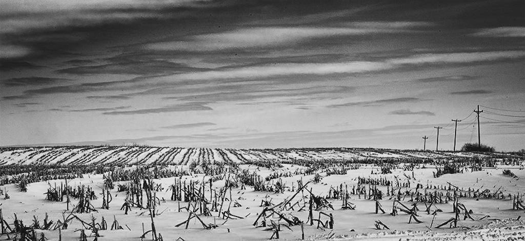
Not so brave in the cold. Here in Saskatchewan it has been -32 to -40 for a few weeks this last month so I have been staying inside. Not much chance to take images in weather like that although I bet I could get some really interesting ones if I was brave enough.
I hate footprints too but worked with what I had.
Thanks Dan |
Feb 27th |
| 96 |
Feb 21 |
Reply |
Bleach bypass is something I have never used. It looks interesting. I will give it a go sometime.
Thanks! |
Feb 27th |
| 96 |
Feb 21 |
Reply |
Thanks Dale. I worry that I tend to oversaturate sometimes. |
Feb 27th |
| 96 |
Feb 21 |
Reply |
Thanks Emily. It seems that the softer effect does not work, at least for this image. |
Feb 27th |
| 96 |
Feb 21 |
Reply |
Thanks Robert.
I definitely agree that I should crop more from the right as in the other image.
Yes the pink on the snow might be interesting! I think I may have been too concerned with the fact that there was too many footprints etc in the snow and it might be too noisy.
|
Feb 27th |
| 96 |
Feb 21 |
Comment |
Hi Gerard
As I am late to the party this month, everyone has already touched on my thoughts.
I would remove most of the tracks and spots. If we going for a bleak cold look, maybe black and white would portray that better.
On a side note, I recently watched a presentation from a club member about shooting black and white for a while. I am trying that and have found it really helps me focus on the light in the scene. Next Month I will be submitting black and white. Looking forward to everyone's comment. |
Feb 27th |
 |
| 96 |
Feb 21 |
Comment |
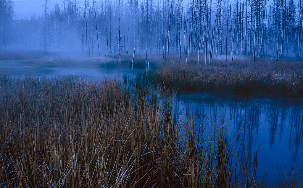
So often some of the greatest images we get are when the weather is just horrible! This is an awesome image.
There are details everywhere holding your interest and the water pulls your eye right into the image to the trees then clouds. I love that it appears untouched by man.
I agree with Witta. Adding a little warmth brightens the image a bit, but I see this a personal preference. It does not portray as much of a cold feel. So it depends what your going for.
I like your crop as is and wouldn't change it. |
Feb 27th |
| 96 |
Feb 21 |
Comment |
You are so talented at creating such soft magical looking photos! I love this image. I really wish you could package that talent up and send me some!
I struggle with cropping. It is often a very personal preference. When I choose a crop I try (try being the operative word) to find good leading lines, to place the subject where the eye goes, and to pay attention to how my eye moves trough the image.
I find with your crop my eye goes along the water from the right to the left and just stops.
I also really love the fog on the left hand side and miss it too much when you crop it out.
As I experience this image my eye is drawn through the water from right to left where the fog is thickest then my eye follows the trees back to the right again, enjoying the vertical lines and detail in the trees, then to grasses and back around again.
I also really love the blue and yellow tones you have chosen.
It is a very calm serene image. One that I really enjoy looking at.
|
Feb 27th |
 |
| 96 |
Feb 21 |
Comment |
Hi Emily
I too am late to comment this month.
It looks like everyone else has similar opinions to me. I really like this one in black and white. Black and white really brings out the textures of the clouds and the shadow of the trees.
This is a minimalistic image which does portray some loneliness and the the feeling of cold in winter. I really like this image. |
Feb 27th |
| 96 |
Feb 21 |
Comment |
Hi Dale
Sorry to be so late to the party this month.
I agree with everyone's comments so far. Great job editing with nice colors and exposure.
I like the leading line of the frozen water through the image. The geese are a nice addition and in my opinion are the main subject so I would do what I could to make them the subject and eliminate as much of the competing elements. I think the addition of tension to an image needs to done deliberately and be obvious. In this image I think it is an after effect of competing elements. Just my humble opinion. I can't say I'm very good at adding tension to my own images. |
Feb 27th |
6 comments - 4 replies for Group 96
|
6 comments - 4 replies Total
|


