|
| Group |
Round |
C/R |
Comment |
Date |
Image |
| 96 |
Jan 21 |
Reply |
Thanks Dan
I've always tried to take all critiques with a grain of salt but sometimes give it a try anyway. I really find this group helpful to clarify what my camera club says. I find if I go with my gut feeling about the photograph usually 9.9 times out of 10 I choose right. With this one it did not feel right to crop it so I guess my gut did not fail me this time. Thank you for your feedback. PS I have removed that Orton effect. I have never really used it before and I'm not sure it is something I really like. The only way to find out is to try I guess! |
Jan 16th |
| 96 |
Jan 21 |
Comment |
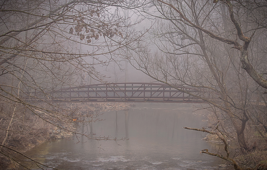
Hi Gerard
Really nice foggy, moody image. I too like Original2 the best. For me it portrays more of the fog. Your final result seems to have removed some of the foggy feel for me. I'm not sure if it is the color or the texture that does this or maybe even a combination of both of them. I would crop a little differently to center the main subject and remove the downward pointing branch. I think it draws the eye down and out of the image.
I too have been reading about increasing ISO to allow for more handheld images but haven't had a chance to try it yet. With todays cameras I could see how this would not be as much of a problem as in the past and am looking forward to giving it a try. It's a great idea. |
Jan 9th |
 |
| 96 |
Jan 21 |
Comment |
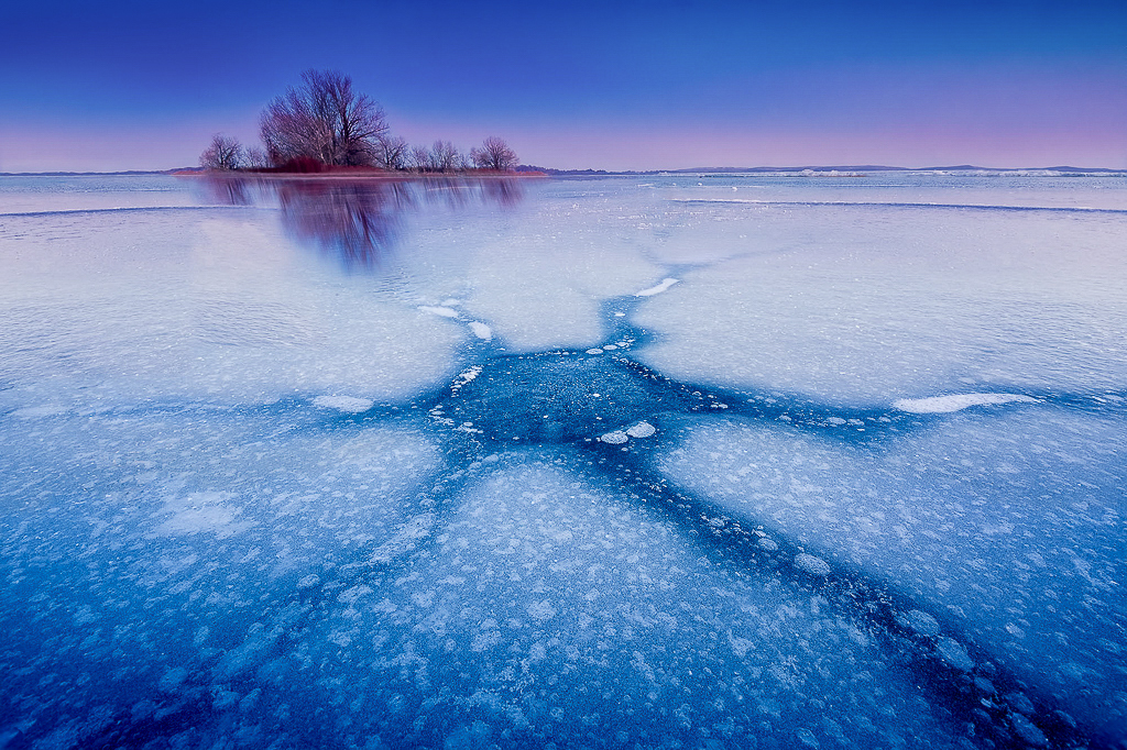
I think I am going to be the odd man out here.
First of all let me say I really like this image. I love colors, the blue is perfect for portraying the cold and the pink is nice. You might have been able to go a bit more pimk but not much. I think your right that it would take the cool feel out of the image. Love the "Star" of the photo and the details in the ice. I agree with your choice not to add a vignette.
Now here is where I'm the odd man out. I personally don't like the floating rock at all. I would clone it out. My eye goes directly to it and does not linger in the trees on the island when it is there. It also breaks up the perfect diagonal line you have going for you between the trees and the star shape. Just my opinion tho..
This is a beautiful image. You have such a great eye and I love the way you got down really low to show depth. |
Jan 9th |
 |
| 96 |
Jan 21 |
Comment |
Hi Robert
Like Gerard this image seems more like an abstract image to me. I love the flow the image suggests and the different shapes and colors created by the water. I don't see a connectivity between the rocks, rather I see them as individuals standing unchanged by the forces against them. It can be interpreted in many ways which makes it an effective image. It pulls thoughts out of the viewer and in doing so can create emotion. I would crop it to make the rocks form a more symmetrical diagonal in the image to improve the sense of flow from the bottom left to the top right. As well I would accent the lights and darks a bit more to give even more dimension in the water. |
Jan 9th |
 |
| 96 |
Jan 21 |
Comment |
Hi Dale
I really love the color palette of this image. The colors are very calming and the scene is so serene. I really like the white tree which for me indicates a foretelling of a time soon to come when winter will arrive and all the trees will be bare and the cold will be upon us. The swans add to the serenity. I do find that the farthest swan is distracting. I like one swan alone which may give the image more solitary quiet feel. Like Gerard I find the white tree a little too centered so I would crop differently. The "human structures" are distracting to me as well so I would clone them out. I would also remove some of the debris from the water to make it look calmer. As a final step I would dodge and burn to add some depth and a vignette to make that white tree and the one swan stand out more as the focal point. Really just minor details though, beautiful image. |
Jan 9th |
 |
| 96 |
Jan 21 |
Reply |
Thanks Robert
My personal preference is for the longer full version of the image but I had some feedback from my camera club in town that the focal point may be stronger in a cropped version so I thought I would get more input. I don't usually use the Orton effect but gave it a go on this image in an attempt to make it look more dreamy....I think I am with you re not liking the trees to look less focused but yes will probably look good in the sky. I will rework it and see how it looks. Thanks so much for the suggestion. This is a view from the Fairmont Hotel grounds in Jasper National park in Alberta Canada. |
Jan 9th |
| 96 |
Jan 21 |
Reply |
Thank you so much Gerard
Ironically I originally got some feedback from my camera club the on the image as a whole was lacking a focal point. I had not seen this myself but thought there might be something to it so I cropped to see what would come of it and get more feedback. My gut feeling is the same as yours that the entire image is better but then I tend toward large expanse type of landscape images so I guess it is a matter of opinion. I like the entire image better too. I submitted it to get more than one opinion.
P.S. Don't worry about being measured with response for me. That is exactly what I am here for, unfiltered honest feedback. Thanks again. |
Jan 9th |
4 comments - 3 replies for Group 96
|
4 comments - 3 replies Total
|


