|
| Group |
Round |
C/R |
Comment |
Date |
Image |
| 96 |
Nov 20 |
Reply |
Love what you did with this Robert! |
Nov 15th |
| 96 |
Nov 20 |
Reply |
Yes a little bit more to give it more balance. Cropping is so hard to get just right sometimes. |
Nov 15th |
| 96 |
Nov 20 |
Reply |
I totally agree with all your points and I do love your crop! Thanks for taking the time to have a go at the editing to show me what you mean, I really appreciate that. |
Nov 15th |
| 96 |
Nov 20 |
Reply |
Yes the fact that the right side is higher than the left makes me uncomfortable too. It is actually this way in real life but in the image it just does not work. I too would like to have something more dominant as a point of interest. This gives me something to work on.
Thanks for the insights! |
Nov 15th |
| 96 |
Nov 20 |
Reply |
Yes I totally agree. The right side is boring so I will be cropping it off. Thanks for taking the time to show me what you meant by having a go at the crop.
|
Nov 15th |
| 96 |
Nov 20 |
Comment |
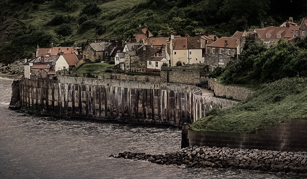
Hi Gerard.
You have done a great job with texture and desaturation to portray bleakness. I like the idea of the vignette as well but would go a step further and desaturate just the green a bit more and crop the top of the image. The right side does not bother me but my eye is definitely drawn to the green, especially at the top of the image. I also found the white a bit too bright on the building walls. |
Nov 11th |
 |
| 96 |
Nov 20 |
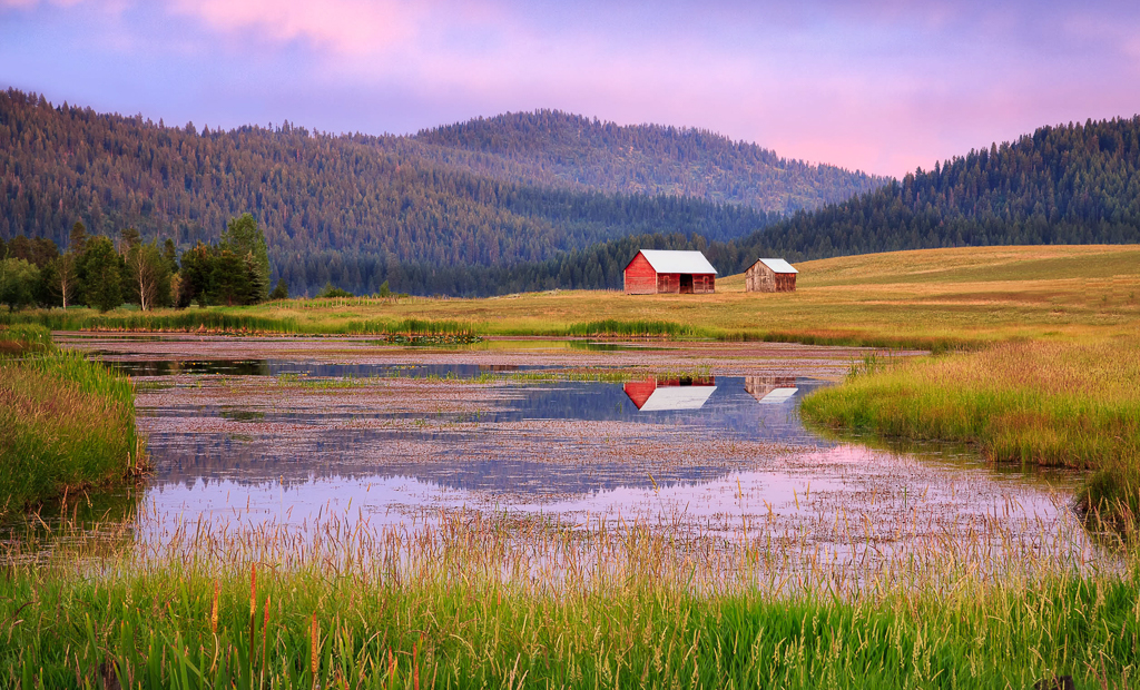
Comment |
I really like the softness of the colors, the s curve leading lines on both sides of the pond. It is a very peaceful image. I think your re-edited version is almost perfect. I however have never been a fan of the rule of thirds. My tastes resonate more with the golden triangle which is a little more centered so I find your crop still a little tight on the right, but that is just my personal preference. I really do like this image. |
Nov 11th |
 |
| 96 |
Nov 20 |
Comment |
This is a very beautiful soft image. I do find the foreground a bit too bright but only a bit. I think the colors are well done. My tendency would be to try to add a little depth with some mild (very mild) burning between some of the trees in the background. I tend to like to add depth this way and it is a personal preference. It may not work well on this image because it is more of a high key image and you would have to use a very light hand. I quite like this image as is and it may not need it. This is the kind of image I would like to be able to capture myself. Very well done! |
Nov 11th |
| 96 |
Nov 20 |
Comment |
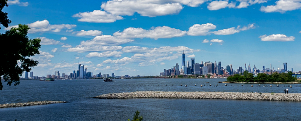
Hi Emily
This view does show the architecture in the background and there are some nice clouds in the sky. When I look at this image I think the main subject is the architecture in the background so I think the image would benefit from cropping in on these buildings. The sky is nice as well but there is so much of it that the viewer is drawn away from your main subject. As well cropping would remove some of the distracting elements in the front of the image. |
Nov 11th |
 |
| 96 |
Nov 20 |
Comment |
Hi Dale
I really agree with what Robert has done. He has emphasized the light rays which I think is also what drew your eye to this image. It makes the light rays the main subject and as Dan said adds drama to the image. Such a beautiful calm photo with lovely backlighting. |
Nov 11th |
5 comments - 5 replies for Group 96
|
5 comments - 5 replies Total
|


