|
| Group |
Round |
C/R |
Comment |
Date |
Image |
| 96 |
Oct 20 |
Comment |
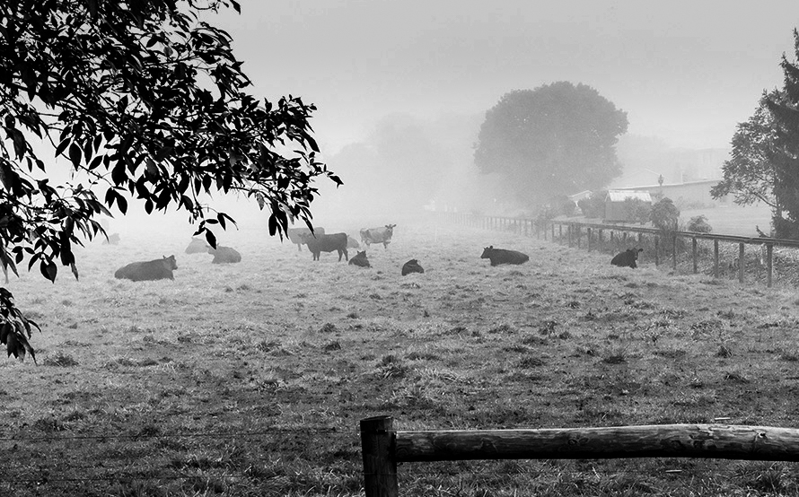
Hi Gerard
Love the fog in this image. It is just enough to create a great background for the cows. I agree with Robert regarding the composition suggestions.
I like how Dan cropped the bottom. In addition I would crop a little off the top and darken the top and bottom to close the image in on the cows. |
Oct 17th |
 |
| 96 |
Oct 20 |
Comment |
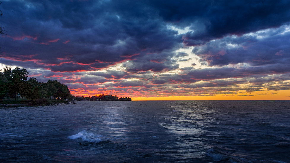
Hi Emily
Just when you thought you had everyone's opinion here I come with one more.
I like the landscape version better than the portrait version. I find in the portrait version the wave becomes too dominant of an element in the photo. I agree that that piece of sky is too bright but I would tone it down in post and make it a bit more yellow/orange. I would change the crop to put the bottom line of the golden rectangle at the horizon and this would crop out the top of the sky which is too bright. It also puts the main subject, the beautiful pink clouds on one of the lines as well.
I would brighten the wave in the foreground to enhance it as a foreground element just like Gerard. With the crop in the landscape mode it does not steal the show.
|
Oct 17th |
 |
| 96 |
Oct 20 |
Comment |
I love this image Dan. The first thing I thought was I love that title!
Colors are beautiful, fog is beautiful, very mysterious. I like the crop. I don't think I would change a thing.
Great image! |
Oct 17th |
| 96 |
Oct 20 |
Comment |
This is a gorgeous image. Love the fall colors and the reflection is perfect!
I too noticed the slightly blue tint of the tree trunks and I like it. It would be too stark if it were removed and the mood would be lost. The blue makes it a little moody for me.
I would like to see a little more room above the trees but not that much. About twice as much space as the narrowest part above the center trees.
I would also burn the shadows a little bit to increase the depth especially around the tree trunks to make it look more 3D. |
Oct 17th |
| 96 |
Oct 20 |
Comment |
I really love the colors in this image.
I agree with the others that some of the leaves are a little blown out. Could this be corrected in post?
Without being there it is difficult to know but I wonder if moving a little to the right might have made a nicer leading line out of the path so both could draw you around the corner.
As well I might burn the shadows under the branches to create more depth and more of a 3D look. |
Oct 17th |
| 96 |
Oct 20 |
Reply |
I actually don't recall if I burned the water. I will have to look back. I am going to remove the foreground elements and compare the two versions to see which I like best. I am not totally convinced that the foreground elements should be totally removed, it may not feel grounded with them all removed. The only way to know is to try it out.
I took all the images on my tripod. I have two tripod heads, a Really Right stuff pano head to take multi row panoramas and a fluid head set up similar to the one Hudson Henry recommends here- https://www.hudsonhenry.com/blog/fluidheads.
I have been using my fluid head much more often than the RRS pano head because it is more compact and easier to travel with. |
Oct 17th |
| 96 |
Oct 20 |
Reply |
Thanks Emily! |
Oct 17th |
| 96 |
Oct 20 |
Reply |
Thanks Dan. Yes I am going to try to clone out the foreground and simplify the image. |
Oct 17th |
| 96 |
Oct 20 |
Reply |
I agree with all your comments! I may try to remove all the objects..... Photoshop here I come!!
P.S. I thought I was going to get a ton of flack from my Husband for buying the 50S (was a little worried about telling him). I did get it on sale and he wasn't as upset as I thought. I guess after 29 years of marriage the man knows me...LOL. This is a hobby (or maybe I should say obsession) for me, so to spend that kind of money was a little crazy. I do like the camera though. If you ever get a chance at a good price and can afford it I would definitely recommend it. |
Oct 17th |
5 comments - 4 replies for Group 96
|
5 comments - 4 replies Total
|


