|
| Group |
Round |
C/R |
Comment |
Date |
Image |
| 96 |
Sep 20 |
Comment |
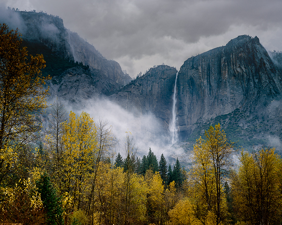
This image is beautiful with the fall colors. I love the mood of the clouds in the image. I is really nice that they don't cover the waterfall so that it is clearly visible. Great timing on your part when taking this image. I love the leading lines of the mountains and the trees into the focal point which in my opinion is the waterfall.
I am going to suggest another crop option. This is an 8x10 crop. I think it definitely benefits from cropping to remove some of the unnecessary foreground. However if you crop in too much you lose some of the wonderful leading lines from the mountains and the trees. I would not clarify too much but a little texture on the right hand mountain may look OK.
I would increase the vibrance of the yellow in the HSL slider of Lightroom to make them pop a little and I would replace the sky but only with a moody grey cloud that does not draw attention away from the waterfall. I just find the sky to empty and bare which I think is partly why you cropped it out. This is an awesome shot. I would have loved to have been there to see this too! |
Sep 27th |
 |
| 96 |
Sep 20 |
Comment |
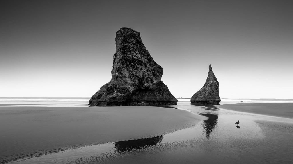
Welcome to the group Dan. I love this image. I like the leading lines of the water on the sand and the lonely bird adds interest.
I agree with other comments regarding cropping to place the rocks more off center and to add more breathing room at the top. I would brighten the rocks a little too and add some texture.
I have added these recommendations in a quick edited version. |
Sep 27th |
 |
| 96 |
Sep 20 |
Reply |
Thanks Dale |
Sep 26th |
| 96 |
Sep 20 |
Comment |
Hi Emily
I really like this image. Blue is a calming color and the reflection and ripples in the water look really nice.
I like the 16x9 crop as well. I would use the gradient filter in lightroom and angle it just to catch the grass in the bottom left corner. Then I would decrease exposure about 0.40 just so it's not so bright drawing the viewers eye there.
As well the blues although a very nice color seem a little over saturated to me giving it an little of an un-natural look.
Love the location! I'd be going back if I could for a sunrise or sunset!. |
Sep 15th |
| 96 |
Sep 20 |
Comment |
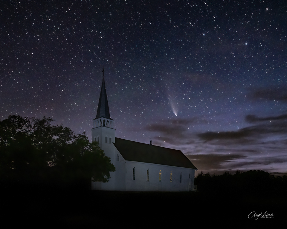
Hi Dale
I really love the clouds in this image. Those God rays are something I would love to capture with something other than my iphone. I too never seem to have my camera when I see them. I like the leading line from the bridge to the center of attention (ie the rays). I might try to decrease the highlights in the clouds on the upper left so that they don't distract from the rays. I like Gerards crop too.
I just purchased Topaz denoise and so far really like it. I have NIK too but topaz works a little better I think.
Great Image! |
Sep 15th |
| 96 |
Sep 20 |
Reply |
Thanks Zolt. I did give the clone stamp a go and it turned out OK. I also used the brush tool in lightroom and decreased the highlights and whits on those stars in the top left to ensure they were not so bright to draw the eye.
Yes the reflections in the window are the same light that created the anoying orange/red on the wall. Looks Ok in the windows though!
Here is my re-edited version that I also used Topaz denoise on. I think topaz did a really good job.
Thanks for retouching the church to show me how good it could look with the clone stamp. |
Sep 15th |
 |
| 96 |
Sep 20 |
Reply |
Thanks Emily! |
Sep 15th |
| 96 |
Sep 20 |
Reply |
Yes I was surprised as well at how much I was able to pull out of this image. I have not done that much night photography but this gives me hope that with some more practice I will be able to get an even better night sky image sometime down the road. |
Sep 15th |
| 96 |
Sep 20 |
Reply |
Thanks Robert. I am going to give the clone stamp a go!
|
Sep 15th |
| 96 |
Sep 20 |
Reply |
Thanks Dan. I was struggling a bit with just how bright to make the church. My light painted version is looking like a bright light itself so I decreased the opacity until I thought it looked natural. Most comments want it a bit brighter so I will take a look at increasing the opacity a bit and see what that looks like. |
Sep 15th |
4 comments - 6 replies for Group 96
|
4 comments - 6 replies Total
|


