|
| Group |
Round |
C/R |
Comment |
Date |
Image |
| 96 |
Aug 20 |
Reply |
Thanks Dale! |
Aug 22nd |
| 96 |
Aug 20 |
Reply |
No your not reaching too far! Others may see it the way you do as well. It is something that I did not see so I will look at options to soften the clouds as well and see which I like best. Thanks so much for pointing this out. |
Aug 22nd |
| 96 |
Aug 20 |
Reply |
Thanks so much Zolt. Yes I did get one of the comet. The clouds were not too cooperative so only one once the clouds cleared. I submitted that one for next month. Let me know what you think about that one. |
Aug 22nd |
| 96 |
Aug 20 |
Reply |
Yes I see what you mean. Whitening the church makes it look a little cleaner. I think I will do that on my copy as well.
Thanks! |
Aug 9th |
| 96 |
Aug 20 |
Comment |
Hi Emily
I really like the composition of this image. Seeing another bridge under the nearest bridge and parts of the city visible under the bridge adds depth. I like leading lines of the bridges drawing your eye to the tall building.
The light trails are interesting but I wonder if it might look better without them. I have no idea how busy the water way was but I might have taken several images to see if one could be taken without the light trails.
As well it looks like the tripod was nudged. The entire image appears to have ghosts from the tripod being moved.
Otherwise it is a great location with great composition. |
Aug 9th |
| 96 |
Aug 20 |
Comment |
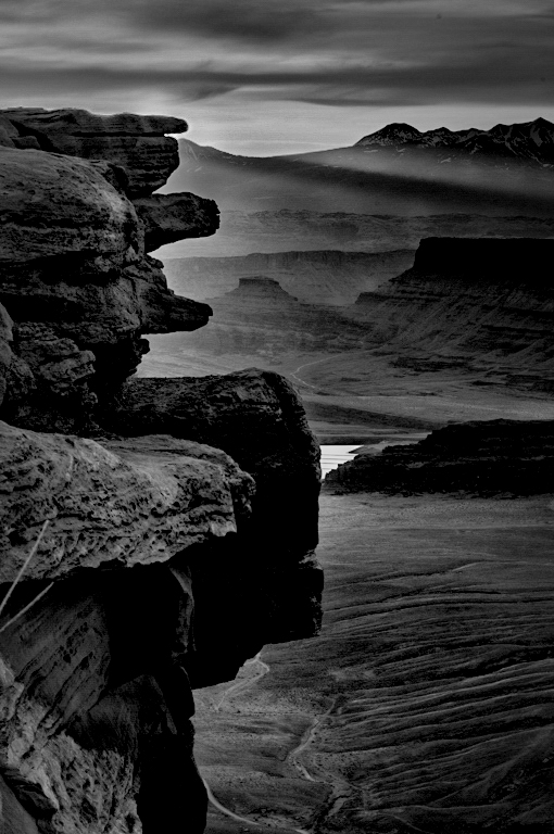
I like the depth that is in this image and the backlighting of the foreground rocks. I agree with you about the morning light and haze creating the depth and with your choice to go black and white. It is a fairly monochromatic scene. Your edit of the white areas is great and no one would ever know it was done unless they saw the original.
I wouldn't have done much differently other than being a little heavier handed with the contrast. I used luminosity masks in photoshop to selectively choose the highlights and shadows then dodged an burned them where I though they could use more contrast.
It's a really nice image showing lots of depth. |
Aug 7th |
 |
| 96 |
Aug 20 |
Comment |
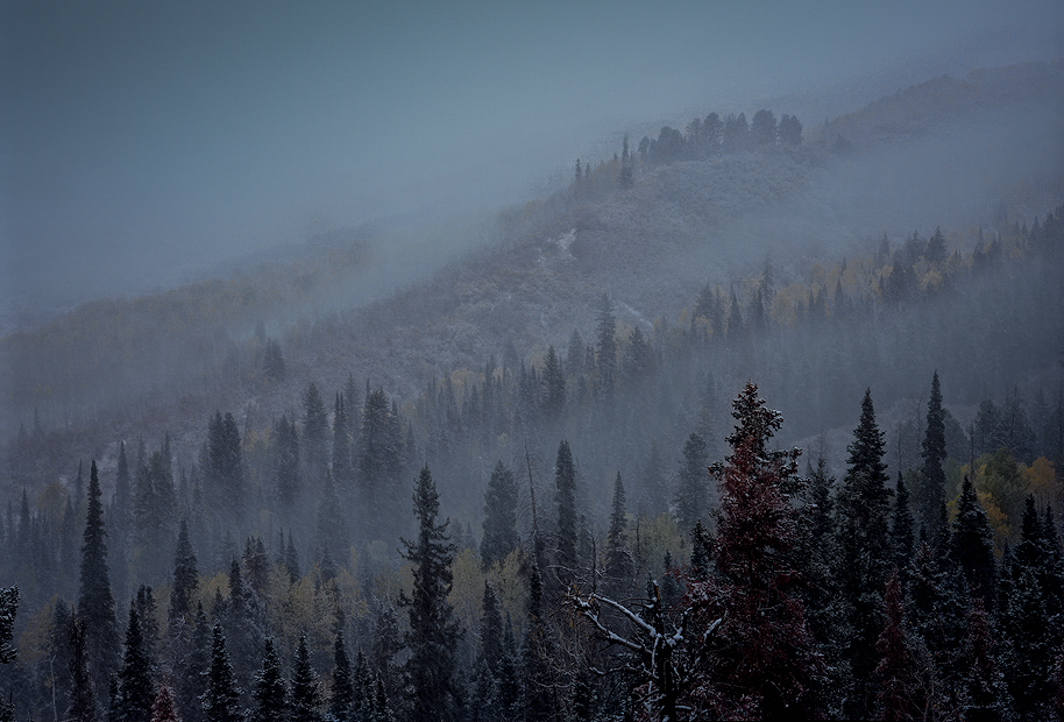
I really love the mood of this image. The misty snowfall gives is a mysterious feel for me. I like how you have some areas more visible than others.
My only thought is that it may be brightened too much with too much being visible in certain areas of your edit. It takes away from the mysterious feel and some of the depth to the image making it look more flat to me.
I used the texture, dehaze and clarity sliders with the brush to try to bring some definition back in the areas you were clarifying in your edit but did not bring them back as far. As well I found it gave depth to pick and choose the tops of occasional trees to clarify.
I also noted that you took the color out of the front tree. I kind of like it but others may say the color draws too much attention to the tree.
Its a great image and it sounds like you had an interesting time creating it!
P.S. Out of curiosity what camera are you using for 4x5 film. Sounds like it's fun to use! |
Aug 7th |
 |
| 96 |
Aug 20 |
Comment |
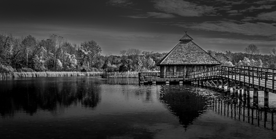
Hi Dale
I agree with Robert regarding tonality and the crop, although my crop was a little different.
I used luminosity masks in photoshop to selectively dodge and burn the highlights and shadows to emphasize them and create depth. I also removed some of the white spots in the cabin reflection because they were quite bright. Darkening the foreground helps to bring attention to the main subject (the cabin and trees).
It is a great choice of image for black and white because it has a lot of texture you can pull out of the cabin and trees.
It is nicely framed with leading lines from the bridge and symmetry provided by the reflections. Balance is also created with the trees on the right and the bridge on the left.
|
Aug 6th |
 |
| 96 |
Aug 20 |
Comment |
Hi Gerard
I really like the texture in this image.
I find my eye is drawn up from the bottom then to the pier rather than to the upper right. This is good in my opinion because I see the main subject being the pier so my eye is not drawn away from it.
If you see the pier as being the main subject it may improve the image to be shifted to the left giving more breathing room on the left of the pier.
As well maybe darkening around the pier making it the brightest part of the image to make it stand out from the rest of the image. Right now it is the same tone as the rest of the image causing it to blend in too much.
It does have really cool texture and leading lines from the bottom making this an interesting image.
|
Aug 6th |
 |
5 comments - 4 replies for Group 96
|
5 comments - 4 replies Total
|


