|
| Group |
Round |
C/R |
Comment |
Date |
Image |
| 96 |
Jul 20 |
Comment |
Hi Dale
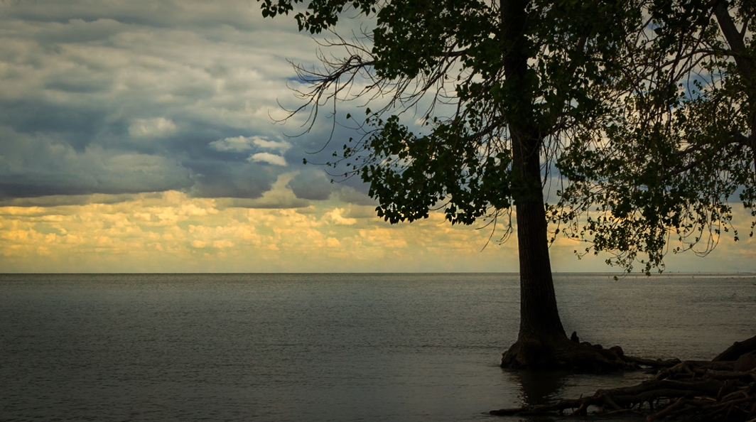
I really like the idea of the tree as a silhouette and looking out over the water at the beautiful clouds.
I would as Gerard said enhance the clouds (using a large oblong radial circle adding yellow and a bit of magenta with feathering at 100%. I also dodged and burned them a bit in photoshop to create more depth.)
I would also darken the tree (using photoshop and luminosity masking to select the tree and darken with dodge and burn).
If the people are not a part of your subject(the clouds) I would remove them because they do draw the eye away from the clouds. If you want them to be a part of the composition I think they would have to be further into the image on the left of the tree to not be distracting.
I also used the gradient tool to darken the top of the sky and the water as well so that the clouds were the brightest part of the image.
I too, like Emily, think cropping some of the foreground is a good idea
Lastly I added a vignette.
As Gerard said I may have done more editing than you are comfortable with. Hope some of my ideas can be useful to you though |
Jul 20th |
 |
| 96 |
Jul 20 |
Reply |
Thank you very much Emily! |
Jul 20th |
| 96 |
Jul 20 |
Reply |
Thanks a lot Dale.
I have thought of print this one large but at the moment I can't decide where to put it. As photographers, most of us quickly run out of room! |
Jul 20th |
| 96 |
Jul 20 |
Reply |
Hi Gerard
I absolutely agree. Thanks for pointing that out. I have updated the copy on my computer to reflect this change of crop |
Jul 20th |
| 96 |
Jul 20 |
Reply |
Thanks Larry
I appreciate the feedback. You have some great images so when you say it is well done, that means a lot! |
Jul 20th |
| 96 |
Jul 20 |
Comment |
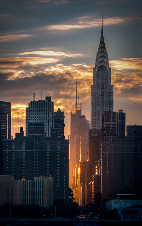
I love the nice soft light in this photo. For me the subject is the sunlight coming down the street between the buildings and possibly the crysler building as well. I would like to see a little more light and detail in the buildings but just a little. The subject is the light so I would work to saturate that a little and possibly bring up the lights on the crysler building itself a bit more. The color of the sky is a bit grey so I would use dehaze on the sky to bring out the blue a bit more.
Great image! Not much you can do to improve it. |
Jul 16th |
 |
| 96 |
Jul 20 |
Comment |
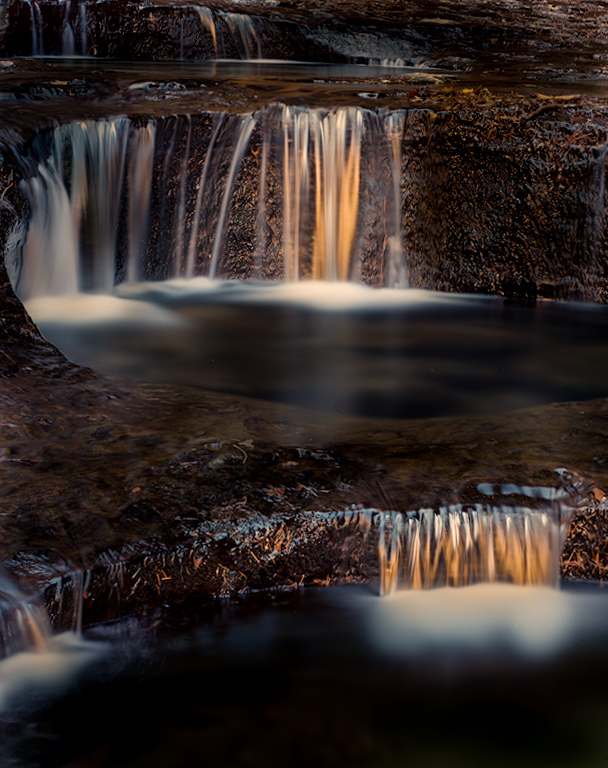
It sounds like the light was wonderful and the camera sometimes does not see this. I really like what you did with your second edit by darkening the areas around the waterfalls to bring attention to the waterfalls themselves. This gives the image more of a subject. I too played around with the crop a little and only you can decide which of us is portraying what you wanted. I wish you would have been able to open up the composition to allow a little more room around the waterfalls but alas sometimes the location does not allow for this as you have stated. I think your second edit does portray more of that mystical feel you were going for. My thoughts regarding your second edit is that the colors are probably a bit overdone. I was not there so it is difficult for me to say for sure but my guess is that they are a little strong. Maybe toning down the color a little and adding a glow might get it closer to what you are wanting to portray. |
Jul 16th |
 |
3 comments - 4 replies for Group 96
|
3 comments - 4 replies Total
|