|
| Group |
Round |
C/R |
Comment |
Date |
Image |
| 96 |
Jun 20 |
Reply |
I love this image! The sky has great color and detail! |
Jun 20th |
| 96 |
Jun 20 |
Reply |
Thanks Dale! It is one of those images that I like but I keep going back to because it seems there can be something more done to draw in the viewer. I think everyone here has helped me to do that. I will play with improving the reflection as you suggested. |
Jun 20th |
| 96 |
Jun 20 |
Reply |
Thanks Emily! I look at the image again today and I thought I liked the one with the rock but now I'm not sure.... You may be right, it is one of those images that could be done either way depending on what you are looking for. |
Jun 20th |
| 96 |
Jun 20 |
Reply |
I'm so glad you don't mind me working with your image to show you what I am talking about. I find it much easier to show sometimes than to explain in words.
Same goes for you and everyone else, don't hesitate to play around with my image to see what you think works and let me know. I would not participate unless I was prepared to see what all of the people here could do with the image. It's a great way to see more perspectives than one person alone can come up with. |
Jun 20th |
| 96 |
Jun 20 |
Reply |
Yes I see what you mean re the halo's used in artwork. As with any judge my opinion is just that, one person's opinion. Always do what works for you, take the feedback for what it is and decide what you like. I have disagreed with many a critique but I have found most to be very helpful in the growth of my image quality.
I hope you don't mind that I took the liberty of quickly editing the original to better show you what I mean. I was unable to show you what I meant about the clouds in the edited version. It really is a beautiful view. I would like to see it sometime myself if Covid ever lets us travel again! |
Jun 14th |
 |
| 96 |
Jun 20 |
Comment |
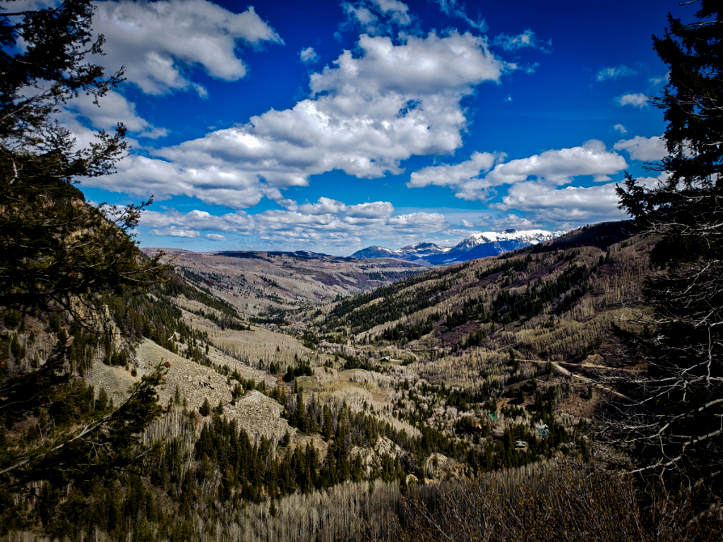
This is a beautiful view. I really like how you used the trees to frame the image on the left and right. The symmetry of the hills on the left and right lead the eye into the middle of the image.
This looks like it is a pretty bright day so I would have used a low ISO like you have but I would have put the aperture at at least 8 (Maybe 11) to ensure the entire image was sharp. With the aperture at 2.4 it is a little soft and even hand held you could go with a much lower shutter speed and still get a sharp image.
I would reduce the brightness, add some contrast and use a vignette to draw the eye into the image.
I would return at sunrise or sunset if I could, to see if I could get it in the most flattering light. This is a lovely spot. |
Jun 13th |
 |
| 96 |
Jun 20 |
Comment |
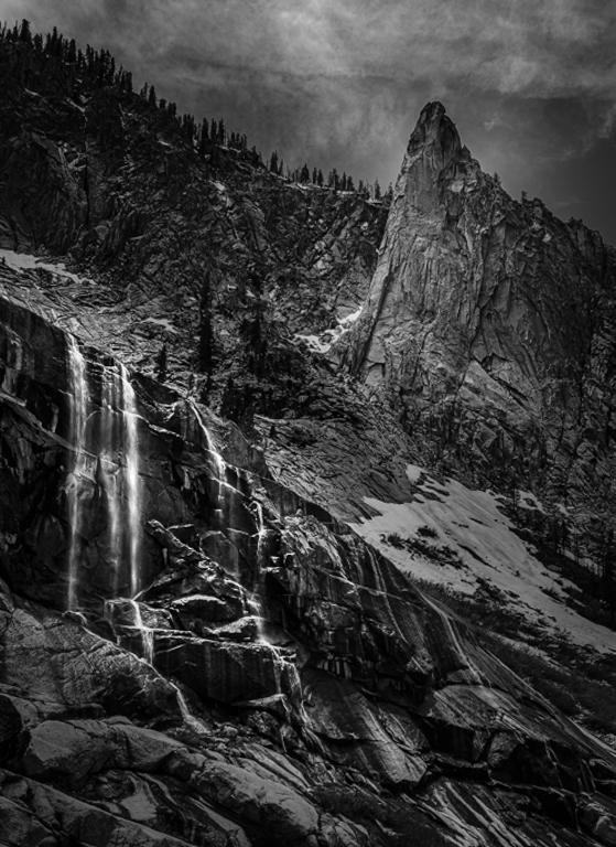
This is a very nice image and I really like the diagonal placement of the waterfall on the left and the peak on the right. It would have been nice to have a little more breathing room on the left side of the waterfall.
I agree with your choice to go black and white because the blue sky pulls the eye away from the waterfall.
For me, the middle area of the image just above the waterfall (the area with the snow) is to bright and pulls my eye away from the main subject which for me is the waterfall.
I would add more contrast with dodging an burning to darken areas that were not the focal point and lighten areas where you want the eye to go.
I would also dodge and burn the waterfall to add more depth to the falling water.
I love hiking in the Canadian Rockies and this image reminds me of that. Great image! |
Jun 13th |
 |
| 96 |
Jun 20 |
Comment |
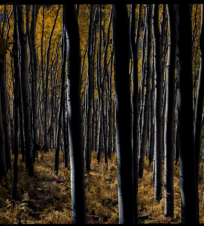
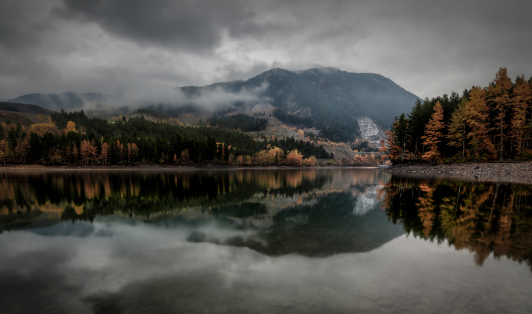
I am really drawn to this image. I love the autumn colors and the vertical tree trunks create symmetry. The crop on this one is challenging. So many tree trunks, my eye had difficulty finding one to focus on. I would adjust the crop to put the closest left tree trunk at the rule of third line and crop the left side although not quite as much as you did.
I would go a little further with the highlights and shadows to create more depth. I might have gone a little too far but you see what I mean.
I would also add a little more saturation in the oranges and yellows. I have attached a quick edit to show you what I mean. |
Jun 13th |
 |
| 96 |
Jun 20 |
Comment |
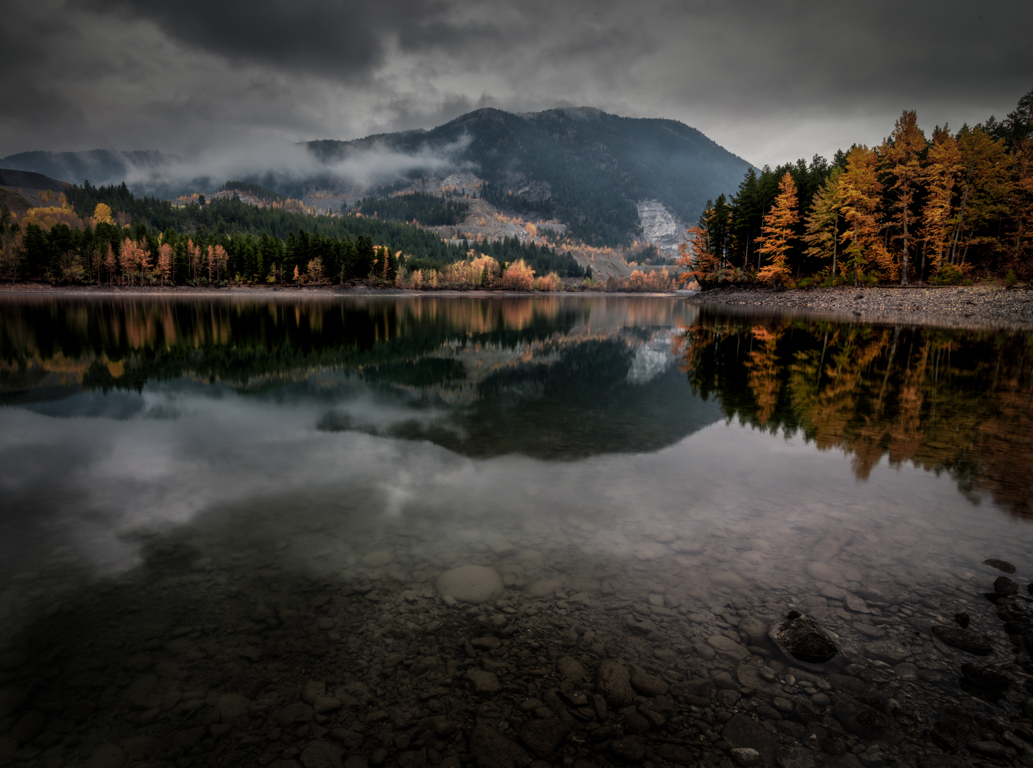
I love the fall colors of the trees so making them the main subject is OK!
I took your advice and decreased the purple in the sky and the green in the reflection. I think it helped to correct the color and I think this is the best I can do (see the image I posted in Stephen's reply so see how this helped).
I agree with you regarding adjusting the crop to put focus on the trees and their reflection and away from the middle mountain. Interestingly by including the foreground the mountain recedes into the background and makes the trees and the reflection more the main subject. I adjusted the crop in at the sides and included the foreground and voila I found the version I like the best. I posted this version in my reply to Stephen.
Thanks so much for you input. All the feedback really helps to improve my photography |
Jun 13th |
| 96 |
Jun 20 |
Reply |
I agree with Gerard too so I adjusted the saturation of the oranges and yellow a bit and softened the clouds. I also adjusted the crop in an attempt to bring the eye to the mountains and clouds. This is what I ended up with.
I think this version is a little too de-saturated and it looks kinda flat.
I too have to admit that in this image the trees have to be the main subject not the clouds. |
Jun 13th |
 |
| 96 |
Jun 20 |
Reply |
I agree with Gerard re the saturation being a bit much so I toned it down but not too much or the image just looks flat. I also decreased the texture of the clouds.
Then I tried a portrait crop but that did not work so I played with it a bit.
I included the foreground as you suggested and came up with the image below which I actually like very much. I could not get the leaf to look good though so I removed it. |
Jun 13th |
 |
| 96 |
Jun 20 |
Reply |
I agree with you. I will try a version without so much tree saturation and a more misty look to the clouds and see where it take me.
Thanks |
Jun 13th |
| 96 |
Jun 20 |
Comment |
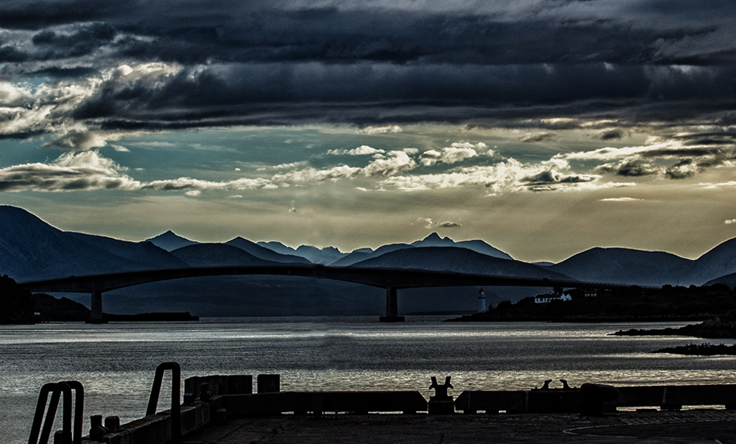
It looks like the sky was wonderful!
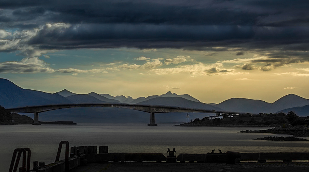
The pole on the quay is in the position on one of the lines of the rule of thirds and because of this becomes the subject of the image.
Without being there it is hard to say if another point of view might have been better that did not put the pole in the image.
If your subject is the bridge and the rolling hills there is too much of the quay in the foreground. I would crop more of that out and put the bridge on the rule of third line.
It also seems like the light and shadow editing went a little far and created noise and a halo around the bridge. |
Jun 2nd |
 |
| 96 |
Jun 20 |
Comment |
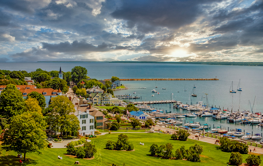
Hi Dale
I really like this image it gives me a sunny warm feel and looks like it was a wonderful day.
I like your crop because it does not cut any trees in half and provides a good balance of foreground and sky.
The white balance looks correct to me as well.
I would have decreased the exposure a bit so that the sky did not look so white. It appears to be almost blown out and because it is so white my eye is drawn there. There is a lovely leading line down the walkway and around to the middle of the water. With the sky not so white my eye spends more time exploring the ships and the buildings.
Hind sight is always 20/20 but if I were to shoot this I would probably use ISO 100, F8 and adjusted shutter speed to ensure I was exposing for the brightest part of the image which is the sky. I also often exposure bracket to ensure I have detail in the brightest and darkest parts of the image.
I could not bring the sky down with the image you submitted but I replaced it just to see the difference it would make if it was not so white. I also adjusted the exposure down a bit. These are just my preferences and my way of showing you what I mean. I hope you don't mind. |
Jun 2nd |
 |
6 comments - 8 replies for Group 96
|
6 comments - 8 replies Total
|


