|
| Group |
Round |
C/R |
Comment |
Date |
Image |
| 15 |
May 20 |
Comment |
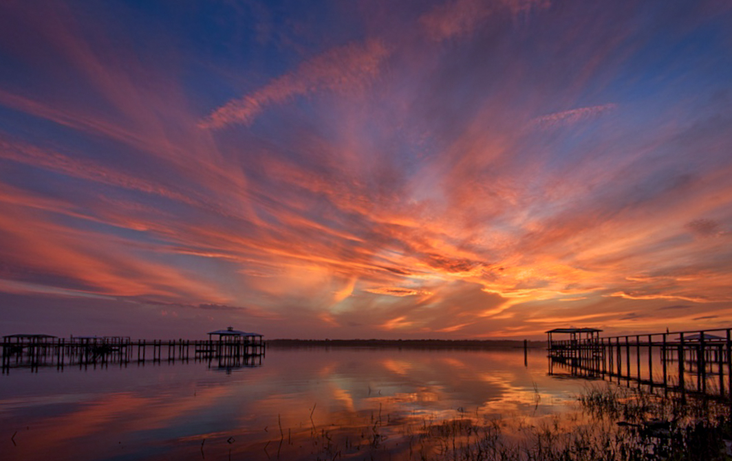
I love the WoW sunset. It is just beautiful. I love how all the clouds create leading lines to the center of the sunset. I actually like the two piers. I would just have straightened them. they are leaning in because of the wide angle lens used. I would have cropped a bit differently as well giving more space to the wonderful sky. The last thing I would have adjusted just a little is the brightness. It is a spectacular shot!! Congratulations! |
May 9th |
 |
1 comment - 0 replies for Group 15
|
| 36 |
May 20 |
Reply |
I have sent in my first photo and I'm sure it will be posted soon. I am really looking forward to some feedback! |
May 9th |
| 36 |
May 20 |
Comment |
I totally love this image and I don't think I would change a thing. Beautiful color, beautiful mood. Love the lights in the cabin, the exposure on the trees and the grass. Fantastic job, I don't think this would have been easy even without the bear drama!!! |
May 9th |
1 comment - 1 reply for Group 36
|
| 96 |
May 20 |
Comment |
Welcome!! I am new to this group and just joined PSA too. I am really enjoying the feedback I am getting. Sometimes you just can't see something until it is pointed out by a fellow photographer.
I played with the cropping quite a bit and decided that with the vignette it looked the best cropped the way it was but that is just how I see it. Cropping is such a personal preference I can see how you might like it the other way. I think the vignette and higher contrast decreased some of the texture but I think it works better this way by not drawing your attention away from the main subject.
Thanks for the feedback. I really appreciate it!
|
May 29th |
| 96 |
May 20 |
Reply |
Thanks Dale! Everyone's input help this image to improve quite a bit! |
May 29th |
| 96 |
May 20 |
Comment |
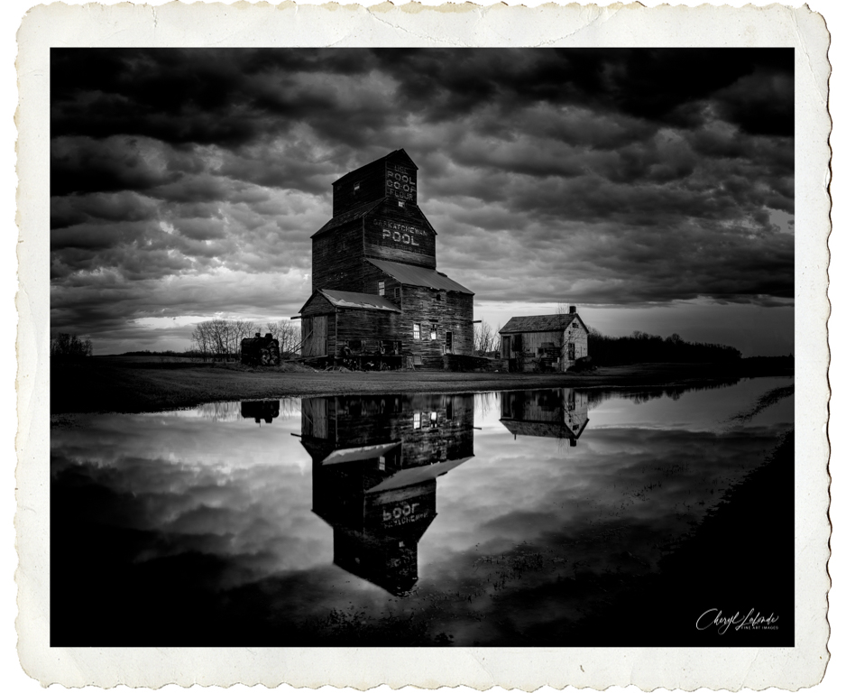
Here is the version that I think I like the best. It has more contrast between light and dark. The Grain Elevator is lighter so that it draws the eye more. Distracting elements are removed. I really appreciate everyone's comments. They have helped me to improve this image. |
May 17th |
 |
| 96 |
May 20 |
Reply |
Yes I think I have to draw more attention to the buildings and lightening them will bring the eye there. Thank you! |
May 17th |
| 96 |
May 20 |
Reply |
Yes I see what you mean. I agree the image has very similar contrast/tone throughout. I will play around and see if I can make the building brighter than the surroundings and therefore draw the eye there. Thanks, I appreciate the input it helps! |
May 17th |
| 96 |
May 20 |
Reply |
Thanks Zolt. I totally agree with you regarding the telephone pole so I removed it in photoshop. I also darkened the reflection as you suggested.
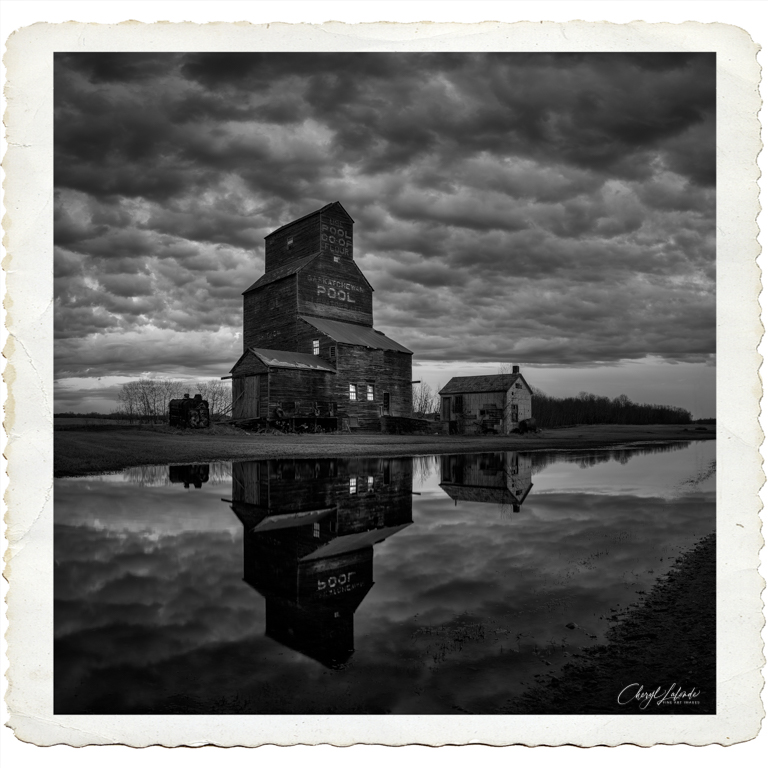
The square crop and border is not my usual method(I tend to go 16x9 with no fancy border most of the time) but it seemed to work in this situation, giving it a more nostalgic retro feel. If you take a look in the picture in the comment above you will see the effect your input has made to the image. I like it better! I appreciate your feedback, Thank you |
May 10th |
| 96 |
May 20 |
Reply |
I see what you mean regarding the reflection being too tight to the bottom edge. There really is no light coming from the windows, just a white blind but I like this idea so I added more contrast and I tried to turn on the lights in the windows! I really like the result. Thanks so much for your ideas! |
May 10th |
 |
| 96 |
May 20 |
Comment |
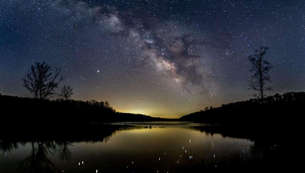
Very beautiful! I really like the symmetry on each side of the water adding balance to the image. The reflection of the stars is nice and the color looks correct to me for the milky way. The only minor things to add would be to go one row higher! When cropping, I like to put the horizon at the bottom 1/3 of the rule of thirds leaving 2/3 sky in an image like this to emphasize the milky way. One more row would accomplish this or you could crop out a bit of water but then you lose some of the beautiful reflection. I personally would have dodged and burned the milky way a little more but that is a personal preference. Some photographers would think that it looked over edited.
|
May 9th |
 |
| 96 |
May 20 |
Comment |
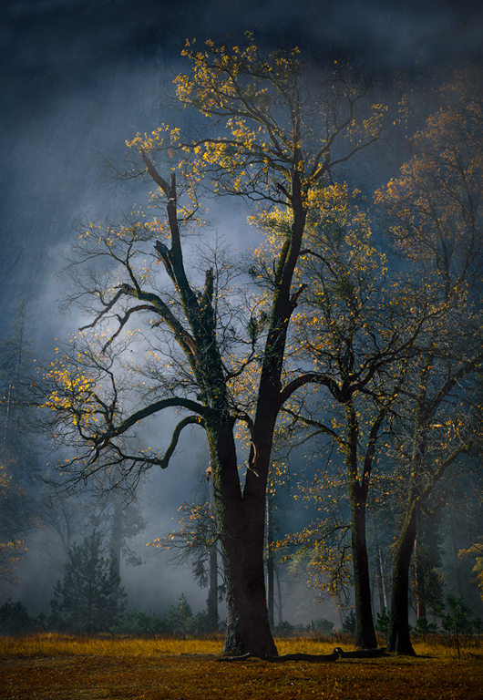
I love the mood of this image. I experience a mystical feel when I look at it. The light coming through on the leaves bringing out the bright yellow and orange with the blue misty background is lovely. Blue and yellow are complimentary colors and look great as a color palette.
It is always up to the artist how they crop an image. Cropping is such a personal taste and it very subjective. It plays a major role in where the viewer focuses. As I experience the image my eye goes straight along the tree trunks to the top of the image and then just stops abruptly where you cropped it. In the original this does not happen to me.
I hope you are OK with me trying my hand at cropping and seeing what could be done. I always like to leave room around my subject so that it can breath. I agree with you that the blue sky is distracting and does not complement the mood of the image. I found it very difficult to decrease the blue in the sky or take attention away from it so in the end I tried cloning out the sky and I liked this the best. I take the view that we are artists and change our images in many way including the use of filters etc. so I view photoshop as just another tool to adjust an image. Here is what it looked like and is in no way done perfectly. If it were my own image I would have spent more time to make it look completely natural. I also increased the saturation and vibrancy of just the yellows and oranges in HSL section of Lightroom and put a vignette around the.
Many photographers do not like changing an image to this degree and that is OK too. It is totally up to you how far you want to take it. |
May 8th |
 |
| 96 |
May 20 |
Comment |
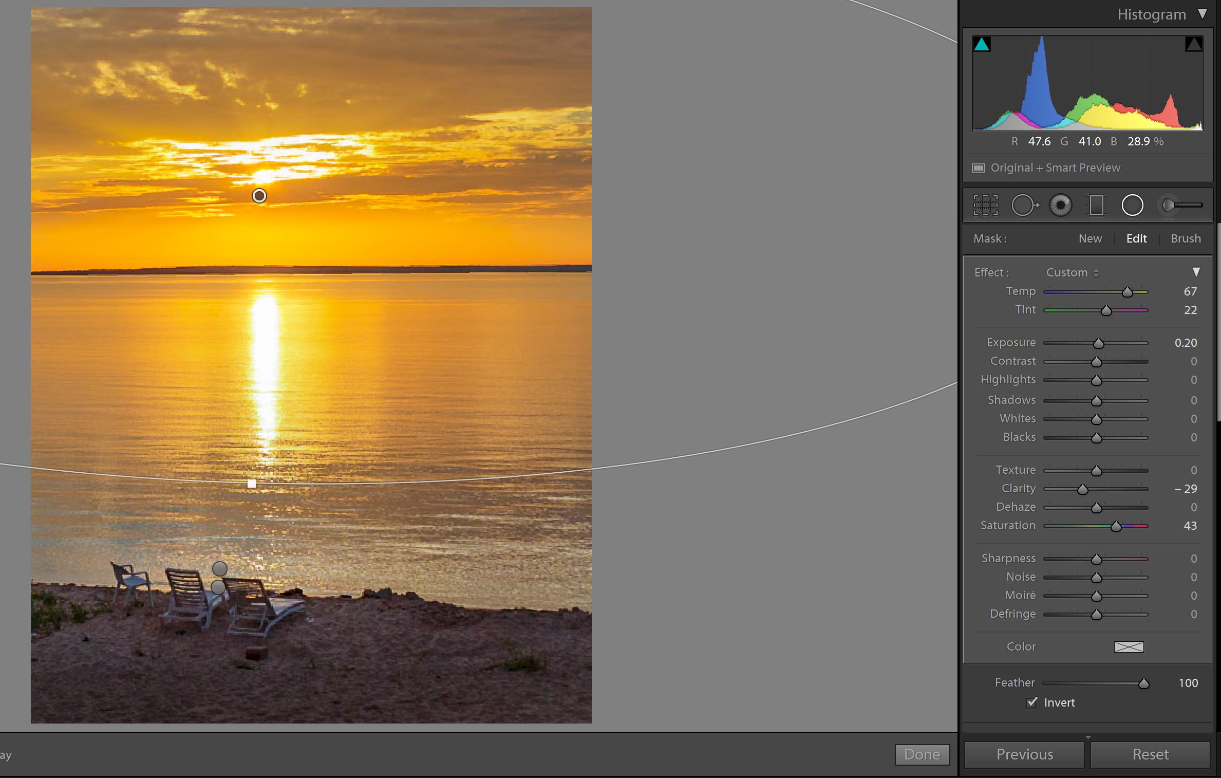
I really love the sunset, it is beautiful and it looks very serene. The sun looks great, not over or underexposed.
Looking at this image and experiencing it I have a few thoughts.
My experience of this image is that the chairs and the sunset are the main subject. I find the grass/trees and boat to be somewhat distracting from the main subject with my eyes being drawn to them and away from the sunset and the chairs. Was there any other composition that would have removed these from the image. Possibly a portrait orientation.
I agree with Larry that the blue at the top of the photo and the sand at the bottom could be cropped out.
I am not sure if you had a tripod but maybe a longer exposure to smooth out the high frequency texture in the water would have added a more serene look to the water.
To me the white balance appears a bit too yellow as well making it look a little un-natural. Possibly correct the white balance of the entire image and use the radial circle in lightroom to enhance the yellow of just the sunset.
|
May 8th |
 |
5 comments - 5 replies for Group 96
|
7 comments - 6 replies Total
|