| 96 |
Apr 26 |
Comment |
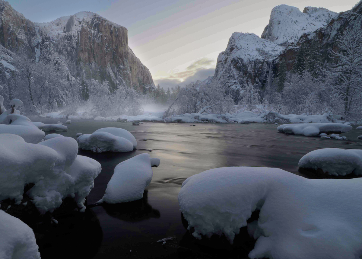
Hi Mike. I am envious of the snow you found in the Valley. It doesn't last long, so you were fortunate to have these conditions, and I think made good use of them. Lovely image!
It works very well as a B&W, though I am not sure I would have been so quick to take it that direction. There is warm color in the reflections, the low distant sky, and most importantly the cliff walls on the left. I think that warmth could be dug out further and would wonderfully contrast the cool blues that exist elsewhere. But again, it is hard to go wrong with a B&W rendering of fresh snow in Yosemite.
Couple small things to maybe think about. You have some posterization in the sky. It is there in the original color version as well. It is probably from the conversion process to get to sRGB and <1MB, but it is worth looking at. There are what I'd call posterized colors in the snow foreground of the color original as well. It is not "noise" in the usual sense, since the physical scale is too large - it is coming from quantization granularity somewhere in your workflow.
Also, the sky is pretty uniform "white" in your B&W version. But there is plenty of "blue" in part of the sky in the original. So, it seems like there is an opportunity to darken part of the sky and add some variation with the right B&W conversion.
Finally, I might consider cropping a little differently. It is powerful if you can create "leading lines" of sort from the corners (or near corners). You have this in the upper left corner of your B&W version (the cliff / sky boundary leading down away from the corner). With a different crop, you could create the same in the upper right (again the cliff edge), and with I think at least one of the lower corners using the foreground snow covered rock elements. Doing this may leave you with a non-standard aspect ratio, but up to you whether that matters.
Tried some of this with the original color image in the attached below. I obviously can't fix the weird colors / posterization. Once that is in, it is hard to take out, so one needs to go back to before it got introduced.
|
Apr 4th |
 |
| 96 |
Apr 26 |
Comment |
Hi Bruce. I agree that it is a very lovely image - very painterly. To me the image is all about the house, with the wagon wheels giving us context about the house. And I too like only showing part of them, so that the house remains the focus.
I like the colors, although the image (all of it below the sky) feels bright given the dusk (or dawn) sky colors. I think darkening the image (other than the sky) a bit overall would make it feel more consistent and connected. Darkening the foreground further would help enhance the 3D feel and would strengthen the house as the subject.
I also feel you could do some cropping. While the left side is interesting with the wheels, there is less happening on the right, and inclusion of so much there puts the house very centered, which is more static. I also am not sure you need so much sky - a little shows us the beautiful colors without the sky stealing the show from the house.
I tried these changes in the image below. To me it preserves the lovely elements you have combined while strengthening a bit how they play together. But just my thoughts. Others can weigh in, and I can't know how it impacts what drew you to the scene.
|
Apr 4th |
 |


