|
| Group |
Round |
C/R |
Comment |
Date |
Image |
| 96 |
Mar 26 |
Reply |
I like that one a lot too. I'd burn the top edge and top of the left edge to hold the viewer in the frame there. But otherwise a great image. I really love how the trees on the left lean in.
I did a lot of waterfall photography, but mine were more close in images. I'll likely post some of them in the coming months. |
Mar 24th |
| 96 |
Mar 26 |
Reply |
Kenneth, I still think something is going on when you paste the image into a Word document to send it to me. I say this because the resolution is well below the 1200 pixels on the long side allowed by the Group. So I feel like MS is compressing things further. Can you just attach it to an email this coming month vs. putting in MS Word and we see how that works? |
Mar 24th |
| 96 |
Mar 26 |
Reply |
I just got back from Yosemite. Of course, not timed for Fire fall (but for minimal crowds, or that was the hope). But I did look at Horsetail falls - it wasn't there! It has already dried up. |
Mar 24th |
| 96 |
Mar 26 |
Reply |
That is the approach I previously used in PS for dodge and burn. Now I create 2 "exposure" layers, one for dodge and one for burn, set the layer masks to black and then paint white on the mask where I want the effect. It has the advantage that I can set the layer blending mode of each to luminosity so that the dodge/burn only effects tonality and not color. I try to separate the tonality and color editing as much as I can. Otherwise I find sometimes the dodge and burn will leave me with subtle local color shifts that are problematic to clean up. But more of a problem with more substantial dodge/burn than light subtle changes. |
Mar 6th |
| 96 |
Mar 26 |
Reply |
Thanks Mike. On the high ISO, it was to freeze the falling snow (hah! like it wasn't already frozen). I needed a fast shutter speed, something like 1/1000 sec (settled on 1/800). Also, at 114mm, I needed to stop down to provide some depth of field. I chose f8, though I'd rather have been at f11 or even f16 to be safe. But it was a compromise to keep the ISO from getting too high and giving me more noise. Granted in a scene like this the DOF softness is likely not going to show if not perfect, and for that matter the noise won't either unless it's really terrible. Anyways, the shutter speed and aperture choices, together with the more dim light in the storm pushed me to ISO 3200, and even then I was not exposing to the right.
I like what you've done in your version. It looks like more than a vignette - it looks like you've darkened a little selectively to give variety. Is that right? I did a little of each - I had a very weak vignette and I also darken here and there for some variation. But I think your version shows I should go a little further.
|
Mar 5th |
| 96 |
Mar 26 |
Reply |
All good points. I do like the upper fall, which is why I aimed my comments at that version. But the first version is definitely a nice image too.
You said you were there last month - I meant to ask, were you there for the Horsetail Falls Fire fall event? |
Mar 5th |
| 96 |
Mar 26 |
Reply |
Thanks Rick. Yes, I purposely tilted the camera when I composed to get the otherwise vertical trunks to lean to the right and contrast the smaller bended trees leaning to the left. |
Mar 3rd |
| 96 |
Mar 26 |
Comment |
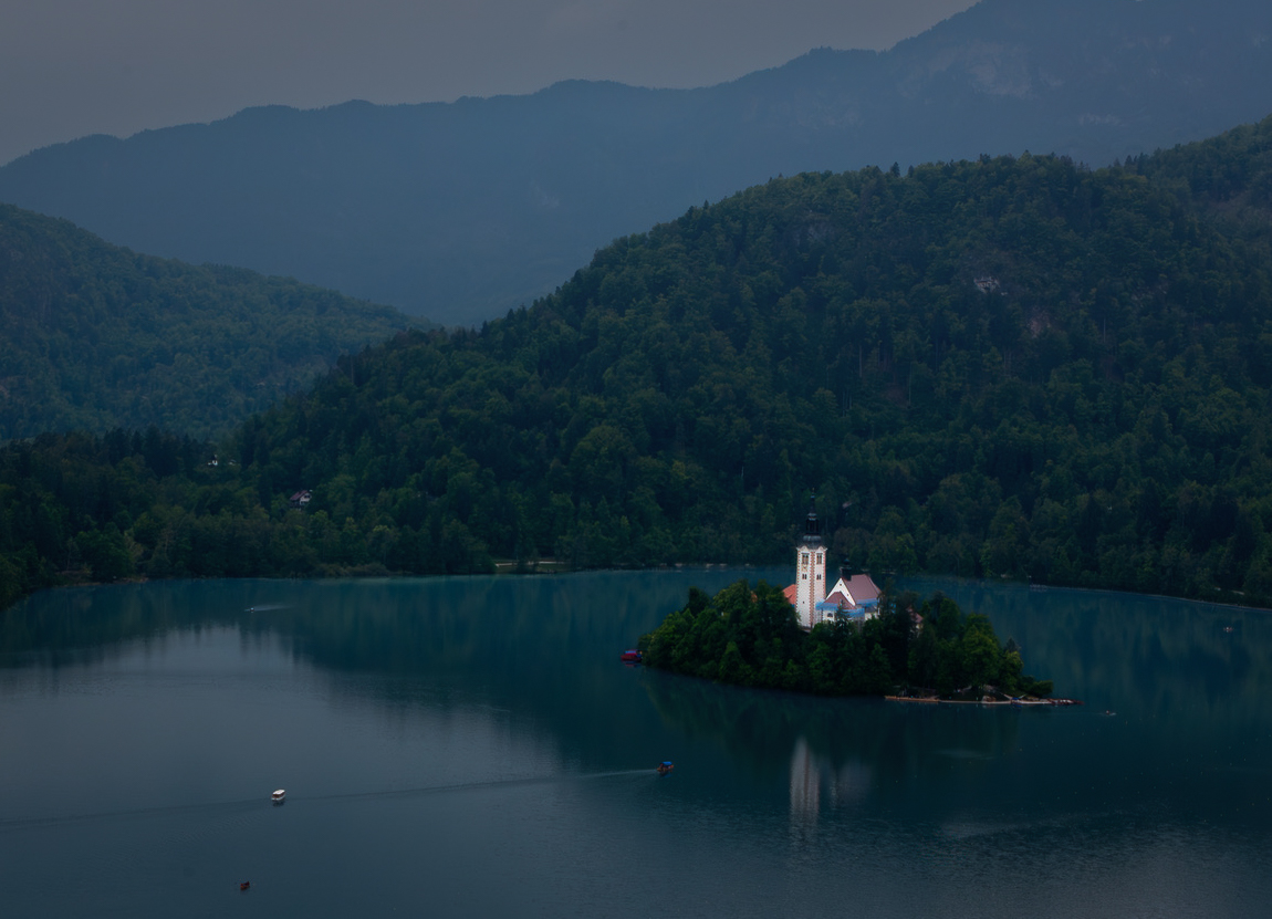
Hi Bruce. It does indeed look like a rainy day, but that can't ruin the beauty of this location - looks like a wonderful spot. I love the layers you've captured in the mountains behind the lake, and the varied shades of green and turquoise throughout.
If I were looking to strengthen the image further, I might lean into the rainy, overcast mood. Perhaps darken it down a bit, add a little more haze in the background, darken the bright sky reflections in the foreground, etc. Compositionally I might also take a little off of the left side to improve the balance in the background and to put the lovely little island and its building closer to the third. I'd also lighted that building - it is the star of the show, pushing back against the gloominess. Overall maybe something like the attached.
Lovely spot in any case, and a nice image even without any other edits.
|
Mar 3rd |
 |
| 96 |
Mar 26 |
Comment |
Hi Kenneth. This is a nice near/far composition, with the trees in the foreground and the mountains in the back. I love the cotton ball clouds that you've found to give the sky interest. Overall it is a nice scene.
As Rick mentions, it seems from the trees that the horizon is not level - that is easy enough to fix if you want with a rotated crop. I would also crop out the bare earth in the lower left as I don't think that is helping the image and is "different" enough it tends to draw the eye there. You'd be left with a pano aspect ratio, but it is a scene that works nicely with a pano which emphasizes the mountain range. Given the mid-day light, you might consider if this would work better in B&W, but that would be your preference.
I am curious, how much is this cropped from the original image? I ask because this is a 0.14 Megapixel image, and I think your camera starts as 20 Megapixel, so either you are doing a very extreme crop or something else is going on in which you are loosing resolution along the way.
|
Mar 3rd |
| 96 |
Mar 26 |
Comment |
Hi Rick. A beautiful image - the textures, the combination of warm and cool colors, and a very balanced visual design all make this work very well. I also admire how you presumably used the tilt shift to get everything perfectly rectilinear in camera. One can really feel the passage of time in the structure. You've suggested a history in the still frame which to me is what the image is really about.
I'm curious why you biased the composition to include more at the top vs. including more at the bottom - the front edge of the door step for example. Was it a visual balance issue, or did more below what you are showing us get "messy" or destroy the wonderful blue "framing"?
I too am seeing a bit of decomposing when I look in the mirror. I think my mirror must be getting old.
|
Mar 3rd |
| 96 |
Mar 26 |
Comment |
Hi Pinaki. Your image really conveys how amazing a place this must be. The high altitude, the sense of truly being out in the wilderness - all that comes across. I assume maybe you photographed this from a bridge? Else your feet must have been very cold.
I particularly like the ice on the right hand side which snakes off into the background with the open water next to it in contrast. I also love the color contrast - the warm grasses with the blue sky. Finally, I think the cloud that sits low in the notch between the hills seems to me to have real personality.
I think it is a pretty amazing image - I can see why you consider it one of your all time favorites. I'm curious, are there things about it that you don't like? How can we help?
|
Mar 3rd |
| 96 |
Mar 26 |
Comment |
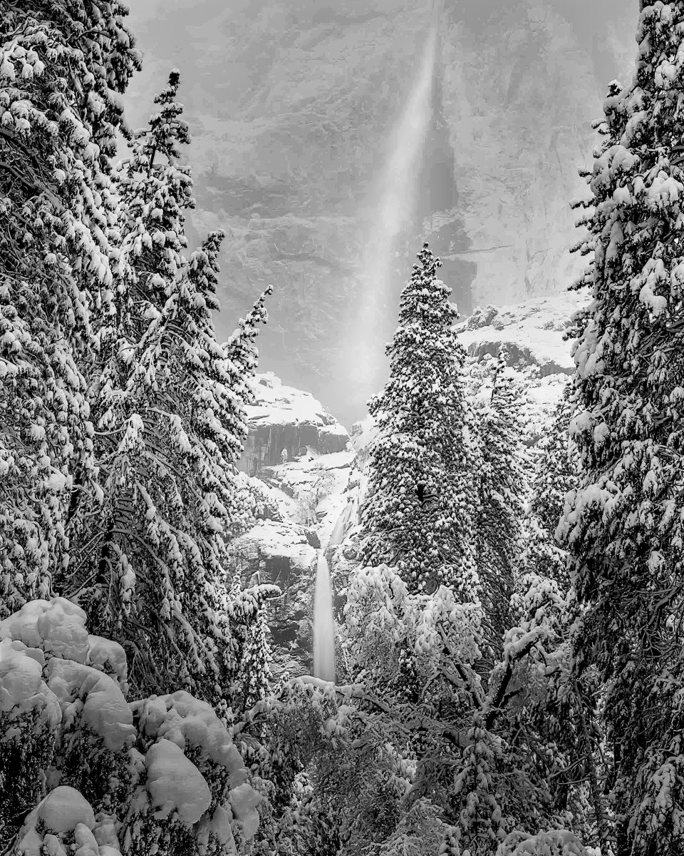
Hi Mike. I am envious - I have been to Yosemite probably a half dozen times in the winter, and am yet to be there when it snows. I am sure it provided many, many great photo opportunities, and I'd love to see some of the others in coming months.
I am curious - where is this taken from? It all looks very different with all of the snow.
I am not sure how I feel about the strong blue cast. I grapple with leaving color cast in some of my own photos. It can help establish mood and it looks wonderful at first glance. But it tends to obscure detail and I am told it can make it so a viewer tires of an image fairly quickly. There are no rules, and from your title, I suspect you are fairly attached to the blue tone. Myself, for this image, I might prefer the B&W.
You mention that you think the composition is not great - I think it is not bad. You have the trees nicely framing the sides, and there is a nice near/far relationship with the detail in the foreground and softer, distant background. If you were photographing it again, you might take one big step to your left to better separate the falls from the tree in the center.
I think the image is at its heart about the falls, and I think there is more you can do to bring that out. I'd shape the light a bit more with local edits - darken the surrounding trees, brighten the falls and the central region, darken the top and bottom to hold us in the center, etc. I might also crop from the top and bottom since the fall is small in the image, so "zooming in" a bit also would help to give it greater dominance. I did all of that to see how it would look in the image below, which I also took to B&W. Just some thoughts ...
|
Mar 3rd |
 |
5 comments - 7 replies for Group 96
|
5 comments - 7 replies Total
|


