|
| Group |
Round |
C/R |
Comment |
Date |
Image |
| 96 |
Feb 26 |
Reply |
I find I have very similar challenges - leaving images too dark and dialing in a strong composition. On the first I often make a practice now getting an image to where I think it is done, but then brightening it and seeing if I like it better. I find I often do, although too much can destroy mood. It is a delicate balance sometimes between preserving the drama and mood and opening up the shadows enough that the detail sings.
On composition, I don't think one is ever done developing stronger visual design skills. I think that is where the 10,000 hours really comes in. I've taken to sometimes "practicing" - just taking an iPhone and working a scene (sometimes for 30 min), making small changes in where I stand, how I frame, how I zoom, etc. Since it is "practice" the pressure is off - I am not trying to make a keeper image, just play around. I find this play particularly effective if done with a forest scene, which is always a challenge in sorting out the chaos. I am continually amazed what a very big difference a very small change can make.
Anyways just some thoughts. If you have approaches, particularly to improving your composition skills, I'd love to hear them. I have a long way to go on my 10,000 hours.
|
Feb 25th |
| 96 |
Feb 26 |
Reply |
Michael, thanks for showing this. Topaz indeed did a very nice job.
I find Topaz Sharpen and Denoise can sometimes truly save images when nothing else works. But other times it doesn't work as well and often introduces weird artifacts. So a bit hit or miss. I admit my versions of both are not the latest, so I am sure there are improvements. In any case it is always good to see examples where the tech really shines. |
Feb 25th |
| 96 |
Feb 26 |
Reply |
Thanks for the kind words. And I am glad the ambiguity is appreciated. A different look for me, but I am moving more and more in that direction I think.
I am terrible about titles. I keep changing titles of images over time. I am not sure I am really supposed to do that, but until I sell a piece, I think it is my choice to keep changing names if I like. On this I've explored both "Storm" and "Falling Sky" as titles. I think the latter brings in more of the environmental theme. |
Feb 23rd |
| 96 |
Feb 26 |
Reply |
Thanks Michael. Ideally I'd prefer that the viewer not identify that it is upside down. The point is more that it stand as the end art piece, not how I got there. Of course glad to share that with interested fellow photographers. :) |
Feb 23rd |
| 96 |
Feb 26 |
Reply |
Thanks Rick. You are obviously on to my upside down thing. |
Feb 23rd |
| 96 |
Feb 26 |
Reply |
Thanks. Yes, it is a little abstract. It might be good that it is not immediately decipherable, but then again, maybe not. |
Feb 23rd |
| 96 |
Feb 26 |
Comment |
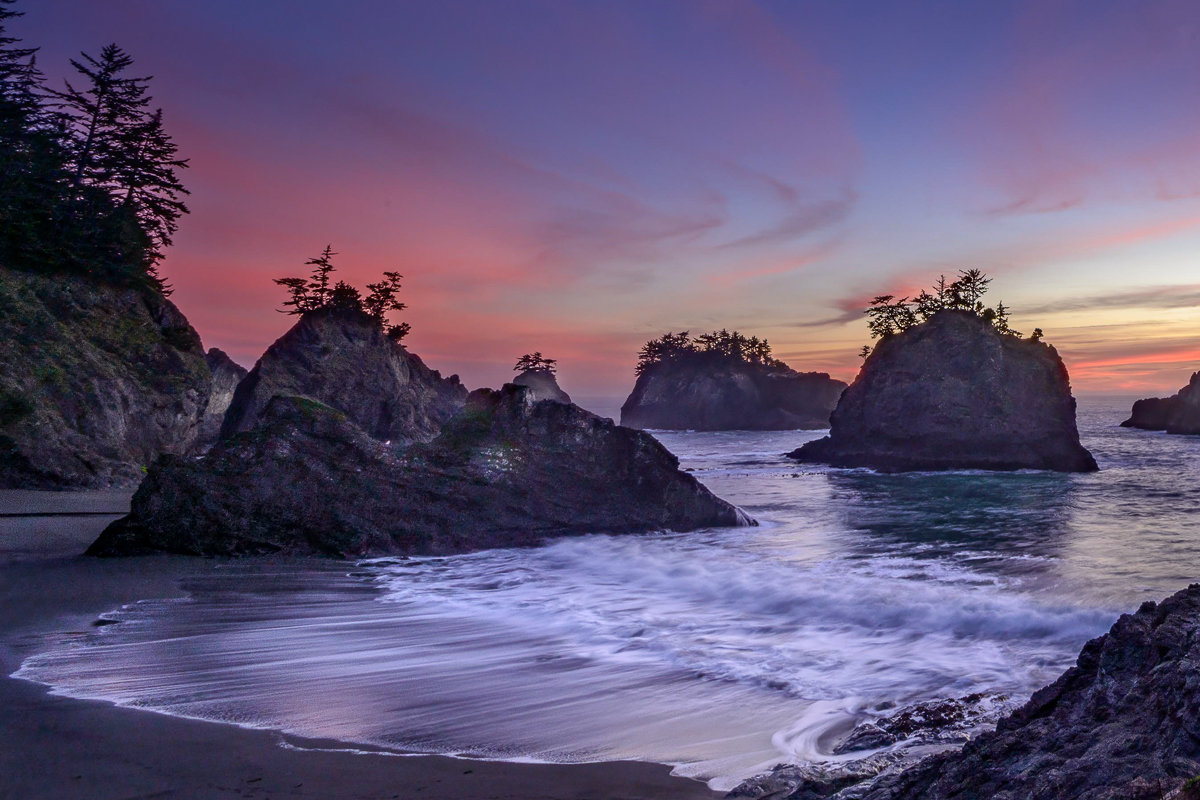
Hi Michael. Again, welcome to the group! This has the feel indeed of a "secret" location - the higher ground on the left and the foreground on the right side give a feeling, correctly I think, of this beach being enclosed on three sides. The colors are obviously marvelous as well.
I feel like the image is a little dark, though that could be my particular screen. But I'd like to see a little more detail in the shadows. You also have so many lovely things in the image, I have a little difficulty deciding where to look. My favorite is the wash coming into the beach. Your long exposure has done a great job bringing out lovely textures in the water.
So, just as a thought, I might explore a crop which brings more focus to that water. I took a shot at that below. I brightened the shadows as well as the image overall, but I particularly brought out the whites in the foreground water (and darkened the sand in contrast). I also gradient darkened the sky to hold the eye in the frame better at the top. Then I increased the saturation in the beautiful reds, but I did that in a strange way - I went to the calibration panel in LR and increased the green saturation. For reasons that are difficult to explain, that brings the saturation of the reds/magentas up, but does it with a lovely "glow".
Anyways, just providing some suggestions. It is a lovely image. And it sounds like you have a number of compositions from that evening, so a lot to play with.
|
Feb 23rd |
 |
| 96 |
Feb 26 |
Comment |
Hi Pinaki. I love the glow you captured in the smoke on the right side. Shooting volcanos is a lot harder than it looks - there are often high dynamic range challenges, a need for fast shutter, and a resulting noise issue as the ISO is cranked up to stop the movement while having a lot of low lit areas to deal with. I think you've managed that all well here, although there is a bit of noise visible. I also feel like you have room to darken the blacks more.
I like the right side of the image more than the left. Crop perhaps? Right now I don't have a great idea where to look. But again, you've captured the scene well technically, so there is a lot of room to experiment with tighter framing, etc.
I'm curious where this was photographer from - is from the visitor center, or down the end of west crater rim drive? I ask because I was there for an eruption a decade ago - it looked very different. Constantly changing I suppose.
|
Feb 23rd |
| 96 |
Feb 26 |
Comment |
Hi Bruce. Very nice wildlife image. You have kept detail in the dark coat of the bear - it is easy to loose that in an image like this as matrix metering often makes the animal too dark. You've also caught the animal in mid stride which is great.
I might clone out the branches in front of the bear and then crop in tighter if you haven't cropped a lot already. Make it simpler and about the bear. The background patterns in the water behind the bear is really nice. That plus the bear is a nice image.
I had to laugh at "looking for bears". I look to not see bears. My greatest fear is a bear coming up behind me while my head is under a 4x5 dark cloth.
|
Feb 23rd |
| 96 |
Feb 26 |
Comment |
Hi Kenneth. I love the colors in this image - the warms oranges contrasting the blues in the sky and particularly in the distant hill. I also think it is a well balanced composition. The only element I might contemplate adjusting is the bright bit of cloud in the upper left corner, which tends to pull the eye up to that corner.
On the blurriness, I pulled it into Lightroom, applied Super resolution, and then applied some sharpening. I think that helped. The other trick though that you can use is to add grain. The added sharpening brought up the noise, so I leaned into that a bit and added a fair amount of grain. Partly that hides the noise. But grain can also give an image a sharper look. With what I've added it is a creative effect perhaps beyond that sharpness. But the combination of all of this I think helps a lot take the blurriness away. Which btw, at 1/800 sec I don't think is coming from motion as much as just the effects of cropping very small to frame this as you wanted. |
Feb 17th |
 |
| 96 |
Feb 26 |
Comment |
Hi Rick. Another very creative symmetry composite. I love the very pleasing S-curve in the edge of the pool which the symmetry has created. That and the glow of the lights gives it a very calm feel.
I wonder if you have explored breaking the symmetry you are creating. My first thought was wouldn't it be interesting if there were a few people sitting in the seats, but where the people were not mirrored. It would really make one stop and think about what is going on. You could also maybe accomplish a similar thing by changing the color of something (one of the arched structures, or some of the chairs, etc.) Again, to me it introduces an interesting curiosity.
But the pure symmetry is of course lovely as you have it. So, just thinking out loud as it were.
|
Feb 17th |
5 comments - 6 replies for Group 96
|
5 comments - 6 replies Total
|


