|
| Group |
Round |
C/R |
Comment |
Date |
Image |
| 96 |
Jan 26 |
Reply |
Thanks Bruce. It was indeed cold that day! |
Jan 29th |
| 96 |
Jan 26 |
Reply |
Thanks Pinaki. I appreciate your references to Tagore which you've made a couple of times. I will have to spend some time reading his poetry. I do think there is a magic when the right words are combined with an image - it amplifies both. Eventually I will do a book and provide myself an opportunity for such mixed media expression. But for now, again, really appreciate the poetic references. |
Jan 29th |
| 96 |
Jan 26 |
Comment |
Interesting. I suppose that speaks to only buying as much castle as you can afford to maintain. :) |
Jan 29th |
| 96 |
Jan 26 |
Reply |
Thanks Rick. Yes, how does it go - the best camera is the one you have with you... |
Jan 12th |
| 96 |
Jan 26 |
Reply |
Thanks Ken. Required almost no editing as well. The tonalities were just there. |
Jan 12th |
| 96 |
Jan 26 |
Comment |
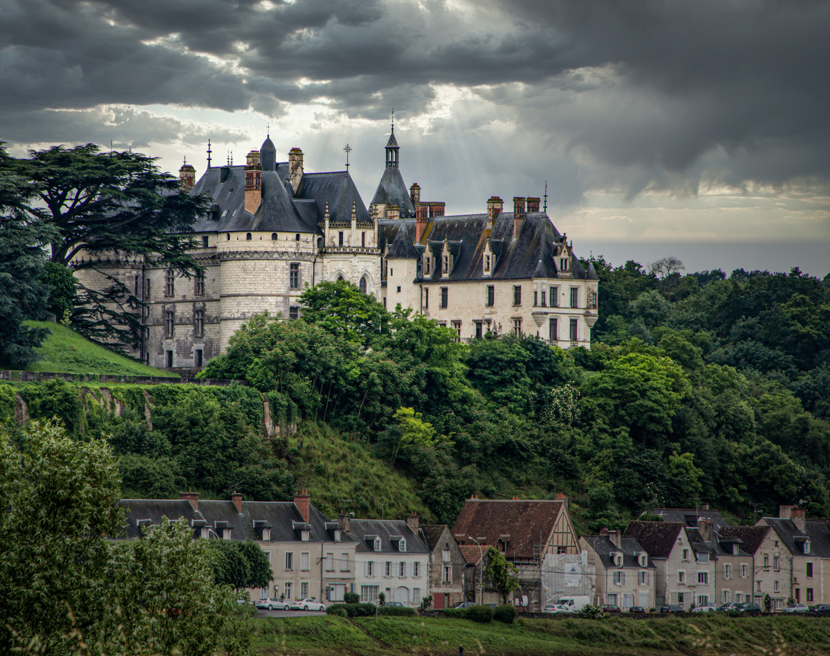
Hi Bruce. I like the metaphor that Rick is raising - the Chateau towering over the more modest homes, and a storm brewing ... that adds emotional impact to the image (whether you intended that metaphor or not).
If you were to chase this metaphor, I'd edit so the Chateau is brighter than the homes below it, and also stronger in contrast and color. Even without the metaphor I'd probably do that, since the Chateau is your subject or focus.
I would also do a crop from the left. I don't think you need all the trees over there, and there are some bright spots in the lower left where things are showing through the trees.
I made some of these changes in the version below. No matter the story this is a very well composed and dramatic image. Well done!
|
Jan 10th |
 |
| 96 |
Jan 26 |
Comment |
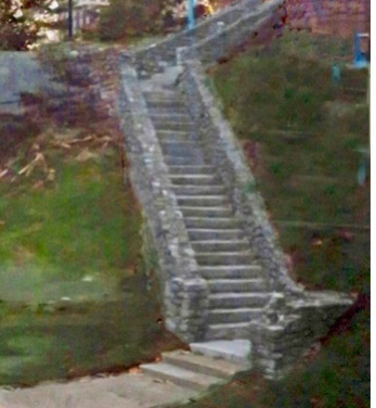
Hi Kenneth. The graphic form of the staircase, which makes a very nice leading line, is very well seen. I think it makes an even stronger image if you crop it to just the stairs as I have done below. This simplifies the image, but it also creates the illusion that the path of the stair continues at both the bottom and top - that you've just show us a piece. Emotionally that is a little stronger, like some story of endless uphill struggles. I doubt you had that in mind, but it doesn't matter - the key is giving the viewer something that invites them to create their own story.
I think the green looks fine - I would not saturate it further (in fact I might back off a little so it doesn't try to compete with the staircase which is your subject). It is different shades on the left and right, but I am not sure that bothers me.
|
Jan 10th |
 |
| 96 |
Jan 26 |
Comment |
Hi Viren. You continue to find some really nice graphic forms in the architectural images you've presented, and I'd say this one is a favorite for me. The sweeping curve from the lower right meeting the leading line from the lower left is very powerful. Clouds are just right. And since I have a preference for color vs. B&W, I love that you've left this one in color. I am not sure I can offer any improvements - maybe a slight edge darkening to hold us in the frame at the top? It's a wonderful image.
I am curious about the pink reflections in the glass. Was there such light, or is that some effect of the glass shifting hues?
|
Jan 10th |
| 96 |
Jan 26 |
Comment |
Hi Rick. We will have to do a whole series of upside down photos!
I really love the painterly effect. Printed on a watercolor paper this would look amazing. Were you to do that, I might just clean up a couple little details - the bright green "dot" on the lower edge in the left corner and the overly bright "white" buildings. I like the vertical "light streaks" in the water above the buildings, but I might make the one in the center a little more subtle (and maybe the brightest of the ones at the right).
Very well seen and edited. The water has just the right amount of ripple to make this really work.
|
Jan 10th |
| 96 |
Jan 26 |
Comment |
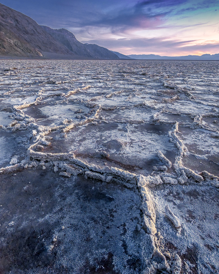
Hi Pinaki. This is a wonderful image of the legendary salt polygons. I have to admit, I've been to DV several times and have yet to find an example as good as this, so I'm jealous!
While it is a strong image as you've presented it, to me there are opportunities to improve the composition and look - depending of course on what message you are after. I tend to a more intimate look, hence the crop I suggest below. I've done a few things to give a path that my eye wants to follow and explore the lovely detail and texture in the salt ridges. By cropping there is a more definitive path and the viewer know which ridges to focus on. Shaping the tonality with some dodge and burn helps bring that out further, as does warming up the "ridge line" of the salt which is receiving the last warm light of the day. I've also simplified the colors a bit using the point color tool and lower the variance of the blues and purples to pull them all more to blue (and I did something similar with yellows and oranges). Your original had a lot of spectrum of colors, and my goal was to simplify them to be a little more harmonious.
All of this is just to give you some ideas. You have to decide what direction to take things, but I think there are opportunities for more visual drama shaped to whatever story or feel the image hold for you. It is a wonderfully seen image.
|
Jan 10th |
 |
6 comments - 4 replies for Group 96
|
6 comments - 4 replies Total
|


