|
| Group |
Round |
C/R |
Comment |
Date |
Image |
| 96 |
Dec 25 |
Reply |
Thanks Pinaki for the kind words. I have not tried B&W though I go back and forth between this and even more muted colors. I think the blue/pink contrast is important to show the fracture, but beyond that, I feel like the colors should be very weathered.
|
Dec 26th |
| 96 |
Dec 25 |
Reply |
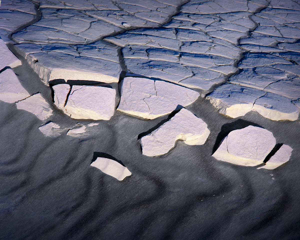
Thanks Kenneth. Yes, exactly - the perception of depth seems off, doesn't it. It is all from just turning it upside down (see below)! |
Dec 26th |
| 96 |
Dec 25 |
Reply |
Thanks Rick. No, I didn't compress anything, I just turned it upside down. The original is below for comparison. |
Dec 26th |
| 96 |
Dec 25 |
Reply |
Bruce, if you saw the world coming together you obviously have a more positive outlook!
I show the change below - I turned it upside down ... |
Dec 26th |
| 96 |
Dec 25 |
Comment |
Ok, here is the reveal on the significant change - I turned it upside down! The original as made is show below.
I think there is a tension that comes with the upside down one that adds interest. The original is ok, but pretty vanilla feeling to me.
|
Dec 26th |
 |
| 96 |
Dec 25 |
Comment |
Hi Bruce. Very interesting history - you do a great job of combining picture and words to really communicate the past.
Visually, I like the S-curve of the trench which leads us back into the image. I also like the small bright vegetation in the foreground which echoes the green forrest in the background, and similarly helps to lead the viewer from front to back.
I might think about cropping some from the bottom. You have a depth of field problem in the very front which is a little blurry. But I also think it is a stronger image if the lovely foreground greens are closer to the bottom edge. With the forrest, the image is then "bookended" with the green tones.
|
Dec 26th |
| 96 |
Dec 25 |
Comment |
Hi Keneth. I love the minimalist nature of this image. The repeating horizontal lines in the terrain and fencing bring a pattern which gives a lot of depth and interest. The warm colors in the foreground and mid ground also work well with the cool tones of the mountains and sky. I particularly like the foreground fence - its gentle undulations and how it is echoed by the piece of fence back by the building. The later helps move one through the frame from the foreground back to the building.
I think you could perhaps crop the sky a bit. There is a little too close to 50% warm foreground and 50% cool background. If it were more like 2/3 to 1/3 I think the image would be stronger.
As to sharpness, I think the question is whether it is really sharpness you are after or more pixels and a bigger image. Since you are cropping, and I suspect quite a bit, the easy but expensive answer is a longer focal length lens so you have to do less cropping. But the other answer which is perhaps a little less expensive is one of the now excellent tools for up scaling images to higher resolution. Lightroom has a "Super Resolution" capability now that can give you 2x in each dimension in terms of pixel count. There are also dedicated tools like Gigapixel AI which can probably even go further in terms of improving the number of pixels and hence resolution. I don't know what software you have, but maybe the first thing to try would be whatever you can get access to inexpensively. I think some of the software has "free trials" you could play around with.
|
Dec 26th |
| 96 |
Dec 25 |
Comment |
Hi Rick. The compositing is very good. At first glance it was certainly not obvious that this was "composite".
I know you've expressed a few times your love of symmetry. I wonder, have you explored taking something very symmetrical and then introducing just a little bit of asymmetry? I am always looking for ways to introduce subtle tension - the kind that makes the viewer stop and think about what is pulling at them unconsciously. Curious if you have explored that and have lessons learned.
|
Dec 26th |
| 96 |
Dec 25 |
Comment |
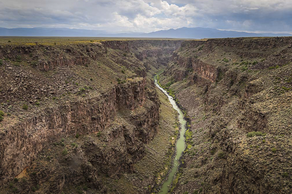
Hi Pinaki. There are a bunch of things I really like about this image. The river is obviously a powerful leading line, but I equally like the lines leading in from the lower left and right corners. On the river, I very much like how you've captured strong reflection just before the river makes its final turn to disappear from view. There are also great atmospherics in the distant portion of the canyon and the mountains peeking above the horizon line which give depth.
Overall the image feels a bit flat though. I am surprised you left it so - was there a story or reason that led you to do that? I am thinking even if you want the muted colors (which are not a bad choice), you could still do more with tonality. I also find that the interesting part of the image for me is the center region. I feel like the 14mm was too wide and captured a lot which - again to me - is less interesting. With these two things in mind, I made the version below.
Again, the look depends on what message you are trying to convey. Could you share your thoughts on that? Maybe there are ways to strengthen a different message in a different way.
|
Dec 26th |
 |
5 comments - 4 replies for Group 96
|
5 comments - 4 replies Total
|


