|
| Group |
Round |
C/R |
Comment |
Date |
Image |
| 96 |
Oct 25 |
Reply |
Thanks Pinaki. I think all the votes are for the "original" labeled one. I've tweaked that one less, so will try to boost the red and orange/yellow as you say.
The main image is "different" - I was trying to prove to myself that flat light can still work for a more "abstract" like image. But I don't think it is dialed in to work, at least not yet.
|
Oct 17th |
| 96 |
Oct 25 |
Reply |
Thanks Viren. Yes, the vote seems to be for the "original". Light does matter, and that is definitely the one in better, more dramatic light. |
Oct 17th |
| 96 |
Oct 25 |
Reply |
Thanks Rick. I think I agree I like the "original" labeled one best - it is a more conventional landscape in contrast, etc. The main image is more of a trial of something different which feels like it could work but is not quite dialed in. |
Oct 17th |
| 96 |
Oct 25 |
Reply |
Thanks Kenneth. When you say the trees dominate, you mean the evergreen ones? I will try dialing up the red's and yellows and see if that balances things a bit more. |
Oct 17th |
| 96 |
Oct 25 |
Comment |
Hi Bruce. Great image - I love the mood you captured with the fog, as well as the perspective with the lighthouse looming over what indeed truly looks like the end of the known world. I might darken the image a bit overall (maybe except the lighthouse itself) which I think would add to the ominous story it carries.
I've had trouble with banding in the past in conversions. The issue I believe is that jpegs are 8 bit color vs the 16 bit color used in LR or PS editing. If you are converting the color space from something like AdobeRGB to sRGB at the same time you are exporting the jpeg, that can further exacerbate the problem. The best approach is to go back to the 16 bit version and introduce enough gradation in tone / color across the affected region that the banding doesn't happen when converting to 8 bit. But the result may not be the look you really want. I don't know a magic, general solution to this problem. If someone out there has one, it would help me too.
|
Oct 17th |
| 96 |
Oct 25 |
Comment |
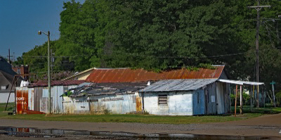
Hi Kenneth. This is another interesting train related image. I enjoy seeing pieces like this of the "project" you have going of images from your train travel. To me, in much of it, there is a theme of not only change, but also structures and locations that have been abandoned to time. I hope you find an opportunity to present a collection of these images together as a project, because I think there is a strength in the threads that weave through them.
Since your project as a whole seems like it is going strong, on the individual images you post, it might help us provide you feedback if you pointed to particular aspects or challenges where you are looking for help, suggestions, or opinions. We want to respect your style and approach so guiding us a bit to what you'd like feedback on would be helpful to us, and presumably also more helpful to you.
As an example, in this image one conventional thing I might do is darken the background around the structure so as the make the structure itself pop out a little more. I've done that in the attached below (and Lightroom has a mask for the background that works pretty well making this pretty easy - I am not sure whether PS Elements does or not). Again though, that might be the wrong edit for you - if you are trying to show time melting these sorts of buildings into the background, then the last thing you might want is to make it stand out more. So context is important. |
Oct 17th |
 |
| 96 |
Oct 25 |
Comment |
Hi Viren. This is another really strong architectural image - great perspective, and really good use of tonality. I love the "texture" of the repeated window pattern.
I think you have also done a very good job creating just enough "unbalance" (or asymmetry) in the image to give tension. Two things are contributing to this. First is that the vertical in the center is slightly off of vertical. I would not correct this - I think it is helping generate the tension I am referring to, and it is far enough from vertical that it will not be taken as a mistake. Second is the cloud. If one does the usual "put your thumb over it" to see how the image would look without it, I would say the image is far less strong, again, because the cloud is creating tension. I think it is important that the cloud cuts the edge as it does because this de-weights it a little bit. Were it fully contained in the frame it would be distracting. My only suggestion might be to try darkening the cloud just a bit. Again, you are trying to achieve the subtle balance between it creating tension and being distracting. You are very close with that now, but de-emphasizing it a bit might dial that in even more perfectly.
Hope that helps.
|
Oct 17th |
| 96 |
Oct 25 |
Comment |
Hi Jim. I love the abstract image you've created here. Dunes are a great place to play around with abstracts like this. You've either walked out a ways or otherwise found a place without footprints which can be hard at the Mesquite Dunes.
The only thing I might suggest is to add a little local contrast (texture, clarity, etc.) to bring out some of the areas where you can see beautiful ripples in the sand. I think you can make them a little more visible.
Great image.
|
Oct 17th |
| 96 |
Oct 25 |
Comment |
Hi Rick. I love the colors you have gotten out of the IR capture. They are realistic enough that it still appears photographic, yet with a very fine art flare. Trying to imagine what the standard visual light photo would have looked like (maybe you took that too), I think this has more interest and appeal, though to be fair it is well composed and that would be clear at any wavelength.
I'm hard pressed to see anything I would do to enhance the image further. Perhaps clone out the one small branch on the right edge sticking out a short distance above the tree. That's all I see.
I think the layering of the image with the faded horizontal crop is a creative way to fill the 1200x1920. If you have multiple portrait images like this throughout the talk I am not sure I'd use this approach every time - maybe mix it up with some other design approaches. But it is a good arrow in the quiver.
|
Oct 17th |
| 96 |
Oct 25 |
Comment |
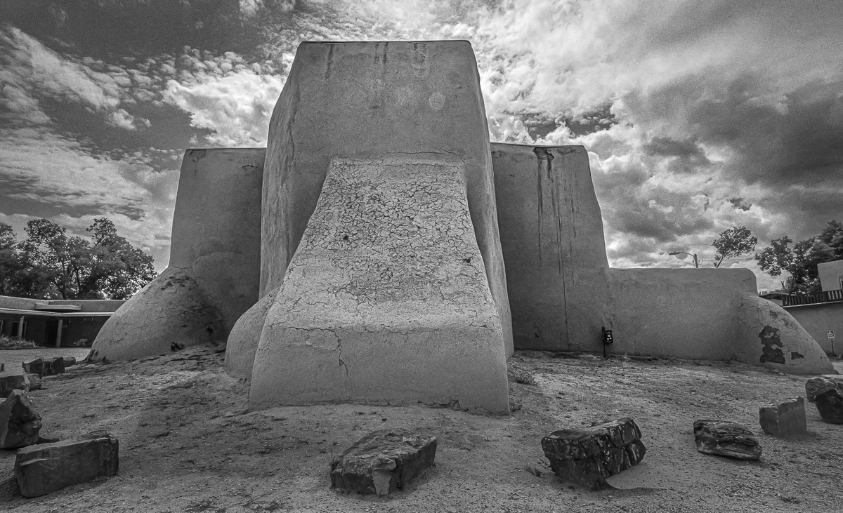
Hi Pinaki. I think you are right to explore a different look given that this has been photographed so many times, including famously. I think the ultra wide approach is fine, but with the adobe structure so curved to begin with, the effect is not obvious to me. Maybe that is a good thing? It does force you to bring in more background on the sides (to keep the whole church in the frame) than a longer lens would, and I think the additional background does not add anything - perhaps is distracting.
I think the bigger thing you might think about is the fact that there are a lot of bright areas in the frame that attract the eye, and none of them is the subject. The sky in particular is much brighter and eye grabbing than the church, and the foreground is as well. The tonality in the church right now is a bit bland by comparison. So I might due some significant dodging and burning to try to make the church more of an attraction. I took one cut at that below. I also cropped a bit to minimize the background.
I am not sure what you mean by finding "that this architecture has a unique architecture balance". But as you say, the question is how does it appeal to us. Your view on that could be different than mine or the next person, so my edit could easily push against what appeals to you.
Hope that is somewhat helpful. |
Oct 17th |
 |
6 comments - 4 replies for Group 96
|
6 comments - 4 replies Total
|


