|
| Group |
Round |
C/R |
Comment |
Date |
Image |
| 96 |
Sep 25 |
Reply |
Yes, I saw the third pier as well and almost asked you about it. I was actually wondering if the bridge is curved (in the horizontal plane)? I wonder if there is a satellite (Google image) view with enough resolution to see if that is the case? |
Sep 22nd |
| 96 |
Sep 25 |
Reply |
Thanks Bruce. It is not reflections, but with the long exposure and the "flowers" oscillating back and forth, they are more "in focus" at the two ends of the oscillation. So each of them appears in twin. I tried some different length exposures, but this is the one I liked best. And it was as slow as I could go without an ND filter, which I sadly had not brought.
I will have to try more of this sort of painterly photography - it is growing on me. Maybe I will bring a copy to my dentist the next time I go and see if she will buy it for her wall!
|
Sep 22nd |
| 96 |
Sep 25 |
Comment |
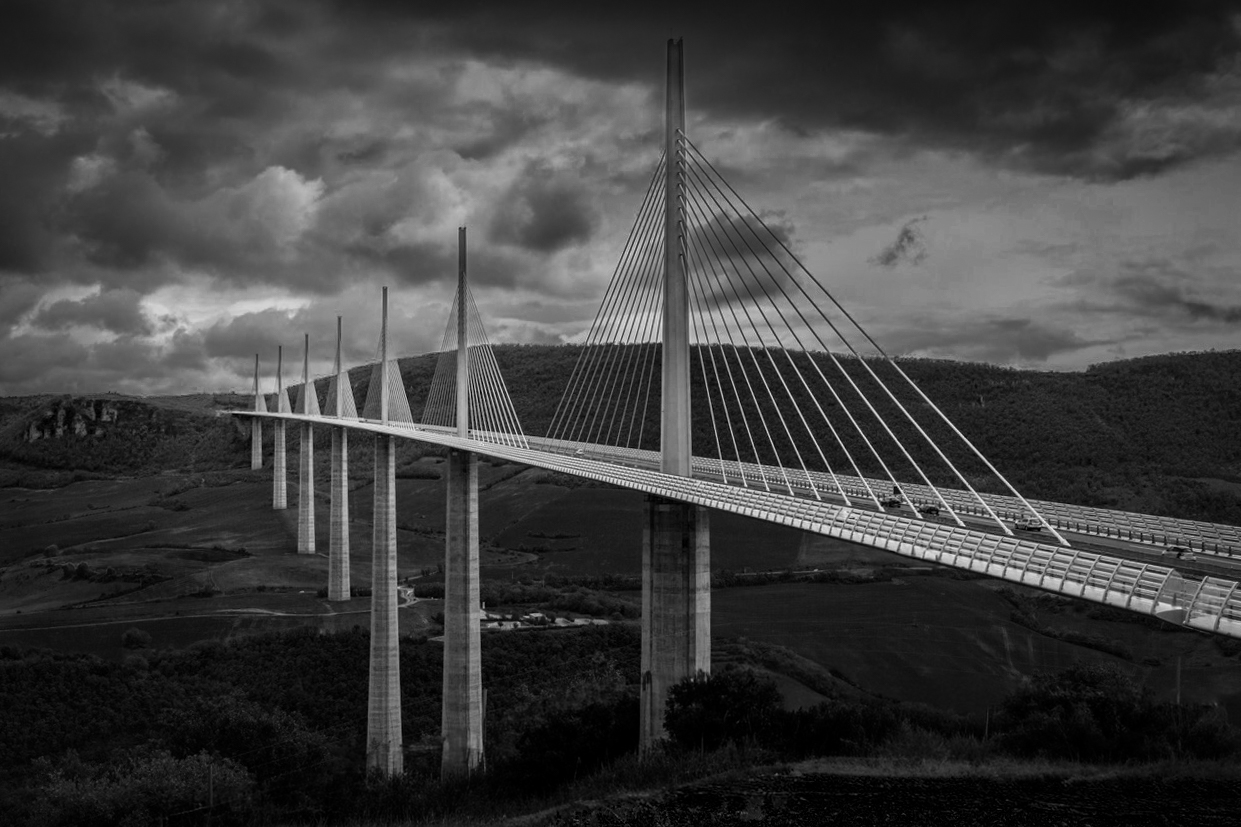
Hi Bruce. That is a quite spectacular bridge, and I love the composition you have put together with it. The magnificence of the bridge comes across, and it clear you have a leading line which the viewer follows off into the distance. There is also a contrast, with the natural, rural landscape interrupted by this massive man-made landmark.
For me the image is about the bridge and that contrast. So I think the suggestions I'd make are largely about trying to make the bridge stand out even more against the natural background. The key thing I'd suggest for that is to darken the sky so that the bridge at least competes with it (and hopefully is dominant) in brightness. With the same intent, I might darken the red foreground in the bottom right as well as the sun lit spot near the left edge.
Small thing, but the bridge upright is not quite vertical, so I would use the crop tool to correct the rotation of the frame slightly.
Finally, the drama here I think could be even more if you considered a black and white rendering. The green in the image is awfully bright and again competes with the bridge for dominance.
I've tried some of these ideas in the image below. Hope that helps.
|
Sep 12th |
 |
| 96 |
Sep 25 |
Comment |
Hi Rick. I'd agree with Kenneth that this is a very beautiful image. But beyond that there is a tension in it that makes me want to keep studying it. I think the tension is from the composition. There is good balance - the major elements of the building, bright cloud, and the brighter sky spot in the upper left (a slightly less major element but key to the balance) are all positioned to give balance both top/bottom and left/right. But it is difficult to figure out how the two major elements (bright cloud and building relate to each other). That's not necessarily bad - it's like a puzzle that holds my attention.
In terms of color, the cyan cast sky (at least on my monitor) is pushing believability but I think it adds to the beauty and you'd loose some of that if you dialed it back to less cyan. So on the edge but ok and a good choice. It also looks to me like the brightest patch of the bright cloud is blown out - maybe just dial back that brightest highlight if possible, but I wouldn't give up brightness in the cloud overall.
If the connection of cloud and building says something specific to you please tell me what it is. Otherwise I am going to stare at your image for too long.
|
Sep 12th |
| 96 |
Sep 25 |
Comment |
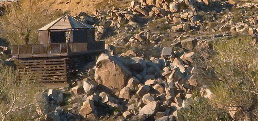
Hi Kenneth. Another very interesting "train photography" image. As I've mentioned before, I like that you are doing a series around that. I also love that you've told us what attracted you to this image, namely the placement of the structure out in the middle of nowhere. The thick brush and rocks help to communicate that sense. The pattern of rocks makes one feel they are almost flowing from the upper right to the lower left - again a rough and tumble sort of feel. And finally the structure is not quite straight, which I think further communicates a rustic feel to the place.
Compositionally it might be helpful to see a little more to the left of the structure - again to see more clearly that there is nothing around it. I'm sure though as you describe that is difficult to frame exactly from the moving train. It is like the sports photographer equivalent in landscapes - split second to frame and capture. Maybe something to be borrowed from sports? Shoot wide and crop? Capture many frames at high rate and pick the winner?
The other thought I have is the color cast which to me is pretty strong. But I admit, I am trying to work through for myself when a stronger cast is appropriate, vs. some/less color cast, vs. none at all. My usual technique in photoshop (I think you could do this in photoshop elements too) is to duplicate the image, average that duplicated layer (blur --> average), and then use the gray dropper in a curves layer to remove the cast (after which you turn off or delete the averaged layer). You can then dial the opacity of the curves layer from zero to 100% to see what degree of color you like. I did that with yours and took some but not all of the color cast out, so other colors like the greens in the vegetation are starting to show through. Of course it's chefs choice what you want in your image.
|
Sep 12th |
 |
| 96 |
Sep 25 |
Reply |
Thanks Kenneth. Yes, this is a very different photo for me. I am heartened that you think it should be studied by the viewer - that's what we're after with art!
I guess when conditions don't allow for the more "usual" landscapes, it forces one to look for different things. I will have to do that more. |
Sep 12th |
| 96 |
Sep 25 |
Comment |
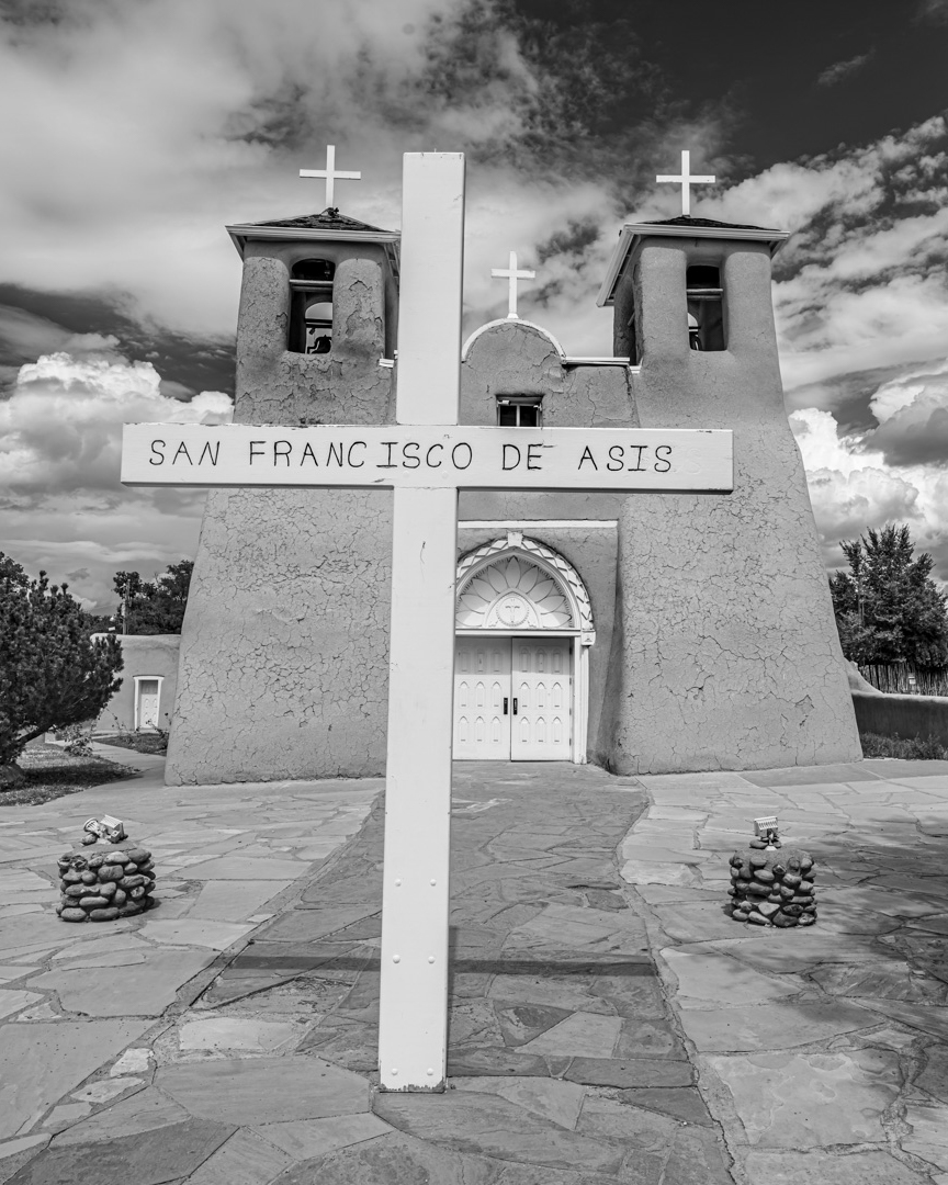
Hi Pinaki. I like the B&W rendering that you have done here, which I agree works well with the architecture as well as the dramatic clouds you've manage to be blessed with. I also like how the large cross is "echoed" by the three smaller ones on the building.
Agreeing a little with Ken's comment, I think the UW lens and placement has made the image very much about the cross vs. the building. There is a sense it blocks our progress to the building. I am not sure whether that is what you are going for or not.
Compositionally I like the leading lines coming in from all of the corners which tends to keep focus in the middle. On the other hand, depending on the intent of the image, the UW lens has included a lot of other stuff in the periphery which may not be important. Also, again depending on the intent, I'd also wonder about the alignment of the edge of the large cross and the edge of the door. I'd generally think you either want to overlap them more, or separate them.
I guess I might crop tighter - something like below. But again, I don't know what message you are trying to communicate.
Is this one of the famous churches that Ansel Adams photographed?
|
Sep 12th |
 |
4 comments - 3 replies for Group 96
|
4 comments - 3 replies Total
|


