|
| Group |
Round |
C/R |
Comment |
Date |
Image |
| 96 |
Aug 25 |
Reply |
Thanks Pinaki. These are all very helpful suggestions. I will continue to evolve the image. |
Aug 28th |
| 96 |
Aug 25 |
Reply |
Thanks Bruce. I will try darkening the mountains and see how that looks. I was going for a hazy, far off look, but the comments are consistently asking for the opposite. |
Aug 14th |
| 96 |
Aug 25 |
Reply |
Thanks Kenneth, that is helpful. I think the consensus is coming out pretty unanimous that no one likes the foreground. |
Aug 14th |
| 96 |
Aug 25 |
Reply |
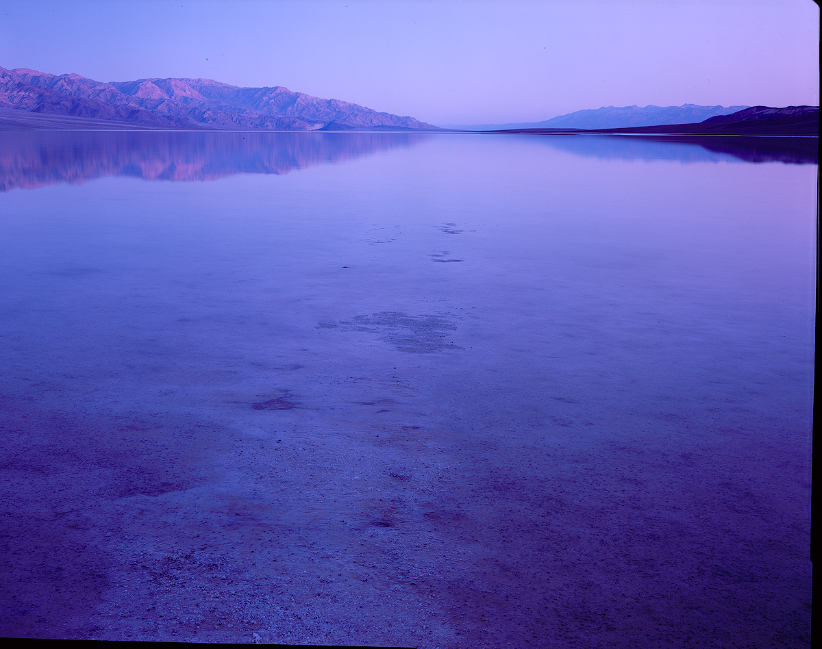
Thanks Jim, those comments are helpful. I think the bottom line is that it needs a crop. At the time, standing in a sea of few inch deep water that went on for miles, the salt just poking through in the foreground seemed pretty interesting, but I agree that doesn't really come through in the image.
I think the colors are still not where they should land, but I think the composition comes first.
|
Aug 14th |
| 96 |
Aug 25 |
Reply |
Thanks Rick. Your thoughts are helpful. The original had the strong pre-dawn colors, made even stronger by the Provia film. I've attached the scan un-edited. I could keep the color (brightening it a bit obviously), could dial back the color, could warm the color, or some combination of the last two.
I think I'm struggling with the color because the composition doesn't really work as is. It is not minimalist enough with the messy foreground. But the foreground is not interesting enough to work.
Your comments on the mountain are also helpful. You can see the original is even less "infinity like".
|
Aug 14th |
 |
| 96 |
Aug 25 |
Comment |
Hi Kenneth. Another very interesting train image! It sounds like you've already made some improvements based on Rick and Jim's comments - I'd love to see version 2 if you could post it.
I don't have much to add as Rick and Jim pointed out what I was going to mention. I'd second that the merger of the person's head and pole shadow is unfortunate. I don't know what PS Elements is and is not capable of. With PS and some work, you could probably move the person slightly and resolve this problem. Might be worth the surgery as this is a very interesting image that I think has a lot to say.
|
Aug 14th |
| 96 |
Aug 25 |
Comment |
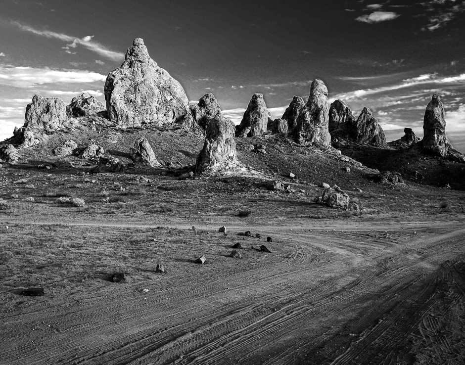
Hi Bruce. This is a terrific image. Though I've been to that region before, I've never visited Trona and these pinnacles - will have to take a look the next time I'm near Death Valley.
Not much I can think of to improve the image further. As Rick pointed out, I'd crop in from the right. While at it, the left feels tight, and you might see if small changes in where you put the edge help with that. I also think you don't need as much sky, so you could come in from the top.
Other than that, it is just about making the pinnacles the star of the show. You might darken the foreground a bit and perhaps increase the contrast on the pinnacles themselves. Overall something like the attached below.
Great image. I'd love to see more from that area if you have them.
|
Aug 14th |
 |
| 96 |
Aug 25 |
Comment |
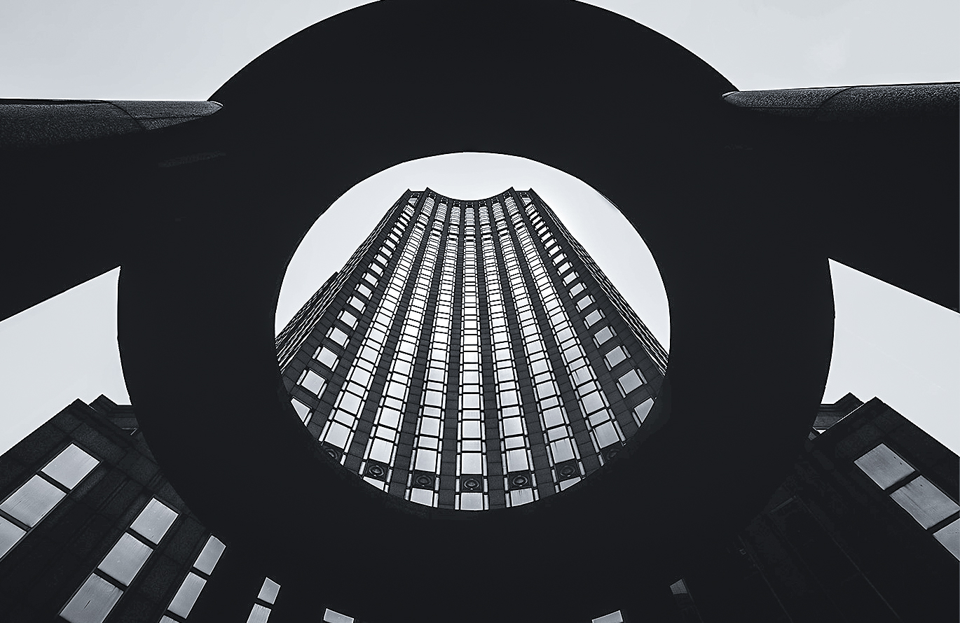
Hi Viren. I love the symmetry and strong graphic form of this image. To me it is all about the giant looming "donut". Everything else is in support of that central element of the image. Again, to me, there is an ominousness to that shadowed ring.
If that is indeed the message you are going for, then a couple of thoughts. Folks have suggested adding space above the ring at the top. I agree that having it just meet the border is probably not what you want, but I'd go the other way and crop in. While at it, I would do the same at the bottom, so the ring overhangs the image. That I think adds to the sense of its size and looming ominous sort of nature.
Also consistent with that I'd cool the image down a bit - the equivalent of a selenium sort of tone. You can choose how far to go, but I think a cold look supports the same message.
Finally, I think there is room to open up the shadows a bit in areas other than the ring. By doing that the consistent absolute black of the ring stands out even more by contrast.
I did these things in the attached. I also cropped slightly to center the ring as others have suggested. Small changes but I think helpful, again depending on what message you are going for. Fantastic image in any case.
|
Aug 14th |
 |
| 96 |
Aug 25 |
Comment |
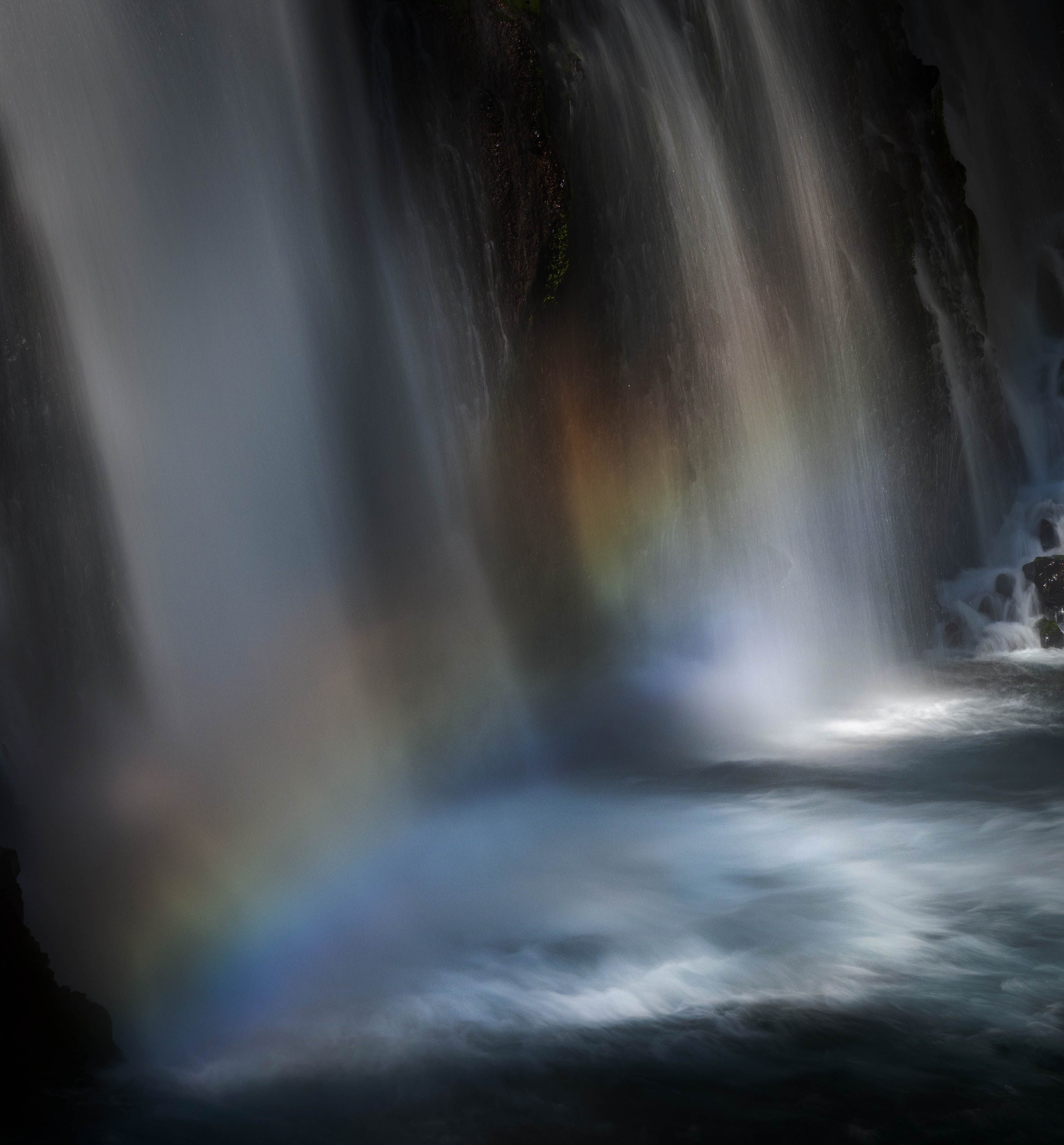
Hi Jim. Again, welcome to the group and thanks for a lovely first image!
I have a propencity to sometime see things in images, and once I've seen them, it is hard to unsee. I immediately looked at the brown and green area in the middle (between the falls) and saw two eyes and a nose peeking through (I thought instantly of Groot if you are a Guardians of the Galaxy fan). So I admit, now all I can see is a face peeking through the falls.
Putting that aside (or trying to), there is a lot to like about this image. You've very effectively used the filters to get a strong rainbow as well as soft ethereal water. I do think the two work a little against each other - the title "lightly falling" suggests the feeling you are after is the more ethereal, and the rainbow is feels "loud". I also think the image could be strengthened further if there was a more clearly defined "focus" - perhaps the bright areas where the water lands?
I took a shot at what I might do to enhance the image further with those thoughts in mind. It is basically a lot of brush work in LR shaping and refining the light as well as the color. It more understated to me with these changes which may not be what you are going for (you said you like a contrasty image). So consider this just a thought about an alternative direction you could take it.
|
Aug 14th |
 |
| 96 |
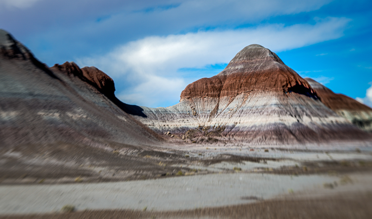
Aug 25 |
Comment |
Hi Pinaki. I applaud you trying some different techniques like the Lensbaby you've used here. While I've seen them used for close up intimate shots, I don't think I've seen them used for grander landscapes such as you've done here. To me the effect you've created is similar to the use of a tilt-shift lens to create a "miniature" effect. It feels a little like the scene is a model that you've photographed.
Did you try moving around the sharp focus spot? For example, did you try making the nearer "hill" sharp and the ones to the right blurred? That is more what intuition would expect, so it might appeal more broadly. Though it would be less "different", so maybe not what you are going for.
Another thought might be to crop what you've presented above. The left hill has a lot of visual weight and is blurry - the eye wants to go there because of the placement and weight, but then is disturbed by how blurry it is. What if you showed less of that left hill? In the attached below I've done that as well as used some shaping of the tonality to get the eye to go to the sharp subject. The LenBaby effect is more subtle as a result, but it is still there - the area of focus is definitely more limited than it would normally be.
Just some thoughts. Keep experimenting.
|
Aug 14th |
 |
| 96 |
Aug 25 |
Comment |
Hi Rick. This is a very creative image - I like very much the "imperfect" reflection rendering of the scene. I do find it shocking how much the windows vary from a common flat plane.
I was going to comment about removing the "light bulbs" showing through, and maybe the wires (both the orange ones and the black ones). But the more I think about it, the more I wonder if those aren't part of the "imperfection" which you are trying (presumably) to communicate. You are capturing the cityscape through the lens of the reflection - I would vote to lean in to that imperfect lens. You might crop down a bit to just eliminate the top light which is near the edge and distracting in that sense (though perhaps the "stack" of the left building is then too close to the edge).
There is a strong blue/teal cast overall. I don't know that that contributes to what you are trying to say. And my take is that these "casts" look good initially but become more tiring over time. So I might dial it back some. I also wish the grid pattern framing the windows was a hair less dominant. I am not sure whether it is distinct enough to easily mask and just darken a bit.
Otherwise, I think this is a very expressive and creative image. Very nice!
|
Aug 14th |
6 comments - 5 replies for Group 96
|
6 comments - 5 replies Total
|


