|
| Group |
Round |
C/R |
Comment |
Date |
Image |
| 96 |
Jun 25 |
Reply |
Thanks Bruce. The polarizer was critical for the close rocks under the water. Otherwise it would have been all reflection. |
Jun 24th |
| 96 |
Jun 25 |
Reply |
Yes, that is much, much sharper! |
Jun 24th |
| 96 |
Jun 25 |
Reply |
Thanks Pinaki. I will see if I can bring a little more color back into the sky. To me though the real problem is the exposed rocks in the mid-ground. Particularly the one near the left edge. A lot of visual weight in the dark rock against the bright water reflection, even if the rock is small. I've tried reducing the weight by cropping, pulling the edge in to intersect the rock. But I'm not sure that works either.
And overall it is serene, and follows the standard foreground, mid-ground, background formula ... perhaps all to say it is a bit boring.
|
Jun 23rd |
| 96 |
Jun 25 |
Comment |
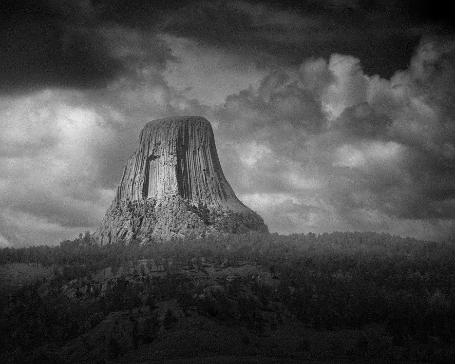
Hi Bruce. I love the humor you bring to your descriptions - creativity in another form. I have never visited this location - it clearly is a pretty unique formation, and that comes across clearly in your image.
I have a couple of questions and thoughts. First, the image is a little soft. That's ok for most of it, but it would be nice if the tower itself was a little sharper. Was this cropped from a wider shot? Was it a really long lens? Just wondering where you are loosing the sharpness, because I would have thought that 1/800 sec would stop camera shake, and f11 should not make things this soft.
Second, with the drama of the aliens and storm in mind, were you so inclined, I think there is much more drama you could bring to this with just local and overall tonality changes (and maybe a crop). Of course it is up to you what you are going for, but I took a cut at a more dramatic interpretation (which was fun to do with this image). I tried both color and B&W versions but thought the B&W was more dramatic.
I think you could play a lot with this image and try out different looks. Thanks for sharing this image. It has made me add this location to my bucket list.
|
Jun 23rd |
 |
| 96 |
Jun 25 |
Comment |
Hi Pinaki. I've gone back to your image of this month several times. I think it conveys a sense of unease and even maybe dizziness which comes from the combination of the unusual shaped and surfaced buildings and the distortion / convergence in the image from tilting up to take them in. It is not quite Alice's wonderland, but it has a similar sort of feel. And generating emotion in an image is a great thing, although I don't know if that was the particular feeling you were going for.
Compositionally, I think it is important that you cut off the top of the left building as you did. I think if you had not things would not have worked as well - the eye would travel up there and get left in the sky. As is, I think the eye is able to bounce to the other building on the right and then start exploring more fully. I am not sure however about the white car in front. It is large, white, near the edge. It demands its own attention, and then it and the buildings battle a bit. It makes me seek a more complex story and fail to come up with one even trying a few times. If you had done a long exposure and blurred that car moving, it would fit nicely with the Alice's Wonderland sort of feel. It would further make me feel anxious.
Smaller things beyond that. I am not sure if the colors are helping or not. The bright yellow pedestrian signs at least are to me distracting. I also feel like I would darken the foreground/midground to give a greater 3D feel and to further make the buildings the main show.
I don't know if any of that is helpful. But now having looked a couple of times, those are my thoughts. It is clearly an interesting image because I kept wanting to go back.
|
Jun 23rd |
2 comments - 3 replies for Group 96
|
2 comments - 3 replies Total
|


