|
| Group |
Round |
C/R |
Comment |
Date |
Image |
| 96 |
May 25 |
Comment |
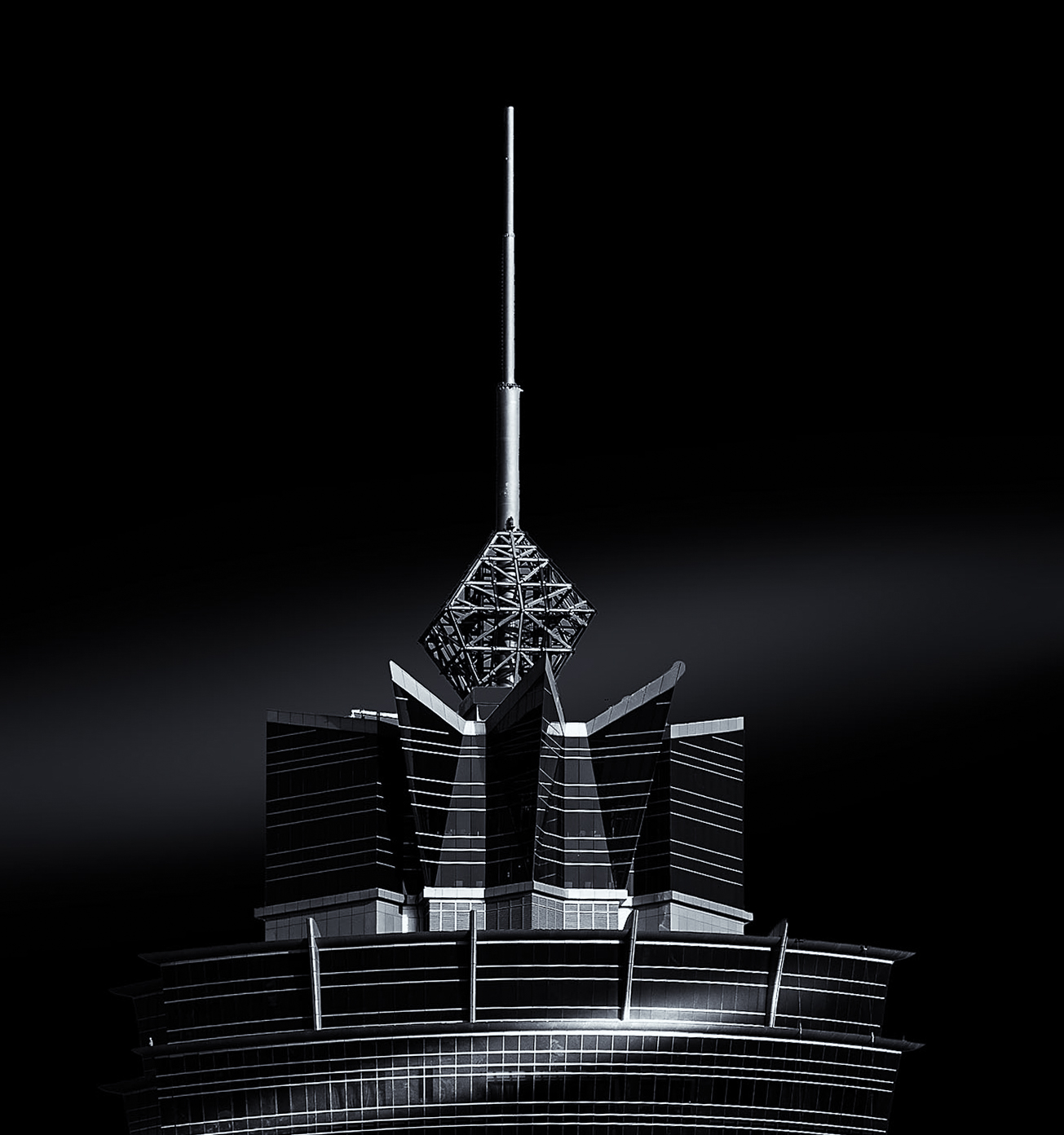
Hi Viren. This is a very dramatic architectural image which I like very much for its simple clean presentation and crisp forms. The black and white works well and emphasizes the lighting and form of the building against the stark backdrop. The diagonal dashes of light are the piece which makes this image stand out against a simple architectural shot.
Very little I can see to improve. So I will point out some "choices". First, while you nailed the spire in getting it vertical, the aspect to the building makes the lower structure look tilted. You could choose to do a guided transformation in LR which would keep the spire vertical while bringing the lower portion of the building symmetrically horizontal. Second, you've chosen to center the spire. Again, in so doing, because of the aspect or structure of the building, the base below the spire is not centered. You can see at the bottom edge there are different gaps to the left and right edge of the image. You could choose instead to center the building at the base so the gaps to the edges are symmetrical. You might choose that approach because the base of the building has more visual weight than the spire. Third, to me the image feels crisp, precise, harsh (not in a bad way) in a manner than makes me feel like it should be rendered cool tone. So you could choose to tone the image selenium or something cool to enhance the feeling it already generates. I've done these three things in the version below.
All small things. All choices. It is a stellar image. Thanks for sharing with us.
|
May 29th |
 |
| 96 |
May 25 |
Comment |
Hi Bruce. Another lovely architectural image. I appreciate how you provide the history of these places in your description - it gives us some context. I like many of the same elements as Pinaki. I particularly like the front of the image - the chain and the wet cement which is both powerful and lovely in light and texture.
A couple of thoughts. First, I think the horizon is not quite level, or at least it feels that way. I would actually do a transformation to keep the edge of the cement in front level while preserving (or making) vertical the inner edge of the structure on the right.
The bigger issue for me is the center of the image. There is not a lot there other than the sky. And in the sky and clouds, not having seen the original unprocessed image, the processing feels a little overdone and unreal (sorry if I have this wrong). The color doesn't look natural, it doesn't quite extend down to the horizon right of center, and the transition from the yellows to the blues in the sky also doesn't look natural to me. I think you have great clouds which presumably were there in the original (no completely new sky added) - I think those are enough to hold the middle of the image but without the processing being overdone.
If you were composing this again, I'd like to see more of the structure on the left. I think there is a little too little of it as is and the composition is not as well balanced as it could be. I might actually think about cropping in from the right in the current image to improve the balance, but I suspect that is the structure you want to show.
One does get the power of the place from your image - so well done that you are capturing that. The rest is just some suggestions to improve the photographic details. Thanks for sharing this with us.
|
May 29th |
| 96 |
May 25 |
Comment |
Hi Kenneth. This is an interesting image that to me seeks to speak to the abandoned and forgotten nature of the buildings (or town?). I love the detail on the building face as well as the fence in front which seems to say "don't come near".
I think the image is exposed and processed well. As Pinaki points out, you need to get the horizon level - it is difficult to judge in this image but it feels a bit off. I might use the building verticals near the center of the frame as the reference. I think the larger comment I'd make though is on the composition. I think you need to either include more or less. The second building on the left is cut off in the current image, and in addition to including all of it I'd be interested in seeing more of the area around the buildings - if that speaks to the desolation. I know that might not be possible from a speeding train. So the alternative is to go the other route and really make the image a portrait of the front building, by cropping more tightly on it and emphasizing the interesting front of this building.
Just some thoughts. Thanks for sharing another interesting train travel image.
|
May 29th |
| 96 |
May 25 |
Comment |
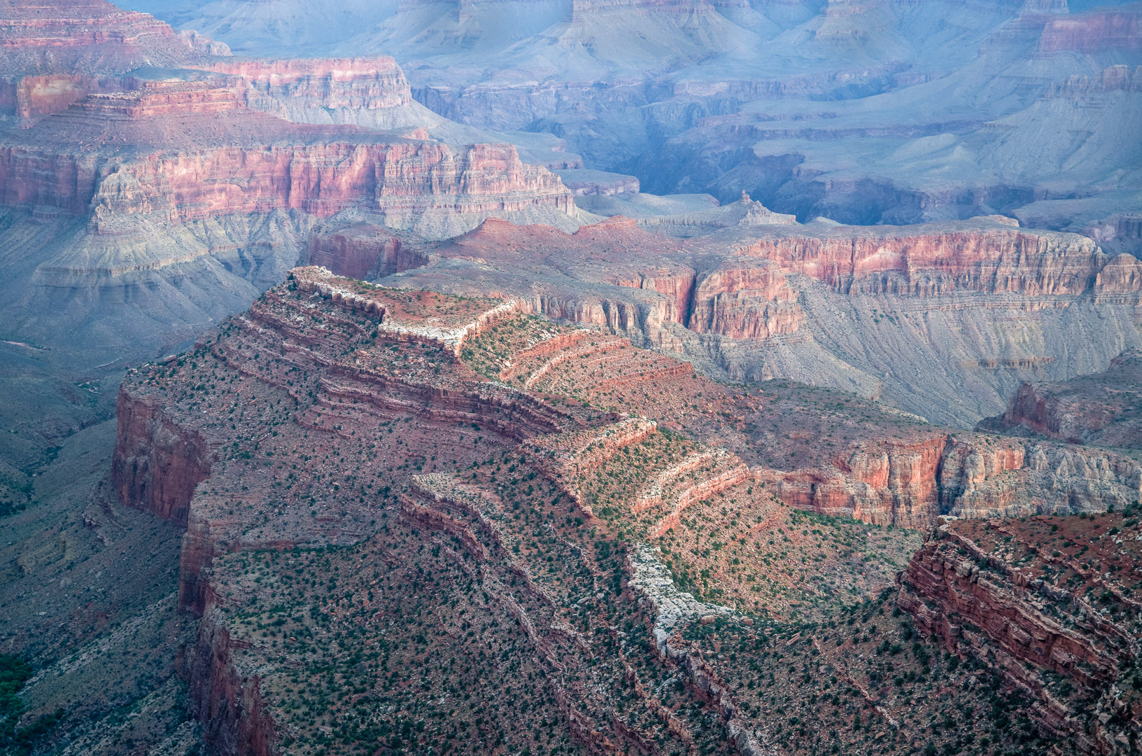
Hi Pinaki. Sorry for the late comment this month. This is a beautiful grand canyon image. I first notice the diagonal sweep from bottom right to upper left, then as I explore I enjoy the darker canyon above that sweeping ridge and the lovely texture created by the dotted green trees across the lower half of the image. I also love the soft and subtle pre-dawn light which caresses the right facing surfaces. There is a lot to like in this image, and a lot to find and enjoy as one explores it more. It keeps revealing itself.
A couple of suggestions to perhaps consider in terms of enhancing the image further. Top of my list is the bright rock face in the upper left corner, pretty much against the left edge. I think it is the brightest thing in the image (the white rock increases this), and it grabs my eye a little too much. I would dial down the brightness of that particular rock. Similarly I think there are a couple of rock faces in the distance against the top edge which are a little too bright given there placement near the edge.
Finally, while I like the soft light and would not want to go too far in what I describe next, I think the contrast overall is a little soft and washed out. I think it is appropriate to the upper, distant part of the image, but greater contrast in the front and along the "ridge" could help create depth and also highlight the beautiful light hitting the ridge. In particular I would darken the near (viewer) side of the ridge. I did a quick and not particularly careful version of these thoughts below.
Great image. I am jealous - it has been a long time since I've been back to the Grand Canyon. |
May 29th |
 |
4 comments - 0 replies for Group 96
|
4 comments - 0 replies Total
|


