|
| Group |
Round |
C/R |
Comment |
Date |
Image |
| 96 |
Apr 25 |
Reply |
Thanks Rick. Your suggestion does indeed make sense. The automatic masking stuff is getting pretty smart, so I should see whether indeed it can help minimize the work in masking the tree.
Hope things go well with the 2nd surgery.
|
Apr 27th |
| 96 |
Apr 25 |
Reply |
Thanks Pinaki. Appreciate you pointing out the image strength in the subtle variations in light. That is something I should pay more attention to, both in editing as well as in selecting compositions to begin with. |
Apr 27th |
| 96 |
Apr 25 |
Comment |
Hi Bruce. This is a fascinating image. I love the row of statues, and how the line through them forms a strong diagonal. I also love how the statues contrast the strong graphic form - lines and textures - of the architecture behind them. I admit I don't know my emperors, so I couldn't name them.
I think there are a couple of things associated with how you framed this that to me could perhaps be strengthened. I am a stickler for getting verticals truly vertical, and the building lines are slightly tilted. Second, I find the bright area beyond the building at the far right a bit distracting. The image is about the statues and architecture, yet my eye just wants to go explore the field because it is bright. Finally, I really wish the emperor on the near left (Shall we call him Nearo?) had a little more room on the left - that we could see all of the statue and he was not bumping the edge.
The first two issues can be solved with crops. The third can be solved with a crop too, as long as you are willing to use Photoshop's generative AI fill to "expand" the image. I did all of that in my version below.
After that I'd do a few more things to really make Nearo stand out as the subject. Stuff like enhancing / sharpening the detail in his face and eye, and lighting him (making lighting adjustments) as you would for a portrait. I'd also do some things to enhance the 3D look - making the near edge on the left darker, cooler, and more saturated than the right side of the photo (taper things across the frame in other words).
Hope those suggestions help. I think it is possible to get Nearo to really pop! Great image.
|
Apr 13th |
 |
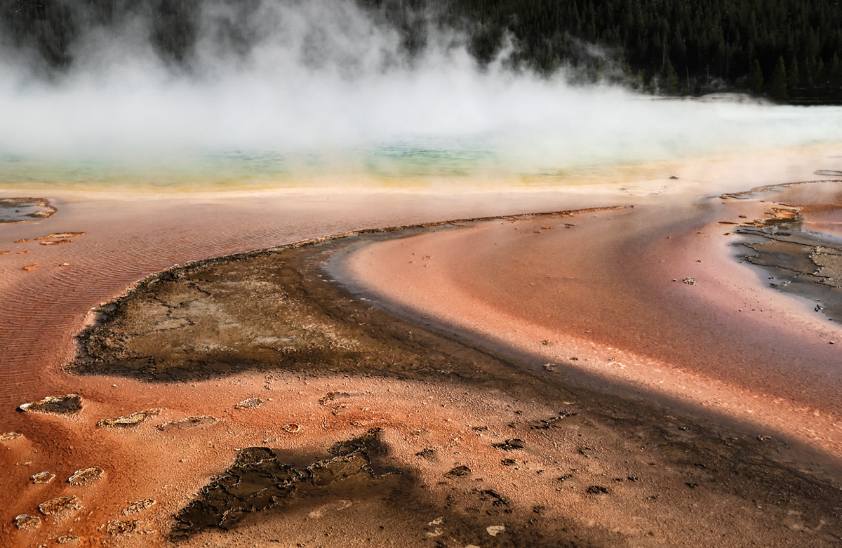
| 96 |
Apr 25 |
Comment |
Hi Pinaki. This is a beautiful image from Yellowstone. You've found a time when the mist is really rising off of the pool, and where the colors are amazing. My understanding is that the color is not this amazing year round so you picked a great time. Given that you were shooting mid-day, I gather you also found overcast conditions which allow the colors to pop.
To me, the image could be even more fabulous with a crop. I find the sky less interesting, as are the trees (other than providing a dark background for the mist). I think the image is all about the pool and lovely color leading to it. The other consideration with the crop would be to find a pleasing "balance" in the abstract foreground (easier said than done), and perhaps leading lines the guide the viewer to the pool. I took a cut at that in my crop below.
Once cropped, I'd probably do a few other things (which I've done in the attached) to make it even more compelling. I darkened the trees so they are more or less just a background. I brought up the whites locally in the mist to make it pop. I think the colors in the actual pool could be made to pop a bit more, so I pulled up the saturation there, and lowered it across the rest of the image (the orange was a little too strong for my taste). Then I did a few things to enhance the 3D feeling. Mainly I darkened, sharpened, and increased the saturation and contrast in the foreground.
To me the cropped version is a little more emotionally compelling - more artistic. I love the sweeping curves you've captured that lead us back to the pool. That is the element you've found that really makes the image. Hope these thoughts help. Again, an amazing image.
|
Apr 13th |
 |
2 comments - 2 replies for Group 96
|
2 comments - 2 replies Total
|


