|
| Group |
Round |
C/R |
Comment |
Date |
Image |
| 96 |
Nov 24 |
Reply |
I had not recognized the heart shape. Wow, that's a very insightful find. I see a lot more reason and potential in keeping the sky now. I'd love to see your edit when you have a chance. |
Nov 27th |
| 96 |
Nov 24 |
Reply |
Ha! That is certainly one way to deal with things. It does look quite convincing that it is all real photo. The generative AI melts right into the photo. |
Nov 27th |
| 96 |
Nov 24 |
Reply |
Here is another frame with more above the falls. This one has no edits at all. |
Nov 27th |
 |
| 96 |
Nov 24 |
Reply |
Here is the image with the crop removed. It doesn't have all the photoshop processing which was done after the LR crop. This particular shot I framed low, so there is less above the fall to work with. I will also post another shot which is framed differently. |
Nov 27th |
 |
| 96 |
Nov 24 |
Reply |
I applaud your attempt to embrace the flare. I've tried that a few times with landscapes and always been shot down. I think it is not accepted in landscapes the way it is in portraits, etc. Pushing back against the established views is hard - but again, I like that you are exploring this. One key is to make sure the flare is sufficient enough that it is clear that it is deliberate. To that end, you might actually want to enhance it in this image.
On the color one thought. Adobe has a web application (search on adobe color) where you can upload your image and it will extract a color scheme. From that you can see where your dominant colors fall on the color wheel and whether they follow one the standard complementary relationships. If they are off, this then gives some idea of how to shift the hue of one or more of your colors to make things more harmonious. Of course you can't go too far or things look unnatural. But often just a little helps a lot. There are other tricks you can do to improve the harmony as well. I don't know if you are familiar with Erin Babnik, but if you search for Erin Babnik color theory you will quickly find an article she wrote on how to edit landscape photos for greater color harmony. |
Nov 27th |
| 96 |
Nov 24 |
Reply |
I think in an abstract sort of image like this you are not necessarily looking for depth in the usual sense - or at least that would be my take. It is all about the colors, tonality, and shapes. |
Nov 27th |
| 96 |
Nov 24 |
Reply |
Yes, coming back to it now I agree I went too far down with the crop. I do really like the rail and stones at the bottom. |
Nov 27th |
| 96 |
Nov 24 |
Reply |
Thanks Haru. Yes consensus seems to be the dark left side is not working and ought to be cropped. I really like your suggestion to balance the distance to the edge at the bottom and top. I should more consistently look for that and crop appropriately. So, here I can crop some at the bottom. Or add back some at the top.
As I mentioned to Rick, I will post the original when back on my computer. If I crop less you start to see a bright edge all along the top. So I know it looks tight as is, but I think opening it up further just introduces a different problem.
You shoot a lot of waterfalls. Do you run into this problem that stuff above the fall is a lot brighter than the rest of the scene? How do you deal with that?
|
Nov 27th |
| 96 |
Nov 24 |
Reply |
Thanks Rick. That is the problem with dark images - exactly how dark it appears will depend on a range of things. I think I can still see detail to the edge, although on my iPad now that is a little less true. But point taken - brighten so not pure black or crop as uninteresting anyways. I think you are right - the crop is better.
On the top edge, all I am hiding is a very bright distracting sky. I will post the original when I am back on my computer. This problem seems to come up a lot for me in waterfalls. Whatever is above the "cliff" it's flowing over is the brightest thing in the scene. Any thoughts on how to handle this issue? I can crop more and eliminate the small bright patch, but then the fall seems to come from nowhere. I can darken the patch (or top edge if I showed more) but unless I go unreasonably dark it still seems distracting to me.
I rarely shoot waterfalls because I find so many problems like this. They never seem to work for me. I'm probably approaching them wrong overall.
|
Nov 27th |
| 96 |
Nov 24 |
Reply |
Thanks Kenneth. Seems to be a consensus that the left side is too dark. If printed and matted, then the "black for ever" issue would be fixed. But as you point out I could do something similar digitally. |
Nov 27th |
| 96 |
Nov 24 |
Comment |
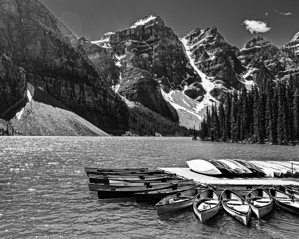
Hi Bruce. I love the Canadian mountains and lakes, and you've captured a nice example of that here with Lake Louise. The color of the water and the canoes is really grabbing.
I think there are a few things to that could be worked to make the image even stronger. As Kenneth points out, there is flare, and while in my experience it can be a lot of work to remove (better to use a good hood or shield the lens some other way), it can be removed. Before doing that though, I'd think about a crop. To me the interesting stuff is in the lower right corner, and I'm not sure the broad expanse of cliff at the left adds much, particularly given how the canoes scream to be the focal point. While there are some great colors, there are a lot of different colors and I don't know that they are all harmonizing. Finally the lighting is pretty harsh.
Given all that I'd think about surrendering the color and going B&W, cropping a lot off the upper left, and then fixing whatever portion of the sun flare you need to. I took a cut at the first two (but did not have the patience to work on the flare).
If you really want to keep the color (and again the water is amazing), then one approach could be to try to mute some of the other colors (like the yellow green of the trees, the sky blue which clashes with the water, the purplish tones in the mountains). Then you are left with fewer colors and ones that harmonize better.
Just some thoughts. You've captured a very beautiful image in any case.
|
Nov 16th |
 |
| 96 |
Nov 24 |
Comment |
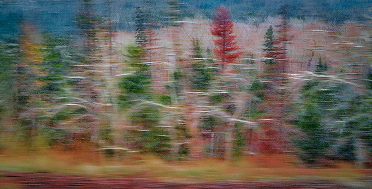
Hi Kenneth. This is a lovely shot which to me is all about the colors and textures. I particularly like the lighter colored (sort of white) branches which sweep in a horizontal direction and add to the feeling of motion.
There are a couple of things though which detract from the "abstract" sort of intentional movement feel. First is the bright water in the upper left - it is both not blurred (because it is further away and the angle changed less) and bright. The second is to a lesser extent the whole background nearer the top of the image. The eye tends to go to sharper areas, and so for me, my eye wants to go up near the top edge and stay there too much. Finally while the colors are beautiful, for me again, they are a bit overpoweringly saturated.
This is the kind of image that you could take in many different directions. But as one possible direction, I decided to commit to the intentional movement and an even more abstract approach. I eliminated the water at the top by cropping some from the left (the brighter branches at the left end are less horizontal so they don't flow with the rest of the image), and then using generative fill in photoshop to replace the water remaining. I decided to emphasize the branches I like so much by lightening them individually (that took a little brush work). Then I desaturated things and added a vignette. Finally I copied the image, did a motion blur horizontally of about 50 pixels, and then layered that on top with about 50% opacity. This "commits" to the abstract look, and fixes what might be a problem in that some stuff is in blurred and some not - enough so that someone might question whether the blur is intentional.
Again this is just one possible look. There are a lot of different ways to develop this particular image, but I very much like the "dancing" theme you've captured.
|
Nov 16th |
 |
| 96 |
Nov 24 |
Comment |
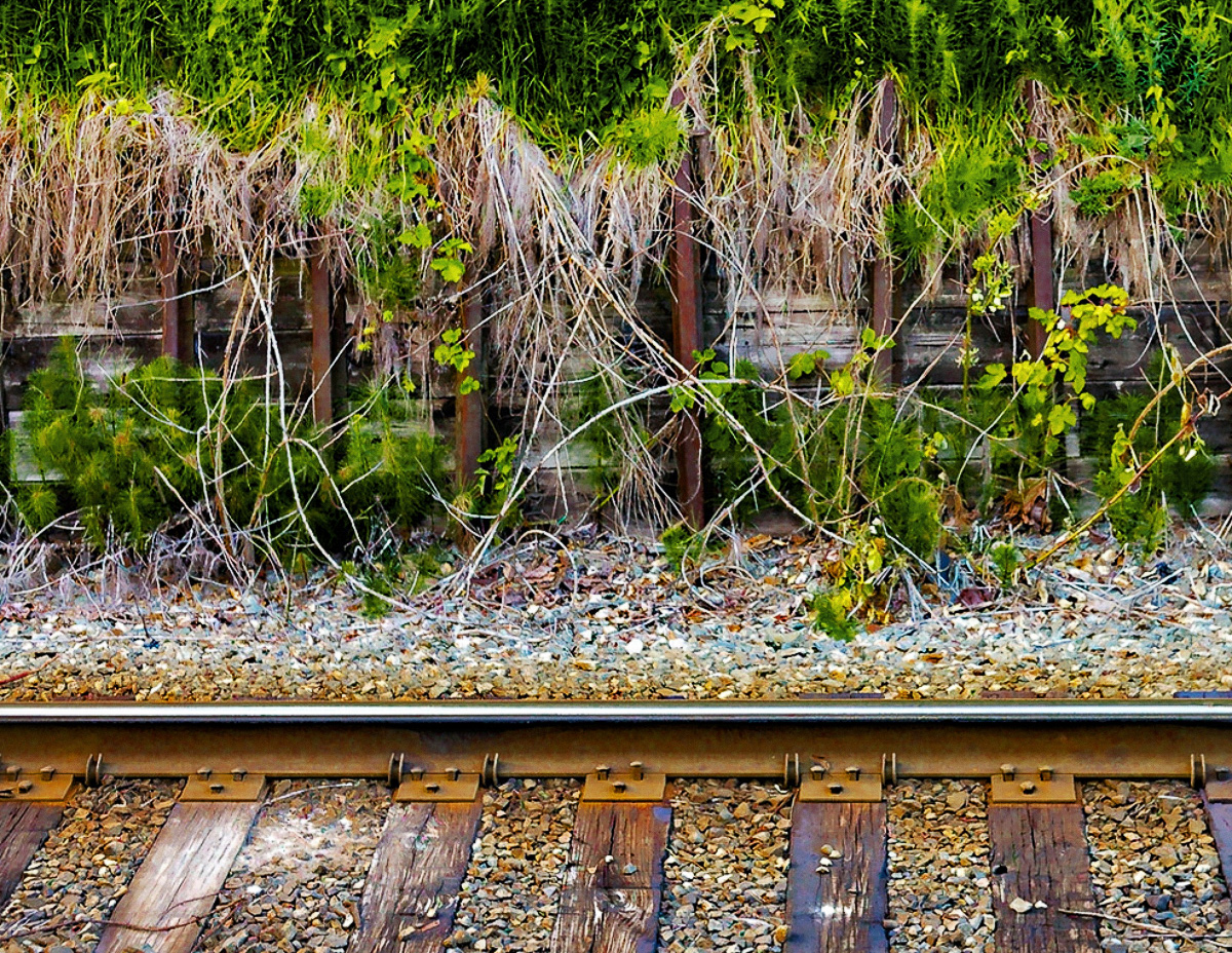
Hi Rick. This is one of those small scenes that is easy to walk by and not see, but which when well thought out (as you've done here) are really compelling. I like the contrast between the linear elements (the rail and the stringy dry vegetation) with the round pebbles. The color contrast between the greens and the warm colors of the stained pebble base and wooden track is also very nice.
My only suggestion is that I find the green at the top a little overwhelming. It is very strong and there is a lot of it. So for me it tends to grab attention and not want to let go. Also it is not as sharp as the stuff at the bottom - it looks like it is pushing depth of field at f8.
So I tried a couple of things to maybe help with this. First I dialed the green back a bit both by dropping the saturation and by adding a b&w layer in photoshop set to luminosity blending and adjusting the greens and yellows. This breaks up the solid green with more shadows and highlights. But then I didn't think that was enough, so I decided to crop. I pretty aggressively came down from the top, because I really love the bottom part of the image. But you've expressed that the image speaks to the symbiotic relationship between nature and humans, so you might want to keep more but play with not keeping "all of it".
It's easy to make great images of the famous locations and epic overlooks. But it is always impressive to me when someone takes a more everyday scene and turns it into compelling art. Very nice!
|
Nov 16th |
 |
| 96 |
Nov 24 |
Comment |
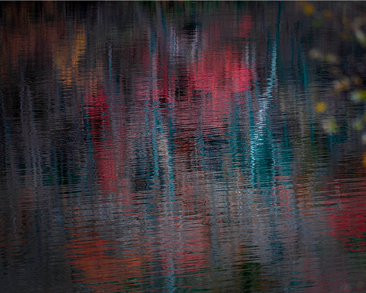
Hi Haru. I love the left 2/3 of this image. I think the biggest issue is the yellow leaves and tree on the right side. It is clearly "in front" of the rest, and to me at least, it competes too much for attention. It is beautiful by itself, but it feels like it is intruding on the other focus, namely the reflected reds and bright whites near the center. I'd suggest cropping and tried that below. I don't think you can completely remove the foreground tree because that puts the bright white reflection too close to the edge, so what I did is a compromise and I think enough to restore a single "center" of attention.
Your image did weird things in terms of color when brought into photoshop and I think that is because it is not tagged with a color space. So photoshop interpreted in a way that changed and brightened the colors. I think some of that helps but that is a matter of taste.
I think there are a few bright white "specks" (really they are just bright point like reflections). I think those should be cloned out - they are just distracting. There are some bigger ones that are part of the extension of the bright white reflected trunk, but they are right near the bottom edge and for that reason I think should be cloned too.
All of this is just some suggestions. I really like the Monet effect. You've created the sort of image that is more timeless and does well on the wall over many years without getting tiring. Would look nice printed on a matte paper with some texture.
|
Nov 16th |
 |
4 comments - 10 replies for Group 96
|
4 comments - 10 replies Total
|