|
| Group |
Round |
C/R |
Comment |
Date |
Image |
| 96 |
Sep 24 |
Comment |
Hi Rick. Picking up on Haru's thought, this could be a really interesting way to present a collection of related images (taken at different times and places for example). Each could be pasted into a window frame in your set of four windows. Then in one overall "photo" you are presenting four images chosen to jointly tell a story, and doing it in a way that is much more subtle and artistic than just putting them side by side, or presenting them as entirely separate images in a collection. It clearly needs to be the right set of images - I am racking my brain to think if I have four which would work in this way. I really want to try this now!
|
Sep 17th |
| 96 |
Sep 24 |
Comment |
Hi Rick. Picking up on Haru's thought, this could be a really interesting way to present a collection of related images (taken at different times and places for example). Each could be pasted into a window frame in your set of four windows. Then in one overall "photo" you are presenting four images chosen to jointly tell a story, and doing it in a way that is much more subtle and artistic than just putting them side by side, or presenting them as entirely separate images in a collection. It clearly needs to be the right set of images - I am racking my brain to think if I have four which would work in this way. I really want to try this now!
|
Sep 16th |
| 96 |
Sep 24 |
Comment |
Hi Bruce. Between the greens of the statue, golden hues of the building, and blue sky, you have a really pleasing set of complementary colors. I also love then detail of the aging in the status - the lines on her arms and torso. I think maybe you could do some work with curve and like in photoshop (or LR equivalents) to showcase that aged weathering even further.
My biggest suggestion would be to think about cropping in from the left to remove the portion of roof line that "juts out forward". I think that is enough of a structure that it tends to pull my eye to the edge away from the statue. You might even think about going with a portrait crop which really emphasizes the statue and puts it a little off center for better balance.
Lovely image in any case.
|
Sep 16th |
| 96 |
Sep 24 |
Comment |
Hi Viren. This is a little bit more of a travel snapshot than most of your images. As you point out, the time of day is not the best, and the lighting a bit harsh. But is do like the way the city is nestling into the curves of the mountain slope. The colors of the city are also bright and beautiful.
I might pick up on this last point is trying to make improvements. What about trying to desaturate all of the green - make it a little more mundane. Then the joyful colors of the city provide a greater contrast. I believe you are post processing a lot of your images for rule sets that restrict the changes you can do, so I am not sure how far you can take this color shift. Similarly I am guessing that is why you did not remove the towers - particularly the one in front which is a definite distraction.
As much as I like the city colors, you might also try a b&w conversion. That often works better with these sorts of mid-day shots, and I would think that would allow you to go a little further in adjusting tonality in the conversion. I think the city could pop pretty well with the right conversion.
|
Sep 16th |
| 96 |
Sep 24 |
Comment |
Hi Howard. What I like about this image is the repeated "arch" motif. The first one is in the fountain spray (not perfect arch but close), the second in the bridge, and the third in the dark canopy at the top. I think if you had stepped to your right just a bit, the first two would have separated just a little more and the pattern would be even stronger.
I'd suggest two clean up things to help with distractions. First, I'd clone out the branches (or ends of branches) that intersect with the fountain. Second, I find my eye drawn to the red foliage at the right side of the bridge. I don't think it is a key element, it is just distracting from the key elements, so what I might do is change the color in photoshop from red to green. It will then blend in.
Just some thoughts - hope that helps. |
Sep 15th |
| 96 |
Sep 24 |
Reply |
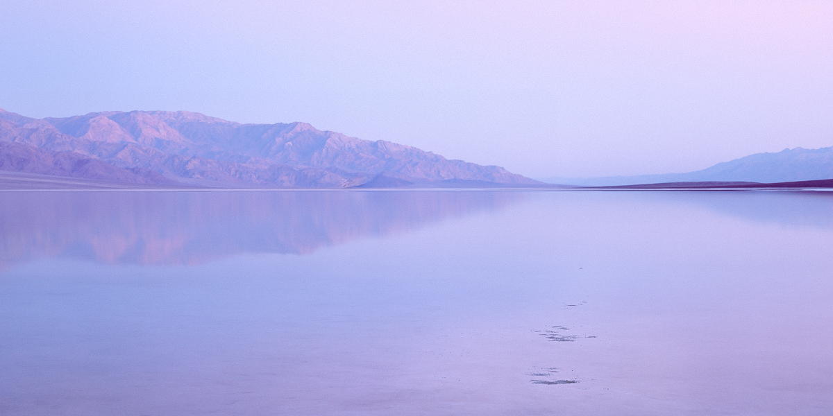
Thanks Rick. If color conveys emotion, then I was obviously in a very purple mood. |
Sep 15th |
| 96 |
Sep 24 |
Reply |
Thanks Bruce. Yes, I need to step away from the image for a while and come back to better see the color casts. I was rushing too much. |
Sep 15th |
| 96 |
Sep 24 |
Reply |
Thanks Haru. Those are both helpful comments. I did another version where I scaled back the color cast. I also did a different crop as an alternative to reduce the blank space in the bottom left. I had to clone in some salt to make up for what I cropped out. I think it still is not great. Done again, I'd compose differently. |
Sep 15th |
 |
| 96 |
Sep 24 |
Comment |
Hi Haru. I think the combination of the ripple and the reflection are very creative. It is the ripple that really makes this image.
To me the image does come across as somewhat bleak. That could be what you are going for, but it sort of conflicts a bit with what is otherwise a very peaceful image. Perhaps warm it up a bit? I also think the best parts of the image are from the ripple down, and even there not the rightmost edge. I think simplifying the image would make it stronger, so a crop might help? As others have commented, the other approach would be cloning out some of the more distracting branches. I am not sure whether I find the little bits of floating material distracting or not. I might consider cloning some of that too. Finally, while I haven't pulled your image into LR to look, the darkest reflected leaves in the heart of the image look really dark and absent of detail. Can you pull the shadows there up a bit?
It's clear you are exploring different ideas with your photography as of late. I applaud you for the courage to do so - I am not sure I am as brave. Many of your recent images are very challenging ones - lots of complexity to organize into a compelling photograph. While there are shorter paths to compelling images I think the journey you are taking will be much more rewarding in the end. And I really enjoy seeing your creativity.
|
Sep 15th |
6 comments - 3 replies for Group 96
|
6 comments - 3 replies Total
|


