|
| Group |
Round |
C/R |
Comment |
Date |
Image |
| 96 |
Aug 24 |
Reply |
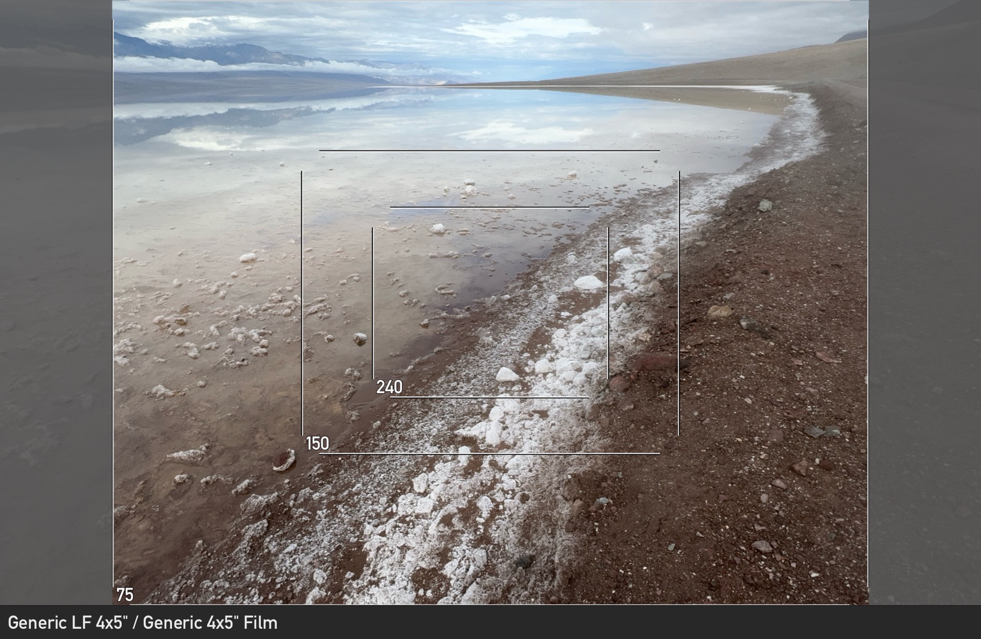
Thanks Haru. I always appreciate the thinking you put in on our images. I believe you are right that it was shot from about eye level. I generally consider shooting lower, particularly for a scene like this and when shooting with a wide angle. I am not sure why I didn't choose a lower perspective here. I attached the scouting shot from my phone - the framing is slightly different and I think substantially better. Little changes clearly matter. The clouds were a little better arranged too. Alas that is the time penalty of setting up 4x5.
I think this shot had a lot of potential to be powerful in a subtle way. But in the end I think there are too many problems and mis-steps, largely in the composition.
|
Aug 29th |
 |
| 96 |
Aug 24 |
Reply |
Thanks Viren. I will try darkening the upper right a bit. |
Aug 29th |
| 96 |
Aug 24 |
Comment |
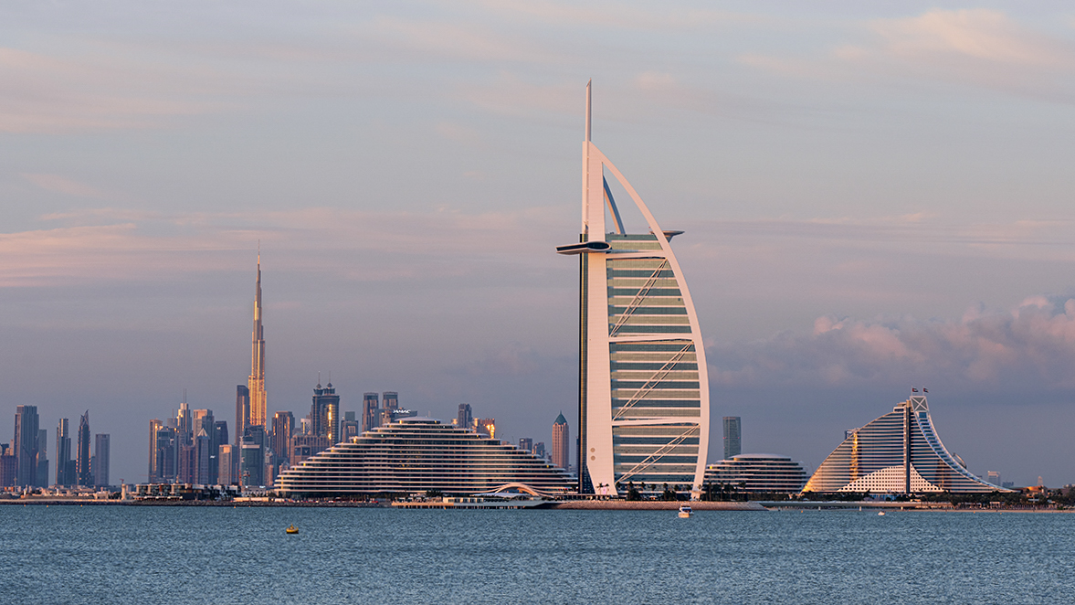
Hi Viren. This is a beautiful image. I love the soft but colorful lighting. You could have pushed the contrast and saturation up but didn't which I think is the right call. The image is also to my eye really well balanced. I think I might have tried a longer 1+ sec exposure to smooth out the water and perhaps make the buildings pop even more but that would have had its own challenges with motion in the boats.
I only have a couple of thoughts for improvement. First, I think the verticals are off just a tiny bit - it is less than a degree but I can see it. Second, while I wouldn't pump up contrast or saturation overall, I might selectively apply some added 3D contrast (pick your favorite method) to the front buildings right on the shore. I think by selectively doing that, the front buildings pop a little more and give a little more 3D effect. I did that in the attached - it is subtle, but that is the point.
This is one of my favorite of your cityscape images. Beautiful capture.
|
Aug 16th |
 |
| 96 |
Aug 24 |
Comment |
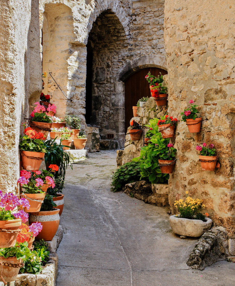
Hi Bruce. This is a nice capture of what seems to be a very happy place. The people are absent, but the decorations of flowers for me suggest a cheerful populace. It makes me want to visit and explore - I am sure there are more flowers and happiness around the next turn of alley, and I want to see them all. I also love the warm stone of the right side which enhances that same feeling.
Rick has made some good suggestions which I'd second. I also agree with your assessment that you could selectively bring out some more detail, particular in the foreground. I'd add one more suggestion to crop from the top to eliminate the window at the top edge. Because it is cut by the frame edge, it tends to walk the eye out of the frame. Below is my cut at some of the suggestions.
|
Aug 15th |
 |
| 96 |
Aug 24 |
Comment |
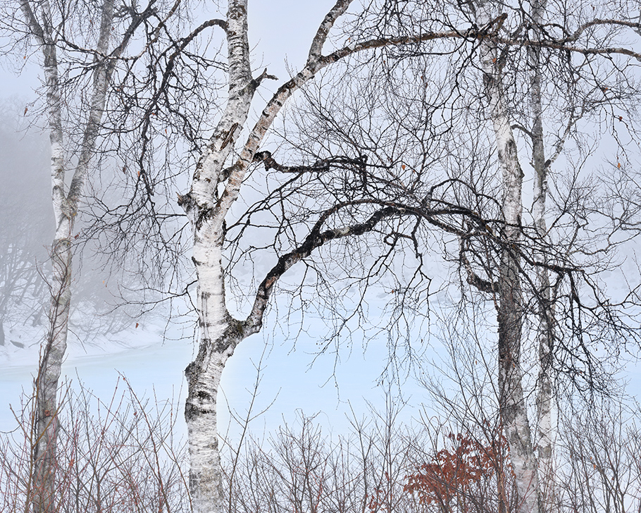
Hi Haru. I very much like the subtly of this image - the subdued but harmonious colors, and the atmosphere of the distant portions. I particularly love the subtle blue of the lake.
To answer your questions, I am drawn immediately to the prominent tree left of center, and its very dark curving branch which reaches to the right. I like the symmetry in that branch and the similarly curving one above it. When I explore more I also like the symmetry in the tree at the left edge and the one second from the right. It took me a while to find the lake. The blue is so subtle and I think the lighting and iPad I was on when I first looked at the image were not helping. Once I saw it though I really love it.
I would not say the image is too tight in the frame. But I think it is a little dense with the disorder of the forrest, and I do not love all portions as much. The top and the right side don't grab me the same way as the rest of the image. So I might consider cropping in. I tried both keeping the symmetric tree on the right and cropping even further - in the end I liked the later better. I also think I would not be quite as subtle - this is a style choice and I love the subtly you bring to images. But I think by selectively using a little contrast and warmth/coolness you can bring more of a 3D look. My attempt at these is below.
|
Aug 15th |
 |
| 96 |
Aug 24 |
Comment |
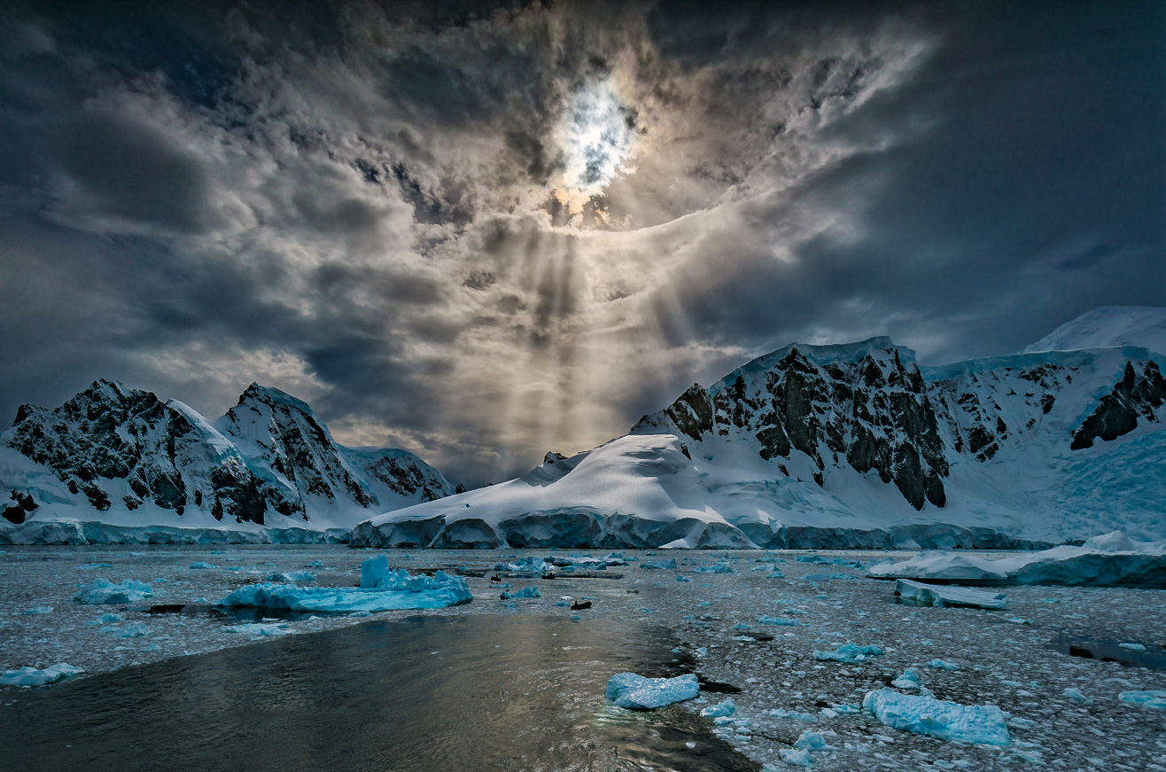
Hi Rick. This is s stunning image. If lighting like this finds you regularly, I want to follow you around. I am curious about your comment that the 3rd image is the sharpest. I am familiar with shooting a sequence to look for the sharpest, but not this rule about the 3rd. Interesting.
I spent quite a bit of time looking at your image - who wouldn't. But after a while, a few comments emerged. I think the biggest is that I find myself ping ponging back and forth between the centroid of the light in the sky and its reflection in the water. Those are so bright that they hold me, and I am less tempted to explore beyond that. I would consider cropping the bottom. I think this also eliminates the expanse of black water in the lower left that doesn't have much going on, and further emphasizes the amazing light in the sky which I think is the star of the show. Exactly where to put the crop is not clear, but my shot at that is below.
The other two suggestions I would make are more details. The "hole" in the sky where the light peaks through is very blue, but a blue that matches the ice and seems unnatural for the sky. I might just desaturate it. Finally, I think there is opportunity to bring out more detail and light in particular larger chunks of ice in the foreground and mid ground which help entice the viewer to explore all the details.
Again, this is a beautiful image as is, so take the suggestions just as avenues to perhaps explore.
|
Aug 15th |
 |
| 96 |
Aug 24 |
Reply |
Thanks Rick. Yes, I don't think you can have a leading line handed to you more overtly than this.
I was struggling to get the clouds in while not letting the leading line get too close to the edge on the other side. The 75mm (~24mm equivalent) is the widest thing in my 4x5 kit. I could try to do a context aware crop expansion on the left side. There is a chance done right that that could allow the dark mountain terminus. I agree that the cloud feels cut off, and too close to the edge too. |
Aug 11th |
4 comments - 3 replies for Group 96
|
4 comments - 3 replies Total
|


