|
| Group |
Round |
C/R |
Comment |
Date |
Image |
| 96 |
Jul 24 |
Reply |
Thanks for clarifying further Haru. I think we are on the same page. Your version improves the upper left, and I am working to do something similar to bring detail to the upper left. I will also look more closely at the trees in front. I can see they are "crunchy". I am not sure whether that is noise, sharpening, or the impact of changing to 8 bit sRGB. |
Jul 19th |
| 96 |
Jul 24 |
Reply |
Thanks Gloria. I've enjoyed both your images and your comments. You will be missed. Will try to visit you in your new group from time to time.
|
Jul 19th |
| 96 |
Jul 24 |
Reply |
Thanks Haru. You have focused in on exactly what I have been battling - how much to bring out the distant portion of the image. I keep going back and forth. I like revealing the detail, but at the same time, it seems to me that as I do that the mood of the image is somewhat lessened. It is not a technical thing, it is a choice thing, and I can't seem to make up my mind. I am also finding that the print comes across differently - again not as a technical thing (my monitor is pretty well calibrated), but the aesthetics are different for such a subtle image. I can get something I like on the screen and it is a gray lifeless mess in print. I will keep working on - actually I have been even before the comments, and I shifted in the direction of revealing more.
I will look at the noise too. Surprising there is a problem there since noise is generally not an issue for scanned 4x5. Where do you see noise?
|
Jul 19th |
| 96 |
Jul 24 |
Reply |
Your welcome. It is fun to play with strong images, particularly ones different from my own. I tend to learn new things doing that. |
Jul 15th |
| 96 |
Jul 24 |
Reply |
Interesting. I am familiar with Kuyper's stuff - I use his TK plugin. But I will take a look at the linear profile approach and give it a try. Thanks! |
Jul 15th |
| 96 |
Jul 24 |
Comment |
Hi Bruce. I love the building that you've found here; there is a rustic texture to the walls that you can almost feel looking at your image. As Rick points out you've used contrast well to enhance the details in the building.
For me you are trying to include a whole lot compositionally - stuff that isn't central to the story which is all about the building. In particular the flowers in front suffer from being part in and part out of focus. There is also a lot of sky, and clouds which are just there enough to be distracting (particularly on the top edge of the image) vs. providing a contrast with the building texture which perhaps would have been possible with more clouds.
I perhaps would try cropping in a little tighter to reduce some of the distraction. There is also a new trick you could employ in Lightroom, namely it can "guess" depth in the image and artificially reduce depth of focus (e.g., lens blur). You could use that to bring the flowers in front out of focus so they don't compete. I tried that to demonstrate in the image below. I also tried to fix the perspective (building leaning) that Rick talked about - again LR has a quick option for this.
The other thing you might think about is trying the image in B&W. For a middle of day image like this sometimes that is very effective.
Again, I complement you on recognizing the potential in the abbey as a subject. Just a case of how to take full advantage of what the wonderful building offers.
|
Jul 15th |
 |
| 96 |
Jul 24 |
Comment |
Hi Howard. From your description it sounds like a very special moment, and your image shows it was accompanied by great light. The birds, seemingly so peacefully enjoying the moment, help convey the serenity. The color contrast in the water, between the blue foreground and warm sunset reflections, is the favorite part of the image for me.
It would be interesting to understand in more detail how you processed the image. While the colors are amazing there does seem to be a color shift in the sky (greenish tones) to something which does not seem completely natural. Also, the detail in the shadows has really been lost, and there also the color doesn't seem completely correct. Could you post the original image without edits? That might allow us to understand better what processing you've done and where the color casts might have arisen.
|
Jul 15th |
| 96 |
Jul 24 |
Comment |
Here is the more abstract image ...
|
Jul 15th |
 |
| 96 |
Jul 24 |
Comment |
Hi Gloria. If all of your Galapagos images are as beautiful as this one, it must have been an amazing trip! The beauty in this photo come from the wonderful color of the rock and its contrast with the water, as well as the very simple clean composition. It doesn't hurt that it is a very charismatic rock.
I think it is possible to do a little more to the image to make it pop even more. Rick has provided some suggestions - crop a little tighter to the rock, and darken the sky so the eye goes to the rock and not the bright sky. I think you can also add a little more contrast in the rock itself. Some thoughts on this are in the image below. Btw, you also have a couple of sensor spots in the sky that become visible as soon as you darken things down; easy to clone those out.
I also see a lot of potential in this image to move past the classic shot of the rock. I really love the colors that are coming out in the water reflections. I think those can be enhanced, and there is a whole second image there if you crop in. To me it could be a bit more abstract and artistic - less the ordinary. I tried such a crop and will post below. Beautiful image no matter what you do with it. And you were skilled to get something this sharp from a rolling boat.
|
Jul 15th |
 |
| 96 |
Jul 24 |
Comment |
This time with the image ... |
Jul 15th |
 |
| 96 |
Jul 24 |
Comment |
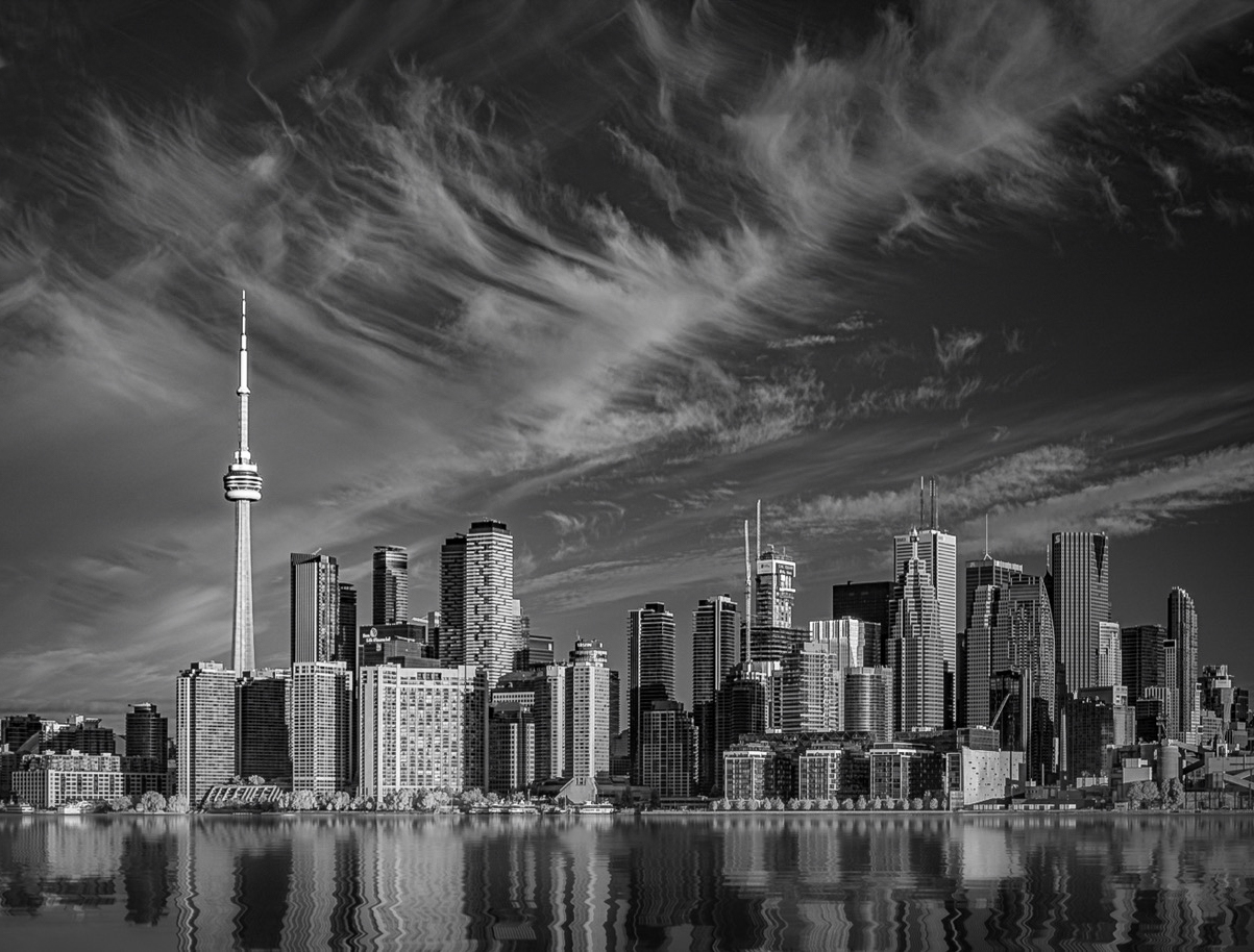
Hi Rick. Welcome again to the Group, and thank you for such a wonderful first image. To me this image is about the contrast between the feathery clouds and the more crisp, block geometry of the cityscape. The strong tonality in the city is balanced by the weight the diagonals give to the clouds, particularly the dominant (most foreground) strip of cloud. There is also an interesting tension from the fact the "horizontal" city intersects with that cloud at the position of the narrow vertical tower - so there are horizontal, vertical, and diagonal all converging. In short, the image keeps giving interesting things.
I'd just raise a few things that you might consider to further strengthen an already strong image. First, the thin line in the upper left - a fresh contrail I'd assume - seem incongruous with the otherwise soft clouds. It tends to grab my eye and distract. Easy enough to clone out. Second, the large "blob" of cloud in the upper left (on the edge) also is not keeping with the airy nature of the other clouds. It has a fair amount of visual weight. This one is a little harder to deal with. But one option is cropping some from the left (perhaps combined with cloning). I might explore a crop on the left side anyways since to me the interesting stuff is pretty much all to the right of the needle tower; the buildings from the needle to the left are less impressive. You need some of them to allow the needle breathing room, but not sure you need as much as you have. Also even if not cropping substantially, you might think about cropping off the "half building" at that edge; I find that distracting. Finally, I think you could selectively give it a little more light - perhaps in the clouds as well as perhaps the buildings near the needle to give a little more strong focus. These are of course matters of taste. I took a shot at these things in the attached. Beautiful image and fun to work with... but not much to do as you've processed it wonderfully.
Thank you for your detailed list of steps in processing the image. One caught my eye, namely "Convert to linear profile". I've never run into that. What is it, and what does that accomplish?
|
Jul 15th |
| 96 |
Jul 24 |
Reply |
Thanks Rick. It took a lot of back and forth to narrow into a look where the distant detail was there, but just barely. Subtly is sometimes not my strongest thing, so I had to fight to not reveal too much. |
Jul 15th |
| 96 |
Jul 24 |
Comment |
Hi Viren. You've captured a beautiful image of a beautiful building. I was struck initially by the crispness of the image and clean, bright presentation of the building. There is a pop to the building.
When I look longer I start to wander to the sides & edges and wish it was less distracting. Yes, it would have probably been better if the van had moved, but even then there is a lot there that does not add. Interestingly my sense is that if you had gone wider, the clutter around the mosque might have worked better, albeit with a little different story - one of the contrast of the pure, pristine building with its more drab surroundings. But there is not enough here to suggest that message. So, I would think perhaps about cropping tighter and making the image more of a portrait of the mosque. I think you could do that with a square crop which I think still allows enough breathing room.
I did that below as well as a few edits to further enhance the light and which to me give a little more 3D pop. You have a sharpening halo which I did not fix since that is likely a product of downsizing to the small size required here. It is better to fix on the original in any case.
Again, a very beautiful B&W image as is, but perhaps with potential for even more.
|
Jul 15th |
 |
| 96 |
Jul 24 |
Comment |
Hi Haru. I love that you are trying some really different sorts of images like this very graphic look. It invites exploring, and I've spent a fair bit of time walking through the details and trying to unravel aspects of the geometry that formed it. It is intriguing.
While I like that journey and the complex geometry, the amount of detail is a little overwhelming for me in an image that otherwise begs to be simple and graphic. In particular, it is the out of focus details, and the partially showing underwater stuff that I think is not adding to the image. I also find the background a little too bright, but at the same time believe you could push the contrast even further in the reeds to enhance the graphic nature of things and the more interesting, in focus, detail. I took a shot at these changes below. The most significant part is cloning out the underwater stuff and unsharp details. I think it simplifies things, at least for me.
I like the silver frame. It goes with the image and contains it without drawing attention too much from the image itself. I agree with Rick that the semi transparent frame is a novel touch that I have not seen before.
|
Jul 10th |
 |
8 comments - 6 replies for Group 96
|
8 comments - 6 replies Total
|


