|
| Group |
Round |
C/R |
Comment |
Date |
Image |
| 96 |
Jun 24 |
Reply |
Thanks Haru. As always you make a lot of good points. But probably the most important one is your question of "what is it about"? When I showed up that morning my plan was to shoot the alpenglow and reflection in the lake. I just needed a good leading line to provide a foreground. But when I swapped compositions, two things happened. One I really liked the dark pool and surrounding salt in the new foreground I found. Second, in order to get it in, I had to swap to a wide angle, which made the mountain peaks and reflection small. I suppose to top it all off, the alpenglow didn't show up exactly where I thought it would, so it is not as balanced with the rest of the composition as it should be. And when I got the image back, the pool and salt in the foreground is not as exciting as it seemed at the time. So I think the whole image is a case of being stuck between two "what is it about" options and doing neither well.
|
Jun 19th |
| 96 |
Jun 24 |
Reply |
Thanks Gloria. I will keep working on it. I did not have much time to let this one sit after editing and then come back to it. So I fear I pushed some things like the sky tonality and pink alpenglow too far. |
Jun 19th |
| 96 |
Jun 24 |
Comment |
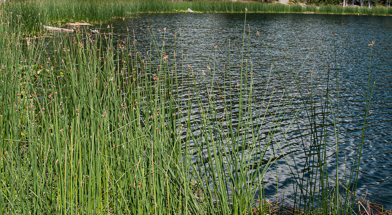
Hi Bruce. What is interesting for me in this image is how the grasses (reeds?) wrap around from the front to the distant side of the water. You get to see them up close and explore the detail, but they are a common element stretching across the image and unifying it. The other thing interesting is the juxtaposition of the very linear and most vertical grasses with the waves in the water which are striping more horizontally.
With those as the interesting elements, what is more distracting and not really contributing is the cluttered shore beyond the grasses on the far bank. I think that is not your subject and distracts from the positive aspects I described above. So, I'd crop as much of it out as possible and maybe edit to darken what is left. I might darken the overall image a little too because by doing so the colors - the greens and blues (which also work well together) - come through stronger.
I took a cut at those few changes which is below. Where exactly to do the crop at the top is a personal choice. I think I like the grasses stretching right to the edge as much as possible.
|
Jun 15th |
 |
| 96 |
Jun 24 |
Comment |
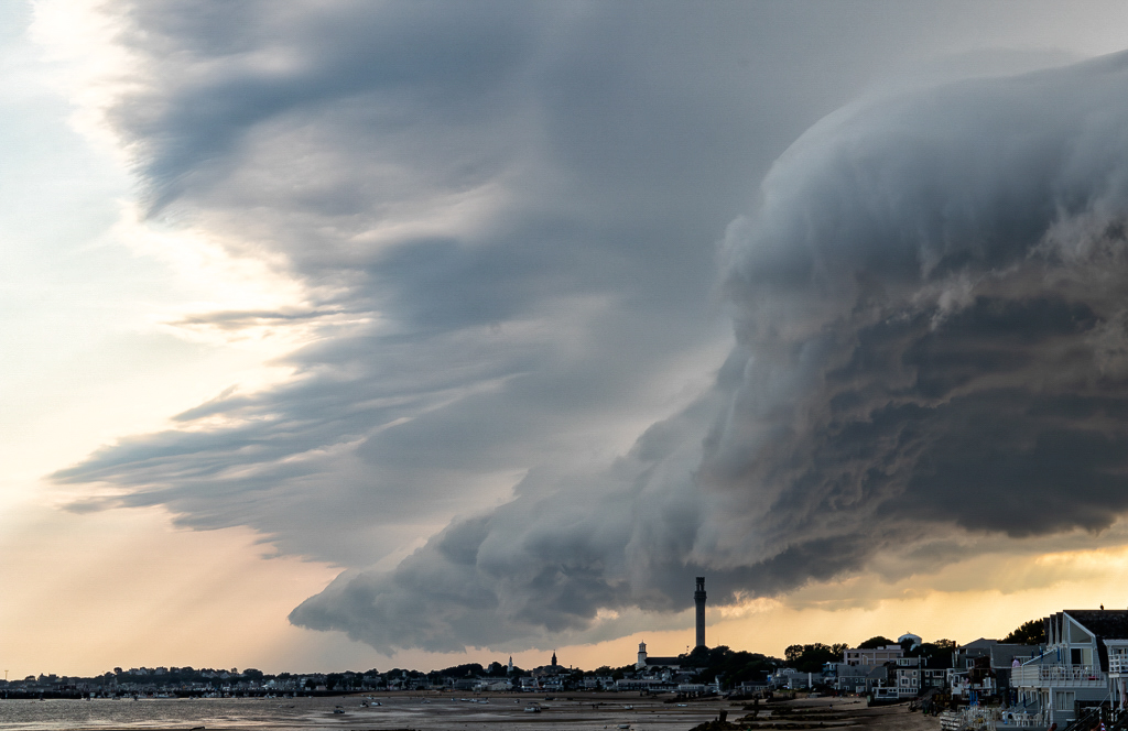
Hi Gloria. These are truly amazing clouds that you've found for this image! I agree it conveys the immensity and power of nature. I also really like the contrast between the blue/cyan shadow tones in the clouds and the warm sunset light which is otherwise showing through in the sky.
Others have commented on showing more land/sea at the bottom. To me, I think you have enough. The smaller sliver of land/sea further emphasizes the enormity of the clouds, and since the shoreline is fairly cluttered, I suspect that much more of it would become distracting.
It seems like your processing of the image was pretty light. I do think there is room to bring out the drama in the clouds more if you wanted. I took a cut at that with one of the contrast tools in Nik Color Efex (Tonal contrast). In addition to a little more drama in the clouds, it also brings out light rays in the sky that were hard to see before. It is a little more "fearsome" or harsh look though, so might not be what you are after. Terrific image in any case no matter how you process it.
|
Jun 15th |
 |
| 96 |
Jun 24 |
Comment |
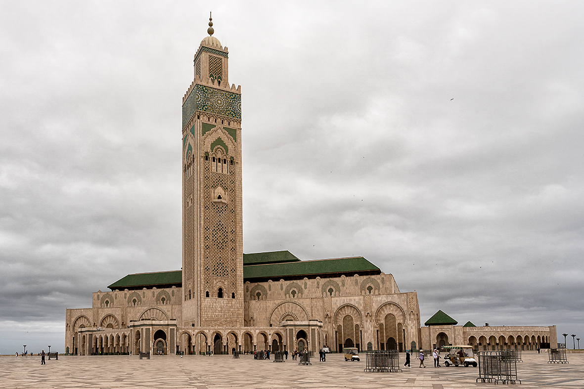
Hi Viren. This is a really beautiful building, and you've showcased well the intricate stone work and patterns, particularly in the tower. I also really like the colors of the stone and the contrast with the green roofing. While the sky was perhaps not interesting, you made good use of the overcast to bring out the details and color.
I also love the stone work on the ground. I wish that you had had a wider lens that could have showed us more of that as a foreground to the building.
Couple small improvements I'd suggest. First, the tower is not quite vertical. It is very close and I am perhaps overly fussy about that in architectural shots, but that's an easy fix. Second, while the sky is overcast, there is a little more drama in the clouds which I think can be brought out. I did that with a couple of the Nik Color Efex contrast tools, but you can choose your approach. The key though is preserving the soft light on the building while doing that, so there is balance. My shot at that is below.
The contrast enhancement made clearer the bird in the upper right. Once you see it I think it is an important element of the image that adds to the story.
|
Jun 14th |
 |
| 96 |
Jun 24 |
Comment |
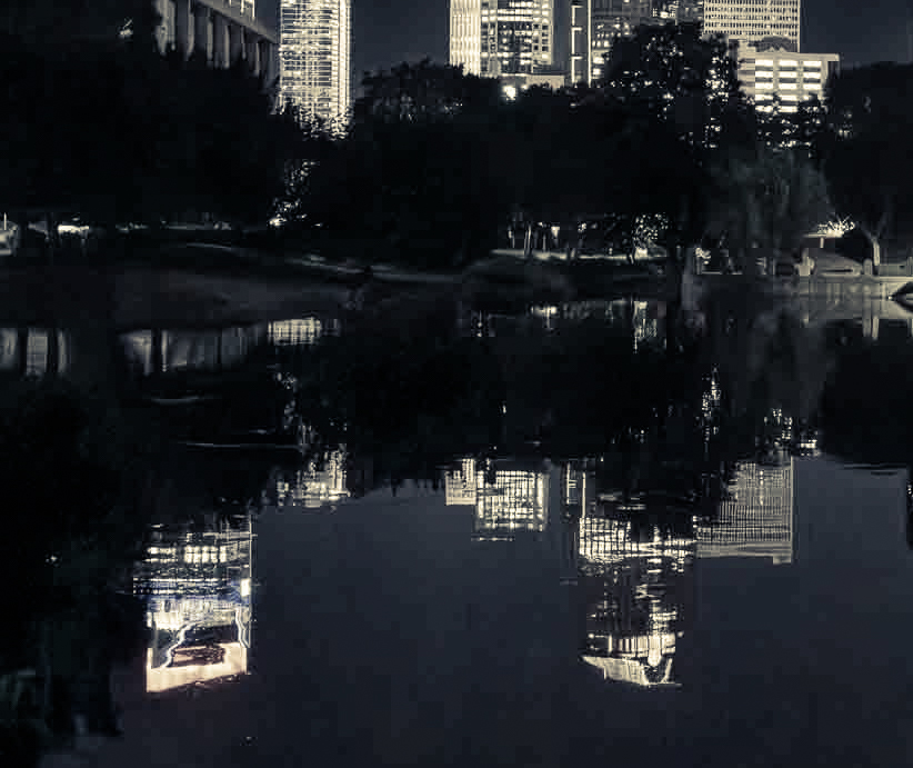
Hi Howard. I don't shoot many night scenes like this, but agree with Viren that they are difficult technically because of the dynamic range involved between the bright lights and deep dark shadows. You don't mention if you were shooting on a tripod or not. As I'm sure you are aware, that can help because you can shoot multiple exposures and then HDR blend them. But even if you don't want to do that, you could shoot a longer exposure at a lower ISO (like 100) which typically gives you more stops of dynamic range.
A couple of other suggestions. I might choose to not show the full extent of the buildings and their reflections. I might also choose to go with something a little more monochrome as the natural colors in this scene do not seem particularly harmonious. I played with it a little along those lines and came up with what is below. It is a little different look that you may like better or not.
|
Jun 14th |
 |
| 96 |
Jun 24 |
Comment |
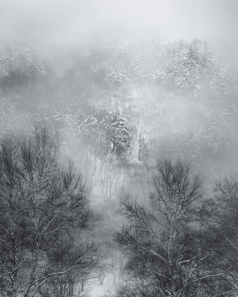
Hi Haru. I love the atmospheric look and feel that the fog has created and you've captured. There is a softness, in a good way, to the image. I can imagine that you took a series of shots, some with more fog, and some less. This seems like a good balance in terms of the background being neither too obscured nor too clear. Everything looks good technically.
There are a couple of compositional aspects that for me don't work as well though. First, it is very left right symmetrical - two trees in front, two less obscured areas in the distance - and the symmetry makes it feel a little less natural. Two is a difficult number, so I'd also say the two trees in front also suffer a little from that. A little wider with three trees might be better. With the vertical format and the two trees up against the edges, there is also a tightness feeling to the image that fights a bit with the relaxed, soft, smooth feel that the atmospherics deliver. Finally, it seems to have been taken from a high position, so I feel a little like I am looking down. I am not sure why, but that feels a little odd.
What I might do to improve this is to crop in - mainly from the top and bottom, but also a little from the sides. This makes the image a little less literal and more abstract, which I think best takes advantage of the atmospherics which go with a less literal interpretation. It also allows you an opportunity to destroy the symmetry a bit which again looks too unnatural to me. I think you can further offset the symmetry and enhance the abstract quality by selectively burning and dodging. Giving the eye more definite dominant points to go to. Finally I increased the contrast a bit by enhancing the blacks and whites, and I gave it a slightly cool tone which I think is keeping with the mood. My result is below.
Just some thoughts. You again have shown your skill at finding really interesting conditions and moments in time that go beyond a simple landscape.
|
Jun 14th |
 |
5 comments - 2 replies for Group 96
|
5 comments - 2 replies Total
|


