|
| Group |
Round |
C/R |
Comment |
Date |
Image |
| 96 |
May 24 |
Comment |
Hi Robert - welcome again to the Group. This is a beautiful image with strong graphic form which is well rendered in B&W. Compositionally the subtle diagonal of the array baseline is echoed in a similar slant in the clouds at the upper left (and even the single cloud in the upper right). I find the brightly lit feed structures on the dishes, along with the strong graphic form of the dishes, is enough to pull my eye directly to them; first I go to the large central one, and then I explore the linear array of them behind. The clouds are a gentle enough white that they do not yell for attention. So for me, the tonalities work well.
It is difficult to find any fault here for improvement. The only thing I'd mention is that the right most dish is a bit close to the edge. I might go for a separation which matches that of the left dish from the left edge.
It is difficult to judge horizon in this image, but the support structure of the dishes appears to be slightly leaning. I am not sure if that is deliberate though; correcting it flattens somewhat the diagonal of the array baseline and makes the image a little more static. It also further places the right most array closer to the edge. So I'd leave the horizon alone.
Finally, I might also try subtly burning the edges, particularly the bottom edge, but that is probably more personal preference.
These are all really small nits as you can tell. It is a great image. Would not change much.
|
May 19th |
| 96 |
May 24 |
Comment |
Hi Gloria - Hope things are better with your family.
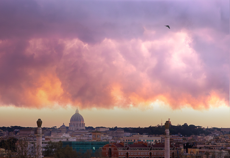
You've really captured some beautiful clouds and light. I think it is potentially the making of a really powerful image, but I think there are a few things that might be needed to get there. The image is very layered horizontally, which is a fairly "static" composition, and there is also not a strong specific focus in the clouds (which for me are the subject). I agree the region between the clouds and cityscape is a bit bland, although I would not go for blue sky there but something more naturally complementing the warmth of the image. The top region of the clouds is also somewhat plain for its extent. Finally, as Haru pointed out, the level is off.
So I took a shot at some things to really make the image about the dramatic clouds in the center horizontal band. I straightened the image, enhanced the color separation in the clouds by bringing saturation up or down in individual colors, brought out the yellow warmth in the sky below the clouds, and then cropped in on all sides. Then I did a tricky thing in photoshop, namely I created a second version of the image, slid it down, and masked; this was to narrow the empty band between the clouds and cityscape. Finally, I chose a focus in the clouds in the upper right (near the bird), and brought up the light there and in that corner. That hopefully gives a definite focus for the image.
Again, you've captured beautiful light. There are probably a host of different directions to take the image, so my suggestions are just one direction.
|
May 19th |
 |
| 96 |
May 24 |
Comment |
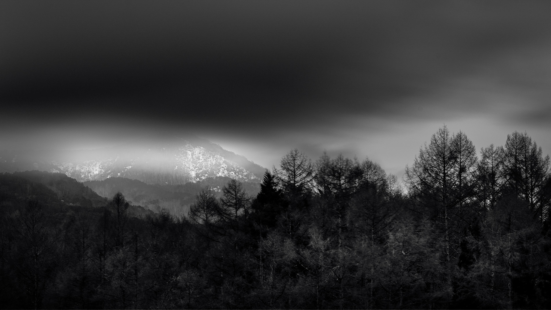
Hi Haru. This is a very different image as you've presented it. I find it spooky. I'd also say it trends toward a lot of what I see often in modern photography fine art in its somewhat blurry, surreal, minimalistic look. I'd almost say it pushes at some level against the notion that landscape photography should convey beauty - that too is perhaps common with some current fine art thinking.
Different is good, so I hesitate, not wanting to be critical, but I have a hard time engaging with it as presented. There is not enough there for me. I am sure it was a dramatic moment, but it is not capturing me as is.
I assumed until I started playing with it that the foreground was lost as pure black. But there is actually a lot of tonality there to be worked. So that is what I sought to do. I think there is a delicate balance between bringing up some detail in the foreground without loosing the ethereal sense the clouds and darkness bring. I am also not great at B&W. But my attempt is below. I think a master fine art B&W printer could keep the foreground dark while allowing just enough detail to glow through. I am not sure you can ever quite do that on screen.
In any case, this is I'm sure a different direction that you were headed with the image. So just consider it an alternative thought.
|
May 18th |
 |
| 96 |
May 24 |
Comment |
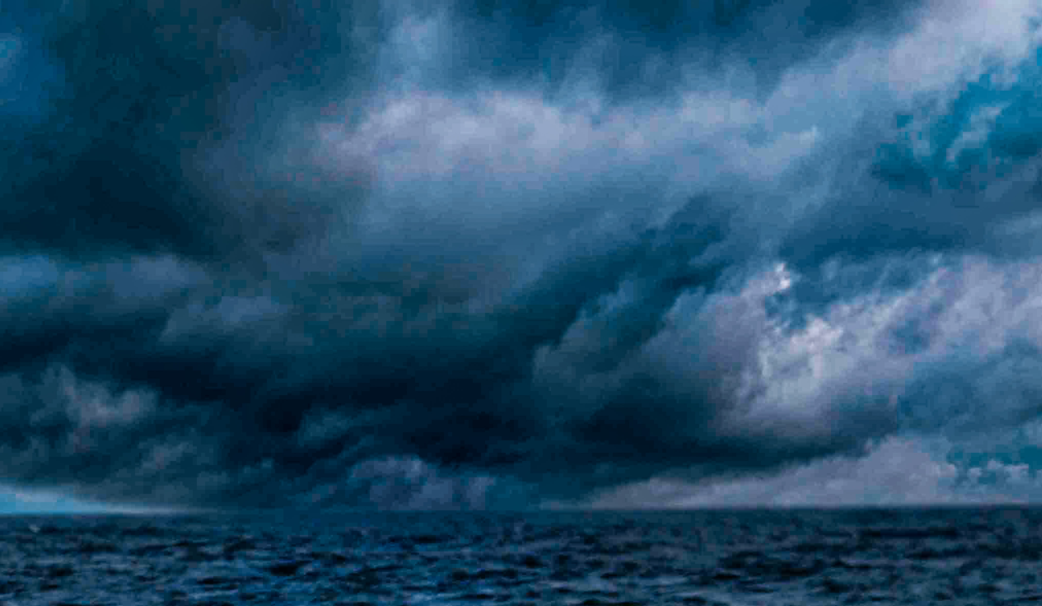
Hi Howard. I played with your image for awhile. You have captured some very dramatic clouds which suggest great potential for a strong image. After trying a bunch of things, I concluded that you are trying to include too much. The wave in the front is not really that spectacular, and as Haru points out, the water in between the wave and the horizon is even less interesting. The interesting part here is the clouds. So why not make the image about those?
I did that by cropping and trying to use the super resolution feature in LR to add some pixels back. I also did a little to enhance the contrast in the clouds. The result is attached. Obviously it suffers from low resolution, but if you have more in the capture you could do better.
I find these sorts of situations often benefit from a wide angle - not to include the foreground, but to take in as much of the sky as you can. But the alternative would be to point your 100mm a little higher and take in mostly sky with just enough sea to give context. Just some thoughts for next time. |
May 18th |
 |
| 96 |
May 24 |
Comment |
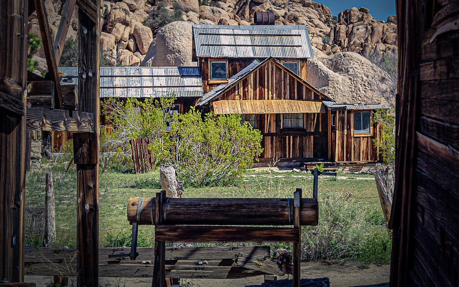
Hi Bruce, and again welcome to the Group! Of your two images, I think I may prefer the one of the wagon. In both I like the weathered wood which comes across with considerable character. The more close up view of the wagon showcases that a bit more, and generally is a simpler image where the focus is clear. Both images would probably benefit from softer light, but I know how hard it often is to visit places closer to sunrise or sunset.
Since you've chosen the ranch image as your preferred image, a couple of things that would help make that image stronger. First, although the framing you've provided is nice, I'd crop in some. On the right the corrugated panel looks out of focus (depth of field issue), so I'd come in to eliminate it. On the left, the left most of the two uprights creates a region to the left which is trapped and distracting. I'd crop in to that upright. Finally, the sky is not particularly interesting, so I'd come down some from the top. The other things I'd do is a detail, but there is blue cord fencing off the structure in the center front. I'd carefully clone that out in PS to preserve the rustic nature which comes across in the image. I did that and a bunch of other misc. things to arrive at the attached version.
It is an interesting building with a lot of unique character. You have a good eye to recognize that and frame it up as you did.
|
May 18th |
 |
| 96 |
May 24 |
Reply |
Thanks Gloria. I too am not in love with the left edge of the photo. I am realizing as I look at it again that there is a dip in the top of the arch. I think that may make the portion to the left feel disconnected - it is too short a segment near the edge. The dip is probably where I should crop it. |
May 18th |
| 96 |
May 24 |
Reply |
Thanks Haru. On the colors, the image was shot on color negative film, so it's of course difficult to say what is real or not about the colors. I don't think I've done anything deliberately in the processing to enhance the colors, but I do see the blue/magenta cast now that you point it out. The foreground should have somewhat of a blue cast since it is in shadow (pretty deep shadow actually), but it is probably too purple now that you point it out.
In your rendering you've preserved the brightness in the sky below the arch compared to above the arch. Again, I don't think I did anything to artificially create that. The sky is just darker at higher elevation. But the presence of the arch makes it seem to me like the sky tonality has been manipulated. I'll assume it works since you didn't comment on it or try to fix it.
|
May 18th |
5 comments - 2 replies for Group 96
|
5 comments - 2 replies Total
|