|
| Group |
Round |
C/R |
Comment |
Date |
Image |
| 96 |
Apr 24 |
Reply |
Thanks Haru. This is a subtle shot, so I appreciate your perspective.
I think in an effort to bring out more contrast in the sand tendrils I've over sharpened the edge of the dune, so I will go back and work that. Similarly with the sun. I thought the cooler tone added to the drama, but I think I need to play around with that, let it sit for a bit, and then see if I feel the same. In some ways I like the warmer and less monotonic colors that Robert brought out. |
Apr 29th |
| 96 |
Apr 24 |
Reply |
Thanks Gloria. Your words are encouraging. This is only my 2nd or 3rd time shooting dunes, and never with these conditions. So much more exploring to do ...
|
Apr 28th |
| 96 |
Apr 24 |
Reply |
Thanks Robert. It is a very different sort of image for me - much more understated, and an experiment that doesn't quite make my heart sing, at least not yet. I do like what you've done with it, particularly the warmer tones. It gives me some thoughts to play with it some more. |
Apr 28th |
| 96 |
Apr 24 |
Comment |
Hi Viren. While I have very little experience with B&W, I think this is quite well processed. There is a richness to the tonalities and none of the mid-tone muddiness which often happens when not carefully processed and converted to B&W.
Since you describe it as an image of the elevator, I would share that my eye has a hard time staying with the elevator. I am attracted to the brightness at the top, and I tend to get stuck there. I guess I just want to look up. I am trying to imagine what the image would look like if the elevator was closer to the top. I think that would have a better chance of making the elevator the focus, but I just don't know if the bottom of the image would hold together or not.
I can imagine some other interesting things that take advantage of the fact the elevator moves. For example, if you took shots (on a tripod) of the elevator in multiple positions, you could combine a few with the lower positioned ones "ghosted" to only partly show. That might be a way to convey the motion of the busy elevator up and down. But that is definitely a different stylistic approach so not sure whether or not that would resonate with you.
|
Apr 14th |
| 96 |
Apr 24 |
Comment |
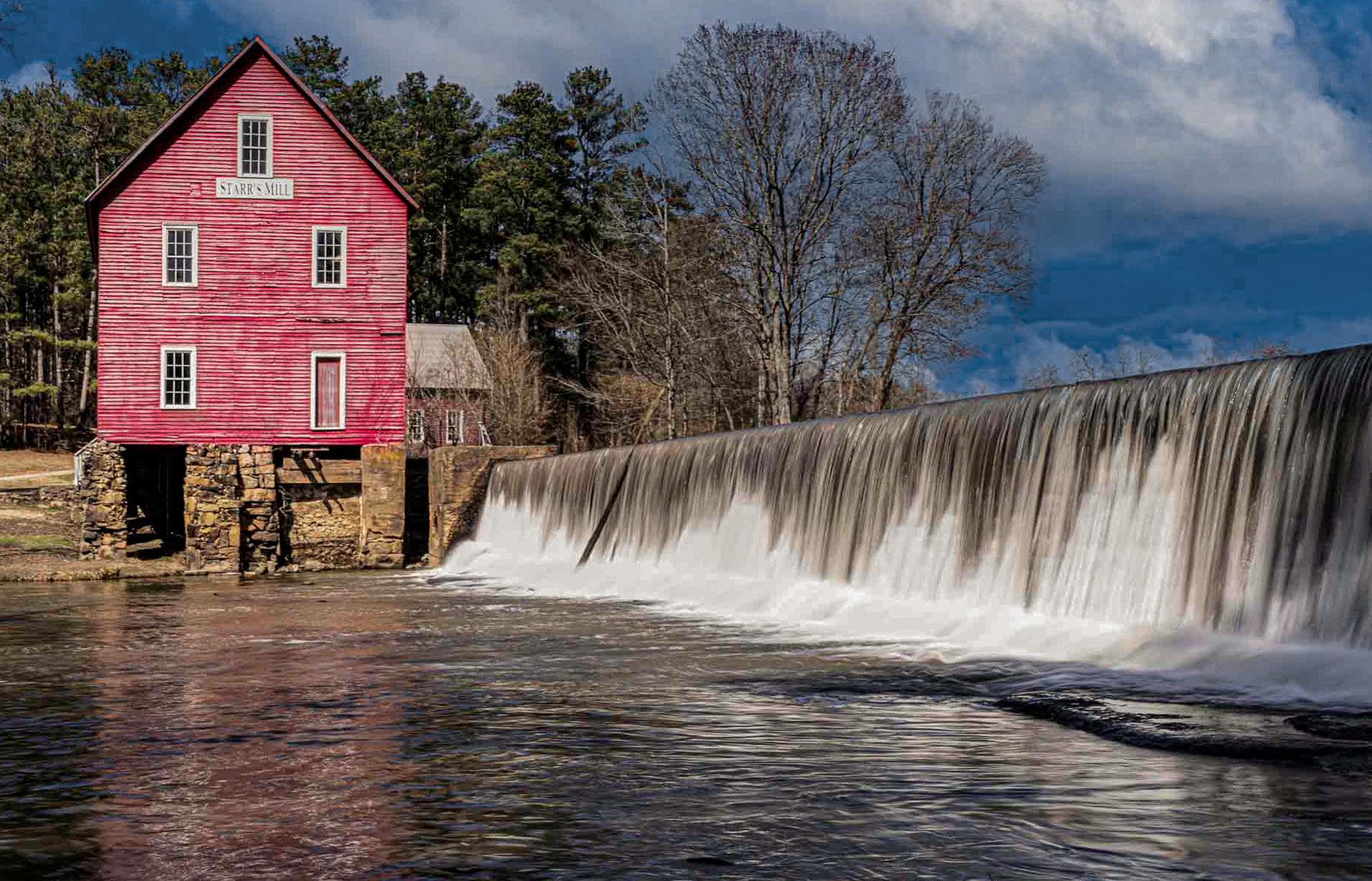
Hi Howard. As you I like the red barn, both the color which draws the eye, and the washed out nature of the paint which gives it character. It is a very pretty scene, and I think I can get behind the feeling of tranquility that you suggest you felt with it.
Couple of technical things. First, I am not sure what you did in processing, but the sky is a color I have never seen in a sky before. :) But unless you have some deliberate reason for the color as is, it is easy enough to adjust the blues and bring it to something more realistic.
Second, I like the creamy water, but as is, it appears blown out, and also is so bright that it competes with the barn too much for attention. When I played with the image I discovered it was not in fact blown out, so there is room to pull back on the whites a bit and show more detail in the water.
Third, the stones are intruding from the bottom edge. I feel like they need to either be more in the image (see more of them) or be cropped out. I don't think you loose anything cropping them as the image is not about the stones and cropping simplifies the image overall.
Finally, small thing but the barn didn't seem straight. Actually the left edge is pretty vertical, but then it is not square with the lower edge. I guess I would not expect things to be square in an old barn, but it was really bugging me, and I don't think that is what you want in a tranquil image. So, I used a perspective adjustment - very minor one - to square it up.
The cut I did with all these adjustments is below. Again, very nice image - just a few easy adjustments that I think make it stronger.
|
Apr 14th |
 |
| 96 |
Apr 24 |
Comment |
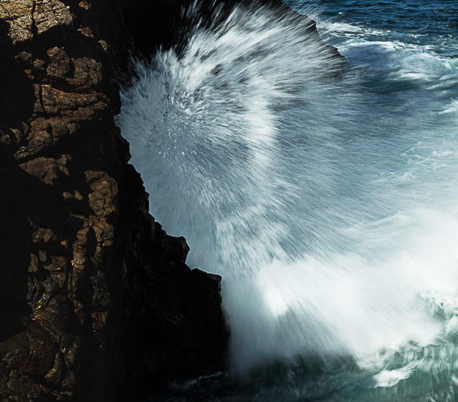
Hi Gloria. I think you nailed the shutter speed perfectly to capture the action in this wave. Faster enough so it is not just blurred out, but slow enough to get some blur to show the motion. The corner where the wave is impacting is very exciting to look at as a result. I would say that the rest of the image is not so interesting to me. So I might consider cropping it. My cut at that is below. I also added some contrast, sharpened it a bit, and toned down the brightness in the rocks at the left so they don't compete with the wave action as much.
I think I get a different message or emotion out the the image than you. For me it is not so much about envelopment but about the power of the wave impact. I can almost hear and feel that impact, and it makes me think about other things like feeling the spray in the air afterwards.
|
Apr 13th |
 |
3 comments - 3 replies for Group 96
|
3 comments - 3 replies Total
|


